meyerweb.com

Skip to: site navigation

Grid-Powered Drop Quotes

Published 6 days ago

I’ve been experimenting with CSS Grid for various layout treatments—not high-level, whole-page layouts, but focused bits of design.  I’d like to share one of them for a few reasons.  Partly it’s because I like what I came up with.  More importantly, though, I think it illustrates a few principles and uses of CSS Grid that might not be immediately intuitively obvious.

First, here’s an interactive demo of the thing I’m going to be talking about.  You can use the checkboxes to alter aspects of the example, whether singly or in combination.  Feel free to fiddle with them before reading the rest of the article, or but you’ll probably want to come back to the demonstration as you read.  There’s also an external version of the demo as a standalone file, if you prefer opening it in a new tab and flipping back and forth.

So that’s how things have been laid out since the middle of 2005, more or less. I fiddled with a flexbox layout at one point as an experiment, but never shipped it, because it felt clumsy to be using a one-dimensional layout tool to manage a two-dimensional layout. I probably should have converted the navigation bar to flexbox, but I got distracted by something else and never returned to the effort.

Besides, Grid was coming. In the run-up to Grid support being released to the public, I was focused on learning and teaching Grid, creating test cases, and using it to build figures for publication.  And then, March 7th, 2017, it shipped to the public in Firefox 52.  I tweeted and posted an article and demo I’d put together the night before, and sat back in wonderment that the day had finally come to pass.  After 20+ years of CSS, finally, a real layout system, a set of properties and values designed from the outset for that purpose.

And then I decided, more or less in that moment, to convert my personal site to use Grid for its main-level layout.  It took me less than five minutes…

Let’s dig in!  The core concept here is a Grid-powered version of the big drop-quote on the left side, there, which is a relatively common treatment for blockquotes.  To make this happen, I’ve applied display: grid to the blockquote element itself, and added the opening quote using generated content, like so:

blockquote {
   display: grid;
   grid-template-columns: -webkit-min-content 1fr;
   grid-template-columns: min-content 1fr;
}
blockquote::before {
   grid-column: 1;
   content: "“";
   font-size: 5em;
   font-weight: bold;
}

There’s more to the actual styles of both rules, but that’s the central thesis: set up a two-column grid, and generate a great big opening quote.

The first thing to note here is that generated content also generates a pseudo-element that can be styled.  You may already realize this, since it’s known we can style generated content separately from the main content of the element.  But given that, if a grid is applied to the element, then any generated content’s pseudo-element, whether ::before or ::after, will become a grid item.  You can then place it in the grid.

I first came across this concept in the comments on my ALA article “Practical CSS Grid”, where Šime proposed using generated elements as a hack to get around the inability to directly style grid cells.  Here, I’m just using one to push a quote over to the side.

Why do this, when we can already use floats or relative/absolute positioning approaches to do the same?  Because it’s not quite the same: with Grid, the column containing the drop-quote responds to any changes to the quotation symbol.  Change the font, change its size, have the preferred font fail and fall back to an unexpected face, or replace the character with an SVG image, and the first column will resize thanks to the min-content track sizing, and the actual main content of the blockquote will adjust its placement to accommodate.  That didn’t happen with earlier techniques.

And yes, there is a vendor prefix in there.  Safari’s 10.1 Grid support came with -webkit- prefixed versions of min-content, max-content, and fit-content.  So I did the old pattern of prefixed first, unprefixed second.  This should be necessary only until the next release; Safari has already dropped the prefixes in its latest Technology Preview builds.  The change apparently just didn’t quite make the cut for 10.1.  It’s sad, but it’s also temporary.

In the meantime, this does mean that if you want to restrict your Grid styles only to implementations that don’t require prefixes, use that in your feature queries:

@supports (grid-template-columns: min-content) {…}

That, as well as a number of close variants like using grid-template-rows or max-content, will keep your Grid styles away from Safari until they update their Grid support in the public release channel.

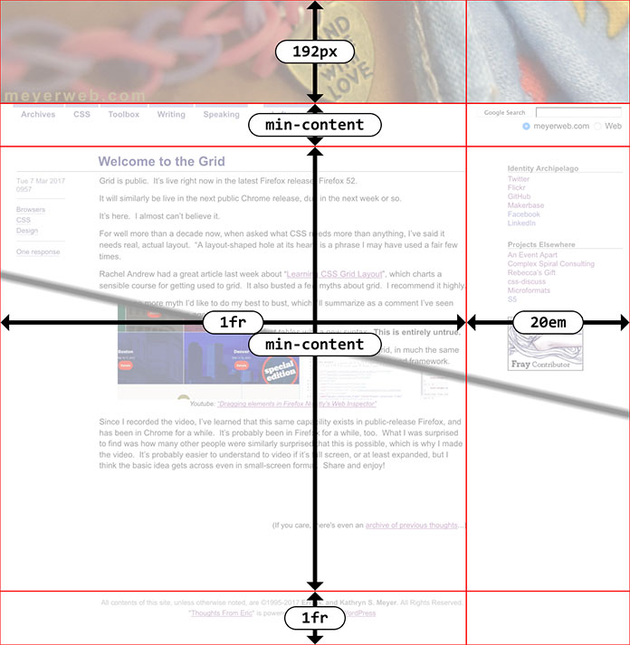
That’s all nice, but there’s a great deal more to learn!  If you use the “Border” checkbox in the demo, you’ll see a dotted red border around the drop quote’s pseudo-element.  Notice that it matches the height of the opening paragraph, not the entire height of the blockquote.  That’s because the pseudo-element and the first paragraph share a row track.  The following paragraphs are in their own row tracks.

This brings up two things to consider.  First, all the child elements of the blockquote are now grid items.  That means the drop quote’s pseudo-element, but also all the paragraphs contained by the blockquote.  The same would happen to any child elements.  We could get around that by wrapping all the contents of the blockquote in a div or something like that, but I’d rather not.  So, this grid has four grid items: the pseudo-element, and three paragraphs.

This leads us to the second consideration: without placing the paragraphs into the same column, they’ll auto-flow into whatever grid cells are available.  You can see this by selecting the “Auto placement” option.  The first column will contain the quote and the second paragraph, as narrow as they both can be due to min-content.  The second column will contain the first and third paragraphs.

How I get around this in the working version is to explicitly put all the paragraphs—really, all child elements of the blockquote, which just happen in the case to be paragraphs—into the second column, like this:

blockquote > * {grid-column: 2;}

Okay, but how do they end up stacked vertically?  After all, I didn’t assign each of those child elements to a row, did I?

Wait a minute.  What rows?

If you go back and look at the CSS I showed, there is nothing about rows.  The property grid-template-rows exists, but I didn’t use it.  All I did was define columns.

Each child element goes into a row of its own anyway, because Grid has the ability to automatically create columns or rows when needed.  Suppose you define a three-by-three grid, and then assign a grid item to the fifth column of the fourth row.  What should happen?  The browser should auto-create as many columns and rows as needed.  Any auto-created tracks will have zero width or height if they don’t contain any grid items, unless you size them using grid-auto-columns or grid-auto-rows, but we’re not going there today.  The point is, here I’ve said all of the blockquote’s child elements should go into column 2.  Given that, they’ll auto-fill rows as available and auto-create rows as needed, filling them in once they’re created.

So the blockquote in the demo above has two columns because I explicitly defined them, and three rows because that’s what it needed to create to handle the three child elements.  If I’d added two more paragraphs and an unordered list, the grid would have had two columns and six rows (because six chid elements).

There are a lot of possible extensions to this technique.  A close quote could be created using ::after and placed in the last row of the grid, thanks to the ability to use negative track values to count back from the end of the grid.  Thus:

blockquote::after {
   grid-column: 3;
   grid-row: -1;
   content: "”";
   font-size: 5em;
   font-weight: bold;   
}

That places the close-quote in the third column, so to the right of the quoted text, and in the last row, regardless of how many rows were auto-created.  Of course, there is no third column…or there wasn’t, until assigning something to the third column.  At the point, the browser created it.

The danger there is that the auto-generated column is essentially tacked on to the trailing edge of the grid, without real consideration for what might be in the way—up to and including the edge of the viewport. Rather than auto-generate the column, we could define a third column like so:

grid-template-columns: min-content 1fr min-content;

This sets up a column on each side of the grid, one for each of the big quotes.  The second column, the one that gets all the actual child elements of the blockquote, receives all the space left over after those outer columns are sized, thanks to its 1fr value.

There’s one more drawback here, albeit one that’s easily overcome.  Grid items’ margins do not collapse.  You can see this effect by checking the “Default margins” option in the demo.  That shows what happens if default paragraph margins are allowed to remain.  We end up with two ems of space between the paragraphs, because each has top and bottom margins of 1em.

In the normal flow, margins collapse to the largest of the adjacent margins, which is why we’re used to 1em of space between adjacent paragraphs.  With grid items, what we see instead is the full element box, margins and all, placed inside the grid cell(s) they occupy.  That means any margin will create space between the edge of the grid cell and the border-edge of the element.  The fix here is straightforward: add a style to reduce margins between elements.  For example, something like:

blockquote > * {
   grid-column: 2;
   margin: 0.5em 0;
}

With a half-em margin above and below each element, any two adjacent elements will have the common 1em separation.  The demo actually has less than that because I wanted to use the print convention of paragraphs with the first lines indented, and a minor separation between paragraphs.  So the actual demo styles are more like this:

blockquote > * {
   grid-column: 2;
   margin: 0.125em 0;
   text-indent: 2.5em;
}
blockquote > *:first-child {
   text-indent: 0;
}

So there you have it: a Grid-powered drop quote.  I should note that all this by itself isn’t quite sufficient: if Grid isn’t supported, it will degrade poorly, as you can verify with the “Disable grid” option.

This is where using @supports() to encapsulate the Grid styling comes in handy.  You can put all of the quote-generation styles into the @supports() block, so that downlevel browsers just don’t get the drop quotes; or, you can set up the drop quotes with floats or positioning and then override those with @supports()-protected Grid styles.  Either one works.

Fortunately, we do have that capability, so it’s fairly easy to progressively enhance your designs with little touches like this one, even if you’re not ready for a full-on Grid plunge.  I’m looking forward to deploying this pattern here on meyerweb, as part of a site design overhaul I’ve been working on for the past couple of weeks.  That’s right: I’m working on my first redesign in a dozen years.  If that doesn’t give you some sense of the power of Grid, well, I just don’t know what will.


Practical CSS Grid

Published 2 weeks, 6 days ago

…In the run-up to Grid support being released to the public, I was focused on learning and teaching Grid, creating test cases, and using it to build figures for publication.  And then, March 7th, 2017, it shipped to the public in Firefox 52.  I tweeted and posted an article and demo I’d put together the night before, and sat back in wonderment that the day had finally come to pass.  After 20+ years of CSS, finally, a real layout system, a set of properties and values designed from the outset for that purpose.

And then I decided, more or less in that moment, to convert my personal site to use Grid for its main-level layout.

Me, writing for A List Apart, taking you on a detailed, illustrated walkthrough of how I added CSS Grid layout to meyerweb.com, while still leaving the old layout in place for non-Grid browsers.  As I write this, Grid is available in the latest public releases of Firefox, Chrome, and Opera, with Safari likely to follow suit within the next few weeks.  Assuming the last holds true, that’s four major browsers shipping major support in the space of one month.  As Jen Simmons hashtagged it, it’s a new day in browser collaboration.

As I’ve said before, I understand being hesitant.  Based on our field’s history, it’s natural to assume that Grid as it stands now is buggy, incomplete, and will have a long ramp-up period before it’s usable.  I am here to tell you, as someone who was there for almost all of that history, Grid is different.  There are areas of incompleteness, but they’re features that haven’t been developed yet, not bugs or omissions.  I’m literally using Grid in production, right now, on this site, and the layout is fine in both Grid browsers and non-Grid browsers (as the article describes).  I’m very likely to add it to our production styles over at An Event Apart in the near future.  I’d probably have done so already, except every second of AEA-related work time I have is consumed by preparations for AEA Seattle (read: tearing my new talk apart and putting it back together with a better structure).

Again, I get being wary.  I do.  We’re used to new CSS stuff taking two years to get up to usefulness.  Not this time.  It’s ready right now.

So: dive in.  Soak up.  Enjoy.  Go forth, and Grid.


Questions and Answers

Published 3 weeks, 1 day ago

“Dad, where is the core of the house?” the youngest asked me this morning, as I made his lunch for school.

I might’ve answered differently if he’d asked me what, but this was specifically where.  Still, I wanted to be sure what he meant, so I asked what he meant by “the core.”  It turned out that, as I thought, he wanted to know the location of the center of the house, like the core of an apple.

I didn’t ask why he wanted to know.  I try not to, in cases like this, although sometimes I say something like, “Why do you ask?  It’s okay that you want to know, I’m just curious about what led to that question.”  But I try to reserve that for questions that seem like they could lead to dangerous activity—e.g., “What would happen if I jumped off a roof?”  (Which, to be clear, I don’t think he’s ever asked, but if he did, I’d answer his question seriously and then ask why he wanted to know.)

This time, I just said, “It’s a good question!  Let’s figure it out.”

First I had him determine which was wider, the living room or the dining room.  He counted off steps and determined the living room was wider.  Then he counted the steps across the front hall (such as it is), and then added up the steps from the three spaces.  They had been big steps, so it was 18 steps across the house.

More steps were taken to measure the house front to back, at which point we figured out that the center was somewhere in the  main stairwell.  (Also the only stairwell.)  But then I threw the curveball: we’d measured the house side to side and front to back.  What else had to be measured?

He thought hard a moment, and then he got it.  The slow-blooming grin on his face was priceless.  Then he laughed.  “How am I supposed to count steps from the basement to the attic?!?  I can’t walk in the air, of course!!”

So we counted the floors and their heights in our heads, and considered that the roof’s peak was a bit higher than the attic ceiling, but that the attic and basement had lower ceilings than the first and second floors.  In the end, we decided the core of the house was probably the step just below the first landing of the stairwell, about two-thirds of the way across it.  He sat in that spot, looking pleased and maybe a little smug.  Then he slid down the stairs, telling me his head felt weird when he thought about how he was sitting in the exact center of the house.

A few minutes later, he’d hauled out the deluxe snap circuit set his uncle had gotten him for Christmas, and was building a circuit of his own making.  Once it was completed, we talked about current flows and why the fan went slower and the light came on when he opened the switch, and the light went off and the fan sped up when it was closed.

And then it was off to kindergarten.  As we walked up the street, he asked why a leaf had moved closer to the door when he slammed it shut instead of being blown further away, so we talked about fluid displacement.  The conversation lasted until he spotted a friend getting out of a car, at which point he ran off to compare outfits.  (Today was Pajama Day at the school.)

I love talking with him about the world and how it works, because it lets me see the world through new eyes.  I felt the same way when I had the same kinds of conversations with his sisters.  It’s a cliché that a small child constantly asking “Why?” is annoying and exasperating, but not to me.  I never, ever want them to stop asking why.  I will always answer their questions, or tell them I don’t know and we’ll find out together.  The internet makes that last part much, much easier than in the past, admittedly.

I have another reason to always give an answer, though.

If I always answer my childrens’ questions, I teach them that questions are okay, that questioning is a good thing.  And more importantly to me, I teach them that they can come to me with anything, and be taken seriously.  Kat feels and acts the same, thankfully.

This has been a real advantage with our eldest, as she moves through middle school and into her teenage years.  She knows she can be honest with us.  More than once, she’s come to us with serious situations in her peer group, and known that we will listen, take her concerns seriously, and will act as needed.  She’s… well, I don’t know if she’s exactly comfortable discussing the biological ramifications of growing up, but she’s able to do so without hesitation or shame.  Because she knows I’ll take her seriously, and listen to her, and not tell her she’s wrong or inappropriate.  A lifetime of answering her questions about ice and airplanes and the Moon and the color of the sky taught her that.

Always listen.  Always give an answer, even if it’s “I don’t know.”  Always take them seriously.

Because one day, that open door may give them a place to go for help and shelter, right when they most need it.


Handiwork

Published 3 weeks, 3 days ago

The story of a mixer-breaking cookbook, the vault of all practical human knowledge, and what I see when I look at my hands

It all started with an afternoon date.  It ended in grease.

Kat and I took a weekend afternoon by ourselves to head down to University Circle, to have some early tea and macarons at Coquette and to see what we might find for a late lunch afterward.  We wandered up and down the new Uptown section, chuckling to ourselves over the massive changes since we’d each come to the city.  See that bowling alley?  Remember when it was a broken parking lot?  And when this bookstore was a strip of gravel and weeds?

In the window of the bookstore, I was looking askance at a coloring-book-for-grownups based on “The Walking Dead” when Kat exclaimed, “Oh, that looks fabulous!”  It was, I was not surprised to discover, a bakers’ cookbook.  Kat loves to bake, mostly for others.  In this case, it was Uri Scheft’s Breaking Breads: A New World of Israeli Baking.

The bookstore was closed, so I took a picture of the cover and we moved on, eventually ending up at a ramen shop.  I had an unagi don.


I gave Kat the book for her birthday.  It’s one of the few things I got right about that celebration this year.

Not long after, Kat had to work at the clinic on a Friday, and asked if I’d make challah from the book so it was ready for dinner that night.  I figured, what the heck.  What could go wrong?  So I hauled out the stand mixer and digital scale, assembled the various ingredients in a line, and started to work.

The challah recipe is sized to make three loaves, because (according to Mr. Scheft) the dough mixes better in large quantities than in small.  I was pleased to see the recipe gave all ingredients first as weights, so I didn’t have to convert.  I’ve never been great at cups and spoons, especially with baking ingredients, and most especially with flour.  I either leave too much air or pack down too hard.  A kilogram of flour seemed like a lot, but once I realized it was only a bit more flour than in the overnight bread recipe I’d made several times before, I forged ahead.

Everything fit fairly well into the mixing bowl, which had been my first concern.  There was enough room to not have the flour overtop the rim and form a glutenclastic flow over the countertop, at least as long as I started slow.  So I did.

Our mixer is a KitchenAid 325W model, bought many years ago and since put to hard service.  Kat as I mentioned before, enjoys baking, being good enough at it that she can often free-style in baking and produce wonderful results.  I do some baking of my own from time to time, though cooking is more my area of strength.  Carolyn has enjoyed learning to bake, and it’s common for her and a friend to decide to make a cake or some cookies when hanging out together, or bake cinnamon rolls for breakfast on a Saturday morning.  One of the last things Rebecca did entirely by herself was hold the dough paddle and slowly, methodically eat raw chocolate-chip cookie dough off of it.  Joshua isn’t as interested in baking yet, but he’s certainly a fan of paddle-cleaning.

As the challah dough started coming together, it kept climbing the dough hook and slowing the mixer, making the motor whine a bit.  I kept shoving it back down, turning the mixer off occasionally to really get it down there.  I was faintly smiling over the possibility that the dough would end overtopping the bowl instead of the raw flour when the hook stopped dead and a buzzing noise burst forth from the motor housing.

Uh-oh.

After I’d removed all the dough from the hook and set the bowl aside—the dough was basically done at that point, thankfully—I tried flipping the gear-speed lever back and forth.  Nothing but buzzing.  It sounded exactly like what you’d expect an unseated gear to sound like, as the teeth buzzed past the gear it was supposed to turn.

There was still bread to make, so I set the mixer aside and got on with the kneading and stretching.  Once the dough started its first rise, I went back to the mixer.  I figured, what the heck, so I banged on the housing a few times to see if the gear would reseat.  And, lo and behold, it started spinning again!  There were still some odd sounds, but it seemed to be mostly okay.  I decided to clean it off, put it away, and see if the “fix” held.


It was a week later that we found the fix had not, in fact, held.  Kat was making babka—from, once again, a recipe in Breaking Breads—for this year’s St. Baldrick’s event in Cleveland Heights when the paddle seized and the buzzing noise once more erupted.

We finished the recipe with a hand mixer (my hand ached for an hour) and I retired to the dining room to search Amazon for a replacement mixer.  We could get the same model for about $300, or a more powerful model for more—although that would mean tossing a bunch of accessories, since the more powerful models use a completely different bowl type.  There wasn’t, so far as I could find, a stronger motor in the same form factor.

On a whim, I opened a new tab and typed “kitchenaid stand mixer stripped gear” into the search bar, and clicked the “Videos” tab.  There were, of course, multiple videos at YouTube, that vast repository of all practical human knowledge.  If you want to know the history of stand mixers, you go to Wikipedia.  If you want to know how to use or fix them, you go to YouTube.

I started watching the first result, realized it was for a different mixer model, and skipped to the “Up Next” video, which was just what I was looking for: same model and everything.  I was a couple of minutes into it when Kat walked into the room saying, “Hey, why don’t you see if maybe you can fix—oh.”


I have not, generally speaking, been what you would call a handy person.  Most of my repair attempts made things worse, not better.  On occasion, I managed to turn a minor inconvenience into a major expense.  I was never particularly ashamed of this, although I was annoyed by the cost.  I wasn’t a stranger to manual labor, but I was always better with a keyboard than I was with a hammer—first 88 keys, and then 104.

But for some reason, one of the first things I did to try to manage my grief, late in 2014, was ask my friend Ferrett to help me do some rough carpentry.  He had the tools, having taken woodworking classes in the past, and I wanted to put a bookcase in the wall of our finished attic.  From that first painful attempt—it took us all day to put together a not-particularly-well-made case—we started getting together once a week or so to just build stuff.  Our friend Jim got into the act as well.

A bookcase here, a shelf there, we’ve gotten better at it.  We’ve managed to use every tool in the arsenal, though not always wisely.  We’ve made abstruse jokes based on the biscuit cutter being made by Freud.  We’ve invented hacks on the spot to make cuts easier and figured out later why things didn’t go quite as intended.  We’ve learned that you can never be too rich or have too many clamps.  (We depart from standard societal attitudes toward thinness.)

As we’ve progressed, those attitudes and skills have osmosed into regular life.  Minor home repair is now a thing I do, and approach with confidence instead of trepidation.  No real surprise there: practice at anything, and you’re likely to become better at it.  But when the screen door latch broke, I bought a replacement and improvised a way to make it work when the frame bracket and latch didn’t line up.  I took a Dremel to my aging laptop stand in order to keep it from scratching desks.  I’ve fixed more than one damaged or jammed toy.

So, sure, why not see if the mixer could be fixed with a cheap part replacement?  After all, a handyman told me years ago, if it’s already broken, trying to fix it can’t make it any worse.  Though I remember thinking to myself that he’d never seen me try to fix things.

I assembled my tools, covered the dining room table in several layers of drop cloth, and started the video.  I had real trouble getting out the roll pin that held the planetary in place, but WD-40 and persistence won the day.  I had to stop for a while while I searched for surgical gloves, but eventually they turned up and I got into the great globs of grease that keep the gears going.  And yes, just as the video had prophesied, the problem was the one plastic gear in the mechanism, nestled in amongst the chain of solid metal gears.

A broken worm gear.
Well, see, there’s my problem.

I’m not annoyed by this.  That gear, I believe, is intentionally plastic as a last-ditch defense against burning out the motor or shattering a metal gear or the paddle itself, should somethiing seize up the planetary.  Think of a metal bar that somehow gets thrust into the paddle, forcing it to stop.  Something has to give.  A small worm gear acting as a fail-safe is a better option than most others.

I went back to Amazon, this time to order a replacement part.  When I found out they were $6.24 each, I ordered three.  Until the new worm gears arrive, the various screws and pins I removed are taped in groups to a piece of printer paper, each group labeled according to their points of origin in the mixer assembly.  The gear tower pieces I put in a plastic sandwich bag, also taped to the paper, to keep their grease contained.

The broken worm gear I may throw away, or I may keep as a memento.


I am, in my way, pleased with myself about all this.  Proud both that I may be able to fix a problem for $7 and an hour or two of time, instead of having to replace an entire appliance for a few hundred dollars; and also for having developed the skills and familiarity to let me try it in the first place.  True, I likely couldn’t have done it without YouTube, but in years past, even with YouTube I’d have been hesitant to try, for fear of making it worse, or just being hapless and frustrated by the feeling that if I only knew more, I’d be able to do it right.

Now I know more.  I’ve learned—not at internet speed, but at slow, methodical, human speed.  I’ve changed, but in ways of my own making instead of ways that circumstance thrust upon me.

When I look at my hands now, I see tools that not only create, but can also repair.  They can put to right at least some things that have gone wrong.

There is much more solace in that than I would ever have guessed.

I don’t know, as I write this, whether the mixer will work again.  I may reassemble it incorrectly, or even correctly but without success.  Sometimes that happens.  Sometimes you do everything right, and still have no path to success.  But if we do have to junk it after all, I’ll know it wasn’t for lack of first trying to correct the situation.

I will draw pride from that, just as I did from the challah I made for my family and friends, an entire loaf of which was quickly devoured.  Just as I have drawn pride from things I’ve written, shaping words that have helped others in ways large and small, and sometimes in ways completely unexpected.

The difference is that when I fix things, I fix for myself, not for others.  One small repair at a time, I fix myself.


Getting Grid

Published 4 weeks, 2 days ago

That converting-meyerweb-to-Grid article I’ve mentioned previously is still coming along (3,999 words as of the last draft, and I realized last night it needs another few hundred) and I think it will be out within a week.  I’ll do my best!  In the meantime, I’d like to point you to a few resources from the end of the article, plus do a tiny bit of self-promotion.

Resources first!  If you’re wondering what Grid means for Flexbox, Chen Hui Jing has a lovely piece on “Grid + Flexbox: the best 1-2 punch in web layout”.  Just the right length, with live Codepens, this is a very good introduction to using Grid and Flexbox in harmony.  Some of what’s described there won’t be as necessary in the future, as Flexbox-style alignment migrates to Grid, but in the meantime Hui Jing explores the current state of the art with elegance.

If you have Firefox or Chrome and they’re updated to the latest release (FF52, C57) then I strongly encourage you to set aside a few minutes and go browse The Experimental Layout Lab of Jen Simmons.  Jen’s been creating Grid demonstrations and experiments for well over a year now, and there are some really great examples there, summarizing some common design patterns and showing how Grid can make them much simpler and more robust.  I especially recommend the 2016 home page, which combines CSS Grid, writing modes, transforms, and design history to create something really great (try resizing to see the responsive coolness).  But don’t stop there!

If you like your learning in motion, Rachel Andrew’s video series introducing Grid concepts and properties is fabulous.  As an application developer—she’s part of the Perch CMS team—she’s been excited about Grid and what it can do longer than just about anyone.  Her deep technical skills and teaching abilities really come together in the video series.  If you prefer to read up on Grid, then Rachel’s written a series of articles for the Mozilla Developer Network that cover similar ground.

Finally, if you like extended technical explanations of every Grid property and value seasoned with lots of examples and screenshots, then I suggest picking up the Early Access version of CSS: The Definitive Guide, 4th EditionEstelle Weyl and I have been working on finishing this for a while now, and it’s just about ready: there are three chapters still to be added.  They’ve already been written, but haven’t quite finished first editorial review and production massaging.  But: the Grid chapter is already available, so if you get the book now, you’ll have instant access to something like 25,000 words going through Grid property by property.  And also a whooooole lot more words covering everything else in CSS.  (The current page count estimate for the book is 950.  Nine hundred fifty.  Yoinks.)

Go forth and Grid!


Chrome Grid Bug Update

Published 1 month ago

I mentioned late last week, in my post about Chrome 57 having landed Grid layout, that there is a bug that affects some people.  Well, further investigation has revealed that the bug doesn’t seem to be in the Grid layout engine.  Instead, disabling selected extensions makes the bug go away.

The odd part is that the extension seems to vary.  In my case, disabling Window Resizer fixed the problem.  Before you think it’s all their fault, though, Rachel Andrew discovered that disabling Window Resizer in her copy of Chrome did not solve the problem.  For her, it was disabling the LastPass extension that did it.  I don’t even have the LastPass extension installed on my machine, in any browser.

So: if you run into this problem, try disabling extensions to see if that fixes it.  If so, you can enable them one at a time and test to see which one triggers the bug.  With any luck, a fix will be found soon and deployed via auto-updating.  And if you find out anything else, please let us know on the bug report!


Doubled Grids

Published 1 month, 3 days ago

Chrome 57 released yesterday, not quite a week ahead of schedule, with Grid support enabled.  So that’s two browsers with Grid support in the space of two days, including the most popular browser in the world right now.  Safari has it enabled in Technology Preview builds, and just blogged an introduction to Grid, so it definitely feels like it’ll be landing there soon as well.  No word from Edge, so far as I know.

I did discover a Chrome bug in Grid this morning, albeit one that might be fairly rare.  I filed a bug report, but the upshot is this: most or all of an affected page is rendered, and then gets blanked.  I ran into a similar bug earlier this year, and it seemed to affect people semi-randomly—others with the same OS as me didn’t see it, and others with different OSes did see it.  This leads me to suspect it’s related to graphics cards, but I have no proof of that at all.  If you can reproduce the bug, and more importantly come up with a reliable way to fix it, please comment on the Chromium bug!


Grid Inspection

Published 1 month, 5 days ago

I said yesterday I would write up the process of adding Grid to meyerweb, and I did.  I started it last night and I finished it this morning, and when I was done with the first draft I discovered I’d written almost four thousand words.

So I pitched it to an online magazine, and they accepted, so it should be ready in the next couple of weeks.  Probably not long after Chrome ships its Grid implementation into public release, in fact.  I’ll certainly share the news when it’s available.

In the meantime, you can inspect live grids for yourself, whether here or at Grid by Example or The Experimental Layout Lab of Jen Simmons or wherever else.  All you need is Firefox 52, though Firefox Nightly is recommended for reasons I’ll get to in a bit.

In Firefox 52, if you inspect an element that has display: grid assigned to it, you’ll get a little waffle icon in the inspector, like so:

Mmmmmm, waffles.

Click it, and Firefox will draw the grid lines on the page for you in a lovely shade of purple.  It will even fill in grid gaps (which are a thing) with a crosshatch-y pattern.  It’s a quick way to visualize what the grid’s template values are creating.

If you have Firefox Nightly, there’s an even more powerful tool at your disposal.  First, go into the inspector’s settings, and make sure “Enable layout panel” is checked.  You may or may not have to restart the browser at this point—I did, but YEMV—but once it’s up and running, there will be a “Layout” panel to go with the other panels on the right side of the Inspector.  There you get the box model stuff, as well as a checklist of grids on the current page.

The Layout panel

For each grid on the page—not just the element you’re inspecting—you can set your own color for the gridlines, though those color choices do not currently persist, even across page reloads.  You can also turn on number labels for the grid lines, which are currently tiny and black no matter what you do.  And if you allow grid lines to extend into infinity, you can turn the page into a blizzard of multicolored lines, assuming there are several grids present.

This panel is very much in its infancy, so we can expect future enhancements.  Things like color persistence and better grid line labels are already on the to-do list, I’m told, as well as several more ambitious features.  Even as it is, I find it valuable in constructing new grids and diagnosing the situation when things go sideways.  (Occasionally, literally sideways: I was playing with writing-mode in grid contexts today.)

There’s another, possibly simpler, way to enable the Layout panel, which I learned about courtesy Andrei Petcu.  You type about:config into the URL bar, then enter layoutview into the search field.  Double-click “devtools.layoutview.enabled” to set it to “true”, and it will be ready to go.  Thanks, Andrei!

So go ahead—inspect those grids!

Feeds

Archives