Eric A. Meyer
Case Western Reserve University
Cleveland OH 44106, USA
eam3@po.cwru.edu
Computer-based training (CBT) is an often-ignored area for development on the World Wide Web. Authors have the ability to teach readers across the globe. Similarly, readers can take advantage of Web-based CBT at any time, choosing the site which works best for them. Authors need to account for the impact their material will have on readers, taking into account what effect new information will have, how much material to introduce at once, how the visual design is important to the conveyance of information, and the fact that interactive quizzing will dramatically improve the reader's ability to retain what they have read.
Computer-based training (CBT) is an old idea, and one which has been used to great effect for many years. The World Wide Web now offers the possibility of conducting CBT on a global scale, without the usual restrictions of platform dependence, the cost of mailing materials, and identifying interested users. Instead of searching for people who would like to use a given CBT course, the Web allows the reader to find the material and review it at his own pace. Because Web pages can be updated at any point, it is possible to keep the CBT materials up to date without having to do anything except edit the HTML documents involved. It is also possible to keep channels of communication open between author and reader, even if the two have never before met or had any sort of contact. Finally, the use of server-side scripts and interactive forms make it possible for the reader to be tested on what he has learned without any need for supervision.
This combination of factors makes the deployment of CBT courses one of the most exciting uses for the Web, and Web-based CBT realizes the greatest promise of the Web: to be a powerful tool for learning and intellectual advancement. However, there are a number of factors which need to be taken into consideration in order to ensure that the lesson is effective, or else the efforts of both author and reader have been wasted.
Computer-based training involves two parties: the author and the reader. Even though the author is (assumedly) an expert in the subject about which he writes, he has far more work to do in the writing of the material than does the eventual reader in reading it. This is because the author not only has to write the text, but also has to consider how the reader will react to what is presented. At this point, psychological issues come into play.
For example, the author needs to remember that every new piece of data-- whether it is a new concept, an unfamiliar word, or a new graphic symbol on the page-- causes the same effect in the reader. It is something which must be added to the reader's set of knowledge. No matter how open the reader's mind is to new ideas, the act of integrating new information into their set of knowledge requires mental effort, and if the effort of integrating too many new things overwhelms the reader, the learning process breaks down.
Therefore, the amount of new information which a reader must handle at any one time should be kept to a minimum. If you are introducing a new concept, don't use new terms unless absolutely necessary, and vice versa. Present new information a step at a time, letting the reader put it all together as he goes. This is the difference between handing a person one ball at a time and throwing five of them at once, thereby forcing them to learn to juggle them in order not to drop any. Most people will simply let the balls drop to the ground and walk away in disgust, especially if you act like they should already know how to juggle. New concepts take time to get used to. Make this process as simple and painless as possible, and you will have a population of very happy readers. Make it difficult and mystifying, and what few readers you have will be likely to complain to you.
When designing a tutorial, there is but one goal: to convey as much useful information to the reader as possible, with a minimum of distractions. In order to do so, it is important to not only express ideas clearly, but also to make the presentation of the information inviting to the reader. Reader confusion can occur in a number of ways, and all of them need to be avoided. These range from dense, unfamiliar text to inconsistent visuals. The author has to always remember that anything new, whether in the text or not, will be another piece of data the reader has to process. Therefore, a well-constructed tutorial presents all of its new data in the text, leaving the look of the text the more or less same throughout the material.
If you intend to use customized conventions or symbols in your text, it is best to explain these to the reader before the instructional text has started. This gives the reader a chance to get used to the look of the material and then turn to learning the material you are trying to teach.
Therefore, as with most sites, there is much to be said for establishing a consistent look-and-feel. This could mean using the same graphics on every page or employing unusual colors for the text and background. It could even mean setting a different pastel shade for the background of each page. Whatever you choose, though, it should not so much make your site memorable as make it visually coherent. Printed material typically uses the same font, then same layout, and the same arrangement throughout the work. An on-line work should be no different. Just because you can make every page look totally different is no reason to do so!
As before, the concern is to avoid confusing the reader. Clashing page appearances will do just that. These differing visual cues will cause the reader to approach each new page as though it were part of a separate work, even though he may realize that this is not so. A consistent look-and-feel reduces the number of new things to deal with to whatever is contained within the text.
When it comes to the specific visual design of a tutorial's pages, there is a delicate balancing act which must be performed. If the look of the pages is too boring, the reader will assume that the text itself will be similarly lacking. If, on the other hand, the pages are wildly colorful and "radical," the reader may be intimidated into thinking that the material will be too hard to understand, or that it will be too hard to read at all.
The best design is one which looks open and inviting-- one which lulls the reader into the sense that the journey ahead will be smooth and pleasant. Muted color tones, a judicious use of white space, and an informal look can all be used to reach this goal. There are many other possible approaches, but these are time-proven successes.
There is also something to be said for leaving the document's text and background colors alone, thereby allowing the reader's preferences to determine these settings. By doing so, the reader is presented with whatever color scheme he is most comfortable with-- else it would not be his default setting! In this approach, the visual consistency is enforced by using similar graphic element such as a logo or other symbol, icons sketched by the same artist, or a certain placement strategy.
Similarly, changing the look of your pages as the text progresses will keep your readers off-balance, which isn't where you want them. Humans, being as dependent as they are on visual cues, will take a change in appearance to mean a change at more fundamental levels. The mindset becomes, "The look changed, so there must be bigger changes afoot, like a new author." This basic assumption of change destroys whatever rapport you have built with the reader, and damages the foundation your previous text has been laying down.
Of course, due to the nature of the Web, the reader can move around as he sees fit. Therefore, the author should make it easy for the reader to do so. Simple, obvious, sensible navigation elements will keep the reader from becoming too frustrated with the interface, and therefore the text itself. This does not include the traditional "Next-Previous-Up" style of navigation found in many on-line technical manuals. The flaw with this approach lies mostly in the use of "Up," which does not make sense to the majority of readers. Have you ever tried to go up in a book? It doesn't make sense. You go forward or backward through the pages. You go up if you need something on the next floor.
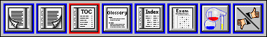
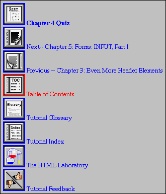
Therefore, keep the navigation elements in terms to which the reader can relate. "Next Page" and "Previous Page" are good examples, as well as "Forward" and "Back." Links to the main page/table of contents are a good idea, and links to any general reference pages like glossaries or indexes are also appreciated by the reader. Other functions, such as feedback forms or search pages, are also good candidates for navigation buttons [Figure 1].
|
It's also a good idea to make the navigation elements easy to reach. While some may use frames to create a persistent navigation area, I prefer to avoid frames, both because they are non-standard HTML and because they are inconsistently implemented in various browsers. Instead, I simply place the navigation elements at the top and bottom of each page. The elements at the top are unlabelled, whereas those at the bottom of the page are fully labelled [Figure 2].
 |
At the core of any successful instructional text is a sense of accomplishment. The reader must have the feeling, as he reads through the material, that he is getting somewhere. It is not enough to grant this feeling at the very end of the text. It must be refreshed repeatedly, in small ways, in every chapter.
The reader will always feel better if he is told at the outset of the tutorial what will be learned by reading the material. First of all, this summary helps the reader determine if the text will teach him what he wants to know. It is much better to inform the readers of the tutorial's contents up front, rather than require them to at least skim through the material to see if it contains what they seek. Second, a broad overview at the beginning of the text helps the reader decide whether or not he wants to spend the time necessary to complete the material, which is often a critical issue for readers who are paying for their connect time by the minute.
Speaking of which, it's also a very good idea to give an estimate of how long it will take the reader to get through the tutorial. Although it's better to be as precise as possible, this time can be a very rough estimate, or even a maximum-time estimate. For example, if you write, "It is my belief that this tutorial can be completed in under ten hours," you're giving the reader the chance to decide whether or not he wants to spend up to ten hours on the material. This only makes sense. If you're going to invest what might be a lot of time in something, it's a big help to know just how much time will be required.
Similarly, previews at the beginning of each chapter are also a good idea, because they set short-term goals and increase the reader's sense of being able to meet those goals. If you tell them that they will be able to fold a simple paper airplane by the end of chapter 2, they will expect to be able to do so. Having finished that chapter, if they then fold the airplane, the reaction is, "Hey! I can do this, just like the author said!" The reader's sense of accomplishment and his faith in the author are increased, and he is encouraged to continue.
In order to reinforce the sense of accomplishment, the reader should given some idea of his progress through the material. With a book, the reader can gauge his progress by simply looking at how many pages he has read, and how many he has yet to read. That immediate visual and tactile feedback tells him how far and fast he has gone. In the on-line world, of course, we must resort to wholly visual cues.
 |
One way of helping the reader track his progress is through the use of some sort of meter or other way of representing progress. For example, you could use a graphic of a readout dial going from zero to one hundred, or a 'progress bar' [Figure 3]. In each chapter, the needle moves up the scale, until at the last chapter it reaches the top and the dial has the words "Ta-Da!" across its face. This is a simple gimmick, but its effect on the reader is profound. At each point he can see how far he has gotten in the text, and how far he has to go before reaching the end. Even a line of text saying things like "You're halfway there!" can mean a world of difference to the reader. The feeling that he's getting somewhere, conveyed in this fashion, is as important as the sense of accomplishment discussed in the previous section.
This is perhaps the most important thing that you, as an author, can do. It's also one of the hardest.
At the end of each major division (for the purposes of this discussion, a chapter), something needs to be done to help the reader fix the information in his mind, as well as provide still more accomplishment. This is most easily done by quizzing the reader in the concepts which were covered in the preceding chapter.
There are a few ways to implement a quiz. The simplest is to simply list questions without any answers, similar to those "Things to Think About" sections in junior-high school textbooks. This is even easier for the author, but can be extraordinarily frustrating to the reader, who is likely looking for something to check himself against.
Almost as easy is to list a number of questions and encourage the reader to write down the answers. Once they have done so, they can follow a link to a list of answers and check their answers against the "official" answers. While this requires the author to merely mark up the questions and answers, it doesn't hide much from the reader. In other words, it's far too easy to cheat.
Further up the rung is a list of questions, with an e-mail address to which the answers can be mailed. The answers are then graded and returned to the reader. This approach will obviously not work in a setting other than a small, restricted pool of readers. As an example, my estimates show that such an e-mail system on a site such as my own Introduction to HTML[1] would generate over fifteen hundred messages per day! On the other hand, a class of twenty students taking five quizzes each over the course of a semester would work out to a little under two messages per day-- although they'd no doubt get bunched up around the due dates.
Most complicated and difficult for the author, but also most useful to the reader, is an interactive quizzing system. This can be accomplished using moderately simple CGI scripts and some HTML-based forms. Using radio buttons, a number of multiple-choice questions can be presented to the reader. The processing script can 'grade' the answers and tell the reader how well he did.
If an interactive quiz system is employed, then it's important to be positive when returned the reader's grade. State what the reader got right, not what they got wrong. For example, "You got three out of five answers correct" is far preferable to "You got two answers wrong." The latter is fairly discouraging in its tone, whereas the former, by accentuating the reader's accomplishment, encourages them to try again.
 |
I will use Introduction to HTML as an example of the use of such a system. Soon after the text was published, I came to realize that it would be greatly improved by adding quizzes. Increasing reader feedback also indicated a desire for something which would test the reader's knowledge.
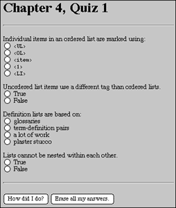
After carefully considering my options, I chose to create an interactive system of the type I describe above. Most quizzes are actually made up of two parts. The first stage is a series of multiple-choice questions, based on radio-button inputs [Figure 4]. Once the reader has selected an answer for each question and requests evaluation, the system returns the appropriate results. Once the reader has correctly answered all of the multiple-choice questions, he can proceed on to the exercises.
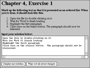
For the second part of the quiz, I was able to implement a number of 'open' exercises [Figure 5]. This was because my subject matter (HTML markup) lent itself to such exercises. By asking the reader to input HTML markup, and then displaying the results, I was able to let the reader test his knowledge in a 'hands-on' fashion, which is very important. In most cases, this will not work very well, although with certain subjects, a Java applet might allow for a similarly interactive application of newly-learned concepts.
 |
The quiz system for Introduction to HTML is actually based on three components: the HTML pages, the Perl scripts which evaluate the reader's input, and quiz keys. These keys are text files which contain the correct answers for the multiple-choice section, or the question text for the open exercises. These files allow me to alter the quiz responses quickly and easily.
However, the quiz system lacks one important feature which I intend to implement at some point in the near future. The problem as it stands is that the open exercises, by their very nature, preclude evaluation. (I suppose I could have written an HTML parser, or at least tried to, but I have other things to do with my time.) I therefore left the reader's progress up to him: if his results seemed to match the example, then he could move on. Of course, the reader can move on at any point, regardless of whether or not he has gotten the right answer.
In order to remedy this, the exercises should offer a link to an "official" answer or set of answers. While this can be used to simply zip through the exercises without really doing them, this can already be done. Providing the answer will be very much appreciated by readers who are trying to complete the exercises but are struggling to find the correct answer. Showing the reader how the 'expert' does things will allow him to see what he missed, or to verify that he got the right answer if he is not quite certain of his answer.
At the core of retaining the reader's interest is keeping the amount of information being imparted to a steady stream. While a slow trickle will bore the reader, a flood of facts and tips will overwhelm the reader, frustrating and often confusing him. At this stage, the reader may start to feel that he is "too stupid" to understand what's being presented and will give up well before reaching the end of the tutorial. This accomplishes nothing!
Accordingly, the material should be broken up into "chunks" which are easy to grasp. In a traditional book, these would be chapters or sections of chapters. Of course, in the printed medium the tendency is to keep the number of chapters low in order to avoid wasting paper. In the on-line world, we have no such restrictions. Accordingly, chapters can be short enough that the reader has a real sense of progress without being inundated by information. This also gives a feeling of accomplishment, since going from one chapter to another has the sense of reaching a new level of expertise. This is very important to keeping the reader interested in the material.
Something else which must be considered is how a novice will receive the concepts under discussion. The author must try to place himself in the role of a "newbie." Concepts which are commonplace to the author may be wondrous and daunting to a reader. Such concepts need to be explained clearly and simply, with "concrete" analogies when possible. For example, the tutorial Intermediate HTML[2] explains the operation of HTML forms by making an analogy to putting the data into boxes, trucking the boxes off to a processing plant, and having the contents turned into a finished product.
This takes the abstract concept of a client-server data transfer and expresses it in terms which are readily understandable by almost everyone who might read it. While it may seem a bit too patronizing for some readers, it's better to err on the side of simplicity. Otherwise, you risk losing many of your readers by making a core principle difficult for them to grasp.
You must also consider how much information the reader needs to deal with at a time. For example, if your entire text is contained in a single document over 300 kilobytes in size, many readers will go somewhere else. As we are all aware, Web users are an impatient lot. If they have the sense that they aren't getting very far every time they advance another 'screen' of text, they will become intimidated by the sheer amount of material they have to face.
My experience is that a 'chapter' should be no more than about ten kilobytes in size; that is, the HTML file itself should be no more than 10KB. If a subject requires more text than this, it's probably better to break it up into multiple chapters. These chapters, however, should be logically divided. Use the first chapter to explain the basics, and each subsequent chapter should cover a more advanced concept or set of related concepts.
Because of its open nature, the World Wide Web carries with it the ability to become the greatest revolution in learning in the last few centuries. However, it can only realize this potential if those who possess information share it-- and share it in such a way that the rest of us can understand it. Creating a tutorial requires far more than skill in HTML. It requires the ability to design clean, inviting Web pages to draw the user in, and it requires authors who can put themselves in the place of their readers and consider how best to convey the material being taught. Hopefully authors will continue to take up this challenge and further the Web itself in ways we can presently only imagine.
Eric A. Meyer is the Hypermedia Systems Manager at Case Western Reserve University (CWRU in Cleveland, Ohio, USA. Eric is a 1992 graduate of CWRU and holds a Bachelor of Arts Degree in History as well as minors in English, Astronomy, and Artifical Intelligence. His current activities include managing the CWRU campus Web server, direction of campus Web growth, and development of new Web-based technology. It is in this last capacity that he has been involved with the Borealis Image Server project. He is also the author of a critically acclaimed on-line tutorial titled "Introduction to HTML" (http://www.cwru.edu/help/introHTML/toc.html) and maintainer of a set of pages concerning CSS1 support in Macintosh Web browsers (http://www.cwru.edu/dms/homes/eam3/css1/css1.html).