Posts from May 2017

Gridded Headings v. Justified Headings

Published 6 years, 9 months past

Amongst the reactions to Gridded Headings, Benjamin de Cock pointed out there’s another way to arrive at the same place I did.  Instead of this:

grid-template-columns:
    minmax(1em,1fr)
    minmax(min-content,max-content)
    minmax(1em,1fr);

…Benjamin pointed out one could instead do this:

justify-content: center;

That’s right: without explicitly specifying any grid columns, but just setting the grid items themselves to be centered, the same behaviors emerge.  Clever!

What’s interesting is that the behaviors are not precisely the same.  While mostly identical behaviors occur with either approach, there are a few subtle differences and a much different possibility space.  I’ll consider each in turn.

First, the differences.  First of all, the small gutters defined by the first and third grid column tracks — the ones defined to be minmax(1em,1fr) — aren’t present in the justify-content version.  This means the headings will jam right up against the edge of the grid container if things get narrow enough.

Side separation versus side smashing.  Grid on the left, justify-content on the right.

So we either need to re-establish them with grid-template-columns, which would seem to put us right back where we were, or else apply side margins to the heading and subheading.  Something like this:

div h2, div h3 {margin-right: 1rem; margin-left: 1rem;}

Either way, that side separation has to be defined (assuming you want it there).  Having to set those separations as margins feels a little clumsy to me, though not hugely so.  Doing all the sizing and separation in a single grid-template-columns declaration feels cleaner to me, though I admit that may be partly due to my current Gridfatuation.

There is another difference worth exploring.  If the content gets wider than the space available, the grid-template-columns approach means the content will overflow to the right (in LTR writing modes).  If it falls offscreen, it can be scrolled to read.  With justify-content: center, the content stays centered within the box, overflowing to both sides.  The content to the left may not be accessible via scrollbar.

How track sizing and content justification handle overspill.  Grid on the left, justify-content on the right.

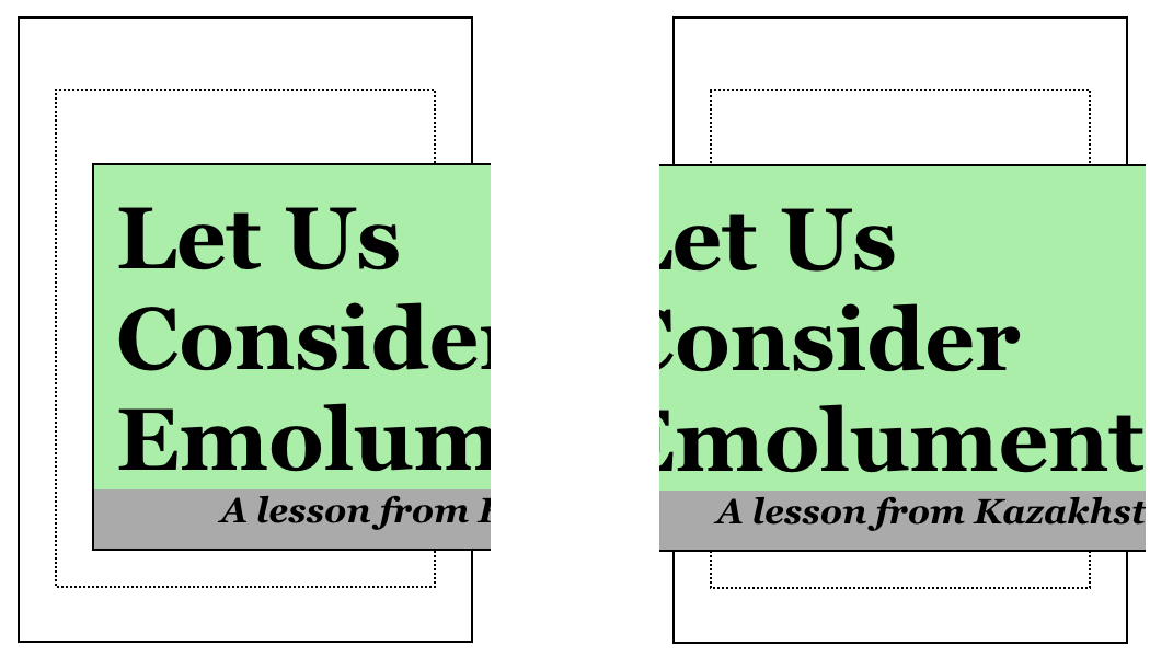
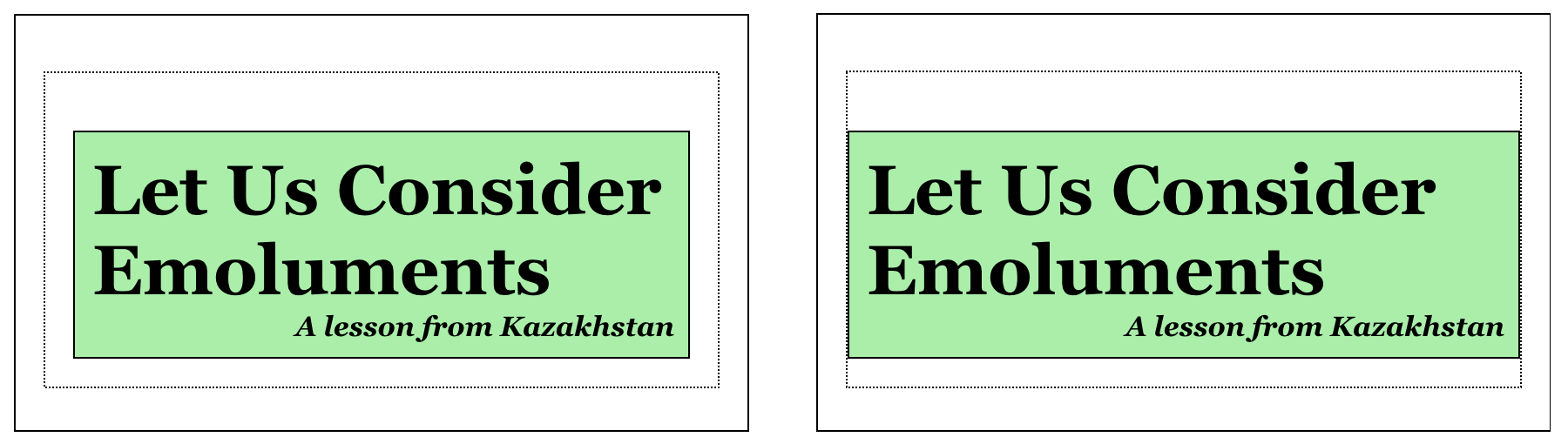
So if you have a large headline containing a lengthy unhyphenated word, like “Kazakhstan” or “emoluments”, you might prefer one result over the other.

Beyond that, the further possibilities are a lot richer with Grid than with content justification.  Center-justifying the content means exactly that: the element boxes are centered.  So if you were interested in taking the heading and subheading, acting as an apparent unit, and shift them toward one side or another, this would be much easier to accomplish with Grid.

Suppose we want there to be three times as much space to one side of the headings’ column as the other.  Here’s what that would look like:

grid-template-columns:
    minmax(1em,1fr)
    minmax(min-content,max-content)
    minmax(1em,3fr);

That’s it.  One number changed, and the whole setup is offset from the center without losing the coherence of the original demo.

The same thing could likely be approximated with justify-content using side margins on the heading elements, but it wouldn’t be precisely the same, even with percentages.  fr is a very special beast, and permits very unique results.

The other major difference in possibilities is that with Grid, we can rearrange elements visually without ever touching the source.  Suppose we wanted to put the subhead above the heading in some layouts, but not others.  (Whether those different designs live on different pages or at different breakpoints, it really doesn’t matter.)  With Grid, that’s as simple as rewriting the grid template in a line or three of CSS.  The h2 remains ahead of h3 in the HTML.

With justify-content, you’d still have to write that same grid template, or else switch to flexbox and use flex-direction: column-reverse or some such.  That would work if you want to just switch the display order of two headings in a single column.  It tends to fall down for anything more demanding than that.

This is not to say Benjamin came up with a bad alternative!  I like it quite a bit, precisely because it has similar outcomes to my original idea, thus shedding light on creative ways Grid and content alignment can be combined.  But I like it even more for its differences, which shed even more light on how the two things operate.

In that combination of similarity and difference, I can sense an incredible range of capability, chock full of nuance and brimming with possibility.  There are going to be ways to put these things together that nobody has figured out yet.  I know I keep saying this, but there’s a vast landscape opening, so vast that I don’t think we can even guess how far it extends yet, let alone have mapped its terrain.


Gridded Headings

Published 6 years, 9 months past

In my ongoing experiments with both a realignment of meyerweb’s design and CSS Grid, I came up with an interesting heading-and-subheading technique I’d like to share.  It allows two elements to be centered as a block, while letting them text-align with respect to each other, while still line-wrapping if necessary.

Here’s a little demobox.

These Are Grid Headings

A useful technique

Boxes and Alignment

It’s the new hotness

Cool

This is pretty darned easy to implement

Gridded Headings

Wednesday, 19 May 2017

Each heading-subheading pair is composed of two heading elements wrapped in another element.  The wrapping element is the grid container for the headings, each of which become grid items.  This is the markup I used:

<div>
    <h2>These Are Grid Headings</h2>
    <h3>A useful technique</h3>
</div>

If you resize your browser window, or select the “Narrow” option, you should see that the boxes surrounding the headings stays as wide as the wider of the two headings.  It “shrink-wraps” them, visually speaking.  In addition, those boxes stay centered within the grid container.

Furthermore, given the demo’s defaults, the two headings are left-aligned with respect to each other.  You can change this: for example, if you choose to “Center-align headings”, the h2s will center when they’re shorter than the subheadings (the h3s).  On the other hand, if you select “Right-align subheads”, then the subheads will right-align themselves with respect to the headings whenever the subhead is shorter in length.

That was actually a bit misleading: if the headings are centered, they’re centered whether or not they’re shorter than the subhead.  It’s just that, if they’re longer, you can’t see that they’re centered, because left-, center-, and right-aligning them has the same effect.  Ditto for right-aligning the subheads: if they’re longer, they sit in the same place regardless of their text alignment.

The alignments hold even when line-wrapping kicks in.  Try narrowing things down to the point that the text starts wrapping.  If you’re having trouble visualizing the two elements, turn on “Separate backgrounds” to given the heads and subheads visually distinct background colors.

So: a centered box as wide as the longest of the two elements, inside which they can align themselves with respect to each other.  Here’s the CSS that makes this possible:

display: grid;
grid-template-columns:
    minmax(1em,1fr)
    minmax(min-content,max-content)
    minmax(1em,1fr);

That’s pretty much it.  The first and third grid tracks are set to be a minimum of 1em, and a maximum of 1fr.  Given the second track (which I’ll get to in a moment), this means the two tracks will split any free space within the grid container, down to a minimum of 1em.  That’s how the centering of the box work; or, if you turn off “Boxes”, how the unbounded text sticks together in the center of the layout area.

That second track, minmax(min-content,max-content), is what makes all the unusual aspects of this possible.  What that says is: “make this grid track no narrower than the narrowest of the grid items in the track, and no wider than the widest grid item”.  In practice, it’ll most likely be as wide as its widest element.

But if I just said max-content (without having the minmax() and min-content parts) for that track width, the track would always be as wide as the widest element at its widest possible layout, which in this case means without line-wrapping the contents.  That would force particularly long headings to run outside of the track, and possibly out of the grid container altogether.  You can see this by enabling “Remove minmax” and narrowing things until text lines should wrap.

It’s the minmax(min-content,max-content) that avoids this fate, because that means that while the grid track (the column the head and subhead share) can’t get any wider than the widest element it contains, it’s allowed to get narrower.  Thus, if the grid container gets too narrow to fit all the grid items’ maximum widths, the contents of the grid items are able to line-wrap, thus avoiding overspill.  In fact, the grid items can keep getting more narrow until they reach min-content, which is to say, the narrowest the track can get without having content of any grid item stick out of the track.  Then it will stop shrinking.

And finally, if you want to see how the options you’ve selected will look in a Gridless browser, select “Remove grids” and see what happens.  Some combinations may not be palatable without Grid, but remember: you can always use @supports(display: grid) to quarantine any styles that are particularly egregious in older UAs.

So there you have it.  While I’m not certain the Grid drop quotes I wrote about last month will be used in the final version of my styles — I’m still looking to see if they’ll fit with more than 17 years of vaguely ad-hoc markup patterns — it’s pretty close to certain I will use these headings, minus the boxes.  I think they’re a neat effect for blog post titles and dates.

Addendum: As of May 2017, WebKit browsers (e.g. Safari) require vendor prefixes for the min-content and max-content keywords.


Browse the Archive