Thanks to the fantastic comments on my previous post, I’ve made some accessibility improvements. Chief among them: adding WAI-ARIA role values to various parts of the structure. These include:
role="banner" for the site’s masthead
role="navigation" added to the navigation links, including subnavigation links like previous/next posts
role="main" for the main portion of a page
role="complementary" for sidebars in the blog archives
role="article" for any blog post, whether there are several on a page or just one
In addition, I restored skip links to the masthead of most pages (the rest will get them soon). The links are revealed on keyboard focus, which I’m not sure I like. I feel like these aren’t quite where they need to be. A big limitation is the lack of :matches() (or similar) support in browsers, since I’d love to have any keyboard focus in the masthead or navigation links bring up the skip links, which requires some sort of parent selection. I may end up using a tiny bit of enhancing Javascript to make the links’ UX more robust in JS situations, but still obviously available if JS fails. And I may replicate them in the footer, as a way to quickly jump back up the page, especially to the navigation.
Speaking of the navigation links, they’ve been moved in the source order to match their place in the visual layout. My instincts with regard to source order and layout placement were confirmed to be woefully out of date: the best advice now is to put the markup where the layout calls for the content to be. If you’re putting navigation links just under the masthead, then put their markup right after the masthead’s markup. So I did that.
The one thing I didn’t change is heading levels, which suffer all the usual problems. Right now, the masthead’s “meyerweb.com” is always an <h1> and the page title (or blog post titles) are all <h2>. If I demoted the masthead content to, say, a plain old <div>, and promoted the post headings, then on pages like the home page, there’d be a whole bunch of <h1>s. I’ve been told that’s a no-no. If I’m wrong about that, let me know!
There’s still more to do, but I was able to put these into place with no more than a few minutes’ work, and going by what commenters told me, these will help quite a bit. My thanks to everyone who contributed their insights and expertise!
Well, here it is — the first new design for meyerweb since February 2005 (yes, almost 13 years). It isn’t 100% complete, since I still want to tweak the navigation and pieces of the footer, but it’s well past the minimum-viable threshold.
My core goal was to make the site, particularly blog posts, more readable and inviting. I think I achieved that, and I hope you agree. The design should be more responsive-friendly than before, and I think all my flex and grid uses are progressively enhanced. I do still need to better optimize my use of images, something I hope to start working on this week.
Things I particularly like about the design, in no particular order:
The viewport-height-scaled masthead, using a minimum height of 20vh. Makes it beautifully responsive, always allowing at least 80% of the viewport’s height to be given over to content, without requiring media queries.
The “CSS” and “HTML” side labels I added to properly classed pre elements. (For an example, see this recent post.)
The fading horizontal separators I created with sized linear gradients, to stand in for horizontal rules. See, for example, between post content and metadata, or underneath the navlinks up top of the page. I first did this over at An Event Apart last year, and liked them a lot. I may start decorating them further, which multiple backgrounds make easy, but for now I’m sticking with the simple separators.
Using string-based grid-template-areas values to rearrange the footer at mobile sizes, and also to make the rare sidebar-bearing pages (such as those relating to S5) more robust.
There are (many) other touches throughout, but those are some high points.
As promised, I did livestream most of the process, and archived copies of those streams are available as a YouTube playlist for those who might be interested. I absolutely acknowledge that for most people, nine hours of screencasting overlaid with rambling monologue would be very much like watching paint dry in a hothouse, but as Abraham Lincoln once said: for those who like this sort of thing, this is the sort of thing they like.
I was surprised to discover how darned easy it is to livestream. I know we live in an age of digital wonders, but I had somehow gotten it into my head that streaming required dedicated hardware and gigabit upstream connections. Nope: my five megabit upstream was sufficient to stream my desktop in HD (or close to it) and all I needed to broadcast was encoding software (I used OBS) and a private key from YouTube, which was trivial to obtain. The only hardware I needed was the laptop itself. Having a Røde Podcaster for a microphone was certainly helpful, but I could’ve managed without it.
(I did have a bit of weirdness where OBS stopped recognizing my laptop’s camera after my initial tests, but before I went live, so I wasn’t able to put up a window showing me while I typed. Not exactly a big loss there. Otherwise, everything seemed to go just fine.)
My thanks to everyone who hung out in the chat room as I livestreamed. I loved all the questions and suggestions — some of which made their way into the final design. And extra thanks to Jen Simmons, who lit the fire that got me moving on this. I enjoyed the whole process, and it felt like a great way to close the books on 2017.
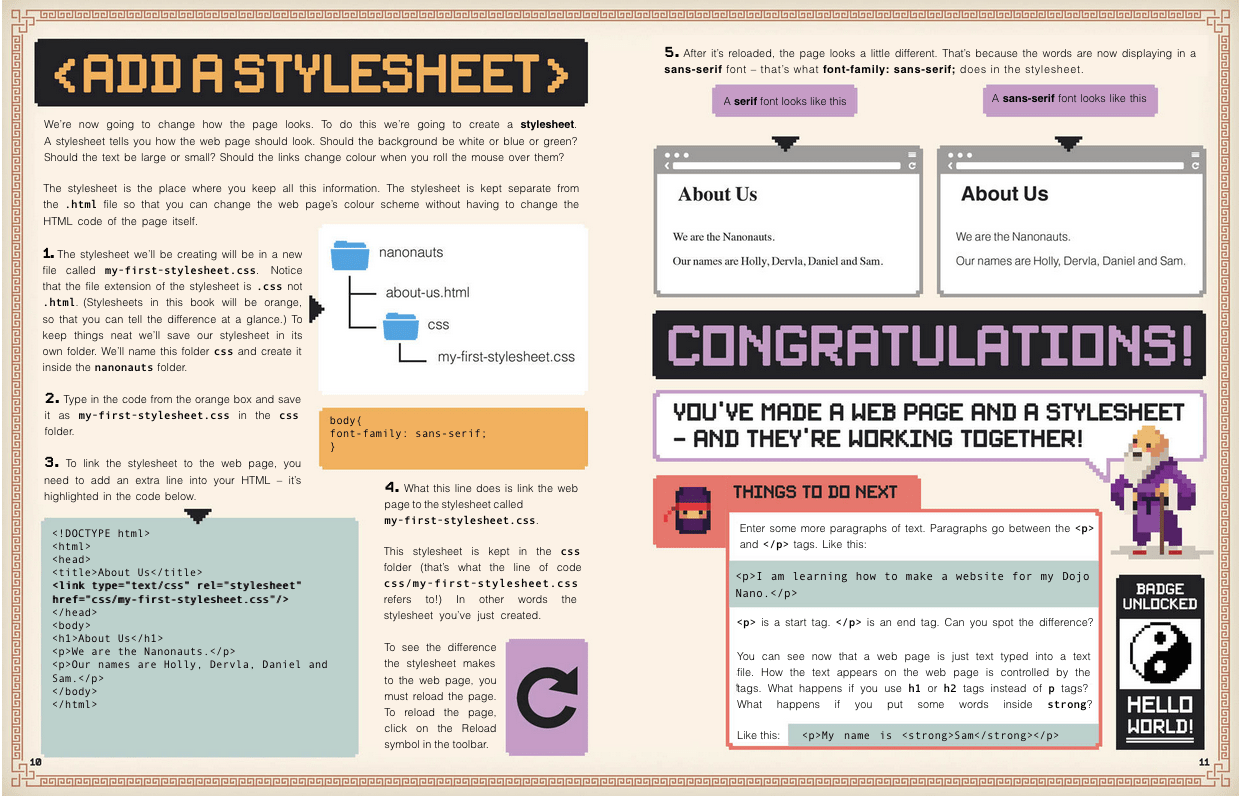
A thing people ask me with some regularity is, “What’s a good book for someone who wants to get started in web design?” I’m here to review a book that’s one of the best I’ve seen, Create with Code: Build Your Own Website, written by Clyde Hatter of CoderDojo’s Dojo Bray in Ireland. I got my copy at my son’s elementary school Scholastic Book Fair earlier this year; it’s available from online booksellers and probably through local bookstores as well.
I’ll go into some details of what’s in it and what I think, and there will be some complaints. So I want to stress up front: this is an excellent book for people who want to learn web design, with the modifier if you’re available to help them out when they hit stumbling blocks. You aren’t going to have to hold their hands through the whole thing by any stretch, but there are moments where, for example, the filenames used in the text will mislead. (More on that anon.) For all that, it’s still an excellent book, and I recommend it.
The book is 94 pages, of which 88 pages are instructional, and none of it is filler — Mr. Hatter packs a surprising amount of good web design practice into those 88 pages. The pages themselves are filled with colorful design, and the text is easily readable. It’s aimed squarely at elementary-school readers, and it shows. That’s a good thing, I hasten to add. The tone is simple, uncomplicated, and stripped to the essentials. At no point does it condescend. It works well for any age, not just the suggested range of 7-17. I enjoyed reading it, even though I knew literally everything the book covers.
The organizing idea of the book is creating a small web site for a ninja band (!!!) called The Nanonauts. In the course of the book, the reader sets up a home page, an About Us page, a page listing upcoming concerts, and a couple more. Everything makes sense and interrelates, even if a couple of things feel ever so slightly forced.
Here’s a page-number timeline of concepts’ first introductions:
p. 6
Brainstorming site content and sketching a site map. Bear in mind here that the actual instructional text starts on page 6.
p. 10
Adding a style sheet to an HTML document via a link element.
p. 14
A nice breakdown of how images are loaded into the page, what the various (common) image attributes are and mean, and the importance of good alt text. On page 14.
p. 17
The concept of an empty element and how it differs from other elements.
pp. 20-24
An extended discussion of proper structure and good content for the web. It shows how using headings and paragraphs breaks up large text walls, makes the distinction between ordered and unordered lists, and demonstrates the importance of proper element nesting.
p. 25
Diving into CSS. A style sheet was added to the document back on page 10, but this is where CSS starts to be discussed in detail.
p. 28
Radial gradients! They went there! The syntax isn’t dissected and explained, but just showing working gradients clues readers in to their existence. There’s also an example of styling html separately from body, without making a super big deal out of it. This is a pattern throughout the rest of the book: many things are used without massively explaining them. The author relies on the reader to repeat the example and see what happens.
pp. 30-32
A really great explanation of hexadecimal color values. I’ve never seen better, to be honest. That’s followed by a similarly great breakdown of the uses for, and differences between, px, em, and % values for sizing.
p. 36
The first of several really lovely step-by-step explanations of style blocks. In this case, it’s styling a nav element with an unordered list of links, explaining the effects of each rule as it’s added.
pp. 50-52
An example of properly structuring and styling tabular data (in this case, a list of upcoming concerts).
p. 59
The box model and inline elements explained in sparing but useful detail. This includes a brief look at inline elements and the baseline, and vertical alignment thereof.
p. 74
Responsive web design! A nice introduction to media queries, and a quick primer on what responsive means and why it’s important.
p. 78
Floating images to wrap text around them. That segues into layout, using floats for the boxes enclosing the bits of content.
p. 88
Using web fonts (basically Google fonts).
p. 90
Putting your site online.
That isn’t everything that’s touched on in the book by a long shot — max-width and min-width show up early, as do :last-child, border-radius, and several more CSS features. As I said above, these are generally introduced without much detailed explanation. It’s a bold approach, but one that I think pays off handsomely. Trusting the reader to become interested enough to track down the details on their own leaves room to include more things to spark interest.
Pages 10 and 11. Not all pages are this text-heavy.
That said, there are some aspects that may — probably will — cause confusion. The biggest of these has to do with images. There are several instances of using img to add images to pages, as you’d expect. The author does provide a downloadable archive of assets, which is a little difficult to actually find (here’s a direct link), but the real problem is that once you extract the files, the filenames don’t match the filenames in print. For example, in the book there’s a reference to nanonauts.jpg. The corresponding file in the archive is NINJA_FACE_FORWARD.png. At another point, DSC03730.png turns out to actually be NINJA_GUITAR.png. There’s no indication of this whatsoever in the book.
I get it: mistakes happen, and sometimes digital assets get out of step with print. Nevertheless, I fear this could prove a major stumbling block for some readers. They see one filename in the book, and that filename doesn’t exist in the assets. Maybe they open up the asset images until they find the right one, and then maybe they figure out to replace the filename in the book with the one they found, and move on from there… but maybe they don’t. I’d be a lot happier if there were an errata note and mapping table on the download page, or the online archive’s assets were corrected.
Something similar happens on page 19, where the reader is directed to create a navigation link to songs.html when the page they’ve already created is called our-songs.html. This one is a lot more forgivable, since the filenames are at least close to each other. But again, it’s a place the reader might get lost and frustrated. The painful irony is that this error appears in a “NINJA TIP” box that starts out, “Be careful when you’re typing links. You have to get them exactly right!”
Another error of this kind happens in the section on adding a video to a page (p.45). All the markup is there, and the URL they supply in great big text loads a video just fine. The problem is that the video it loads is an ad for Scholastic, not the ninja-playing-a-guitar video the text very heavily implies it will be. I don’t know if it used to be a rock ninja shredding power chords and Scholastic replaced it or what, but it almost feels like a bait and switch. It was a little disheartening.
There’s one aspect I can’t quite make up my mind about, which is that just about everything in the book — text, design elements, media query breakpoints — is done using pixels. A couple of percentage widths show up near the very end, but not much is said about them. There is a very nice comparison of pixels, ems, and percentages on page 32, but with ems never being used (despite a claim to the contrary), readers are unlikely to use or understand them.
Now, I don’t style this way, and my every instinct rebels against it. But given that pixels really don’t mean what they used to, and that all modern browsers will scale pages up and down pretty seamlessly, is this a major problem? I’m not sure that it is. Either way, this does set readers on a specific initial path, and if that path bothers you, it’s worth knowing about so you can give them extra advice.
The third thing I found weird was the two pages devoted to embedding a live Google Map into one of the pages (showing the location of the Nanonauts’ next show). On the one hand, it’s cool in that it shows how some HTML elements (i.e., iframe) can serve as containers for external assets more complicated than images and videos, and having a live map show up in the page you’re building is probably pretty mind-blowing for someone just starting out. On the other, it’s kind of a fiddly and unusual use case: not many novice sites need an embedded widget calling an API.
I had less of a problem with the author showing a simple image-swapping-on-hover JavaScript solution, later in the book (even though my hindbrain kept chanting, “do that with CSS!”). It’s a simple example of scripting pieces of the page, and lets Mr. Hatter talk about the DOM and DOM scripting without getting super crazy about it.
The last thing I found a bit lacking was the closing two pages, which cover putting the site online. The author does their best with the two pages, and what’s there is correct, but it’s just not enough to help everyone get the results of their work online. I’m not sure two pages ever could be enough to help the novice audience. I’d have liked to see this get four pages, so there was room for more detail and more options. If you’re giving this book to someone to help them learn, my advice is to tell them up front that you’ll help them get their work online once they’ve finished the book.
Okay, all that said? I still absolutely recommend this as a beginners’ book. Nearly every topic the text introduces, and there are many I didn’t mention here, is covered just the right amount and in just the right way to get readers where they need to be, excited about what they’ve accomplished, and ready to learn more on their own. It’s pretty well up to date, at least as I write this, and isn’t likely to fall badly out of date any time soon. Approachable, accessible, and instructive.
Final grade: I give it a solid B+, only falling short of A level due to the filename mismatches.
Note: All images in this review are copyright The CoderDojo Foundation. Some were taken from the book’s asset files.
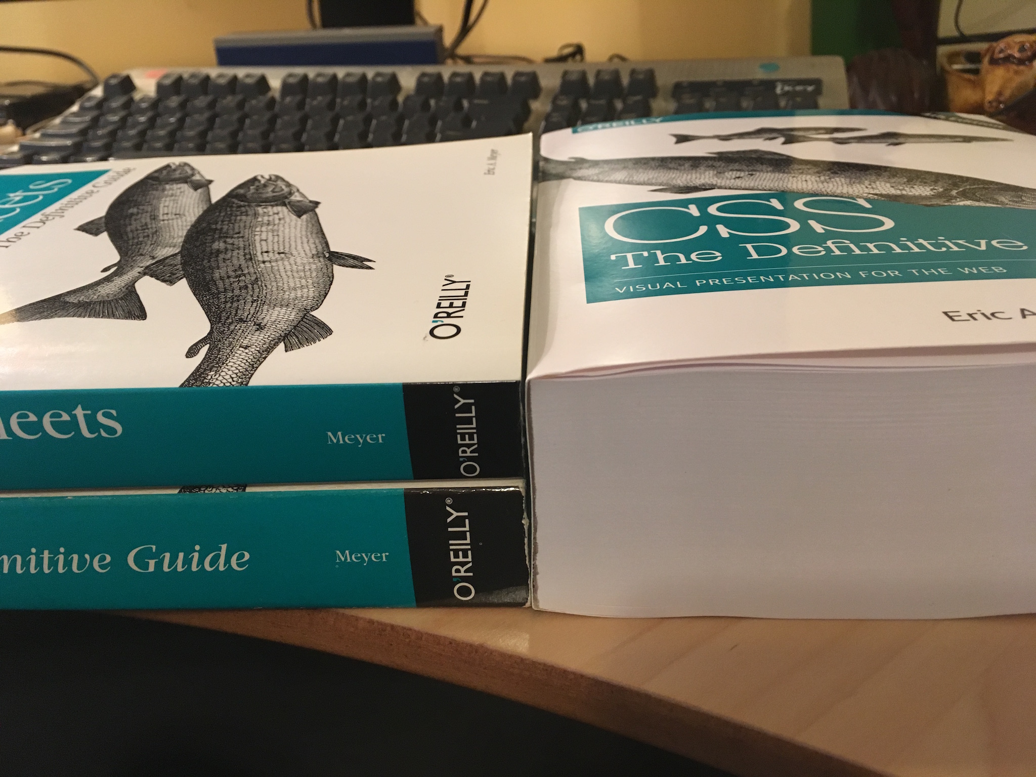
At the end of last week, I posted this picture to Twitter and Facebook, and on Twitter it kind of took off.
On the left: the 2nd and 3rd editions of “CSS: The Definitive Guide”. On the right, a single copy of the fourth edition. 😳
My intent in posting it was to say, in not nearly so many words, “Look at how CSS has dramatically expanded its capabilities since the previous edition, and wow, I can’t believe Estelle and I did that much work!” I know we have 280 characters now, but I try not to blog places other than, well, my actual blog. (Welcome!)
The Twitter reaction was…interesting. And by interesting, I really do mean interesting. There were the people who responded with excitement and anticipation — thanks to you all! — but a whole lot of people who said, in effect, “This is what’s wrong with front end, all this accelerating complexity.”
Which was not what I was saying. And which is not, I think, what’s actually happened here, but it depends on what you mean by ”complexity”.
CSS has a great deal more capabilities than ever before, it’s true. In the sense of “how much there potentially is to know”, yes, CSS is more of a challenge.
But the core principles and mechanisms are no more complicated than they were a decade or even two decades ago. If anything, they’re easier to grasp now, because we don’t have to clutter our minds with float behaviors or inline layout just to try to lay out a page. Flexbox and Grid (chapters 12 and 13, by the way) make layout so much simpler than ever before, while simultaneously providing far more capability than ever before.
“How? How is that even possible?” you might ask, to which I would reply, “That’s what happens when you have systems that were designed from the outset to be used for layout.” Floats weren’t; they were a necessary hack. Inline-block wasn’t; that was a necessary hack. People did ingenious, brilliant things to make those tools work, yes. But they were always a perversion of original intent.
Whereas with Grid and Flexbox, we have things that were always meant to handle layout. That’s why, for example, they make vertical centering of elements a breeze. A breeze, people. I’ve been working with the new stuff long enough that I literally forget vertical centering is supposed to be difficult. I have similar amnesia about the struggle to balance layout needs with accessible source order. These problems are not 100% banished, but it’s to the point now that when I do run into these problems, it’s a surprise, and almost a personal affront. Like how you feel when you’ve been zooming along a near-empty highway for hours, enjoying the rush of wind and power, and then you come around a curve and all of a sudden there’s a roadblock of two slow-moving cars side by side, doing exactly the speed limit of all things, each refusing to pass the other.
I envy “the kids”, the ones just starting to learn front end now. They’re likely never going to know the pain of float drop, or wrestling with inline blocks, or not being able to center along one axis. They’re going to roll their eyes when we old-timers start grumbling about the old days and say, “Floats?!? Who ever thought floats would be a good way to lay out a page? That’s totally not what they’re for, anyone can see that! Were you all high as a kite, or just utterly stupid?” You know, the way “the kids” talked ten years ago, except then it was about using tables for layout.
So if you’ve written CSS in the past, CSS today is not significantly harder to understand, and probably a bit easier. There’s just a lot more of it. You might not be able to remember every single property and value, but that’s okay. Neither can I. I don’t think many (or any) of us can hold every last tiny piece of a serious programming language in our heads, either. We know the core things, and the patterns we learned, and some cool techniques, and there are the things we always have to look up because we don’t often use them.
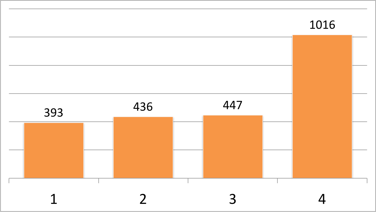
I also think people saw the books in the picture and forgot about the time component. I checked the page number at the end of the last chapter for each book (thus omitting appendices and the index) and came up with the following chart.
Editions of CSS: The Definitive Guide
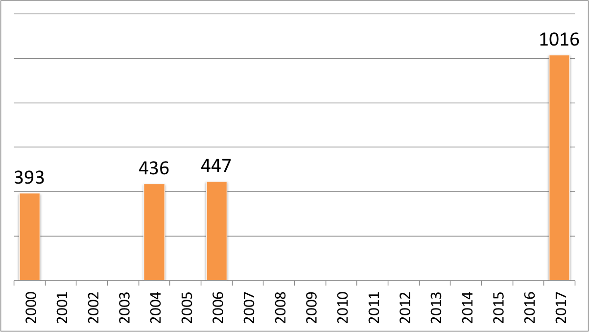
Whoa, right? But let’s chart those numbers again, this time taking date of publication into account.
Editions of CSS: The Definitive Guide over 18 years
Rather less crazy, I would say. It’s still an apparent upward trend, but think about all the new features that have come out since the 3rd Edition, or are coming out right now: gradients, multiple backgrounds, sticky positioning, flexbox, Grid, blending, filters, transforms, animation, and media queries, among others. A lot of really substantial capabilities. They don’t make CSS more convoluted, but instead extend it into new territories.
Speaking of which, a few people asked how I got the books to line up so neatly. I admit they’re being supported by a table there, but the real secret? Grid. So easy. Here, have a set of three “book spines” (each one a cite element) gridded out in supporting browsers, and still laid out just fine in older browsers.
See what I mean? That took me about 20 minutes all told, even though I’m using internal markup that’s probably not ideal, by putting grids in my grid so I can grid while I grid. I rearranged the 2nd-3rd-4th source order into the visual arrangement seen in the photo, and centered the text blocks vertically without using margins or padding or line height to fake it, just because I could. The grid layout is an enhancement: in older browsers, the spines render as a vertical stack, one atop the other, in chronological order.
Another five minutes, and I could neaten that rendering up further so the spines looked more consistent between grid-capable and grid-incapable browsers. Five to ten more minutes could get the O’Reilly logo and fish graphics into the black areas. Five more, and it would be neatly responsive. Maybe I’ll come back and fix it up to do those things, but for now, as far as I’m concerned, this will do nicely.
The other common response I got was, “Well, looks like it’s time for ‘CSS: The Good Parts’!” Fam, we already have “CSS: The Good Parts”. Estelle and I just wrote it. You can see it on the right side of the picture up above. Available now on paper or in electronic form!
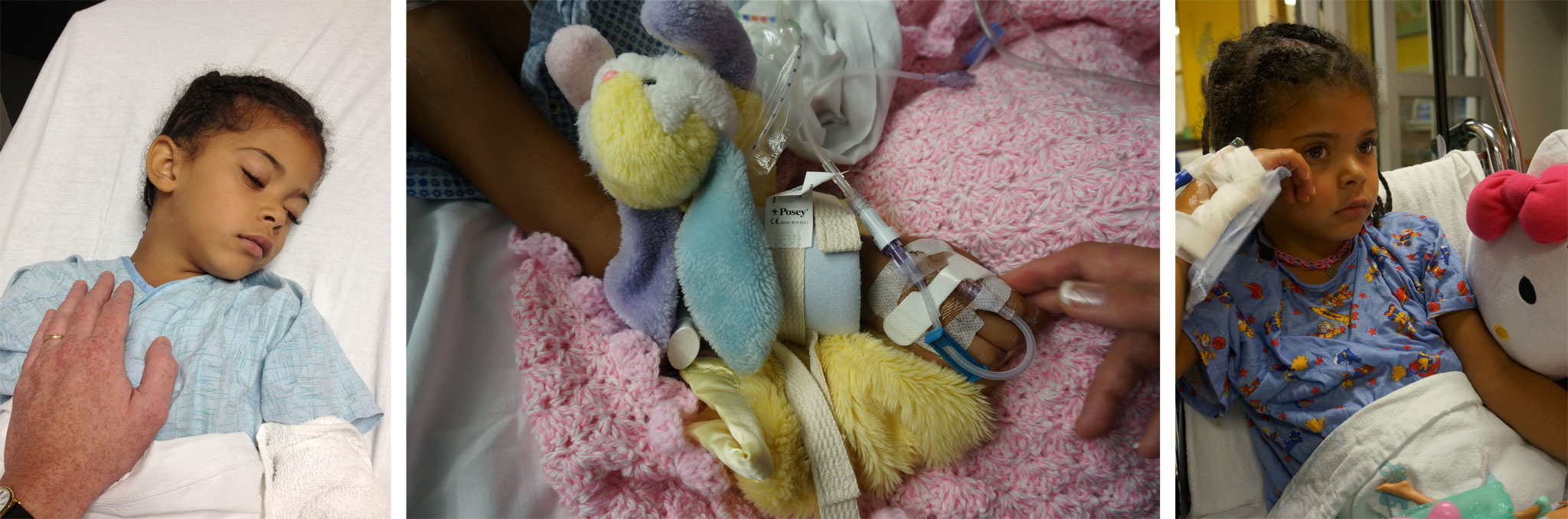
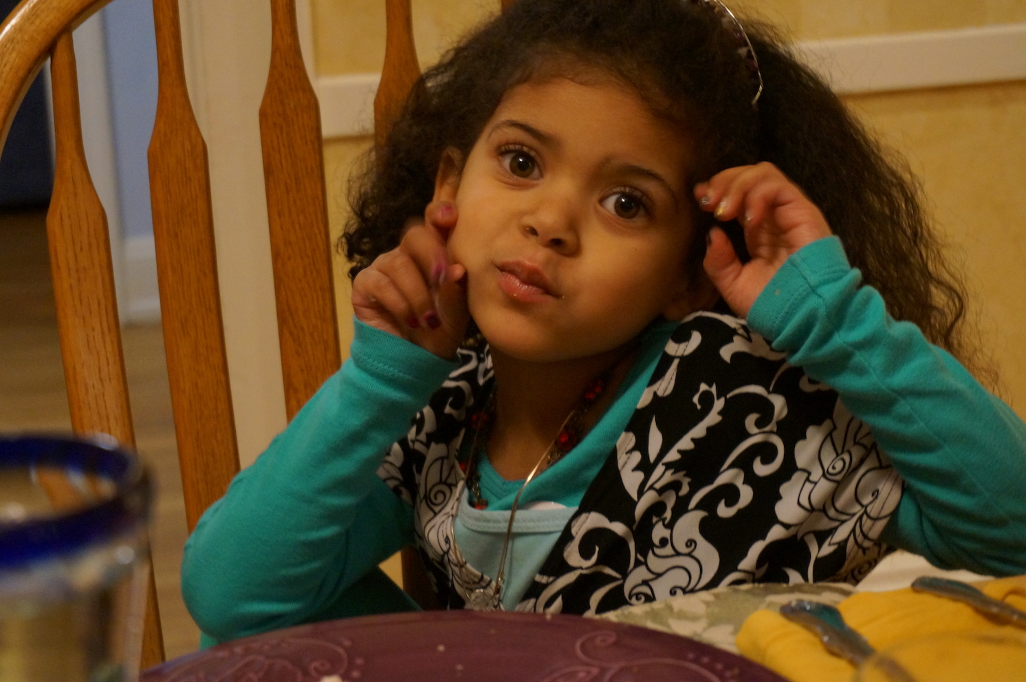
This is my daughter Rebecca in 2013. She was 5¼ years old when I took this picture. Less than three days later, she almost died on an ER bed.
She’d been completely fine when we set out for vacation that year, and just seemed to come down with a virus or something just after we arrived. She got checked out at an urgent care center, where they diagnosed strep throat. But antibiotics didn’t help. She slowly got more and more sick. We finally took her to be checked out at a nearby hospital, who were just as stumped as we were. They were looking for a room to put her in when she seized and flatlined.
Just like that. She’d been ill, but not severely so. All of sudden, she was on the edge of death. The ER staff barely stabilized her, by intubating her and administering drugs to induce a coma.
There was a large tumor in the center of her brain. Our five-year-old girl, who so far as we knew was completely fine just days before, had aggressive brain cancer.
After a midnight life flight nobody was sure she would survive, she arrived in Philadelphia and had several cranial surgeries, spent more than a week in the pediatric intensive care unit, and then was transferred down a few levels to spend another two weeks on the recovery floor, slowly rebuilding the muscle strength she’d lost from more than a week of immobility.
Later, there were weeks on weeks of radiation and chemotherapy in Philadelphia. After the initial treatment was done, we came home to Cleveland for more chemotherapy.
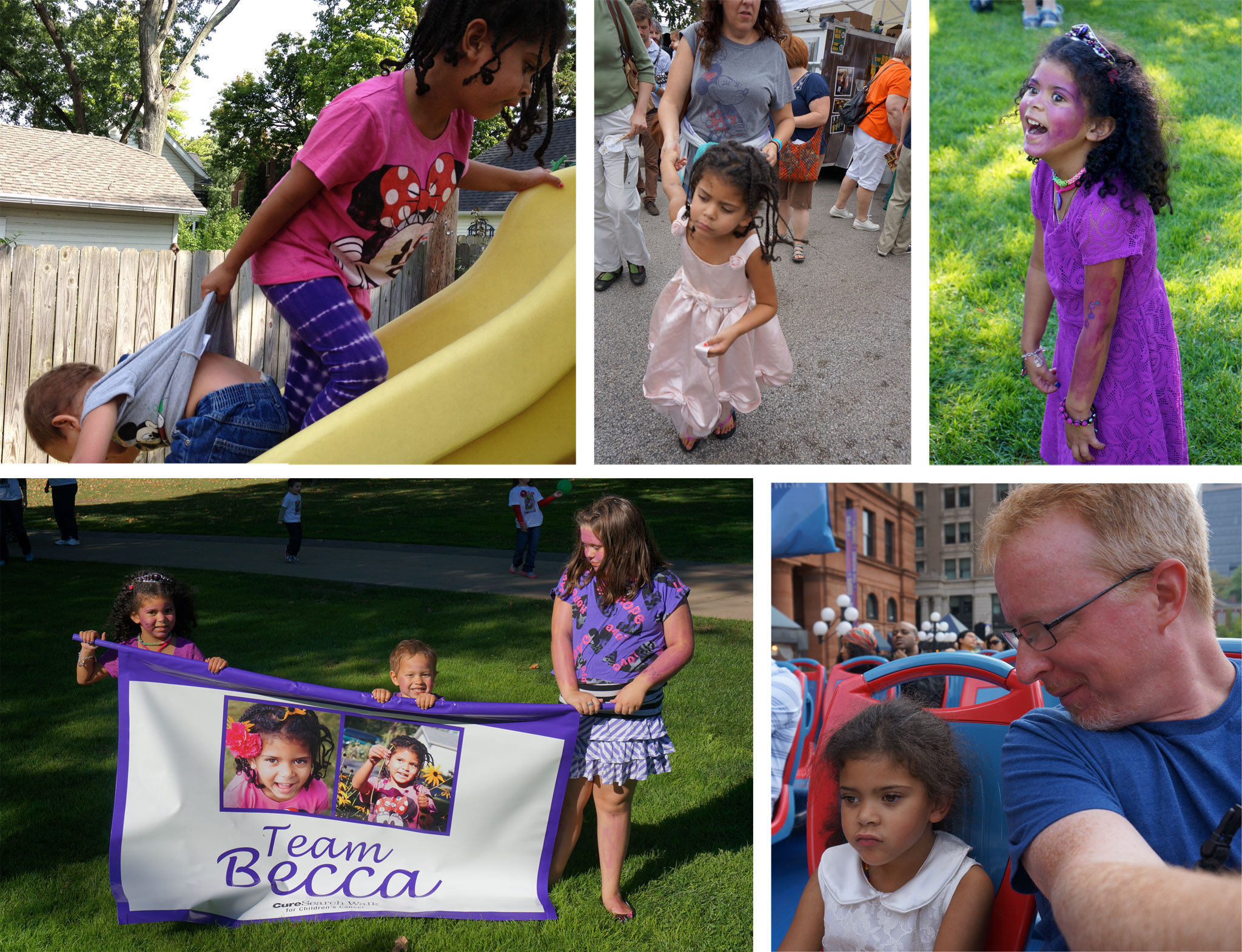
This is her, hauling her baby brother Joshua up the slide in our backyard, and hauling her mom through the crowd at the local garlic festival. At a CureSearch walk with her siblings and dozens of friends and family. Just barely tolerating my terrible dad jokes, doing her utmost not to encourage me by laughing.
We did everything we could, sometimes through tears and sickening horror, but the treatments didn’t work. Rebecca died at home, surrounded by friends and family one final time, less than ten months after her cancer was discovered, in the early evening hours of June 7th, 2014, her sixth birthday.
In those ten months, the total retail cost of her procedures and treatments was $1,691,627.45. Nearly one point seven million US dollars.
We had health insurance — really good insurance, thanks to COSE’s group plans and my wife’s and my combined incomes. The insurance company’s negotiated rates meant they paid $991,537.29, or about 58% of the retail price.
We paid very little, comparatively speaking, until you counted the monthly premiums. All of it together, co-pays and premiums, was still in the low five figures. Which we were, fortunately, able to pay.
Without insurance, even if we’d been able to get the insurer’s rate, we’d have gone bankrupt. All our investments, our house, everything gone. If pre-existing conditions had prevented us from being covered, or if we’d been less fortunate and unable to afford premiums — bankrupted.
In which case, Rebecca’s brother and sister would have suffered her death, and the loss of their home and what precious little remained normal in their lives.
How many families live through that double hell? How many go completely broke trying to save their child? How many could have saved their children, with coverage that paid for life-saving treatments? How many never had any chance of saving their child, but ran out of money before treatment was complete and now believe their lack of insurance and money was what killed their child?
How many more will have to live with those unthinkable situations, if the House and Senate bills go forward?
The point, the essential point, is this: every family should have the chance to fight as hard as possible for their loved one’s life without going bankrupt in the process. And for those who cannot be saved, no family should be denied the knowledge that they didn’t have a chance. Because knowing that does provide some (small) measure of comfort.
The Affordable Care Act wasn’t perfect, and it was severely and willfully undercut after it launched, but it was a huge step in the right direction. The bill currently before Congress would be an enormous step back. I doubt that I’ll benefit from the tax cuts that are part of the bill, but if I do, I’ll commit every cent I get from them and more to unseat anyone who votes yes on this bill. I have let my senators know this.
I would spare every family the pain we endured, if I could, but nobody has that power. We do, together, have the power to help every family that must endure that pain, to give them access to the simple safety net they need, to concentrate everything they can on the struggle to heal.
I miss her every day, but I know that we did everything that could be done, including being able to afford the hospice care that kept her as comfortable as possible in her final hours, preventing the seizures and pain and fear that would have made her last moments a hell beyond endurance. Allowing her a peaceful end. Every family should have access to that.
Please think about what it means to take that ability away. Please think about what it means to take away the ability to avoid having to make those choices.
The GIF Survey is complete. In just under a week, 1,457 people gave their answers on how they pronounce the acronym, and their perceptions of the rightness of that pronunciation. I thought that, today of all days, it made some sense to share the results of a far less momentous poll.
For those who missed, it, how this survey worked was that the first question was: “How do you pronounce GIF?” To this, the choices were:
The obviously correct way
The clearly incorrect way
Upon answering this, respondents moved on to a section that asked three optional demographic questions: age, gender, and race/ethnicity, all as open text fields. These had about a 16% skip rate, and about a 4% ‘faithless’ response rate; that is, answers that were clearly jokes, insults, or other explicit refusals to answer the question as intended.
Once the demographic questions were answered or skipped, there was a final question: “How do you pronounce GIF?”, exactly the same as the first question of the survey. Only this time, the options were:
Hard G (like “gift”)
Soft G (like “gin”)
For both pronunciation questions, the answer order was randomized so as to avoid any first-choice advantage. The demographic questions, being open entries, didn’t have options to randomize.
(Aside: I discovered in the course of the survey that there are other pronunciations, most commonly in non-English languages. My apologies to those who fell outside the binary choice I presented.)
So! The results came out like this:
Table 1. Perception of pronunciation
The obviously correct way
83.7%
The clearly incorrect way
16.3%
First of all, it amuses and slightly mystifies me that more than 16% of respondents feel they say it the “incorrect” way. Second of all, these percentages didn’t line up with actual pronunciation.
Table 2. Actual pronunciation
Hard G
77.8%
Soft G
22.2%
This deserves a closer look. How do perceptions of correctness break down by actual pronunciation?
Table 3. Perception versus pronunciation
Pronunciation
“Correct”
“Incorrect”
Hard G
87.3%
12.7%
Soft G
71.2%
28.8%
In other words, people who pronounce it with a hard G are significantly more likely to believe their pronunciation is correct than those who go the soft-G route.
It’s an interesting inversion of what one might (perhaps naïvely?) expect: given that the creator of the format has explicitly said the pronunciation is with a soft G, one might expect that those who use the hard G know it’s incorrect but say it anyway. My personal opinion is that this is actually a reflection of human nature: faced with evidence that undermines our instinctive reactions, we tend to double down. (Of course, if the evidence lines up with what we believe, we seize on that too.)
Now: demographics, which actually were the point of the survey, but not in the way I think some people assumed. After I did my first, tongue-in-cheek version of the poll on Twitter, my colleague Aki noted that she’d love to know something about the demographics behind those results, something I’d had flitting around in the back of my mind. Her comment made me decide to just go for it. What I wanted to see was whether there were significant differences in perceptions of correctness in various groups. For example, one might hypothesize that those identifying as female were more likely to say their choice was incorrect. Well, if that were the hypothesis, what evidence I was able to gather contradicts it.
Table 4. Perception of pronunciation by gender
Gender
“Correct”
“Incorrect”
Female
83.4%
16.6%
Male
83.5%
16.5%
Roughly speaking, of those people who gave an answer about their gender (81.5% of the total), about 25% of respondents identified as female, and about 70% identified as male. One thing that did jump out at me was that those identifying as female were more likely to use the hard G, rather than the soft G. Not by a lot, possibly within the margin of error, but still.
Table 5. Actual pronunciation by gender
Gender
Hard G
Soft G
Female
82.7%
17.3%
Male
77.2%
22.8%
The other thing that interested me was how patterns of pronunciation and correctness would correspond, if they did at all, to age — for example, were younger respondents more or less likely to think they were right than older respondents? I decided to group by decades, in effect. Of the 81.6% of respondents who gave a reasonably valid age (I tossed, for example, “1.7977E+308”), here’s how they clustered.
Table 6. Age groups
20-29
22.2%
30-39
42.7%
40-49
25.5%
50-59
6.6%
There weren’t enough respondents outside the 20-59 range to analyze. I’m not even sure about the 50-59 group, to be honest — I’m not sure 79 replies out of 1,457 is enough. But what the heck, I’m rolling with it. Respondents’ perception of correctness didn’t change a lot, but did seem to rise a bit with age.
Table 7. Perception by age group
Age Group
“Correct”
“Incorrect”
20-29
81.8%
18.2%
30-39
84.3%
15.7%
40-49
83.2%
16.8%
50-59
86.1%
13.9%
It would be interesting to see if a different division of age groups would create different results. But what really caught my eye was how the pronunciation shifts with age: younger respondents were notably more likely to use the soft G than older respondents.
Table 8. Pronunciation by age group
Age Group
Hard G
Soft G
20-29
73.1%
26.9%
30-39
77.8%
22.2%
40-49
84.2%
15.8%
50-59
83.7%
16.5%
So if you’re a soft-G speaker and are convinced that’s correct, perhaps you can take comfort in the belief that the children are our future.
I’m not going to present numbers on race/ethnicity. This is partly because the question was a MacGuffin: I asked it because it would have seemed odd not to after asking for age and gender, and also because I’ve found over the years that asking for ethnic or racial identification is a handy way to give some people a chance to vent a little built-up animus. The other reason is that even after filtering out the few abusive and the somewhat more numerous “decline to answer” replies, the remaining values are all over the place and difficult to make consistent.
And just to be clear, I’m not planning to post the complete data set, just in case any combination of demographic answers could be used to reconstruct an identity. (Each set was sorted differently, so a line number in one set doesn’t correspond to the line number in another.)
So what did all this tell us? It told us something about the people who saw the survey and chose to respond. It told us that if the results are representative, then people who are older tend to use the hard G and be more convinced of their rightness. Maybe that’s representative of the world as a whole, and maybe not. It may not mean a lot in the grand scheme of things, but it was fun to ask, hopefully fun for people to answer, and fun to crunch the numbers that resulted.
My thanks to everyone who took part, and to Aki for prompting me to do it in the first place.
There’s a lot I could say about Niantic’s apparent lack of foresight regarding how Pokémon Go play might intersect badly with the physical world and the people who inhabit it. Spawning a water Pokémon in the middle of New York City’s 9/11 Memorial, for example, comes off as a little bit…callous? Disrespectful? To say nothing of the reports of Pokémon Go play disrupting the Holocaust Museum in Washington, DC, or Auschwitz.
But that’s not what I want to ponder right now.
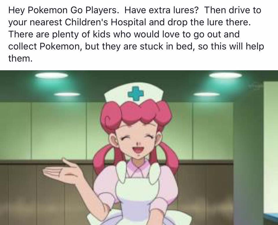
I’ve seen a meme circulating around Twitter and Facebook, encouraging Pokémon Go players with extra lures to drive down to the local children’s hospital, in order to draw more creatures to the sick kids, confined to their beds, who might want to play.
And, indeed, at least one children’s hospital in Michigan is embracing Pokémon Go to get their patients up, moving around, and interacting with each other. Hospitals generally have multiple Pokéstops in them already, so luring in creatures is even easier. Why not jump in the car, as the meme suggests, and bring a few tears of joy to a bedridden child’s face?
Because it might have the opposite effect. Not every bed in the hospital is within range of the Pokéstops, which means that you might condemn a child unable to leave their bed to watch the creatures spawn and spawn, just beyond their ability to collect them. Their tears won’t be of joy — and their misery might be prolonged by having other patients talk excitedly about all the Pokémon they caught and levels they gained.
Beyond that, if the Pokéstops in a hospital are constantly in Lure mode, they’ll lure more than just Pokémon: members of the general public will start showing up and trying to gain access to the hospital for no other reason than to “catch ‘em all”. This can create a number of problems, from the simple disruption to people’s work to adding extra strain on the hospital’s security personnel. The surge in random visitors at all hours could force the hospital to spend money on extra security staff hours — money which is then not available for other things. Like medicine. And children in hospitals are often immune-compromised, which means all it takes is one infectious Pokémon player to cause a serious medical crisis. A whole crowd of them represents every NICU’s nightmare.
What’s the societally correct thing to do? Here’s the thing: we don’t know. We haven’t figured this out yet; in fact, we’ve barely started to think about figuring it out. When it comes to luring monsters for the benefit of sick kids, please, call the hospital first to ask if your act of generosity will be welcome. Maybe it will! Or maybe not, and for very good reasons. In the absence of better experience design on Niantic’s part, the players need to step up and think through the possible ramifications of their choices, positive and negative.
I can easily imagine some hospitals asking players to only drop Lures at certain times, such as only during daylight hours, or to spread them out so as to maintain a constant supply. They might request specific Pokéstops be enhanced, and others left alone. (Remember, Pokéstops’ locations are defined by Niantic, not the physical place that ‘hosts’ them.)
And I can just as easily imagine hospitals having absolutely no idea what to say to people who ask them what they would prefer. This is all happening at internet-game speed, and large organizations can be slow to react. So call ahead — and in the absence of a clear “yes, please, come on down!”, assume that the Lures would not be welcome.
I know this isn’t tidy. In a just world, the idea of dropping Lures for sick kids would be pure and right, with no potential downsides. But then, in a just world, there would be no need of children’s hospitals.
Except no, that’s not really it. In truth, I’m afraid of what a cure for cancer will do to me, and to Kat.
After my mom died of breast cancer in 2003, I gritted my teeth at news stories of promising new cancer treatments. I’d think to myself, If a cure is coming soon, why couldn’t it have come sooner? As, I’m sure, the parents of polio victims asked themselves, when the vaccine came into being.
And I remember reading about this treatment, which had worked in a single case, two years ago, as our daughter was treated for glioblastoma. We tried to get access to the treatment, tried to get into a study or just be given a sample to administer, and were denied. Twice. They wouldn’t let us try it on a little girl with multiple tumors, when it had only been successfully tried on an adult with a single tumor. That door was closed to us.
So the experimental treatment we tried wasn’t a modified polio virus. It was something else. It was something promising. It didn’t work.
I know this polio treatment, as much as we wanted it then and as promising as it looks now, may come to nothing. So many other treatments have before. I remember the every-other-year drumbeat of “Is This The Cure For Cancer?” headlines and magazine covers — all about novel, promising approaches that nobody remembers now, because they didn’t work as it seemed like they might.
“A cure for cancer is the next great breakthrough in medicine, and it always will be,” I sometimes joke, a little bleakly. But then, that’s what they used to say about polio itself. About smallpox. About wound infections.
I read that story about the treatment we’d begged them to let us try, and how it looked like it might cure the cancer we could not, and sick grief ached anew in my chest. I thought, What if this really works, and we failed to get it for her? What if I could have called that doctor again, begged and pleaded, and somehow gotten him to say yes that time, and saved Rebecca’s life? Will I ever forgive myself if the cure was there all along, and I was too weak or blind to force it into our hands?
I still don’t know the answer.
I don’t want brain cancer to remain uncured. I don’t want any cancer to remain uncured. I don’t want other families to suffer what we and so many other families have suffered. There is much I would give to bring about that day, even though it comes too late for my mother, and for my daughter. There is much I have given, in many senses, to try to bring about that day.
When that day comes, if it ever comes, even if it’s just for one type of cancer, celebrate all the lives that will be saved. Feel that joy and relief. But also spare a moment of compassion for all the lives that were lost, and all the lives that were broken. Especially for the ones who died just before the cure came, the ones who mourn both their absence and the could-have-been that came so close.
Until that day comes, if it ever comes, spare a thought for those who live sick with dread and desperate hope, wishing and praying for a breakthrough to save their loved ones.
Spare another for those who live in dread of that day, and hate that they do.


 And, indeed, at least