Posts in the CSS Category

25 Years of CSS

Published 2 years, 10 months past

It was the morning of Tuesday, May 7th and I was sitting in the Ambroisie conference room of the CNIT in Paris, France having my mind repeatedly blown by an up-and-coming web technology called “Cascading Style Sheets”, 25 years ago this month.

I’d been the Webmaster at Case Western Reserve University for just over two years at that point, and although I was aware of table-driven layout, I’d resisted using it for the main campus site.  All those table tags just felt… wrong.  Icky.  And yet, I could readily see how not using tables hampered my layout options.  I’d been holding out for something better, but increasingly unsure how much longer I could wait.

Having successfully talked the university into paying my way to Paris to attend WWW5, partly by having a paper accepted for presentation, I was now sitting in the W3C track of the conference, seeing examples of CSS working in a browser, and it just felt… right.  When I saw a single word turned a rich blue and 100-point size with just a single element and a few simple rules, I was utterly hooked.  I still remember the buzzing tingle of excitement that encircled my head as I felt like I was seeing a real shift in the web’s power, a major leap forward, and exactly what I’d been holding out for.

Page 4, HTML 3.2.

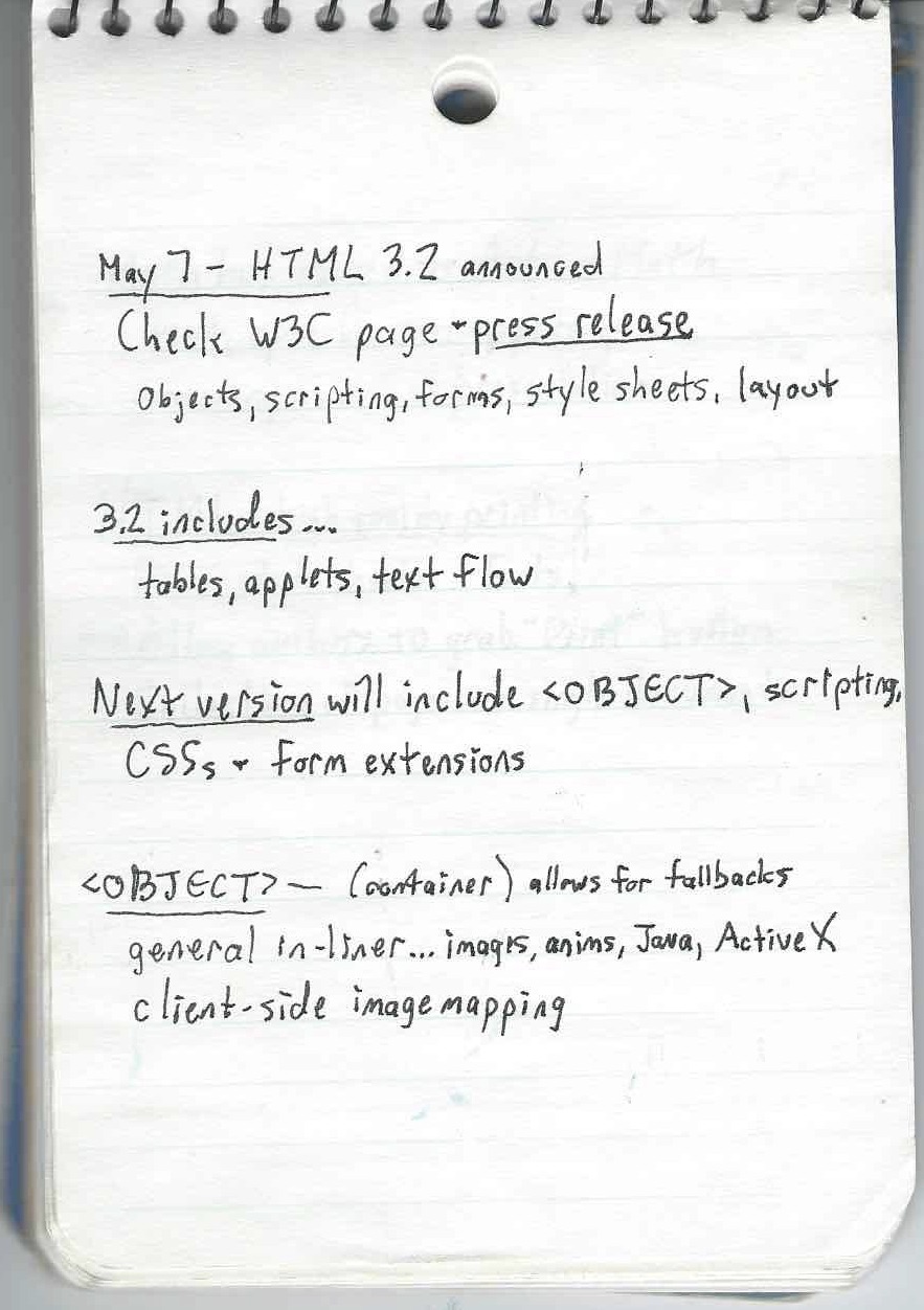
Looking back at my hand-written notes (laptops were heavy, bulky, battery-poor, and expensive in those days, so I didn’t bother taking one with me) from the conference, which I still have, I find a lot that interests me.  HTTP 1.1 and HTML 3.2 were announced, or at least explained in detail, at that conference.  I took several notes on the brand-new <OBJECT> element and wrote “CENTER is in!”, which I think was an expression of excitement.  Ah, to be so young and foolish again.

There are other tidbits: a claim that “standards will trail innovation” — something that I feel has really only happened in the past decade or so — and that “Math has moved to ActiveMath”, the latter of which is a term I freely admit I not only forgot, but still can’t recall in any way whatsoever.

My first impressions of CSS, split for no clear reason across two pages.

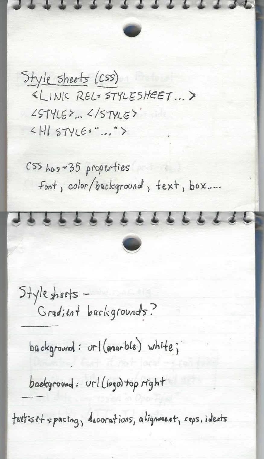
But I did record that CSS had about 35 properties, and that you could associate it with markup using <LINK REL=STYLESHEET>, <STYLE>…</STYLE>, or <H1 STYLE="…">.  There’s a question — “Gradient backgrounds?” — that I can’t remember any longer if it was a note to myself to check later, or something that was floated as a possibility during the talk.  I did take notes on image backgrounds, text spacing, indents (which I managed to misspell), and more.

What I didn’t know at the time was that CSS was still largely vaporware.  Implementations were coming, sure, but the demos I’d seen were very narrowly chosen and browser support was minimal at best, not to mention wildly inconsistent.  I didn’t discover any of this until I got back home and started experimenting with the language.  With a printed copy of the CSS1 specification next to me, I kept trying things that seemed like they should work, and they didn’t.  It didn’t matter if I was using the market-dominating behemoth that was Netscape Navigator or the scrappy, fringe-niche new kid Internet Explorer: very little seemed to line up with the specification, and almost nothing worked consistently across the browsers.

So I started creating little test pages, tackling a single property on each page with one test per value (or value type), each just a simple assertion of what should be rendered along with a copy of the CSS used on the page.  Over time, my completionist streak drove me to expand this smattering of tests to cover everything in CSS1, and the perfectionist in me put in the effort to make it easy to navigate.  That way, when a new browser version came out, I could run it through the whole suite of tests and see what had changed and make note of it.

Eventually, those tests became the CSS1 Test Suite, and the way it looks today is pretty much how I built it.  Some tests were expanded, revised, and added, plus it eventually all got poured into a basic test harness that I think someone else wrote, but most of the tests — and the overall visual design — were my work, color-blindness insensitivity and all.  Those tests are basically what got me into the Working Group as an Invited Expert, way back in the day.

Before that happened, though, with all those tests in hand, I was able to compile CSS browser support information into a big color-coded table, which I published on the CWRU web site (remember, I was Webmaster) and made freely available to all.  The support data was stored in a large FileMaker Pro database, with custom dropdown fields to enter the Y/N/P/B values and lots of fields for me to enter template fragments so that I could export to HTML.  That support chart eventually migrated to the late Web Review, where it came to be known as “the Mastergrid”, a term I find funny in retrospect because grid layout was still two decades in the future, and anyway, it was just a large and heavily styled data table.  Because I wasn’t against tables for tabular data.  I just didn’t like the idea of using them solely for layout purposes.

You can see one of the later versions of Mastergrid in the Wayback Machine, with its heavily classed and yet still endearingly clumsy markup.  My work maintaining the Mastergrid, and articles I wrote for Web Review, led to my first book for O’Reilly (currently in its fourth edition), which led to my being asked to write other books and speak at conferences, which led to my deciding to co-found a conference… and a number of other things besides.

And it all kicked off 25 years ago this month in a conference room in Paris, May 7th, 1996.  What a journey it’s been.  I wonder now, in the latter half of my life, what CSS — what the web itself — will look like in another 25 years.


Highlighting Accessible Twitter Content

Published 3 years, 3 months past

For my 2020 holiday break, I decided to get more serious about supporting the use of alternative text on Twitter.  I try to be rigorous about adding descriptive text to my images, GIFs, and videos, but I want to be more conscientious about not spreading inaccessible content through my retweets.

The thing is, Twitter doesn’t make it obvious whether someone else’s content has been described, and the way it structures (if I can reasonably use that word) its content makes it annoyingly difficult to conduct element or accessibility-property inspections.  So, in keeping with the design principles that underlie both the Web and CSS, I decided to take matters into my own hands.  Which is to say, I wrote a user stylesheet.

I started out by calling out things that lacked useful alt text.  It went something like this:

div[aria-label="Image"]::before {
	content: "WARNING: no useful ALT text";
	background: yellow;
	border: 0.5em solid red;
	border-radius: 1em;
	box-shadow: 0 0 0.5em black;
	…

…and so on, layering on some sizing, font stuff, and positioning to hopefully place the text where it would be visible.  This failed to satisfy for two reasons:

  1. Because of the way Twitter nests it dozens of repeatedly utility-classes divs, and the styles repeatedly applied thereby, many images were tall (but cut off) or wide (ditto) in ways that pulled the positioned generated text out of the visible frame shown on the site.  There wasn’t an easily-found human-readable predictable way to address the element I wanted to use as a positioning context.  So that was a problem.
  2. Almost every image in my feed had a big red and yellow WARNING on it, which quickly depressed me.

What I realized was that rather than calling out the failures, I needed to highlight the successes.  So I commented out the Big Red Angry Text approach above and got a lot more simple.

div[aria-label="Image"] {
	filter: grayscale(1) contrast(0.5);
}
div[aria-label="Image"]:hover {
	filter: none;
}

A screenshot of the author’s Twitter timeline, showing three tweets.  The middle tweet is text only.  The top tweet has a blurred-out image which is grayscale and of reduced contrast, indicating it has no useful alternative text.  The bottom tweet is also blurred, but it full color and contrast, indicating it has been given useful alternative text by the person who posted it.
Three consecutive tweets from my timeline on Friday, January 1st, 2021.  The blurring of the images in the top and bottom tweets is an effect of the Data Saver preference, not my CSS.

Just that.  De-emphasize the images that have the default alt text by way of their enclosing divs, and remove that effect on hover so I can see the image as intended if I so choose.  I like this approach better because it de-emphasizes images that aren’t properly described, while those which are described get a visual pop.  They stand out as lush islands in a flat sea.

In case you’ve been wondering why I’m selecting divs instead of img and video elements, it’s because I use the Data Saver setting on Twitter, which requires me to click on an image or video to load it.  (You can set it via Settings > Accessibility, display and languages > Data usage > Data saver.  It’s also what’s blurring the images in the screenshot shown here.)  I enable this setting to reduce network load, but also to give me an extra layer of protection when disturbing images and videos circulate.  I generally follow people who are careful about not sharing disturbing content, but I sometimes go wandering outside my main timeline, and never know what I’ll find out there.

After some source digging, I discovered a decent way to select non-described videos, which I combined with the existing image styles:

div[aria-label="Image"],
div[aria-label="Embedded video"] {
	filter: grayscale(1) contrast(0.5);
}
div[aria-label="Image"]:hover,
div[aria-label="Embedded video"]:hover {
	filter: none;
}

The fun part is, Twitter’s architecture spits out nested divs with that same ARIA label for videos, which I imagine could be annoying to people using screen readers.  Besides that, it also has the effect of applying the filter twice, which means videos that haven’t been described get their contrast double-reduced!  And their grayscale double-enforced!  Fun.

What I didn’t expect was that when I start playing a video, it loses the grayscale and contrast reduction effects even when not being hovered, which makes the second rule above a little over-written.  I don’t see the DOM structure changing a whole lot when the video loads and plays, so either videos are being treated differently for filter purposes, or I’m missing something in the DOM that’s invalidating the selector matching.  I might poke at it over time to find a fix, or I may just let it go.  The user experience isn’t too far off what I wanted anyway.

There is a gap in my coverage, which is GIFs pulled from Twitter’s GIF pool.  These have default alt text other than Image, which makes selecting for them next to impossible.  Just a few examples pulled from Firefox’s Accessibility panel when I searched the GIF panel for “this is a test”:

testing GIF
This Is ATest Fool GIF
Corona Test GIF by euronews
Test Fail GIF
Corona Virus GIF by guardian
Its ATest Josh Subdquist GIF
Corona Stay Home GIF by INTO ACTION
Is This A Test GIF
Stressed Out Community GIF
A1b2c3 GIF

I assume these are Giphy titles or something like that.  In nearly every case, they’re insufficient, if not misleading or outright useless.  I looked for markers in the DOM to be able to catch these, but didn’t find anything that was obviously useful.

I did think briefly about filtering for any aria-label that contains the string GIF ([aria-label*="GIF"]), but that would improperly catch images and videos that have been described but happen to have the string GIF inside them somewhere.  This might be a relatively rare occurrence, but I’m loth to gray out media that someone went to the effort of describing.  I may change my mind about this, but for now, I’m accepting that GIFs which appear in full color are probably not described, particularly when containing common memes, and will try to be careful.

I apply the above styles in Firefox using Stylus, which also available for Chrome, and they’re working pretty well for me.  I wish I could figure out a way to apply them in mobile contexts, but that’s a (much bigger) problem for another day.

I’m not the first to tread this ground, nor do I expect to be the last, sadly.  For a deeper dive into all the details of Twitter accessibility and the pitfalls that can occur, please read Adrian Roselli’s excellent article Improving Your Tweet Accessibility from just over two years ago.  And if you want apply accessibility-aid CSS to your own Twitter experience but can’t or won’t use Stylus, Adrian has a bookmarklet that injects Twitter alt text all set up and ready to go — you can use it as-is, or replace the CSS in his bookmarklet with mine above or your own if you want to take a different approach.

So that’s how I’m upping my awareness of accessible content on Twitter in 2021.  I’d love to hear what y’all are using to improve your own experiences, or links to tools and resources on this same topic.  If you have any of that, please drop the links in a comment below, so that everyone who reads this can benefit.  Thanks!


Accordion Rows in CSS Grid

Published 3 years, 9 months past

Another aspect of the meyerweb redesign I’d like to explore is the way I’m using CSS Grid rows to give myself more layout flexibility.

First, let’s visualize the default layout of a page here on meyerweb.  It looks something like this:

A page layout diagram showing a header stretching across the top of the page, a footer stretching across the bottom of the page, and three columns of content between them: two sidebars to either side, and a main content column in the middle.

So simple, even flexbox could do it!  But that’s only if things always stay this simple.  I knew they probably wouldn’t, because the contents in those two sidebars were likely to vary from one part of the site to another — and I would want, in some cases, for the sidebar pieces to line up vertically.  Here’s an example:

A page layout diagram showing a header stretching across the top of the page, a footer stretching across the bottom of the page, and three columns of content between them. There is a main content column in the middle which stretches full-height between the header and footer. In the right sidebar, there are three boxes, labeled 'navigation', 'feeds', and 'categories', arranged in that order, top to bottom. In the left sidebar, there is a single box labeled 'archives' that isn’t as tall as the main content column. Its top edge is vertically aligned with the top edge of 'feeds', the second box in the right-hand sidebar.

That’s the basic layout of archive pages.  See how the left sidebar’s Archives lines up with the top of the Feeds box in the right sidebar?  That’s Grid for you.  I thought about lumping the Feeds and Categories into a the same grid cell (thus making them part of the same grid row), which would have meant wrapping them in a <div>, but decided keeping them separate allows more flexibility in terms of responsive rearrangement of content.  I can, for example, assign the Feeds to be followed by Archives and then Categories at mobile sizes.  Or to reverse that order.

More to the point, I also wanted the ability to place things along the bottoms of the sidebars, down near the footer but still next to the main content column, like so:

A page layout diagram similar to the previous diagram, with header and footer, main content column, and the 'archives' box in the left sidebar; and 'navigation, 'feeds', and 'categories' in the right sidebar. This figure adds 'box1' and 'box2' to the bottom of the left sidebar, and 'box3' to the bottom of the right sidebar. The bottom edges of 'box2' and 'box3' are vertically aligned with the bottom of the main column.

An early design prototype for the blog archives put the “Next post” and “Previous post” links in some of those spots, before I moved the links into the bottom of the main content column.  So at the moment, I don’t have anything making use of those spots, although the capability is there.  I could cluster content along the tops and the bottoms of the sidebars, as needed.

But here’s the important thing, and really the point of this article: I’m not rewriting the row structure and grid cell assignments for each page type.  There’s a unified row template applied to the body on every page that uses the Hamonshū design.  It is:

grid-template-rows: repeat(7,min-content) 1fr repeat(3,min-content);

The general idea here is, the first seven rows are sized to be the minimum necessary to contain content inside those rows.  This is also true of the last three rows.  And in between those sets, a 1fr row that takes up the rest of the grid container’s height, pushing the two sets apart.

In the simplest case, where there’s just a header, main content column, and a footer, with nothing in the sidebars (the layout has three columns, remember), the content will fill the rows like so:

A page layout diagram showing a header stretching across the top of the page, a footer stretching across the bottom of the page, and a main content column. There is open space to the sides of the main content column.

Here’s the Grid CSS to make that happen:

header {grid-row: 1; grid-column: 1 / -1;}
footer {grid-row: -2; grid-column: 1 / -1;}
main {grid-row: 2; grid-column: 2;}

Thus: The header fills all of row one.  The content expands row two from its placement in the center column.  The footer fills all of the last row, which is specified via grid-row: -2 (because grid-row: -1 would align its top with the bottom edge of the grid container).  There’s no more content, so all the other min-content rows have no content, so their height is zero.  And there’s no leftover height to soak up, so the 1fr row also has a height of zero.  Seems like a lot of rows specified to no real purpose, doesn’t it?

But now, let’s add some sidebar content to columns one and three; that is, the sidebars.  For example, you might remember this layout from before:

The same as figure 2. To recap: A page layout diagram showing a header stretching across the top of the page, a footer stretching across the bottom of the page, and three columns of content between them. There is a main content column in the middle which stretches full-height between the header and footer. In the right sidebar, there are

Given this setup, we can’t just assign the main content column to grid-row: 2 and leave it at that — it’s going to have to span rows.  Really, it needs to span all but the last, thus ensuring it reaches down to the footer.  So the CSS ends up like this:

header, footer {grid-row: 1; grid-column: 1/-1;}
footer {grid-row: -2;}
main {grid-column: 2; grid-row: 2/-2;}
nav {grid-row: 2; grid-column: 3;}
.archives {grid-row: 3 / span 3;}
.feeds {grid-row: 3; grid-column: 3;}
.categories {grid-row: 4; grid-column: 3;}

And as a result, the rows end up like this:

The same as the previous diagram, but in this case the main content column is taller. Purple dashed lines show where the grid lines are placed in this layout; in particular, they make it clear that the 'navigation', 'feeds', 'categories' boxes in the right-hand sidebar are placed in separate grid rows, and the 'archives' box in the left-hand sidebar spans three grid rows.
Grid-line visualization courtesy the Firefox Web Inspector.

The first set of min-content rows are all gathered up against the bottom of the top part of the layout, and the second set are all pushed down at the bottom.  Between them, the 1fr row eats up all the leftover space, which is what pushes the two sets of min-content rows apart.

I like this pattern.  It feels good to me, having two sets of rows where the individual rows accordion open to accept content when needed, and collapse to zero height when not, with a “blank” row in between the sets that pushes them apart.  It’s flexible, and even allows me to add more rows to the sets without having to rewrite all my layout styles.

As an example, suppose I decided I needed to add a few more rows to the bottom set, for use in a few specialty templates.  Because of the way things are set up, all I have to do is change the row template like this:

grid-template-rows: repeat(7,min-content) 1fr repeat(5,min-content);

That’s everything. I just changed the number of repeats in the second set of rows.  All the existing pages will continue on just fine, no layout changes, no CSS changes.  In the few (currently hypothetical) pages where I need to put a bunch of stuff along the bottom of the main content column, I just plug them in using grid-row values, whether positive or negative.  It all just works.

The same is true if more rows are added to the first set, for whatever reason.  Everything gets managed in a single CSS rule, where you can add rows for the whole site instead of having to write, track, and maintain a bunch of variants for various page types.  (Subtracting rows is harder without causing layout upset, but could still be done in some scenarios.)

As a final note, you’re probably wondering: Is that one 1fr row actually necessary to get a layout like this one?  Not really, no.  Let’s take it out, like this:

grid-template-rows: repeat(11,min-content);

What happens as a result is the rows that aren’t directly occupied by content (the ones that previously collapsed to zero height), but are still spanned by content (the center column), divvy up the leftover space the 1fr row used to consume.  This leads to a situation like so:

The same layout diagram as the previous figure, but with some of the grid rows placed differently.

To the user, there’s no practical difference.  Things go to the same places either way.  You just get the “extra” rows stretching out, instead of being pushed apart by the 1fr row.

I certainly could have left it at that, and it arguably would have been cleaner to do so.  But something about this approach doesn’t sit quite right with me; there’s a tickly feeling in the back of my instinct that tells me there’s a downside to this.  Admittedly, it could be a vestigial instinct from the Age of Floats; I doubtless have many things I still have not unlearned.  On the other hand, it could be something about Grid I’ve picked up on subconsciously but haven’t yet brought into full realization.

If I ever pin the tickle down enough to articulate it, I’ll update the post to include it.

Thanks to Kitt Hodsden and Laura Kalbag for their assistance with this article.


Pseudo-Randomly Adding Illustrations with CSS

Published 4 years, 4 days past

I’ve been incredibly gratified and a bit humbled by the responses to the new design.  So first of all, thank you to everyone who shared their reactions!  I truly appreciate your kindness, and I’d like to repay that kindness a bit by sharing some of the techniques I used to create this design.  Today, let’s talk about the ink-study illustrations placed between entries on the site, as well as one other place I’ll get to later.

Very early in the process, I knew I wanted to separate entries with decorations of some sort, as a way of breaking up the stream of text.  Fortunately, Hamonshū provided ample material.  A little work in Acorn and I had five candidate illustrations ready to go.

The five illustrations.

The thing was, I wanted to use all five of them, and I wanted them to be picked on a random-ish basis.  I could have written PHP or JS or some such to inject a random pick, but that felt a little too fiddly.  Fortunately, I found a way to use plain old CSS to get the result I wanted, even if it isn’t truly random.  In fact, its predictability became an asset to me as a designer, while still imparting the effect I wanted for readers.

(Please note that in this article, I’ve simplified some aspects of my actual CSS for clarity’s sake; e.g., removing the directory path from url() values and just showing the filenames, or removing declarations not directly relevant to the discussion here.  I mention this so that you’re prepared for the differences in the CSS shown in this piece versus in your web inspector and/or the raw stylesheet.)

Here’s how it starts out:

#thoughts .entry + .entry::before {
   content: "";
   display: block;
   height: 10em;
   background:
      url(separator-big-05.png) 50% 100% / contain no-repeat;
}

That means, for every blog entry except the first, a block-level bit of generated content is inserted at the beginning of the entry, given a height, and the image separator-big-05.png is dropped into the generated box and sized to be contained within it, which means no part of the image will spill outside the background area and thus be clipped off.  (The file has the number 05 because it was the fifth I produced.  It ended up being my favorite, so I made it the default.)

With that in place, all that remains is to switch up the background image that’s used for various entries.  I do it like this:

#thoughts .entry:nth-of-type(2n+1)::before {
   background-image: url(separator-big-02.png);
}
#thoughts .entry:nth-of-type(3n+1)::before {
   background-image: url(separator-big-03.png);
}
#thoughts .entry:nth-of-type(4n+1)::before {
   background-image: url(separator-big-04.png);
}
#thoughts .entry:nth-of-type(5n+1)::before {
   background-image: url(separator-big-01.png);
}

So every second-plus-one entry (the third, fifth, seventh, etc.) that isn’t the first entry will use separator-big-02.png instead of -05.png.  Unless the entry is an every-third-plus-one (fourth, seventh, tenth, etc.), in which case separator-big-03.png is used instead.  And so on, up through every-fifth-plus-one.  And as you can see, the first image I produced (separator-big-01.png) is used the least often, so you can probably guess where it stands in my regard.

This technique does produce a predictable pattern, but one that’s unlikely to seem too repetitious, because it’s used to add decoration separated by a fair amount of text content, plus there are enough alternatives to keep the mix feeling fresh.  It also means, given how the technique works, that the first separator image on the home page (and on archive pages) is always my favorite.  That’s where the predictability of the approach helped me as a designer.

I use a similar approach for the separator between posts’ text and their comments, except in that case, I add a generated box to the end of the last child element in a given entry:

.single #thoughts article .text > *:last-child:after {
   content: "";
   display: block;
   height: 10em;
   background:
      url(separator-big-05.png) 50% 100% / contain no-repeat;
}

That is, on any page classed single (which is all individual post pages) after the last child element of a .text element (which holds the text of a post), the decoration box is generated.  The default, again, is separator-big-05.png — but here, I vary the image based on the number of elements in the post’s body:

.single #thoughts article .text > *:nth-child(2n+1)::after {
   background-image: url(separator-big-02.png);
}
.single #thoughts article .text > *:nth-child(3n+1)::after {
   background-image: url(separator-big-03.png);
}
.single #thoughts article .text > *:nth-child(4n+1)::after {
   background-image: url(separator-big-04.png);
}
.single #thoughts article .text > *:nth-child(5n+1)::after {
   background-image: url(separator-big-01.png);
}

In other words: if the last child element of the post text is a second-plus-one, separator-big-02.png is used.  If there are 3n+1 (one, four, seven, ten, thirteen, …) HTML elements in the post, separator-big-03.png is used.  And so on.  This is an effectively random choice from among the five images, since I don’t count the elements in my posts as I write them.  And it also means that if I edit a piece enough to change the number of elements, the illustration will change!  (To be clear, I regard this as a feature.  It lends a slight patina of impermanence that fits well with the overall theme.)

I should note that in the actual CSS, the two sets of rules above are merged into one, so the selectors are actually like so:

#thoughts .entry + .entry::before,
   .single #thoughts article .text > *:last-child:after {…}

#thoughts .entry:nth-of-type(2n+1)::before,
   .single #thoughts article .text > *:nth-child(2n+1)::after {…}

#thoughts .entry:nth-of-type(3n+1)::before,
   .single #thoughts article .text > *:nth-child(3n+1)::after {…}

In all honesty, this technique really satisfies me.  It makes use of document structure while having a random feel, and is easily updated by simply replacing files or changing URLs.  It’s also simple to add more rules to bring even more images to the mix, if I want.

And since we’re talking about using structure to vary layout, I also have this @media block, quoted here verbatim and in full:

@media (min-width: 50em) {
   #thoughts .entry:nth-of-type(2n) {
      transform: translate(-1vw,0);
   }
   #thoughts .entry:nth-of-type(3n) {
      transform: translate(3vw,0);
   }
}

This means on the home page and blog archive pages, but only at desktop-browser widths, some entries are shifted a bit to the left or right by fractions of the viewport width, which subtly breaks up the strict linearity of the content column on long pages, keeping it from feeling too grid-like.

To be honest, I have no idea if that side-shifting effect actually affects visitors’ experience of using meyerweb, but I like it.  Sometimes the inter-entry wave art fits together with the side-shift so that it looks like the art flows into the content.  That kind of serendipity always delights me, whether it comes by my hand or someone else’s.  With luck, it will have delighted one or two of you as well.


CSS Naked Day 2020

Published 4 years, 1 week past

If you’re here on meyerweb on April 9th, 2020, then you’re seeing the site without the CSS I wrote for its design and layout.  Why?  It’s CSS Naked Day!  To quote that site:

The idea behind this event is to promote Web Standards. Plain and simple. This includes proper use of HTML, semantic markup, a good hierarchy structure, and of course, a good old play on words. It’s time to show off your <body> for what it really is.

So last night, I removed the links to the main stylesheets for the site.  There are, I should note, scattered pages where local CSS is still in play. I could have tracked them all down and removed their CSS as well, and I considered doing so, but in the end I decided against it.

There’s a history to this day.  In the late Aughts, it was an annual thing, not unlike Blue Beanie Day, to draw attention to web standards and reinforce among the community that good, solid, robust development practices are a good thing.  Because after all, if your site isn’t usable without the CSS, then it almost certainly has structure and accessibility problems you probably haven’t been thinking about.

In all honesty, I had forgotten about it until just a couple of days prior, I suddenly thought, “Wait, early April, isn’t that when CSS Naked Day was observed?”  I went looking, and discovered that yes, it was.  I had remembered April 7th, but apparently April 9th was the actual date.  Or became it over time.  Either way, here we are, feeling fancy-free!

What’s been interesting has been what CSS Naked Day has revealed about browsers as well as about our HTML.  To pick one example, suppose you have a very large SVG logo, which you size to where you want it with CSS.  This is ordinarily a best practice: the SVG is the same file size whether it renders huge or tiny, so there’s no downside to having an SVG that renders 1200 x 1000 when you view it directly — thus allowing you to see all the little details — but is sized to 120 x 100 via CSS for layout purposes.

But take away the CSS, and the SVG will become 1200 x 1000 again.  That might tell you to resize it for production, sure, and you probably should.  But it also points out that browsers will not constrain that image, not even to the viewport.  If your window is only 900 pixels wide, the SVG could well spill outside, forcing a horizontal scrollbar.  Is that good?  Maybe!  Maybe not!  We might wish browsers would bake something like img {max-width: 100%; height: auto;} into their user-agent stylesheet(s), but maybe that would have unforeseen downsides.  The point is, this is a thing about browsers that CSS Naked Day reveals, and it’s worth knowing.

Similarly, this reveals that browsers don’t have a way to restrict the width of lines of text.  Thus, if the browser window is wide, the lines get very long — long enough to make reading more difficult.  This isn’t a problem on handheld devices like smartphones, but on desktop (use of which has risen significantly in areas locked down to limit the spread of SARS-CoV-2) it can be a problem.  Again, if browsers had something like body {max-width: 70em;} or max-width: 100ch or suchlike, this wouldn’t be a problem.  Should they?  Maybe!  It’s worth thinking about for your own work, if nothing else.

(For much more thinking about these kinds of browser behaviors and how to address them, you should absolutely check out the CSS Remedy project.  “CSS Remedy sets CSS properties or values to what they would be if the CSSWG were creating the CSS today, from scratch, and didn’t have to worry about backwards compatibility.”)

If I’d remembered sooner, I might have contacted the maintainers of the CSS Naked Day site and posted about it ahead of time and thought about stuff like a hashtag to spread the word.  Maybe that will happen next year.  Until then, enjoy all the nudity!


CSS Specification Timelines, Updated and Modernized

Published 4 years, 1 month past

Back in 2011, I decided to make a timeline out of CSS modules’ version histories, where “version history” means “a list of all the various drafts that were published”.  I updated the data every now and again, and then kind of let it go dormant for a few years.

Until this past weekend, when for no clear reason I decided what the hell, it’s time for a refresh.  So I trawled through all the specs’ version histories to get the stuff I didn’t have, and gave the presentation a bit of an upgrade.  The overall look and feel is pretty consistent, except now, thanks to repeating linear gradients, I have vertical stripes to show each year in the now 21-year-long timeline.  I put labels up at the top of the stripes, and figured they should remain visible no matter where you scroll, so I set them to position: sticky.  Then I realized most people would have to scroll horizontally, so I made the specification names sticky as well.

So now, no matter where you scroll on the page, you’ll see the specifications along the left and the years along the top.  The layout isn’t mobile-hostile, exactly, but it isn’t RWD-ized either.  I’m not really sure how I could make this fully responsive, except maybe to just drop the timeline layout altogether and revert to the lists that underlie the layout.

While I was at it, I converted a fair bit of the CSS to use var() and calc() so that I could set a column width in one place, and sprinkled in just a tiny bit more PHP to output offset values in a couple of places.  Nothing major, just quality-of-life upgrades for the maintainer, which is to say, me.

I bring all this up for two reasons.  One, I like the presentation upgrades, and wanted to share.  Two, by sheer coincidence, today the CSS Working Group published first versions of four CSS modules:

So I’ve added them to the timeline, along with CSS Color Module Level 4, which I’d overlooked in my weekend update.  These are the first module versions of 2020, so enjoy!

I do find it a little weird that Color Level 5 is out when Color Level 4 has never left Working Draft status, but maybe Level 4 is about to graduate, and this just happened to come out first.  We’ll see!


Woodshop SVG

Published 4 years, 3 months past

For the holiday break this year, I decided to finally tackle creating an indoor work space.  I’d had my eye on a corner of our basement storage room for a while, and sketched out various rough plans on graph paper over the past couple of years.  But this time?  This time, I was doing it.

The core goal is to have a workbench where I can do small toy and appliance repair when needed, as well as things like wood assembly after using the garage power tools to produce the parts — somewhere warm in the depths of winter and cool at the height of summer, where glue and finish will always be in its supported temperature range.  But that spawns a whole lot of other things in support of that goal: places to store components like screws, clamps, drills, bits, hammers, saws, wires, and on and on.

Not to mention, many tools are powered, and the corner in question didn’t come with any outlets.  Not even vaguely nearby, unless you count the other side of the room behind a standing freezer.  Which, for the record, I don’t count.  I had to do something about that.

So anyway, a lot of stuff got cleared out of the corner and stored elsewhere, if it wasn’t just tossed outright.  Then I took a couple of cabinets off the wall and remounted one of them elsewhere in the room, which was quite the experience, let me tell you.  When I discovered I’d mis-measured the available space and the cabinet ever so slightly, I had the following conversation with myself:

“This cabinet is an eighth-inch too tall to fit. You’ll never get it in there!”

“Yeah?  Well, me and Mister Block Plane here say different.”

Reader, I got it in there.

Moving the cabinets exposed a short wall of framing studs mounted atop a cinderblock foundation wall.  I’ll get to how I used those in a future piece, but here I want to talk about something I’ve been using to help me visualize parts of this project and get cut lists out of it at the end: hand-written SVG.

You heard me.  I’ve been hand-coding SVG schematics to figure out how thing should go together, and as a by-product, guide me in both material buying and wood cutting.

This might sound hugely bespoke and artisanally overdone, but they’re not that complicated, and as a major benefit, the process has helped me understand SVG a little bit better.  Here’s one example, a top-down diagram of the (supposedly) temporary workbench I recently built out of plywood and kiln-dried framing studs.

That shows a 2’×4′ benchtop with a supporting frame (the overlapping grayish boxes) and the placement of the four legs (the brown rectangles).  Here’s how I wrote the elements to represent the supporting frame.

<g class="structure">
    <path d="M 3.75 3.75  l 40.5 0" /> <!-- back -->
    <path d="M 3.75 12.00 l 40.5 0" class="optional" />
    <path d="M 3.75 20.25 l 40.5 0" /> <!-- front -->

    <path d="M 3.75 3  l 0 18" /> <!-- left -->
    <path d="M 24.00 3.75 l 0 16.5" class="optional" />
    <path d="M 44.25 3 l 0 18" /> <!-- right -->
</g>

And here’s how I styled them.

.structure {
    stroke: #000;
    stroke-width: 0;
    fill: #000;
}
.structure path {
    opacity: 0.1;
    stroke-width: 1.5;
}
.structure .optional {
    opacity: 0.05;
}

I like using paths in this situation because they let me pick a starting coordinate, then draw a line with relative X-Y values.  So that first path starts at X=3.75 and Y=3.75, and then draws a line whose endpoint is 40.5 X-units and 0 Y-units from the starting point.  In other words, it’s 40.5 units long and purely horizontal.  Compare that to the path marked left, which starts nearby (X=3.75, Y=3) and runs 18 units straight down.

This helps with cut planning because I set things up such that each unit equals an inch.  Just by looking at the values in the SVG, I know I need two pieces that are 40.5 inches long, and two that are 18 inches long.  (Three pieces of each length, if I’d decided to use the pieces classed as optional, but I didn’t.)

And how did I get that to work?  I set the viewbox to be only a few coordinate units larger than the overall piece, which I knew would be 24 by 48 units (inches), and then made the image itself large.

<svg xmlns:svg="http://www.w3.org/2000/svg"
    xmlns="http://www.w3.org/2000/svg"
    xmlns:xlink="http://www.w3.org/1999/xlink"
    width="1000"
    height="500"
    viewBox="0 0 54 30"
    >

Basically, I added 6 to each of 24 and 48 to get my viewBox values, allowing me three units of “padding” (not CSS padding) on each side.  I filled the whole thing with a rectangle with a soft gray fill, like so.

<rect height="100%" width="100%" fill="#EEE" />

Which was great, but now I had to figure out how to get the 24×48 workplan into the center of the viewbox without having to add three to every coordinate.  I managed that with a simple translation.

<g transform="translate(3,3)">
    <rect width="48" height="24" fill="hsla(42deg,50%,50%,0.5)" />
    …
</g>

And with that, everything inside that g (which is basically the entire diagram) can use coordinates relative to 0,0 without ending up jammed into the top left corner of the image.  For example, that rect, which has no x or y attributes and so defaults both to 0.  It thus runs from 0,0 to 48,24 (as is proper, X comes before Y), but is actually drawn from 3,3 to 51,27 thanks to the transform of the g container.

The drawback to this approach, in my eyes, is that if text is added, it needs a really small font size.  In this particular case, I decided to add a measurement grid to the diagram which is revealed when the SVG is printed.  You can also see it on a mouse-and-keyboard computer if you click through to the SVG and then hover the tabletop.  To all the paths I used to make the grid (and yes, there’s a better way), I added a set of labels like these:

<text x="12" y="0" dx="0.5" dy="-0.5">12</text>
<text x="24" y="0" dx="0.5" dy="-0.5">24</text>
<text x="36" y="0" dx="0.5" dy="-0.5">36</text>
<text x="48" y="0" dx="0.5" dy="-0.5">48</text>

<text x="0" y="0" dx="-0.33" dy="-0.33">0</text>
<text x="0" y="12" dx="-0.5" dy="0.5">12</text>
<text x="0" y="24" dx="-0.5" dy="0.5">24</text>

At my browser’s default of 16px, the text is HUGE, because it gets made 16 units tall.  That’s almost three-quarters the height of the viewbox!  So I ended up styling it to be teensy by any normal measure, just so it would come out contextually appropriate.

.lines text {
    font-size: 1px;
    font-family: Arvo, sans-serif;
    text-anchor: end;
}

Yes.  1px.  I know.  And yet, they’re the right size for their context.  It still grates on me, but it was the answer that worked for this particular context.  You can see the result if you load up the SVG on its own and mouse-hover the benchtop.

The legs I decided to do as rect elements, for no reason I can adequately explain other than I’d started to get a little sick of the way path forced me to figure out where the center of each line had to be in order to make the edges land where I wanted.  path is great if you want a line exactly centered on a unit, like 12.00, but if you want the edge of a board to be three inches from the left edge of the tabletop, it has to start at x="3.75" if the board is 1.5 inches wide.  If the width ever changes, you have to change the x value as well.

For the support frame, which is going to be made entirely out of boards an inch and a half wide, this wasn’t a super big deal, but the math had started to grate a bit.  So, the legs are rects, because I could use the grid I’d drawn to figure out their top left corners, and the height and width were constants.  (I probably could have set those via the CSS, but eh, sometimes it’s better to have your code self-document.)

<g class="legs">
    <rect x="4.5" y="4.5" height="1.5" width="3.5" />
    <rect x="4.5" y="18" height="1.5" width="3.5" />
    <rect x="40" y="4.5" height="1.5" width="3.5" />
    <rect x="40" y="18" height="1.5" width="3.5" />
</g>

Honestly, I probably didn’t even need to include these, but they served as a useful reminder not to forget them when I went to buy the wood.

As I said, simply by glancing at the SVG source, I can see how long the support frame’s pieces need to be — but more to the point, as I adjusted numbers to move them around, I worked their sizes into my head.  What I mean is, I had to visualize them to draw the right lines, and that means I’ve already done some visualization of the assembly.  I just need to remember that each of the four legs will be 34″ long at the most.  Taken all together, I’ll need three 8-foot 2×4 boards (which actually have a cross-section of 1.5″×3.5″ — don’t ask), chopped up and joined appropriately, to go under my 2’×4′ benchtop.

So that’s how I utterly geeked up my workbench project — and if that seems like a bit much, just wait until you see the next thing I did, and what I learned along the way.


“Flexible Captioned Slanted Images” at 24 ways

Published 4 years, 3 months past

We have a lot of new layout tools at our disposal these days — flexbox is finally stable and interoperable, and Grid very much the same, with both technologies having well over 90% support coverage. In that light, we might think there’s no place for old tricks like negative margins, but I recently discovered otherwise.

That’s the opening paragraph to my 24ways piece “Flexible Captioned Slanted Images”, which I now realize I should have called “Accessible Flexible Captioned Slanted Images”.  Curse my insufficient title writing!  In just about 2,000 words, I explore a blend of new CSS and old layout tricks to take an accessible markup structure and turn it into the titular slanted images, which are fully flexible across all screen sizes while being non-rectangular.

It’s just my second piece for 24ways, coming a dozen years and a day after the first — and is very possibly my last, as Drew closed out this year by putting 24ways on hiatus.  Fifteen years is a heck of a run for any project, let alone an annual side project, and I salute everyone involved along the way.  Content is hard.  Managing content is harder.  Here’s to everyone who put in the time and energy to make such a valuable resource.  If you’ve never been through the 24 ways archives, now’s your chance.  I promise it will be very much worth your time.


Browse the Archive

Earlier Entries

Later Entries