Posts in the Tools Category

Transiently Damaged PDF Attachments

Published 12 years, 2 weeks past

I have this very odd problem that seems to be some combination of PDF, Acrobat, Outlook, Thunderbird, and maybe even IMAP and GMail.  I know, right?

The problem is that certain PDFs sent to me by a single individual won’t open at first.  I’ll get one as an email attachment.  I drag the attachment to a folder in my (Snow Leopard) Finder and double-click it to open.  The error dialog I immediately get from Acrobat Professional is:

There was an error opening this document. The file is damaged and could not be repaired.

Preview, on the other hand, tells me:

The file “[redacted]” could not be opened.  It may be damaged or use a file format that Preview doesn’t recognize.

When this happens, I tell the person who sent me the file that The Problem has happened again.  She sends me the exact same file as an attachment.  Literally, she just takes the same file she sent before and drags it onto the new message to send to me again.

And this re-sent file opens without incident.  Every time.  Furthermore, extra re-sends open without incident.  I recently had her send me the same initially damaged file five times, some attached to replies and others to brand-new messages.  All of them opened flawlessly.  The initially damaged file remained damaged.

Furthermore, if I go through the GMail web interface, I can view the initial attached PDF (the one my OS X applications say is damaged) through the GMail UI without trouble.  If I download that attachment to my hard drive, it similarly opens in Acrobat (and Preview) without trouble.

A major indication of damage: that first download is a different size than all the others.  In the most recent instance, the damaged file is 680,302 bytes.  The undamaged files are all 689,188 bytes.  If only I knew why it’s damaged the first time, and not all the others!

So far, I’ve yet to see this happen with PDFs from anyone else, but then I receive very few attached PDFs from people other than this one (our events manager at An Event Apart, who sends and receives PDFs and Office documents like they’re conversational speech — an occupational hazard of her line of work), and it only seems to happen with PDFs of image scans that she’s created.  Other types of PDFs, whether she generated them or not, seem to come through fine; ditto for other file types, like Word documents.  I’d be tempted to blame the scanning software, but again: the exact same file is damaged the first time, and fine on every subsequent re-attachment.

I’ve done some Googling, and found scattered advice on ways clear up corrupted-PDF-attachment problems in Thunderbird.  I’ve followed these pieces of advice, and nothing has helped.  In summary, I have so far:

  1. Set mail.server.default.fetch_by_chunks to false.
  2. Set mail.imap.mime_parts_on_demand to false.
  3. Set mail.server.default.mime_parts_on_demand to false.
  4. Tried the Thunderbird extension OPENATTACHMENTBYEXTENSION.  That failed, and so I immediately uninstalled it because handling files by extension alone is just asking to be pwned, regardless of your operating system or personal level of datanoia.  (I wouldn’t have left it installed had it worked; I just wanted to see if it did work as a data point.)

Here’s what I know about the various systems in play here:

  • I’m using Thunderbird 11.0.1 on OS X 10.6.8.
  • The attachments are always sent via Outlook 2010 on Windows 7.
  • The software used for the scanning is the HP scanning software that was installed with the scanner.  Scans are saved to the hard drive, renamed, and then manually attached to the email.  On resend, the same file is manually attached to the email.
  • My email account is a GMail IMAP account.

So.  Any ideas?

Finding Unicode

Published 12 years, 1 month past

A little while back, I was reading some text when I realized the hyphens didn’t look quite right.  A little too wide, I thought.  Not em-dash wide, but still…wide.  Wide-ish?  But when I copied some of the text into a BBEdit window, they looked just like the hyphens I typed into the document.

Of course, I know Unicode is filled with all manner of symbols and that the appearance of those symbols can vary from one font face to another.  So I changed the font face, made the size really huge, and behold: they were indeed different characters.  At this point, I was really curious about what I’d found.  What exactly was it?  How would I find out?

For the record, here’s the character in question:

Googling “−” and “− Unicode” got me nothing useful.  I knew I could try the Character Viewer in OS X, and eventually I did, but I was wondering if there was a better (read: lazier) solution.  I asked the Twittersphere for advice, and while I don’t know if these solutions are any lazier, here are the best of the suggestions I received.

  • Unicode Lookup, a site that lets you input or paste in any character and get a report on what it is and how one might call it in various encodings.
  • Richard Ishida’s UniView Lite, which does much the same as Unicode Lookup with the caveat that once you’ve input your character, you have to hit the “Chars” button, not the “Search” button.  The latter is apparently how you search Unicode character names for a word or other string, like “dash” or “quot”.
  • UnicodeChecker (OS X), a nice utility that includes a character list pane as well as the ability to type or paste a character into an input and instantly get its gritty details.

Any of those will tell you that the − in question is MINUS SIGN, codepoint 8722 (decimal) / 2212 (UTF-16 hex) / U+2212 (Unicode hex) / et cetera, et cetera.  Did you know it was designated in Unicode 1.1?  Now you do, thanks to UnicodeChecker and this post.  You’re welcome.

Update 2 Mar 12:  Philippe Wittenberg points out in the comments that you can add a UnicodeChecker service.  With that enabled, all you have to do is highlight a character, summon the contextual menu (right-click, for most of us), and have it shown in UnicodeChecker.  Now that’s the kind of laziness I was trying to attain!


Seeing the matrix()

Published 13 years, 1 week past

Over the weekend, Aaron Gustafson and I created a tool for anyone who wants to resolve a series of CSS transforms into a matrix() value representing the same end state.  Behold: The Matrix Resolutions.  (You knew that was coming, right?)  It should work fine in various browsers, though due to the gratuitous use of keyframe animations on the html element’s multiple background images it looks best in WebKit browsers.

The way it works is you input a series of transform functions, such as translateX(22px) rotate(33deg) scale(1.13).  The end-state and its matrix() equivalent should update whenever you hit the space bar or the return key, or else explicitly elect to take the red pill.  If you want to wipe out what you’ve input and go back to a state of blissful ignorance, take the blue pill.

There is one thing to note: the matrix() value you get from the tool is equivalent to the end-state placement of all the transforms you input.  That value most likely does not create an equivalent animation, particularly if you do any rotation.  For example, animating translateX(75px) rotate(1590deg) translateY(-75px) will not appear the same as animating matrix(-0.866025, 0.5, -0.5, -0.866025, 112.5, 64.9519).  The two values will get the element to the same destination, but via very different paths.  If you’re just transforming, not animating, then that’s irrelevant.  If you are, then you may want to stick to the transforms.

This tool grew out of the first Retreats 4 Geeks (which was AWESOME) just outside of Gatlinburg, TN.  After some side conversations betwen me and Aaron during the CSS training program, we hacked this together in a few hours on Saturday night.  Hey, who knows how to party?  Aaron of course wrote the JavaScript.  Early on we came up with the punny name, and of course once we did that the visual design was pretty well chosen for us.  A free TTF webfont (for the page title), a few background images, and a whole bunch of RGBa colors later we had arrived.  Creating the visual appearance was a lot of fun, I have to say.  CSS geeks, please feel free to view source and enjoy.  No need to say “whoa” — it’s actually not that complicated.

So anyway, there you go.  If you want to see the matrix(), remember: we can only show you the door. You’re the one that has to walk through it.


Reset v2.0

Published 13 years, 2 months past

Earlier today, I updated the CSS Tools: Reset CSS page to list the final version of Reset v2.0, as well as updated the reset.css file in that directory to be v2.0.  (I wonder how many hotlinkers that will surprise.)  In other words, it’s been shipped.  Any subsequent changes will trigger version number changes.

There is one small change I made between 2.0b2 and 2.0 final, which is the replacement of the “THIS IS BETA” warning text with an explicit lack of license.  The reset CSS has been in the public domain ever since I first published it, and the Reset CSS page explicitly said it was, but the file itself never said one way or the other.  Now it does.

Thanks to everyone who contributed their thoughts and perspectives on the new reset.  Here’s to progress!


Reset Revisited

Published 13 years, 3 months past

It was close to four years ago now that I first floated (ha!), publicly refined, and then published at its own home what’s become known as the “Eric Meyer Reset”.  At the time, I expected it would be of interest to a small portion of the standards community, provoke some thought among fellow craftspeople, and get used occasionally when it seemed handy.  Instead, it’s ended up almost everywhere.

(This occasionally backfires on me when people use it in the CSS of e-mail campaigns, it’s exposed by older mail clients, and people then mail me to demand that I unsubscribe them from the mailing list.  But that’s not the worst backfire — I’ll get to that in just a minute.)

Four years is long enough for a revisit, I’d say.  I spent a little time working on and thinking about it over the holidays.  Here’s where I ended up.

/* http://meyerweb.com/eric/tools/css/reset/ 
   v2.0b1 | 201101 
   NOTE: WORK IN PROGRESS
   USE WITH CAUTION AND TEST WITH ABANDON */

html, body, div, span, applet, object, iframe,
h1, h2, h3, h4, h5, h6, p, blockquote, pre,
a, abbr, acronym, address, big, cite, code,
del, dfn, em, img, ins, kbd, q, s, samp,
small, strike, strong, sub, sup, tt, var,
b, u, i, center,
dl, dt, dd, ol, ul, li,
fieldset, form, label, legend,
table, caption, tbody, tfoot, thead, tr, th, td,
article, aside, canvas, details, figcaption, figure, 
footer, header, hgroup, menu, nav, section, summary,
time, mark, audio, video {
	margin: 0;
	padding: 0;
	border: 0;
	outline: 0;
	font-size: 100%;
	font: inherit;
	vertical-align: baseline;
}
/* HTML5 display-role reset for older browsers */
article, aside, details, figcaption, figure, 
footer, header, hgroup, menu, nav, section {
	display: block;
}
body {
	line-height: 1;
}
ol, ul {
	list-style: none;
}
blockquote, q {
	quotes: none;
}
blockquote:before, blockquote:after,
q:before, q:after {
	content: '';
	content: none;
}

/* remember to define visible focus styles! 
:focus {
	outline: ?????;
} */

/* remember to highlight inserts somehow! */
ins {
	text-decoration: none;
}
del {
	text-decoration: line-through;
}

table {
	border-collapse: collapse;
	border-spacing: 0;
}

Some of you may be thinking: “Hey, it’s the HTML5 Doctor reset!”  Actually, no, though I did use their work as a check on my own.  I felt like that one went a bit far, to be honest.  What I have above is simply the reset I had before with the following changes:

  • Removed font from the selector of the first rule.  It’s been long enough now, I think.  We can let that one go.
  • Removed background: transparent from the declaration block of the first rule.  I don’t think it really served any purpose in the long run, given the way browsers style by default and the CSS-defined default for background-color (which background encompasses, of course).  Its removal will also stop causing table-appearance glitches in old versions of IE, if that’s of interest.
  • Added font: inherit to the declaration block of the first rule.  There are still older versions of IE that don’t understand inherit, but support is now widespread enough that I feel this can go in.  I left font-size: 100% as a sop to older browsers, and override it with the next declaration in those browsers that understand.
  • Added HTML5 elements to the selector of the first rule.  While this is probably unnecessary right now, those elements being about as styled as a common div, it’s in the spirit of the thing to list them.
  • A separate rule to make blocks of those HTML5 elements that generally default to blocks.  This is more backward-looking, as the comment suggests, and it’s a prime excision candidate for anyone adapting these styles to their own use.  However, if you’ve ever known the pain of HTML5 markup shattering layouts in, say, older versions of Firefox, this rule has a place.
  • Removed the “cellspacing” comment near the end.  It used to be the case that lots of browsers needed the support, but that’s a lot less true today.
  • And then the big one, trying to correct the biggest backfire of the whole enterprise: I commented out and subtly altered the commentary on the :focus rule without removing it entirely.

On that last point, defining an invisible focus was the biggest blunder of the original reset.  In hindsight, it’s really a obvious unforced error, but when I published the reset I literally had no conception that it would be just copied (or, worse, hotlinked) blindly in a thousand sites and frameworks.  As the new advocacy site outlinenone.com points out, I did say right in the style sheet that one should define a focus style.  I put in a value of 0 in the same spirit I zeroed out paragraph margins and set the body element’s line-height to 1: by taking everything to a “plain baseline”, the thoughtful craftsperson would be reminded to define the focus style that made most sense for their site’s design.

Instead, focus outlines were obliterated wholesale as lots and lots of people, not all of them craftsmen, just copied the reset and built on top of it without thinking about it.  I can’t find it in my heart to fault them: most construction workers don’t think about how beams and rivets or even riveters are made.  They just bolt ’em together and make a building.

Perhaps some of the pain would have been eased if I had said in the comment, as I do now, “remember to define visible focus styles”.  But I doubt it.

So in this revision, I’ve altered the rule and commentary to raise its visibility, but more importantly I’ve commented out the whole rule.  This time, copiers and hotlinkers won’t destroy focusing.  Some may still uncomment it and change the value back to 0, of course, but that could happen anyway.  With luck, this change will help educate.

As was the case in 2007, comments and suggestions are most welcome, and may well result in changes that make it into the final version.  Also, my thanks to the HTML5 Doctor crew for publishing their variant, which I used as a sanity check; and Michael Tuck, whose research into the history of resets got me looking back and interested in moving things forward.

Addendum 3 Jan 11:  as the previous paragraph says, and the version number (2.0b1) heavily implies, this is not a final version.  It may well change, either due to errors on my part (one of which has already come to light) or changes of mind due to discussions in the comments.  You can take this version and use it if you want, but I don’t particularly recommend it because—again—changes are likely.

Translations


A Textile Filter for BBEdit?

Published 13 years, 6 months past

A few days back I tweeted a request for a Textile filter for BBEdit, which is one of those things people have asked for over the years but has never actually appeared.  There’s been a Markdown filter since forever, but since I find myself on Basecamp a lot for business reasons and Basecamp uses Textile I’d really prefer to stick to one syntax instead of constantly confusing myself by switching between two similar syntaxes.

(And I prefer to use BBEdit because I like it a lot, know it well, and have no compelling reason to switch.  Please take any thoughts of text-editor snobbery or flamewars elsewhere.)

In response, the mighty Arlen Walker told me how to install Xcode, the Text::Textile module, and a short Perl script to drop into  ~/Library/Application Support/BBEdit/Unix Support/Unix Filters.  I did that, and it all worked, but I was unhappy with the <span class="caps"> that default Textile litters all over.  I tried to disable it, failed, tweeted for help, and was contacted by the incredible Brad Choate (who wrote the Text::Textile module!).

The upshot of all this is that Brad not only told me how to disable the spans, but how to convert Textile to a standalone BBEdit filter that, so far as I can tell, shouldn’t require installation of either Xcode or Text::Textile.  I’m pretty sure about this, but since I’ve already installed Text::Textile I can’t be entirely certain.  Who wants to test it out?

All you have to do is download TextileSA_pl.zip, unzip it, and drop the Perl script into ~/Library/Application Support/BBEdit/Unix Support/Unix Filters.  Once you do that, it should immediately become available in BBEdit, even if BBEdit is already running.  (At least that’s what happens in BBEdit 9.x.)  Here’s a test file to Texile-ize if you’re so inclined:

h1. Testing the BBEdit Textile filter

This is _awesome_!  "Arlen":http://theodicius.net/ and "Brad":http://bradchoate.com/ are the *bomb*.

There’s a bug at the moment that means double-quote marks don’t get smart-encoded, but Brad’s aware of it and plans to fix it.  Also, this does a straight Textile run with nothing disabled, so it will in fact still litter <span class="caps"> around any sequence of uppercase letters (like those in, say, “BBEdit”).  If you can’t stand that even during testing, open up TextileSA.pl and insert the following after line 2312:

my $css_flags = $textile->css();
$css_flags->{'class_caps'} = '';
$textile->css($css_flags);

If you don’t mind (or even like) those spans, then of course you can slip that part.

The “SA” in TextileSA.pl stands for “StandAlone”, by the way.  I’ll drop that once I’m sure this actually works and pass it along to the BBEdit gang.


Better PDF File Size Reduction in OS X

Published 14 years, 1 month past

One of the things you discover as a speaker and, especially, a conference organizer is this:  Keynote generates really frickin’ enormous PDFs.  Seriously.  Much like Miles O’Keefe, they’re huge.  We had one speaker last year whose lovingly crafted and beautifully designed 151-slide deck resulted in a 175MB PDF.

Now, hard drives and bandwidth may be cheap, but when you have four hundred plus attendees all trying to download the same 175MB PDF at the same time, the venue’s conference manager will drop by to find out what the bleeding eyestalks your attendees are doing and why it’s taking down the entire outbound pipe.  Not to mention the network will grind to a nearly complete halt.  Whatever you personally may think of net access at conferences, at this point, not providing net access is roughly akin to not providing functioning bathrooms.

So what’s the answer?  ShrinkIt is fine if the slides use lots of vectors and you’re running Snow Leopard.  If the slides use lots of bitmapped images, or you’re not on Snow Leopard, ShrinkIt can’t help you.

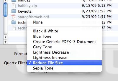
If the slides are image-heavy, then you can always load the PDF into Preview and then do a “Save As…” where you select the “Reduce File Size” Quartz filter.  That will indeed drastically shrink the file size — that 175MB PDF goes down to 13MB — but it can also make the slides look thoroughly awful.  That’s because the filter achieves its file size reduction by scaling all the images down by at least 50% and to no more than 512 pixels on a side, plus it uses aggressive JPEG compression.  So not only are the images infested with compression artifacts, they also tend to get that lovely up-scaling blur.  Bleah.

I Googled around a bit and found “Quality reduced file size in Mac OS X Preview” from early 2006.  There I discovered that anyone can create their own Quartz filters, which was the key I needed.  Thus armed with knowledge, I set about creating a filter that struck, in my estimation, a reasonable balance between image quality and file size reduction.  And I think I’ve found it.  That 175MB PDF gets taken down to 34MB with what I created.

If you’d like to experience this size reduction for yourself (and how’s that for an inversion of common spam tropes?) it’s pretty simple:

  1. Download and unzip Reduce File Size (75%).  Note that the “75%” relates to settings in the filter, not the amount of reduction you’ll get by using it.
  2. Drop the unzipped .qfilter file into ~/Library/Filters in Leopard/Snow Leopard or /Library/PDF Services in Lion.  (Apparently no ~ in Lion.)

Done.  The next time you need to reduce the size of a PDF, load it up in Preview, choose “Save As…”, and save it using the Quartz filter you just installed.

If you’re the hands-on type who’d rather set things up yourself, or you’re a paranoid type who doesn’t trust downloading zipped files from sites you don’t control (and I actually don’t blame you if you are), then you can manually create your own filter like so:

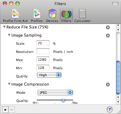
  1. Go to /Applications/Utilities and launch ColorSync Utility.
  2. Select the “Filters” icon in the application’s toolbar.
  3. Find the “Reduce File Size” filter and click on the little downward-arrow-in-gray-circle icon to the right.
  4. Choose “Duplicate Filter” in the menu.
  5. Use the twisty arrow to open the duplicated filter, then open each of “Image Sampling” and “Image Compression”.
  6. Under “Image Sampling”, set “Scale” to 75% and “Max” to 1280.
  7. Under “Image Compression”, move the arrow so it’s halfway between the rightmost marks.  You’ll have to eyeball it (unless you bust out xScope or a similar tool) but you should be able to get it fairly close to the halfway point.
  8. Rename the filter to whatever will help you remember its purpose.

As you can see from the values, the “75%” part of the filter’s name comes from the fact that two of the filter’s values are 75%.  In the original Reduce File Size filter, both are at 50%.  The maximum size of images in my version is also quite a bit bigger than the original’s — 1280 versus 512 — which means that the file size reductions won’t be the same as the original.

Of course, you now have the knowledge needed to fiddle with the filter to create your own optimal balance of quality and compression, whether you downloaded and installed the zip or set it up manually — either way, ColorSync Utility has what you need.  If anyone comes up with an even better combination of values, I’d love to hear about it in the comments.  In the meantime, share and enjoy!

Translations

Update 2 Aug 11: apparently there have been changes in Lion — here’s an Apple forum discussion of the problem.  There are two workarounds described in the thread: either to open and save files with ColorSync Utility itself, or to copy the filter to another folder in your Library (or install it there in the first place, above).

Update 27 Mar 12: edited the Lion install directory to remove an errant ~ .  Thanks to Brian Christiansen for catching the error!


Inspector Scrutiny

Published 14 years, 2 months past

It’s been said before that web inspectors — Firebug, Dragonfly, the inspectors in Safari and Chrome, and so forth — are not always entirely accurate.  A less charitable characterization is that they lie to us, but that’s not exactly right.  The real truth is that web inspectors repeat to us the lies they are told, which are the same lies we can be told to our faces if we ask directly.

Here’s how I know this to be so:

body {font-size: medium;}

Just that.  Apply it to a test page.  Inspect the body element in any web inspector you care to fire up.  Have it tell you the computed styles for the body element.  Assuming you haven’t changed your browser’s font sizing preferences, the reported value will be 16px.

You might say that that makes sense, since an unaltered browser equates medium with “16”.  But as we saw in “Fixed Monospace Sizing“, the 16px value is not what is inherited by child elements.  What is inherited is medium, but web inspectors will never show you that as a computed style.  You can see it in the list of declared styles, which so far as I can tell lists “specific values” (as per section 6.1 of CSS2.1).  When you look to see what’s actually applied to the element in the “Computed Styles” view, you are being misled.

We can’t totally blame the inspectors, because what they list as computed styles is what they are given by the browser.  The inspectors take what the browser returns and prettify it for us, and give us ways to easily alter those values on the fly, but in the end they’re just DOM inspectors.  They don’t have a special line into the browser’s internal data.  Everything they report comes straight from the same DOM that any of us can query.  If you invoke:

var obj = document.getElementsByTagName('body')[0];
alert(getComputedStyle(obj,null).getPropertyValue('font-size'));

…on a document being given the rule I mentioned above, you will get back 16px, not medium.

This fact of inspector life was also demonstrated in “Rounding Off“.  As we saw there, browsers whose inspectors report integer pixel values also return them when queried directly from the DOM.  This despite the fact that it can be conclusively shown that those same browsers are internally storing non-integer values.

Yes, it might be possible for an inspector to do its own analysis of properties like font-size by checking the element’s specified values (which it knows) and then crawling up the document tree to do the same to all of the element’s ancestors to try to figure out a more accurate computed style.  But what bothers me is that the browser reported computed values that simply aren’t accurate in the first place.  it seems to me that they’re really “actual values”, not “computed values”, again in the sense of CSS2.1:6.1.  This makes getComputedStyle() fairly misleading as a method name; it should really be getActualStyle().

No, I don’t expect the DOM or browsers to change this, which is why it’s all the more important for us to keep these facts in mind.  Web inspectors are very powerful, useful, and convenient DOM viewers and editors, essentially souped-up interfaces to what we could collect ourselves with JavaScript.  They are thus limited by what they can get the browser to report to them.  There are steps they might take to compensate for known limitations, but that requires them to second-guess both what the browser does now and what it might do in the future.

The point, if I may be so bold, is this:  never place all your trust in what a web inspector tells you.  There may be things it cannot tell you because it does not know them, and thus what it does tell you may on occasion mislead or confuse you.  Be wary of what you are told — because even though all of it is correct, not quite all of it is true, and those are always the lies that are easiest to believe.


Browse the Archive

Earlier Entries

Later Entries