In our continuing series of articles on the new selectors of CSS2, so far we've covered the universal, child, and adjacent-sibling selectors. In this article, we come to a mixed bag of pseudo-classes, each of which does something very different. Because of this mixture of new features, this article will be a little bit longer than the previous ones, but it's well worth the effort.
Odds are that you're already quite familiar with CSS pseudo-classes. :link and :visited are two examples of pseudo-classes, and they typify the syntax of a pseudo-class, which is a colon (:) followed by the actual identifier. These are typically hooked up to a document element, but can be combined with classes and IDs as well. For example:
A:link {color: maroon;}
A.external:link {color: green;}
*:visited {color: gray;}
The first of these rules sets any anchor hyperlink which points to an unvisited URL to be maroon. The second rule causes unvisited links with a class of external to be green, and the third sets any element which is a pointer to a visited URL to be colored gray.
Using the pseudo-classes we'll examine today, authors can:
The first one fits in well with the other hyperlink-related pseudo-classes, although in theory it isn't constrained to links.
Introduced by Internet Explorer 4 and made a part of CSS2, :hover sets the styles for any element which is being "hovered"-- that is, the mouse pointer is positioned over the element itself. The most common use for this pseudo-class is something like:
A:link {color: purple; background: white;}
A:visited {color: gray; background: white;}
A:hover {color: red; background: white;}
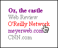
As you can see in Figure 1, the various links are styled appropriately. Notice the link which is red. It's red because the mouse pointer is currently hovering over the link, so if the mouse button is clicked, that link will be followed. This is, of course, very similar to the "image rollovers" so many sites employ. The advantage of :hover is that you don't need Javascript and a bunch of images to make it work.
Another advantage is a little more theoretical, but potentially very interesting. CSS2 makes it clear that :hover need not be constrained only to hyperlinks. It should be possible, for example, to use this rule:
P:hover {color: black; background: yellow; border: medium solid orange;}
Thus, any paragraph with the mouse pointer hovering over it would get a yellow background and an orange border. This may seem like useless and possibly annoying eye candy until you consider how useful it could be when making a presentation. Instead of using a laser pointer to highlight given paragraphs, the speaker need only move the mouse pointer until it's over the relevant paragraph, and voila, it's highlighted.
Of course, this is only possible if the user agent supports the application of :hover to elements other than hyperlinks. As of this writing, that describes some builds of Mozilla. The other browsers only support hover styles on hyperlinks.
Even with a browser that fully supports hover styles, one thing you may want to avoid is changing the weight or size of an element when it's being hovered. Consider the implications of this style:
P:hover {font-size: 300%;}
Now any hovered paragraph will have its text balloon to three times its normal size! But what will happen? Does the entire page get redrawn as a result, or will the text just get huge and overwrite other content? The CSS2 specification says flat out that it's up to user agents to decide, and also that user agents are not required to reflow the document. Thus, a browser might not change the document layout to accommodate the expanded text. Then again, it might.
If it did, then legalese could become much easier to read. Consider:
P.legal {font-size: 50%;}
P.legal:hover {font-size: 300%;}
That would make reading the fine print much easier on the eyes. You could also use :hover to make it clear which form elements are being hovered.
INPUT:hover, SELECT:hover, TEXTAREA:hover {background: purple;}
Once you've gone and done that, wouldn't it be cool if you could apply styles to the specific form element with which the user is currently interacting?
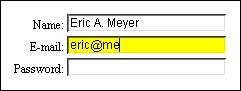
Thanks to :focus, you can complement the hover styles with focus styles. An element is said to have focus if it's the place where the user can input data in some way. One example is with forms: whichever input is currently available to accept keyboard input has the focus. Thus:
INPUT:focus {color: black; background: yellow;}
Wherever the user is typing, or is currently able to type, will have a yellow background with black text. This is demonstrated in Figure 2.
The same document-reflow issues which came up with :hover also apply to :focus. Consider the potential havoc caused by:
INPUT:focus {font-size: 250%;}
It's hard to say which would be worse: a user agent which did reflow the document in this circumstance, or one which didn't. Either way, since currently very few user agents support this sort of behavior anyway, we'll all have plenty of time to figure out good and bad ways to use :focus.
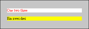
On a rather different note, CSS2 makes it possible to apply styles to elements, or even entire documents, based on the human language being used. Of course, the user agent isn't going to figre that out on its own. It will need a little help from the document itself, such as a value being given for the lang attribute in HTML. Let's assume a document of mixed English and German text, where each element has a lang attribute to indicate which laguage is in use. Thus:
<P lang="en">One two three</P>
<P lang="de">Ein zwei drei</P>
Now we decide that all English elements should be red text on a white background, and all German elements should be black text over a yellow background. The styles we need are:
*:lang(en) {color: red; background: white;}
*:lang(de) {color: black; background: yellow;}
This will yield the results in Figure 3.
It should also be possible to style entire documents based on their language, assuming that there is some indication of what that is. For example:
HTML:lang(en) {color: red; background: white;}
HTML:lang(de) {color: black; background: yellow;}
If the document's language is given-- through a lang attribute on the HTML element, or as an HTTP header, or even as a META element-- then it would be possible to construct rules to match them, as shown above.
Finally we come to a pseudo-class a little more in line with the selectors we've seen in the other articles in the series. With :first-child, you can apply styles to the first element contained within another. In order to understand this a little better, we need to return to the tree view of a document.
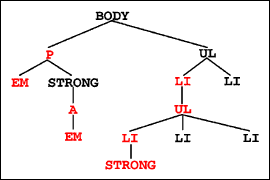
In Figure 4, we've marked the first children red so that they're more obvious. As you can see, any element which is the only child of another element is also the first child. If an element has multiple children, however, then only the first one is selected. (This probably comes as no surprise.)
So here's how it works. Let's say you want the first child of any element to be red, as in Figure 4. That would be written:
*:first-child {color: red;}
Simple enough, right? What we have to understand, though, is how this really works. *:first-child translates to "any element which is the first child of another element should be red." This is quite different than saying "the first child of any element is red," which is not what the :first-child pseudo-class does. Going back to Figure 4, let's say that we only want list items which are first children to be red. No problem. That's written:
LI:first-child {color: red;}
In other words, "any LI which is the first child of another element should be red." If we had written the selector as UL:first-child, then only the lower UL would have been selected, as it's the first (and only) child of an LI element. The higher UL is the second child of the BODY element, so it wouldn't be selected.
It's also important to realize how this pseudo-class operates in contextual selectors, and indeed in conjunction with any other selector. Let's say we want the first child of the BODY to be italicized. The correct way to select for it would be:
BODY > *:first-child {font-style: italic;}
The addition of the child selector (>) is what makes this work, as it yields the behavior "any element which is the first child of the BODY should be italicized." Assume that we left out the child selector, so that we had this:
BODY *:first-child {font-style: italic;}
In this case, what we have is "any element which is the first child of another element, and is the descendant of the BODY element, should be italicized." In other words, we could have just left out the BODY part of the selector, and the effect would be the same (assuming the document is valid HTML, of course.)
That's not to say that you can never use :first-child in a descendant selector. You might want to boldface the first list-item of any list contained with in any unordered list. Thus:
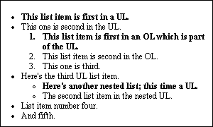
UL LI:first-child {font-weight: bolder;}
Now, any list item which is a first child, and which is some descendant of an unordered list, will be boldfaced. This is true even if the LI is a child of an ordered list, so long as one of its ancestors is a UL element. See Figure 5 for an example.
By combining the first-child pseudo-class with the adjacent-sibling selector, it's possible to pick children other than the first one. You might want to always style the third child of any element. That could be accomplished by writing:
*:first-child + * + * {color: green;}
It isn't necessarily the most common thing you'll ever try to do, but you never know. Just as an example, you might want to make the first list-item in a list boldfaced and red, the second boldfaced, and the third one gray. The styles would be:
LI:first-child {font-weight: bold; color: red;}
LI:first-child + LI {font-weight: bold;}
LI:first-child + LI + LI {color: gray;}
Again, it probably isn't something you've been waiting years to be able to accomplish, but now the capability is there for those who wish to use it.
No matter which of these pseudo-classes you find most interesting-- most people leap at the ability to use :hover, but :first-child is potentially much more useful-- the letdown is in browser support. A quick glance at the entries on the CSS2 Selectors Chart shows the lack of support for these features among legacy browsers, although among recent releases there are signs of hope. Not reflected on this chart is Mozilla, which generally does support all of the features covered in this article. Due to the unstable nature of Mozilla at this time, however, it's difficult to say that full support is there or not there (which is why it isn't on the chart).
For those who are planning ahead, the next (and last) installment in the series will actually be a three-part piece which covers attribute selectors, which in many ways are the most powerful addition to CSS selectors. The wide range they cover and depths to which they reach basically require a three-part article to fully explain them. You may also want to be on the lookout for an upcoming article which explains how to use CSS pseudo-elements and -classes most effectively, and how they've changed some from the old CSS1 rules. Until then, have fun experimenting with the things we've discussed so far!