complexspiral demo
The page you are viewing right now exists to show off what can be accomplished with pure CSS1 and a little teeny piece of CSS2 (specifically, the hover effects on hyperlinks). Remember: as you look this demo over, there is no Javascript here, nor are any PNGs being used, nor do I employ any proprietary extensions to CSS or any other language. It's all done using straight W3C-recommended markup and styling, all validated, plus a total of four (4) images. Unfortunately, not every browser supports all of CSS1, and only those browsers which fully and completely support CSS1 will get this right. Despite some claims to the contrary, IE6/Win's rendering of this page is not correct, as it (as well as some other browsers) doesn't correctly support background-attachment: fixed for any element other than the body. That makes it impossible to pull off the intended effect. Other browsers may or may not get the effect right.
Hands-on: Things to Examine
Before you start, make sure you're viewing this page in one of the browsers mentioned above. Otherwise the descriptions to follow won't match what you see.
The first, easiest thing to do is scroll the page vertically. Notice how the hyperlinks on the left side of the page slide over the background seamlessly, as does the main content area (this blue-backed box right here). The visual effect should be that the hyperlinks and the main content area have translucent backgrounds, but opaque foregrounds. They don't, in fact, but that's what it should look like.
Try changing the text size and notice how the compositing effect remains consistent. Then make your browser window really narrow and scroll horizontally. Again, everything should remain seamless and consistent. Try hovering over the left-hand links and you should see the background change. Scroll the page so it's not at its default, change the size of the text, and hover again. The "compositing" is still seamless as ever.
No, I'm not using one or more semi-transparent PNGs for the link and content backgrounds, nor am I employing a half-screen GIF trick. The entire page is driven by one HTML document containing an embedded stylesheet and no Javascript, one external CSS file, and four JPG images.
What the Sam Scratch is goin' on here?!?
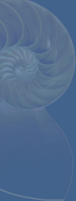
Glad you asked. The effect demonstrated here is achieved by using fixed background images, nothing more. For example, the main-content area (the blue part here) uses the following styles for the default spiral-shell background:
div#content {background: #468 url(shell-blue.jpg) 0 0 no-repeat fixed;}
The above is equivalent to these styles:
div#content {
   background-color: #468;
   background-image: url(shell-blue.jpg);
   background-position: 0 0;
   background-repeat: no-repeat;
   background-attachment: fixed;
   }
The effect of these longer rules is exactly the same; they're just split out into individual background properties for more detailed consideration by you, gentle reader.
First, check out the blue-shell image found here: url(shell-blue.jpg). Then come back to this page and I'll continue with the explanation. All done? Great.
According to CSS, any background image that is "fixed" using background-attachment: fixed; is fixed with respect to the viewport-- not the element with which the image is associated. So I set the blue-shell background image to be aligned with the top left corner of the browser window (the viewport) with the values given for background-position. However, the image will only be visible wherever is intersects with the element to which it's been assigned. Therefore, even though the top left corner of the blue-shell image is aligned with the top left corner of the viewport, we can only see it wherever it intersects with a div that has an id with a value of content (which, again, happens to be the one containing this text).
So I set a fixed background for the BODY, the content DIV, and the hyperlinks in both their normal and hovered states. (I also turned the hyperlinks into block-level elements, thus avoiding the need for tables or other cumbersome markup tricks.) In any given case of an element's display, we see whatever part of the associated background image intersects with the element. The rest of the background image remains hidden.
And that's how it works.
Alternate fun
I've associated four additional backgrounds with this page, all of them LINKed in as alternate stylesheets. In Netscape 6.x, you can pick them by going to the menu "View" and opening the submenu "Use Stylesheet." In IE5/Mac, you can pick alternate stylesheets using the "Choose stylesheet" favelet made available at favelets.com. Either way, picking a stylesheet will cause the browser to switch to using one of the following stylesheets. Here are links to those stylesheets, so you can see for yourself how similar (and simple!) they are:
If you're using a browser that supports alternate stylesheets, use its picking mechanism to switch to any one of the stylesheets you like and do the same scrolling tests as before. The compositing will remain seamless. While you're at it, feel free to dig around in this directory and look at the images used for each stylesheet. I guarantee you that everything used in the display of the "themes" presented here is contained in this directory.
I'm not seeing any seamless compositing!
Then I'm willing to bet that you're using Internet Explorer for Windows (any version), or possibly Opera (version 6 or earlier). Neither of these browsers properly support background-attachment: fixed for elements other than body. In the case of both, images are fixed with respect to the elements that contain them, not the browser window, which is not what CSS1 defines background-attachment: fixed to mean, although browsers are allowed to ignore fixed if they stick to CSS1 (CSS2 requires its implementation for conformance). And yes, this page uses a strict DOCTYPE, so IE6 is in "strict mode." I guess when Microsoft claims 100% CSS1 compliance, they're referring to the CSS1 core (a reduced subset of CSS1) instead of the entirety of the CSS1 specification. It tends to make me wonder how limited or flawed their "full support" is for other key open specifications, like HTML and DOM.
The pros and cons
Right off the bat, there's the fact that I've demonstrated something here that no sliced-image tool can provide for you. The compositing effects that background-attachment: fixed makes possible are without equal in the WYSIWYG world. Furthermore, if you look in the source you'll see that my left-side hyperlinks are all text, which would make rearranging or rewriting them a snap. It also lets them adapt to the user's display preferences with a minimum of fuss.
While I used pixel widths to position my elements here, I could have used ems or any other measure. I just used pixels because I felt like it. I also used positioned elements instead of a table just for kicks, but I could have used a table just as easily. The result would have been the same, at least in CSS1-conformant browsers. The key here is the incredible flexibility of layout you can have, and lining up the backgrounds isn't necessary because the browser does it for you. No more re-slicing your images, or having to edit cumbersome graphic files!
In addition, creating new styles for the visited and active states of the hyperlinks requires nothing more than two new background images and a couple of lines of CSS. That's it! With a sufficently optimized (or small) background image, you could get each effect while only adding a few kilobytes to your page weight, which might seem like a lot but almost certainly will be less than the overhead incurred with multiple sliced images and the HTTP requests needed to load them in a traditional sliced-image site-- and again I say it: in such sites, you can't have the seamless compositing effect shown here.
The drawback, of course, is (as ever) flawed browsers.
Image credits
- Nautilus shell: scanned by and copyright Eric A. Meyer
- Space shuttle: NASA
- Big Ben: unknown; downloaded from Usenet
- Lightning: unknown; downloaded from Usenet
- Flower: unknown; downloaded from Usenet