A response to Jen Simmons’ challenge to recreate a 1990s-era page using CSS Grid. I decided to tackle it two ways, with different priorities in each attempt.
Presented in Classic Mozillavision™! This was a single image with an imagemap applied, followed by a bunch of spacer-GIFfed links to the same things in case images failed to load.
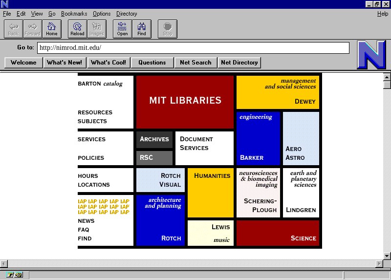
PLEASE NOTE: the CSS used to drive the following examples is still a right mess. It works in supporting browsers, but hasn’t been refactored into anything vaguely rational. If you view it, you’ll see the end result of a lot of free-form experimentation and double-backs, from when I played with various approaches. Basically, it’s stream-of-consciousness CSS, with all that that implies. The point of this being: DO NOT assume that all Grid styles have to be this disorganized and confusing. I’ll clean them up, but in the meantime, don’t take these as exemplars of good Grid CSS. Thanks!
This version is literally a collection of hyperlinks in a section, and no more. No list markup, no subdivision, no section headings. This means the links themselves become grid items, and are placed directly on the single grid (applied to the section element). The advantage is that tracks (in this case, the rows) can be sized according to the contents within the various links, using min-content. Content inside the links is arranged with flexbox, though tiny grids would also have worked.
This version uses structured, semantic HTML. There are a couple of heading elements, a nav section, and an unordered list. This means a single grid is not enough. There’s one grid for the containing section, one for the nav, and one for the ul. The latter two are grid items of the section grid, and have their own grids that mimic the outer grid. All the rows are of fixed height, since track sizes can’t be shared from one grid to another, making this a more fragile implementation since changes in content could cause overflow and overlap. Subgrids would have been super useful here.