Styling Inside the Box
Web Review
January 1998
CSS box properties -- once they're fully supported by the major browsers -- will enable Web developers to position text and images without the use of tables. This month, we'll take a look at some of the CSS box properties to show their potential advantages. We'll start out with an explanation of the difference between margins and padding, and toward the end of the article, we'll explain how to float elements to create some interesting effects.
|
Note: |
||
|
Box properties are used to control the appearance of an element's "box" -- thus the name. A "box" is the area of space an element occupies when displayed by the browser. For example, if you were to draw four lines to form a square around this paragraph, that would be the box for this paragraph.
Because there are a lot of box properties, we won't get to all of them in this article. Instead, we'll hit two major groups of properties. (The table at right lists all of the box properties defined in the CSS1 specification.) It's important to remember that box properties are one of the areas of the CSS specification that aren't fully supported by the major browsers. To see which properties are supported, I'd recommend you peruse the CSS Compatibility Charts.
A basic example (Figure 1) shows a diagram of the various components of an element's box. The olive-colored area is the Content Box, so named because it's the box containing the text. Beyond this box is Padding, then the Border, and finally the Margin of the box. Added together, these areas make up the element's box, and there are properties that can address just about every part of the box. Note that the line around the outer edge of the margins is included here for illustrative purposes; there are no properties for setting visible lines at that point. Also, as we'll see in a moment, the padding should really be a different color, but I left it gray for clarity's sake.
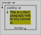
Figure 1: Learning the placement of margins, padding and borders can
help to understand CSS1 box properties.
Padding and Margins
At the outer edge of the element box, outside of the borders, are the margins. These are areas of blank space found around the box through which the background is visible. For example, if you have a paragraph with a white background, and your page's background is blue, the margins will be blue.
Inside the margins, between the borders and the element's content, is the padding. The difference between padding and margins (besides where they sit in relation to the borders) is while margins do not take on the element's background, the padding does. Thus, if you have a paragraph with a white background, and your page's background is blue, the padding will be white. The difference can be seen in Figure 2.
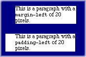
Figure 2: This image reflects the difference between the
margin-left and padding-left box properties
(see the code below).
<P style="margin-left: 20px;">

This is a paragraph with a

 <CODE>margin-left</CODE> of 20 pixels.

</P>
<P style="padding-left: 20px;">

This is a paragraph with a

 <CODE>padding-left</CODE> of 20 pixels.

</P>
The padding and margins can be defined using the properties
padding and margin, as well as the
side-specific properties listed in the CSS1 Box
Properties list above. With the shorthand properties, however,
you can set all four sides at once, which is a real timesaver.
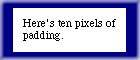
Figure 3: This paragraph has the padding set to 10 pixels (see the
code below).
<P style="padding: 10px;">
Here's ten pixels of padding.</P>
| Making Padding Behave |
|---|
|
Although you can get the padding effects shown in this article using
either Navigator 4 or Explorer 4, you'll need to employ a workaround in
order to make sure that Navigator gets things right when using a
background color. Anywhere padding is used with a
background color, add the following declaration: |
The easiest case is assuming that you want the same value all the way
around. For example, let's say you want a paragraph with a white
background and 10 pixels of padding on all sides. This would require the
declarations background: white; padding: 10px;, and get you
the result in Figure 3 (Netscape users, see the sidebar Making Padding Behave).
However, suppose we want different amounts of padding on each side: 10
pixels on top, but only 3 on the bottom, 20 on the left, and none on the
right. In that case, you can string the values together, but you must do
so in a specific "clockwise" order: top, right, bottom, left. Thus, the
above values would be declared as padding: 10px 0px 3px
20px;. You must write the values in this order, or else
you'll have values assigned to sides you don't want.
There are a few shortcuts in this approach, thankfully enough. Let's say
we want 10 pixels of padding on the sides, but 30 pixels of padding
on the top and bottom. In that case, you might think you'd have to write
padding: 30px 10px 30px 10px;. You can do things that way,
but if you want to keep things simple, then the padding
declaration can be changed to padding: 30px 10px;, which
gives you the results seen in Figure 4.

Figure 4: By alternating the padding width, you can
create different sized borders around text and objects.
<P style="padding: 30px 10px;">
Here's some uneven but symmetrical padding.
</P>
How does this work? The declaration padding: 30px 10px;
means, literally, top=30px and right=30px. The
browser then looks for the bottom padding value, which should be next in
the string. However, when it doesn't find a value for the bottom
padding, the browser uses the value for the top padding. The same goes
for the left padding. When the browser doesn't find a left padding
value, it uses the right padding value. Similarly, if you use three
values, then the first and third are used to set the top and bottom
padding, respectively, and the second is used to set both right and left
padding, like this: padding: 10px 20px 5px;.
The same rules apply when using the margin property. The
only difference, as we discussed earlier, is that margins don't inherit
the element's background; they merely add empty space around the
element. Also, if you only want to set the padding or margin for a
single side, leaving the others to their defaults, then you can use one
of the properties designed for this purpose, such as
padding-top or margin-left.
Making float Behave |
|---|
|
Here we go again...this time, though, IE 4 is the one we have to coddle.
In order to get |
Floating Along
Floating is pretty simple to grasp, assuming you're familiar with HTML v3.2 or later. As you're no doubt aware, it's possible to make images stick to either the left or right side of a page, with text (and other elements) flowing past it. This is how you would code the HTML to float an image to the left:
<IMG SRC="one.gif" ALIGN="left" VSPACE="8"
HSPACE="5">
When you do this to an image, you're floating it, and adding padding
around the image using the VSPACE and HSPACE
attributes.
Well, thanks to CSS1, you can float anything using, of course, the
float property. In order to float an image to the left, you
could write the following image tag:
<IMG SRC="one.gif" STYLE="float: left;">
Or simply declare at the top of the document that all images (perhaps those of a given class) are floated.
As I said, however, we can (in theory) float anything: headings, tables, even whole paragraphs. Think of it -- actual sidebars which aren't dependent on tables, but are instead paragraphs which have been floated to the side and given a different color! It would be a wonderful thing.
And again, I say "would be" because browsers aren't very good about
handling floated text just yet. Navigator does the best job, though it
is a tad buggy, and Explorer can be coaxed into floating some text (see
the sidebar Making float Behave). Figure
5 shows a good example of floating a paragraph.
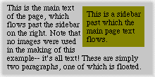
Figure 5: Here we've used the CSS class .fig5 to
float the paragraph with the olive background color.
This is the code used to get the above effect:
<STYLE type="text/css">
.fig5 {color: black;
       background: olive;
       float: right;
       width: 8em;
       padding: 5px;}
</STYLE>

<P class="fig5">
This is a sidebar past which...</P>

<P>This is the main text of the page...</P>
Another way to use float and the other box properties in
interesting ways is with drop-caps. In order to get a drop-cap effect,
the use of float is pretty much mandatory. Here's an
example, using the <SPAN> workaround we discussed
last month:
<STYLE type="text/css">
.dropcap {float: left;
          font-size: 24pt;
          background: black;
          color: silver;
          padding: 5px 1px;}
</STYLE>

<P>
<SPAN class="dropcap">T</SPAN>his paragraph
starts ...</P>
Assuming that the page's background is also silver, then the drop-cap should look like a black box with the shape of an uppercase "T" punched out of it.
Closing the Box
I realize there is a lot more to be covered, but I'm running out of space, and besides, properly explaining box properties could be one or two whole chapters of a book. Hopefully, this month's installment has piqued your interest in box properties enough to want to experiment with them a bit.
Next month, be here for a special issue on CSS2, including some in-depth examinations of what's new and what's changed compared to CSS1, a how-to on CSS positioning and how it may someday make your life a lot easier, and a look at the efforts of some experts to make authoring style sheets a heck of a lot easier for us.