In case you were wondering...
There seems to be a touch of confusion over how the demonstrations here in css/edge are intended to look. Therefore, I've created this gallery of screenshots showing the demos as they are supposed to be rendered by browsers. You can use these screenshots to check the performance of the browser you're using. Please note, however, that the text size may well vary from what you see in your browser. In most cases, I didn't set a text size, so whatever you see will be your default text size, or something based on it. The point is that the overall layout be basically the same. There are comments below each screenshot to point out the important bits. Selecting any of the screenshots will take you to the demo in question.
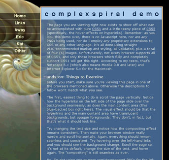
Notice how it appears that there's only one image in the background, viewed through various translucent backgrounds. You should not see the entire shell image in the background of the main text. You should not see the same image in the background of each link on the left side of the page. What you see above is the correct rendering.
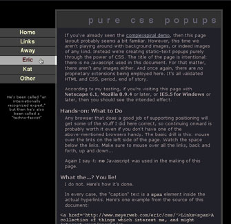
See the little paragraph below the links on the left side? A different piece of text should pop up as you mouse over each of those links, and disappear when you mouse out.
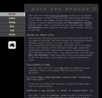
This is just like the one above, except this time images should appear and disappear as you mouse over the left-hand links.
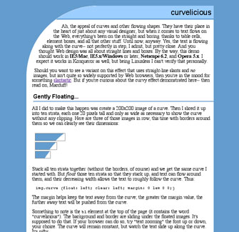
Notice the curve in the upper left corner, and how the text flows along it. That's pretty much the whole point of the demo.
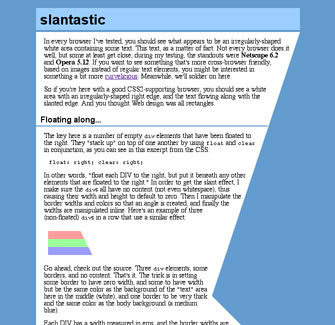
In this one, you can see that the text is flowing along with the big slant along the right side of the page, filling in as much of the white area as it can. Anything else, including a "shattered" slant (big white bars appearing within it) would be considered incorrect. The text might have a different size or line-breaking, but if it doesn't flow along the slant then there's a problem.
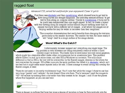
In a variation on curvelicious (see above), the text in the document flows around an irregular outline-- here, an image of a jolly chef. Any image you can slice up into layers could be adapted to create a similar effect on the left or right side of the document.
And, finally, the main page of the site. There should be one background image that appears in the light-blue areas, and not at all in the dark blue background. (I could have put an image back there too, but decided against it.) The background image should also be visible behind the "demos" links if you make the browser window small enough, which I didn't do when producing this image. If you resize the window, the image should stay centered within the browser window.