Formal Weirdness
Published 19 years, 2 months pastAs I described and tweaked my version of reset styling, a fair number of people asked (with varying degrees of politeness) why I didn’t just use a universal selector instead of that big ugly grouped selector. I said that I wanted to avoid styling form controls (inputs, textareas, and so on), and the only way to do that, given the state of selector support in today’s browsers, is to list all the elements I want to reset while leaving out those I don’t want to touch—like all the form controls.
This led to a fair number of questions as to why I’d bother avoiding form controls, and I said it was due to their “inherent weirdness”. By this, I meant that form controls are impossible to describe with current CSS; and if they were treated the way CSS says they should be, we’d all hate the results. Furthermore, the handling of form control styling is going to be a very unstable branch of our field for the foreseeable future.
Herein, I scratch the surface of this entire mess. Fair warning up front: this is going to be a long one. Also, as Bette Davis once proclaimed, buckle your seat belts: it’s going to be a bumpy ride.
Let’s start with a (seemingly) simple form element: a checkbox. Here are two in Firefox, one checked and one unchecked.

All right, now here’s a question: what should happen if I assign these checkboxes padding: 10px;? Take a moment and think through the details.
“That’s an easy one,” you may say. “There’s 10 pixels of padding between the checkmark and the borders of the box.” And maybe you’re right. But let’s consider the same question for these checkboxes from Safari.

Notice how the checkmark hangs jauntily out of the box? If we add padding, does the checkmark become contained within the box—in other words, does the checkmark stay the same size while the box visually expands—or does it stretch in size so that it’s still sticking out of the box? You don’t even have to think about what to do with the drop shadow or the glassy beveled highlight effect; just worry about what to do with the checkmark. Again, take a few moments to think through all the implications.
All right, you should have an answer by now. Bully! The sad truth is that no matter what you’ve decided, you’re wrong. Okay, I admit that’s unnecessarily harsh: more properly, you aren’t right. You can’t be, because there are no defined answers to these questions.
Thus, if a browser lets you style a form element, it’s doing so blindly, from a specification-compliance point of view. The people who wrote that browser code were guessing. No doubt they were intelligent guesses, but they’re guesses all the same.
So why not just define the answers? That turns out to be a good deal trickier than we might hope. Take checkboxes (please!). They’re replaced elements, right? You have an input element that ends up placing a symbol, in much the same way an img element places an image file. The symbol changes based on whether the checkbox has been checked or not, something like a JavaScript-driven image-swap. The appearance of the checkbox isn’t defined in any way, so browsers are free to do whatever they want, as we saw above.
That means that the “interior” of this kind of input element—the checkbox (filled or not)—is a black box from a CSS point of view. There’s nothing in the document structure or content that represents the actual checkmark, for example. You can’t in good conscience define the checkmark as content and the checkbox as the element that surrounds it. So should padding apply at all? Maybe.
But if it does, and the checkbox is a replaced element, then defining a background color and padding for the checkbox would put the defined background color around the symbol—the whole symbol, checkmark and checkbox and all—instead of inside the checkbox. That’s a completely reasonable conclusion given the assumption that the checkbox symbol is replaced. It’s just completely unreasonable if you’re a visual type and you want that checkbox to be filled in with red, for the love of Bob!
So: is a checkbox a combination of an element box surrounding content, or a completely replaced element? Which padding-and-background effect should take hold?

Just to muddy the waters a bit further, consider the following:
- What happens to the checkmark when the input is italicized, either directly or by inheritance? How about when it’s boldfaced? (Assume the checkmark comes from a font family that has italic and boldfaced versions of the checkmark available.) What, if anything, should happen to the checkbox under either condition?
- If
text-decoration: underlineis applied to the checkbox, should the whole box be underlined, or just the checkmark? Does your answer change when you consider the effects of padding? - Should
vertical-alignapply to the checkmark, or to the checkbox as a whole in relation to the line of text in which it sits? - What effect should
line-heighthave on the checkbox and its contents? For example, what should happen if you sayinput[type="checkbox"] {line-height: 3em;}? Don’t forget that the most common way for an element to experience altered line height is by inheritance. - Should
heightandwidthbe honored on a checkbox? If so, should they apply to the whole box, or to the “content” (the checkmark)? If the former, what should happen to the checkmark as a result–should it stay the same size and be aligned in some way, or should its size scale along with the checkbox?
In my experience, the most common answers to these questions tend to be contradictory—some implying a box-and-content model, others implying a replaced model. I mean, just look at the poser buried in the middle of that last point. What does width even mean when it comes to a form control? Is it just the content, like with non-replaced elements; or is it the whole element box, borders and all, like in replaced elements?
As far as the latest draft of CSS 2.1 is concerned, all inputs (really, all form controls) are replaced, the same as images. So no background inside the checkbox; no change due to italics or boldfacing or line heights; vertical-align shifting the box as a whole; and height and width applying to the entire box.
You might feel that’s acceptable, overall, but remember that I said CSS 2.1 regards all form controls as replaced. So all that would be just as true for text inputs and textareas as it is for checkboxes. That’s probably not acceptable to most people. For example, that would mean that vertical-align: baseline would put a text input’s bottom edge on the baseline of the text that surrounds it, instead of aligning the text inside the input with the text around it. Almost everyone prefers the second to the first, and most browsers conform to that preference, but that’s not what should happen. In fact, when it comes to form controls, nearly all known browsers ignore the specification’s assertion that form controls are replaced elements.
And we haven’t even touched the hard cases, like select boxes. Here’s one from Firefox in the “closed” and “open” states.

Let’s jump straight to the obvious puzzler: what should happen if you declare select {padding: 10px;}? Here are three different possibilities for just the closed select.

Go ahead, pick your favorite. Got it? Now, should the same thing happen when the select is “open”, showing all the options? For that matter, should the same thing happen given this select box from Safari?

It does no good to say that your choice would be just fine if Safari would only just go along with everyone else. There is no pre-defined appearance for select boxes, or for any other form control. In Safari’s case, it’s pulling these things right out of OS X and placing them in the document—the very definition of replaced-element behavior. (And yet, browsers keep treating them as if they’re non-replaced.) Explorer does the same thing, actually, and is the reason why form controls seemed to have infinite z-index in IE6 and earlier—they were drawn by the OS after everything else on the document had been laid out. Firefox, on the other hand, draws its own form controls, which is why they’re more consistent across operating systems, but also don’t suffer from draw-order issues like Explorer did. (It’s also part of the reason Firefox takes longer to launch on many systems; rather than making use of the OS for things like form controls, it has to carry its own around with it.)
We could get into a very long discussion about whether form elements should always reflect the operating system or not, which usually breaks down to HCI advocates on one side of the debate and designers on the other. Let’s not, though (at least not here). Let’s just assume that form controls should be styleable, because that brings us right back to the central dilemma: how, exactly?
After all, we can make the previous select box riddle even more interesting. Suppose you declare this:
select {padding: 10px;}
option {padding: 10px;}
Now what? After all, there’s an option element visible there in the select box from the moment it’s drawn—or is it? Maybe that’s a special feature of a select element that copies content from an option element to display when no option elements are visible. We don’t know. But let’s assume that what we see there is an option element visible inside the select element. It’ll be either the first one in the list, or the one with a proper selected attribute. Hey, what about this rule set?
select {padding: 10px;}
option {padding: 10px; border-bottom: 1px solid gray;}
option[selected] {font-style: italic; background: yellow;}
Yee haw! There are a ton of questions I could pose here, but I’ll go with one of the trickier ones: should the gray option bottom border be visible inside the select box when the select is “closed”, or should it only appear on option elements when the select is “open”? Oh, and here’s another good one: does the padding on the select element apply to the drop-down menu made up of option elements, or no?
The beauty is that whichever answers are perfectly obvious to you, it’s perfectly obvious to someone else that your answers are completely wrong. And vice versa.
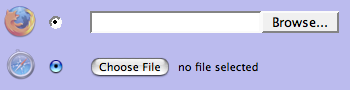
And remember, these are some of the simpler cases. When you start considering things like how to style radio buttons and file inputs, things get really hairy. I mean, just look at the differences between Safari and Firefox.
Merely sticking to questions of padding and background colors is vexing enough. Start throwing in text/font styling, borders, and even foreground colors; they quickly generate a cornucopia of complex control condundra. The pain!
And don’t think the entire issue of styling form controls is going to get any easier; in fact, the Safari team is about to make it a good deal harder. If you read their post “Text Fields“, you’ll see that Safari will soon make it possible to do all kinds of stuff to text inputs. (If you’re downloading nightly builds of Safari, it already allows these.) Of the nine example images, only two have any hope of being described using current CSS—and even those have to dodge questions like exactly how a text input should be baseline-aligned (as mentioned earlier).
So in order to style form controls in any sort of meaningful way, it will be necessary to invent a whole bunch of new properties and pseudo-classes (and most likely pseudo-elements) and describe how they behave and interact. That’s much more easily said than done. It’s taken more than five years to not finish CSS 2.1, and that’s just a reduced and clarified version of CSS 2. Just imagine how much longer it could take to not finish inventing a whole new branch of CSS.
Not that anyone’s really working on it right now. The closest we have is the Basic User Interface Module, which became a Candidate Recommendation on 11 May 2004 (yes, three years ago) and has not moved since. There is no other form controls module. There are things that could apply in a variety of other modules (like “The box model“, “Generated and replaced elements“, and “line“), but none of them are explicitly about form controls and so their relevance is at best debatable.
In that vacuum, browsers are acting to different degrees. As we saw earlier, Safari is pushing forward in a major way. Explorer allows some form control styling, but not much. Firefox allows a little more—but not all that long ago, it ignored all attempts to style form controls. Opera blocks attempts at form styling, the last I checked.
Because there are no agreed answers, and each browser is making its own guesses, there are inevitably going to be conflicts. If one out of five browsers uses (for example) padding to set the separation between the content and borders of text inputs, then * {padding: 0;} is going to make them seriously scrunchy, while the other four will completely ignore it. I might then declare input[type="text"] {padding: 2px;}, but what happens when one of the other four starts applying styles to form controls, but treats padding on text inputs differently, adding padding to the default form control layout because it treats the whole interior of the input, instead of just the text, as the content?
As veterans of meyerweb have already guessed, this is not a post with answers. Like many of my longer entries, it poses only questions and (I hope) provokes thought. What I hope it also does is explain my aversion to applying CSS to form controls, and thus why I constructed a great big grouped selector for my reset style sheet instead of using the universal selector. I understand why so many people want to go the universal route: it’s a lot simpler to type and uses a lot fewer characters. I’m usually one for saving characters, but this is one case where I think extra characters are more than worth the possible cost.
Comments (81)
After reading your post, I’m less suprised that form controls have styling problems, and much, much more suprised that any element can be styled at all!
It’s like computers – most people are surprised when they crash; tech-heads are surprised when they don’t.
Great post
Anthony, you should see what the process of laying out a line of ordinary text involves. When I did that, I was surprised that pages ever get laid out at all!
I love posts like this. I work with forms a lot, and styling the inputs themselves is obviously one of the most frustrating aspects. Especially the file inputs…bah!
Eric – what are your thoughts about using button instead of input:submit as far as styling goes? There have been a couple of posts around recently that suggest they are the best thing since buttered bread…would you consider the way modern browsers deal with buttons to be an ideal way to style inputs in general (ie give all style options to css instead of browsers)?
what about giving css the option to replace inputs like checkboxes and radio inputs with images instead of browsers automatically using their own replacements?
Styling form controls is a headache.
Pingback ::
input [type=checkbox] - borderless ? wie geht? - XHTMLforum
[…] Formal Weirdness f�hrt den Gedankengang weiter aus, warum ein * {padding:0} zu Problemen f�hren kann. __________________ Ingo Chao […]
It’s a great great post.
Even being into Web Development field for two years, I never knew that form controls behave so differently. As soon as I read your post, I tried the same through my favourite code editor Dreamweaver!
I found different results (in WIN XP SP2) for different browsers IE 6.0, Firefox 2.0, Opera 9.10 and Flock 0.7.13.1 versions.
I tried defining a style as:
style="padding: 20px; border:4px solid #000; background:#CCCCFF;"
In Firefox & Flock, no results were shown. IE displayed the border and Opera took every parameter but the result was boo! It was far from a checkbox view.
Thanks a lot for this nice post. It gave me a zeal to learn more…
P.S. Sorry, if my English bothered you :)
I’m scared now! :-O
Make it all go away Eric! |-(
I think I’m too frightened to code now!
;-)
Thanks for the great heads up!
Styling form controls has always been a bugbear of mine, I’ve never understood why they don’t just apply CSS the same as every other damned element. And now I know, I can see why it’s such a headache, so thanks for explaining it.
I think part of the problem is actually the lack of specification for them. I think that handing them over to the OS to handle means there is never a chance of consistency, it was always going to be an area to cause problems. I also think that form controls should not be OS elements anyway – they’re part of a web-page UI, not an OS UI.
I’d love for a specification to be drawn up to properly control form elements such as these using CSS. Perhaps CSS3 needs a new module…
A very interesting and insightful article, Eric. Thanks!
BTW, whether or not Opera blocks form styling is up to the user. Opera 9 has an option setting, ‘Enable styling of forms’. With form styling enabled, it allows a bit of styling of form controls.
Given there are, and are unlikely to be any standards for how UI controls should look and behave, and given that form elements should look and behave in a way consistent with the user’s experience of the same/similar UI controls in their host OS (not that they always do of course), then treating such things as “black box content” is really the only thing that currently makes sense.
This doesn’t preclude some types of styling of course, but without any specifics as to what should and shouldn’t be allowed and when allowed specifics of the effects, then attempting to style such things is probably best avoided even with the proverbial 10′ barge pole in hand.
And all this isn’t to say that it couldn’t or shouldn’t be done, just that until it is then avoiding styles on form elements as your reset styling does is best practice for now.
Interesting questions, although for us web designers they’re more theoretical. I mean, a lot of the questions you pose are actually implemented (or not) by browsers; and for us it’s a matter of trial and error, and using resources such as styling form controls with CSS. It would certainly help a lot if this would be standardized or even rationalized, but how long will it take until we’re able to reap the benefits of that?
Great, thorough exploration of the problem of styling forms.
It’s easy to see why applying CSS to form controls has remained a black art to me. Other than the text input fields, it just can’t be reliably done.
Thanks for detailing why!
Cool post Eric. I was already wearing the reset.css T so I didn’t need convincing, but it’s good to see such weight and rational thought behind my clothing decision.
Tables also run into this. A basic table using THEAD, TBODY, TFOOT set to a max-height for TBODY and overflow: auto (to get scrolling while keeping the header and footer around): Is the scrollbar part of the content of TBODY? Does it go into padding or margin? If it’s TBODY content, does that make the scrollbar part of TD content, or is TBODY (and therefore TABLE) now wider than all the TDs in a single TR, or does the scrollbar just overlay on top (or bottom) of TD content to keep sum(TDwidth)=TBODYwidth?
This attachment from Mozilla’s bugzilla demonstrates part of the problem after a partial fix in gecko (before, content was obscured by the vertical scrollbar). I don’t know how other browsers deal with it.
Great article Eric. I’ve always used the universal selector and then gone back in and added some form control styling to clean up the mess caused on the form controls by the universal selector. As you point out, it’s never perfect across all browsers though and this article is definitely going to make me rethink that approach.
Top notch post, Eric. Thank you very much.
Matt:
Yeah, but then it might be possible to style complex controls in a way that normal user expectations for how to interact with a control no longer hold. Also, what do you do about users who need assistive technologies?
HCI vs. designers, see? I lean towards the HCI side of the argument (and I”m a web developer, not a designer), but not by a whole lot – I can see the design-side argument too.
It actually seems to me that this is an area where there are no right universal answers.
Maybe it would be better to say that the only thing that can be universally controlled is the margins around any form element and the width and height only for form elements that display textual content, and then encourage each browser vendor to define their own styling mechanisms. Designers who insist that styling forms is necessary would then be expected to do so separately for each platform they target.
Matt, I think this is due to the fact mentioned by Eric in the post: the rendering speed. Drawing browser’s own form elements, such as select lists or checkboxes, need to take some of your processor’s time.
If we agree with Eric that styling of the forms elements should be taken with a great caution, I think that drawing inputs taken from OS is a reasonable solution.
Looks like form controls is an area wherein keeping it simple and stupid has merit. If a project’s design is so critical that it depends upon absolute control and exact design, HTML/XHTML may not be the best delivery method.
Meyer– I did notice your comment regarding “with varying degrees of politeness”. Referring to anyone by their “Christian” name is, frankly in my culture, condescending familiarity and disrespectful. Surname reference indicates a level field and respect. Take it as such, please.
Thank you.
Nice story. And my I add, you almost certainly only scratched the surface of the issues involved :-).
One thing I want to add. You mention a few times that form controls are replaced elements. Their behavior is actually more akin to elements with
display: inline-block. WebKit (and Opera, I think) explicitly defines them as such. Gecko uses an internal alias to it.Not that it makes anything easier, mind.
Perhaps, Phillippe, but whether an element is
inlineorinline-block(or whatever) has nothing to do with its being replaced or not. And I think most form controls are obviously replaced.Thank you for bringing these questions to the forefront. The sooner they are asked by those who matter, the sooner they can be answered. You are one the industry commonly looks to for insight on these topics. I, for one, feel much better that you have spoken up. Your words tend to speak louder than the collective voices of those of us in the trenches.
My preference is on consistency’s side.
Regarding Dan’s comment on buttons vs. traditional submit:
I was reading an article on Particletree yesterday concerning this matter (perhaps one of the articles to which Dan refers).
I liked the article, and am intrigued by the technique, but applying some of Eric’s logic found here, problems (inevitably) pop up. For example, what about file inputs? For those, you’re going to be stuck with the browser button default no matter what, and I would quickly ask myself if I really want to introduce two different styles of buttons in my application. I think the inconsistency, while arguably trivial, would not sit well with me. (Granted, a “typical” site may avoid file inputs altogether, but many of the ones I create do indeed include them.)
It just feels like anything we do with form elements will invariably be half-baked (even buttons).
Form controls have so much style and problems,I leave they normal.
Hi Eric,
Thanks for your thoughtful insights. Please Eric, make it go away! :-)
At WebVisions 2007 in Portland, OR Aaron Gustafson gave a very helpful workshop he called Learning to Love Forms. That’s a link to his slides from the workshop.
He discussed the pros & cons of using the button vs. submit starting on slide 17. Lot’s to chew on!
Blessings,
Rich
I was just handed a photoshop mockup layout from my Marketing department that included several form elements (text+submit+radio) in the masthead — inherent to the deisgn. I’m-a thinkin’ to go back to the dept for some revisions… somehow I think it’s a lost cause for now…
Oh my – as always Eric, a great post with at least one instantly memorizable quote:
Excellent :-)
On the topic of using the OS for rendering form controls, I’d say that it’s always nice to instantly know how to use a control, instead of having to do the “mouse dance” that so many Flash sites makes you do… just to scroll a layer of, say, text…
Good practice for all of us. I need to make the switch…
…and apparently you do too! I noticed you’re using the universal selector on this this very page!
Pingback ::
Forms… Gotta love em… at Mad Web Skills - Web design in Melbourne and Shepparton
[…] Meyer has written an informed piece about how styling forms with CSS is the bane of our existence. Okay, well maybe that’s a bit extreme, but we’ve still got a long way to go until we […]
Eric, I’m referring to the behavior of the form controls, when manipulating padding/border/margin. Check this simple test with a browser that supports inline-block decently: Minefield builds, Opera 9.2, Webkit builds (not Safari 2.0). The same applies to form controls (text fields, select[multiple],…).
radioandcheckboxare a problem on their own in this regard.What I’m getting at is that if an author wants to style a form control, inline-block is one of the places to look for to understand the behavior, especially how the form control participates in, and shapes, the line-boxes.
And, note, I’m not advocating author styling of form controls. To the contrary, I’m more of a partisan of the ‘leave them alone’ school.
And I’m still hoping it will be possible for the user to block styling of form controls, through userContent.css as a minimum.
Pingback ::
Links of the day « Geeks in the West Country
[…] Formal weirdness – Eric Meyer […]
Hey Eric, I was waiting for this one and it was exactly what I expected. Are you an advocate of creating custom forms using javascript applied to non-form elements? Have you ever seen a case where javascript based form element degraded gracefully/was accessible in cases where CSS and JS were disabled?
That should be easy to create with Javascript. Just be sure your form has correct semantics, before replacing the form fields with DHTML alternatives.
Personally I’m against any styling of form fields. The “native” form fields are familiar to users. Changing the look causes confusion for inexperienced web users.
Brilliant! Thank you. Although it points out the hopelessness of some layout dreams, one takes consolation in knowing why.
Thanks, Eric ;)
yet again – it all seems to make a lot more sense when YOU explain it…. though there seems to be no sense at all in this mess of form elements… :”(
… love being referred to as → “a visual type” ;)
Wow… this was a bit too deep for me at 5:30 this morning! Having come back and read it after inserting my caffeine IV, it is truly a work of art. Great article!
I work on our intranet for my company and we are always creating some type of form and wrestling with these same issues. Fortunately (or unfortunately) the standard of my company is to only code for IE so once we find something that works we are set. I love Firefox though and it painful browsing through our sites.
Pingback ::
Bram.us » Formal Weirdness
[…] Eric Meyer on styling forms. Great resource together with the list created by Roger Johansson back in January (which was a reworked version from a 2004 (!!) post) Spread the word! […]
Pingback ::
eyedeas » Blog Archive » forms baving badly…
[…] Eric’s posts on resetting styles and particularly reading his recent post on ‘formal weirdness‘ – the strange results for any styling applied to forms are slowing starting to make more […]
Pingback ::
links for 2007-05-18 : Faith and Web
[…] Eric’s Archived Thoughts: Formal Weirdness In depth discussion of the oddities of form elements and why they are somewhere between hard and impossible to style (tags: CSS forms) […]
Another method which sometimes may help is to strip down input elements (margin:0; border:0; padding:0;), then put that element into container (div) a set margin, border and padding to container. This method works for text, textarea, even select, but do not work for check and radio.
Some examples used on intranet you can find on my web.
Thanks for this thorough explanation. I had already stopped using the universal selector, but it feels good to actually understand why, and not do it just ‘because Eric Meyer said so’ :-)
I keep fighting to stay away from restyling form elements. They have always been a pain. Thanks for a detailed explanation and examples on the subject. ;-)
Pingback ::
For Users Only » Blog Archive » Eric Meyer on problems designing forms
[…] On his website Eric Meyer has written an article about the many problems that can occur when designing web forms. […]
Pingback ::
Max Design - standards based web design, development and training » Some links for light reading (22/5/07)
[…] Formal weirdness […]
Thanks so much for writing this Eric, it puts the whole forms conundrum into words. I hope everyone will read this and understanding why styling form controls is such a difficult issue.
I once had a client that wanted me to do all sorts of insane styling on every kind of form element, and I had to firmly explain that some things just couldn’t be done. I think the only answer to the whole forms mess is a separate CSS spec for forms, but that’s nowhere in the near future.
As an aside, I should mention that Firefox on Windows Vista used the Vista-native form controls, though I don’t know if that will change in the near future.
It really doesn’t seem so difficult to me. The way it *should* be is that some styles can be applied to form controls and some can’t. (stream of consciousness to follow.)
No, checkmarks won’t be affected by font-family, font-weight, or text-decoration (and maybe some others).
Yes, checkmarks will be affected by color, width, and height (if things were rendered via SVG we could arbitrarily change the size).
Applying padding to a checkbox will make the box look like your example on the right, the one with the red background. Of *course* that’s what padding should do to a checkbox.
Why would anyone expect Safari’s form controls to change in the first place? They *already* don’t change. I don’t think using Safari’s form controls makes much sense for your argument.
Aristotle “Yeah, but then it might be possible to style complex controls in a way that normal user expectations for how to interact with a control no longer hold. Also, what do you do about users who need assistive technologies?”
Well the point is that’s up to the designer. A good designer will not make interface elements non-obvious, but stripping the ability to style in order to protect against poor designers has never been an argument I saw any validity in. As for Assistive technologies, I’m proposing the ability to change the way a form control is displayed, not how it behaves. The mark-up would be exactly the same (thanks to that ‘presentation | behaviour | content’ separation that Standards is all about), and so I don’t understand why there would be any issues at all for assistive technology.
Bartosz “Drawing browser”s own form elements, such as select lists or checkboxes, need to take some of your processor”s time. If we agree with Eric that styling of the forms elements should be taken with a great caution, I think that drawing inputs taken from OS is a reasonable solution.”
I’m amazed that multi-gigahert CPUs can’t keep up with the task of drawing a button. I don’t pretend to understand the technicalities of how a browser draws its contents to screen, but the very idea that it slows down on current computers seems absolutely crazy to me. We can have 3D games of amazing detail, in real time, with reflections and refractions and sub-serface scattering, and particle systems and physics – but we can’t get a browser to draw a button fast enough? Really?! Why?
I agree, getting the OS to paint the buttons is currently an OK solution, but why settle for OK? Table layouts were ‘ok’ too. Horses for mass transport were ok. one water-pump in the villiage was ok. I’d rather head onward and upward by asking ‘what does it take to do this?’ as opposed to ‘why dont we do it now?’
Trackback ::
456 Berea Street
Why styling form controls with CSS is problematic…
Eric Meyer explains the technical reasons for form controls being so hard to style consistently across platforms with CSS….
In Safari it’s obviously the currently selected option but in Firefox it’s a cloned value. Safari’s method of displaying selects is better. I had a lists of reasons why…but can’t find them at the moment.
It looks like if you want better visual control over of your form elements, you’ll have to use javascript/flash for progressive enhancement like Lucian Slatineanu’s Niceforms and this flash replacement for the file upload.
I’m using a CMS that allows me to upload 5 images simultaneously from a single form.
I’m using Safari.
I choose 5 jpegs.
I then realize that I only want to upload 4 of those files.
There is no way to clear one of the 5 file inputs in Safari.
Were I using Firefox or something else, I could just delete the path displayed.
I find safari’s implimentation of file inputs interesting but I think it should have been implimented as a browser specific feature that is activated by javascript and through JS works in conjunction with normal looking file inputs hidden somewhere on the page.
The way everyone else does file inputs in pretty consistent and we could maybe someday style them with some sort of built in pseudo elements in css like input:file_path{} for the path text area and input:file_browse for the brows button.
If it were up to me I’d just let you make all the decisions regarding form styling (I would then base my scrollbar styling draft on your work :) )
Since people these days seem so content with forms just the way they (because they’re afraid Jakob Nielsen will kill them in their sleep otherwise) I don’t see why we don’t just let one person like you who’s truly thought long and hard on this subject make all the decisions regarding it. It’s not like anyone in this generation will actually use them on a production site. But it will finally give us a near finished starting point without all the time consuming and pointless arguements that are so common on the w3c mailing lists.
I do think that the one size fits all approach in CSS2.1 is wrong. I think each form element needs to be handled individually and all browsers will need to update their form rendering to match by the time css3 or html5 is ready (so they’ve go lots of time, no excuses!)
With all this talk of the “web replacing the OS” that keeps popping up all over the place wouldn’t it be more important for the Web OS (aka the browserS) to look more consistent with each other.
And since there’s likely to someday be many hundreds of websites claiming to be “the best WebOS” and actually presenting themselves to be unique alternatives to the Desktop OS, shouldn’t it be a good thing to allow those sites to style their widgets and form controls and *gasp* SCROLLBARS to match their WebOS???
Ok, maybe “web os” is going too far. Let’s stick with web “applications”. On the desktop, applications like Adobe’s Creative Suite 3, (the award winning) Z-Brush, and (the award winning) Modo all have their own unique interface that looks nothing like the standard interfaces of the two or three OS’s they run on but NOBODY’S COMPLAINING about that. They just work so well that people just open them and get stuff done in an attractive and user friendly interface.
Hell, Modo even won the “Prestigious Apple Design Award at WWDC 2006”!!!
And nobody complains more about inconsistent user interface design than Apple people!
I’m not even gonna start on the hundreds of best selling video games that ALL have VERY DIFFERENT appearing interfaces but pretty much work all the same.
USERS ARE NOT STUPID…(ok, sometimes we are)…BUT WE KNOW WHAT A SCROLLBAR LOOKS LIKE DAMMIT!…(when it’s been well designed to obviously look and act like a scrollbar)
Nice coverage of the issue Eric. Forms are a nightmare.
This article really is an eye-opener. Thanks!
I always found styling form-controls to be a pain in the ***, and tried to explain to the designers why. But with this article, it’s going to be easy to let people soo why it’s so hard.
As time goes on, I increasingly see a differentiation between form elements and the ‘rest’ of the elements that make up an HTML page. I still find myself struggling with the fact that ‘name” is deprecated in XHTML1.0 strict, yet I can’t submit a form with using name. I’m not sure if the reason for the differences stems from the fact that web pages were initially exclusively for one-way communication. The introduction of forms was another stage, where people could interact with the page. The rules are slightly different and thus so in the rendering, yet it’s not immediately obvious.
I wonder if the adoption of XFORMS will help, as the model is more obviously different?
Pingback ::
form letters : afhill
[…] came across Eric Meyer’s Formal Weirdness, which reminded me of some other thoughts I’ve had as of late with regards to […]
The nightly “WebKit” build of Safari will soon be running of Microsoft’s Trident, which will affect its ability to style anything correctly. What path Apple will take with WebCore then I don’t know.
Wouldn’t it be possible to have it partially replaced? E.g. having all the rules for replaced elements apply, but then handling rules for the (anonymous) content.
E.g. option {padding: 10px;} and option * {padding: 10px;}, where the second rule applies to the content and the first to the element. That would fall in line wit the spec also; the behavior of the first rule is well-defined. The second one doesn’t make sense from a HTML standpoint, but are perfectly possible for CSS (and XML). The “content” should be considered the actual text content (e.g. input field where text can be typed in or arbitrary text is displayed).
For things like the “browse” button, there’d need to be different properties, definitely.
The German web standards group Webkrauts has just released a German translation of this article:
Verrückte Formulare
Many thanks Eric for crystallising the whys and wherefores of form element styling. I’m gonna revisit my reset as a result of this!
Pingback ::
Peter Kröner - Die Kunst des Machbaren » Archiv » Etwas Formular-Lektüre
[…] Formal Weirdness von Eric Meyer gibt Einblick in das Styling von Formularelementen. Genau genommen erklärt er, warum man derartigen Ansinnen besser direkt abschwört. Denn jeder Browser kocht diesbezüglich sein eigenes Süppchen, so dass alle Versuche, Inputs und Konsorten mit CSS zu Leibe zu rücken im besten Fall höchst uneinheitliche Ergebnisse hervorbringen. […]
I found using .6em for width and height on radio and input buttons allowed it to still look good when resizing fonts via browser controls.
Pingback ::
ThePickards » Blog Archive » 5 Blogs That Make Me Think
[…] me, the classic example of this would have been his recent post on the formal weirdness associated with styling form elements — things I’d never even considered before. Not […]
Of the nine example images, only two have any hope of being described using current CSS
Depends on what you mean by “Current”. I count five. Here’s the css (specifying colors and sizes broadly)
Image 1: background: lime, color: white, border-radius: 100%, text-shadow: 3px 3px gray
Image 2: background: cyan, color: white, border-radius: 100%
Image 5: border: 8px dotted green
Image 6: border: 8px ridge purple
Image 7: background: transparent
I think you meant to say only two look like anything other browsers can do at present (though, firefox can do 5, 6, and 7)
No, I meant what I said. ‘border-radius’ doesn’t count as “current CSS”, but instead as “future CSS”, and ‘text-shadow’ may or may not be CSS, future or otherwise.
Examples 5 and 6 were the two I was thinking of, and as for #7, I may have misunderstood its point. If it’s supposed to have either a transparent or filled background all the time, then yes, that’s doable. If the two fields next to each other are supposed to represent the presentation of the text field out of focus and in focus, then CSS can’t describe the disappearance of the text in the field when it acquires focus. (Or loses it; I don’t know which.) So I maybe should have said “two or three” instead of just “two”.
My only question now is, did I miscount the seven as nine, or did the image change? I’m betting the former, but I’d like to know for sure before I go editing the post.
I know that you didn’t mean to ‘pick on’ Safari for being different, but I can please suggest that in future you let Camino stand shoulder to shoulder with Safari in maintaining the correct user experience by using the form elements that the user expects to see?
Apart from that, very thought-provoking article.
Not quite sure that I understand why you insist that shadows and border-radius aren’t “current CSS”?
Pingback ::
CSS reset and the universal selector (*) « joe gornick
[…] to reset the margin and padding of all elements. I must admit, I did the same thing until I read Eric Meyer’s artilce on Formal Weirdness. Eric’s article explains why you don’t want to reset every element on the page, […]
Pingback ::
Tilgjengelige og brukervennlige webskjema - bza.no
[…] opp skjemaets utseende med CSS, men vær obmerksom på at dette kan motargumenteres. Sørg for at brukeren ser at skjemaet fortsatt er et skjema, og at ikke designbiten overstyrer […]
Pingback ::
BrianBal.com : Styling Form Controls
[…] you cannot get consistent results across different browsers. In Eric Meyer’s blog post Formal Weirdness he explains why form controls are impossible to describe with current […]
Pingback ::
BrianBal.com » Blog Archive » Styling Form Controls
[…] because you cannot get consistent results across different browsers. In Eric Meyer”s blog post Formal Weirdness he explains why form controls are impossible to describe with current […]
Pingback ::
Space Ninja » Blog Archive » 41 Useful CSS Links
[…] Eric Meyer explains, CSS and forms are unpredictable, for good reason. Still, there’s a lot you can do, and most of it starts with a good […]
Pingback ::
Templaterie Blog
[…] Einen mehr als Berechtigten Rant bezüglich der Art und Weise wie Formulare in Browser integriert wurden, wie unflexible und inkongruent diese sich in den verschiedenen Browsern geben, schrieb Erich Meyer in einem lesenswerten Beitrag: Formal Weirdness. […]
Pingback ::
fcicq's del.icio.us » Blog Archive » links for 2008-02-11
[…] Eric”s Archived Thoughts: Formal Weirdness (tags: css webdesign forms) […]
Pingback ::
MyCashflow blogi – Asiaa MyCashflow'sta, Interface-rajapinnasta ja verkkokauppabisneksestä yleisesti.
[…] se, että ne ovat tiukasti sidottu joko suoraan käyttöjärjestelmään tai selaimeen, jolloin lähtökohdat ja lopputulokset ovat monesti hyvinkin vaihtelevia. Tämä johtuu yksinkeraisesti vain siitä, että CSS2.1 […]
Pingback ::
Adding classes to input tags as a matter of course | Css Templates - 1000s of Free, Premium CSS Templates
[…] Eric Meyer’s Formal Wierdness […]
Pingback ::
Focus on Forms « Rachael L. Moore, Web Designer - Tallahassee, Florida
[…] http://meyerweb.com/eric/thoughts/2007/05/15/formal-weirdness/ […]
Pingback ::
wheresrhys » Blog Archive » In defence of jQuery browser detection
[…] would be the obvious way to do this. No matter how many CSS bugs get fixed in browsers, how to render form elements by default isn’t specified by CSS/html, so there will always be this reason to want to detect […]
Pingback ::
Image positioning in IE and FF
[…] Originally Posted by CloudedVision I do that all the time, and nothing bad happens to any of my submit buttons The effects aren’t the same in all browsers. Also, I think submit buttons are one of the less noticeably affected elements. Eric Meyer explains the issue in formal weirdness. […]
Pingback ::
Safari and Chrome css form issues
[…] very simple, really: style form controls at your own peril! ;) Read this article: Formal Weirdness. My advice would be not to style the controls at […]
Pingback ::
Best Practice: Use native form elements whenever possible - Space Ninja
[…] Eric Meyer: Formal Weirdness […]
Seems to me that form controls need to be overhauled in the HTML specification. I see the focus of forms in HTML 5 tends to be new features and new types of input such as telephone, phone number. But what about simply better defining basic controls like check boxes. Shouldn’t this be the place to start to making forms easier to style?
Pingback ::
Interaction: Core Lab » Week 10: Homework Assignment
[…] week, please read Eric Meyer’s article Formal Weirdness, which discusses some CSS issues with form elements that I touched on in class. Just to note, when […]