Subgrids Considered Essential
Published 10 years, 3 months pastGrid layout is a pretty darned fantastic thing. I’ve been digging into it as I write the grid layout chapter of CSS:TDG4e, and there are more things in here than have been dreamt of in our layout philosophies. One of the things I’ve recently come to realize is the power and necessity of subgrids.
To understand why, let’s explore a use case, which you can see in various forms on this test page. I cribbed this use case pretty directly from Fantasai, but I’m going to be analyzing it a little differently. The basis is a form with the various fields and labels in unordered list items, to help with accessibility and to be basically readable and usable if the CSS somehow fails to be applied. The markup looks like this:
<form method="post" action="script.cgi">
  <ul>
    <li><label for=name>Name:</label>
        <input id=name name=name></li>
    <li><label for=email>Email:</label>
        <input id=email name=email type=email></li>
    <li><label for=tel>Telephone:</label>
        <input id=tel name=tel type=tel></li>
    <li><label for=url>Homepage:</label>
        <input id=url name=url type=url></li>
    <li><label for=bday>Birthday:</label>
        <input id=bday name=bday type=date></li>
  </ul>
</form>

Ideally, we’d like the form fields to all line up into a column, and the labels to be in another column. Furthermore, we’d like the label column to be only as wide as the widest label’s element box, and no more; the rest of the grid can be taken up by the input column.
This seems like a case tailor-made for grid layout, but there’s a problem. Because grid items are only ever the child elements of a grid container, we can’t just apply a grid to the ul element and go from there. Instead, we have to make each li element a grid container, in order to make each label and input element a grid item. But that means each list item’s grid affects its children, with no reference to the other list items’ grids. We can write the template we want, like so:
form ul li {display: grid;
  grid-template-columns: [start label] max-content [input] 1fr [end];}

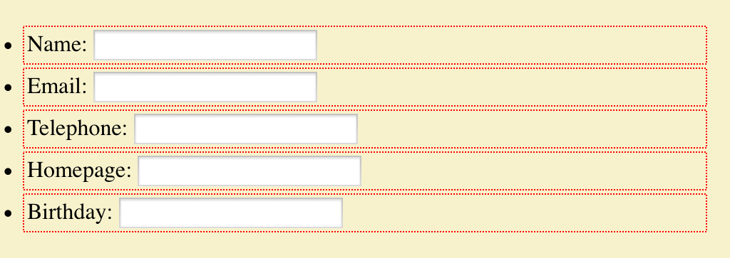
That will get us a result almost precisely as if we’d applied no grids at all. The only difference is that the input elements will all be as wide as their columns, according to the CSS Grid specification. Chrome fails to do this last bit correctly, whereas Firefox Nightly gets it right, but otherwise the layout is essentially the same. You can see this in the #form1 example on the test page. (Remember, you have to have a current grid-supporting browser for the examples to correspond to what I’m talking about here.)
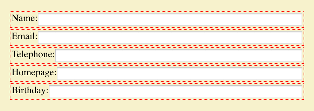
We can get closer to our goal by experimenting with a fixed-width grid column for the labels, figuring out the width of the widest label, and then just making all the label columns be that wide. That would be written something like this:
form ul li {display: grid;
  grid-template-columns: [start label] 7em [input] 1fr [end];}

That works pretty well so long as none of the labels ever change — if a label is added (or edited) to be wider, it will wrap to multiple lines. Alternatively, if the longest label is dropped or edited to be shorter, the label column won’t resize down. It will just stay the same dumb fixed width until someone hand-adjusts it. And honestly, at that point I may as well be using flexbox, which would do this version of the layout just as well, and would be more widely supported for the near to intermediate future. At any rate, you can see the grid version of this in the #form2 example on the test page.
But what if we could set a grid on the ul element, and then make all the li elements grids that use their parents’ grid for the layout of their children? That’s exactly what subgrids do. This is the solution we’ve been seeking, in basic form:
form ul {display: grid;
  grid-template-columns: [start label] max-content [input] 1fr [end];}
form ul li {display: grid; grid: subgrid; grid-column: start / end;}
Here the list items establish grid containers, thus making the label and input elements into grid items like before, but are stretched across the two columns of the ul while using those very grid lines for laying out their child elements, plus those children influence the placement of their grandparent’s grid lines. Thus, we can specify things like max-content for the label column size and have it Just Work™.
Or it would Just Work™, except that as I write this, none of the grid implementations have subgrid support. Authors who want to create the kind of layout we’re after have to compromise in one way or another — either by faking the content-sizing with a fixed-width column, or by stripping down the markup until there’s barely anything left — thus sacrificing accessibility, progressive enhancement, and general best practices, as Fantasai illustrated in her article.
You can probably see a lot of other ways in which subgrids would be useful. Take defining a full-page grid, the kind with a bunch of regularly repeating grid lines onto which various elements can be attached, like this one or this one. In this scenario, being able to designate each section of the page a subgrid would let you have all the pieces inside that section participate in, and lay out in relation to, the overall page grid. Without subgrids, you’d either have to make every element you want to lay out a child of the body element (or whatever you used to create the page grid), or you’d have to recreate segments of the page grid in each nested grid, and give up any hope of columns that can flex with the contents of multiple page sections. Neither solution is appealing.
This is why I’ve come to the same conclusion other grid experts (like Rachel) already have: subgrids are a major component of grid layout, and should be a part of any grid layout implementation when it emerges from developer-preview status. If that means delaying the emergence of grids, I think it’s worth it.
I say that because our field has a tendency to glom onto the first iteration of a technology, learn it inside out, hack around its limitations, and then ignore any future improvements unless somehow forced to do so. If grid layout is released without subgrid support, we’re risking shoving subgrids into the back of the author-practices cupboard for a long time to come. And along with it, potentially, grids themselves. The frustration of trying to build layouts without subgrids will quickly become overwhelming for all but the simplest cases, leading authors to try and then discard grids as a serious tool.
First impressions matter. CSS itself suffered for years from the initial impressions designers formed of “boring, boxy” layouts, and it still suffers from the handicap of being a presentation system without a layout engine at its core. Grid layout is the first serious candidate to fill that hole in the past two decades, and I don’t want to see them hamstrung from the outset. Subgrids are essential to the adoption of grids. I hope they’ll be implemented as soon as possible, and before grids are pushed into public release channels.
Comments (32)
I’m probably missing the point entirely, but isn’t aligning columns to max width like this exactly what table layouts already do?
They do, at least to some degree, Kevin, but in a much more constrained and limited way. This limited test case just scratches the surface of what grids make possible, not least of which is completely source-independent layout. In fact, recreating table layout behavior might well be possible with grid layout—assuming subgrid support.
Would setting display:contents on the li help here?
Author’s note: I just updated the post to use
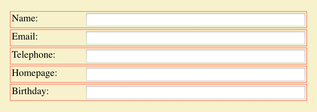
max-contentinstead ofmin-content, since that’s what I was actually trying to do. Thanks to Fantasai for correcting my error!As suggested in comment #3, I’ve tested (in Firefox Nightly) display: contents on li elements in #form3, and indeed, it makes it Just Work as if subgrid were supported.
It’s interesting that
display: contentscan be used as a workaround for the lack of subgrid support, but this is exactly the problem I talked about at the end of the post: we’re already trying to hack our way around limitations, even before grids are fully public. This is what we do, and I love the impulse even as I recognize its downside. I really don’t want to see subgrids buried by hacks that take the place they should have filled.Not to mention, while
display: contentsmight work in this particular case, which is extremely limited by nature, my instincts are that it will not be exactly the same thing. Which is even worse, because if the display hack bends toward one coding pattern while actual subgrids bend toward another, it will be even harder to switch over from the hack to the proper approach. Far better to have subgrid support from the outset, and avoid trouble.Somehow I feel subgrid is an over-engineering issue. Why do we need it anyway?
“The basis is a form with the various fields and labels in unordered list items, to help with accessibility and to be basically readable and usable if the CSS somehow fails to be applied.”
The latter one (“if CSS somehow fails to be applied”) doesn’t seem a good reason for subgrid to me. I assume you refer to the case where grid layout is not being supported.
Can you please elaborate a bit on the accessibility part? What’s the issue with grid layout?
Initially I thought subgrid means nested grid support.
Even flexboxes today have a problem with nesting flexboxes. Which is really a big issue.
Pingback ::
Web Development Reading List #121: The Illusion Of Completeness, Client Hints, CSS Subgrids
[…] Eric Meyer wrote about why CSS grid layouts are such a great thing for us developers but also noted why they will utterly fail if browsers ship them without providing support for subgrids22. […]
Pingback ::
Revision 250: Achtung Baby! | Working Draft
[…] [00:37:50] Subgrids Considered Essential […]
Grid layout + Flex box is what is needed rather than subgrids.
Grid layout is to partition known sections. Flexbox is a panel that helps with managing 1 to n items to fill the space.
Grid layout comes from WPF’s Grid. Flexbox in WPF would be equivalent to stackpanel and wrappanel rolled into 1.
Flexbox isn’t a replacement for grid layout, however. Yes, it works great if you have a single line of content you want to flex. That’s exactly what it’s designed to do, and what I would recommend people use for, say, navbars. If you have rows and columns that you want to “link together” so that each item in the layout affects the other parts, on the other hand, flexbox won’t really help.
Grid is long overdue for easily creating and maintaining layouts in web development.
What’s very important also is Grid nesting. So you can have a page which has a Grid layout and inside it, it can have components which also use Grid.
A successful layout engine requires both Grid and Flexbox.
In this sample the grid should describe the rows and columns and flexbox should be used to describe the cells.
Grid’s in an SPA would be perfect for the outer container description and Flexbox should fill the grid sections.
Grid layout + Flexbox is what is needed. Nesting Grid and Flexbox and vice-versa. There is no need to introduce subgrid to the spec.
I agree completely that a successful layout engine needs both grid and flexbox, Leblanc. I don’t think this is an example that lends itself to flexbox, but perhaps I’m overlooking something. How would you get the flexible boxes to line up in a columnar fashion, as called for in the post’s design direction?
I know Grid is going to get more support, but there’s a very long way to see Grid layout well implemented in all popular web-browsers or ‘browsers which make sense’, desktop and mobile (Chrome, FF, IE11/Edge, Safari 8+, Android Chrome 4.3+).
The ul, li elements are unnecessary.
Andrew: from an accessibility standpoint, no, they aren’t.
Flexbox only affects the direct children. Why should grid layout be any different? It does suck that we have to change the html structure but maybe we should leave flexbox and grid layout as is and introduce another panel based on absolute positioning similar to http://gridstylesheets.org/
Grid at a top level, flexbox at a list level, and constraint based solver at an item level.
Can you please explain that a bit more?
Label has “for” attribute, shouldn’t that be enough for accessibility?
Or is the order of the items within the grid the problem?
Andrew: the using the list gives those using (for example) screen readers an idea of how long the form is at the outset, by announcing the number of list items when they reach the beginning of the list. It also makes navigation easier for such users, I’m told.
@Leblanc, please no, not Apple’s Auto-Layout.
Pingback ::
Bruce Lawson’s personal site : Reading List
[…] Subgrids Considered Essential – Eric Meyer on CSS Grids: “If grid layout is released without subgrid support, we’re risking shoving subgrids into the back of the author-practices cupboard for a long time to come. And along with it, potentially, grids themselves.” […]
@Eric: With Grid/Flexbox I wonder if there isn’t a need for new HTML5 accessibility feature (like attributes)
Nice article. Although I did realise that the exact desired layout can be achieved easily with a high browser support now: http://codepen.io/darlec77/pen/vLVLQR
Leblanc Meneses: you can have a flexbox as a direct child of a flexbox. You can have that flex as a flex child; it can adjust itself to its parent. I think that is the issue that subgrids solve. Please correct me if I’m wrong.
Andrew: what are you thinking about? There are some aria attributes that can help, but that shouldn’t be the outset; this stuff needs to Just Work™.
Pingback ::
Web Development Reading List #121: The Illusion Of Completeness, Client Hints, CSS Subgrids – Smashing Magazine
[…] Eric Meyer wrote about why CSS grid layouts are such a great thing for us developers but also noted why they will utterly fail if browsers ship them without providing support for subgrids22. […]
Pingback ::
An Event Apart: “CSS Grid Layout” – ntdln
[…] the subgrid value” — CSS Grid Layout Module Level 1 – Without subgrid we create the potential for accessibility problems. Authors may remove semantic markup in order to use grid layout. – “Subgrids are essential to the adoption of grids. I hope they’ll be implemented as soon as possible, and before grids are pushed into public release channels.” — Eric Meyer, “Subgrids Considered Essential” […]
Pingback ::
Revision 284: Rückblick und Ausblick | Working Draft
[…] Subgrids considered essential […]
Yesterday, I became very excited about grid and dove in head first, learning all about the various properties and things. Then I tried to apply the grid to some nested HTML and ran directly into this problem, at which point I found myself here.
@Eric: Since you wrote this article a year and a half ago, do you still think grid shouldn’t have been released without subgrid? I haven’t been able to find an update on the status of subgrid – do you have an idea when it might be released in browsers?
Hey, Nathan. I do still think it should have been shipped with Grid, but there were too many factors against it. So now we wait for Grid Level 2, where we hope there will be subgrid support. I don’t have a timeline on that, and I doubt anyone really does. Odds are high the vendors will first want to see how people use grid, and what they wish were possible but isn’t.
Pingback ::
Practical CSS Subgrid Video Tutorials – Bram.us
[…] Coyier and Dave Rupert also talked about subgrid. In the first part they cover an example originally by Eric […]