I’ve played a lot of video games over the years, and the thing that just utterly blows my mind about them is how every frame is painted from scratch. So in a game running at 30 frames per second, everything in the scene has to be calculated and drawn every 33 milliseconds, no matter how little or much has changed from one frame to the next. In modern games, users generally demand 60 frames per second. So everything you see on-screen gets calculated, placed, colored, textured, shaded, and what-have-you in 16 milliseconds (or less). And then, in the next 16 milliseconds (or less), it has to be done all over again. And there are games that render the entire scene in single-digits numbers of milliseconds!
I mean, I’ve done some simple 3D render coding in my day. I’ve done hobbyist video game development; see Gravity Wars, for example (which I really do need to get back to and make less user-hostile). So you’d think I’d be used to this concept, but somehow, I just never get there. My pre-DOS-era brain rebels at the idea that everything has to be recalculated from scratch every frame, and doubly so that such a thing can be done in such infinitesimal slivers of time.
So you can imagine how I feel about the fact that web browsers operate in exactly the same way, and with the same performance requirements.
Maybe this shouldn’t come as a surprise. After all, we have user interactions and embedded videos and resizable windows and page scrolling and stuff like that, never mind CSS animations and DOM manipulation, so the viewport often needs to be re-rendered to reflect the current state of things. And to make all that feel smooth like butter, browser engines have to be able to display web pages at a minimum of 60 frames per second.
Admittedly, this would be a popular UI for browsing social media.
This demand touches absolutely everything, and shapes the evolution of web technologies in ways I don’t think we fully appreciate. You want to add a new selector type? It has to be performant. This is what blocked :has() (and similar proposals) for such a long time. It wasn’t difficult to figure out how to select ancestor elements — it was very difficult to figure out how to do it really, really fast, so as not to lower typical rendering speed below that magic 60fps. The same logic applies to new features like view transitions, or new filter functions, or element exclusions, or whatever you might dream up. No matter how cool the idea, if it bogs rendering down too much, it’s a non-starter.
I should note that none of this is to say it’s impossible to get a browser below 60fps: pile on enough computationally expensive operations and you’ll still jank like crazy. It’s more that the goal is to keep any new feature from dragging rendering performance down too far in reasonable situations, both alone and in combination with already-existing features. What constitutes “down too far” and “reasonable situations” is honestly a little opaque, but that’s a conversation slash vigorous debate for another time.
I’m sure the people who’ve worked on browser engines have fascinating stories about what they do internally to safeguard rendering speed, and ideas they’ve had to spike because they were performance killers. I would love to hear those stories, if any BigCo devrel teams are looking for podcast ideas, or would like to guest on Igalia Chats. (We’d love to have you on!)
Anyway, the point I’m making is that performance isn’t just a matter of low asset sizes and script tuning and server efficiency. It’s also a question of the engine’s ability to redraw the contents of the viewport, no matter what changes for whatever reason, with reasonable anticipation of things that might affect the rendering, every 15 milliseconds, over and over and over and over and over again, just so we can scroll our web pages smoothly. It’s kind of bananas, and yet, it also makes sense. Welcome to the web.
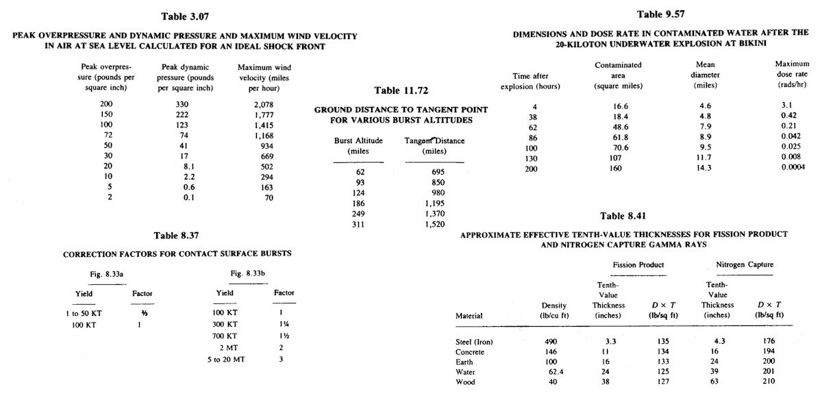
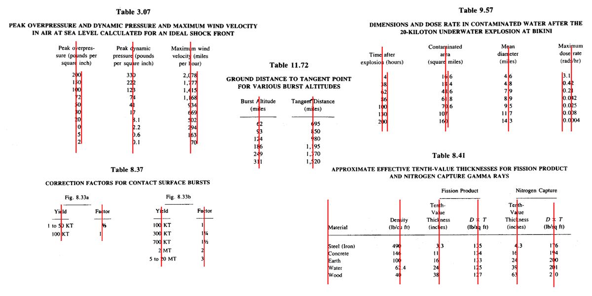
One of the bigger challenges of recreating The Effects of Nuclear Weapons for the Web was its tables. It was easy enough to turn tab-separated text and numbers into table markup, but the column alignment almost broke me.
To illustrate what I mean, here are just a few examples of columns that had to be aligned.
A few of the many tables in the book and their fascinating column alignments. (Hover/focus this figure to start a cyclic animation fading some alignment lines in and out. Sorry if that doesn’t work for you, mobile readers.)
At first I naïvely thought, “No worries, I can right- or left-align most of these columns and figure out the rest later.” But then I looked at the centered column headings, and how the column contents were essentially centered on the headings while having their own internal horizontal alignment logic, and realized all my dreams of simple fixes were naught but ashes.
My next thought was to put blank spacer columns between the columns of visible content, since table layout doesn’t honor the gap property, and then set a fixed width for various columns. I really didn’t like all the empty-cell spam that would require, even with liberal application of the rowspan attribute, and it felt overly fragile — any shifts in font face (say, on an older or niche system) might cause layout upset within the visible columns, such as wrapping content that shouldn’t be wrapped or content overlapping other content. I felt like there was a better answer.
I also thought about segregating every number and symbol (including decimal separators) into separate columns, like this:
<tr>
<th>Neutrinos from fission products</th>
<td>10</td>
<td></td>
<td></td>
</tr>
<tr class="total">
<th>Total energy per fission</th>
<td>200</td>
<td>±</td>
<td>6</td>
</tr>
Then I contemplated what that would do to screen readers and the document structure in general, and after the nausea subsided, I decided to look elsewhere.
It was at that point I thought about using spacer <span>s. Like, anywhere I needed some space next to text in order to move it to one side or the other, I’d throw in something like one of these:
Again, the markup spam repulsed me, but there was the kernel of an idea in there… and when I combined it with the truism “CSS doesn’t care what you expect elements to look or act like”, I’d hit upon my solution.
Let’s return to Table 1.43, which I used as an illustration in the announcement post. It’s shown here in its not-aligned and aligned states, with borders added to the table-cell elements.
Table 1.43 before and after the cells are shifted to make their contents visually align.
This is exactly the same table, only with cells shifted to one side or another in the second case. To make this happen, I first set up a series of CSS rules:
For a given class, the table cell is translated along the X axis by the declared number of ch units. Yes, that means the table cells sharing a column no longer actually sit in the column. No, I don’t care — and neither, as I said, does CSS.
I chose the labels lp and rp for “left pad” and “right pad”, in part as a callback to the left-pad debacle of yore even though it has basically nothing to do with what I’m doing here. (Many of my class names are private jokes to myself. We take our pleasures where we can.) The number in each class name represents the number of “characters” to pad, which here increment by half-ch measures. Since I was trying to move things by characters, using the unit that looks like it’s a character measure (even though it really isn’t) made sense to me.
With those rules set up, I could add simple classes to table cells that needed to be shifted, like so:
That was most of the solution, but it turned out to not be quite enough. See, things like decimal places and commas aren’t as wide as the numbers surrounding them, and sometimes that was enough to prevent a specific cell from being able to line up with the rest of its column. There were also situations where the data cells could all be aligned with each other, but were unacceptably offset from the column header, which was nearly always centered.
So I decided to calc() the crap out of this to add the flexibility a custom property can provide. First, I set a sitewide variable:
body {
--offset: 0ch;
}
I then added that variable to the various transforms:
Why use a variable at all? Because it allows me to define offsets specific to a given table, or even specific to certain table cells within a table. Consider the styles embedded along with Table 3.66:
Yeah. The first cell of the first row and the seventh cell of every row in the table body needed to be shoved over an extra quarter-ch, and the fourth cell in every table-body row (under the heading “Sp”) got a tenth-ch nudge. You can judge the results for yourself.
So, in the end, I needed only sprinkle class names around table markup where needed, and add a little extra offset via a custom property that I could scope to exactly where needed. Sure, the whole setup is hackier than a panel of professional political pundits, but it works, and to my mind, it beats the alternatives.
I’d have been a lot happier if I could have aligned some of the columns on a specific character. I think I still would have needed the left- and right-pad approach, but there were a lot of columns where I could have reduced or eliminated all the classes. A quarter-century ago, HTML 4 had this capability, in that you could write:
But browsers never really supported these features, even if some of them do still have bugs
open on the issue. (I chuckle aridly every time I go there and see “Opened 24 years ago” a few lines above “Status: NEW”.) I know it’s not top of anybody’s wish list, but I wouldn’t mind seeing that capability return, somehow. Maybe as something that could be used in Grid column tracks as well as table columns.
I also found myself really pining for the ability to use attr() here, which would have allowed me to drop the classes and use data-* attributes on the table cells to say how far to shift them. I could even have dropped the offset variable. Instead, it could have looked something like this:
Alas, attr() is confined to the content property, and the idea of letting it be used more widely remains unrealized.
Anyway, that was my journey into recreating mid-20th-Century table column alignment on the Web. It’s true that sufficiently old browsers won’t get the fancy alignment due to not supporting custom properties or calc(), but the data will all still be there. It just won’t have the very specific column alignment, that’s all. Hooray for progressive enhancement!
It’s not every week the release notes for a preview build of a web browser ignite Yet Another Twitter Teacup Storm (YATTS™), but that’s what happened when Safari Technology Preview 138 dropped late last week. At least, it’s what happened in the Twitter Teacups I tend to sip.
Just in case you missed it, here’s the summary:
The WebKit team released Safari Technology Preview 138, and the release notes for same.
The “CSS” section of the release notes started with a line saying:
A few people, including Jen Simmons, gave credit to Igalia for implementing :focus-visible by means of a crowdfunding project (more on that in a moment).
KABOOM
I suppose I could be a bit more explicit in step 4, but I don’t really want to get into speculating on apparent motives and assumptions by others, because that’s not the point of this post. The point of this post is to clear up what seems to be a very common misunderstanding.
What I kept seeing people saying was something to the effect of, “Why the hell did Apple have to crowdfund this feature?” And that’s wrong in two ways:
Apple doesn’t have to crowdfund anything, up to and including colonization of the Moon. (They might have to ask for a few bucks to do Venus or Mars.)
Apple didn’t crowdfund :focus-visible.
This isn’t me splitting hairs, either. Nobody at Apple asked the crowd to fund anything. Nobody at Apple asked Igalia to crowdfund anything. They didn’t even ask Igalia to implement :focus-visible, and then Igalia decided to crowdfund the work. In fact, all of those assumptions get things almost exactly backwards — which is understandable! It’s what we expect from our experience of how the web has developed since at least the late 1990s. But here, something new happened.
So, let me summarize what happened using yet another ordered list:
Igalia noticed they’d done a fair bit of work adding features to all the browser engines (e.g., CSS Grid), with each project supported by a single paying client, and thought, “Wait a minute, the web is a commons. Why are features being driven one client at a time?”
Of its own volition, Igalia decided to experiment with the idea of letting the web community (the “crowd”) vote for implementation of a missing browser feature with their wallets (the “funding”). They called this ongoing experiment Open Prioritization, and launched it in 2019.
There were six possible projects, chosen by Igalia through their own set of criteria, for the community to vote on by pledging monetary support:
CSS lab() colors in Firefox
:focus-visible in WebKit/Safari
HTML inert in WebKit/Safari
Selector list arguments for :not() in Chrome
CSS Containment support in WebKit/Safari
CSS d (SVG path) support in Firefox
The winner was implementing :focus-visible in WebKit/Safari, and by “winner”, I mean that project got the most monetary commitment from the members of the community.
Igalia matched the community contributions dollar for dollar, and moved forward with the work.
The work was done, and submitted to the WebKit code base. (Along the way, inconsistencies and other problems were discovered, addressed, and fixes contributed to engines other than WebKit.)
The WebKit team accepted Igalia’s contributions, and are now shipping them in a preview build of Safari for developers to test out.
In other words: the community (more precisely, a portion of it) voted on which feature was most needed, Igalia implemented it, and Apple accepted it. Apple’s role in this process came at the end, not the beginning.
And no, this is not the usual thing! It’s not supposed to be. Igalia is deeply committed to not just advancing the web, but to an unprecedented extent democratizing that advancement. It isn’t anything like a pure democratic effort, at least not yet, but these are early days and the initiative is structured to meet the current constraints of the environment (read: living under capitalism means coders gotta get paid).
But why is Igalia doing this? Time for another list! Just to switch things up, this one will be unordered:
Because the community should have more of a say in what gets prioritized in browsers. The community can be large collections of individuals, or it could be small collections of small companies, or a mix.
Because in every browser team, there’s always a priority list, and sometimes good features get pushed down that list for various reasons. It could be lack of expertise. It could be lack of time. It could be lack of interest. It could be interference by higher-ups. It doesn’t matter.
Because browser teams — not any one team, but the unfortunately small number of browser teams — are a bottleneck. No matter how much money the companies who employ those teams throw at them, they will always be a bottleneck, because resources are finite.
And this brings us to why I think “Wait, shouldn’t the $browser_name team have already done $feature_name by now? Why did an outside party have to do it?” is a little short-sighted. There will always be a $feature_name that the $browser_name team hasn’t done yet, for any value of $browser_name you care to posit. Today it could be WebKit; tomorrow, Chromium. In ten years, maybe there will be teams at Amazon and Huawei, making browser engines that compete for user share. Maybe not. Doesn’t actually matter, because however many or few engines there are, no matter what their priorities are, this problem will persist.
This is also why I’m not getting into Apple’s funding levels and priorities for WebKit and the web. Yes, there is much Apple-the-company can be criticized about, and personally, I am one of the biggest fans browser-engine diversity ever had, but that is a different conversation. Even if you could somehow wave a magic wand and open all platforms everywhere to engine diversity, and simultaneously cause a thousand browsers to bloom, we would still have the same basic problem. Open Prioritization would still need to exist.
For another piece of evidence on that point, look at the second Open Prioritization project: MathML-Core, whose goal is to bring full cross-browser support for the MathML Core specification to browsers, starting with Chrome (which needs the most work in this area) and then moving on to other engines (which need less work, but still need work). Doing this will not only improve support for web-wide math markup and its visual rendering, but will also improve the accessibility of math content on the web by making math a first-class content type in browsers. And you can even now contribute to this effort with a pledge of your own!
“But wait, why didn’t $browser_name already finish implementing MathML Core?” It doesn’t matter. Whether or not $browser_name (whichever one that is) should have done this by now, they haven’t. Maybe they would have done it eventually, but again, that doesn’t matter. We can make it happen now.
That’s what happened with :focus-visible in WebKit, which helped improve other engines; it’s what will happen with MathML Core in various browsers; and it could very well be what happens with other features in the future. Igalia would love nothing more than to see more and more projects launch, even if they don’t get hired to do the work for a single one of them. This isn’t us spackling over the cracks of browser teams’ neglect. This is us trying to chart an entirely new way to advance browser engines.
I go deeper into all of the above, as well as how Open Prioritization is designed to be an open forum and not some private reserve of Igalia’s, in a 17-minute talk delivered at W3C TPAC in fall 2021, available and captioned on Igalia’s YouTube channel. This post sort of summarizes it, but there are more examples and details in the talk, so if you’re interested, please do check that out.
Just in case your eyes sort of glazed and you skipped to the end to see if there was a TL;DR, here it is:
The addition of :focus-visible to WebKit was lead by the community, done by Igalia, and contributed to WebKit without any involvement from Apple except in the sense of their reviewing patches and accepting the contributions. Many of us are mad at Apple for a lot of good reasons, but please don’t let the process of venting that anger tar the goals and achievements of Open Prioritization. The future browser-feature priority you save may be your own.
If you’re here on meyerweb on April 9th, 2020, then you’re seeing the site without the CSS I wrote for its design and layout. Why? It’s CSS Naked Day! To quote that site:
The idea behind this event is to promote Web Standards. Plain and simple. This includes proper use of HTML, semantic markup, a good hierarchy structure, and of course, a good old play on words. It’s time to show off your <body> for what it really is.
So last night, I removed the links to the main stylesheets for the site. There are, I should note, scattered pages where local CSS is still in play. I could have tracked them all down and removed their CSS as well, and I considered doing so, but in the end I decided against it.
There’s a history to this day. In the late Aughts, it was an annual thing, not unlike Blue Beanie Day, to draw attention to web standards and reinforce among the community that good, solid, robust development practices are a good thing. Because after all, if your site isn’t usable without the CSS, then it almost certainly has structure and accessibility problems you probably haven’t been thinking about.
In all honesty, I had forgotten about it until just a couple of days prior, I suddenly thought, “Wait, early April, isn’t that when CSS Naked Day was observed?” I went looking, and discovered that yes, it was. I had remembered April 7th, but apparently April 9th was the actual date. Or became it over time. Either way, here we are, feeling fancy-free!
What’s been interesting has been what CSS Naked Day has revealed about browsers as well as about our HTML. To pick one example, suppose you have a very large SVG logo, which you size to where you want it with CSS. This is ordinarily a best practice: the SVG is the same file size whether it renders huge or tiny, so there’s no downside to having an SVG that renders 1200 x 1000 when you view it directly — thus allowing you to see all the little details — but is sized to 120 x 100 via CSS for layout purposes.
But take away the CSS, and the SVG will become 1200 x 1000 again. That might tell you to resize it for production, sure, and you probably should. But it also points out that browsers will not constrain that image, not even to the viewport. If your window is only 900 pixels wide, the SVG could well spill outside, forcing a horizontal scrollbar. Is that good? Maybe! Maybe not! We might wish browsers would bake something like img {max-width: 100%; height: auto;} into their user-agent stylesheet(s), but maybe that would have unforeseen downsides. The point is, this is a thing about browsers that CSS Naked Day reveals, and it’s worth knowing.
Similarly, this reveals that browsers don’t have a way to restrict the width of lines of text. Thus, if the browser window is wide, the lines get very long — long enough to make reading more difficult. This isn’t a problem on handheld devices like smartphones, but on desktop (use of which has risen significantly in areas locked down to limit the spread of SARS-CoV-2) it can be a problem. Again, if browsers had something like body {max-width: 70em;} or max-width: 100ch or suchlike, this wouldn’t be a problem. Should they? Maybe! It’s worth thinking about for your own work, if nothing else.
(For much more thinking about these kinds of browser behaviors and how to address them, you should absolutely check out the CSS Remedy project. “CSS Remedy sets CSS properties or values to what they would be if the CSSWG were creating the CSS today, from scratch, and didn’t have to worry about backwards compatibility.”)
If I’d remembered sooner, I might have contacted the maintainers of the CSS Naked Day site and posted about it ahead of time and thought about stuff like a hashtag to spread the word. Maybe that will happen next year. Until then, enjoy all the nudity!
Firefox 62 ships today, bringing with it some real CSS goodness. For one: float shapes! Which means now, mainline Firefox users will see the text flow past the blender in “Handiwork” the same way Chrome users have for a long time now.
But an even bigger addition is support for variable fonts. The ability to have one font file that mathematically describes variants on the base face means that all kinds of fine-grained typography is possible with far less bandwidth overhead and a major reduction in page weight.
However: bear in mind that like Safari, but unlike Chrome, Firefox’s variable-font support is dependent on the operating system on which is runs. If you have Windows 10, or Max OS X 10.13, then you have variable font support in Firefox and Safari. Earlier versions of those operating systems don’t support variable fonts, and so Safari and Firefox don’t either. Chrome rolls its own variable-font support, so it can extend support backwards in the OS timeline.
(I don’t know how things stand in the Linux world. Hopefully someone can clear things up in the comments!)
I say this not to chastise Firefox (nor Safari), because I tend to think leaning on the OS for this sort of thing is reasonable. I feel the same way about form elements like <select> dropdowns, to be clear, which I know likely places me in the minority. The point here is to give you a heads-up: if you get reports that a font isn’t doing the variable thing you styled, but it’s working fine for you, keep “check their operating system version” on your list of diagnostic tests.
Back in 2015, I wrote about Firefox’s screenshot utility, which used to be a command in the GCLI. Well, the GCLI is gone now, but the coders at Mozilla have brought command-line screenshotting back with :screenshot, currently available in Firefox Nightly and Firefox Dev Edition. It’s available in the Web Console (⌥⌘K or Tools → Web Developer → Console).
An image I captured by typing :screenshot --dpr 0.5 in the Web Console
Once you’re in the Web Console, you can type :sc and then hit Tab to autocomplete :screenshot. From there, everything is the same as I wrote in 2015, with the exception that the --imgur and --chrome options no longer exist. There are plans to add uploading to Firefox Screenshots as a replacement for the old Imgur option, but as of this writing, that’s still in the future.
So the list of :screenshot options as of late August 2018 is:
--clipboard
Copies the image to your OS clipboard for pasting into other programs. Prevents saving to a file unless you use the --file option to force file-writing.
--delay
The time in seconds to wait before taking the screenshot; handy if you want to pop open a menu or invoke a hover state for the screenshot. You can use any number, not just integers.
--dpr
The Device Pixel Ratio (DPR) of the captured image. Values above 1 yield “zoomed-in” images; values below 1 create “zoomed-out“ results. See the original article for more details.
--fullpage
Captures the entire page, not just the portion of the page visible in the browser’s viewport. For unusually long (or wide) pages, this can cause problems like crashing, not capturing all of the page, or just failing to capture anything at all.
--selector
Accepts a CSS selector and captures only that element and its descendants.
--file
When true, forces writing of the captured image to a file, even if --clipboard is also being used. Setting this to false doesn’t seem to have any effect.
--filename
Allows you to set a filename rather than accept the default. Explicitly saying --filename seems to be optional; I find that writing simply :screenshot test yields a file called test.png, without the need to write :screenshot --filename test. YFFMV.
I do have one warning: if you capture an image to a filename like test.png, and then you capture to that same filename, the new image will overwrite the old image. This can bite you if you’re using the up-arrow history scroll to capture images in quick succession, and forget to change the filename for each new capture. If you don’t supply a filename, then the file’s name uses the pattern of your OS screen capture naming; e.g., Screen Shot 2018-08-23 at 16.44.41.png on my machine.
I still use :screenshot to this day, and I’m very happy to see it restored to the browser — thank you, Mozillans! You’re the best.
My primary SVG viewer is Firefox. This is partly because it’s always running, so the startup time is essentially zero. It also allows me to directly inspect and modify elements of the SVG element through the Web Inspector, which can be handy.
But I’ve run into a problem more than once, which is that if I load an SVG file in Firefox, the browser window’s background defaults to white, and a lot of times I’m trying to view images that are partially or entirely white. I started thinking that if there were a way to make the window background medium gray, that would solve the problem with rare downsides, since I can’t remember trying to view an all-medium-gray SVG.
After a question on Twitter and some ideas from Tibor Martini, I realized I could use Stylish to give the SVG files a background through CSS. I didn’t want to select all SVGs, only those I was loading directly, so I tried this:
svg:root {background: gray;}
And it worked! So I decided to make it more robust by doing a multicolor gradient, and grayscaling it on hover. I couldn’t use filter because that would grayscale the whole image, rather than just the background, but that was easy to work around. I ended up with this:
Which works great! Except that I discovered Firefox applies it to all SVGs, even those loaded into HTML documents via img. SVGs apparently define their own roots, which I hadn’t expected, but I can see how it might make sense. So I poked around in MDN until I came up with this:
And that’s exactly what I wanted. If it’s useful to you, have at it. Just paste that into a new Stylish rule in Firefox, and you should be good to go.
If you’re on Chrome, you can import the above into Stylish and create a new rule, but it hasn’t worked for me, and I’m not sure why not. Removing :root didn’t fix it when I tried, and that shouldn’t matter anyway: I can see in Chrome’s user styles that svg:root is used and applied. And my Stylish toolbar icon shows the rule is being applied. It just doesn’t do anything I can see. If anyone can figure out how to make it work, or explain why it can’t work, I’d love to know in the comments!
That’s right: without explicitly specifying any grid columns, but just setting the grid items themselves to be centered, the same behaviors emerge. Clever!
What’s interesting is that the behaviors are not precisely the same. While mostly identical behaviors occur with either approach, there are a few subtle differences and a much different possibility space. I’ll consider each in turn.
First, the differences. First of all, the small gutters defined by the first and third grid column tracks — the ones defined to be minmax(1em,1fr) — aren’t present in the justify-content version. This means the headings will jam right up against the edge of the grid container if things get narrow enough.
Side separation versus side smashing. Grid on the left, justify-content on the right.
So we either need to re-establish them with grid-template-columns, which would seem to put us right back where we were, or else apply side margins to the heading and subheading. Something like this:
div h2, div h3 {margin-right: 1rem; margin-left: 1rem;}
Either way, that side separation has to be defined (assuming you want it there). Having to set those separations as margins feels a little clumsy to me, though not hugely so. Doing all the sizing and separation in a single grid-template-columns declaration feels cleaner to me, though I admit that may be partly due to my current Gridfatuation.
There is another difference worth exploring. If the content gets wider than the space available, the grid-template-columns approach means the content will overflow to the right (in LTR writing modes). If it falls offscreen, it can be scrolled to read. With justify-content: center, the content stays centered within the box, overflowing to both sides. The content to the left may not be accessible via scrollbar.
How track sizing and content justification handle overspill. Grid on the left, justify-content on the right.
So if you have a large headline containing a lengthy unhyphenated word, like “Kazakhstan” or “emoluments”, you might prefer one result over the other.
Beyond that, the further possibilities are a lot richer with Grid than with content justification. Center-justifying the content means exactly that: the element boxes are centered. So if you were interested in taking the heading and subheading, acting as an apparent unit, and shift them toward one side or another, this would be much easier to accomplish with Grid.
Suppose we want there to be three times as much space to one side of the headings’ column as the other. Here’s what that would look like:
That’s it. One number changed, and the whole setup is offset from the center without losing the coherence of the original demo.
The same thing could likely be approximated with justify-content using side margins on the heading elements, but it wouldn’t be precisely the same, even with percentages. fr is a very special beast, and permits very unique results.
The other major difference in possibilities is that with Grid, we can rearrange elements visually without ever touching the source. Suppose we wanted to put the subhead above the heading in some layouts, but not others. (Whether those different designs live on different pages or at different breakpoints, it really doesn’t matter.) With Grid, that’s as simple as rewriting the grid template in a line or three of CSS. The h2 remains ahead of h3 in the HTML.
With justify-content, you’d still have to write that same grid template, or else switch to flexbox and use flex-direction: column-reverse or some such. That would work if you want to just switch the display order of two headings in a single column. It tends to fall down for anything more demanding than that.
This is not to say Benjamin came up with a bad alternative! I like it quite a bit, precisely because it has similar outcomes to my original idea, thus shedding light on creative ways Grid and content alignment can be combined. But I like it even more for its differences, which shed even more light on how the two things operate.
In that combination of similarity and difference, I can sense an incredible range of capability, chock full of nuance and brimming with possibility. There are going to be ways to put these things together that nobody has figured out yet. I know I keep saying this, but there’s a vast landscape opening, so vast that I don’t think we can even guess how far it extends yet, let alone have mapped its terrain.