What happened was, I wrote a bookmarklet in early 2024 that would load all of the comments on a lengthy GitHub issue by auto-clicking any “Load more” buttons in the page, and at some point between then and now GitHub changed their markup in a way that broke it, so I wrote a new one. Here it is:
It totals 258 characters of JavaScript, including the ISO-8601-style void marker, which is smaller than the old version. The old one looked for buttons, checked the .textContent of every single one to find any that said “Load more”, and dispatched a click to each of those. Then it would do that again until it couldn’t find any more such buttons. That worked great until GitHub’s markup got changed so that every button has at least three nested <div>s and <span>s inside itself, so now the button elements have no text content of their own. Why? Who knows. Probably something Copilot or Grok suggested.
So, for the new one provided above: when you invoke the bookmarklet, it waits half a second to look for an element on the page with a class value that starts with LoadMore-module__buttonChildrenWrapper. It then dispatches a bubbling click event to that element, waits two seconds, and then repeats the process. Once it repeats the process and finds no such elements, it terminates.
I still wish this capability was just provided by GitHub, and maybe if I keep writing about it I’ll manage to slip the idea into the training set of whatever vibe-coding resource hog they decide to add next. In the meantime, just drag the link above into your toolbar or otherwise bookmark it, use, and enjoy!
(And if they break it again, feel free to ping me by commenting here.)
I’m a little (okay, a lot) late to it, but meyerweb is now participating in CSS Naked Day — I’ve removed the site’s styles, except in cases where pages have embedded CSS, which I’m not going to do a find-and-replace to try to suppress. So if I embedded a one-off CSS Grid layout, like on the Toolbox page, that will still be in force. Also, cached files with CSS links could take a little time to clear out. Otherwise, you should get 1990-style HTML. Enjoy!
(The site’s design will return tomorrow, or whenever I remember [or am prodded] to restore it.)
One of the things I think we all struggle with is keeping up to date with changes in web development. You might hear about a super cool new CSS feature or JavaScript API, but it’s never supported by all the browsers when you hear about it, right? So you think “I’ll have to make sure check in on that again later” and quickly forget about it. Then some time down the road you hear about it again, talked about like it’s been best practice for years.
To help address this, Brian Kardell and I have built a service called BCD Watch, with a nicely sleek design by Stephanie Stimac. It’s free for all to use thanks to the generous support of Igalia in terms of our time and hosting the service.
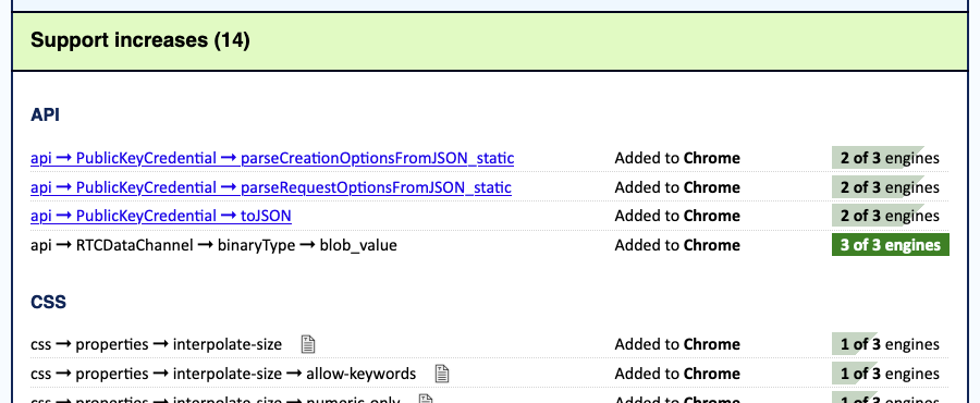
Every Monday, BCD Watch produces two reports. The Weekly Changes Report lists all the changes to BCD that happened in the previous week — what’s been added, removed, or renamed in the whole of BCD. It also tells you which of the Big Three browsers newly support (or dropped support for) each listed feature, along with a progress bar showing how close the feature is to attaining Baseline status.
The Weekly Baselines Report is essentially a filter of the first report: instead of all the changes, it lists only changes to Baseline status, noting which features are newly Baseline. Some weeks, it will have nothing to report. Other weeks, it will list everything that’s reached Baseline’s “Newly Available” tier.
Both reports are available as standalone RSS, Atom, and JSON feeds, which are linked at the bottom of each report. So while you can drop in on the site every week to bask in the visual design if you want (and that’s fine!), you can also get a post or two in your feed reader every Monday that will get you up to date on what’s been happening in the world of web development.
If you want to look back at older reports, the home page has a details/summary collapsed list of weekly reports going back to the beginning of 2022, which we generated by downloading all the BCD releases back that far, and running the report script against them.
If you encounter any problems with BCD Watch or have suggestions for improvements, please feel free to open an issue in the repository, or submit suggested changes via pull request if you like. We do expect the service to evolve over time, perhaps adding a report for things that have hit Baseline Widely Available status (30 months after hitting all three engines) or reports that look at more than just the Big Three engines. Hard to say! Always in motion, the future is.
Whatever we may add, though, we’ll keep BCD Watch centered on the idea of keeping you better up to date on web dev changes, once a week, every week. We really hope this is useful and interesting for you! We’ve definitely appreciated having the weekly updates as we built and tested this, and we think a lot of you will, too.
If you’re reading this, odds are you’ve at least heard of A Book Apart (ABA), who published Design for Real Life, which I co-wrote with Sara Wachter-Boettcher back in 2016. What you may not have heard is that ABA has closed up shop. There won’t be any more new ABA titles, nor will ABA continue to sell the books in their catalog.
That’s the bad news. The great news is that ABA has transferred the rights for all of its books to their respective authors! (Not every ex-publisher does this, and not every book contract demands it, so thanks to ABA.) We’re all figuring out what to do with our books, and everyone will make their own choices. One of the things Sara and I have decided to do is to eventually put the entire text online for free, as a booksite. That isn’t ready yet, but it should be coming somewhere down the road.
In the meantime, we’ve decided to cut the price of print and e-book copies available through Ingram. DfRL was the eighteenth book ABA put out, so we’ve decided to make the price of both the print and e-book $18, regardless of whether those dollars are American, Canadian, or Australian. Also €18 and £18. Basically, in all five currencies we can define, the price is 18 of those.
…unless you buy it through Apple Books; then it’s 17.99 of every currency, because the system forces us to make it cheaper than the list price and also have the amount end in .99. Obversely, if you’re buying a copy (or copies) for a library, the price has to be more than the list price and also end in .99, so the library cost is 18.99 currency units. Yeah, I dunno either.
At any rate, compared to its old price, this is a significant price cut, and in some cases (yes, Australia, we’re looking at you) it’s a huge discount. Or, at least, it will be at a discount once online shops catch up. The US-based shops seem to be up to date, and Apple Books as well, but some of the “foreign” (non-U.S.) sources are still at their old prices. In those cases, maybe wishlist or bookmark or something and keep an eye out for the drop. We hope it will become global by the end of the week. And hey, as I write this, a couple of places have the ebook version for like 22% less than our listed price.
So! If you’ve always thought about buying a copy but never got around to it, now’s a good time to get a great deal. Ditto if you’ve never heard of the book but it sounds interesting, or you want it in ABA branding, or really for any other reason you have to buy a copy now.
I suppose the real question is, should you buy a copy? We’ll grant that some parts of it are a little dated, for sure. But the concepts and approaches we introduced can be seen in a lot of work done even today. It made significant inroads into government design practices in the UK and elsewhere, for example, and we still hear from people who say it really changed how they think about design and UX. We’re still very proud of it, and we think anyone who takes the job of serving their users seriously should give it a read. But then, I guess we would, or else we’d never have written it in the first place.
And that’s the story so far. I’ll blog again when the freebook is online, and if anything else changes as we go through the process. Got questions? Leave a comment or drop me a line.
TAKE HEED! Due to changes in GitHub’s markup, the following post was superseded in September 2025 by the post Bookmarklet: Load All GitHub Comments (take 2), which has an updated bookmarklet.
What happened was, Brian and I were chatting about W3C GitHub issues and Brian mentioned how really long issues are annoying to search and read, because GitHub has this thing where if there are too many comments on an issue, it snips out the middle with a “Load more…” button that’s very tastefully designed and pretty easy to miss if you’re quick-scrolling to try to catch up. The squiggle-line would be a good marker, if it weren’t so tasteful as to blend into the background in a way that makes the Baby WCAG cry.
And what’s worse, from this perspective, is that if the issue has been discussed to a very particular kind of death, the “Load more…” button can have more “Load more…” buttons hiding within. So even if you know there was an interesting comment, and you remember a word or two of it, page-searching in your browser will do no good if the comment in question is buried one or more XMLHTTPRequest calls deep.
“I really wish GitHub had an ‘expand all comments’ button at the top or something,” Brian said (or words to that effect).
Well, it was a Friday afternoon and I was feeling code-hacky, so I wrote a bookmarklet. Here it is in easy-to-save hyperlink form:
It waits half a second after you activate it to find all the buttons on the page (in my test runs, usually six hundred of them). Then it looks through all the buttons to find the ones that have a textContent of “Load more…” and dispatches a click event to each one. With that done, it waits five seconds and does it all again, waits five seconds to do it again, and so on. Once it finds there are zero buttons with the “Load more…” textContent, it exits. And, if five seconds is too quick due to slow loading times, you can always invoke the bookmarklet again should you come across a “Load more…” button.
If you want this ability for yourself, just drag the link above into your bookmark toolbar or bookmarks menu, and whenever you load up a mega-thread GitHub issue, fire the bookmarklet to load all the comments. I imagine there may be cleaner ways to do this, but I was able to codeslam this in about 15 minutes using ViolentMonkey on live GitHub pages, and it does the thing.
I did consider complexifying the ViolentMonkey script so that any GitHub page is scanned for the “Load more…” button, and if one is present, then a “Load all comments” button is plopped into the top of the page, but I knew that would take at least another 15 minutes and my codeslam window was closing. Also, it would require anyone using it to run ViolentMonkey (or equivalent) all the time, whereas the bookmarlet has zero impact unless the user invokes it. If you want to extend this into something more than it is and share your solution with the world, by all means feel free.
The point of all this being, if you too wish GitHub had an easy way to load all the comments without you having to search for the “Load more…” button yourself, now there’s a bookmarklet made just for you. Enjoy!
A few days ago was the 30th anniversary of the first time I wrote an HTML document. Back in 1993, I took a Usenet posting of the “Incomplete Mystery Science Theater 3000 Episode Guide” and marked it up. You can see the archived copy here on meyerweb. At some point, the markup got updated for reasons I don’t remember, but I can guarantee you the original had uppercase tag names and I didn’t close any paragraphs. That’s because I was using <P> as a shorthand for <BR><BR>, which was the style at the time.
Its last-updated date of December 3, 1993, is also the date I created it. I was on lobby duty with the CWRU Film Society, and had lugged a laptop (I think it was an Apple PowerBook of some variety, something like a 180, borrowed from my workplace) and a printout of the HTML specification (or maybe it was “Tags in HTML”?) along with me.
I spent most of that evening in the lobby of Strosacker Auditorium, typing tags and doing find-and-replace operations in Microsoft Word, and then saving as text to a file that ended in .html, which was the style at the time. By the end of the night, I had more or less what you see in the archived copy.
The only visual change between then and now is that a year or two later, when I put the file up in my home directory, I added the toolbars at the top and bottom of the page — toolbars I’d designed and made a layout standard as CWRU’s webmaster. Which itself only happened because I learned HTML.
A couple of years ago, I was fortunate enough to be able to relate some of this story to Joel Hodgson himself. The story delighted him, which delighted me, because delighting someone who has been a longtime hero really is one of life’s great joys. And the fact that I got to have that conversation, to feel that joy, is inextricably rooted in my sitting in that lobby with that laptop and that printout and that Usenet post, adding tags and saving as text and hitting reload in Mosaic to instantly see the web page take shape, thirty years ago this week.
The Web is a little bit darker today, a fair bit poorer: Molly Holzschlag is dead. She lived hard, but I hope she died easy. I am more sparing than most with my use of the word “friend”, and she was absolutely one. To everyone.
If you don’t know her name, I’m sorry. Too many didn’t. She was one of the first web gurus, a title she adamantly rejected — “We’re all just people, people!” — but it fit nevertheless. She was a groundbreaker, expanding and explaining the Web at its infancy. So many people, on hearing the mournful news, have described her as a force of nature, and that’s a title she would have accepted with pride. She was raucous, rambunctious, open-hearted, never ever close-mouthed, blazing with fire, and laughed (as she did everything) with her entire chest, constantly. She was giving and took and she hurt and she wanted to heal everyone, all the time. She was messily imperfect, would tell you so loudly and repeatedly, and gonzo in all the senses of that word. Hunter S. Thompson should have written her obituary.
I could tell so many stories. The time we were waiting to check into a hotel, talking about who knows what, and realized Little Richard was a few spots ahead of us in line. Once he’d finished checking in, Molly walked right over to introduce herself and spend a few minutes talking with him. An evening a group of us had dinner one the top floor of a building in Chiba City and I got the unexpectedly fresh shrimp hibachi. The time she and I were chatting online about a talk or training gig, somehow got onto the subject of Nick Drake, and coordinated a playing of “ Three Hours” just to savor it together. A night in San Francisco where the two of us went out for dinner before some conference or other, stopped at a bar just off Union Square so she could have a couple of drinks, and she got propositioned by the impressively drunk couple seated next to her after they’d failed to talk the two of us into hooking up. The bartender couldn’t stop laughing.
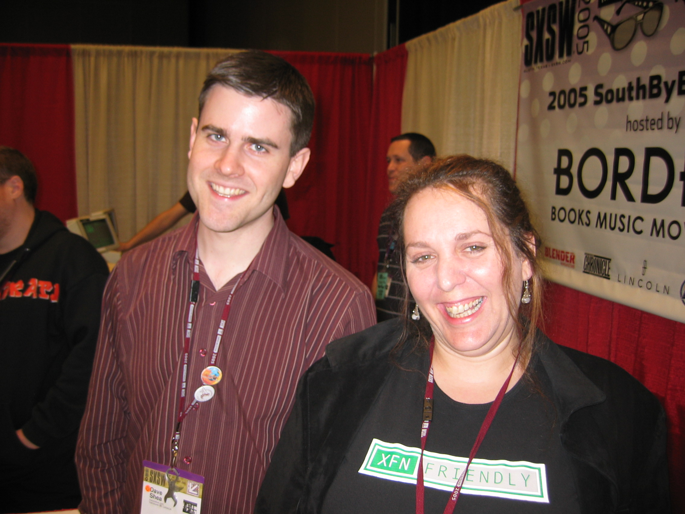
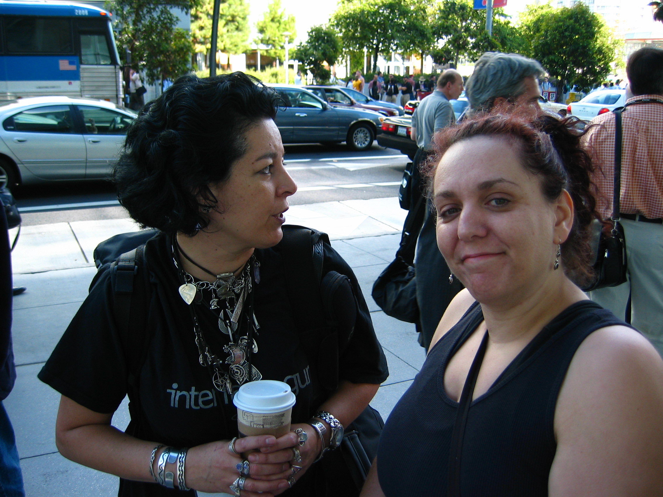
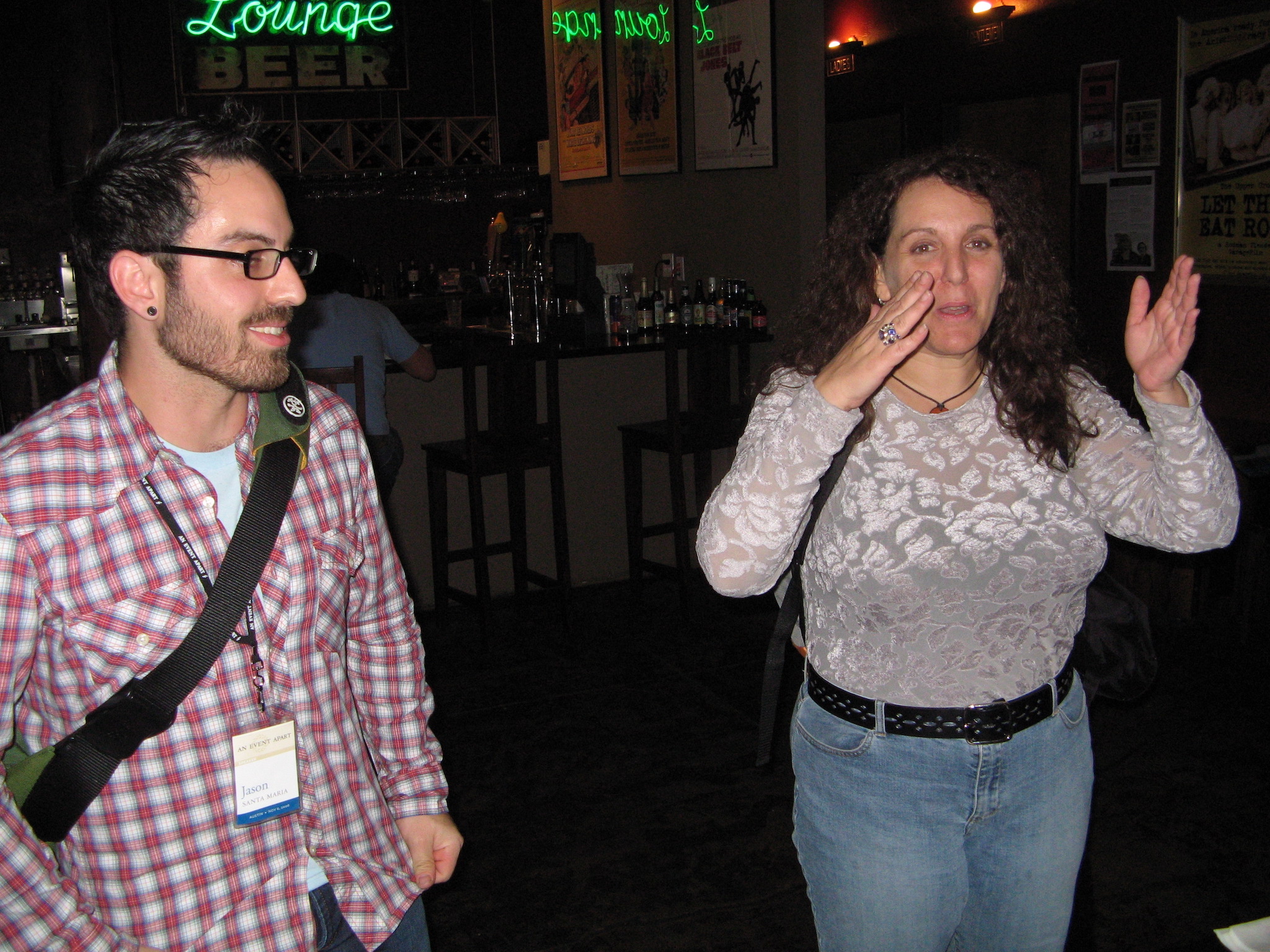
At SXSW 2005 with Dave Shea, her co-author on The Zen of CSS, and wearing an XFN shirt.Standing outside Moscone Center in San Francisco with Cia Romano. I think this is that time we all got evacuated due to a fire alarm.
Or the time a bunch of us were gathered in New Orleans (again, some conference or other) and went to dinner at a jazz club, where we ended up seated next to the live jazz trio and she sang along with some of the songs. She had a voice like a blues singer in a cabaret, brassy and smoky and full of hard-won joys, and she used it to great effect standing in front of Bill Gates to harangue him about Internet Explorer. She raised it to fight like hell for the Web and its users, for the foundational principles of universal access and accessible development. She put her voice on paper in some three dozen books, and was working on yet another when she died. In one book, she managed to sneak past the editors an example that used a stick-figure Kama Sutra custom font face. She could never resist a prank, particularly a bawdy one, as long as it didn’t hurt anyone.
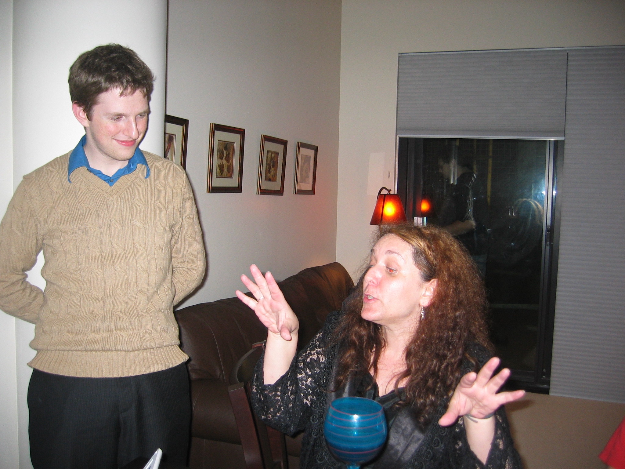
Holding court in somebody’s hotel suite, with a baby Matt Mullenweg in attendance.Once again holding court, this time at a bar with Jason Santa Maria.
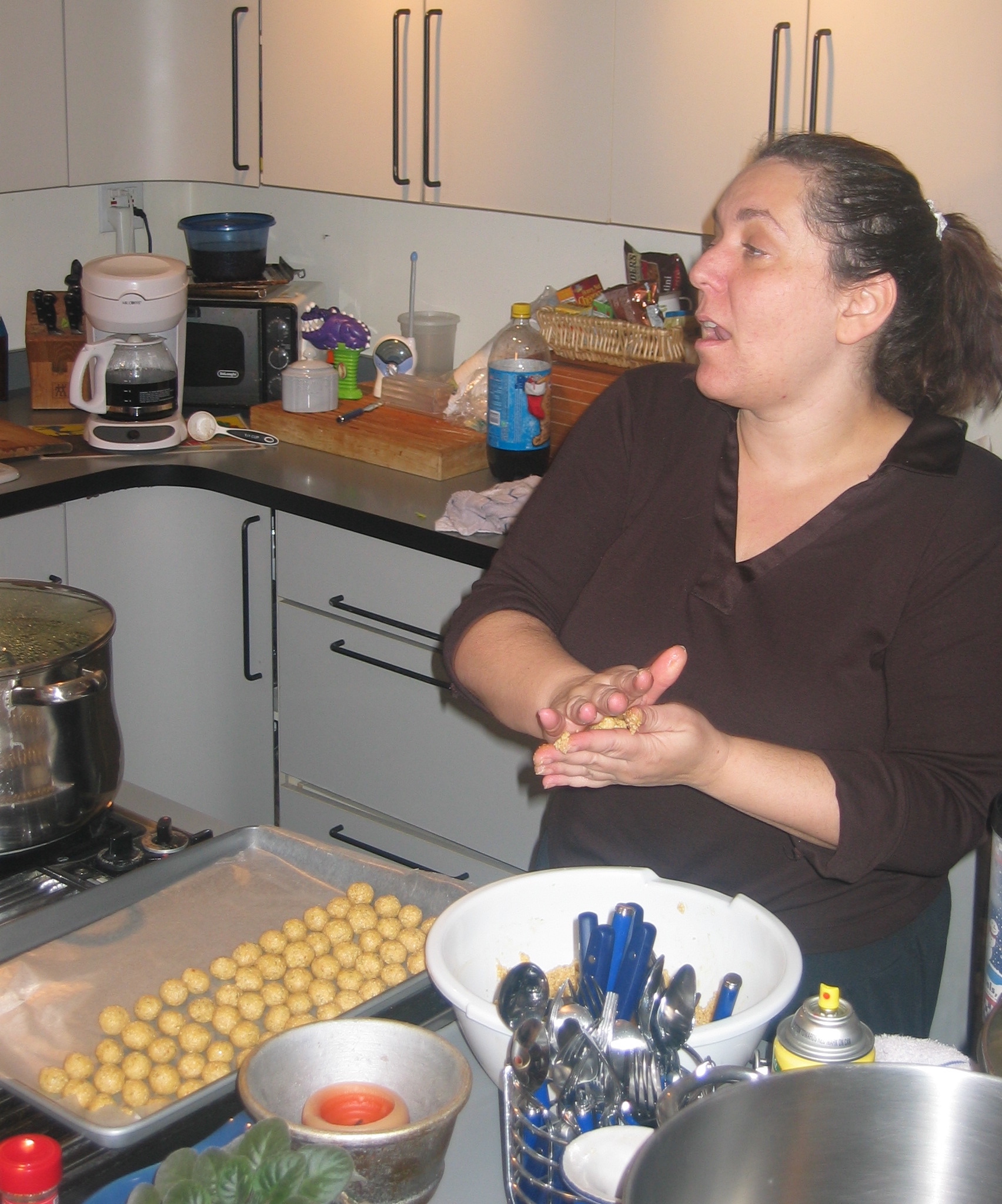
She made the trek to Cleveland at least once to attend and be part of the crew for one of our Bread and Soup parties. We put her to work rolling tiny matzoh balls and she immediately made ribald jokes about it, laughing harder at our one-up jokes than she had at her own. She stopped by the house a couple of other times over the years, when she was in town for consulting work, “Auntie Molly” to our eldest and one of my few colleagues to have spent any time with Rebecca. Those pictures were lost, and I still keenly regret that.
Rolling matzoh balls in our kitchen, still holding court.On top of a bus somewhere in the world, probably London, with my partner Kat.
There were so many things about what the Web became that she hated, that she’d spent so much time and energy fighting to avert, but she still loved it for what it could be and what it had been originally designed to be. She took more than one fledgling web designer under her wing, boosted their skills and careers, and beamed with pride at their accomplishments. She told a great story about one, I think it was Dunstan Orchard but I could be wrong, and his afternoon walk through a dry Arizona arroyo.
I could go on for pages, but I won’t; if this were a toast and she were here, she would have long ago heckled me (affectionately) into shutting up. But if you have treasured memories of Molly, I’d love to hear them in the comments below, or on your own blog or social media or podcasts or anywhere. She loved stories. Tell hers.
I’ve played a lot of video games over the years, and the thing that just utterly blows my mind about them is how every frame is painted from scratch. So in a game running at 30 frames per second, everything in the scene has to be calculated and drawn every 33 milliseconds, no matter how little or much has changed from one frame to the next. In modern games, users generally demand 60 frames per second. So everything you see on-screen gets calculated, placed, colored, textured, shaded, and what-have-you in 16 milliseconds (or less). And then, in the next 16 milliseconds (or less), it has to be done all over again. And there are games that render the entire scene in single-digits numbers of milliseconds!
I mean, I’ve done some simple 3D render coding in my day. I’ve done hobbyist video game development; see Gravity Wars, for example (which I really do need to get back to and make less user-hostile). So you’d think I’d be used to this concept, but somehow, I just never get there. My pre-DOS-era brain rebels at the idea that everything has to be recalculated from scratch every frame, and doubly so that such a thing can be done in such infinitesimal slivers of time.
So you can imagine how I feel about the fact that web browsers operate in exactly the same way, and with the same performance requirements.
Maybe this shouldn’t come as a surprise. After all, we have user interactions and embedded videos and resizable windows and page scrolling and stuff like that, never mind CSS animations and DOM manipulation, so the viewport often needs to be re-rendered to reflect the current state of things. And to make all that feel smooth like butter, browser engines have to be able to display web pages at a minimum of 60 frames per second.
Admittedly, this would be a popular UI for browsing social media.
This demand touches absolutely everything, and shapes the evolution of web technologies in ways I don’t think we fully appreciate. You want to add a new selector type? It has to be performant. This is what blocked :has() (and similar proposals) for such a long time. It wasn’t difficult to figure out how to select ancestor elements — it was very difficult to figure out how to do it really, really fast, so as not to lower typical rendering speed below that magic 60fps. The same logic applies to new features like view transitions, or new filter functions, or element exclusions, or whatever you might dream up. No matter how cool the idea, if it bogs rendering down too much, it’s a non-starter.
I should note that none of this is to say it’s impossible to get a browser below 60fps: pile on enough computationally expensive operations and you’ll still jank like crazy. It’s more that the goal is to keep any new feature from dragging rendering performance down too far in reasonable situations, both alone and in combination with already-existing features. What constitutes “down too far” and “reasonable situations” is honestly a little opaque, but that’s a conversation slash vigorous debate for another time.
I’m sure the people who’ve worked on browser engines have fascinating stories about what they do internally to safeguard rendering speed, and ideas they’ve had to spike because they were performance killers. I would love to hear those stories, if any BigCo devrel teams are looking for podcast ideas, or would like to guest on Igalia Chats. (We’d love to have you on!)
Anyway, the point I’m making is that performance isn’t just a matter of low asset sizes and script tuning and server efficiency. It’s also a question of the engine’s ability to redraw the contents of the viewport, no matter what changes for whatever reason, with reasonable anticipation of things that might affect the rendering, every 15 milliseconds, over and over and over and over and over again, just so we can scroll our web pages smoothly. It’s kind of bananas, and yet, it also makes sense. Welcome to the web.


.jpg)