Posts in the Projects Category

Once Upon a Browser

Published 2 months, 2 weeks past

Once upon a time, there was a movie called Once Upon a Forest.  I’ve never seen it.  In fact, the only reason I know it exists is because a few years after it was released, Joshua Davis created a site called Once Upon a Forest, which I was doing searches to find again.  The movie came up in my search results; the site, long dead, did not.  Instead, I found its original URL on Joshua’s Wikipedia page, and the Wayback Machine coughed up snapshots of it, such as this one.  You can also find static shots of it on Joshua’s personal web site, if you scroll far enough.

That site has long stayed with me, not so much for its artistic expression (which is pleasant enough) as for how the pieces were produced.  Joshua explained in a talk that he wrote code to create generative art, where it took visual elements and arranged them randomly, then waited for him to either save the result or hit a key to try again.  He created the elements that were used, and put constraints on how they might be arranged, but allowed randomness to determine the outcome.

That appealed to me deeply.  I eventually came to realize that the appeal was rooted in my love of the web, where we create content elements and visual styles and scripted behavior, and then we send our work into a medium that definitely has constraints, but something very much like the random component of generative art: viewport size, device capabilities, browser, and personal preference settings can combine in essentially infinite ways.  The user is the seed in the RNG of our work’s output.

Normally, we try very hard to minimize the variation our work can express.  Even when crossing from one experiential stratum to another  —  that is to say, when changing media breakpoints  —  we try to keep things visually consistent, orderly, and understandable.  That drive to be boring for the sake of user comprehension and convenience is often at war with our desire to be visually striking for the sake of expression and enticement.

There is a lot, and I mean a lot, of room for variability in web technologies.  We work very hard to tame it, to deny it, to shun it.  Too much, if you ask me.

About twelve and half years ago, I took a first stab at pushing back on that denial with a series posted to Flickr called “Spinning the Web”, where I used CSS rotation transforms to take consistent, orderly, understandable web sites and shake them up hard.  I enjoyed the process, and a number of people enjoyed the results.

google.com, late November 2023

In the past few months, I’ve come back to the concept for no truly clear reason and have been exploring new approaches and visual styles.  The first collection launched a few days ago: Spinning the Web 2023, a collection of 26 web sites remixed with a combination of CSS and JS.

I’m announcing them now in part because this month has been dubbed “Genuary”, a month for experimenting with generative art, with daily prompts to get people generating.  I don’t know if I’ll be following any of the prompts, but we’ll see.  And now I have a place to do it.

You see, back in 2011, I mentioned that my working title for the “Spinning the Web” series was “Once Upon a Browser”.  That title has never left me, so I’ve decided to claim it and created an umbrella site with that name.  At launch, it’s sporting a design that owes quite a bit to Once Upon a Forest  —  albeit with its own SVG-based generative background, one I plan to mess around with whenever the mood strikes.  New works will go up there from time to time, and I plan to migrate the 2011 efforts there as well.  For now, there are pointers to the Flickr albums for the old works.

I said this back in 2011, and I mean it just as much in 2023: I hope you enjoy these works even half as much as I enjoyed creating them.


Nuclear Targeted Footnotes

Published 1 year, 6 months past

One of the more interesting design challenges of The Effects of Nuclear Weapons was the fact that, like many technical texts, it has footnotes.  Not a huge number, and in fact one chapter has none at all, but they couldn’t be ignored.  And I didn’t want them to be inline between paragraphs or stuck into the middle of the text.

This was actually a case where Chris and I decided to depart a bit from the print layout, because in print a chapter has many pages, but online it has a single page.  So we turned the footnotes into endnotes, and collected them all near the end of each chapter.

Originally I had thought about putting footnotes off to one side in desktop views, such as in the right-hand grid gutter.  After playing with some rough prototypes, I realized this wasn’t going to go the way I wanted it to, and would likely make life difficult in a variety of display sizes between the “big desktop monitor” and “mobile device” realms.  I don’t know, maybe I gave up too easily, but Chris and I had already decided that endnotes were an acceptable adaptation and I decided to roll with that.

So here’s how the footnotes work.  First off, in the main-body text, a footnote marker is wrapped in a <sup> element and is a link that points at a named anchor in the endnotes. (I may go back and replace all the superscript elements with styled <mark> elements, but for now, they’re superscript elements.)  Here’s an example from the beginning of Chapter I, which also has a cross-reference link in it, classed as such even though we don’t actually style them any differently than other links.

This is true for a conventional “high explosive,” such as TNT, as well as for a nuclear (or atomic) explosion,<sup><a href="#fnote01">1</a></sup> although the energy is produced in quite different ways (<a href="#§1.11" class="xref">§ 1.11</a>).

Then, down near the end of the document, there’s a section that contains an ordered list.  Inside that list are the endnotes, which are in part marked up like this:

<li id="fnote01"><sup>1</sup> The terms “nuclear” and atomic” may be used interchangeably so far as weapons, explosions, and energy are concerned, but “nuclear” is preferred for the reason given in <a href="#§1.11" class="xref">§ 1.11</a>.

The list item markers are switched off with CSS, and superscripted numbers stand in their place.  I do it that way because the footnote numbers are important to the content, but also have specific presentation demands that are difficult  —  nay, impossible — to pull off with normal markers, like raising them superscript-style. (List markers are only affected by a very limited set of properties.)

In order to get the footnote text to align along the start (left) edge of their content and have the numbers hang off the side, I elected to use the old negative-text-indent-positive-padding trick:

.endnotes li {
	padding-inline-start: 0.75em;
	text-indent: -0.75em;
}

That works great as long as there are never any double-digit footnote numbers, which was indeed the case… until Chapter VIII.  Dang it.

So, for any footnote number above 9, I needed a different set of values for the indent-padding trick, and I didn’t feel like adding in a bunch of greater-than-nine classes. Following-sibling combinator to the rescue!

.endnotes li:nth-of-type(9) ~ li {
	margin-inline-start: -0.33em;
	padding-inline-start: 1.1em;
	text-indent: -1.1em;
}

The extra negative start margin is necessary solely to get the text in the list items to align horizontally, though unnecessary if you don’t care about that sort of thing.

Okay, so the endnotes looked right when seen in their list, but I needed a way to get back to the referring paragraph after reading a footnote.  Thus, some “backjump” links got added to each footnote, pointing back to the paragraph that referred to them.

<span class="backjump">[ref. <a href="#§1.01">§ 1.01</a>]</span>

With that, a reader can click/tap a footnote number to jump to the corresponding footnote, then click/tap the reference link to get back to where they started.  Which is fine, as far as it goes, but that idea of having footnotes appear in context hadn’t left me.  I decided I’d make them happen, one way or another.

(Throughout all this, I wished more than once the HTML 3.0 proposal for <fn> had gone somewhere other than the dustbin of history and the industry’s collective memory hole.  Ah, well.)

I was thinking I’d need some kind of JavaScript thing to swap element nodes around when it occurred to me that clicking a footnote number would make the corresponding footnote list item a target, and if an element is a target, it can be styled using the :target pseudo-class.  Making it appear in context could be a simple matter of positioning it in the viewport, rather than with relation to the document.  And so:

.endnotes li:target {
	position: fixed;
	bottom: 0;
	padding-block: 2em 4em;
	padding-inline: 2em;
	margin-inline: -2em 0;
	border-top: 1px solid;
	background: #FFF;
	box-shadow: 0 0 3em 3em #FFF;
	max-width: 45em;
}

That is to say, when an endnote list item is targeted, it’s fixedly positioned against the bottom of the viewport and given some padding and background and a top border and a box shadow, so it has a bit of a halo above it that sets it apart from the content it’s overlaying.  It actually looks pretty sweet, if I do say so myself, and allows the reader to see footnotes without having to jump back and forth on the page.  Now all I needed was a way to make the footnote go away.

Again I thought about going the JavaScript route, but I’m trying to keep to the Web’s slower pace layers as much as possible in this project for maximum compatibility over time and technology.  Thus, every footnote gets a “close this” link right after the backjump link, marked up like this:

<a href="#fnclosed" class="close">X</a></li>

(I realize that probably looks a little weird, but hang in there and hopefully I can clear it up in the next few paragraphs.)

So every footnote ends with two links, one to jump to the paragraph (or heading) that referred to it, which is unnecessary when the footnote has popped up due to user interaction; and then, one to make the footnote go away, which is unnecessary when looking at the list of footnotes at the end of the chapter.  It was time to juggle display and visibility values to make each appear only when necessary.

.endnotes li .close {
	display: none;
	visibility: hidden;
}
.endnotes li:target .close {
	display: block;
	visibility: visible;
}
.endnotes li:target .backjump {
	display: none;
	visibility: hidden;
}

Thus, the “close this” links are hidden by default, and revealed when the list item is targeted and thus pops up.  By contrast, the backjump links are shown by default, and hidden when the list item is targeted.

As it now stands, this approach has some upsides and some downsides.  One upside is that, since a URL with an identifier fragment is distinct from the URL of the page itself, you can dismiss a popped-up footnote with the browser’s Back button.  On kind of the same hand, though, one downside is that since a URL with an identifier fragment is distinct from the URL of the page itself, if you consistently use the “close this” link to dismiss a popped-up footnote, the browser history gets cluttered with the opened and closed states of various footnotes.

This is bad because you can get partway through a chapter, look at a few footnotes, and then decide you want to go back one page by hitting the Back button, at which point you discover have to go back through all those footnote states in the history before you actually go back one page.

I feel like this is a thing I can (probably should) address by layering progressively-enhancing JavaScript over top of all this, but I’m still not quite sure how best to go about it.  Should I add event handlers and such so the fragment-identifier stuff is suppressed and the URL never actually changes?  Should I add listeners that will silently rewrite the browser history as needed to avoid this?  Ya got me.  Suggestions or pointers to live examples of solutions to similar problems are welcomed in the comments below.

Less crucially, the way the footnote just appears and disappears bugs me a little, because it’s easy to miss if you aren’t looking in the right place.  My first thought was that it would be nice to have the footnote unfurl from the bottom of the page, but it’s basically impossible (so far as I can tell) to animate the height of an element from 0 to auto.  You also can’t animate something like bottom: calc(-1 * calculated-height) to 0 because there is no CSS keyword (so far as I know) that returns the calculated height of an element.  And you can’t really animate from top: 100vh to bottom: 0 because animations are of a property’s values, not across properties.

I’m currently considering a quick animation from something like bottom: -50em to 0, going on the assumption that no footnote will ever be more than 50 em tall, regardless of the display environment.  But that means short footnotes will slide in later than tall footnotes, and probably appear to move faster.  Maybe that’s okay?  Maybe I should do more of a fade-and-scale-in thing instead, which will be visually consistent regardless of footnote size.  Or I could have them 3D-pivot up from the bottom edge of the viewport!  Or maybe this is another place to layer a little JS on top.

Or maybe I’ve overlooked something that will let me unfurl the way I first envisioned with just HTML and CSS, a clever new technique I’ve missed or an old solution I’ve forgotten.  As before, comments with suggestions are welcome.


Recreating “The Effects of Nuclear Weapons” for the Web

Published 1 year, 7 months past

In my previous post, I wrote about a way to center elements based on their content, without forcing the element to be a specific width, while preserving the interior text alignment.  In this post, I’d like to talk about why I developed that technique.

Near the beginning of this year, fellow Web nerd and nuclear history buff Chris Griffith mentioned a project to put an entire book online: The Effects of Nuclear Weapons by Samuel Glasstone and Philip J. Dolan, specifically the third (1977) edition.  Like Chris, I own a physical copy of this book, and in fact, the information and tools therein were critical to the creation of HYDEsim, way back in the Aughts.  I acquired it while in pursuit of my degree in History, for which I studied the Cold War and the policy effects of the nuclear arms race, from the first bombers to the Strategic Defense Initiative.

I was immediately intrigued by the idea and volunteered my technical services, which Chris accepted.  So we started taking the OCR output of a PDF scan of the book, cleaning up the myriad errors, re-typing the bits the OCR mangled too badly to just clean up, structuring it all with HTML, converting figures to PNGs and photos to JPGs, and styling the whole thing for publication, working after hours and in odd down times to bring this historical document to the Web in a widely accessible form.  The result of all that work is now online.

That linked page is the best example of the technique I wrote about in the aforementioned previous post: as a Table of Contents, none of the lines actually get long enough to wrap.  Rather than figuring out the exact length of the longest line and centering based on that, I just let CSS do the work for me.

There were a number of other things I invented (probably re-invented) as we progressed.  Footnotes appear at the bottom of pages when the footnote number is activated through the use of the :target pseudo-class and some fixed positioning.  It’s not completely where I wanted it to be, but I think the rest will require JS to pull off, and my aim was to keep the scripting to an absolute minimum.

LaTeX and MathJax made writing and rendering this sort of thing very easy.

I couldn’t keep the scripting to zero, because we decided early on to use MathJax for the many formulas and other mathematical expressions found throughout the text.  I’d never written LaTeX before, and was very quickly impressed by how compact and yet powerful the syntax is.

Over time, I do hope to replace the MathJax-parsed LaTeX with raw MathML for both accessibility and project-weight reasons, but as of this writing, Chromium lacks even halfway-decent MathML support, so we went with the more widely-supported solution.  (My colleague Frédéric Wang at Igalia is pushing hard to fix this sorry state of affairs in Chromium, so I do have hopes for a migration to MathML… some day.)

The figures (as distinct from the photos) throughout the text presented an interesting challenge.  To look at them, you’d think SVG would be the ideal image format. Had they come as vector images, I’d agree, but they’re raster scans.  I tried recreating one or two in hand-crafted SVG and quickly determined the effort to create each was significant, and really only worked for the figures that weren’t charts, graphs, or other presentations of data.  For anything that was a chart or graph, the risk of introducing inaccuracies was too high, and again, each would have required an inordinate amount of effort to get even close to correct.  That’s particularly true considering that without knowing what font face was being used for the text labels in the figures, they’d have to be recreated with paths or polygons or whatever, driving the cost-to-recreate astronomically higher.

So I made the figures PNGs that are mostly transparent, except for the places where there was ink on the paper.  After any necessary straightening and some imperfection cleanup in Acorn, I then ran the PNGs through the color-index optimization process I wrote about back in 2020, which got them down to an average of 75 kilobytes each, ranging from 443KB down to 7KB.

At the 11th hour, still secretly hoping for a magic win, I ran them all through svgco.de to see if we could get automated savings.  Of the 161 figures, exactly eight of them were made smaller, which is not a huge surprise, given the source material.  So, I saved those eight for possible future updates and plowed ahead with the optimized PNGs.  Will I return to this again in the future?  Probably.  It bugs me that the figures could be better, and yet aren’t.

It also bugs me that we didn’t get all of the figures and photos fully described in alt text.  I did write up alternative text for the figures in Chapter I, and a few of the photos have semi-decent captions, but this was something we didn’t see all the way through, and like I say, that bugs me.  If it also bugs you, please feel free to fork the repository and submit a pull request with good alt text.  Or, if you prefer, you could open an issue and include your suggested alt text that way.  By the image, by the section, by the chapter: whatever you can contribute would be appreciated.

Those image captions, by the way?  In the printed text, they’re laid out as a label (e.g., “Figure 1.02”) and then the caption text follows.  But when the text wraps, it doesn’t wrap below the label.  Instead, it wraps in its own self-contained block instead, with the text fully justified except for the last line, which is centered.  Centered!  So I set up the markup and CSS like this:

<figure>
	<img src="…" alt="…" loading="lazy">
	<figcaption>
		<span>Figure 1.02.</span> <span>Effects of a nuclear explosion.</span>
	</figcaption>
</figure>
figure figcaption {
	display: grid;
	grid-template-columns: max-content auto;
	gap: 0.75em;
	justify-content: center;
	text-align: justify;
	text-align-last: center;
}

Oh CSS Grid, how I adore thee.  And you too, CSS box alignment.  You made this little bit of historical recreation so easy, it felt like cheating.

Look at the way it’s all supposed to line up on the ± and one number doesn’t even have a ± and that decimal is just hanging out there in space like it’s no big deal.  LOOK AT IT.

Some other things weren’t easy.  The data tables, for example, have a tendency to align columns on the decimal place, even when most but not all of the numbers are integers.  Long, long ago, it was proposed that text-align be allowed a string value, something like text-align: '.', which you could then apply to a table column and have everything line up on that character.  For a variety of reasons, this was never implemented, a fact which frosts my windows to this day.  In general, I mean, though particularly so for this project.  The lack of it made keeping the presentation historically accurate a right pain, one I may get around to writing about, if I ever overcome my shame.  [Editor’s note: he overcame that shame.]

There are two things about the book that we deliberately chose not to faithfully recreate.  The first is the font face.  My best guess is that the book was typeset using something from the Century family, possibly Century Schoolbook (the New version of which was a particular favorite of mine in college).  The very-widely-installed Cambria seems fairly similar, at least to my admittedly untrained eye, and furthermore was designed specifically for screen media, so I went with body text styling no more complicated than this:

body {
	font: 1em/1.35 Cambria, Times, serif;
	hyphens: auto;
}

I suppose I could have tracked down a free version of Century and used it as a custom font, but I couldn’t justify the performance cost in both download and rendering speed to myself and any future readers.  And the result really did seem close enough to the original to accept.

The second thing we didn’t recreate is the printed-page layout, which is two-column.  That sort of layout can work very well on the book page; it almost always stinks on a Web page.  Thus, the content of the book is rendered online in a single column.  The exceptions are the chapter-ending Bibliography sections and the book’s Index, both of which contain content compact and granular enough that we could get away with the original layout.

There’s a lot more I could say about how this style or that pattern came about, and maybe someday I will, but for now let me leave you with this: all these decisions are subject to change, and open to input.  If you come up with a superior markup scheme for any of the bits of the book, we’re happy to look at pull requests or issues, and to act on them.  It is, as we say in our preface to the online edition, a living project.

We also hope that, by laying bare the grim reality of these horrific weapons, we can contribute in some small way to making them a dead and buried technology.


First Week at Igalia

Published 3 years, 3 weeks past

The first week on the job at Igalia was… it was good, y’all.  Upon formally joining the Support Team, got myself oriented, built a series of tests-slash-demos that will be making their way into some forthcoming posts and videos, and forked a copy of the Mozilla Developer Network (MDN) so I can start making edits and pushing them to the public site.  In fact, the first of those edits landed Sunday night!  And there was the usual setting up accounts and figuring out internal processes and all that stuff.

A series of tests of the CSS logical property ';block-border'.
Illustrating the uses of border-block.

To be perfectly honest, a lot of my first-week momentum was provided by the rest of the Support Team, and setting expectations during the interview process.  You see, at one point in the past I had a position like this, and I had problems meeting expectations.  This was partly due to my inexperience working in that sort of setting, but also partly due to a lack of clear communication about expectations.  Which I know because I thought I was doing well in meeting them, and then was told otherwise in evaluations.

So when I was first talking with the folks at Igalia, I shared that experience.  Even though I knew Igalia has a different approach to management and evaluation, I told them repeatedly, “If I take this job, I want you to point me in a direction.”  They’ve done exactly that, and it’s been great.  Special thanks to Brian Kardell in this regard.

I’m already looking forward to what we’re going to do with the demos I built and am still refining, and to making more MDN edits, including some upgrades to code examples.  And I’ll have more to say about MDN editing soon.  Stay tuned!


Hamonshu

Published 3 years, 11 months past

I ended my observance of CSS Naked Day 2020 by launching an entirely new design for meyerweb.  I’m calling it Hamonshū after the source from which I adapted most of the graphic elements.  I’ve been working on it sporadically in my free time since mid-January, finally coming to a place I thought was ready to launch in late March.

Naked Day was a convenient way to change over the structure of pages while there was no design, which probably makes it sound like that’s the only reason I even observed it.  To the contrary, I hadn’t planned to launch the new design until June 8th of this year — but once I decided on going style-naked, I realized it was the perfect opportunity to make the switch.

I might still have delayed, if not for everything happening in the world right now.  But Cameron Moll said it best as he recently launched a new design: “Deploying in the middle of a pandemic seems so unimportant at the moment. Or maybe there’s no better time for it.”  That last sentence resonated with me unexpectedly deeply, and came to mind again as I took the CSS away for Naked Day.

I’ll have quite a few things to say about the design in the future: things I learned, techniques I used, bits I really like, that sort of thing.  In this post, I want to say a bit about its genesis.

It all started when someone — I’ve since lost track of who, or even where it happened — brought my attention to Hamonshū, Vols. 1-3, available on the Internet Archive thanks to the Smithsonian Institution.  Hamonshū, a word which I understand roughly translates into English as “wave forms” or “wave design”, is a three-volume set of art studies of water.  Created by Yūzan Mori and published in 1903, I had never heard of it before, but the sketches immediately appealed to me.  You can get an preview of some of Yūzan’s art in this article from Public Domain Review, or just go to the source (linked previously, as well as in the footer of the site) and immerse yourself in it.

As I absorbed Yūzan’s ink studies of ocean waves, rivers, fountains, and more, the elements of a design began to form in my head.  I won’t say I saw it — being aphantasic, I couldn’t — but certain sketches suggested themselves as components of a layout, and stuck with me.

Tall Bamboo and Distant Mountains, after Wang Meng, Wang Hui 王翬, 1694

Early on, I had thought to combine elements from Hamonshū with other artwork, primarily ink landscape paintings from the Qing Dynasty and Edo periods: two such examples being Tall Bamboo and Distant Mountains, after Wang Meng (Wang Hui 王翬, 1694) and View of West Lake (Ike Taiga, 1700s).  I made attempts, but the elements never really combined properly.  I eventually realized I was trying to combine close-up studies of water with adaptations of much larger works, and the scale of the brush strokes was clashing.  At that point, I abandoned the paintings and concentrated exclusively on Hamonshū.

As the various design elements came together, I went looking for fonts to use.  I originally thought to use variable fonts, but I kept coming back to IM Fell, a typeface I’d seen Simon St. Laurent use and had put to my own purposes in an experimental typeset of Neal Stephenson’s Mother Earth Mother Board.  IM Fell has a sort of nautical feel to it, at least to me, which fit nicely with the water elements I was adapting from Hamonshū, so I ended up using it as a “site elements” typeface.  It’s what’s used for the site name in the header, the main navigation links, metadata for posts, sidebar heading text, the h1 on most pages, and so on.

Originally I used IM Fell for the titles of blog posts like this one, but it didn’t feel quite right.  I think it caused the titles to blend into the rest of the design a little too much unless I kept it relatively huge.  I needed something that felt consistent, but distinguished itself at the smaller sizes I needed for post titles.  I went back to Google Fonts and scrolled through the choices until I narrowed down to a few faces, of which Eczar was the eventual winner.  In addition to using Eczar for post titles, I also employ it in the site’s footer, at least wherever IM Fell isn’t used.  The general body copy of the site is Georgia Pro, falling back to Georgia or a generic serif as needed.

One of the limitations I set for myself was to be reasonably lightweight, and that was a major part of the process.  The details merit a post or two of their own, but my overall goal was to get even the post archive pages under a megabyte in total.  I’m pleased to say I was able to get there, for the most part.  As an example, the main post archive page is, as I write this (but before I posted it) 910.98KB, and that includes the various photographs and other images embedded in posts.  The time to DOMContentLoaded over WiFi is consistently below 200ms, 400-500ms on “Regular 3G”, and 500-600ms on “Regular 2G”, all with the local cache disabled, at least when the server is responding well.  I still have work to do in this area, but I was comfortable enough with the current state to launch the design publicly.

Since I was redesigning anyway, I did some sprucing up of various subpages.  Most notable are the Toolbox and Writing pages, which use a number of techniques to improve organization and appearance.  I still think the top part of the Writing page could use some work, but it’s leagues better than it used to be.  The one major page I’d like to further upgrade is CSS Work, but I’m still looking for an approach that is distinct from the other pages, yet thematically consistent.  If I can’t find one, I’ll probably take the same general approach I did for Toolbox.  I also rewrote some of the microcopy, such as the metadata (publication date, categories, etc.) at the bottom of blog posts, to be more evocative of the feel I was going for.

Late in the process, I got a welcome assist from Jesse Gardner, who had seen a preview of article design.  He had the idea to make a traced SVG version of the “Hand Made With Love” necklace charm from the masthead of the previous design, and then he just up and did it and sent me the file.  You’ll find it in the footer of the site.  It isn’t interactive, although it may in the future.  I haven’t decided yet.

I really hope you enjoy the new look.  It’s the first design I’ve done that wasn’t cribbed off someone else’s site in, oh, 15-20 years, give or take, and I’m rather proud of it.  It won’t win any awards, but it makes the statement I want it to make, and visiting my own site gives me a little glow of satisfaction.  I don’t know if I could ask for more than that.


Woodshop SVG: Studs and Shelves

Published 4 years, 1 month past

As I’ve worked on my indoor workspace, I’ve continued to find SVG useful for planning purposes, and putting it to use in my planning has pushed me to learn more about the language.  (That last sentence is actually a play on words, for reasons that I hope will become clear by the end of the post.)

For example, the basement room I’m partially turning into a workspace has a set of exposed framing studs (exposed once I removed a couple of cabinets, anyway) that I wanted to turn into a set of rough shelving, so that I could organize the various bits ‘n’ bobs I accumulate: leftover bolts, extra pullchain, and so on.  These studs are perched on foundation cinderblock, about 48 inches off the floor, and run up to the ceiling from there.

Each stud is 28 inches tall, running from a 2×6 base up to a stacked pair of 2×6 crossbeams.  They also have strips of 2×10 mounted vertically at their bottoms, running between each stud.  (I’m not entirely sure why the 2×10s are there, but I’m not about to start ripping them out now.)

The distances between subsequent studs is also not consistent: they’re mostly close to 16 inches on-center, but not perfectly so, and the last set is only 12 inches apart because the framing ends where a set of stairs begins.  So I created a schematic, including a red box to mark where a 1-gang electrical box. protrudes from the other side of the wall.

The middle stud is taller as a reminder to me that, if not for the crossbeams, it could keep going up past the ceiling joist.  The others are essentially centered on the joists above them (centered within half an inch or so, anyway).

Why does that matter?  Because to make the shelves, I decided to mount 2×6s in front of the framing studs, to allow for shelves 11 inches deep.  So in cases where the studs are centered below ceiling joists, I can run the front-mounted 2×6es up to them.  In that middle case, I’ll actually need a longer 2×6 to run up next to the joist.

This all might sound like a lot of work to deal with odd circumstances, but that was part of the point of this part of the project.  We don’t always get to work in ideal circumstances.  Learning how best to work around the existing limitations is a valuable lesson in itself.

I tried out a lot of different shelf configurations.  At first, I was just using <rect> elements like this.

<rect x="1.5" y="9"    width="14.5" height="0.5" />
<rect x="1.5" y="19.5" width="14.5" height="0.5" />

That’s two shelves, ten inches apart, in the leftmost stud bay.  (The shelves are a half-inch thick.)  That worked okay for a while, but then I decided to show the support rails that would both tie the 2×6s to the studs behind them, and also hold up the shelves.  So that meant more <rect>s, like so.

<rect x="1.5" y="9"    width="14.5" height="0.5" />
<rect x="1.5" y="19.5" width="14.5" height="0.5" />
<rect x="1.5" y="9.5"  width="0.75" height="1.125" />
<rect x="15.25" y="9.5"  width="0.75" height="1.125" />
<rect x="1.5" y="20"  width="0.75" height="1.125" />
<rect x="15.25" y="20"  width="0.75" height="1.125" />

Again, that’s just for the first stud bay: two shelves, and then four supports, two for each shelf.  And I have five bays to do.

Still, it it took deciding to show the storage bins I wanted on the shelves to push to look for a better way.  Basically, what I wanted was a way to define a primitive of a shelf and two support rails, and then just place that.  And then a way to do the same for collections of storage bins, which could be stacked atop each other.

SVG provides for exactly this, through the combination of <defs> and <use>.  I set up a basic shelf set like this:

<defs>
    <g id="shelf">
        <rect x="0" y="0" width="14.5" height="0.5" />
        <rect x="0" y="0.5"  width="0.75" height="1.125" />
        <rect x="13.75" y="0.5"  width="0.75" height="1.125" />
    </g>
</defs>

If you think of that as its own little SVG, it defines a horizontal shelf 14.5 coordinate units wide, and half a unit tall, starting at 0,0.  It then places the two support rails just below, starting half a unit down from the top.

With that in hand, the two shelves I was drawing before collapsed from six lines to two:

<use xlink:href="#shelf" x="1.5" y="9" />
<use xlink:href="#shelf" x="1.5" y="20" />

Suddenly, rather than fiddling with the X,Y coordinates of several pieces just to move a shelf, I could adjust the X,Y of one <use> element.  To say this sped up my workflow would be a monumental understament.  Trying out different shelf spacing and shelf counts went from being a chore to being almost too easy.

This was only magnified when I wrote the definitions for storage-bin primitives.  At first, I drew them the same way I had the shelves, down and right from 0,0, but that was difficult in a number of ways.  Different bin sizes meant I had to do different math to get the bins to sit on the shelves.  And then I remembered that SVG is unbounded on both axes — which meant I could draw the bins up from 0,0, meaning I could give them the same y coordinate as the shelves.

Wait, what?  Let me show you.  Inside <defs>, I wrote:

<g id="bins4">
    <rect x="0" y="-4" width=".15" height="4" />
    <rect x="4" y="-4" width=".15" height="4" />
    <rect x="0" y="-1.5" width="4.15" height="1.5" />
    <rect x="4.2" y="-4" width=".15" height="4" />
    <rect x="8.2" y="-4" width=".15" height="4" />
    <rect x="4.2" y="-1.5" width="4.15" height="1.5" />
    <rect x="8.4"  y="-4" width=".15" height="4" />
    <rect x="12.4" y="-4" width=".15" height="4" />
    <rect x="8.4"  y="-1.5" width="4.15" height="1.5" />
</g>

Everything is drawn starting from above the y=0 line, and reaches down to y=0.  So that first <rect> with height="4" starts at a Y coordinate of -4.  -4 plus 4 equals zero.

That allowed the following:

<use xlink:href="#shelf" x="1.5" y="9" />
<use xlink:href="#bins4" x="2.5" y="9" />
<use xlink:href="#shelf" x="1.5" y="20" />
<use xlink:href="#bins4" x="3.0" y="20" />

See how the y coordinate is the same for both shelf and associated bins?  If I decide to move a shelf up an inch and a half, I just take 1.5 off the y value for the shelf’s <use>, and then use that same value for the y attribute on the bins’ <use>.

Could I have made this even better by combining shelves and bins into a single primitive definition, and only having one <use>?  Yes, if there would only be one set of bins per shelf.  That’s how I dd it in this particular arrangement.  (In this case, the brown vertical studs are actually the 2×6s mounted in front of the wall studs, so they’re taller and based lower.)

However, I also considered stacking bins on each other between shelves, as in this configuration.

That wound up being pretty close to what I did, in the end.

There were a couple of things I wished I could do (or wish I had figured out how to do) in SVG.  The first was a way of varying the width on the <use> elements.  The rightmost stud bay is 12 inches wide, not the 14½ inch bays the others have.  I ended up defining a separate primitive definition for those shelves.

<g id="shelf-sm">
    <rect x="0" y="0" width="12.5" height="0.5" />
    <rect x="0" y="0.5"  width="0.75" height="1.125" />
    <rect x="11.75" y="0.5"  width="0.75" height="1.125" />
</g>

I guess I could have done X-axis scaling transforms on the regular #shelf primitive.  Actually, looking back on it, that probably makes a lot more sense than what I did.  It would have squished the support rails a tiny bit, but not enough to throw off precision cuts or anything.  (There really were no precision cuts in this project — this is carpentry at its roughest.)

The other thing I wanted was the ability to draw “backwards” by giving negative height and width values.  So as an example, I’d have liked to write the rightmost support rail like this:

<rect x="14.5" y="0.5" width="-0.75" height="1.125" />

I know, I know, a negative distance doesn’t really make sense when talking about physical units.  I still wanted to do it.  I mean, it made sense to me in my head.

Just like the idea of hand-authoring SVG to plan out workshop projects made sense to me.  I’m sure I could have done it a little faster and a little more intuitively in a vector editor, but I’d have had to buy one (my copy of Illustrator no longer runs on my Mac, more’s the pity) and if I’d gone that route, I wouldn’t have learned a lot more about SVG and its capabilities.  Either way, the end result is pleasing to me… at least for the time being.


Woodshop SVG

Published 4 years, 2 months past

For the holiday break this year, I decided to finally tackle creating an indoor work space.  I’d had my eye on a corner of our basement storage room for a while, and sketched out various rough plans on graph paper over the past couple of years.  But this time?  This time, I was doing it.

The core goal is to have a workbench where I can do small toy and appliance repair when needed, as well as things like wood assembly after using the garage power tools to produce the parts — somewhere warm in the depths of winter and cool at the height of summer, where glue and finish will always be in its supported temperature range.  But that spawns a whole lot of other things in support of that goal: places to store components like screws, clamps, drills, bits, hammers, saws, wires, and on and on.

Not to mention, many tools are powered, and the corner in question didn’t come with any outlets.  Not even vaguely nearby, unless you count the other side of the room behind a standing freezer.  Which, for the record, I don’t count.  I had to do something about that.

So anyway, a lot of stuff got cleared out of the corner and stored elsewhere, if it wasn’t just tossed outright.  Then I took a couple of cabinets off the wall and remounted one of them elsewhere in the room, which was quite the experience, let me tell you.  When I discovered I’d mis-measured the available space and the cabinet ever so slightly, I had the following conversation with myself:

“This cabinet is an eighth-inch too tall to fit. You’ll never get it in there!”

“Yeah?  Well, me and Mister Block Plane here say different.”

Reader, I got it in there.

Moving the cabinets exposed a short wall of framing studs mounted atop a cinderblock foundation wall.  I’ll get to how I used those in a future piece, but here I want to talk about something I’ve been using to help me visualize parts of this project and get cut lists out of it at the end: hand-written SVG.

You heard me.  I’ve been hand-coding SVG schematics to figure out how thing should go together, and as a by-product, guide me in both material buying and wood cutting.

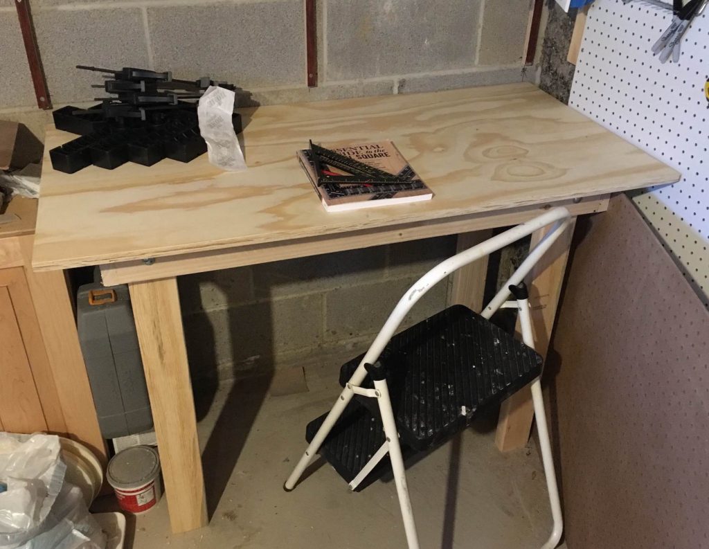
This might sound hugely bespoke and artisanally overdone, but they’re not that complicated, and as a major benefit, the process has helped me understand SVG a little bit better.  Here’s one example, a top-down diagram of the (supposedly) temporary workbench I recently built out of plywood and kiln-dried framing studs.

That shows a 2’×4′ benchtop with a supporting frame (the overlapping grayish boxes) and the placement of the four legs (the brown rectangles).  Here’s how I wrote the elements to represent the supporting frame.

<g class="structure">
    <path d="M 3.75 3.75  l 40.5 0" /> <!-- back -->
    <path d="M 3.75 12.00 l 40.5 0" class="optional" />
    <path d="M 3.75 20.25 l 40.5 0" /> <!-- front -->

    <path d="M 3.75 3  l 0 18" /> <!-- left -->
    <path d="M 24.00 3.75 l 0 16.5" class="optional" />
    <path d="M 44.25 3 l 0 18" /> <!-- right -->
</g>

And here’s how I styled them.

.structure {
    stroke: #000;
    stroke-width: 0;
    fill: #000;
}
.structure path {
    opacity: 0.1;
    stroke-width: 1.5;
}
.structure .optional {
    opacity: 0.05;
}

I like using paths in this situation because they let me pick a starting coordinate, then draw a line with relative X-Y values.  So that first path starts at X=3.75 and Y=3.75, and then draws a line whose endpoint is 40.5 X-units and 0 Y-units from the starting point.  In other words, it’s 40.5 units long and purely horizontal.  Compare that to the path marked left, which starts nearby (X=3.75, Y=3) and runs 18 units straight down.

This helps with cut planning because I set things up such that each unit equals an inch.  Just by looking at the values in the SVG, I know I need two pieces that are 40.5 inches long, and two that are 18 inches long.  (Three pieces of each length, if I’d decided to use the pieces classed as optional, but I didn’t.)

And how did I get that to work?  I set the viewbox to be only a few coordinate units larger than the overall piece, which I knew would be 24 by 48 units (inches), and then made the image itself large.

<svg xmlns:svg="http://www.w3.org/2000/svg"
    xmlns="http://www.w3.org/2000/svg"
    xmlns:xlink="http://www.w3.org/1999/xlink"
    width="1000"
    height="500"
    viewBox="0 0 54 30"
    >

Basically, I added 6 to each of 24 and 48 to get my viewBox values, allowing me three units of “padding” (not CSS padding) on each side.  I filled the whole thing with a rectangle with a soft gray fill, like so.

<rect height="100%" width="100%" fill="#EEE" />

Which was great, but now I had to figure out how to get the 24×48 workplan into the center of the viewbox without having to add three to every coordinate.  I managed that with a simple translation.

<g transform="translate(3,3)">
    <rect width="48" height="24" fill="hsla(42deg,50%,50%,0.5)" />
    …
</g>

And with that, everything inside that g (which is basically the entire diagram) can use coordinates relative to 0,0 without ending up jammed into the top left corner of the image.  For example, that rect, which has no x or y attributes and so defaults both to 0.  It thus runs from 0,0 to 48,24 (as is proper, X comes before Y), but is actually drawn from 3,3 to 51,27 thanks to the transform of the g container.

The drawback to this approach, in my eyes, is that if text is added, it needs a really small font size.  In this particular case, I decided to add a measurement grid to the diagram which is revealed when the SVG is printed.  You can also see it on a mouse-and-keyboard computer if you click through to the SVG and then hover the tabletop.  To all the paths I used to make the grid (and yes, there’s a better way), I added a set of labels like these:

<text x="12" y="0" dx="0.5" dy="-0.5">12</text>
<text x="24" y="0" dx="0.5" dy="-0.5">24</text>
<text x="36" y="0" dx="0.5" dy="-0.5">36</text>
<text x="48" y="0" dx="0.5" dy="-0.5">48</text>

<text x="0" y="0" dx="-0.33" dy="-0.33">0</text>
<text x="0" y="12" dx="-0.5" dy="0.5">12</text>
<text x="0" y="24" dx="-0.5" dy="0.5">24</text>

At my browser’s default of 16px, the text is HUGE, because it gets made 16 units tall.  That’s almost three-quarters the height of the viewbox!  So I ended up styling it to be teensy by any normal measure, just so it would come out contextually appropriate.

.lines text {
    font-size: 1px;
    font-family: Arvo, sans-serif;
    text-anchor: end;
}

Yes.  1px.  I know.  And yet, they’re the right size for their context.  It still grates on me, but it was the answer that worked for this particular context.  You can see the result if you load up the SVG on its own and mouse-hover the benchtop.

The legs I decided to do as rect elements, for no reason I can adequately explain other than I’d started to get a little sick of the way path forced me to figure out where the center of each line had to be in order to make the edges land where I wanted.  path is great if you want a line exactly centered on a unit, like 12.00, but if you want the edge of a board to be three inches from the left edge of the tabletop, it has to start at x="3.75" if the board is 1.5 inches wide.  If the width ever changes, you have to change the x value as well.

For the support frame, which is going to be made entirely out of boards an inch and a half wide, this wasn’t a super big deal, but the math had started to grate a bit.  So, the legs are rects, because I could use the grid I’d drawn to figure out their top left corners, and the height and width were constants.  (I probably could have set those via the CSS, but eh, sometimes it’s better to have your code self-document.)

<g class="legs">
    <rect x="4.5" y="4.5" height="1.5" width="3.5" />
    <rect x="4.5" y="18" height="1.5" width="3.5" />
    <rect x="40" y="4.5" height="1.5" width="3.5" />
    <rect x="40" y="18" height="1.5" width="3.5" />
</g>

Honestly, I probably didn’t even need to include these, but they served as a useful reminder not to forget them when I went to buy the wood.

As I said, simply by glancing at the SVG source, I can see how long the support frame’s pieces need to be — but more to the point, as I adjusted numbers to move them around, I worked their sizes into my head.  What I mean is, I had to visualize them to draw the right lines, and that means I’ve already done some visualization of the assembly.  I just need to remember that each of the four legs will be 34″ long at the most.  Taken all together, I’ll need three 8-foot 2×4 boards (which actually have a cross-section of 1.5″×3.5″ — don’t ask), chopped up and joined appropriately, to go under my 2’×4′ benchtop.

So that’s how I utterly geeked up my workbench project — and if that seems like a bit much, just wait until you see the next thing I did, and what I learned along the way.


CSS4 Color Keyword Distribution Visualization

Published 4 years, 11 months past

Long, long ago — not quite seven years ago, in fact — I built a canvas-based visualization of the distribution of CSS3/SVG color keywords and released it.  And there it’s sat, static and inert (despite being drawn with a whooooole lotta JS) ever since.

I’ve always meant to get back to it and make it more interactive.  So over the past several evenings, I’ve rebuilt it as an SVG-based visualization.  The main point of doing this was so that when you hover the mouse pointer over one of the little color boxes, it will fill the center of the color wheel with the hovered color and tell you its name and HSL values.  Which it does, now.  It even tries to guess whether the text should be white or black, in order to contrast with the underlying color.  Current success rate on that is about 90%, I think.  Calculating perceived visual brightness turns out to be pretty hard!

Other things I either discovered, or want to do better in the future:

  • Very nearly half the CSS4 (and also CSS3/SVG) color keywords are in the first 90 degrees of hue.  More than half are in the first 120 degrees.
  • There are a lot of light/medium/dark variant names in the green and blue areas of the color space.
  • I wish I could make the color swatches bigger, but when I do that the adjacent swatches overlap each other and one of them gets obscured.
  • Therefore, being able to zoom in on parts of the visualization is high on my priority list.  All I need is a bit of event monitoring and some viewbox manipulation.  Well, that and a bit more time. Done, at least for mouse scroll wheels.
  • I’d like to add a feature at some point where you type text, and a list is dynamically filtered to show keywords containing what you typed.  And each such keyword has a line connecting it to the actual color swatch in the visualization.  I have some ideas for how to make that work.
  • I’d love to create a visualization that placed the color swatches in a 3D cylindrical space summarizing hue, lightness. and saturation.  Not this week, though.
  • I’m almost certain it needs accessibility work, which is also high on my priority list.
  • SVG needs conic gradients.  Or the ability to wrap a linear gradient along/inside/around a shape like a circle, that would work too.  Having to build a conic gradient out of 360 individual <path>s is faintly ridiculous, even if you can automate it with JS.
  • And also z-index awareness.  C’mon, SVG, get it together.

Anyway, here it is: CSS4 Color Keyword Distribution.  I hope you  like it!


Browse the Archive

Earlier Entries