Design for Real Life: Online for Free AND On Sale for Money
Published 1 year, 9 months past
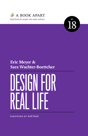
Design for Real Life is now available, for free, in its entirety, at dfrlbook.com. If you like what you read and want a personal copy, or just to support Sara and me, print-on-demand and ePub versions are also available from a number of sources. There are some countries where the book is not yet available, which we hope will be fixed soon. We’ll update the “Buy the book” page as appropriate.
The booksite contains the entire content of the book, with no paywalls or premium tiers or whatever gimmicks late-stage capitalism/early-stage infoconomy is forcing online publishers to try this month. So if you want to read it for nothing more than some of your time, or share it with people who you think might benefit from the free resource, go for it! Spread the word far and wide! Please and thank you.
To those who already own a copy of the book, the only real differences between that text and the one we have now is: we removed all the A Book Apart (ABA) branding and contact information, and made a couple of URL updates. We also had to switch to fonts for which we had licensing. Thus, if you have the ABA version, this is essentially the same thing. You do not need to buy this new printing. You certainly can buy it, if you want, but the content won’t be different in any meaningful way.
A project like this does not happen individually, and some thanks are in order.
First, so very many thanks to my co-author, Sara Wachter-Boettcher. Not just for writing it with me almost a decade ago, but also for her tireless work on the tedious minutia of transferring ownership of publisher accounts, obtaining a new ISBN, organizing the work that needed to be done, et cetera, et cetera. Basically, project managed the whole thing. It would have taken forever to get done if I’d been in charge, so the credit for it being live goes entirely to her.
Second, many thanks to Jeff Eaton, who wrote a converter called Dancing Queen that takes in an ABA ePub file and spits out Markdown files containing all the text and images of the figures. Then he gave it to us all for free.
Third, we were able to get the book up for free thanks to the generosity of fellow ABA author and union man Mat Marquis, who wrote some code to take the output of Dancing Queen and import it into an 11ty install. He did free tech support and lent a helping hand to us whenever we ran into snags. He was also an integral part of the process that led to all the ABA authors reclaiming full ownership of their books. He’ll deny every word of it, but dude is a mensch. You should hire him to do cool stuff for you.
Speaking of all the ABA authors, the community we formed to help each other through the reclamation process has been a real blessing. So many tips and tricks and expressions of support and celebrations of progress have flowed through the team over the past few months. None of us had to do any of this alone. Collective action, community support, works.
The conversion to ePub was handled by the entirely capable Ron Bilodeau, who leveraged his experience doing that work for ABA to do it for us. Thank you, Ron!
And certainly not least, thank you to everyone at A Book Apart for publishing the book in the first place, for being great partners in its creation, and for releasing the books back to us when it was time to close up shop. It’s hard to imagine it would have existed at all without ABA, so thank you, one and all.