Generating Wireframe Boxes with CSS and HTML5
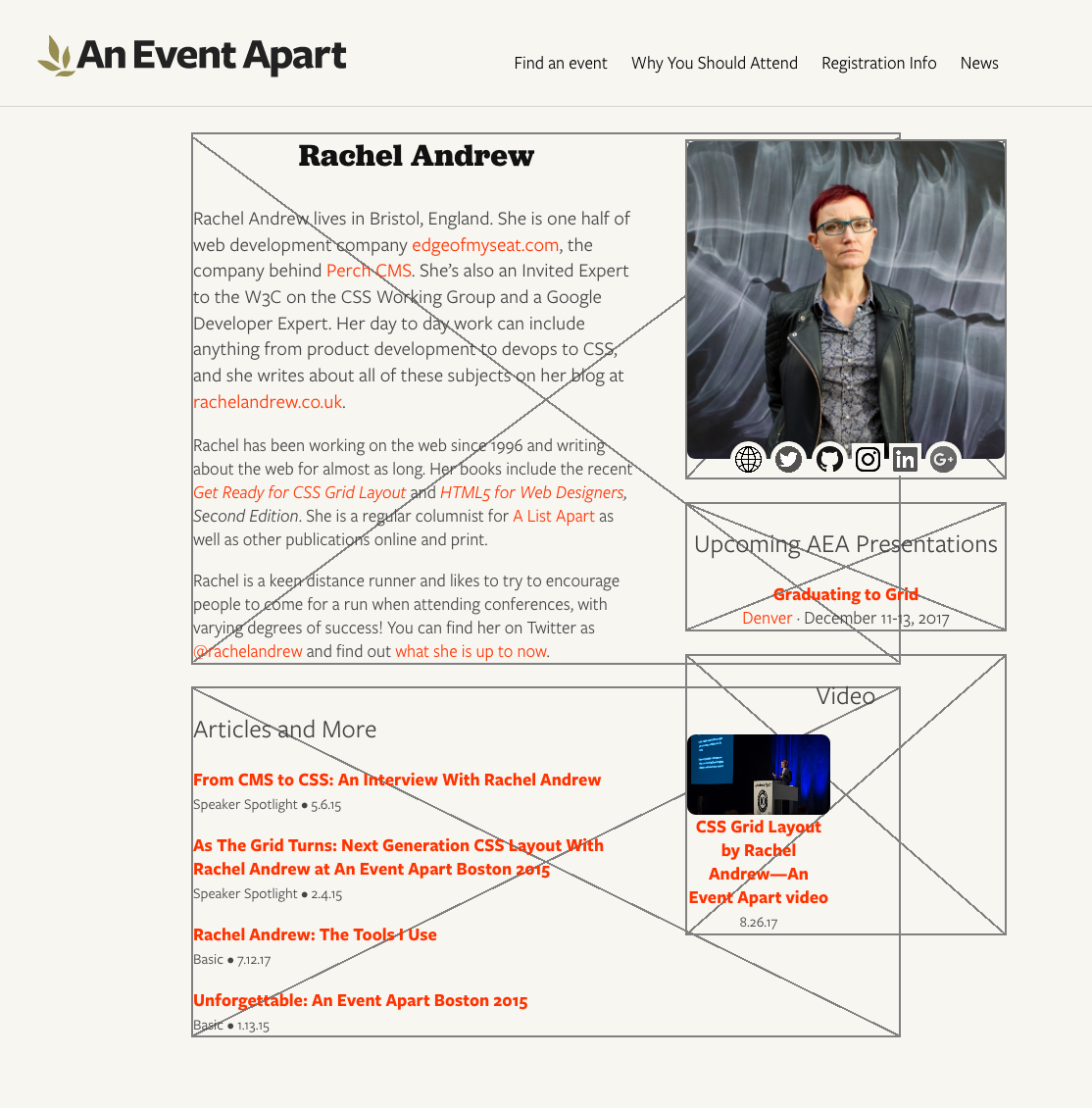
Published 8 years, 7 months pastI was recently noodling around with some new layout ideas for An Event Apart’s speaker pages (e.g., Chris Coyier’s or Jen Simmons’) and wanted to share the ideas with other members of the team. But what I really wanted to show was wireframes to convey basic arrangement of the pieces, since I hadn’t yet done any time polishing details.
I thought about taking screenshots and Photoshopping wireframe boxes over the various layout pieces, but then I wondered: could I overlay boxes on the live page with CSS? Or perhaps even create and overlay them with nothing but some declarations and a wanton disregard for the sensibilities of god or man?
And that’s when I realized…I could.

Now I’m going to share my discovery with you.
Before I get started, I want to make one thing clear: this isn’t backward compatible. I don’t care. It doesn’t need to be. It does work in the latest versions of Firefox and Chrome, within reasonable tolerances — Chrome falls a bit short on one aspect, which I’ll point out when we get there.
All good? Then let’s go.
The goal was creating X-filled boxes that wireframers love so very, very much. I figured, any container element that needs to have a box stuck over it gets a class of wireframe.
<div class="wireframe">…(content goes here)…</div>(Don’t get too attached to that class, by the way: it doesn’t survive the article. Foreshadowing!)
The easy part was drawing a box around any element with that class. I decided to use outlines, because they’re rarely employed for box edging and they don’t affect the layout even if your box-sizing is set to content-box. (Mine usually is, by dint of not setting box-sizing at all. But, you know, you do you.)
.wireframe {outline: 2px solid gray;}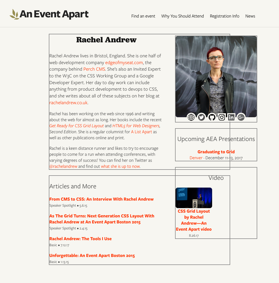
The boxes overlap each other because the layout pieces on the right are, at least for the moment, floated. They’re laid out that way so that if the right-hand content is short and the bio and articles run long, they can wrap around below the ‘sidebar’. It’s generally useful to have the outlines showing the actual limits of the element boxes to which they’re attached.
There is a potential drawback here: if your layout involves using negative margins to pull some elements out of their parents, and those parent elements are designated as wireframe boxes, outlines will stretch around the outhanging elements in Firefox, though not in Chrome. Borders do not act the same way in Firefox. I can’t rightly call this a bug, because I’m honestly not sure what outlines should do here. Just be aware of it, is what I’m saying.
Anyway, drawing rectangles with outlines, that’s the easy part. Now I needed two diagonal lines, going from corner to corner. But how?
Linear gradients, that’s how. See, if you use quadrant-based directions for your gradients, special magic math happens under the hood such that at the exact midpoint of the gradient, the color-line that extends perpendicularly off the gradient ray shoots precisely into the corners of the two quadrants adjacent to the quadrant into which the gradient ray is pointing. Okay, that was probably hard to follow. For example, set the gradient direction as to top right and the 50% color line of the gradient will run into the top left to the bottom right corners.
That’s exactly what I needed! Thus:
.wireframe {outline: 2px solid gray;
   background:
      linear-gradient(to top right,
         transparent 49.9%, gray 49.9%,
         gray 50.1%, transparent 50.1%);
}
Okay, that’s one diagonal line. The other is literally a copy of the first, except for having it go toward a different quadrant.
.wireframe {outline: 2px solid gray;
   background:
      linear-gradient(to top right,
         transparent 49.9%, gray 49.9%,
         gray 50.1%, transparent 50.1%),
      linear-gradient(to bottom right,
         transparent 49.9%, gray 49.9%,
         gray 50.1%, transparent 50.1%);
}
Bingo: an X. But not one that scales terribly well. Using percentages there means that the gray lines will be as thick as 0.2% the total length of the gradient ray. Small boxes get thin, sometimes broken diagonals. Great big boxes get thick honkin’ lines.
So I fixed it with calc().
.wireframe {outline: 2px solid gray;
   background:
      linear-gradient(to top right,
         transparent calc(50% - 1px), gray calc(50% - 1px),
         gray calc(50% + 1px), transparent calc(50% + 1px)),
      linear-gradient(to bottom right,
         transparent calc(50% - 1px), gray calc(50% - 1px),
         gray calc(50% + 1px), transparent calc(50% + 1px));
}
And there you go: two-pixel-thick diagonal lines.
There are two things to note here, before we move on. First is that the spaces around the operators in the calc() values are intentional and, more to the point, necessary. If you remove one or both of those spaces, calc() will simply fail to work. In other words, calc(50%-1px) will fail — no background for you! This is as designed, and there are reasons for it I don’t want to go into here, but suffice to say they exist and are arguably sensible. calc(50% - 1px), on the other hand, works as intended.
Well, mostly: this is where Chrome comes up a bit short. In large boxes, Chrome creates fuzzy lines thicker than 2 pixels. I’m not sure what it’s doing to fudge the numbers here, but it sure seems like it’s fudging something. The lines also don’t go into the corners quite as precisely as they should. Firefox’s lines, on the other hand, come out correctly sized no matter what box size I set up, even if they are a bit jagged at times, and they go exactly into the corners of all the boxes I tested. Chrome’s sloppiness here isn’t a deal-breaker, as far as I’m concerned, but it’s there and you should know about it.
So that’s an element with an outer edge and two diagonal lines. This is great as long as the box contains no actual content, which will sit on top of the diagonals, as you can see with the “hero image” in the top right. Maybe that’s what you want, in which case great, but I specifically wanted overlays. That way I could stick them on a live page and sort of fade out the contents while sticking wireframe boxes on top, to make the boxes the focus while still showing the stuff inside them.
Enter generated content. If I create a pseudo-element and attach the diagonal background gradients to that, they can sit on top of all the content. That’ll also let me throw in a translucent background color to fill the box and fade out the contents. Like so:
.wireframe {outline: 2px solid gray;
   position: relative; z-index: 1;}
.wireframe::before {
   position: absolute; z-index: 8675309;
   top: 0; bottom: 0; right: 0; left: 0;
   background:
      linear-gradient(to top right,
         transparent calc(50% - 1px), gray calc(50% - 1px),
         gray calc(50% + 1px), transparent calc(50% + 1px)),
      linear-gradient(to bottom right,
         transparent calc(50% - 1px), gray calc(50% - 1px),
         gray calc(50% + 1px), transparent calc(50% + 1px)),
      #FFF9;
      content: "";
}
I used ::before mostly because hey, why not, but also because clearfix is usually an ::after and I hear people are still using clearfix, more’s the pity. So this avoids it. If you’ve moved beyond the need for clearfix, then you can use ::after just as easily. Whatever floats your fancy. (Get it? Floats? Yeah? Clearfix? Floats? Ah, I kill me.)
The stupidly large z-index on the ::before is there to put the box overlay above any gridded, flexed, or positioned content that has an automatic z-index, or at least a sensible one. You can raise it as high as you’d like (and your browser’s bit-depth will allow). The small z-index on the elements themselves, on the other hand, makes sure they get an explicit stacking placement instead of an automatically-assigned place on the Z axis. I find this generally settles a number of odd behaviors in various browsers. Your experience may vary.
It was at this point that I realized there was a whole other level here. I mean, wireframe boxes stretched over content is pretty nifty all by itself. That could have been enough. But it wasn’t.
Because what I realized was that I didn’t just want wireframe boxes, I wanted labeled wireframe boxes. If a box was being applied to a list of articles, then I wanted a great big “Articles” label sitting in the middle of it, to make it obvious what was being placed there.
Well, there was already a content property just sitting there, waiting to throw in actual content instead of an empty string, but how to fill it? And that’s when I knew that .wireframe’s days were numbered.
That’s because the easiest way to label each box was to use an HTML data attribute to attach the label I wanted to display. And once that attribute was there, why not apply the wireframe styles based on the presence of the attribute, instead of adding class names that might get in the way of some unexpected DOM script? So I changed the markup and CSS like this:
<div data-wf="Articles">…(content goes here)…</div>[data-wf] {outline: 2px solid gray;
position: relative; z-index: 1;}
[data-wf]::before {
position: absolute; z-index: 8675309;
top: 0; bottom: 0; right: 0; left: 0;
background:
linear-gradient(to top right,
transparent calc(50% - 1px), gray calc(50% - 1px),
gray calc(50% + 1px), transparent calc(50% + 1px)),
linear-gradient(to bottom right,
transparent calc(50% - 1px), gray calc(50% - 1px),
gray calc(50% + 1px), transparent calc(50% + 1px)),
#FFF9;
content: "";
}(True story: I almost called it data-wtf instead. Almost.)
Having done that, I could modify the CSS to insert the attribute value, style the inserted text to look nice, and use flexbox properties to center it in the box. So I did.
[data-wf] {outline: 2px solid gray;
   position: relative; z-index: 1;}
[data-wf]::before {
   position: absolute; z-index: 8675309;
   top: 0; bottom: 0; right: 0; left: 0;
   background:
      linear-gradient(to top right,
         transparent calc(50% - 1px), gray calc(50% - 1px),
         gray calc(50% + 1px), transparent calc(50% + 1px)),
      linear-gradient(to bottom right,
         transparent calc(50% - 1px), gray calc(50% - 1px),
         gray calc(50% + 1px), transparent calc(50% + 1px)),
      #FFF9;
      content: attr(data-wf);
      font: bold 2em Jubilat, Georgia, serif;
      color: gray;
      display: flex; justify-content: center; align-items: center;
}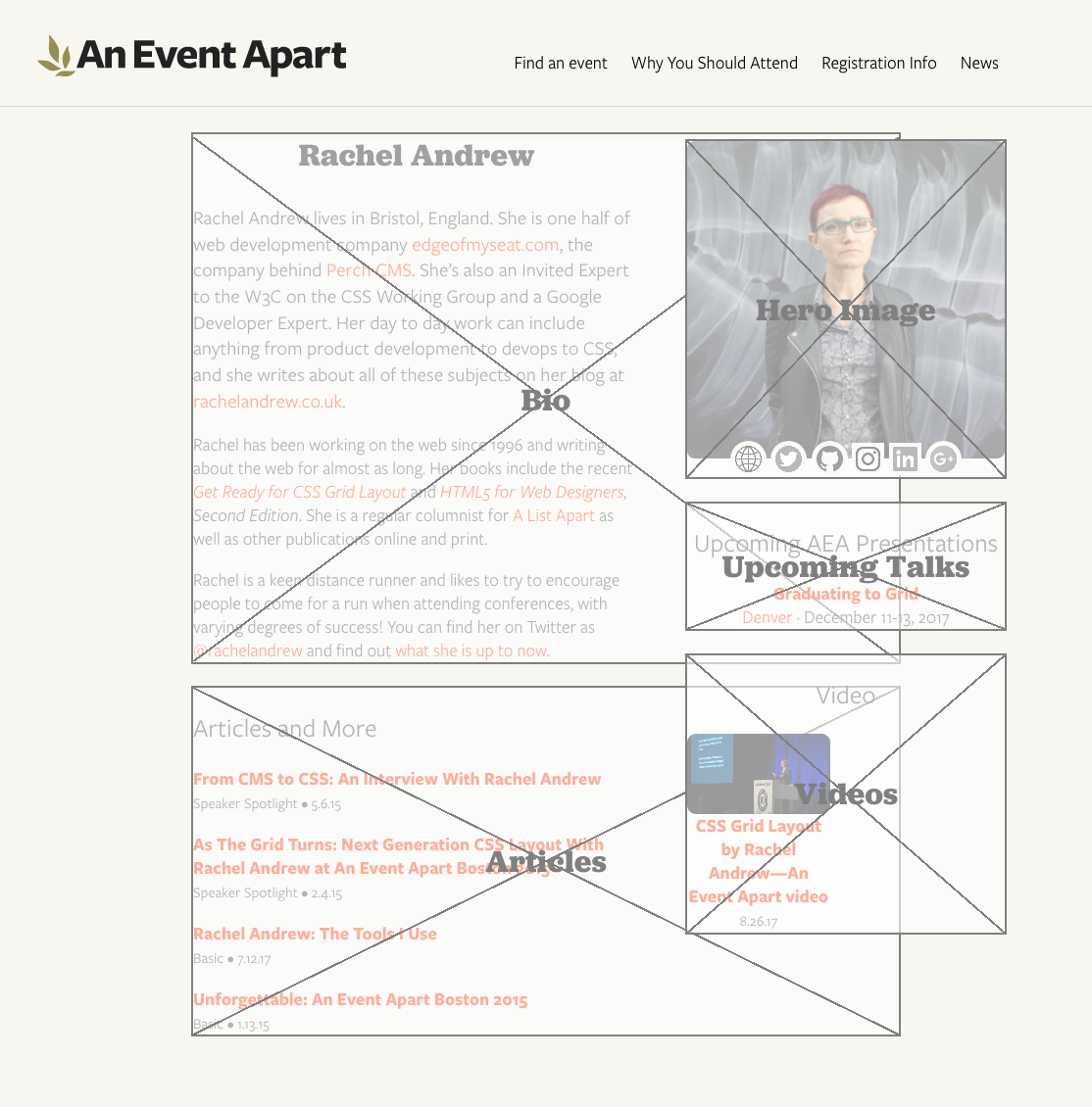
That yielded big beautiful bold Jubilat labels (Jubilat is one of AEA’s brand font faces), sitting right on top of the center of the box, the crossing of the two diagonal lines behind them.
Which actually turned out to be a small problem for me. That text is certainly readable, but I wanted it to stand out a bit more from the diagonals. I decided to stack text shadows in order to semi-simulate outside text stroking.
[data-wf] {outline: 2px solid gray;
   position: relative; z-index: 1;}
[data-wf]::before {
   position: absolute; z-index: 8675309;
   top: 0; bottom: 0; right: 0; left: 0;
   background:
      linear-gradient(to top right,
         transparent calc(50% - 1px), gray calc(50% - 1px),
         gray calc(50% + 1px), transparent calc(50% + 1px)),
      linear-gradient(to bottom right,
         transparent calc(50% - 1px), gray calc(50% - 1px),
         gray calc(50% + 1px), transparent calc(50% + 1px)),
      #FFF9;
      content: attr(data-wf);
      font: bold 2em Jubilat, Georgia, serif;
      color: gray;
      text-shadow:
         0 0 0.25em #FFF9, 0 0 0.25em #FFF9,
         0 0 0.25em #FFF9, 0 0 0.25em #FFF9,
         0 0 0.25em #FFF9;
      display: flex; justify-content: center; align-items: center;
}
It’s possible to use just four offset shadows with minimal or zero blur, but I find it sometimes creates weird jags on serif fonts, so I like stacking blurred shadows better. But, again, you do you.
As I looked over the results, it slowly dawned on me that the white-on-gray box scheme works well enough for a starting wireframe setup with no branding applied, but I was planning to drop these on pages with actual design and colors and that sort of thing. I didn’t want the boxes to fill with translucent white; I wanted them to be translucent versions of the page background color. And, furthermore, I wanted a way to be able to easily alter that color, when applied to different designs.
Custom properties to the rescue! Which is to say, native CSS variables to the rescue!
Our page background color at An Event Apart is #F7F6F1, a combo I actually have memorized at this point. Since I wanted to fill the boxes with a roughly three-quarters-opaque variant, I settled on #F7F6F1BB. (Actual 75% is BF, if you care.) So I defined a custom property for it:
html {
   --fill: #F7F6F1BB;
}
I could have assigned the variable to the [data-wf] rule instead of html, but I felt like setting them globally. Because that’s how I roll, yo — Wulf & Shaw have no strings on me. If you want to bring the variables in closer, go for it.
While I was there, I figured, why not, let’s also define a variable for the shared color of the outlines, diagonals, and label text.
html {
   --fill: #F7F6F1BB;
   --wire: gray;
}
Then all I needed was to sprinkle variable calls where the colors were sitting. I ended up here:
html {
   --fill: #F7F6F1BB;
   --wire: gray;
}
[data-wf] {outline: 2px solid var(--wire);
   position: relative; z-index: 1;}
[data-wf]::before {
   position: absolute; z-index: 8675309;
   top: 0; bottom: 0; right: 0; left: 0;
   background:
      linear-gradient(to top right,
         transparent calc(50% - 1px), var(--wire) calc(50% - 1px),
         var(--wire) calc(50% + 1px), transparent calc(50% + 1px)),
      linear-gradient(to bottom right,
         transparent calc(50% - 1px), var(--wire) calc(50% - 1px),
         var(--wire) calc(50% + 1px), transparent calc(50% + 1px)),
      var(--fill);
      content: attr(data-wf);
      font: bold 2em Jubilat, Georgia, serif;
      color: var(--wire);
      text-shadow:
         0 0 0.25em var(--fill), 0 0 0.25em var(--fill),
         0 0 0.25em var(--fill), 0 0 0.25em var(--fill),
         0 0 0.25em var(--fill);
      display: flex; justify-content: center; align-items: center;
}
The label could be broken out to use its own variable (e.g., --text or --label) easily enough, but I wanted a minimum of things to change. I know myself too well to set up a bunch of controls to fiddle with, especially where color is concerned.
And with that, I had a ready-to-hand, easily theme-able wireframing style block that I can drop into any development page and invoke simply by adding a few data attributes to the markup. Data attributes, I might add, that would be trivially easy to later find and remove with regular expressions. It’s a quick way to make it clear to stakeholders that a work in progress is, in fact, in progress, as well as a handy way to visualize which pieces of a prototype layout are going where.
Now that we’ve come to the end and you’re still hanging in there with me, let me just say that I hope you’ve enjoyed this little trip through various parts of CSS. If you have any questions, feel free to drop them in the comments below. I’ll do my best to respond in reasonable amounts of time, travel and such permitting.
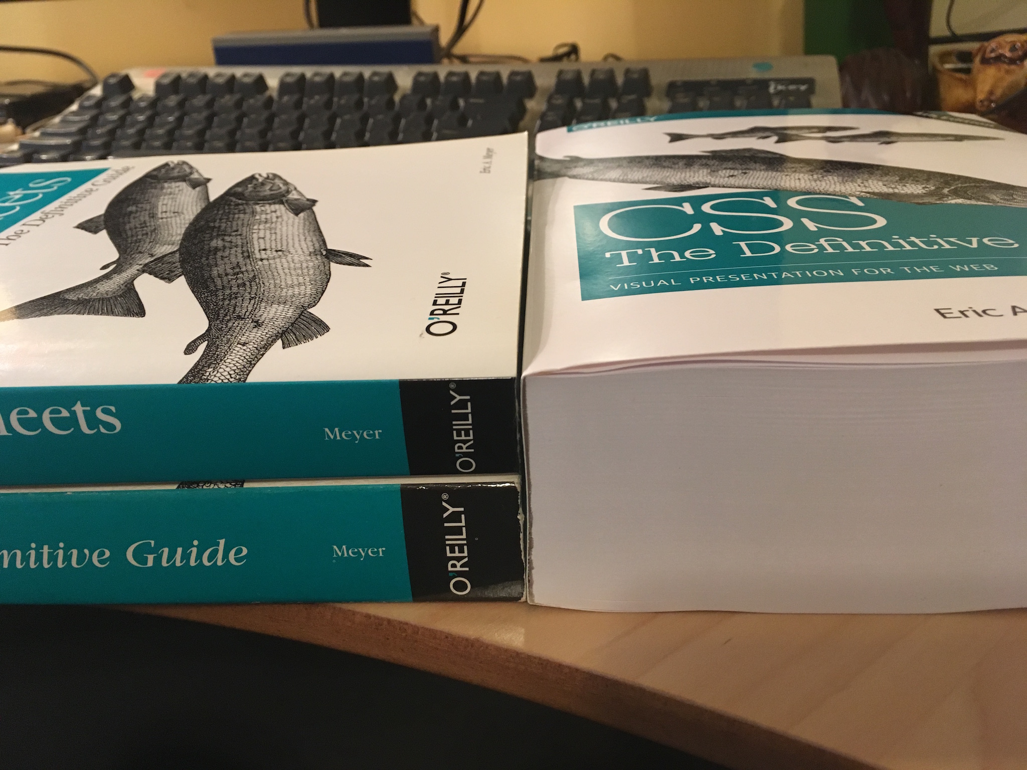
P.S. And one final note, as Kai Ryssdal would say: every bit of CSS I used here is covered in CSS: The Definitive Guide, 4th Edition. I turned to my print copy twice in the process of working all this out, as it happens, to remind myself of specific syntax (for custom properties) and whitespace requirements (for calc() operators). It really feels good to have a thing I made be useful to me!