Posts from October 2015

Essential Tool: Firefox’s screenshot Command

Published 9 years, 3 weeks past

The Graphical Command Line Interpreter (GCLI) has been removed from Firefox, but screenshot has been revived as :screenshot in the Web Console (⌥⌘K), with most of the same options discussed below. Thus, portions of this article have become incorrect as of August 2018.  Read about the changes in my post Firefox’s :screenshot Command.

Everyone has their own idiosyncratic collection of tools they can’t work without, and I’ve recently been using one of mine as I produce figures for CSS: The Definitve Guide, Fourth Edition (CSS:TDG4e).  It’s Firefox’s command-line screenshot utility.

To get access to screenshot, you first have to hit ⇧F2 for the Developer Toolbar, not ⌥⌘K for the Web Console.  (I know, two command lines — who thought that was a good idea?  Moving on.)  Once you’re in the Developer Toolbar, you can type s and then hit Tab to autocomplete screenshot.  Then type a filename for your screenshot, if you want to define it, either with or without the file extension; otherwise you’ll get whatever naming convention your computer uses for screen captures.  For example, mine does something like Screen Shot 2015-10-22 at 10.05.51.png by default.  If you hit [return] (or equivalent) at this point, it’ll save the screenshot to your Downloads folder (or equivalent).  Done!

Except, don’t do that yet, because what really makes screenshot great is its options; in my case, they’re what elevate screenshot from useful to essential, and what set it apart from any screen-capture addon I’ve ever seen.

The option I use a lot, particularly when grabbing images of web sites for my talks, is --fullpage.  That option captures absolutely everything on the page, even the parts you can’t see in the browser window.  See, by default, when you use screenshot, it only shows you the portion of the page visible in the browser window.  In many cases, that’s all you want or need, but for the times you want it all, --fullpage is there for you.  Any time you see me do a long scroll of a web page in a talk, like I did right at the ten-minute mark of my talk at Fluent 2015, it was thanks to --fullpage.

If you want the browser --chrome to show around your screenshot, though, you can’t capture the --fullpage.  Firefox will just ignore the -fullpage option if you invoke --chrome, and give you the visible portion of the page surrounded by your browser chrome, including all your addon icons and unread tabs.  Which makes some sense, I admit, but part of me wishes someone had gone to the effort of adding code to redraw the chrome all the way around a --fullpage capture if you asked for it.

Now, for the purposes of CSS:TDG4e’s figures, there are two screenshot options that I cannot live without.
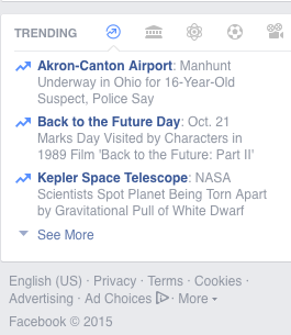
A screen capture of Facebook’s “Trending” panel.
I captured this using screenshot fb-trend --selector '#u_0_l'.  That saved exactly what you see to fb-trend.png.

The first is --selector, which lets you supply a CSS selector to an element — at which point, Firefox will capture just that element and its descendants.  The only, and quite understandable, limitation is that the selector you supply must match a single element.  For me, that’s usually just --selector 'body', since every figure I create is a single page, and there’s nothing in the body except what I want to include in the figure.  So instead of trying to drag-select a region of the screen with ⇧⌘4, or (worse) trying to precisely size the browser window to show just the body element and not one pixel more, I can enter something like screenshot fig047 --selector 'body' and get precisely what I need.

That might seem like a lot to type every time, but the thing is, I don’t have to: not only does the Web Toolbar have full tab-autocomplete, the Toolbar also offers up-arrow history.  So once I’ve tab-completed the command to capture my first figure, I just use the up arrow to bring the command back and change the file name.  Quick, simple, efficient.

The second essential option for me is --dpr, which defines a device pixel ratio.  Let’s say I want to capture something at four times the usual resolution.  --dpr 4 makes it happen.  Since all my figures are meant to go to print as well as ebooks, I can capture at print-worthy resolutions without having to use ⌘+ to blow up the content, or fiddle with using CSS to make everything bigger.  Also if I want to go the other way and capture a deliberately pixellated version of a page, I can use something like --dpr 0.33.

I have used this occasionally to size down an image online: I “View Image” to get it in its own window, then use screenshot with a fractional DPR value to shrink it.  Yes, this is a rare use case, even for me, but hey — the option exists!  I haven’t used the DPR option for my talks, but given the growing use of HD 16:9 projectors — something we’ve been using at An Event Apart for a while now, actually — I’m starting to lean toward using --dpr 2 to get sharper images.

(Aside: it turns out this option is only present in very recent versions of Firefox, such as Developer Edition 43 and the current Nightlies.  So if you need DPR, grab a Nightly and go crazy!)
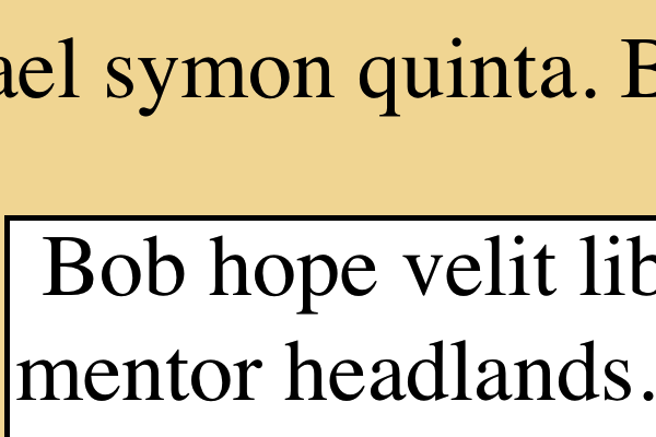
A closeup of text on a test page.
A snippet of an image I captured using --dpr 5.  On-screen, the page was at 100% zoom, 16-pixel (browser default) text sizing.  The resulting capture was 4000×2403 pixels.

And that’s not all!  You can set a --delay in seconds, to make sure a popup menu or other bit of interaction is visible before the capture happens.  If you want to take your captured image straight into another program before saving it, there’s --clipboard.  And there’s an option to upload straight to --imgur, though I confess I haven’t figured out how that one works.  I suspect you have to be logged into imgur first.  If anyone knows, please leave a comment so the rest of us know how to use it!

The one thing that irks me a little bit about screenshot is that the file name must come before the options.  When I’m producing a bunch of figures in a row, having to drag-select just the file name for replacement is a touch tedious; I wish I could put the file name at the end of the command, so I could quickly drag-select it with a rightward wrist-flick.  But all things considered, this is a pretty minor gripe.  Well, shut my mouth and paint me red — it turns out you can put the filename after the options.  Either that wasn’t possible at some point and I never retested the assertion, or it was always possible and I just messed up.  Either way, this irk is irksome no more!

The other thing I wish screenshot could do is let me define a precise width or height in pixels — or, since I’m dreaming, a value using any valid CSS length unit — and scale the result to that measure.  This isn’t really useful for the CSS:TDG4e figures, but it could come in pretty handy for creating talk slides.  No, I have no idea how that would interact with the DPR option, but I’d certainly be willing to find out.

So that’s one of my “unusual but essential” tools.  What’s yours?


A More Compassionate Facebook

Published 9 years, 1 month past

It’s been a busy couple of weeks for Facebook, in terms of compassionate design decisions.

First they announced that they aren’t adding a Dislike button, but they are adding a set of six emoji reactions to the “Like” button, so you can indicate a wider range of emotion.  Some people immediately linked this to Slack, as if emoji reactions hadn’t been a thing on social media for the last couple of years.  I happened to see Sally Herships asking “what are your thoughts?” about it on Twitter (heh), and oh, I had thoughts.  I ended up sharing some of those thoughts by phone, and one of them was part of a segment on American Public Media’s Marketplace.

It’s funny, in a way, that my thought on marketing and advertisers was what made it into the piece, because I think that was literally my whole thought about that side of things.  Most of the rest of my conversation with Sally was about how Facebook could use these reactions as a way to avoid insensitive design choices.  As an example, a status update that gets lots of interaction in the frowny-face or sad-face realm could be avoided when it comes to things like Year in Review.  I said something to the effect of:

People are sharing everything about their lives, positive and negative, billions of us every day.  That isn’t going to stop, so it’s great to see Facebook making changes to meet us where we are, or at least meet us partway.

These reaction emoji almost certainly aren’t the last word on this, but they’re a credible initial attempt.  In more than one sense, they’re a first step into a larger world.


Next, Facebook introduced filtering for its On This Day (OTD) feature.  This is another step in the evolution of On This Day, one that’s very welcome.  Facebook had already been revising its language to be more humane, shifting from simple “Relive this memory” to nuanced language expressing care and openness.

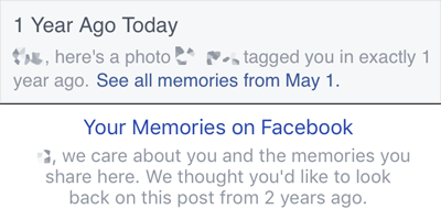
The original and more recent copy at the top of an On This Day memory.

With its new OTD preferences, Facebook now lets you define ranges of dates you’d like to be blacklisted, in effect, as well as people you don’t want to see memories about.  I’d commented on the lack of this, back when OTD launched:

…what I notice here is what’s missing:  I don’t see any reference to an ability to opt out of On This Day, either for certain days or altogether.

So far as I can tell, you still can’t opt out entirely; even if you turn off all notifications, you can still get memories inserted into your timeline.  For me, I see about one a month, more or less.  But here’s the interesting thing: they’re almost never my memories.  In what I still regard as a major gamble by Facebook, On This Day will show you posts, pictures, and videos posted by someone else, but on which you were tagged.  I presume (though I have no simple way to test) that adding a person in the OTD filtering preferences will prevent you from seeing memories in which they’re tagged as well as memories they posted.

If so, that’s a really smart step, as I can only imagine how a spiteful ex might abuse OTD.  It still leaves open the possibility of old posts that you don’t remember being tagged on suddenly appearing.  In many cases, that will be a delightful moment, but in many others, the exact opposite of that.  This is why I regard Facebook’s decision to show you posts from other people a gamble.  Even if they show unwanted memories to just 1% of their user base — a ridiculously low percentage — that’s literally 10 million people a day.

Still: wrinkles or no, flaws or no, the presence of filtering preferences is a major enhancement to On This Day.  I could block out all of June 2014, if I so chose.  There might be years where I blocked it, and others where I removed the block.  The important thing is that I’m being given that capability, in an environment that’s already designed to show me memories and acknowledge that it’s easy to get that wrong.  The user experience for adding filters is still clunky, but much like the reaction emoji, I view this as a credible first try, not the final word.

All this has made for some interesting Slack discussions between me and Sara, as we literally just finished the manuscript for our forthcoming, still-not-quite-titled-but-we’re-really-close-honest book on compassion in design.  Which has references to things like On This Day, so we’re already revising a book that hasn’t even been published yet.  And when will it be published?  We’re pulling for early next year, which sounds like a long way away until you remember that 2015 is getting close to done.

Kudos to Facebook, both for its efforts to be kinder in what they do and for its willingness to try.  Not many businesses, let alone social-media titans, have had the courage to think about what can go wrong in this realm, let alone actually acknowledge missteps and work to do better.  Well done.


Rebecca’s Boardwalk

Published 9 years, 1 month past

One month from today is the first-ever Rebecca’s Boardwalk, a fundraiser in support of Rebecca’s Gift.  It’s a family-friendly afternoon of carnival games with actual prizes to be won, a facepaint and temporary tattoo booth (many thanks to Tattly for their generous support!), indoor mini-golf and bounce houses, boardwalk food, and a pretty great silent auction.  We’ll have everything from gift-card grab bags to artisanal meat parties to signed shooting scripts from The Walking Dead up for bid!

All of the proceeds will go to fund the mission of Rebecca’s Gift, which is to provide healing family vacations after the death of a child.  The organization has already raised enough to assist at least two families in 2016.  We’d very much appreciate your support in helping us lend a helping hand to more families in desperate need of time to reconnect, rebuild, and relax.  It’s one of the very few organizations we know of that supports families after a child’s death, as opposed to before.  This is something I touched on in a piece I wrote for Natural Papa back in September, in conjunction with St. Baldrick’s.  It’s something Kat and our friend Karla are determined to do something about, and I’m honored to support their efforts.

I very much hope you can join us for Rebecca’s Boardwalk, or if not, support the event via a sponsorship.  Rebecca loved travel and boardwalks in particular, and we can’t think of a better way to celebrate her life while striving to help others heal as best we can.


(Side note for the web folks in the audience: the Rebecca’s Gift site in general, and the event page in particular, makes use of flexbox for simple layout.  Just in case you were looking for a public deployment example.)


CSS:TDG Update

Published 9 years, 1 month past

It’s time for a semi-periodic update on CSS: The Definitive Guide, 4th Edition!  The basic news is that things are proceeding, albeit slowly.  Eight chapters are even now available as ebooks or, in most cases, print-on-demand titles.  Behold:

  • CSS and Documents, which covers the raw basics of how CSS is associated with HTML, including some of the more obscure ways of strapping external styles to the document as well as media query syntax.  It’s free to download in any of the various formats O’Reilly offers.
  • Selectors, Specificity, and the Cascade, which combines two chapters to cover all of the various Level 3 selector patterns as well as the inner details of how specificity, inheritance, and cascade.
  • Values, Units and Colors, which covers all the various ways you can label numbers as well as use strings.  It also takes advantage of the new cheapness of color printing to use a bunch of nice color-value figures that aren’t forced to be all in grayscale.
  • CSS Fonts, which dives into the gory details of @font-face and how it can deeply affect the use of font-related properties, both those we use widely as well as many that are quickly gaining browser support.
  • CSS Text, which covers all the text styles that aren’t concerned with setting the font face — stuff like indenting, decoration, drop shadows, white-space handling, and so on.
  • Basic Visual Formatting in CSS, which covers how block, inline, inline-block, and other boxes are constructed, including the surprisingly-complicated topic of how lines of text are constructed.  Very fundamental stuff, but of course fundamentals are called that for a reason.
  • Transforms in CSS, which is currently FREE in ebook format, covers the transform property and its closely related properties.  2D, 3D, it’s all here.
  • Colors, Backgrounds, and Gradients, which covers those three topics in FULL GLORIOUS COLOR, fittingly enough.  Curious about the new background sizing options?  Ever wondered exactly how linear and radial gradients are constructed?  This book will tell you all that, and more.

Here’s what I have planned to write next:

  • Padding, Borders, Outlines, and Margins — including the surprisingly tricky border-image
  • Positioning – basically an update, with new and unexpected twists that have been revealed over the years (case in point)
  • Grid Layout – though this is coming faster than many of us realize, I may put this one off for a little bit while we see how browser implementations go, and find out what changes happen as a result

My co-author, Estelle, has these three chapters/short books currently in process:

  • Transitions
  • Animations
  • Flexbox

Beyond those 14 chapters, we have eight more on the roster, covering topics like floating, multicolumn layout, shapes, and more.  CSS is big now, y’all.

So that’s where we are right now.  Our hope is to have the whole thing written by the middle of 2016, at which point some interesting questions will have to be answered.  While most of the book is fine in grayscale, there are some chapters (like Colors, Backgrounds, and Gradients) that really beenfit from being in color.  Printing a 22-chapter book in color would make it punishingly expensive, even with today’s drastically lower cost of color printing.  So what to do?

Not to mention, printing a 22-chapter book is its own level of difficulty.  Even if we assume an average of 40 pages a chapter — an unreasonabnly low figure, but let’s go with it — that’s still a nine hundred page book, once you add front and back matter.  The binding requirements alone gets us into the realm of punishingly expensive, even without color.

Of course, ebook readers don’t have to care about any of that, but some people (like me) really do prefer paper.  So there will be some interesting discussions.  Print in two volumes?  Sell the individual chapter books in a giant boxed set, Chronicles of Narnia style?  We’ll see!


The Stages of Fear

Published 9 years, 1 month past

How many talks have I given over the years?  How many times have I stood at the front of a room, on a stage or in front of a chalkboard or otherwise before an audience, and talked at them for an hour or so?

Lanyrd says 72 as I write this, with two more coming this year.  But Lanyrd only goes back to 2003, so I already know it’s missing some of my past appearances.  Everything from 1995 (or was it 1996?) through 2003, for example.  The talks I’ve done for college classes and user groups in Cleveland.  Probably others as well.  So let’s round it off to an even one hundred, and pretend like that’s a meaningful milestone or something.

I used to talk about code, style, standards, all that stuff.  It was all, as the cliché goes, subjects for which I had prepared not my talk, but myself.  I knew the subject so thoroughly, I pretty much never wrote out a script.  I wrote an outline, assembled slides or demos or whatever to support that outline, and then mostly improvised my way through the talk.  The closest I got to rehearsal was back in 2007, I think, when my talk was two slides in Keynote and then a bunch of pre-created style snippets that I dropped into a live web page, saving and reloading, talking about the changes as I went.  Live-coding, except without relying on my sloppy typing skills.

(That one was called “Secrets of the CSS Jedi”, where I took a table of data, marked up as such, and turned it into a bar graph live on stage, the summary line of which I still remember: “CSS does not care what you think an element should look or act like.  You have far more power than you realize.”  That was a revolutionary thing to say back then.  We were coders once, and young.)

These days, my talks are nearly or entirely code-free, as I explore topics like compassion in design, and the ways that our coding has a profound influence on society now and into the future.  The talks generally start life as 9,000-word essays that I edit, rearrange, patch up, re-edit, polish, and then rehearse.  After the first two rehearsals, I re-re-edit and re-polish.  Then I rehearse several more times.

The point of all this being:

I stumble through my rehearsals, getting more and more incoherent, getting more frustrated every time I have to start over, certain I’ll never get the words to work, increasingly convinced it means the ideas behind them have no merit at all, until I want to curl up in a cushion fort and never come out.  I grapple with the fear that even if by some miracle I do have one or two worthwhile things to say, they’ll be buried in a flood of stuttered half-sentences and self-protective rhetorical tricks.

So I get nervous before my talks.  Adrenaline surges through me, elevating my pulse and making my palms sweat as they get prickly, the cold fire washing up my arms and into my cheeks.  I pace and fidget, concentrating on my breathing so I don’t hyperventilate.  Or hypoventilate, for that matter.

I do this before every talk I give at An Event Apart, even when I’ve given the talk half a dozen times previously.  I did it before I hit the stage at XOXO 2015.  I did it before I started my talks at Rustbelt Refresh.

A hundred public talks or more, and it’s still not easy.  I’m not sure it ever will be easy.  I’m not sure it ever should be easy.

The further point being:

Every speaker I know feels pretty much exactly the same.  We don’t all get the same nervous tics, but we all get nervous.  We struggle with our fears and doubts.  We all feel like we have no idea what we’re doing.

So if you’re afraid to get up in front of people and share what you know: you’re in very, very good company.  I know this, because I am too.

If you have something to share — and you do — try not to let the fear stop you.

We’re all afraid up there.

This article was originally published at The Pastry Box Project on 2 October 2015.


Browse the Archive