Posts from December 2023

2023 in (Brief) Review

Published 10 months, 2 weeks past

I haven’t generally been one to survey years as they end, but I’m going to make an exception for 2023, because there were three pretty big milestones I’d like to mark.

The first is that toward the end of May, the fifth edition of CSS: The Definitive Guide was published.  This edition weighs in at a mere 1,126 pages, and covers just about everything in CSS that was widely supported by the end of the 2022, and a bit from the first couple of months in 2023.  It’s about 5% longer by page count than the previous edition, but it has maybe 20% more material.  Estelle and I pulled that off by optimizing some of the older material, dropping some “intro to web” stuff that was still hanging about in the first chapter, and replacing all the appendices from the fourth edition with a single appendix that lists the URLs of useful CSS resources.  As with the previous edition, the files used to produce the figures for the book are all available online as a website and a repository.

The second is that Kat and I went away for a week in the summer to celebrate our 25th wedding anniversary.  As befits our inclinations, we went somewhere we’d never been but always wanted to visit, the Wisconsin Dells and surrounding environs.  We got to tour The Cave of the Mounds (wow), The House on the Rock (double wow), The World of Doctor Evermore (wowee), and the Dells themselves.  We took a river tour, indulged in cheesy tourist traps, had some fantastic meals, and generally enjoyed our time together.  I did a freefall loop-de-loop waterslide twice, so take that, Action Park.

The third is that toward the end of the year, Kat and I became grandparents to the beautiful, healthy baby of our daughter Carolyn.  A thing that people who know us personally know is that we love babies and kids, so it’s been a real treat to have a baby in our lives again.  It’s also been, and will continue to be, a new and deeper phase of parenthood, as we help our child learn how to be a parent to her child.  We eagerly look forward to seeing them both grow through the coming years.

So here’s to a year that contained some big turning points, and to the turning points of the coming year.  May we all find fulfillment and joy wherever we can.

Pixelating Live with SVG

Published 10 months, 3 weeks past

For reasons I’m not going to get into here, I want be able to pixelate web pages, or even parts of web pages, entirely from the client side.  I’m using ViolentMonkey to inject scripts into pages, since it lets me easily open the ViolentMonkey browser-toolbar menu and toggle scripts on or off at will.

I’m aware I could take raster screenshots of pages and then manipulate them in an image editor.  I don’t want to do that, though  —  I want to pixelate live.  For reasons.

So far as I’m aware, my only option here is to apply SVG filters by way of CSS.  The problem I’m running into is that I can’t figure out how to construct an SVG filter that will exactly:

  • Divide the element into cells; for example, a grid of 4×4 cells
  • Find the average color of the pixels in each cell
  • Flood-fill each cell with the average color of its pixels

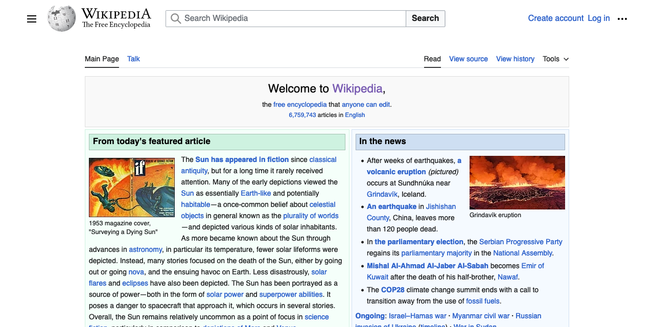
As a way of understanding the intended result, see the following screenshot of Wikipedia’s home page, and then the corresponding pixelated version, which I generated using the Pixelate filter in Acorn.

Wikipedia in the raw, and blockified.

See how the text is rendered out?  That’s key here.

I found a couple of SVG pixelators in a StackOverflow post, but what they both appear to do is sample pixels at regularly-spaced intervals, then dilate them.  This works pretty okay for things like photographs, but it falls down hard when it comes to text, or even images of diagrams.  Text is almost entirely vanished, as shown here.

The text was there a minute ago, I swear it.

I tried Gaussian blurring at the beginning of my filters in an attempt to overcome this, but that mostly washed the colors out, and didn’t make the text more obviously text, so it was a net loss.  I messed around with dilation radii, and there was no joy there.  I did find some interesting effects along the way, but none of them were what I was after.

I’ve been reading through various tutorials and MDN pages about SVG filters, and I’m unable to figure this out.  Though I may be wrong, I feel like the color-averaging step is the sticking point here, since it seems like <feTile> and <feFlood> should be able to handle the first and last steps.  I’ve wondered if there’s a way to get a convolve matrix to do the color-averaging part, but I have no idea  —  I never learned matrix math, and later-life attempts to figure it out have only gotten me as far as grasping the most general of principles.  I’ve also tried to work out if a displacement map could be of help here, but so far as I can tell, no.  But maybe I just don’t understand them well enough to tell?

It also occurred to me, as I was prepared to publish this, that maybe a solution would be to use some kind of operation (a matrix, maybe?) to downsize the image and then use another operation to upsize it to the original size.  So to pixelfy a 1200×1200 image into 10×10 blocks, smoothly downsize it to 120×120 and then nearest-neighbor it back up to 1200×1200.  That feels like it would make sense as a technique, but once again, even if it does make sense I can’t figure out how to do it.  I searched for terms like image scale transform matrix but I either didn’t get good results, or didn’t understand them when I did.  Probably the latter, if we’re being honest.

So, if you have any ideas for how to make this work, I’m all ears  —  either here in the comments, on your own site, or as forks of the Codepen I set up for exactly that purpose.  My thanks for any help!


Three Decades of HTML

Published 11 months, 1 week past

A few days ago was the 30th anniversary of the first time I wrote an HTML document.  Back in 1993, I took a Usenet posting of the “Incomplete Mystery Science Theater 3000 Episode Guide” and marked it up.  You can see the archived copy here on meyerweb.  At some point, the markup got updated for reasons I don’t remember, but I can guarantee you the original had uppercase tag names and I didn’t close any paragraphs.  That’s because I was using <P> as a shorthand for <BR><BR>, which was the style at the time.

Its last-updated date of December 3, 1993, is also the date I created it.  I was on lobby duty with the CWRU Film Society, and had lugged a laptop (I think it was an Apple PowerBook of some variety, something like a 180, borrowed from my workplace) and a printout of the HTML specification (or maybe it was “Tags in HTML”?) along with me.

I spent most of that evening in the lobby of Strosacker Auditorium, typing tags and doing find-and-replace operations in Microsoft Word, and then saving as text to a file that ended in .html, which was the style at the time.  By the end of the night, I had more or less what you see in the archived copy.

The only visual change between then and now is that a year or two later, when I put the file up in my home directory, I added the toolbars at the top and bottom of the page  —  toolbars I’d designed and made a layout standard as CWRU’s webmaster.  Which itself only happened because I learned HTML.

A couple of years ago, I was fortunate enough to be able to relate some of this story to Joel Hodgson himself.  The story delighted him, which delighted me, because delighting someone who has been a longtime hero really is one of life’s great joys.  And the fact that I got to have that conversation, to feel that joy, is inextricably rooted in my sitting in that lobby with that laptop and that printout and that Usenet post, adding tags and saving as text and hitting reload in Mosaic to instantly see the web page take shape, thirty years ago this week.


Browse the Archive