Posts from February 2010

Better PDF File Size Reduction in OS X

Published 14 years, 3 weeks past

One of the things you discover as a speaker and, especially, a conference organizer is this:  Keynote generates really frickin’ enormous PDFs.  Seriously.  Much like Miles O’Keefe, they’re huge.  We had one speaker last year whose lovingly crafted and beautifully designed 151-slide deck resulted in a 175MB PDF.

Now, hard drives and bandwidth may be cheap, but when you have four hundred plus attendees all trying to download the same 175MB PDF at the same time, the venue’s conference manager will drop by to find out what the bleeding eyestalks your attendees are doing and why it’s taking down the entire outbound pipe.  Not to mention the network will grind to a nearly complete halt.  Whatever you personally may think of net access at conferences, at this point, not providing net access is roughly akin to not providing functioning bathrooms.

So what’s the answer?  ShrinkIt is fine if the slides use lots of vectors and you’re running Snow Leopard.  If the slides use lots of bitmapped images, or you’re not on Snow Leopard, ShrinkIt can’t help you.

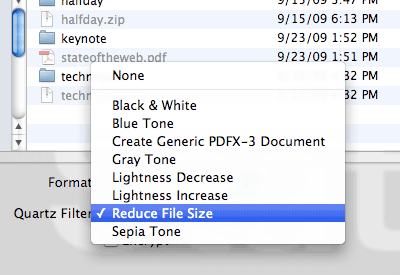
If the slides are image-heavy, then you can always load the PDF into Preview and then do a “Save As…” where you select the “Reduce File Size” Quartz filter.  That will indeed drastically shrink the file size — that 175MB PDF goes down to 13MB — but it can also make the slides look thoroughly awful.  That’s because the filter achieves its file size reduction by scaling all the images down by at least 50% and to no more than 512 pixels on a side, plus it uses aggressive JPEG compression.  So not only are the images infested with compression artifacts, they also tend to get that lovely up-scaling blur.  Bleah.

I Googled around a bit and found “Quality reduced file size in Mac OS X Preview” from early 2006.  There I discovered that anyone can create their own Quartz filters, which was the key I needed.  Thus armed with knowledge, I set about creating a filter that struck, in my estimation, a reasonable balance between image quality and file size reduction.  And I think I’ve found it.  That 175MB PDF gets taken down to 34MB with what I created.

If you’d like to experience this size reduction for yourself (and how’s that for an inversion of common spam tropes?) it’s pretty simple:

  1. Download and unzip Reduce File Size (75%).  Note that the “75%” relates to settings in the filter, not the amount of reduction you’ll get by using it.
  2. Drop the unzipped .qfilter file into ~/Library/Filters in Leopard/Snow Leopard or /Library/PDF Services in Lion.  (Apparently no ~ in Lion.)

Done.  The next time you need to reduce the size of a PDF, load it up in Preview, choose “Save As…”, and save it using the Quartz filter you just installed.

If you’re the hands-on type who’d rather set things up yourself, or you’re a paranoid type who doesn’t trust downloading zipped files from sites you don’t control (and I actually don’t blame you if you are), then you can manually create your own filter like so:

  1. Go to /Applications/Utilities and launch ColorSync Utility.
  2. Select the “Filters” icon in the application’s toolbar.
  3. Find the “Reduce File Size” filter and click on the little downward-arrow-in-gray-circle icon to the right.
  4. Choose “Duplicate Filter” in the menu.
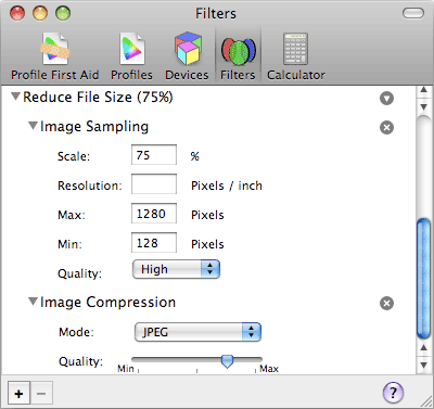
  5. Use the twisty arrow to open the duplicated filter, then open each of “Image Sampling” and “Image Compression”.
  6. Under “Image Sampling”, set “Scale” to 75% and “Max” to 1280.
  7. Under “Image Compression”, move the arrow so it’s halfway between the rightmost marks.  You’ll have to eyeball it (unless you bust out xScope or a similar tool) but you should be able to get it fairly close to the halfway point.
  8. Rename the filter to whatever will help you remember its purpose.

As you can see from the values, the “75%” part of the filter’s name comes from the fact that two of the filter’s values are 75%.  In the original Reduce File Size filter, both are at 50%.  The maximum size of images in my version is also quite a bit bigger than the original’s — 1280 versus 512 — which means that the file size reductions won’t be the same as the original.

Of course, you now have the knowledge needed to fiddle with the filter to create your own optimal balance of quality and compression, whether you downloaded and installed the zip or set it up manually — either way, ColorSync Utility has what you need.  If anyone comes up with an even better combination of values, I’d love to hear about it in the comments.  In the meantime, share and enjoy!

Translations

Update 2 Aug 11: apparently there have been changes in Lion — here’s an Apple forum discussion of the problem.  There are two workarounds described in the thread: either to open and save files with ColorSync Utility itself, or to copy the filter to another folder in your Library (or install it there in the first place, above).

Update 27 Mar 12: edited the Lion install directory to remove an errant ~ .  Thanks to Brian Christiansen for catching the error!


MIXmasters

Published 14 years, 3 weeks past

The winners of Microsoft’s MIX 10K Smart Coding Challenge (for which I was honored to serve as one of the judges) have been announced, and the Grand Prize has been awarded to…

Jimmy D‘s Frog Log.

Which is an HTML5/CSS/JS entry.

That doesn’t run in Internet Explorer.

Yep.

Frog Log was my top pick, and obviously did very well with the other judges too, for a good reason: it’s a fun game.  It doesn’t play quite the same in Firefox previous to v3.5, as the drag-n-drop doesn’t work.  Instead, you click on a frog, then click where you want to place it.  I actually found that made the game a touch easier for me, but your interaction may vary.  In addition to working in Firefox, Safari, and Opera, it also runs on a number of mobile devices.

Here’s an excerpt from my judging remarks:

Just a great little game, addictive and well thought out with some interesting gameplay.  I would LOVE to see this developed further by the author…  My only ding was that drag-n-drop failed in Firefox 3.5; clicking worked fine, though.

I’m not sure why I had trouble with drag-n-drop in Firefox 3.5, since I don’t have have the same problem now.  Maybe I got confused with browser version numbers or something.  Regardless, it works fine, it’s a great game, and remember: it’s less than 10K unzipped.

I also gave high marks to the HTML5 runner-up, Chris Evans’ 100pxls, which was the source of my Dadaist tweet a couple of weeks back and lands right in my personal sweet spot for “doing odd things with popular web services”.  Here’s some of what I had to say in my remarks:

…really liked the concept here, especially the nonsensical tweets that were generated by drawing your own icon.  The icons could be made easier to see in the main display, but I suppose that’s a minor quibble.

I’d like to thank the MIX 10K crew for getting me involved as a contest judge; I really enjoyed seeing what people created and had a hard time narrowing down my votes to just a handful of winners.  More importantly, though, I offer my heartiest congratulations to all the winners, and most especially to Jimmy and Chris for doing such fun, interesting, and downright cool stuff with 10K of web standards goodness!


Inspector Scrutiny

Published 14 years, 1 month past

It’s been said before that web inspectors — Firebug, Dragonfly, the inspectors in Safari and Chrome, and so forth — are not always entirely accurate.  A less charitable characterization is that they lie to us, but that’s not exactly right.  The real truth is that web inspectors repeat to us the lies they are told, which are the same lies we can be told to our faces if we ask directly.

Here’s how I know this to be so:

body {font-size: medium;}

Just that.  Apply it to a test page.  Inspect the body element in any web inspector you care to fire up.  Have it tell you the computed styles for the body element.  Assuming you haven’t changed your browser’s font sizing preferences, the reported value will be 16px.

You might say that that makes sense, since an unaltered browser equates medium with “16”.  But as we saw in “Fixed Monospace Sizing“, the 16px value is not what is inherited by child elements.  What is inherited is medium, but web inspectors will never show you that as a computed style.  You can see it in the list of declared styles, which so far as I can tell lists “specific values” (as per section 6.1 of CSS2.1).  When you look to see what’s actually applied to the element in the “Computed Styles” view, you are being misled.

We can’t totally blame the inspectors, because what they list as computed styles is what they are given by the browser.  The inspectors take what the browser returns and prettify it for us, and give us ways to easily alter those values on the fly, but in the end they’re just DOM inspectors.  They don’t have a special line into the browser’s internal data.  Everything they report comes straight from the same DOM that any of us can query.  If you invoke:

var obj = document.getElementsByTagName('body')[0];
alert(getComputedStyle(obj,null).getPropertyValue('font-size'));

…on a document being given the rule I mentioned above, you will get back 16px, not medium.

This fact of inspector life was also demonstrated in “Rounding Off“.  As we saw there, browsers whose inspectors report integer pixel values also return them when queried directly from the DOM.  This despite the fact that it can be conclusively shown that those same browsers are internally storing non-integer values.

Yes, it might be possible for an inspector to do its own analysis of properties like font-size by checking the element’s specified values (which it knows) and then crawling up the document tree to do the same to all of the element’s ancestors to try to figure out a more accurate computed style.  But what bothers me is that the browser reported computed values that simply aren’t accurate in the first place.  it seems to me that they’re really “actual values”, not “computed values”, again in the sense of CSS2.1:6.1.  This makes getComputedStyle() fairly misleading as a method name; it should really be getActualStyle().

No, I don’t expect the DOM or browsers to change this, which is why it’s all the more important for us to keep these facts in mind.  Web inspectors are very powerful, useful, and convenient DOM viewers and editors, essentially souped-up interfaces to what we could collect ourselves with JavaScript.  They are thus limited by what they can get the browser to report to them.  There are steps they might take to compensate for known limitations, but that requires them to second-guess both what the browser does now and what it might do in the future.

The point, if I may be so bold, is this:  never place all your trust in what a web inspector tells you.  There may be things it cannot tell you because it does not know them, and thus what it does tell you may on occasion mislead or confuse you.  Be wary of what you are told — because even though all of it is correct, not quite all of it is true, and those are always the lies that are easiest to believe.


Fixed Monospace Sizing

Published 14 years, 1 month past

Monospace text sizing is, from time to time, completely unintuitive and can be quite maddening if you don’t look at it in exactly the right way.  Fortunately, there is a pretty simple workaround, and it’s one you might want to consider using even if you weren’t aware that a problem existed.

But first, allow me to lay some foundations.  Assuming no other author styles beyond the ones shown, consider the following:

span {font-family: monospace;}

<p>This is a 'p' with a <span>'span'</span> inside.</p>
All right, what should be the computed font-size of the span element?  Remember, there are no other author styles being applied.

The savvier among you will have said: “It depends, but most likely 13px.”  That’s because here, the size of the monospace text is controlled by the browser’s preferences.  The vast majority of users, of course, have never touched their default settings of “16” for proportional fonts and “13” for monospace/fixed fonts.  For them, then, the answer is 13px.  Similarly, if I’d asked about the p element’s computed font-size, the answer would be: “It depends, but most likely 16px.”

So let’s add a bit more and see where we land.

span {font-family: monospace; font-size: 1em;}

<p>This is a 'p' with a <span>'span'</span> inside.</p>

As before: bearing in mind that there are no other author styles, what should be the computed font-size of the span element?

In this case, building on the previous question and answer, you might say, “It depends, but most likely 16px.”  The reasoning here is pretty straightforward:  since the computed font-size of the p element is 16px, the font-size: 1em; assigned to the span will result in it having the same size.

And that’s true… in two of five browsers I tested: Opera 10 and Internet Explorer 8.  In the other three I tested—Firefox 3.6, Safari 4, and Chrome 4—the computed (and rendered) font-size of the span is 13px, the same as in our first example.  This result holds true if the rule is changed to use font: 1em monospace; instead of the two separate properties.  The behavior continues to persist even when adding specific font families, like Courier New, Courier, Andale Mono, and so on to the rule.  It also persists if 1em is converted to 100%.

So in other words, even though I have written CSS that explicitly says “Make the font-size of this element the same as its parent”, three of five browsers apparently ignore me.

I say “apparently” because what’s happening is that those browsers are allowing the span to inherit the default font-size from its parent (and thus, indirectly, all its ancestors), but the default font-size is medium.  If you go look up medium, you find out that it doesn’t have a defined numeric size. So what those browsers do is equate medium with the preference settings, which means it’s different for monospace fonts than for everything else.

In other words, those three browsers are doing something like this:

  1. This span needs to have the same font-size as its parent element.
  2. The parent’s font-size is medium, even though when my web inspector (or an author’s DOM script) asks, I report the 16px I used to output the text.  So the span‘s font-size is actually medium.
  3. This medium-sized span is using a monospace font.  The preference setting for monospace is “13”, and I equate medium with the preference setting, so I’ll output the span using 13-pixel text.

Opera 10, as I said, doesn’t do this, even if your monospace font preference setting is the default value of “13” or indeed different from the preference for non-monospace fonts.  And IE8 doesn’t appear to do it either, although you can’t set numeric font size preferences in IE8 so what it’s actually doing is open to interpretation.  Oh, IE8, you inscrutable little scamp, you.

All that might seem reasonable enough, but it turns out that’s not the whole story.  No, the three resizing browsers are being a good deal more “clever”, if that’s actually the word I want, than that.  In fact, what those browsers do makes it seem like they use the two preference settings to create a ratio, and that ratio is used to scale monospace text.  That’s not actually what’s happening, but it looks that way at first.  To see what I mean, let’s consider:

span {font-family: monospace; font-size: 2em;}

<p>This is a 'p' with a <span>'span'</span> inside.</p>

Again: in the absence of other author styles, what should be the computed font-size of the span element?

The answer: “It depends, but most likely 26px as long as we aren’t talking about Opera 10 or IE8.  If it is one of those two, then most likely 32px.”  Why?  Because the resizing browsers see the font-size: 2em; declaration as “twice medium” and twice 13 is 26.  Opera 10 and IE8, as previously established, don’t do the resizing.  Or else they simply interpret medium as being equal to the proportional font size preference setting.  Whatever.

Okay.  So what all this means is that in many browsers, you can declare that an element’s font size should be twice the size of its parent’s and have it actually be 1.625 times the size — or, if you want to look at it another way, 0.8125 times the size you expected it to be.  The 0.8125 comes from 26/32, which of course reduces to 13/16.  If you were to adjust your browser’s preferences so the monospace setting is “15”, then monospace fonts would be 0.9375 (15/16) times the expected size.

But — and here’s where things get really fun — this is not always so.  See, you may not have run into this problem if you’ve been declaring specific font families with no generic fallback.  Consider this variation (note that I dropped back to 1em for the font-size):

span {font-family: "Courier New"; font-size: 1em;}

<p>This is a 'p' with a <span>'span'</span> inside.</p>

This time, in every one of the five browsers I mentioned before, assuming the browser defaults, the computed (and rendered) font-size of the span will be 16px.  Not 13px.  And the only difference is that we switched from a generic font family to a specific one.

“Hey presto!” you shout.  “We’ll just tack the generic family on the end there and be right as rain!”  Sadly, no.  For if you do this:

span {font-family: "Courier New", monospace; font-size: 1em;}

<p>This is a 'p' with a <span>'span'</span> inside.</p>

…then the answer to the question I keep asking will be:  “It depends, but given browser defaults it will be 16px, unless we’re talking about Safari.  In that case, it’s 13px.”

Really.  Alone among the browsers I tested, Safari goes back to doing the resizing when you provide a generic fallback to your specific family.  Or even multiple families.  Do your best to make sure the user at least gets a fixed-width font, and you get a size smaller than you’d intended.  (You can get the back story on this in a late-2006 post on the Surfin’ Safari blog.)

So what do we do?  Get creative.  That’s what the ARIA folks did in their specification’s style sheet, where they declare two font stacks: the first with a generic fallback, and the second without it.  That works, but it’s ugly.  I didn’t like that at all.  And then, halfway through writing up this post, a fix came to me like a shot in the dark.  Check this out:

span {font-family: "Courier New", monospace, serif; font-size: 1em;}

<p>This is a 'p' with a <span>'span'</span> inside.</p>

This time around, the answer is:  “It depends, but given browser defaults, 16px.”

Really!  Even in Safari!  And in all tested browsers, it falls back to a generic monospace font at the requested size even if the specific family (or families) we declare aren’t available!  This can be verified by altering the specific font family to something that doesn’t actually exist:

span {font-family: "Corier Neu", monospace, serif; font-size: 1em;}

<p>This is a 'p' with a <span>'span'</span> inside.</p>

Monospacey goodness at the intended, parent-matching size.  It’s enough to make a body believe in monotheism.

Since I generally assume that anything I devise was already invented by someone else, I went Googling for prior art.  And wouldn’t you know it, the Wikipedia folks had worked it out around the end of last year.  This, of course, supports my contention that Wikipedia is the new Steve Allen.  I also found some claims that ending the font stack with monospace, monospace would have the same effect, but that wasn’t borne out in my testing.  Perhaps it worked in older versions of browsers but no longer does.

I did leave out another way to make monospaced fonts behave as expected, which you may have already figured out from the preceding: declare the font-size for any parent of a monospaced element to be a length value, along the lines of body {font-size: 12px;}.  That will pass the length value down the document tree to the monospaced element via inheritance, which will use it without resizing it in every browser I tested.  Though you may have heard that page zooming makes pixel-sized text okay, I’m not really convinced.  Not yet.  There are too many people who don’t know how to zoom, and too many whose browsers aren’t advanced enough to zoom pages.  Even in page-zooming browsers, there are problems with pixel text.  So I’m still on the ems-and-percentages bandwagon.

In fact, there are a fair number of details and extra browser oddities that I left out of this, as it’s already way more than long enough, and besides you don’t really want to hear the gory details of manually stepping through 37 different preferences settings just to verify a theory.  Plus you already heard about the font-size rounding investigation that spawned off of this one, about halfway through.  I think that’s more than enough for the time being.

I should also lay down a caveat: it’s possible that this behavior will be interpreted as a bug by the Safari team and “fixed”, if that’s the word I want, in a future release.  I really hope not — and if they’re looking for ways to improve how they handle monospace font sizing, I have a few suggestions — but it is possible.  Adjust your expectations accordingly.

And with that, I’m going to stop now.  I hope this will be useful to you, either now or in the future.


Rounding Off

Published 14 years, 1 month past

In the course of digging into the guts of a much more complicated problem, I stumbled into an interesting philosophical question posed by web inspection tools.

Consider the following CSS and HTML:

p {font-size: 10px;}
b {font-size: 1.04em;}

<p>This is text <b>with some boldfacing</b>.</p>

Simple enough.  Now, what is the computed font-size for the b element?

There are two valid answers.  Most likely one of them is intuitively obvious to you, but take a moment to contemplate the rationale for the answer you didn’t pick.

Now, consider the ramifications of both choices on a situation where there are b elements nested ten layers deep.

If you hold that the answer is 10px, then the computed font-size of the tenth level of nesting should still be 10px, because at every level of nesting the mathematical answer will be rounded down to 10.  That is: for every b element, its computed font-size will be round(10*1.04), which will always yield 10.

If, on the other hand, you hold that the answer is 10.4px, then the computed font-size of the tenth level of nesting should be 14.802442849px.  That might get rounded to some smaller number of decimal places, but even so, the number should be pretty close to 14.8.

The simplest test, of course, is to set up a ten-level-deep nesting of b elements with the previously-shown CSS and find out what happens.  If the whole line of text is the same size, then browsers round their computed font-size values before passing them on.  If the text swells in size as the nesting gets deeper, then they don’t.

As it happens, in all the browsers I’ve tested, the text swells, so browsers are passing along fractional pixel values from level to level.  That’s not the interesting philosophical question.  Instead, it is this:  do web inspectors that show integer font-size values in their ‘computed style’ windows lie to us?

To see what I mean, load up the font size rounding test page in Firefox and use Firebug to inspect the “1(“, which is the first of the b elements, in the first (1.04em) test case.  Make sure you’re looking at the “Computed Styles” pane in Firebug, and you’ll get a computed font-size of 10.4px.  That makes sense: it’s 10 × 1.04.

Now try the inspecting that same “1(” in Safari or Opera.  Both browsers will tell you that the computed font-size of that b element is 10px.  But we already know that it’s actually 10.4px, because the more deeply-nested layers of b elements increase in size.  These inspectors are rounding off the internal number before showing it to us.  Arguably, they are lying to us.

But are they really?  The reason to doubt this conclusion is that the values shown in those inspectors accurately reflect the value being used to render the characters on-screen.  To see what I mean, look at the last example on the test page, where there’s sub-pixel size testing.  The “O” characters run from a flat 10 pixels to a flat 11 pixels in tenths (or less) of a pixel, all of their font-sizes assigned with inline style elements to pin the characters down as much as possible.  In Safari, you can see the size jump up one pixel right around the text’s midpoint, where I wrote font-size: 10.5px.  So everything from 10px to 10.49px gets drawn at 10 pixels tall; everything from 10.5px to 11px is 11 pixels tall.  Safari’s inspector reflects this accurately.  It’s telling you the size used to draw the text.

A comparative illustration of the many-O test case in three different browsers showing three different results.  The browsers used to create the illustration were Safari, Opera, and Firefox.

In Opera 10.10, you get the same thing except that the jump from 10 to 11 pixels happens on the very last “O”, both visually and in the inspector (Dragonfly).  That means that when it comes to font sizes, Opera always rounds down.  Everything from 10px to 10.9px — and, presumably, 10.99999px for as many nines as you’d care to add — will be drawn 10 pixels tall.  Brilliant.

In Firefox for OS X, there’s no size jump.  The “O” characters look like they form a smooth line of same-size text.  In fact, they’re all being drawn subtly differently, thanks to their subtly different font-size values.  If you use OS X’s Universal Access screen zooming to zoom way, way in, you can see the differences in pixel shading from one “O” to the next.  Even if you don’t, though, the fact that it’s hard to tell that there is an increase in size from one end of the line to the other is evidence enough.

In Firefox for XP, on the other hand, the size jump occurs just as it does in Safari, going from 10 pixels to 11 pixels of text size at the 10.5 mark.  But Firebug still reports the correct computed font-size values.  Thus, its reported value doesn’t match the size of the text that’s been output to the screen.  Arguably, it’s lying just as much as Safari and Opera,  in a different way.

But, again: is it really?  The computed values are being accurately reported.  That there is a small variance between that fractional number and the display of the text is arguably irrelevant, and can lead to its own confusion.  Situations will arise where apparent rounding errors have occurred — I see people complain about them from time to time — when the apparent error is really an artifact of how information is delivered.

I have my own thoughts about all this, but I’m much more interested in the thoughts of others.  What do you think?  Should web inspectors report the CSS computed values accurately, without regard to the actual rendering effects; or should the inspectors modify the reported values to more accurately reflect the visual rendering, thus obscuring the raw computed values?

Addendum 10 Feb 10: I’ve updated the test page with a JS link that will dynamically insert the results of getComputedStyle(el,null).getPropertyValue("font-size") into the test cases.  The results are completely consistent with what the inspectors report in each browser.  This tells us something about the inspectors that most of us probably don’t consciously realize: that what they show us rests directly on the same JS/DOM calls we could write ourselves.  In other words, inspectors are not privileged in what they can “see”; they have no special view into the browser’s guts.  Thus another way to look at this topic is that inspectors simply repeat the lies that browsers tell the world.


Events and A Day, Belatedly

Published 14 years, 1 month past

I’m a bad conference organizer.

Why?  Because we opened the An Event Apart 2010 schedule for sales back in, um, flippin’ November, and I never mentioned it here.  Cripes, I never even posted when we announced the lineup of cities.  I could go through the great big long sob-story list of reasons why 2009 was really tough and blah blah blah, but when you get right down to it, I fell down on my job.

Okay.  So.  Time to correct that.

(deep breath)

Hey everyone, check it out: the complete tour schedule for An Event Apart 2010!  Woohoooo!

  1. Seattle: April 5-7, 2010 (yes, three days; more on that anon)
  2. Boston: May 24-25, 2010
  3. Minneapolis: July 26-27, 2010
  4. Washington, DC: September 16-17, 2010
  5. San Diego: November 1-2, 2010

We’ve got a pretty killer lineup, if I do say so myself.  You can get the mostly-complete list from our opening-of-sales announcement last November.  It lists the people we had confirmed at the time; there have been a few additions since then.  Check out your city of choice to see who’s going to be there!  (But always remember that speaker lineups are subject to change: speakers are people too, and life has a way of interfering with schedules.  I myself had to withdraw from An Event Apart Boston last year due to a family emergency.)

The price to register for these two-day, one-track Events is the same as it was in 2009, and there are educational and group discounts available for those who are interested.

But wait, I just said “two-day” when the first show of the year is clearly three days.  What gives?

Seattle is the site of our first-ever A Day Apart, a full-day workshop that can be attended on its own or as part of a full three days of Event Apart ecstasy.  And the inaugural Day Apart will be nothing less than a detailed plunge into HTML 5 and CSS3 with Jeremy Keith and Dan Cederholm.  Jeremy handles the markup; Dan gets stylish.  It’s going to be fantastic.  I’m going to be in the back of the room for the whole day, soaking up as much as I can.

If you want to attend just the workshop, it’s $399 for the whole day if you buy an early bird ticket (available through March 5th).  The price goes up $50 when early bird ends, and another $100 if you show up at the door.  But I wouldn’t recommend that last, because I don’t think there will be any tickets available at the door.  Again: if you show up unannounced on the day of the workshop and ask to buy a ticket, we will most likely have to turn you away, because I expect that there won’t be any seats available.

On the other hand, maybe you’d like to experience more than just one day of AEA goodness.  Maybe you’d like to go whole hog and attend both the two-day Event Apart and the subsequent Day Apart, soaking up all the knowledge and enthusiasm and camaraderie that typifies An Event Apart.  And who could blame you?  If you do that, then the total early bird price for all three days is $1,190, whereas buying the event and workshop passes separately would total $1,294.  That’s right: you actually get slightly more than $100 off the cost of the workshop if you attend all three days, over and above the early bird discount.  (Or you can think of it as getting $100+ off the cost of the conference.  We’re not fussy.)

As it happens, these three-day passes have proved quite popular.  So if you want to get your hands on one of those — or on any Seattle tickets, whether one, two, or three days — I wouldn’t wait too long.  Our internal analyses suggest that there will come a time, some time before the doors open on April 5th, that the ability to buy a ticket will cease to be.  It may even pine for a fjord or two.

As for the four shows that come after Seattle, well, they’re looking pretty popular too.

I know I say this every year, but I’m really excited about what we’ve got planned for the year.  Jeffrey and I constantly and (we hope) consistently strive to create an event that we ourselves want to attend, and that’s absolutely true of the shows and workshop we have planned in 2010.  I can’t wait to hear what the speakers and attendees have to share.  Hope to see you there!


Browse the Archive