Rounding Off
Published 16 years, 5 months pastIn the course of digging into the guts of a much more complicated problem, I stumbled into an interesting philosophical question posed by web inspection tools.
Consider the following CSS and HTML:
p {font-size: 10px;}
b {font-size: 1.04em;}

<p>This is text <b>with some boldfacing</b>.</p>
Simple enough. Now, what is the computed font-size for the b element?
There are two valid answers. Most likely one of them is intuitively obvious to you, but take a moment to contemplate the rationale for the answer you didn’t pick.
Now, consider the ramifications of both choices on a situation where there are b elements nested ten layers deep.
If you hold that the answer is 10px, then the computed font-size of the tenth level of nesting should still be 10px, because at every level of nesting the mathematical answer will be rounded down to 10. That is: for every b element, its computed font-size will be round(10*1.04), which will always yield 10.
If, on the other hand, you hold that the answer is 10.4px, then the computed font-size of the tenth level of nesting should be 14.802442849px. That might get rounded to some smaller number of decimal places, but even so, the number should be pretty close to 14.8.
The simplest test, of course, is to set up a ten-level-deep nesting of b elements with the previously-shown CSS and find out what happens. If the whole line of text is the same size, then browsers round their computed font-size values before passing them on. If the text swells in size as the nesting gets deeper, then they don’t.
As it happens, in all the browsers I’ve tested, the text swells, so browsers are passing along fractional pixel values from level to level. That’s not the interesting philosophical question. Instead, it is this: do web inspectors that show integer font-size values in their ‘computed style’ windows lie to us?
To see what I mean, load up the font size rounding test page in Firefox and use Firebug to inspect the “1(“, which is the first of the b elements, in the first (1.04em) test case. Make sure you’re looking at the “Computed Styles” pane in Firebug, and you’ll get a computed font-size of 10.4px. That makes sense: it’s 10 × 1.04.
Now try the inspecting that same “1(” in Safari or Opera. Both browsers will tell you that the computed font-size of that b element is 10px. But we already know that it’s actually 10.4px, because the more deeply-nested layers of b elements increase in size. These inspectors are rounding off the internal number before showing it to us. Arguably, they are lying to us.
But are they really? The reason to doubt this conclusion is that the values shown in those inspectors accurately reflect the value being used to render the characters on-screen. To see what I mean, look at the last example on the test page, where there’s sub-pixel size testing. The “O” characters run from a flat 10 pixels to a flat 11 pixels in tenths (or less) of a pixel, all of their font-sizes assigned with inline style elements to pin the characters down as much as possible. In Safari, you can see the size jump up one pixel right around the text’s midpoint, where I wrote font-size: 10.5px. So everything from 10px to 10.49px gets drawn at 10 pixels tall; everything from 10.5px to 11px is 11 pixels tall. Safari’s inspector reflects this accurately. It’s telling you the size used to draw the text.
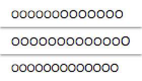
In Opera 10.10, you get the same thing except that the jump from 10 to 11 pixels happens on the very last “O”, both visually and in the inspector (Dragonfly). That means that when it comes to font sizes, Opera always rounds down. Everything from 10px to 10.9px — and, presumably, 10.99999px for as many nines as you’d care to add — will be drawn 10 pixels tall. Brilliant.
In Firefox for OS X, there’s no size jump. The “O” characters look like they form a smooth line of same-size text. In fact, they’re all being drawn subtly differently, thanks to their subtly different font-size values. If you use OS X’s Universal Access screen zooming to zoom way, way in, you can see the differences in pixel shading from one “O” to the next. Even if you don’t, though, the fact that it’s hard to tell that there is an increase in size from one end of the line to the other is evidence enough.
In Firefox for XP, on the other hand, the size jump occurs just as it does in Safari, going from 10 pixels to 11 pixels of text size at the 10.5 mark. But Firebug still reports the correct computed font-size values. Thus, its reported value doesn’t match the size of the text that’s been output to the screen. Arguably, it’s lying just as much as Safari and Opera, in a different way.
But, again: is it really? The computed values are being accurately reported. That there is a small variance between that fractional number and the display of the text is arguably irrelevant, and can lead to its own confusion. Situations will arise where apparent rounding errors have occurred — I see people complain about them from time to time — when the apparent error is really an artifact of how information is delivered.
I have my own thoughts about all this, but I’m much more interested in the thoughts of others. What do you think? Should web inspectors report the CSS computed values accurately, without regard to the actual rendering effects; or should the inspectors modify the reported values to more accurately reflect the visual rendering, thus obscuring the raw computed values?
Addendum 10 Feb 10: I’ve updated the test page with a JS link that will dynamically insert the results of getComputedStyle(el,null).getPropertyValue("font-size") into the test cases. The results are completely consistent with what the inspectors report in each browser. This tells us something about the inspectors that most of us probably don’t consciously realize: that what they show us rests directly on the same JS/DOM calls we could write ourselves. In other words, inspectors are not privileged in what they can “see”; they have no special view into the browser’s guts. Thus another way to look at this topic is that inspectors simply repeat the lies that browsers tell the world.
Comments (37)
That’s a typical problem with floating point numbers that upsets every programmer now and then:
http://en.wikipedia.org/wiki/Floating_point#Representable_numbers.2C_conversion_and_rounding
Try:
javascript:alert(0.1 + 0.2 – 0.3)
Perhaps some kind of a disclosure, akin to an asterisk, you can hover or toggle to reveal the actual fractional numbers.
I’d like both, i.e.
“The precise computed value is X, and is rendered as X by [browser]”
porneL, floating point number rounding has almost entirely nothing to do with what the post is about.
I think it would be best if we could know the actual raw font-size while also knowing what size it chose to show the typeface at. So with Safari, something like 10.4px (10px) would make be really happy.
However, since Firefox on the mac is drawing each O differently, I’m not sure what it would report.
Ouch. That hurt to read. I can’t imagine how hard it must have been to research and then write.
To my mind, it sounds as though we need standards to dictate how font-size rounding should be handled, or we’re creating quite the mess on the web. However, negotiating the politics of that is probably worse than trying to figure all of this out.
Web inspectors should accurately report exactly what is rendered, imo.
My personal opinion is that the “computed value” should show as Firefox shows it, with the decimal if need. The different inspectors should perhaps also allow for a space to show the “rendered value”, where if the browser is doing something different than the computed value, we’d be able to see that value as well. Showing the rounded value as the “computed value” I believe is the lie here…
Being a programmer and designer, I’d want both. The reason for this is because of how the computed elements would affect position and various other elements about it, but I would also get the displayed size so I know what size is being displayed. If it were one or the other, I would end up with a nervous twitch…”I know it’s not that big/small!”
Okay, thought about it for a bit. I agree with Jeff here. Since the computed value is so important when it comes to nested values, show me the decimals. Tell me what the actual computed value. Except for FF/Mac, I know that a font is going to be rendered at .32 of a pixel. I would rather assume the rounding in my head and have the math of the “swell” shown to me otherwise why the on screen rendering is different when every size is 10px is going to be really confusing.
Plus, if FF/Mac actually renders each sub-pixel size different, I don’t want it to show 10px for everyone when it really is trying to show 10.2px
Showing in an inspector:
font-size 10.4333px (10px)
is not a bad option either, at least for the browsers that actually do that. Opera and FF/Mac would of course need to match how they do things.
Here’s another wrinkle: is the computed value being rounded (or truncated in the case of Opera), or is the *displayed* computed value being rounded/truncated? Maybe add a bit of JavaScript to your tests to output the computed values yourself?
I see. I jumped the gun and made fool of myself. Next time I’ll try RTFA first :)
If I can’t choose “both,” I’d rather have the computed value rather than the rendered value.
The computed value can be used to calculate the next relative relationship you’d like to deliberately target whereas the rendered value would give you a false base.
It’s also easier to spot the full-pixel shift in rendered rounding and with a little experience, one could spot it and learn that 10.4px and 10.5px render differently by a full pixel in certain browser-OS combinations.
But if given the choice, I’d choose “both.” I like the 10px (10.4px) example a lot.
It seems to me that if there is a computed value that results from compounded inheritance )or any other reason for that matter), the browser should show the correct computed value. Moreover, the browser (in my opinion) should also render the element with the computed value. To not render the element as computed sounds to me like a browser bug.
I prefer the way Safari and Opera inspectors works. When I’m using inspector I want to see what actually is drawn on the screen.
Thanks for noticing this behavior it’s good to know about it.
Troy, I don’t have to resort to JavaScript (although it would be interesting to know what
getComputedStylewould report) and I know where the rounding is happening, as explained at length in the article. If the actual computed values were rounded, the text size would not swell in the first test case. So it has to be that the displayed computed values are rounded from the actual computed values.I would prefer the computed value rather than the rendered value. The computed value represents what would ideally be rendered. The actual rendering could change between operating system and browser, but the computed value would not.
Also, what would the rendered value be if I had used page zoom to increase the text size by 200%. Would it still return 10px or the actual number of pixels the text was rendered?
OK, my vote goes to the 10px without rounding. The inspector should report what’s actually happening on the screen, and not the internal processes that lead to the eventual value.
This conundrum strongly reminds me of W3C getComputedStyle vs. IE currentStyle, where the second reports the exact value that’s defined in the style sheet and the first the resulting value in pixels. I used to be a currentStyle fan, but lately I’m not so sure any more.
As many have already said, both bits of data can be useful in different circumstances. Still, the inspector inspects the end result as rendered on-screen, and should report the final values.
I have to second Philip’s notion. Showing both the rendered and computed values in one property is ideal from my standpoint. I am assuming this occurs on other elements as well, should they be sized with
<em>, right?We encounter this kind of issue in the highway engineering world as well, especially when setting grades and elevations. We are specifying the grades to 3 decimals while the elevations are specified to 2 decimal places. To balance the discrepancies during our quality control process, we always provide both sets of numbers (rounded and not rounded). The numbers are reviewed and adjusted as such. Naturally, I’d like to see both in the inspector tools.
One additional problem is that the browser might not always know the size in which the font is actually rendered.
For example, if the browser tells the operating system to render a string at 10.5 pixels at a specific location on the page it might use the same height as the same text at 10.4 pixels, but in theory the text could be rendered differently due to anti-aliasing and also the width of the text could be different.
Likewise a different operating system might just round to the nearest pixel first and then render the text.
My point is, at most the browser can show what it tells the operating system to render. It can’t tell how the operating system actually rendered it.
Read this article earlier and thought about it a lot. My decision: I want the inspector to report fractional pixel sizes, even if the browser renders only integer font sizes.
Same with other metrics (margin, padding, border) — I want the inspector to show me fractional values, because their interactions are obviously not constrained to integer values.
It’d be really, really nice if the browser did all of its CSS-metrics-math in a consistent way (so two 0.5px units add up to 1px of space, and 50% of 2 is exactly 1), but I suspect one could find odd cases in which every browser treats different properties or different elements in different ways.
Some of this is a bit over my head, but it seems like the problem (if there is one?) is just that browsers can only approximate in the render what they calculate internally?
See http://www.clagnut.com/blog/2228/
You can really see this if you inspect the inspector, which I learned you could do a while back while complaining about how the Webkit inspector doesn’t do something like Firebug. @xeenon told me it’s just built using HTML/CSS/Javascript. Webkit nightlies allow you to do this in the context menu – start webkit, start the inspector, hover over what appears to be ‘chrome’ of the inspector, right click/two finger click, and choose ‘Inspect Element’. Then you can see the markup of the inspector itself. However, you can’t write a user stylesheet that changes the inspector as Webkit doesn’t honor those. You can edit the one hiding deep inside the WebKit.app bundle, though.
Chrome in XP is doing the same as Firefox. Once again I feel envious of the vastly superior font-handling in OSX: a feeling that persists until I chance to look at an OSX screen, whereupon something inside me goes ewwwww. I like it in theory, but it feels wrong in practice. That is, of course, entirely a personal response, and I do not require anyone to agree with me.
I think it’s entirely correct that the computed styles show the values that are used to actually render the page. That’s the behaviour I want and expect. Perhaps the name “computed” could be misleading, it would be more accurate to call them the rendered styles. Perhaps the browsers could show the computed style in brackets or some such “font-size: 10px (10.49999999)”, but I’m not sure I see the value in having this information.
I prefer the Firefox way, i.e. through clever use of subpixel positioning have the text match what is most probably the desired intent of the author. What is drawn on the screen and what is reported is the same thing.
As for the browsers that round to integer values, of course it would be better to report both values. Anyone who has filed a bug with Opera or Webkit?
Well, this behaviour seems to match what the spec says should happen…
It talks of specified values, computed values, used values, and actual values. So you specify 1.04em, which gets computed to 10.4px, which gets matched to a font, to give you a used value of 10px.
http://www.w3.org/TR/CSS2/cascade.html#value-stages
It is the computed value that gets inherited.
http://www.w3.org/TR/CSS2/cascade.html#inheritance
The font-matching algorithm says ‘font-size’ must be matched within a UA-dependent margin of tolerance.
http://www.w3.org/TR/CSS2/fonts.html#algorithm
The only thing the spec doesn’t specify is what the Javascript should return, but if the call name is “Computed X” then I would expect the computed value, not the used value. Though I’m pretty sure I’d like to know the used value too, especially since it is UA dependent.
Personally I would like to see both the computed and rendered styles. I prefer the solution because the computed style could potentially effect other elements on the page(per the spec). On the other hand, CSS is a design tool, and a designer is more worried about what the page will look like then what it is supposed to look like.
I have to disagree with ppk here (# 17):
The inspectors inspects the element in the DOM. It shows you the CSS applied to that element. The inspector is showing you (and telling you that it’s showing you) the COMPUTED style. If an inspector is showing you a rendered style, it should say so.
If I had to choose between the computed value and the rendered value, I’d take the computed one in a second. They both have their uses, but it’s easy to determine the rendered value from the computed value (just use a little javascript that detects the browser and applies its rounding rules), but it’s harder to go the other way.
Obviously though, in an ideal world, I’d want both.
I’d also like to see both values (rendered with computed in brackets & gray or smaller).
I also get frustrated by em-value rounding, in which Safari uses a rounded value (plus compounding errors) whereas Firefox uses the specified value (if I remember correctly). This becomes really apparent when designing to a baseline grid, even with 4 or 5 decimal places.
Designing for the platform of Dao is 0.49999 finding the brilliant solutions (thank you for this one) and 1/2 letting go ^^
@Philip Renich: A bit off topic perhaps, but am I correct to interpret from your post that browsers apart from firefox (ie, webkit) round calculated font-pixels to values close to a third of a pixel (0.32px)?
I ask because for my current project I am dealing with a line-height of phi em (approx. 1.618034em) to a 100%/16px font-size. When I set a box to a line-height of 2phi (approx. 3.236068em), firefox renders the resulting box exactly at 2 lines worth, but in webkit pixels are added and my vertical rhythm is disturbed. If such a .32px render factor is a given i could script to achieve proper alignment.
Cheers
I have already tested this scenario in multiple browsers. The correct answer is that different browsers approximate the values to different degrees of certainty. IE7 and IE6, for instance will approximate a value down to the nearest 5 hundreths of an em if 1em is equal to 10 pixels. Opera and Firefox allowed a greater degree of certainty, but I did not bother to test anything more specific than hundredths of an em where 1em is equal to 10px.
Here is the test platform that I used:
http://mailmarkup.org/zen/
Please feel free to play with the css values and alter them to become more specific to see where the browser begins rounding values in conflict with the specifics you provide. The degree of precision is set pretty high and specific by default for many of the values, so it becomes very easy to see finite changes.
Hey great article…
But the headache this gives me makes me want to toss the em’s go back to the good old days of everything in px…
;)
But seriously – until all of our A-rated browsers support the sub-pixel rendering in the FF example, shouldn’t we be coding things so that they land at full integer values as much as possible? When a designer hands us a PSD doc with 11.5pt arial, shouldn’t we be asking “do you mean 11px or 12px?”
I guess my question is – what’s the practical application of
b {font-size: 1.04em;}right now if it leads to unpredictable results?
While there is a “rounding” issue, it isn’t necessarially the browser’s fault. The browser calculates what it wants to draw, but it ultimately passes it to a rendering engine. Firefox, IE, whatever doesn’t calculate which pixels are which colors, it has the OS draw for it. The OS can have limitations on it’s rendering, plus the FONT can (true-type vs bitmapped).
The browser may be choosing (i.e. round before passing to the OS) because it knows the OS’s behavior – or simply out of bad programming, or because it can’t tell how the OS will render the font, not knowing if the system’s font file format and scaling options. Heck, on most OS’s you can replace the text drawing core – such as supporting a new format.
Add to that, the OS is written to try and allow for the fact the output might be on your screen OR your printer.
Firefox’s smooth size change may actually be a case of “fire and hope” where it passes it to the OS and happens to get lucky it renders well – try the test with a bitmapped font and you may get different results. Oh, like courier at 6px, which windows doesn’t like to do.
There SHOULD be a W3C rule that if a browser is going to round it should REALLY round (i.e. 0.5 split point) in order to get universal behavior where possible. (they can’t dictate OS font render engines but this would make them as “alike” as possible).
I strongly agree with others info should be shown as:
Size = rawsize (rendersize)
so you have as much info as possible.
To squarecandy: Why use a fractional font size?
This article discusses font HEIGHT, but doesn’t touch on the side effect – font WIDTH.
If you want a piece of text to fill a horizontal space (like a banner for a title) as close as possible, then the fractions are very helpful.
Say you want to fill a space 700px wide. If your text is 650px wide at 10px high, then:
10.0px high = 650px wide
10.5px high = about 685px wide
10.7px high = about 695px wide (your ideal size)
Those fractional sizes can be handy.
Turns out you can fix most of this by using…
…which in my tests pretty consistently fix the rounding issues entirely.