Posts from April 2020

Better Image Optimization by Restricting the Color Index

Published 3 years, 10 months past

Let’s talk about image optimization.  There are a few images used in meyerweb’s new design, and while I wanted them to be pleasing to the eye, I also wanted them to be lightweight.  My rough goal was to not have the design elements (images plus CSS) be more than half the total page weight for a typical blog post, not counting any post-specific images like photos or diagrams.  Thus, if a typical blog post’s page weight was 500KB, I didn’t want the images and CSS to add up to more than 250KB or so.

Spoiler: I achieved my goal, but at the same time fell short.  What I had overlooked was custom fonts, which I’ll get to in a later post.

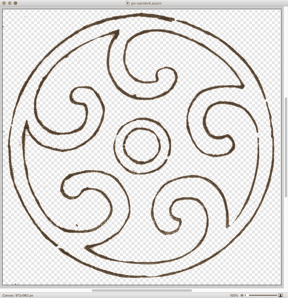
I found out that how you optimize images matters a whole lot.  Let’s consider one example: the spiral-like image (which, yes, is a quiet callback to past work) at the center of the previous-next links at the bottom of blog posts and archive pages.  After I extracted a full-resolution copy of that particular sketch from pages 13-14 of Hamonshū, Vol. 1 and did a little cleanup with filters and so on, it became a 1.4MB Acorn file.

The full-size image in Acorn.

(Side note: Acorn’s “Transparentomatic” filter was an enormous time-saver on this project — it made dropping out the page texture a breeze, and easily adjustable, without forcing me to create and retouch mask layers and whatnot.  Thanks, Flying Meat!)

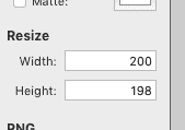
With the image ready to be tested in-browser, I would use Acorn’s Web Export dialog to save it as a PNG.  The nice thing about this dialog is its built-in Resize feature, which let me keep the Acorn file at its native size (almost a thousand pixels on each side) and export it to the size I wanted — in this case, 200 pixels across.  I did this sort of thing a lot, because I tested a variety of images for every design element.

Once I settled on the image I wanted, I’d drop it on ImageOptim to optimize it.  This usually slammed all eight cores in my aged laptop’s CPU for a good few seconds, and resulted in up to 5% size savings.

That last paragraph probably looks like an indictment of ImageOptim, but wait!  It’s fully redeemed by the end of the post, by which time I will have indicted myself instead.

At this point, my spiral image had gone from a 1.4MB Acorn file to a 30KB PNG.  That’s pretty good, even if 30KB feels a tad bulky for a 200×200 image.  I just assumed, what with all the transparency and shades of color and all that, it wasn’t too far out of line.  But as the whole design started to come together, I discovered that when you added up all the illustration images on, say, the home page, I’d let image bloat sneak up on me in the worst way.  They were totalling close to a megabyte, and they’d all been through ImageOptim already.

I went back to Acorn to see if I could squeeze any more out of the file size, maybe convert some of the images to JPGs if they didn’t need the transparency.  As I flipped between file formats in the Web Export dialog, I noticed something I’d previously overlooked in the PNG export options: a bit depth slider.  I’d been saving the PNGs with no bit depth restrictions, meaning the color table was holding space for 224 colors.  That’s… a lot of colors, roughly 224 of which I wasn’t actually using.

When I clicked the “Index PNG Colors” checkbox and changed the slider until I started getting dithers or obvious color loss, then brought it up a notch or two, the difference was astounding.  Instead of a 30KB file, I got a 4.4 KB file.  Instead of saving at 75% the original size, it was now 11%.

Wait a second… how long has THAT been there?

So I went back through the directory with all my design elements and repeated the process.  I do have batch image processing software installed, but I elected to do this manually so I could pick the best color depth for each file by eye.  It could be that some would be okay at 4 colors instead of 8; others might need 16 or 32 to retain visual fidelity.  Fortunately for me, I only had a couple dozen images to go through, but it would have been worth it even at 10 times that many.

Once I’d gone through all the images and saved them with restricted color depth, my theme’s image directory was down to 242KB total.  The biggest of them, the separator wave illustrations, had gone from being ~150KB each to ~25KB each — all five of them together now totalled less than just one of them had before I did the color indexing.

The directory, well and fully smooshed.

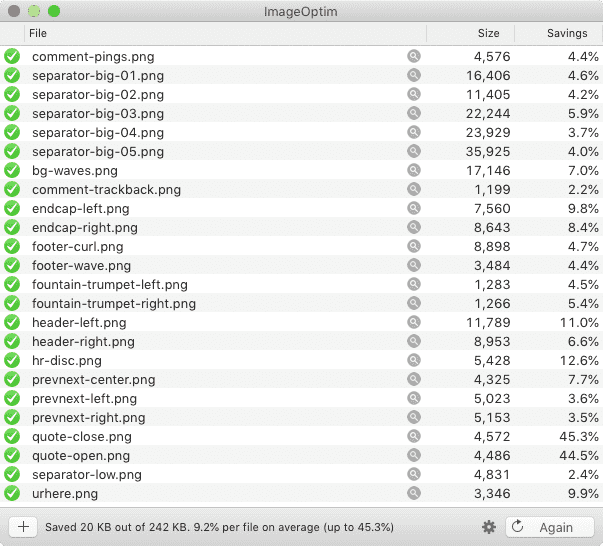
At this point, I thought, “All right, let’s see what ImageOptim does with these.”  It squeezed them down even further, taking my total from 242KB to 222KB, a nine percent reduction.  Which is to say, the percentage savings I got on these already-small files was larger than I’d been getting on the much bigger files — plus, ImageOptim processed them quickly and with a minimum of CPU slamming.  Which is honestly pretty great, given the age of my laptop (about seven years).

So: did I meet my performance goal?  As I said at the outset, yes, but also no.  For a single blog post with around 10KB of text content and no embedded media, the page weight is around 460KB, with the size varying a bit depending on how much markup is needed for the 10KB of text.  (Here’s one recent example with some content variety.)  Of that, the CSS, split across two files, totals 35.2KB.  The images add up to 102.9KB.  Add them together, and you get just a hair over 138KB, or right around 30%.  Huge success!

Except I hadn’t factored in custom fonts, which all by themselves currently total 203.6KB (44% total page weight), mostly due to the three faces of IM Fell I’m using.  That’s right: The fonts weigh more than the CSS and images put together.  Once they’re added in with the CSS and images, the design elements end up being almost 75% the total page weight — about 341.6KB of the 460KB total.  Most of the rest is the 104.4KB chewed up by showdown.js, the enhancement script I’m using to allow the use of Markdown in post comments.

Thus, next up on my performance quest is looking into subsetting the fonts I’m using in order to get their weight down, and finding out if there’s anything I can do to subset Showdown as well.

But as of now, I’m well pleased with where I ended up on image optimization.  I just need to go back and do the same for post-specific images I’d left at unrestricted color depths, where I anticipate a similar 90% savings in file sizes.  If you’ve got a lot of images, particularly PNGs, try running them through a process that lets you restrict the color depth, and see how much it saves.  The results might surprise you!


Pseudo-Randomly Adding Illustrations with CSS

Published 3 years, 11 months past

I’ve been incredibly gratified and a bit humbled by the responses to the new design.  So first of all, thank you to everyone who shared their reactions!  I truly appreciate your kindness, and I’d like to repay that kindness a bit by sharing some of the techniques I used to create this design.  Today, let’s talk about the ink-study illustrations placed between entries on the site, as well as one other place I’ll get to later.

Very early in the process, I knew I wanted to separate entries with decorations of some sort, as a way of breaking up the stream of text.  Fortunately, Hamonshū provided ample material.  A little work in Acorn and I had five candidate illustrations ready to go.

The five illustrations.

The thing was, I wanted to use all five of them, and I wanted them to be picked on a random-ish basis.  I could have written PHP or JS or some such to inject a random pick, but that felt a little too fiddly.  Fortunately, I found a way to use plain old CSS to get the result I wanted, even if it isn’t truly random.  In fact, its predictability became an asset to me as a designer, while still imparting the effect I wanted for readers.

(Please note that in this article, I’ve simplified some aspects of my actual CSS for clarity’s sake; e.g., removing the directory path from url() values and just showing the filenames, or removing declarations not directly relevant to the discussion here.  I mention this so that you’re prepared for the differences in the CSS shown in this piece versus in your web inspector and/or the raw stylesheet.)

Here’s how it starts out:

#thoughts .entry + .entry::before {
   content: "";
   display: block;
   height: 10em;
   background:
      url(separator-big-05.png) 50% 100% / contain no-repeat;
}

That means, for every blog entry except the first, a block-level bit of generated content is inserted at the beginning of the entry, given a height, and the image separator-big-05.png is dropped into the generated box and sized to be contained within it, which means no part of the image will spill outside the background area and thus be clipped off.  (The file has the number 05 because it was the fifth I produced.  It ended up being my favorite, so I made it the default.)

With that in place, all that remains is to switch up the background image that’s used for various entries.  I do it like this:

#thoughts .entry:nth-of-type(2n+1)::before {
   background-image: url(separator-big-02.png);
}
#thoughts .entry:nth-of-type(3n+1)::before {
   background-image: url(separator-big-03.png);
}
#thoughts .entry:nth-of-type(4n+1)::before {
   background-image: url(separator-big-04.png);
}
#thoughts .entry:nth-of-type(5n+1)::before {
   background-image: url(separator-big-01.png);
}

So every second-plus-one entry (the third, fifth, seventh, etc.) that isn’t the first entry will use separator-big-02.png instead of -05.png.  Unless the entry is an every-third-plus-one (fourth, seventh, tenth, etc.), in which case separator-big-03.png is used instead.  And so on, up through every-fifth-plus-one.  And as you can see, the first image I produced (separator-big-01.png) is used the least often, so you can probably guess where it stands in my regard.

This technique does produce a predictable pattern, but one that’s unlikely to seem too repetitious, because it’s used to add decoration separated by a fair amount of text content, plus there are enough alternatives to keep the mix feeling fresh.  It also means, given how the technique works, that the first separator image on the home page (and on archive pages) is always my favorite.  That’s where the predictability of the approach helped me as a designer.

I use a similar approach for the separator between posts’ text and their comments, except in that case, I add a generated box to the end of the last child element in a given entry:

.single #thoughts article .text > *:last-child:after {
   content: "";
   display: block;
   height: 10em;
   background:
      url(separator-big-05.png) 50% 100% / contain no-repeat;
}

That is, on any page classed single (which is all individual post pages) after the last child element of a .text element (which holds the text of a post), the decoration box is generated.  The default, again, is separator-big-05.png — but here, I vary the image based on the number of elements in the post’s body:

.single #thoughts article .text > *:nth-child(2n+1)::after {
   background-image: url(separator-big-02.png);
}
.single #thoughts article .text > *:nth-child(3n+1)::after {
   background-image: url(separator-big-03.png);
}
.single #thoughts article .text > *:nth-child(4n+1)::after {
   background-image: url(separator-big-04.png);
}
.single #thoughts article .text > *:nth-child(5n+1)::after {
   background-image: url(separator-big-01.png);
}

In other words: if the last child element of the post text is a second-plus-one, separator-big-02.png is used.  If there are 3n+1 (one, four, seven, ten, thirteen, …) HTML elements in the post, separator-big-03.png is used.  And so on.  This is an effectively random choice from among the five images, since I don’t count the elements in my posts as I write them.  And it also means that if I edit a piece enough to change the number of elements, the illustration will change!  (To be clear, I regard this as a feature.  It lends a slight patina of impermanence that fits well with the overall theme.)

I should note that in the actual CSS, the two sets of rules above are merged into one, so the selectors are actually like so:

#thoughts .entry + .entry::before,
   .single #thoughts article .text > *:last-child:after {…}

#thoughts .entry:nth-of-type(2n+1)::before,
   .single #thoughts article .text > *:nth-child(2n+1)::after {…}

#thoughts .entry:nth-of-type(3n+1)::before,
   .single #thoughts article .text > *:nth-child(3n+1)::after {…}

In all honesty, this technique really satisfies me.  It makes use of document structure while having a random feel, and is easily updated by simply replacing files or changing URLs.  It’s also simple to add more rules to bring even more images to the mix, if I want.

And since we’re talking about using structure to vary layout, I also have this @media block, quoted here verbatim and in full:

@media (min-width: 50em) {
   #thoughts .entry:nth-of-type(2n) {
      transform: translate(-1vw,0);
   }
   #thoughts .entry:nth-of-type(3n) {
      transform: translate(3vw,0);
   }
}

This means on the home page and blog archive pages, but only at desktop-browser widths, some entries are shifted a bit to the left or right by fractions of the viewport width, which subtly breaks up the strict linearity of the content column on long pages, keeping it from feeling too grid-like.

To be honest, I have no idea if that side-shifting effect actually affects visitors’ experience of using meyerweb, but I like it.  Sometimes the inter-entry wave art fits together with the side-shift so that it looks like the art flows into the content.  That kind of serendipity always delights me, whether it comes by my hand or someone else’s.  With luck, it will have delighted one or two of you as well.


Hamonshu

Published 3 years, 11 months past

I ended my observance of CSS Naked Day 2020 by launching an entirely new design for meyerweb.  I’m calling it Hamonshū after the source from which I adapted most of the graphic elements.  I’ve been working on it sporadically in my free time since mid-January, finally coming to a place I thought was ready to launch in late March.

Naked Day was a convenient way to change over the structure of pages while there was no design, which probably makes it sound like that’s the only reason I even observed it.  To the contrary, I hadn’t planned to launch the new design until June 8th of this year — but once I decided on going style-naked, I realized it was the perfect opportunity to make the switch.

I might still have delayed, if not for everything happening in the world right now.  But Cameron Moll said it best as he recently launched a new design: “Deploying in the middle of a pandemic seems so unimportant at the moment. Or maybe there’s no better time for it.”  That last sentence resonated with me unexpectedly deeply, and came to mind again as I took the CSS away for Naked Day.

I’ll have quite a few things to say about the design in the future: things I learned, techniques I used, bits I really like, that sort of thing.  In this post, I want to say a bit about its genesis.

It all started when someone — I’ve since lost track of who, or even where it happened — brought my attention to Hamonshū, Vols. 1-3, available on the Internet Archive thanks to the Smithsonian Institution.  Hamonshū, a word which I understand roughly translates into English as “wave forms” or “wave design”, is a three-volume set of art studies of water.  Created by Yūzan Mori and published in 1903, I had never heard of it before, but the sketches immediately appealed to me.  You can get an preview of some of Yūzan’s art in this article from Public Domain Review, or just go to the source (linked previously, as well as in the footer of the site) and immerse yourself in it.

As I absorbed Yūzan’s ink studies of ocean waves, rivers, fountains, and more, the elements of a design began to form in my head.  I won’t say I saw it — being aphantasic, I couldn’t — but certain sketches suggested themselves as components of a layout, and stuck with me.

Tall Bamboo and Distant Mountains, after Wang Meng, Wang Hui 王翬, 1694

Early on, I had thought to combine elements from Hamonshū with other artwork, primarily ink landscape paintings from the Qing Dynasty and Edo periods: two such examples being Tall Bamboo and Distant Mountains, after Wang Meng (Wang Hui 王翬, 1694) and View of West Lake (Ike Taiga, 1700s).  I made attempts, but the elements never really combined properly.  I eventually realized I was trying to combine close-up studies of water with adaptations of much larger works, and the scale of the brush strokes was clashing.  At that point, I abandoned the paintings and concentrated exclusively on Hamonshū.

As the various design elements came together, I went looking for fonts to use.  I originally thought to use variable fonts, but I kept coming back to IM Fell, a typeface I’d seen Simon St. Laurent use and had put to my own purposes in an experimental typeset of Neal Stephenson’s Mother Earth Mother Board.  IM Fell has a sort of nautical feel to it, at least to me, which fit nicely with the water elements I was adapting from Hamonshū, so I ended up using it as a “site elements” typeface.  It’s what’s used for the site name in the header, the main navigation links, metadata for posts, sidebar heading text, the h1 on most pages, and so on.

Originally I used IM Fell for the titles of blog posts like this one, but it didn’t feel quite right.  I think it caused the titles to blend into the rest of the design a little too much unless I kept it relatively huge.  I needed something that felt consistent, but distinguished itself at the smaller sizes I needed for post titles.  I went back to Google Fonts and scrolled through the choices until I narrowed down to a few faces, of which Eczar was the eventual winner.  In addition to using Eczar for post titles, I also employ it in the site’s footer, at least wherever IM Fell isn’t used.  The general body copy of the site is Georgia Pro, falling back to Georgia or a generic serif as needed.

One of the limitations I set for myself was to be reasonably lightweight, and that was a major part of the process.  The details merit a post or two of their own, but my overall goal was to get even the post archive pages under a megabyte in total.  I’m pleased to say I was able to get there, for the most part.  As an example, the main post archive page is, as I write this (but before I posted it) 910.98KB, and that includes the various photographs and other images embedded in posts.  The time to DOMContentLoaded over WiFi is consistently below 200ms, 400-500ms on “Regular 3G”, and 500-600ms on “Regular 2G”, all with the local cache disabled, at least when the server is responding well.  I still have work to do in this area, but I was comfortable enough with the current state to launch the design publicly.

Since I was redesigning anyway, I did some sprucing up of various subpages.  Most notable are the Toolbox and Writing pages, which use a number of techniques to improve organization and appearance.  I still think the top part of the Writing page could use some work, but it’s leagues better than it used to be.  The one major page I’d like to further upgrade is CSS Work, but I’m still looking for an approach that is distinct from the other pages, yet thematically consistent.  If I can’t find one, I’ll probably take the same general approach I did for Toolbox.  I also rewrote some of the microcopy, such as the metadata (publication date, categories, etc.) at the bottom of blog posts, to be more evocative of the feel I was going for.

Late in the process, I got a welcome assist from Jesse Gardner, who had seen a preview of article design.  He had the idea to make a traced SVG version of the “Hand Made With Love” necklace charm from the masthead of the previous design, and then he just up and did it and sent me the file.  You’ll find it in the footer of the site.  It isn’t interactive, although it may in the future.  I haven’t decided yet.

I really hope you enjoy the new look.  It’s the first design I’ve done that wasn’t cribbed off someone else’s site in, oh, 15-20 years, give or take, and I’m rather proud of it.  It won’t win any awards, but it makes the statement I want it to make, and visiting my own site gives me a little glow of satisfaction.  I don’t know if I could ask for more than that.


CSS Naked Day 2020

Published 3 years, 11 months past

If you’re here on meyerweb on April 9th, 2020, then you’re seeing the site without the CSS I wrote for its design and layout.  Why?  It’s CSS Naked Day!  To quote that site:

The idea behind this event is to promote Web Standards. Plain and simple. This includes proper use of HTML, semantic markup, a good hierarchy structure, and of course, a good old play on words. It’s time to show off your <body> for what it really is.

So last night, I removed the links to the main stylesheets for the site.  There are, I should note, scattered pages where local CSS is still in play. I could have tracked them all down and removed their CSS as well, and I considered doing so, but in the end I decided against it.

There’s a history to this day.  In the late Aughts, it was an annual thing, not unlike Blue Beanie Day, to draw attention to web standards and reinforce among the community that good, solid, robust development practices are a good thing.  Because after all, if your site isn’t usable without the CSS, then it almost certainly has structure and accessibility problems you probably haven’t been thinking about.

In all honesty, I had forgotten about it until just a couple of days prior, I suddenly thought, “Wait, early April, isn’t that when CSS Naked Day was observed?”  I went looking, and discovered that yes, it was.  I had remembered April 7th, but apparently April 9th was the actual date.  Or became it over time.  Either way, here we are, feeling fancy-free!

What’s been interesting has been what CSS Naked Day has revealed about browsers as well as about our HTML.  To pick one example, suppose you have a very large SVG logo, which you size to where you want it with CSS.  This is ordinarily a best practice: the SVG is the same file size whether it renders huge or tiny, so there’s no downside to having an SVG that renders 1200 x 1000 when you view it directly — thus allowing you to see all the little details — but is sized to 120 x 100 via CSS for layout purposes.

But take away the CSS, and the SVG will become 1200 x 1000 again.  That might tell you to resize it for production, sure, and you probably should.  But it also points out that browsers will not constrain that image, not even to the viewport.  If your window is only 900 pixels wide, the SVG could well spill outside, forcing a horizontal scrollbar.  Is that good?  Maybe!  Maybe not!  We might wish browsers would bake something like img {max-width: 100%; height: auto;} into their user-agent stylesheet(s), but maybe that would have unforeseen downsides.  The point is, this is a thing about browsers that CSS Naked Day reveals, and it’s worth knowing.

Similarly, this reveals that browsers don’t have a way to restrict the width of lines of text.  Thus, if the browser window is wide, the lines get very long — long enough to make reading more difficult.  This isn’t a problem on handheld devices like smartphones, but on desktop (use of which has risen significantly in areas locked down to limit the spread of SARS-CoV-2) it can be a problem.  Again, if browsers had something like body {max-width: 70em;} or max-width: 100ch or suchlike, this wouldn’t be a problem.  Should they?  Maybe!  It’s worth thinking about for your own work, if nothing else.

(For much more thinking about these kinds of browser behaviors and how to address them, you should absolutely check out the CSS Remedy project.  “CSS Remedy sets CSS properties or values to what they would be if the CSSWG were creating the CSS today, from scratch, and didn’t have to worry about backwards compatibility.”)

If I’d remembered sooner, I might have contacted the maintainers of the CSS Naked Day site and posted about it ahead of time and thought about stuff like a hashtag to spread the word.  Maybe that will happen next year.  Until then, enjoy all the nudity!


Browse the Archive