Posts from 2008

Adoption Day

Published 15 years, 9 months past

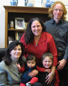
Yesterday afternoon, in a small office on the second floor of the Cuyahoga County Courthouse in downtown Cleveland, Ohio, Kat and Carolyn and I finalized our adoption of Rebecca.  There were a few witnesses to this: the social worker who has handled our case from the outset, as she did Carolyn’s; the lawyer who made sure all of our paperwork was correct; our friends Gini and Ferrett; and the magistrate who conducted the proceedings.

As I did with Carolyn, I’ve avoided mention of Rebecca’s being adopted, though anyone who’s been reading the site for the last several years would probably have inferred it from the fact that Carolyn was adopted.  And as with Carolyn, I avoided saying anything because the adoption wasn’t legally final until yesterday.  Up to that point, we were borrowing her from the agency, as it were: they were her legal guardians.  It was possible at any point for the agency to remove her from our home.  In the strictest legal sense, they didn’t even need a reason to do so.  Ditto the state.  Had we missed one of the six monthly post-placement meetings with our social worker, for example, or even not met the required schedule, custody would have been revoked.

Now, of course, that’s no longer possible.  Now she is ours as legally as she has been emotionally, now judicially recognized as the part of our family she’s long since become.  It was her sister who made it official: the magistrate had Carolyn stamp the legal decrees, so that it was she who made the adoption permanent and binding.  Most of the witnesses choked back tears.  I felt a few eye-prickles myself, but suppressed them to make sure I got the pictures I hope both girls will cherish as they grow older.

After a celebratory dinner with friends, as we got ready for bedtime, I took Rebecca into my arms and whispered, “Welcome to our family, little one.  Again.  And forever.”


MW Latest Tweet 1.1b2

Published 15 years, 9 months past

Now available: MW Latest Tweet 1.1b2.  The only real difference between this version and the previous is better auto-link routines, thanks largely to a PHP4-ified version of Joseph Scott‘s recently released MakeItLink PHP class.  I tightened up some related code as well, thanks to my newfound understanding of just what the heck a “callback function” actually does, and how it can be useful.  And anonymous functions, too!

Also, there is an “enter debug mode” link at the bottom of the administrative panel for the plugin.  It’s very cleverly matched with an “exit debug mode” link when you’re in debug mode.  These links do just what they sound like they should do.  Debug mode itself, introduced in the previous beta, is unchanged (except maybe cosmetically).

In case anyone’s interested in seeing how I use the text-replacement strings on  meyerweb, here’s what I have in that textarea, formatted slightly for readability:


<div class="panel">
<h4>Recently Tweeted</h4>
<p class="more">
<a href="http://twitter.com/%%USER_SCREEN_NAME%%">see more</a>
</p>
<p>
%%TEXT%% <small>–tweeted %%CREATED_AT%%</small>
</p>
</div>

There were some reports of incompatibility between this plugin and early WordPress 2.7 betas.  Word is it’s working fine with the latest beta.  I probably won’t fix any incompatibilities until 2.7 final ships, but if anyone spots something they absolutely know will be a problem in 2.7 final, let me know.  Thanks!


Fixing Postcodes

Published 15 years, 10 months past

In case anyone’s interested, I finally updated the ZIP archive of all the countries and postcodes from the 2008 ALA survey.  The two files are sorted like before, but this time leading-zero postcodes haven’t had their leading zeroes stripped by Excel.  Oh, Excel.

I have learned way more about Excel’s “helpful” handling of CSV and text imports than I ever wanted to know.  The basic drill is, if you want to open a CSV or text file but don’t want Excel to be “helpful”, don’t drop the file onto Excel or double-click the file icon.  No no!  That would be too easy.

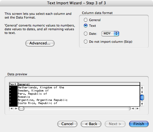
Instead, launch Excel, select “File > Open”, and then select the CSV or text file you want to open in the file browser.  Go through the Text Import Wizard carefully:

  1. Tell Excel that the file is delimited on the first screen.  (Or, if it isn’t, then don’t.  I bet it is, though.)
  2. Tell Excel what delimiter you’re using on the second screen.
  3. Then—this is the crucial bit—on the third Wizard screen, select the columns you don’t want Excel to “help” you with and set them to “Text”.  Be careful about setting all the columns as “Text”, though: if you have non-ASCII characters, Excel will “helpfully” replace their contents with octothorpes when you try to export the data later.  Such “help”!  It’s so “helpful”!

Yay!  An open file where the data is all in its original state!

Now you can save the file as an Excel workbook and it should (but please note my use of the word should) leave your data alone.  Ditto if you do “Save As…” to export to CSV or text again, which you might do if you run some calculations and want to capture the result in a basic, portable format.  But remember!  If you ever want to open those CSV/text files in Excel, you can’t just open them.  You have to go through the whole text-import process again.

So the survey files now contain actual useful data, especially for countries where postcodes can start with zeroes.  (Which is a lot of them.)  The files also have the usual bits of abuse that come along with daring to ask people to supply optional information, because I didn’t even try to filter that stuff out.  So, you know, naughty words ahead.

In part, I’m posting this to leave a record for anyone else who runs into the same problems I had, and also to remind myself of what has to be done next year.  Also to provide a heads-up to anyone who’d like to grab the fixed-up data and do fun mapping stuff with it, as did some commenters on the previous post.


Shock and Awe

Published 15 years, 10 months past

I almost feel like the Presidential election didn’t happen.

You see, for the entire second half of Election Day, from almost noon until after midnight, Eastern time, I was aboard a Continental flight to Tokyo.  We had video-on-demand systems but not live satellite television, so as we arced over Canada, Alaska, and the northern reaches of the Pacific Ocean, we flew in ignorance.  As Jeremy Keith put it regarding his own flight to Japan, we were aboard Schrödinger‘s Airplane.

For me, the wave collapsed as we began the initial descent toward Narita.  One of the flight attendants, having announced that they were starting the initial-descent procedures and would like us to check around our seats for any personal items we might like to start stowing, added:  “And for those of you interested in the results of the election, we have a new President: Barack Obama.”

There was a burst of applause from the economy section of the plane.  In business class, there was silence.

Well, not quite.  I was myself sitting in business class, thanks to a great big pile of reward miles and some lucky timing in calling the airline.  As I heard her say Obama’s name, I let out an involuntary “Wow“.  Because until that moment, deep down I had believed, truly believed, that Mr. Obama would not win the Presidency.  That was not the outcome I desired, but it was the outcome I expected.

I am in many ways ashamed of my doubts and fears, because I had thought less of my fellow Americans than they deserved.

Since then, from here in Tokyo, I’ve felt weirdly disconnected from what’s happened.  In time zone terms, I’m fourteen hours in my home’s future, half a day ahead of everyone back home.  But because I received word after it was all over and soon after slept through America’s Wednesday daylight hours, I feel like I’m a day behind.  Time and distance combine to create a feeling of disconnectedness from the end result, as though I’m getting word of election results in Germany or India or Australia: interesting, but something seen at a remove.

It’s odd.  I’m used to being an observer, but this is something else entirely.  I think it’s pure astonishment.


JavaScript Will Save Us All

Published 15 years, 10 months past

A while back, I woke up one morning thinking, John Resig’s got some great CSS3 support in jQuery but it’s all forced into JS statements.  I should ask him if he could set things up like Dean EdwardsIE7 script so that the JS scans the author’s CSS, finds the advanced selectors, does any necessary backend juggling, and makes CSS3 selector support Transparently Just Work.  And then he could put that back into jQuery.

And then, after breakfast, I fired up my feed reader and saw Simon Willison‘s link to John Resig’s nascent Sizzle project.

I swear to Ged this is how it happened.

Personally, I can’t wait for Sizzle to be finished, because I’m absolutely going to use it and recommend its use far and wide.  As far as I’m concerned, though, it’s a first step into a larger world.

Think about it: most of the browser development work these days seems to be going into JavaScript performance.  Those engines are being overhauled and souped up and tuned and re-tuned to the point that performance is improving by orders of magnitude.  Scanning the DOM tree and doing things to it, which used to be slow and difficult, is becoming lightning-fast and easy.

So why not write JS to implement multiple background-image support in all browsers?  All that’s needed is to scan the CSS, find instances of multiple-image backgrounds, and then dynamically add divs, one per extra background image, to get the intended effect.

Just like that, you’ve used the browser’s JS to extend its CSS support.  This approach advances standards support in browsers from the ground up, instead of waiting for the browser teams to do it for us.

I suspect that not quite everything in CSS3 will be amenable to this approach, but you might be surprised.  Seems to me that you could do background sizing with some div-and-positioning tricks, and text-shadow could be supportable using a sIFR-like technique, though line breaks would be a bear to handle.  RGBa and HSLa colors could be simulated with creative element reworking and opacity, and HSL itself could be (mostly?) supported in IE with HSL-to-RGB calculations.  And so on.

There are two primary benefits here.  The first is obvious: we can stop waiting around for browser makers to give us what we want, thanks to their efforts on JS engines, and start using the advanced CSS we’ve been hearing about for years.  The second is that the process of finding out which parts of the spec work in the real world, and which fall down, will be greatly accelerated.  If it turns out nobody uses (say) background-clip, even given its availability via a CSS/JS library, then that’s worth knowing.

What I wonder is whether the W3C could be convinced that two JavaScript libraries supporting a given CSS module would constitute “interoperable implementations”, and thus allow the specification to move forward on the process track.  Or heck, what about considering a single library getting consistent support in two or more browsers as interoperable?  There’s a chance here to jump-start the entire process, front to back.

It is true that browsers without JavaScript will not get the advanced CSS effects, but older browsers don’t get our current CSS, and we use it anyway.  (Still older browsers don’t understand any CSS at all.)  It’s the same problem we’ve always faced, and everyone will face it differently.

We don’t have to restrict this to CSS, either.  As I showed with my href-anywhere demo, it’s possible to extend markup using JS.  (No, not without breaking validation: you’d need a custom DTD for that.  Hmmm.)  So it would be possible to use JS to, say, add audio and video support to currently-available browsers, and even older browsers.  All you’d have to do is convert the HTML5 element into HTML4 elements, dynamically writing out the needed attributes and so forth.  It might not be a perfect 1:1 translation, but it would likely be serviceable—and would tear down some of the highest barriers to adoption.

There’s more to consider, as well: the ability to create our very own “standards”.  Maybe you’ve always wanted a text-shake property, which jiggles the letters up and down randomly to look like the element got shaken up a bit.  Call it -myCSS-text-shake or something else with a proper “vendor” prefix—we’re all vendors now, baby!—and go to town.  Who knows?  If a property or markup element or attribute suddenly takes off like wildfire, it might well make it into a specification.  After all, the HTML 5 Working Group is now explicitly set up to prefer things which are implemented over things that are not.  Perhaps the CSS Working Group would move in a similar direction, given a world where we were all experimenting with our own ideas and seeing the best ideas gain widespread adoption.

In the end, as I said in Chicago last week, the triumph of standards (specifically, the DOM standard) will permit us to push standards support forward now, and save some standards that are currently dying on the vine.  All we have to do now is start pushing.  Sizzle is a start.  Who will take the next step, and the step after that?


Survey Mapping

Published 15 years, 11 months past

An anonymized copy of the data collected in the 2008 Survey has been turned over to some professional statisticians, as we did last year, and we’re waiting to hear back from them before moving into writing the full report.  But there’s no reason we can’t have a little fun while we wait, right?

So, calling all mapping ninjas: here’s a 136KB zip archive containing two tab-separated text files listing the countries and postcodes supplied by takers of the survey.  Before anyone has a privacy-related aneurysm, though, let me explain how they’re structured.

One of the two files is sorted alphabetically by country, with the postcodes as the second “column of data” (it’s country name, tab, postcode).  The second is the reverse: it’s sorted alphabetically by postcode, with the country names following each postcode.  This sorting should break any association they might have with the released data set, given that we won’t be including the postcodes in the released set.  (More on that in a moment.)

A word of warning: though I cleaned out some of the more obvious cases of people heaping abuse on us for even daring to ask the question, I can’t guarantee that the data set is perfectly clean.  There may be drops of bile here and there along with the usual collection of mistyped postcodes.  I know there’s at least one bit of obvious humor that I chose to leave in, so enjoy that when you find it.

We have two reasons to release this data this way at this point.  The first is to see what people do with it—heatmaps, perhaps, or one of those proportion-distortion maps, or a list of top-ten global postcodes or cities (or both).  Hey, go crazy!  I’d love to see a number of Google Maps/Yahoo! Maps/OpenMap/whatever mashups with this data.  That would be awesome.

The second reason is to ask for help with an API challenge.  Like I said, we’re not including the postcodes into the released data set.  What I would like to do instead is translate the postcodes into administrative regions (states, provinces, etc.) and put those in the data set.  That way, we can include things like “Ohio” and “British Columbia” and “Oaxaca”—thus providing a little bit better granularity in terms of geography, which was area of weakness in the 2007 survey.

Thanks to reading a couple of articles, I know how to do this for a single postcode.  But how does one do it for 26,457 postcode-and-country combinations without having to submit every single postcode as a separate request?  I’ve yet to see an explanation, and maybe there isn’t one, but I’d like to know either way.  And please, if someone does come up with a way, please show the work instead of just spitting out the result!  I’m hoping to learn a few things from the solution, but I obviously can’t do that without seeing the code.

One note: in cases where a postcode isn’t recognized or some kind of an error is returned, I’d like to have a little dash or “ERR” or something put in the result file.  That way we can get a handle on what percentage of the responses were resolvable.  Thanks.

Anyway, map and enjoy!


People and Places

Published 16 years, 1 day past

I don’t know about you, but I find the results of the People magazine cover Ericsperiment (thanks for the term, Bob!) to be quite interesting.  The boiled-down version of the results is: just about everyone saw what I did, but nearly everyone drew the wrong conclusions about what I was saying.  (What?  I’ll explain.)

First, I want to address a couple of objections that were raised.  The first was: “It’s just a family photograph”.  No, it’s not.  It’s a magazine cover shoot.  Those things are planned, directed, and executed down to the tiniest detail.  If you think it’s just a family portrait, you’re either being willfully obdurate or else completely ignoring the context.  That’s a mistake, because context is everything.  I’ve been involved in a few portrait sessions of no public reach whatsoever, and the photographer is always telling people where to stand or sit, adjusting the angle of people’s arms, getting them to fractionally tilt heads one way or the other, shifting people an inch or two, and so on.  “Just a family photo” is when the magazine gets a real family photo, taken by an amateur using a consumer-grade camera during a vacation, and puts it on the cover in a white Polaroid-esque frame at a 15-degree angle.

The second was that the image is a Photoshop job, created either by assembling individual shots or altering a group photo.  Maybe, maybe not; either way, Photoshopping or a lack thereof is completely irrelevant to my point.  If it wasn’t Photoshopped, then the photographer is responsible for the arrangement of the shot; if it was, then it’s the Photoshopper who bears responsibility.  Either way, someone arranged the shot, and did so very badly.

So here’s what I saw: “large group” and “outsider”.  That was the immediate message.  Look at the cover again, paying attention to where the faces are.  There’s a blob of faces above the headline text, which is the group.  Then there’s a face to the left of the headline text, which is the outsider.

This is completely independent of the race, color, gender, creed, etc. of the people in the photo.  The visual message is “here’s a bunch of people, plus a hanger-on”.  Not because of color, which is what most people assumed I was talking about (and more on that in a minute).  Because of placement.

Though I think this unlikely, you may not quite be seeing it.  In that case, imagine a cover image with nine faces in the same places, only they’re of religious deities.  Or pop stars.  Or CEOs.  Or heads of state.  Or conference speakers.  Or browser-team leads; heck, even browser logos.  Whichever it is, imagine your favorite of each group is in the lower-left position, with all the others up above.  Feel good about that?  Even neutral?  Still think there’s no message being conveyed by that placement?

(And if you still aren’t seeing it, maybe a comparative example, courtesy George Butler, will provide some insight.)

Now, given that one of the people has been placed as an outsider, the natural next step is to wonder why they’ve been so placed.  And here, there are obvious visual differences that jump right out:  like being female, having darker skin, and being younger.  Already primed to ask “Why is this person an outsider?” we can find apparent reasons, and in this case they’re touchy ones.  If you know the background story of the family, then there’s a non-visual one as well: that she’s adopted.

But remember, I’m not saying Bridget (the young lady in that position) has been excluded for any of those reasons.  I’m saying that having been given a visual cue that she is excluded, we look for reasons to explain that exclusion.  That’s exactly what most of the people who responded to my post about the cover did.  All those people saw it, consciously or otherwise, and responded to the message… and then took that next step, trying to find reasons to explain the message.  Then, as per each individual’s feelings and experiences, they reacted, either accepting or rejecting what they thought I was saying.  Interesting, though, that so many people came to the same conclusion about what they thought I was saying.  That’s evidence of a strong message, whether or not said message was intended.

And that is the failure that occurred, one which I lay squarely at the doorstep of the magazine.  I might also toss in a head-slap to the campaign, if they saw the image and gave approval to use it—such pre-approval is sometimes, but not always, an option.  The problem with that composition should have been obvious from the outset, and avoided.  That it wasn’t makes me wonder a number of things about the magazine.  Taking a teenaged girl and putting her in the outsider spot?  Seriously?  How callous do you have to be to do that?

Oh, and special postscript to all the people who took the time to share their pitying sorrow over how “you Americans” are so race-aware:  I know it’s a tragedy, but remember, we’re still a young country and have not had the same lengthy maturation time you’ve enjoyed.  So please, try to remain patient with us while segregation, anti-immigrant violence, race riots, tribal warfare, and ethnic cleansing uniquely wrack our poor, blighted country, and continue to hope that one day we’ll join the rest of the world in the tranquil harmony that so characterizes your enlightened societies.

Placement

Published 16 years, 6 days past

I was in line to buy a few groceries and spotted the latest issue of People magazine in the point-of-sale magazine rack, the one with the McCain family on the cover.  Something about the cover just seemed a little bit… off.  Do you see it, too?

There’s a metaphor there, but I’m having trouble deciding exactly what it is, or perhaps more accurately to whom it applies.

Seriously, I’m not generally one to read messages into things—in fact, I probably lean too far the other direction—but on this?  Somebody needs to be fired for gross negligence, because there’s a message being sent here, intentionally or otherwise.  In fact, it’s worse if it’s unintentional.  The question is who was negligent.  The photographer for not seeing what the placement communicated?  The editor for approving use of the image on their cover?  The McCain campaign for approving the image in the first place?

Maybe all of the above.

I’ll be very interested in people’s responses on this one… and even more in People‘s response, should anyone ask them about it.


Browse the Archive

Earlier Entries