Posts in the Personal Category

Design for Real Life News!

Published 1 month, 2 weeks past

If you’re reading this, odds are you’ve at least heard of A Book Apart (ABA), who published Design for Real Life, which I co-wrote with Sara Wachter-Boettcher back in 2016.  What you may not have heard is that ABA has closed up shop.  There won’t be any more new ABA titles, nor will ABA continue to sell the books in their catalog.

That’s the bad news.  The great news is that ABA has transferred the rights for all of its books to their respective authors! (Not every ex-publisher does this, and not every book contract demands it, so thanks to ABA.) We’re all figuring out what to do with our books, and everyone will make their own choices.  One of the things Sara and I have decided to do is to eventually put the entire text online for free, as a booksite.  That isn’t ready yet, but it should be coming somewhere down the road.

In the meantime, we’ve decided to cut the price of print and e-book copies available through Ingram.  DfRL was the eighteenth book ABA put out, so we’ve decided to make the price of both the print and e-book $18, regardless of whether those dollars are American, Canadian, or Australian.  Also €18 and £18.  Basically, in all five currencies we can define, the price is 18 of those.

…unless you buy it through Apple Books; then it’s 17.99 of every currency, because the system forces us to make it cheaper than the list price and also have the amount end in .99.  Obversely, if you’re buying a copy (or copies) for a library, the price has to be more than the list price and also end in .99, so the library cost is 18.99 currency units.  Yeah, I dunno either.

At any rate, compared to its old price, this is a significant price cut, and in some cases (yes, Australia, we’re looking at you) it’s a huge discount.  Or, at least, it will be at a discount once online shops catch up.  The US-based shops seem to be up to date, and Apple Books as well, but some of the “foreign” (non-U.S.) sources are still at their old prices.  In those cases, maybe wishlist or bookmark or something and keep an eye out for the drop.  We hope it will become global by the end of the week.  And hey, as I write this, a couple of places have the ebook version for like 22% less than our listed price.

So!  If you’ve always thought about buying a copy but never got around to it, now’s a good time to get a great deal.  Ditto if you’ve never heard of the book but it sounds interesting, or you want it in ABA branding, or really for any other reason you have to buy a copy now.

I suppose the real question is, should you buy a copy?  We’ll grant that some parts of it are a little dated, for sure.  But the concepts and approaches we introduced can be seen in a lot of work done even today.  It made significant inroads into government design practices in the UK and elsewhere, for example, and we still hear from people who say it really changed how they think about design and UX.  We’re still very proud of it, and we think anyone who takes the job of serving their users seriously should give it a read.  But then, I guess we would, or else we’d never have written it in the first place.

And that’s the story so far.  I’ll blog again when the freebook is online, and if anything else changes as we go through the process.  Got questions?  Leave a comment or drop me a line.


A Decade Later, A Decade Lost

Published 3 months, 1 day past

I woke up this morning about an hour ahead of my alarm, the sky already light, birds calling.  After a few minutes, a brief patter of rain swept across the roof and moved on.

I just lay there, not really thinking.  Feeling.  Remembering.

Almost sixteen years to the minute before I awoke, my second daughter was born.  Almost ten years to the same minute before, she’d turned six years old, already semi-unconscious, and died not quite twelve hours later.

So she won’t be taking her first solo car drive today.  She won’t be celebrating with dinner at her favorite restaurant in the whole world.  She won’t kiss her niece good night or affectionately rag on her siblings.

Or maybe she wouldn’t have done any of those things anyway, after a decade of growth and changes and paths taken.  What would she really be like, at sixteen?

We will never know.  We can’t even guess.  All of that, everything she might have been, is lost.

This afternoon, we’ll visit Rebecca’s grave, and then go to hear her name read in remembrance at one of her very happiest places, Anshe Chesed Fairmount Temple, for the last time.  At the end of the month, the temple will close as part of a merger.  Another loss.

A decade ago, I said that I felt the weight of all the years she would never have, and that they might crush me.  Over time, I have come to realize all the things she never saw or did adds to that weight.  Even though it seems like it should be the same weight.  Somehow, it isn’t.

I was talking about all of this with a therapist a few days ago, about the time and the losses and their accumulated weight.  I said, “I don’t know how to be okay when I failed my child in the most fundamental way possible.”

“You didn’t fail her,” they said gently.

“I know that,” I replied. “But I don’t feel it.”

A decade, it turns out, does not change that.  I’m not sure now that any stretch of time ever could.


Once Upon a Browser

Published 8 months, 6 days past

Once upon a time, there was a movie called Once Upon a Forest.  I’ve never seen it.  In fact, the only reason I know it exists is because a few years after it was released, Joshua Davis created a site called Once Upon a Forest, which I was doing searches to find again.  The movie came up in my search results; the site, long dead, did not.  Instead, I found its original URL on Joshua’s Wikipedia page, and the Wayback Machine coughed up snapshots of it, such as this one.  You can also find static shots of it on Joshua’s personal web site, if you scroll far enough.

That site has long stayed with me, not so much for its artistic expression (which is pleasant enough) as for how the pieces were produced.  Joshua explained in a talk that he wrote code to create generative art, where it took visual elements and arranged them randomly, then waited for him to either save the result or hit a key to try again.  He created the elements that were used, and put constraints on how they might be arranged, but allowed randomness to determine the outcome.

That appealed to me deeply.  I eventually came to realize that the appeal was rooted in my love of the web, where we create content elements and visual styles and scripted behavior, and then we send our work into a medium that definitely has constraints, but something very much like the random component of generative art: viewport size, device capabilities, browser, and personal preference settings can combine in essentially infinite ways.  The user is the seed in the RNG of our work’s output.

Normally, we try very hard to minimize the variation our work can express.  Even when crossing from one experiential stratum to another  —  that is to say, when changing media breakpoints  —  we try to keep things visually consistent, orderly, and understandable.  That drive to be boring for the sake of user comprehension and convenience is often at war with our desire to be visually striking for the sake of expression and enticement.

There is a lot, and I mean a lot, of room for variability in web technologies.  We work very hard to tame it, to deny it, to shun it.  Too much, if you ask me.

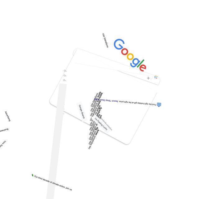
About twelve and half years ago, I took a first stab at pushing back on that denial with a series posted to Flickr called “Spinning the Web”, where I used CSS rotation transforms to take consistent, orderly, understandable web sites and shake them up hard.  I enjoyed the process, and a number of people enjoyed the results.

google.com, late November 2023

In the past few months, I’ve come back to the concept for no truly clear reason and have been exploring new approaches and visual styles.  The first collection launched a few days ago: Spinning the Web 2023, a collection of 26 web sites remixed with a combination of CSS and JS.

I’m announcing them now in part because this month has been dubbed “Genuary”, a month for experimenting with generative art, with daily prompts to get people generating.  I don’t know if I’ll be following any of the prompts, but we’ll see.  And now I have a place to do it.

You see, back in 2011, I mentioned that my working title for the “Spinning the Web” series was “Once Upon a Browser”.  That title has never left me, so I’ve decided to claim it and created an umbrella site with that name.  At launch, it’s sporting a design that owes quite a bit to Once Upon a Forest  —  albeit with its own SVG-based generative background, one I plan to mess around with whenever the mood strikes.  New works will go up there from time to time, and I plan to migrate the 2011 efforts there as well.  For now, there are pointers to the Flickr albums for the old works.

I said this back in 2011, and I mean it just as much in 2023: I hope you enjoy these works even half as much as I enjoyed creating them.


2023 in (Brief) Review

Published 8 months, 1 week past

I haven’t generally been one to survey years as they end, but I’m going to make an exception for 2023, because there were three pretty big milestones I’d like to mark.

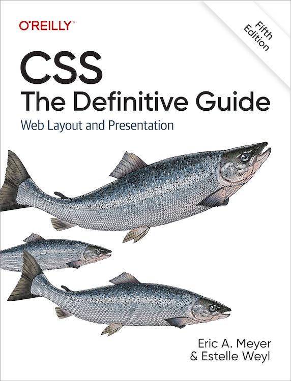
The first is that toward the end of May, the fifth edition of CSS: The Definitive Guide was published.  This edition weighs in at a mere 1,126 pages, and covers just about everything in CSS that was widely supported by the end of the 2022, and a bit from the first couple of months in 2023.  It’s about 5% longer by page count than the previous edition, but it has maybe 20% more material.  Estelle and I pulled that off by optimizing some of the older material, dropping some “intro to web” stuff that was still hanging about in the first chapter, and replacing all the appendices from the fourth edition with a single appendix that lists the URLs of useful CSS resources.  As with the previous edition, the files used to produce the figures for the book are all available online as a website and a repository.

The second is that Kat and I went away for a week in the summer to celebrate our 25th wedding anniversary.  As befits our inclinations, we went somewhere we’d never been but always wanted to visit, the Wisconsin Dells and surrounding environs.  We got to tour The Cave of the Mounds (wow), The House on the Rock (double wow), The World of Doctor Evermore (wowee), and the Dells themselves.  We took a river tour, indulged in cheesy tourist traps, had some fantastic meals, and generally enjoyed our time together.  I did a freefall loop-de-loop waterslide twice, so take that, Action Park.

The third is that toward the end of the year, Kat and I became grandparents to the beautiful, healthy baby of our daughter Carolyn.  A thing that people who know us personally know is that we love babies and kids, so it’s been a real treat to have a baby in our lives again.  It’s also been, and will continue to be, a new and deeper phase of parenthood, as we help our child learn how to be a parent to her child.  We eagerly look forward to seeing them both grow through the coming years.

So here’s to a year that contained some big turning points, and to the turning points of the coming year.  May we all find fulfillment and joy wherever we can.


Three Decades of HTML

Published 9 months, 2 days past

A few days ago was the 30th anniversary of the first time I wrote an HTML document.  Back in 1993, I took a Usenet posting of the “Incomplete Mystery Science Theater 3000 Episode Guide” and marked it up.  You can see the archived copy here on meyerweb.  At some point, the markup got updated for reasons I don’t remember, but I can guarantee you the original had uppercase tag names and I didn’t close any paragraphs.  That’s because I was using <P> as a shorthand for <BR><BR>, which was the style at the time.

Its last-updated date of December 3, 1993, is also the date I created it.  I was on lobby duty with the CWRU Film Society, and had lugged a laptop (I think it was an Apple PowerBook of some variety, something like a 180, borrowed from my workplace) and a printout of the HTML specification (or maybe it was “Tags in HTML”?) along with me.

I spent most of that evening in the lobby of Strosacker Auditorium, typing tags and doing find-and-replace operations in Microsoft Word, and then saving as text to a file that ended in .html, which was the style at the time.  By the end of the night, I had more or less what you see in the archived copy.

The only visual change between then and now is that a year or two later, when I put the file up in my home directory, I added the toolbars at the top and bottom of the page  —  toolbars I’d designed and made a layout standard as CWRU’s webmaster.  Which itself only happened because I learned HTML.

A couple of years ago, I was fortunate enough to be able to relate some of this story to Joel Hodgson himself.  The story delighted him, which delighted me, because delighting someone who has been a longtime hero really is one of life’s great joys.  And the fact that I got to have that conversation, to feel that joy, is inextricably rooted in my sitting in that lobby with that laptop and that printout and that Usenet post, adding tags and saving as text and hitting reload in Mosaic to instantly see the web page take shape, thirty years ago this week.


Memories of Molly

Published 1 year, 2 days past

The Web is a little bit darker today, a fair bit poorer: Molly Holzschlag is dead.  She lived hard, but I hope she died easy.  I am more sparing than most with my use of the word “friend”, and she was absolutely one.  To everyone.

If you don’t know her name, I’m sorry.  Too many didn’t.  She was one of the first web gurus, a title she adamantly rejected  —  “We’re all just people, people!”  —  but it fit nevertheless.  She was a groundbreaker, expanding and explaining the Web at its infancy.  So many people, on hearing the mournful news, have described her as a force of nature, and that’s a title she would have accepted with pride.  She was raucous, rambunctious, open-hearted, never ever close-mouthed, blazing with fire, and laughed (as she did everything) with her entire chest, constantly.  She was giving and took and she hurt and she wanted to heal everyone, all the time.  She was messily imperfect, would tell you so loudly and repeatedly, and gonzo in all the senses of that word.  Hunter S. Thompson should have written her obituary.

I could tell so many stories.  The time we were waiting to check into a hotel, talking about who knows what, and realized Little Richard was a few spots ahead of us in line.  Once he’d finished checking in, Molly walked right over to introduce herself and spend a few minutes talking with him.  An evening a group of us had dinner one the top floor of a building in Chiba City and I got the unexpectedly fresh shrimp hibachi.  The time she and I were chatting online about a talk or training gig, somehow got onto the subject of Nick Drake, and coordinated a playing of “ Three Hours” just to savor it together.  A night in San Francisco where the two of us went out for dinner before some conference or other, stopped at a bar just off Union Square so she could have a couple of drinks, and she got propositioned by the impressively drunk couple seated next to her after they’d failed to talk the two of us into hooking up.  The bartender couldn’t stop laughing.

Or the time a bunch of us were gathered in New Orleans (again, some conference or other) and went to dinner at a jazz club, where we ended up seated next to the live jazz trio and she sang along with some of the songs.  She had a voice like a blues singer in a cabaret, brassy and smoky and full of hard-won joys, and she used it to great effect standing in front of Bill Gates to harangue him about Internet Explorer.  She raised it to fight like hell for the Web and its users, for the foundational principles of universal access and accessible development.  She put her voice on paper in some three dozen books, and was working on yet another when she died.  In one book, she managed to sneak past the editors an example that used a stick-figure Kama Sutra custom font face.  She could never resist a prank, particularly a bawdy one, as long as it didn’t hurt anyone.

She made the trek to Cleveland at least once to attend and be part of the crew for one of our Bread and Soup parties.  We put her to work rolling tiny matzoh balls and she immediately made ribald jokes about it, laughing harder at our one-up jokes than she had at her own.  She stopped by the house a couple of other times over the years, when she was in town for consulting work, “Auntie Molly” to our eldest and one of my few colleagues to have spent any time with Rebecca.  Those pictures were lost, and I still keenly regret that.

There were so many things about what the Web became that she hated, that she’d spent so much time and energy fighting to avert, but she still loved it for what it could be and what it had been originally designed to be.  She took more than one fledgling web designer under her wing, boosted their skills and careers, and beamed with pride at their accomplishments.  She told a great story about one, I think it was Dunstan Orchard but I could be wrong, and his afternoon walk through a dry Arizona arroyo.

I could go on for pages, but I won’t; if this were a toast and she were here, she would have long ago heckled me (affectionately) into shutting up.  But if you have treasured memories of Molly, I’d love to hear them in the comments below, or on your own blog or social media or podcasts or anywhere.  She loved stories.  Tell hers.


Designing the Igalia Chats Logo

Published 1 year, 2 weeks past

One of the things I’ve been doing at Igalia of late is podcasting with Brian Kardell.  It’s called “Igalia Chats”, and last week, I designed it a logo.  I tried out a number of different ideas, ran them past the Communication team for feedback, and settled on this one.

The Igalia Chats logo, which combines the official full Igalia logo of a many-colored circle and the name of the company with the word “Chats” below the logo in a slightly larger font size than that used for the name of the company.  Next to them is a large stylized icon of a microphone.  
D&AD Awards committee, you know where to find me.

And there you have it, the first logo I’ve designed in… well, in quite a while.  My work this time around was informed by a few things.

  • Podcast apps, sites, etc.  expect a square image for the podcast’s logo.  This doesn’t mean you have to make the visible part of it square, exactly, but it does mean any wide-and-short logo will simultaneously feel cramped and lost in a vast void.  Or maybe just very far away.  The version shown in this post is not the square version, because this is not a podcast app and because I could.  The square version just adds more empty whitespace at the top and bottom, anyway.
  • I couldn’t really alter the official logo in any major way: the brand guidelines are pretty strong and shouldn’t be broken without collective approval.  Given the time that would take, I decided to just work with the logo as-is, and think about possible variants (say, the microphone icon in the blank diamond of the logo) in a later stage.  I did think about just not using the official logo at all, but that felt like it would end up looking too generic.  Besides, we hav e a pretty nifty logo there, so why not use it?
  • A typeface for the word “Chats” that works well with Igalia’s official logo.  I used Etelka, which is a font we already use on the web site, and I think is the basis of the semi-serifed letters in the official logo anyway.  Though I could be wrong about that; while I definitely have opinions about typefaces these days, I’m not very good at identifying them, or being able to distinguish between two similar fonts.  Call it typeface blindness.
  • Using open-source resources where possible; thus, the microphone icon came from The Noun Project.  I then modified it a bit (rounded the linecaps, shortened the pickup’s brace) to balance its visual weight with the rest of the design, and not crowd the letters too much.  I also added a subtle vertical gradient to the icon, which helped the word “Chats” to stand out a little more.  Gotta make the logo pop, donchaknow?

There are probably some adjustments I’ll make after a bit of time, but I was determined not to let perfect be the enemy of shipping.  As for how I came to create the logo, you’re probably thinking fancy CSS Grid layout and custom fonts and all that jazz, but no, I just dumped everything into Keynote and fiddled with ideas until I had some I liked.  It’s not a fantastic environment for this sort of work, I expect, but it’s Good Enough For Me™.

So, if you’re subscribed to Igalia Chats via your listening channel of choice, you should be seeing a new logo.  If you aren’t subscribed… try us, won’t you?  Brian and I talk about a lot of web-related stuff with a lot of really interesting people  —  most recently, with Kilian Valkhof about the web development application Polypane, with Stephen Shankland about undersea data cables, with Zach Leatherman about open-source work and funding, and many more.  Plus sometimes we just talk with each other about what’s new in Web land, things like Google Baseline or huge WebKit updates.  And, yes, sometimes we talk about what Igalia is up to, like our work on the Servo engine or the Steam Deck.

This is one of the things I quite enjoy about working for Igalia  —  the way I can draw upon all the things I’ve learned over my many (many) years to create different things.  A logo last week, a thumbnail-building tool the week before, writing news posts, recording podcasts, doing audio production, figuring out transcription technology, and on and on and on.  It can sometimes be frustrating in the way all work can be, but it rarely gets boring. (And if that sounds good to you, we are hiring for a number of roles!)


From ABC’s to 9999999

Published 1 year, 4 months past

The other week I crossed a midpoint, of sorts: as I was driving home from a weekly commitment, my iPhone segued from Rush’s “Mystic Rhythms” to The Seatbelts’ “N.Y.  Rush”, which is, lexicographically speaking, the middle of my iTu —  oh excuse me, the middle of my Music Dot App Library, where I passed from the “M” songs into the “N” songs.

See, about a year or so ago, I took inspiration from Kevin Smokler to set about listening through my entire music library alphabetically by song title.  Thus, I started with “ABC’s” by K’naan and will end, probably in a year or so, with “9999999” by Mike Morasky (a.k.a Aperture Science Psychoacoustics Laboratory).

Every time I have to drive my car for more than a few minutes, I’ll plug in my iPhone and continue the listen from where I left off.  This mainly happens during the aforementioned weekly commitment, which usually sees me driving for an hour or so.  I also listen to it while I’m doing chores around the house like installing ceiling fans or diagnosing half-dead Christmas light strings.

This sort of listen is, in many ways, like listening to the entire library on shuffle, because, as Jared Spool used to point out (and probably still does), alphabetically sorting a long list of things is indistinguishable from having it randomized.  For me, the main difference between alphabetical and random is that it’s a lot easier to pick back up where you left off when working through alphabetically. (Yes, Music Dot App should do that automatically, but sometimes it forgets where it was.) You can also be a lot more certain that every song gets a listen, something that’s harder to ensure if you’re listening to a random shuffle of a couple thousand tracks and your software loses its place.

There are other advantages: sometimes, artists will use the same song title, and you get interesting combinations.  For example, there was “America”, which gave me a song by K’naan and then a same-titled, but very different, song by Spinal Tap.  Similarly, there are titular combinations that pop out, like  “Come On” by The Goo Goo Dolls, “Come On In, The Dreams Are Fine” by Dee-Lite, and “Come On Over” by Elana Stone.

Some of these combinations groove, some delight, some earn the stank face, and some make me literally laugh out loud.  And some aren’t related by title but still go together really, really well.  A recent example was the segue from The Prodigy’s “Narayan” to Radiohead’s “The National Anthem”, which sonically flowed just right at the switchover, almost like they’d been composed to have that effect.  It made this old long-ago radio DJ smile.

I say I took inspiration from Kevin because my listen has a couple of differences to his:

  • Kevin has a “no skips, ever” rule, but I will skip songs that are repeats.  This happens a lot when you have both live and studio albums, as I do for a few artists (particularly Rush), or have copied tracks for lightly-engineered playlists, as I have a few times.  That said, if I have a song by one artist and a cover of that song by another, I don’t skip either of them.  For remixes or alternate recordings of a song by the same artist, I generally don’t skip, unless the remix is just the original song with a vaguely different beat track.
  • I filtered out most of my classical content before starting.  This is not because I dislike classical, but because they tend to sort together in unrelenting clumps  —  all of Beethoven’s and Mozart’s symphonies one after another after another, for example  —  and I wanted a varietal mix.  I did keep “classical” albums like Carreras Domingo Pavarotti in Concert and Carmina Burana because they have normal-length tracks with titles that scatter them throughout the sort.  The same reasoning was used to retain classic film and TV scores, even if I was stretching it a bit to leave in The Music of Cosmos (the 1980 one), which prefixes all its tracks with Roman numerals… but each track is a medley, so it got a pass.  The whole-album-in-a-single-MP3 The Music of Osmos, on the other hand, did not.

All that said, I have a much shorter road than Kevin: he has a library of over twelve thousand tracks, whereas my slightly-filtered library is just shy of 2,500 tracks, or right around 160 hours.  The repeated-song skips knock the total time down a bit, probably by a few hours but not much more than that.  So, figure at an average of 80 minutes per week, that’s about 120 weeks, or two years and four months to get from beginning to end.

And what will I do when I reach the end?  Probably go back to better curate the sorting (e.g., configuring Soundgarden’s “4th of July” to be sorted as “Fourth of July”), create a playlist that cuts out the repeats ahead of time, and start over.  But we’ll see when I get there.  Maybe next time I’ll listen to it in reverse alphabetical order instead.


Browse the Archive

Earlier Entries