What happened was, I wrote a bookmarklet in early 2024 that would load all of the comments on a lengthy GitHub issue by auto-clicking any “Load more” buttons in the page, and at some point between then and now GitHub changed their markup in a way that broke it, so I wrote a new one. Here it is:
It totals 258 characters of JavaScript, including the ISO-8601-style void marker, which is smaller than the old version. The old one looked for buttons, checked the .textContent of every single one to find any that said “Load more”, and dispatched a click to each of those. Then it would do that again until it couldn’t find any more such buttons. That worked great until GitHub’s markup got changed so that every button has at least three nested <div>s and <span>s inside itself, so now the button elements have no text content of their own. Why? Who knows. Probably something Copilot or Grok suggested.
So, for the new one provided above: when you invoke the bookmarklet, it waits half a second to look for an element on the page with a class value that starts with LoadMore-module__buttonChildrenWrapper. It then dispatches a bubbling click event to that element, waits two seconds, and then repeats the process. Once it repeats the process and finds no such elements, it terminates.
I still wish this capability was just provided by GitHub, and maybe if I keep writing about it I’ll manage to slip the idea into the training set of whatever vibe-coding resource hog they decide to add next. In the meantime, just drag the link above into your toolbar or otherwise bookmark it, use, and enjoy!
(And if they break it again, feel free to ping me by commenting here.)
TAKE HEED! Due to changes in GitHub’s markup, the following post was superseded in September 2025 by the post Bookmarklet: Load All GitHub Comments (take 2), which has an updated bookmarklet.
What happened was, Brian and I were chatting about W3C GitHub issues and Brian mentioned how really long issues are annoying to search and read, because GitHub has this thing where if there are too many comments on an issue, it snips out the middle with a “Load more…” button that’s very tastefully designed and pretty easy to miss if you’re quick-scrolling to try to catch up. The squiggle-line would be a good marker, if it weren’t so tasteful as to blend into the background in a way that makes the Baby WCAG cry.
And what’s worse, from this perspective, is that if the issue has been discussed to a very particular kind of death, the “Load more…” button can have more “Load more…” buttons hiding within. So even if you know there was an interesting comment, and you remember a word or two of it, page-searching in your browser will do no good if the comment in question is buried one or more XMLHTTPRequest calls deep.
“I really wish GitHub had an ‘expand all comments’ button at the top or something,” Brian said (or words to that effect).
Well, it was a Friday afternoon and I was feeling code-hacky, so I wrote a bookmarklet. Here it is in easy-to-save hyperlink form:
It waits half a second after you activate it to find all the buttons on the page (in my test runs, usually six hundred of them). Then it looks through all the buttons to find the ones that have a textContent of “Load more…” and dispatches a click event to each one. With that done, it waits five seconds and does it all again, waits five seconds to do it again, and so on. Once it finds there are zero buttons with the “Load more…” textContent, it exits. And, if five seconds is too quick due to slow loading times, you can always invoke the bookmarklet again should you come across a “Load more…” button.
If you want this ability for yourself, just drag the link above into your bookmark toolbar or bookmarks menu, and whenever you load up a mega-thread GitHub issue, fire the bookmarklet to load all the comments. I imagine there may be cleaner ways to do this, but I was able to codeslam this in about 15 minutes using ViolentMonkey on live GitHub pages, and it does the thing.
I did consider complexifying the ViolentMonkey script so that any GitHub page is scanned for the “Load more…” button, and if one is present, then a “Load all comments” button is plopped into the top of the page, but I knew that would take at least another 15 minutes and my codeslam window was closing. Also, it would require anyone using it to run ViolentMonkey (or equivalent) all the time, whereas the bookmarlet has zero impact unless the user invokes it. If you want to extend this into something more than it is and share your solution with the world, by all means feel free.
The point of all this being, if you too wish GitHub had an easy way to load all the comments without you having to search for the “Load more…” button yourself, now there’s a bookmarklet made just for you. Enjoy!
I’ve posted a followup to this post which you should read before you read this post, because you might decide there’s no need to read this one. If not, please note that what’s documented below was a hack to overcome a bug that was quickly fixed, in a part of CSS that wasn’t enabled in stable Firefox at the time I wrote the post. Thus, what follows isn’t really useful, and leaves more than one wrong impression. I apologize for this. For a more detailed breakdown of my errors, please see the followup post.
I’ve been doing some development recently on a tool that lets me quickly produce social-media banners for my work at Igalia. It started out using a vanilla JS script to snarfle up collections of HTML elements like all the range inputs, stick listeners and stuff on them, and then alter CSS variables when the inputs change. Then I had a conceptual breakthrough and refactored the entire thing to use fully light-DOM web components (FLDWCs), which let me rapidly and radically increase the tool’s capabilities, and I kind of love the FLDWCs even as I struggle to figure out the best practices.
With luck, I’ll write about all that soon, but for today, I wanted to share a little hack I developed to make Firefox a tiny bit more capable.
One of the things I do in the tool’s CSS is check to see if an element (represented here by a <div> for simplicity’s sake) has an image whose src attribute is a base64 string instead of a URI, and when it is, add some generated content. (It makes sense in context. Or at least it makes sense to me.) The CSS rule looks very much like this:
div:has(img[src*=";data64,"])::before {
	[…generated content styles go here…]
}
This works fine in WebKit and Chromium. Firefox, at least as of the day I’m writing this, often fails to notice the change, which means the selector doesn’t match, even in the Nightly builds, and so the generated content isn’t generated. It has problems correlating DOM updates and :has(), is what it comes down to.
There is a way to prod it into awareness, though! What I found during my development was that if I clicked or tabbed into a contenteditable element, the :has() would suddenly match and the generated content would appear. The editable element didn’t even have to be a child of the div bearing the :has(), which seemed weird to me for no distinct reason, but it made me think that maybe any content editing would work.
I tried adding contenteditable to a nearby element and then immediately removing it via JS, and that didn’t work. But then I added a tiny delay to removing the contenteditable, and that worked! I feel like I might have seen a similar tactic proposed by someone on social media or a blog or something, but if so, I can’t find it now, so my apologies if I ganked your idea without attribution.
My one concern was that if I wasn’t careful, I might accidentally pick an element that was supposed to be editable, and then remove the editing state it’s supposed to have. Instead of doing detection of the attribute during selection, I asked myself, “Self, what’s an element that is assured to be present but almost certainly not ever set to be editable?”
Well, there will always be a root element. Usually that will be <html> but you never know, maybe it will be something else, what with web components and all that. Or you could be styling your RSS feed, which is in fact a thing one can do. At any rate, where I landed was to add the following right after the part of my script where I set an image’s src to use a base64 URI:
let ffHack = document.querySelector(':root');
ffHack.setAttribute('contenteditable','true');
setTimeout(function(){
	ffHack.removeAttribute('contenteditable');
},7);
Literally all this does is grab the page’s root element, set it to be contenteditable, and then seven milliseconds later, remove the contenteditable. That’s about a millisecond less than the lifetime of a rendering frame at 120fps, so ideally, the browser won’t draw a frame where the root element is actually editable… or, if there is such a frame, it will be replaced by the next frame so quickly that the odds of accidentally editing the root are very, very, very small.
At the moment, I’m not doing any browser sniffing to figure out if the hack needs to be applied, so every browser gets to do this shuffle on Firefox’s behalf. Lazy, I suppose, but I’m going to wave my hands and intone “browsers are very fast now” while studiously ignoring all the inner voices complaining about inefficiency and inelegance. I feel like using this hack means it’s too late for all those concerns anyway.
I don’t know how many people out there will need to prod Firefox like this, but for however many there are, I hope this helps. And if you have an even better approach, please let us know in the comments!
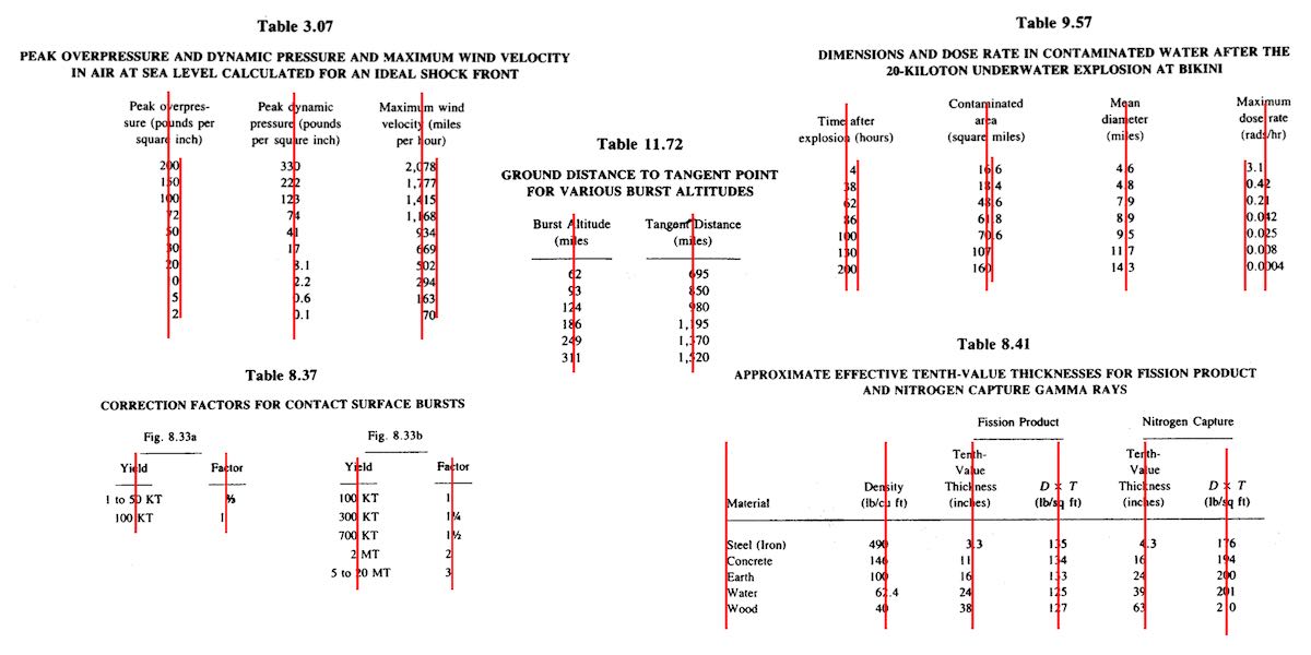
One of the bigger challenges of recreating The Effects of Nuclear Weapons for the Web was its tables. It was easy enough to turn tab-separated text and numbers into table markup, but the column alignment almost broke me.
To illustrate what I mean, here are just a few examples of columns that had to be aligned.
A few of the many tables in the book and their fascinating column alignments. (Hover/focus this figure to start a cyclic animation fading some alignment lines in and out. Sorry if that doesn’t work for you, mobile readers.)
At first I naïvely thought, “No worries, I can right- or left-align most of these columns and figure out the rest later.” But then I looked at the centered column headings, and how the column contents were essentially centered on the headings while having their own internal horizontal alignment logic, and realized all my dreams of simple fixes were naught but ashes.
My next thought was to put blank spacer columns between the columns of visible content, since table layout doesn’t honor the gap property, and then set a fixed width for various columns. I really didn’t like all the empty-cell spam that would require, even with liberal application of the rowspan attribute, and it felt overly fragile — any shifts in font face (say, on an older or niche system) might cause layout upset within the visible columns, such as wrapping content that shouldn’t be wrapped or content overlapping other content. I felt like there was a better answer.
I also thought about segregating every number and symbol (including decimal separators) into separate columns, like this:
<tr>
  <th>Neutrinos from fission products</th>
  <td>10</td>
  <td></td>
  <td></td>
</tr>
<tr class="total">
  <th>Total energy per fission</th>
  <td>200</td>
  <td>±</td>
  <td>6</td>
</tr>
Then I contemplated what that would do to screen readers and the document structure in general, and after the nausea subsided, I decided to look elsewhere.
It was at that point I thought about using spacer <span>s. Like, anywhere I needed some space next to text in order to move it to one side or the other, I’d throw in something like one of these:
Again, the markup spam repulsed me, but there was the kernel of an idea in there… and when I combined it with the truism “CSS doesn’t care what you expect elements to look or act like”, I’d hit upon my solution.
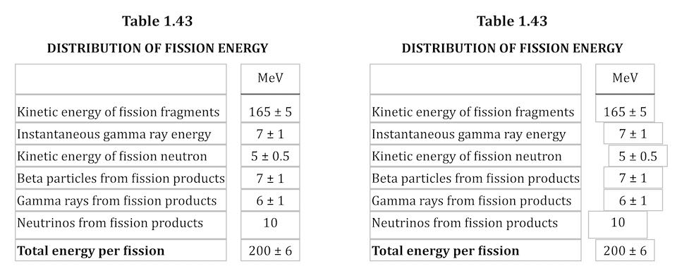
Let’s return to Table 1.43, which I used as an illustration in the announcement post. It’s shown here in its not-aligned and aligned states, with borders added to the table-cell elements.
Table 1.43 before and after the cells are shifted to make their contents visually align.
This is exactly the same table, only with cells shifted to one side or another in the second case. To make this happen, I first set up a series of CSS rules:
For a given class, the table cell is translated along the X axis by the declared number of ch units. Yes, that means the table cells sharing a column no longer actually sit in the column. No, I don’t care — and neither, as I said, does CSS.
I chose the labels lp and rp for “left pad” and “right pad”, in part as a callback to the left-pad debacle of yore even though it has basically nothing to do with what I’m doing here. (Many of my class names are private jokes to myself. We take our pleasures where we can.) The number in each class name represents the number of “characters” to pad, which here increment by half-ch measures. Since I was trying to move things by characters, using the unit that looks like it’s a character measure (even though it really isn’t) made sense to me.
With those rules set up, I could add simple classes to table cells that needed to be shifted, like so:
That was most of the solution, but it turned out to not be quite enough. See, things like decimal places and commas aren’t as wide as the numbers surrounding them, and sometimes that was enough to prevent a specific cell from being able to line up with the rest of its column. There were also situations where the data cells could all be aligned with each other, but were unacceptably offset from the column header, which was nearly always centered.
So I decided to calc() the crap out of this to add the flexibility a custom property can provide. First, I set a sitewide variable:
body {
	--offset: 0ch;
}
I then added that variable to the various transforms:
Why use a variable at all? Because it allows me to define offsets specific to a given table, or even specific to certain table cells within a table. Consider the styles embedded along with Table 3.66:
Yeah. The first cell of the first row and the seventh cell of every row in the table body needed to be shoved over an extra quarter-ch, and the fourth cell in every table-body row (under the heading “Sp”) got a tenth-ch nudge. You can judge the results for yourself.
So, in the end, I needed only sprinkle class names around table markup where needed, and add a little extra offset via a custom property that I could scope to exactly where needed. Sure, the whole setup is hackier than a panel of professional political pundits, but it works, and to my mind, it beats the alternatives.
I’d have been a lot happier if I could have aligned some of the columns on a specific character. I think I still would have needed the left- and right-pad approach, but there were a lot of columns where I could have reduced or eliminated all the classes. A quarter-century ago, HTML 4 had this capability, in that you could write:
But browsers never really supported these features, even if some of them do still have bugs
open on the issue. (I chuckle aridly every time I go there and see “Opened 24 years ago” a few lines above “Status: NEW”.) I know it’s not top of anybody’s wish list, but I wouldn’t mind seeing that capability return, somehow. Maybe as something that could be used in Grid column tracks as well as table columns.
I also found myself really pining for the ability to use attr() here, which would have allowed me to drop the classes and use data-* attributes on the table cells to say how far to shift them. I could even have dropped the offset variable. Instead, it could have looked something like this:
Alas, attr() is confined to the content property, and the idea of letting it be used more widely remains unrealized.
Anyway, that was my journey into recreating mid-20th-Century table column alignment on the Web. It’s true that sufficiently old browsers won’t get the fancy alignment due to not supporting custom properties or calc(), but the data will all still be there. It just won’t have the very specific column alignment, that’s all. Hooray for progressive enhancement!
For my 2020 holiday break, I decided to get more serious about supporting the use of alternative text on Twitter. I try to be rigorous about adding descriptive text to my images, GIFs, and videos, but I want to be more conscientious about not spreading inaccessible content through my retweets.
The thing is, Twitter doesn’t make it obvious whether someone else’s content has been described, and the way it structures (if I can reasonably use that word) its content makes it annoyingly difficult to conduct element or accessibility-property inspections. So, in keeping with the design principles that underlie both the Web and CSS, I decided to take matters into my own hands. Which is to say, I wrote a user stylesheet.
I started out by calling out things that lacked useful alt text. It went something like this:
…and so on, layering on some sizing, font stuff, and positioning to hopefully place the text where it would be visible. This failed to satisfy for two reasons:
Because of the way Twitter nests it dozens of repeatedly utility-classes divs, and the styles repeatedly applied thereby, many images were tall (but cut off) or wide (ditto) in ways that pulled the positioned generated text out of the visible frame shown on the site. There wasn’t an easily-found human-readable predictable way to address the element I wanted to use as a positioning context. So that was a problem.
Almost every image in my feed had a big red and yellow WARNING on it, which quickly depressed me.
What I realized was that rather than calling out the failures, I needed to highlight the successes. So I commented out the Big Red Angry Text approach above and got a lot more simple.
Three consecutive tweets from my timeline on Friday, January 1st, 2021. The blurring of the images in the top and bottom tweets is an effect of the Data Saver preference, not my CSS.
Just that. De-emphasize the images that have the default alt text by way of their enclosing divs, and remove that effect on hover so I can see the image as intended if I so choose. I like this approach better because it de-emphasizes images that aren’t properly described, while those which are described get a visual pop. They stand out as lush islands in a flat sea.
In case you’ve been wondering why I’m selecting divs instead of img and video elements, it’s because I use the Data Saver setting on Twitter, which requires me to click on an image or video to load it. (You can set it via Settings > Accessibility, display and languages > Data usage > Data saver. It’s also what’s blurring the images in the screenshot shown here.) I enable this setting to reduce network load, but also to give me an extra layer of protection when disturbing images and videos circulate. I generally follow people who are careful about not sharing disturbing content, but I sometimes go wandering outside my main timeline, and never know what I’ll find out there.
After some source digging, I discovered a decent way to select non-described videos, which I combined with the existing image styles:
The fun part is, Twitter’s architecture spits out nested divs with that same ARIA label for videos, which I imagine could be annoying to people using screen readers. Besides that, it also has the effect of applying the filter twice, which means videos that haven’t been described get their contrast double-reduced! And their grayscale double-enforced! Fun.
What I didn’t expect was that when I start playing a video, it loses the grayscale and contrast reduction effects even when not being hovered, which makes the second rule above a little over-written. I don’t see the DOM structure changing a whole lot when the video loads and plays, so either videos are being treated differently for filter purposes, or I’m missing something in the DOM that’s invalidating the selector matching. I might poke at it over time to find a fix, or I may just let it go. The user experience isn’t too far off what I wanted anyway.
There is a gap in my coverage, which is GIFs pulled from Twitter’s GIF pool. These have default alt text other than Image, which makes selecting for them next to impossible. Just a few examples pulled from Firefox’s Accessibility panel when I searched the GIF panel for “this is a test”:
testing GIF
This Is ATest Fool GIF
Corona Test GIF by euronews
Test Fail GIF
Corona Virus GIF by guardian
Its ATest Josh Subdquist GIF
Corona Stay Home GIF by INTO ACTION
Is This A Test GIF
Stressed Out Community GIF
A1b2c3 GIF
I assume these are Giphy titles or something like that. In nearly every case, they’re insufficient, if not misleading or outright useless. I looked for markers in the DOM to be able to catch these, but didn’t find anything that was obviously useful.
I did think briefly about filtering for any aria-label that contains the string GIF ([aria-label*="GIF"]), but that would improperly catch images and videos that have been described but happen to have the string GIF inside them somewhere. This might be a relatively rare occurrence, but I’m loth to gray out media that someone went to the effort of describing. I may change my mind about this, but for now, I’m accepting that GIFs which appear in full color are probably not described, particularly when containing common memes, and will try to be careful.
I apply the above styles in Firefox using Stylus, which also available for Chrome, and they’re working pretty well for me. I wish I could figure out a way to apply them in mobile contexts, but that’s a (much bigger) problem for another day.
I’m not the first to tread this ground, nor do I expect to be the last, sadly. For a deeper dive into all the details of Twitter accessibility and the pitfalls that can occur, please read Adrian Roselli’s excellent article Improving Your Tweet Accessibility from just over two years ago. And if you want apply accessibility-aid CSS to your own Twitter experience but can’t or won’t use Stylus, Adrian has a bookmarklet that injects Twitter alt text all set up and ready to go — you can use it as-is, or replace the CSS in his bookmarklet with mine above or your own if you want to take a different approach.
So that’s how I’m upping my awareness of accessible content on Twitter in 2021. I’d love to hear what y’all are using to improve your own experiences, or links to tools and resources on this same topic. If you have any of that, please drop the links in a comment below, so that everyone who reads this can benefit. Thanks!
For years, I’ve had a bash alias that re-runs the previous command via sudo. This is useful in situations where I try to do a thing that requires root access, and I’m not root (because I am never root). Rather than have to retype the whole thing with a sudo on the front, I just type please and it does that for me. It looked like this in my .bashrc file:
alias please='sudo "$BASH" -c "$(history -p !!)"'
But then, the other day, I saw Kat Maddox’s tweet about how she aliases please straight to sudo, so to do things as root, she types please apt update, which is equivalent to sudo apt update. Which is pretty great, and I want to do that! Only, I already have that word aliased.
What to do? A bash function! After commenting out my old alias, here’s what I added to .bash_profile:
please() {
	if [ "$1" ]; then
		sudo $@
	else
		sudo "$BASH" -c "$(history -p !!)"
	fi
}
That way, if I remember to type please apachectl restart, as in Kat’s setup, it will ask for the root password and then execute the command as root; if I forget my manners and simply type apachectl restart, then when I’m told I don’t have privileges to do that, I just type please and the old behavior happens. Best of both worlds!
Inspired by Jonnie Hallman, I’ve added a couple of links to the bottom of RSS items here on meyerweb: a link to the commenting form on the post, and a mailto: link to send me an email reply. I prefer that people comment, so that other readers can gain from the reply’s perspective, but not all comments are meant to be public. Thus, the direct-mail option.
As Jonnie says, it would be ideal if all RSS readers just used the value of the author element (assuming it’s an email address) to provide an email action; if they did, I’d almost certainly add mine to my posts. Absent that, adding a couple of links to the bottom of RSS items is a decent alternative.
Since the blog portion of meyerweb (and therefore its RSS) are powered by WordPress, I added these links programmatically via the functions.php file in the site’s theme. It took me a bit to work out how to do that, so here it is in slightly simplified form (update: there’s an even more simplified and efficient version later in the post):
function add_contact_links ( $text ) {
   if (is_feed()) {
      $text .= '
      <hr><p><a href="' . get_permalink($post) . '#commentform">Add a comment to the post, or <a href="mailto:admin@example.com?subject=In%20reply%20to%20%22' . str_replace(' ', '%20', get_the_title()) . '%22">email a reply</a>.</p>';
   }
   return $text;
}
add_filter('the_content', 'add_contact_links');
If there’s a more efficient way to do that in WordPress, please leave a comment to tell the world, or email me if you just want me to know. Though I’ll warn you, a truly better solution will likely get blogged here, so if you want credit, say so in the email. Or just leave a comment! You can even use Markdown to format your code snippets.
Update 2020-09-10:David Lynch shared a more efficient way to do this, using the WordPress hook the_feed_content instead of plain old the_content. That removes the need for the is_feed() check, so the above becomes the more compact:
function add_contact_links ( $text ) {
   $text .= '
   <hr><p><a href="' . get_permalink($post) . '#commentform">Add a comment to the post, or <a href="mailto:admin@example.com?subject=In%20reply%20to%20%22' . str_replace(' ', '%20', get_the_title()) . '%22">email a reply</a>.</p>';
   return $text;
}
add_filter('the_content_feed', 'add_contact_links');
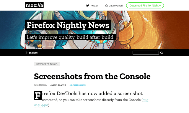
Back in 2015, I wrote about Firefox’s screenshot utility, which used to be a command in the GCLI. Well, the GCLI is gone now, but the coders at Mozilla have brought command-line screenshotting back with :screenshot, currently available in Firefox Nightly and Firefox Dev Edition. It’s available in the Web Console (⌥⌘K or Tools → Web Developer → Console).
An image I captured by typing :screenshot --dpr 0.5 in the Web Console
Once you’re in the Web Console, you can type :sc and then hit Tab to autocomplete :screenshot. From there, everything is the same as I wrote in 2015, with the exception that the --imgur and --chrome options no longer exist. There are plans to add uploading to Firefox Screenshots as a replacement for the old Imgur option, but as of this writing, that’s still in the future.
So the list of :screenshot options as of late August 2018 is:
--clipboard
Copies the image to your OS clipboard for pasting into other programs. Prevents saving to a file unless you use the --file option to force file-writing.
--delay
The time in seconds to wait before taking the screenshot; handy if you want to pop open a menu or invoke a hover state for the screenshot. You can use any number, not just integers.
--dpr
The Device Pixel Ratio (DPR) of the captured image. Values above 1 yield “zoomed-in” images; values below 1 create “zoomed-out“ results. See the original article for more details.
--fullpage
Captures the entire page, not just the portion of the page visible in the browser’s viewport. For unusually long (or wide) pages, this can cause problems like crashing, not capturing all of the page, or just failing to capture anything at all.
--selector
Accepts a CSS selector and captures only that element and its descendants.
--file
When true, forces writing of the captured image to a file, even if --clipboard is also being used. Setting this to false doesn’t seem to have any effect.
--filename
Allows you to set a filename rather than accept the default. Explicitly saying --filename seems to be optional; I find that writing simply :screenshot test yields a file called test.png, without the need to write :screenshot --filename test. YFFMV.
I do have one warning: if you capture an image to a filename like test.png, and then you capture to that same filename, the new image will overwrite the old image. This can bite you if you’re using the up-arrow history scroll to capture images in quick succession, and forget to change the filename for each new capture. If you don’t supply a filename, then the file’s name uses the pattern of your OS screen capture naming; e.g., Screen Shot 2018-08-23 at 16.44.41.png on my machine.
I still use :screenshot to this day, and I’m very happy to see it restored to the browser — thank you, Mozillans! You’re the best.