Posts from August 2022

Table Column Alignment with Variable Transforms

Published 1 year, 8 months past

One of the bigger challenges of recreating The Effects of Nuclear Weapons for the Web was its tables.  It was easy enough to turn tab-separated text and numbers into table markup, but the column alignment almost broke me.

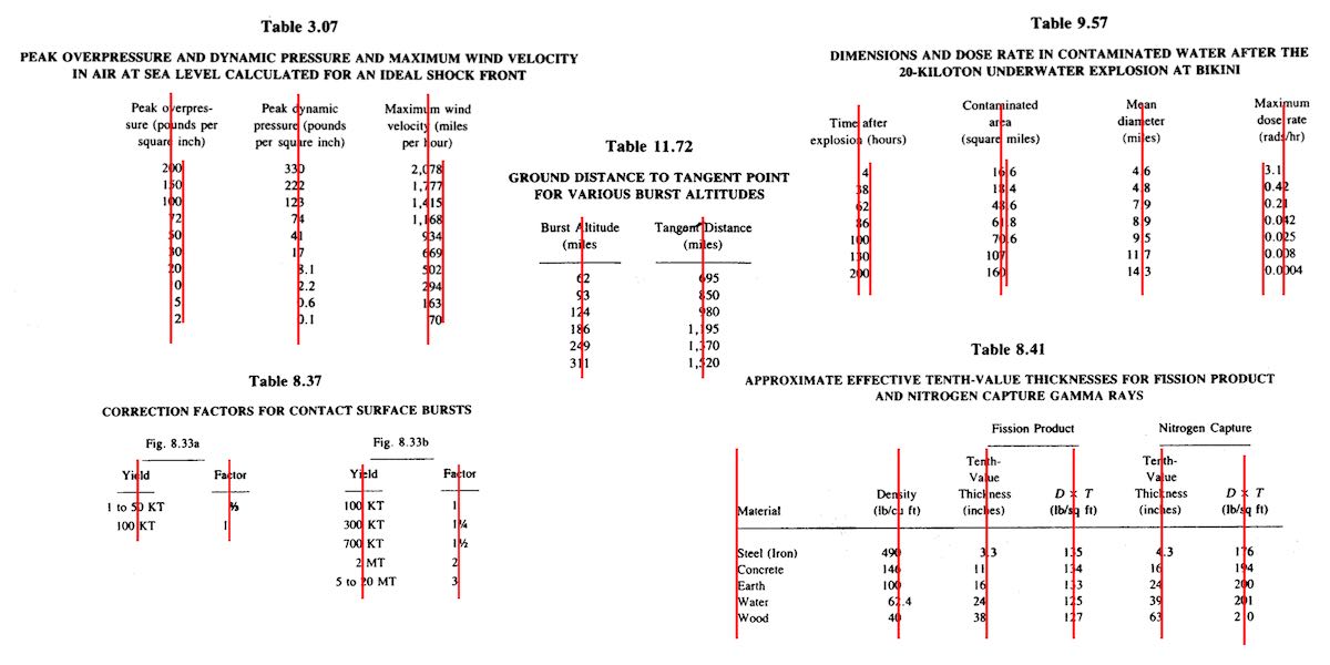
To illustrate what I mean, here are just a few examples of columns that had to be aligned.

A few of the many tables in the book and their fascinating column alignments.  (Hover/focus this figure to start a cyclic animation fading some alignment lines in and out. Sorry if that doesn’t work for you, mobile readers.)

At first I naïvely thought, “No worries, I can right- or left-align most of these columns and figure out the rest later.”  But then I looked at the centered column headings, and how the column contents were essentially centered on the headings while having their own internal horizontal alignment logic, and realized all my dreams of simple fixes were naught but ashes.

My next thought was to put blank spacer columns between the columns of visible content, since table layout doesn’t honor the gap property, and then set a fixed width for various columns.  I really didn’t like all the empty-cell spam that would require, even with liberal application of the rowspan attribute, and it felt overly fragile  —  any shifts in font face (say, on an older or niche system) might cause layout upset within the visible columns, such as wrapping content that shouldn’t be wrapped or content overlapping other content.  I felt like there was a better answer.

I also thought about segregating every number and symbol (including decimal separators) into separate columns, like this:

<tr>
  <th>Neutrinos from fission products</th>
  <td>10</td> 
  <td></td>
  <td></td>
</tr>
<tr class="total">
  <th>Total energy per fission</th>
  <td>200</td>
  <td>±</td>
  <td>6</td>
</tr>

Then I contemplated what that would do to screen readers and the document structure in general, and after the nausea subsided, I decided to look elsewhere.

It was at that point I thought about using spacer <span>s.  Like, anywhere I needed some space next to text in order to move it to one side or the other, I’d throw in something like one of these:

<span class="spacer"></span>
<span style="display: inline; width: 2ch;"></span>

Again, the markup spam repulsed me, but there was the kernel of an idea in there… and when I combined it with the truism “CSS doesn’t care what you expect elements to look or act like”, I’d hit upon my solution.

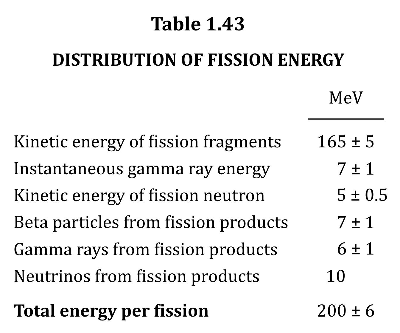
Let’s return to Table 1.43, which I used as an illustration in the announcement post.  It’s shown here in its not-aligned and aligned states, with borders added to the table-cell elements.

Table 1.43 before and after the cells are shifted to make their contents visually align.

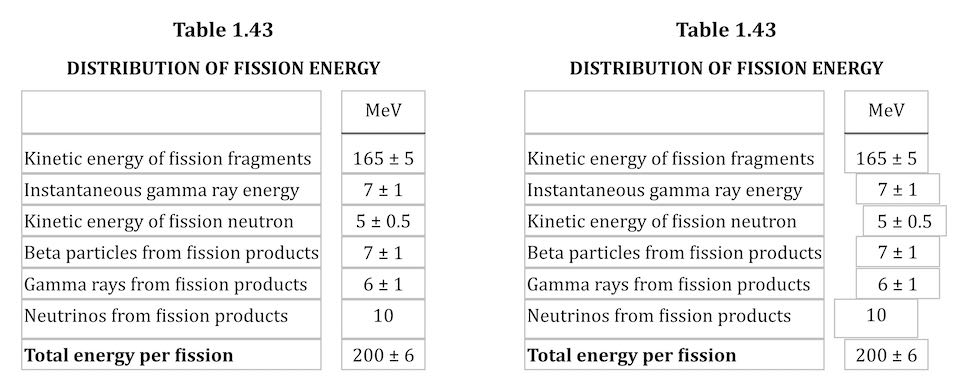
This is exactly the same table, only with cells shifted to one side or another in the second case.  To make this happen, I first set up a series of CSS rules:

figure.table .lp1 {transform: translateX(0.5ch);}
figure.table .lp2 {transform: translateX(1ch);}
figure.table .lp3 {transform: translateX(1.5ch);}
figure.table .lp4 {transform: translateX(2ch);}
figure.table .lp5 {transform: translateX(2.5ch);}

figure.table .rp1 {transform: translateX(-0.5ch);}
figure.table .rp2 {transform: translateX(-1ch);}

For a given class, the table cell is translated along the X axis by the declared number of ch units.  Yes, that means the table cells sharing a column no longer actually sit in the column.  No, I don’t care — and neither, as I said, does CSS.

I chose the labels lp and rp for “left pad” and “right pad”, in part as a callback to the left-pad debacle of yore even though it has basically nothing to do with what I’m doing here.  (Many of my class names are private jokes to myself.  We take our pleasures where we can.)  The number in each class name represents the number of “characters” to pad, which here increment by half-ch measures.  Since I was trying to move things by characters, using the unit that looks like it’s a character measure (even though it really isn’t) made sense to me.

With those rules set up, I could add simple classes to table cells that needed to be shifted, like so:

<td class="lp3">5 ± 0.5</td>

<td class="rp2">10</td>

That was most of the solution, but it turned out to not be quite enough.  See, things like decimal places and commas aren’t as wide as the numbers surrounding them, and sometimes that was enough to prevent a specific cell from being able to line up with the rest of its column.  There were also situations where the data cells could all be aligned with each other, but were unacceptably offset from the column header, which was nearly always centered.

So I decided to calc() the crap out of this to add the flexibility a custom property can provide.  First, I set a sitewide variable:

body {
	--offset: 0ch;
}

I then added that variable to the various transforms:

figure.table .lp1 {transform: translateX(calc(0.5ch + var(--offset)));}
figure.table .lp2 {transform: translateX(calc(1ch   + var(--offset)));}
figure.table .lp3 {transform: translateX(calc(1.5ch + var(--offset)));}
figure.table .lp4 {transform: translateX(calc(2ch   + var(--offset)));}
figure.table .lp5 {transform: translateX(calc(2.5ch + var(--offset)));}

figure.table .rp1 {transform: translateX(calc(-0.5ch + var(--offset)));}
figure.table .rp2 {transform: translateX(calc(-1ch   + var(--offset)));}

Why use a variable at all?  Because it allows me to define offsets specific to a given table, or even specific to certain table cells within a table.  Consider the styles embedded along with Table 3.66:

#tbl3-66 tbody tr:first-child td:nth-child(1),
#tbl3-66 tbody td:nth-child(7) {
	--offset: 0.25ch;
}
#tbl3-66 tbody td:nth-child(4) {
	--offset: 0.1ch;	
}

Yeah. The first cell of the first row and the seventh cell of every row in the table body needed to be shoved over an extra quarter-ch, and the fourth cell in every table-body row (under the heading “Sp”) got a tenth-ch nudge.  You can judge the results for yourself.

So, in the end, I needed only sprinkle class names around table markup where needed, and add a little extra offset via a custom property that I could scope to exactly where needed.  Sure, the whole setup is hackier than a panel of professional political pundits, but it works, and to my mind, it beats the alternatives.

I’d have been a lot happier if I could have aligned some of the columns on a specific character.  I think I still would have needed the left- and right-pad approach, but there were a lot of columns where I could have reduced or eliminated all the classes.  A quarter-century ago, HTML 4 had this capability, in that you could write:

<COLGROUP>
	<COL>
	<COL>
	<COL align="±">
</COLGROUP>

CSS2 was also given this power via text-align, where you could give it a string value in order to specify horizontal alignment.

But browsers never really supported these features, even if some of them do still have bugs open on the issue.  (I chuckle aridly every time I go there and see “Opened 24 years ago” a few lines above “Status: NEW”.)  I know it’s not top of anybody’s wish list, but I wouldn’t mind seeing that capability return, somehow. Maybe as something that could be used in Grid column tracks as well as table columns.

I also found myself really pining for the ability to use attr() here, which would have allowed me to drop the classes and use data-* attributes on the table cells to say how far to shift them.  I could even have dropped the offset variable.  Instead, it could have looked something like this:

<td data-pad="3.25">5 ± 0.5</td>

<td data-pad="-1.9">10</td>

figure.table *[data-pad] {transform: translateX(attr(data-pad,'ch'));}

Alas, attr() is confined to the content property, and the idea of letting it be used more widely remains unrealized.

Anyway, that was my journey into recreating mid-20th-Century table column alignment on the Web.  It’s true that sufficiently old browsers won’t get the fancy alignment due to not supporting custom properties or calc(), but the data will all still be there.  It just won’t have the very specific column alignment, that’s all.  Hooray for progressive enhancement!


Recreating “The Effects of Nuclear Weapons” for the Web

Published 1 year, 8 months past

In my previous post, I wrote about a way to center elements based on their content, without forcing the element to be a specific width, while preserving the interior text alignment.  In this post, I’d like to talk about why I developed that technique.

Near the beginning of this year, fellow Web nerd and nuclear history buff Chris Griffith mentioned a project to put an entire book online: The Effects of Nuclear Weapons by Samuel Glasstone and Philip J. Dolan, specifically the third (1977) edition.  Like Chris, I own a physical copy of this book, and in fact, the information and tools therein were critical to the creation of HYDEsim, way back in the Aughts.  I acquired it while in pursuit of my degree in History, for which I studied the Cold War and the policy effects of the nuclear arms race, from the first bombers to the Strategic Defense Initiative.

I was immediately intrigued by the idea and volunteered my technical services, which Chris accepted.  So we started taking the OCR output of a PDF scan of the book, cleaning up the myriad errors, re-typing the bits the OCR mangled too badly to just clean up, structuring it all with HTML, converting figures to PNGs and photos to JPGs, and styling the whole thing for publication, working after hours and in odd down times to bring this historical document to the Web in a widely accessible form.  The result of all that work is now online.

That linked page is the best example of the technique I wrote about in the aforementioned previous post: as a Table of Contents, none of the lines actually get long enough to wrap.  Rather than figuring out the exact length of the longest line and centering based on that, I just let CSS do the work for me.

There were a number of other things I invented (probably re-invented) as we progressed.  Footnotes appear at the bottom of pages when the footnote number is activated through the use of the :target pseudo-class and some fixed positioning.  It’s not completely where I wanted it to be, but I think the rest will require JS to pull off, and my aim was to keep the scripting to an absolute minimum.

LaTeX and MathJax made writing and rendering this sort of thing very easy.

I couldn’t keep the scripting to zero, because we decided early on to use MathJax for the many formulas and other mathematical expressions found throughout the text.  I’d never written LaTeX before, and was very quickly impressed by how compact and yet powerful the syntax is.

Over time, I do hope to replace the MathJax-parsed LaTeX with raw MathML for both accessibility and project-weight reasons, but as of this writing, Chromium lacks even halfway-decent MathML support, so we went with the more widely-supported solution.  (My colleague Frédéric Wang at Igalia is pushing hard to fix this sorry state of affairs in Chromium, so I do have hopes for a migration to MathML… some day.)

The figures (as distinct from the photos) throughout the text presented an interesting challenge.  To look at them, you’d think SVG would be the ideal image format. Had they come as vector images, I’d agree, but they’re raster scans.  I tried recreating one or two in hand-crafted SVG and quickly determined the effort to create each was significant, and really only worked for the figures that weren’t charts, graphs, or other presentations of data.  For anything that was a chart or graph, the risk of introducing inaccuracies was too high, and again, each would have required an inordinate amount of effort to get even close to correct.  That’s particularly true considering that without knowing what font face was being used for the text labels in the figures, they’d have to be recreated with paths or polygons or whatever, driving the cost-to-recreate astronomically higher.

So I made the figures PNGs that are mostly transparent, except for the places where there was ink on the paper.  After any necessary straightening and some imperfection cleanup in Acorn, I then ran the PNGs through the color-index optimization process I wrote about back in 2020, which got them down to an average of 75 kilobytes each, ranging from 443KB down to 7KB.

At the 11th hour, still secretly hoping for a magic win, I ran them all through svgco.de to see if we could get automated savings.  Of the 161 figures, exactly eight of them were made smaller, which is not a huge surprise, given the source material.  So, I saved those eight for possible future updates and plowed ahead with the optimized PNGs.  Will I return to this again in the future?  Probably.  It bugs me that the figures could be better, and yet aren’t.

It also bugs me that we didn’t get all of the figures and photos fully described in alt text.  I did write up alternative text for the figures in Chapter I, and a few of the photos have semi-decent captions, but this was something we didn’t see all the way through, and like I say, that bugs me.  If it also bugs you, please feel free to fork the repository and submit a pull request with good alt text.  Or, if you prefer, you could open an issue and include your suggested alt text that way.  By the image, by the section, by the chapter: whatever you can contribute would be appreciated.

Those image captions, by the way?  In the printed text, they’re laid out as a label (e.g., “Figure 1.02”) and then the caption text follows.  But when the text wraps, it doesn’t wrap below the label.  Instead, it wraps in its own self-contained block instead, with the text fully justified except for the last line, which is centered.  Centered!  So I set up the markup and CSS like this:

<figure>
	<img src="…" alt="…" loading="lazy">
	<figcaption>
		<span>Figure 1.02.</span> <span>Effects of a nuclear explosion.</span>
	</figcaption>
</figure>
figure figcaption {
	display: grid;
	grid-template-columns: max-content auto;
	gap: 0.75em;
	justify-content: center;
	text-align: justify;
	text-align-last: center;
}

Oh CSS Grid, how I adore thee.  And you too, CSS box alignment.  You made this little bit of historical recreation so easy, it felt like cheating.

Look at the way it’s all supposed to line up on the ± and one number doesn’t even have a ± and that decimal is just hanging out there in space like it’s no big deal.  LOOK AT IT.

Some other things weren’t easy.  The data tables, for example, have a tendency to align columns on the decimal place, even when most but not all of the numbers are integers.  Long, long ago, it was proposed that text-align be allowed a string value, something like text-align: '.', which you could then apply to a table column and have everything line up on that character.  For a variety of reasons, this was never implemented, a fact which frosts my windows to this day.  In general, I mean, though particularly so for this project.  The lack of it made keeping the presentation historically accurate a right pain, one I may get around to writing about, if I ever overcome my shame.  [Editor’s note: he overcame that shame.]

There are two things about the book that we deliberately chose not to faithfully recreate.  The first is the font face.  My best guess is that the book was typeset using something from the Century family, possibly Century Schoolbook (the New version of which was a particular favorite of mine in college).  The very-widely-installed Cambria seems fairly similar, at least to my admittedly untrained eye, and furthermore was designed specifically for screen media, so I went with body text styling no more complicated than this:

body {
	font: 1em/1.35 Cambria, Times, serif;
	hyphens: auto;
}

I suppose I could have tracked down a free version of Century and used it as a custom font, but I couldn’t justify the performance cost in both download and rendering speed to myself and any future readers.  And the result really did seem close enough to the original to accept.

The second thing we didn’t recreate is the printed-page layout, which is two-column.  That sort of layout can work very well on the book page; it almost always stinks on a Web page.  Thus, the content of the book is rendered online in a single column.  The exceptions are the chapter-ending Bibliography sections and the book’s Index, both of which contain content compact and granular enough that we could get away with the original layout.

There’s a lot more I could say about how this style or that pattern came about, and maybe someday I will, but for now let me leave you with this: all these decisions are subject to change, and open to input.  If you come up with a superior markup scheme for any of the bits of the book, we’re happy to look at pull requests or issues, and to act on them.  It is, as we say in our preface to the online edition, a living project.

We also hope that, by laying bare the grim reality of these horrific weapons, we can contribute in some small way to making them a dead and buried technology.


Browse the Archive