Posts from December 2014

Well, That Escalated Quickly

Published 9 years, 10 months past

This post is probably going to be a little bit scattered, because I’m still reeling from the overwhelming, unexpected response to the last post.  I honestly expected “Inadvertent Algorithmic Cruelty” to be read by maybe two or three hundred people over the next couple of weeks, all of them friends, colleagues, and friends who are colleagues.  I hoped that I’d maybe give a few of them something new and interesting to think about, but it was really mostly just me thinking out loud about a shortcoming in our field.  I never expected widespread linking, let alone mainstream media coverage.

So the first thing I want to say: I owe the Year in Review team in specific, and Facebook in general, an apology.  No, not the other way around.  I did get email from Jonathan Gheller, product manager of the Year in Review team at Facebook, before the story starting hitting the papers, and he was sincerely apologetic.  Also determined to do better in the future.  But I am very sorry that I dropped the Internet on his head for Christmas.  He and his team didn’t deserve it.

(And yes, I’ve reflected quite a bit on the irony that I inadvertently made their lives more difficult by posting, after they inadvertently made mine more difficult by coding.)

Yes, their design failed to handle situations like mine, but in that, they’re hardly alone.  This happens all the time, all over the web, in every imaginable context.  Taking worst-case scenarios into account is something that web design does poorly, and usually not at all.  I was using Facebook’s Year in Review as one example, a timely and relevant foundation to talk about a much wider issue.

The people who I envisioned myself writing for — they got what I was saying and where I was focused.  The very early responses to the post were about what I expected.  But then it took off, and a lot of people came into it without the context I assumed the audience would have.

What surprised and dismayed me were the…let’s call them uncharitable assumptions made about the people who worked on Year in Review.  “What do you expect from a bunch of privileged early-20s hipster Silicon Valley brogrammers who’ve never known pain or even want?” seemed to be the general tenor of those responses.

No.  Just no.  This is not something you can blame on Those Meddling Kids and Their Mangy Stock Options.

First off, by what right do we assume that young programmers have never known hurt, fear, or pain?  How many of them grew up abused, at home or school or church or all three?  How many of them suffered through death, divorce, heartbreak, betrayal?  Do you know what they’ve been through?  No, you do not.  So maybe dial back your condescension toward their lived experiences.

Second, failure to consider worst-case scenarios is not a special disease of young, inexperienced programmers.  It is everywhere.

As an example, I recently re-joined ThinkUp, a service I first used when it was install-yourself-and-good-luck alpha ware, and I liked it then.  I’d let it fall by the wayside, but the Good Web Bundle encouraged me to sign up for it again, so I did.  It’s a fun service, and it is specifically designed to “show how well you’re using your social networks at a more human level,” to quote their site.

So I started getting reports from ThinkUp, and one of the first was to tell me about my “most popular shared link” on Twitter.  It was when I posted a link to Rebecca’s obituary.

“Popular” is maybe not the best word choice there.

Admittedly, this is a small wrinkle, a little moment of content clashing with context, and maybe there isn’t a better single word than “popular” to describe “the thing you posted that had the most easily-tracked response metrics”.  But the accompanying copy was upbeat, cheery, and totally didn’t work.  Something like, “You must be doing something right — people loved what you had to say!”

This was exactly what Facebook did with Year in Review: found the bit of data that had the most easily-tracked response metrics.  Facebook put what its code found into a Year in Review “ad”.  ThinkUp put what its code found into a “most popular” box.  Smaller in scale, but very similar in structure.

I’m not bringing this up to shame ThinkUp, and I hope I haven’t mischaracterized them here.  If they haven’t found solutions yet, I know they’re trying.  They really, really care about getting this right.  In fact, whenever I’ve sent them feedback, the responses have been fantastic — really thoughtful and detailed.

My point is that ThinkUp is a product of two of the smartest and most caring people I know, Gina Trapani and Anil Dash.  Neither of them comes anywhere close to fitting the Young Brogrammer stereotype; they are, if anything, its antithesis, in both form and deed.  And yet, they have fallen prey to exactly the same thing that affected the Year in Review team: a failure to anticipate how a design decision that really worked in one way completely failed in another, and work to handle both cases.  This is not because they are bad designers: they aren’t.  This is not because they lack empathy: they don’t.  This is not because they ignored their users: they didn’t.  This is such a common failure that it’s almost not a failure any more.  It just… is.

We need to challenge that “is”.  I’ve fallen victim to it myself.  We all have.  We all will.  It will take time, practice, and a whole lot of stumbling to figure out how to do better, but it is, I submit, vitally important that we do.

Inadvertent Algorithmic Cruelty

Published 9 years, 10 months past

I didn’t go looking for grief this afternoon, but it found me anyway, and I have designers and programmers to thank for it.  In this case, the designers and programmers are somewhere at Facebook.

I know they’re probably pretty proud of the work that went into the “Year in Review” app they designed and developed, and deservedly so — a lot of people have used it to share the highlights of their years.  Knowing what kind of year I’d had, though, I avoided making one of my own.  I kept seeing them pop up in my feed, created by others, almost all of them with the default caption, “It’s been a great year! Thanks for being a part of it.”  Which was, by itself, jarring enough, the idea that any year I was part of could be described as great.

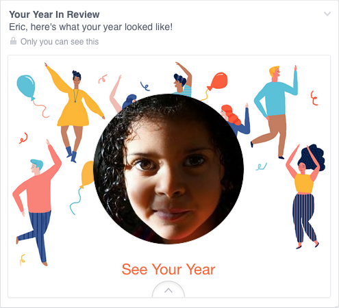
Still, they were easy enough to pass over, and I did.  Until today, when I got this in my feed, exhorting me to create one of my own.  “Eric, here’s what your year looked like!”

image

A picture of my daughter, who is dead.  Who died this year.

Yes, my year looked like that.  True enough.  My year looked like the now-absent face of my little girl.  It was still unkind to remind me so forcefully.

And I know, of course, that this is not a deliberate assault.  This inadvertent algorithmic cruelty is the result of code that works in the overwhelming majority of cases, reminding people of the awesomeness of their years, showing them selfies at a party or whale spouts from sailing boats or the marina outside their vacation house.

But for those of us who lived through the death of loved ones, or spent extended time in the hospital, or were hit by divorce or losing a job or any one of a hundred crises, we might not want another look at this past year.

To show me Rebecca’s face and say “Here’s what your year looked like!” is jarring.  It feels wrong, and coming from an actual person, it would be wrong.  Coming from code, it’s just unfortunate.  These are hard, hard problems.  It isn’t easy to programmatically figure out if a picture has a ton of Likes because it’s hilarious, astounding, or heartbreaking.

Algorithms are essentially thoughtless.  They model certain decision flows, but once you run them, no more thought occurs.  To call a person “thoughtless” is usually considered a slight, or an outright insult; and yet, we unleash so many literally thoughtless processes on our users, on our lives, on ourselves.

Where the human aspect fell short, at least with Facebook, was in not providing a way to opt out.  The Year in Review ad keeps coming up in my feed, rotating through different fun-and-fabulous backgrounds, as if celebrating a death, and there is no obvious way to stop it.  Yes, there’s the drop-down that lets me hide it, but knowing that is practically insider knowledge.  How many people don’t know about it?  Way more than you think.

This is another aspect of designing for crisis, or maybe a better term is empathetic design.  In creating this Year in Review app, there wasn’t enough thought given to cases like mine, or friends of Chloe, or anyone who had a bad year.  The design is for the ideal user, the happy, upbeat, good-life user.  It doesn’t take other use cases into account.

Just to pick two obvious fixes: first, don’t pre-fill a picture until you’re sure the user actually wants to see pictures from their year.  And second, instead of pushing the app at people, maybe ask them if they’d like to try a preview — just a simple yes or no.  If they say no, ask if they want to be asked again later, or never again.  And then, of course, honor their choices.

It may not be possible to reliably pre-detect whether a person wants to see their year in review, but it’s not at all hard to ask politely — empathetically — if it’s something they want.  That’s an easily-solvable problem.  Had the app been designed with worst-case scenarios in mind, it probably would have been.

If I could fix one thing about our industry, just one thing, it would be that: to increase awareness of and consideration for the failure modes, the edge cases, the worst-case scenarios.  And so I will try.


Note: There is a followup to this post that clarifies my original intent, among other things.

A slightly revised and updated version of this post was published at Slate.


Finding My Way

Published 9 years, 10 months past

With presentations of “Designing for Crisis” at AEA Orlando and World Usability Day Cleveland now behind me, I’m getting into the process of reviewing and refining the talk for 2015.  This will be my talk at An Event Apart all throughout this year, making me one of the rare AEA speakers who won’t have a brand-new talk in 2015.  (We’ll have a mix of new and familiar faces, as we always try to do, and they’ll all be bringing new material to the stage.)

Even “Designing for Crisis” will have some new aspects to it, as I discover ways to strengthen it and loop in some new thoughts and discoveries.  As an example, I just recently had a great chat with Amy Cueva, who gave me some really sharp insights into how I can share the message even more effectively.  I expect that kind of iterative improvement to continue throughout the year, given how new the topic is to me, and possibly to everyone.  It’s been something of a surprise to have many people tell me it’s caused them to see their own work in a whole new light — even people working in fields where you might think they would already be on top of this.  I’m really excited to bring this talk to people at AEA, and elsewhere as opportunities arise.  I hope it will do some good in the world.

In parallel with that ongoing effort, I’m getting back to writing more than just the occasional blog post.  I’ve restarted work on the fourth edition of CSS: The Definitive Guide — details on that will be forthcoming just after the holidays.  I’m also starting to write down some of the thoughts and approaches in “Designing for Crisis”, as well as some nascent thoughts on network effects, responsibility, community, and guidance.  I’m also trying to teach myself git so I can push out public repositories of my CSS tests and some bits of code I’d like to release into the wild, but honestly that’s pretty slow going, because it’s always a fifth or sixth priority behind my family, working on AEA, refining and rehearsing the new talk, and writing.

(“Bits of code”.  SEE WHAT I DID THERE?)

Given everything that’s coming together, I really am looking forward to 2015 and a return to speaking and writing.  For painfully obvious reasons, I was pretty out of the loop for nearly all of 2014, not to mention the last half of 2013.  I tried to stay up to date, but it’s one thing to be in the middle of things, and quite another to observe things from a distance.  (The mosh pit never looks like it feels, you know?)  So in addition to all the other stuff, I’m working overtime to catch up, and that’s where I could really use some help from the community.

So, tell me: what did I miss?  What’s emerging that I should be (or should already have been) paying attention to, and what am I already behind the curve on?  What has you excited, and what sounds so awesome that you’re hungering to know more about it?  And maybe most important of all, where should I be going to get caught up?

All input welcome, whether here in the comments, or out there on les médias sociaux.  And thank you!


Six Months, Ten Seconds

Published 9 years, 11 months past

Six months ago today, our child died in our arms.

I still have trouble believing this.  Kat and I both still have trouble.  But only on occasion, these days, and not for long.  As someone once said, when it comes to the death of a loved one, you don’t get over it, but you do, eventually, if you allow yourself, get used to it.  We’re slowly getting used to it.

Half a year.  It seems like it’s been forever, as if uncountable years have passed since Rebecca died, and yet there are still so many traces and impressions of her that sometimes it seems as if she was only just here.  We struggle, sometimes, to decide what to preserve and what to let go.  We had to force ourselves to put the few boxes of mementoes we’ve kept into storage this past week.  It felt like we were consigning Rebecca to the attic, which doesn’t seem like much when you think about it, but it was in some ways as difficult as consigning her remains to the earth.  For that matter, we were recently making some changes to the family picture wall, and for each picture of Rebecca, we had to ask if it should stay up or come down.  None of those choices were easy, even after half a year.

Of course, half a year is less time than elapsed between her diagnosis and her death.  I remember so much, and so little, of those months.  But this is unremarkable, given that we remember so little of our regular lives.  (Think about yesterday, or of last Friday.  How much of the day do you actually remember?  How many of those several thousand minutes can you no longer recall with clarity?  Now, what else have you forgotten?)

We have thousands upon thousands of images of Rebecca; just in my iPhoto library alone, there are 10,188 photos tagged with her name, 1,624 of which I flagged or rated five stars (or both), 785 of which are on Flickr.  Kat has thousands more, as do so many of our friends and relatives.  Those pictures can take us back, clarify our memories, or remind us of some aspect of her personality.  Myriad facets of a life so short, and yet so fully lived.

Videos are far more rare — the Flickr album has just three — mostly because I greatly dislike shooting video.  In the end, it didn’t matter.  Our friend Jessica captured a video that is the quintessential Rebecca, a near-perfect distillation of Rebecca’s personality in just under ten seconds — all her sass ‘n’ spice, and all her sweetness too.


(Full transcript available at flickr.com.)

Rebecca Alison Meyer, ladies and gentlemen.  How I wish you could have known her as we did.

I laugh every time I watch that video.  Every time.


ardnassaC

Published 9 years, 11 months past
May 2014

“You realize this CT could push us out of the study.”

“Yes.”

“Are you ready to face whatever we find out?”

“Of course I’m not ready.  But I will.  We take it a day at a time.  Today she’s okay.”

“Today she’s okay.  Except she isn’t.”

“I know, Kat, but maybe it’s a side effect of the p28.  Or maybe it’s tumor infiltration, or a virus, or who knows what.  She’s been through a lot these past few months.  Whatever’s happening, we’ll find out what it is and deal with it.”


August 2012

“God, what a week!”

“Yeah.”

“It’s not enough that Rebecca nearly killed herself choking on that gum-ball right before we left for vacation.  Thank God Jen was right there to give her the Heimlich!  I don’t want to think about what would have happened if she’d aspirated with nobody around.  And the way she was wailing after the car hit us, I was sure she was headed to the hospital.“

“Me too.  Which I have to say seemed weird, because she was sitting furthest from the impact.”

“I thought maybe the energy from the impact somehow bounced around the car and focused where she was sitting, or maybe she wasn’t buckled in tightly enough.  I thought a lot of things.”

“Yeah.  At least I managed to speed up enough that the impact was behind Joshua instead of right into his door.  I’m not sure the van would be drivable if I hadn’t, and I’m not sure that he’d be out of the hospital altogether.  I just wish I could’ve sped up sooner, or faster, or something.”

“You did great.  Nobody was hurt.  We couldn’t ask for much more.”

“I know.  Still.  I’m not going to soon forget how I felt when I thought Rebecca was seriously hurt.  Like you said, she sounded like she was.”

“Sometimes I think her guardian angel either gets sloppy or works overtime in August.  Remember that bad allergic reaction she had to the sunblock last year?”

“Yes, and I remember how hyper the Benadryl made her.”

“All this stuff that’s happened to her — I just picture her guardian angel sitting in a bar every August going, ‘I kept her safe, now gimme another one!’”

“At least she’ll have some great stories to tell in high school, when they play ‘who had the worst vacation’.”


April 2012

“I can’t believe these things are back.”

“At least this time they aren’t as widespread, and they can be removed laparoscopically.  It was hard enough when you were bedridden for two months when we had only two kids.  With three now, I think I’d go insane.  Especially given Joshua’s disinterest in sleep.”

“I can’t figure out how a baby that young is so opposed to sleep.  He’ll never remember this, and to Carolyn this is just another round of Mommy-in-the-hospital.  But Rebecca is so worried.  Have you seen how clingy she’s gotten with me since we told her?”

“She’s still pretty young.  She’ll adjust quickly.”

“How do we help her do that?”

“The same way we did with Carolyn.  We tell her a hospital is where people go to get better, and that Mommy has bad rocks in her belly that the doctors will take out and then Mommy will get better.”

“You know she’s going to ask us if every rock we go past is a good rock or a bad rock.”

“That’s okay.  She’ll figure it out soon enough, and she’s too little to understand things like tumor growth and how one kind of tissue is good but another is bad.  And one day, when she grows up, she’ll probably chuckle about how she thought Mommy had actual rocks in her belly.”


July 2009

“How’s Kat doing?”

“She’s feeling a little bit better every day.  The infection she got in her incision really set her back, but that finally seems to be cleared up.  We’re hoping that she’ll be able to start walking unassisted and maybe get downstairs in the next week or two.”

“How are the girls?”

“They’re fine.  I think Carolyn enjoys taking her mom snacks in bed, and we sometimes have family dinner up there.  It was a little scary for her at first, but she’s young and resilient.  Rebecca is still Rebecca, crawling and cruising like crazy.”

“You know, I really thought you’d be a widower by now.”

“What?  Why?”

“When we saw those MRIs showing the mass, and then they delayed her surgery for an oncologist to be on hand, I was convinced it was malignant and that she’d die from it and leave you all alone with the girls.  I was sure.”

“Ah.  Well, fortunately, it wasn’t.”

“Seriously.  It was a pretty terrible first birthday present for Rebecca, though, to have her party postponed and her mom in the hospital.”

“I suppose, but she’s so young that she’ll never remember any of it.  Besides, she’ll have plenty more birthdays.”


June 2008

“I know we’ve waited a long time to be placed, but we can’t take a child with cystic fibrosis if we’re not ready to deal with everything that entails.”

“What does it mean if she has CF?”

“A lot of respiratory problems, lots of lung infections, possible lung transplants.  Bottom line?  She’d probably die from it in her teens or early twenties.”

“…I don’t know if I can do that.”

“This could be nothing.  We’ll know by Monday whether she has it or not.”

“If she does, I —  I have to turn down placement, Kat.  I’m sorry.  I don’t think I can go into an adoption knowing that it’s time-limited.  I know we’ve been waiting more than two years, but I don’t know if I could survive one of our children dying young.  I’d rather wait longer, and take placement of another baby, than face that.”

“You know some people would ask what you’d do if we’d been able to get pregnant and given birth to a child with CF.”

“And I’d tell them that I’d love and care for that child.  But we can’t get pregnant, and one of the side effects of that inability is that we get the ability to choose which child we take into our lives.  I make no apology for exercising that choice to maximize our chances of having the best outcome.  We’ve done it before, and if need be, we’ll do it again.  I don’t think I can choose to adopt a child with a life-span I know ahead of time to be limited.  Maybe I’m a coward for that, and maybe not, but that’s where I am.”


March 2008

“I don’t get it.  Why do we have to renew our homestudy?”

“They’re only good for two years.  State law says you have renew if you’re still waiting.”

“Yes, thank you, I know that.  I mean, why are we still waiting?  After two years?  We only waited a few months for Carolyn.”

“I know.”

“We’re great parents.  Why are we waiting so long?  What’s wrong with us?”

“Nothing.  You know that.  It’s just, sometimes you wait.”

“Two years, though.  Sometimes I feel like we’re never going to get picked.”

“Sometimes I feel the same way, but you know that if we wait long enough, eventually we’ll be at the top of the list.  And then even if no birthparents actively pick us, we’ll get placed if the birthmother says she doesn’t care who gets the baby.”

“Wouldn’t you rather be picked?  Instead of just placed by default?”

“Honestly, I’m fine with it either way.  I know it’s been a long time.  I know it feels like forever.  But compared to how long we’ll get to be with that child, it’s really not very long at all.  They’ll be our child for the rest of our lives.  We’ll get to love them for decades.  Compared to that, what’s a couple of years?”


October 2003

“I talked to Adoption Circle today and we’re back on the waiting list.”

“Okay, great.”

“They asked how we were doing.”

“What did you tell them?”

“That we were doing okay, and we were ready.”

“Well, it has been four months since Mom died.  It’s sad, but we can’t put our lives on hold forever.”

“That’s basically what I told them.”

“You know, given Mom’s family’s history of cancer, it’s probably for the best that we’re adopting — I wouldn’t want to risk passing that on to our kids.  I just hope I live long enough to see them grow up.”


October 1998

As the funeral service for Kat’s aunt Judy ended, the sun slipped behind a bank of clouds.  The mourners began to disperse, leaving the family to stand in the chill October air, talking quietly as they comforted Judy’s husband and children.  Off to one side, Judy’s mother, Kat’s grandmother, stood stiff and drawn next to me, her eyes glistening with tears as she stared off at the horizon.  I had already expressed condolences and couldn’t think of anything else to say, so I just stood there.  After a few moments, she looked at the grave, then looked at me, and shook her head.

“It’s a terrible thing for a parent to bury a child,” she said.  “Terrible.  Nobody should ever outlive their child.”


Blue Beanie Day 2014

Published 9 years, 11 months past

This past Sunday was Blue Beanie Day, the annual celebration of web standards that was established by Douglas Vos, taking as his inspiration the cover of Jeffrey Zeldman’s field-defining book, Designing With Web Standards.  This year’s was the eighth annual celebration, and to mark the occasion, I replaced my purple-infused Twitter and Facebook avatars to sport blue beanies.

That’s how much web standards mean to me.

If you missed Blue Beanie Day — which, it being the Sunday of a major U.S. holiday weekend, many of you may well have — don’t let that stop you!  Drop a cerulean toque on your social-media avatars, make a quick status update about why, and wear your pride in your craft and your love of the web on your sleeve.  Head.  Whatever.

If you don’t have a beanie ready to hand, then here, feel free to use one of these.

image image image

Every day is web standards day, of course, but Blue Beanie Day comes but once a year.  It’s not too late to mark the occasion.  As Ethan says, toque ‘em if you got ‘em!


Browse the Archive