Posts from January 2018

My Contribution to “Modern Loss”

Published 6 years, 1 month past


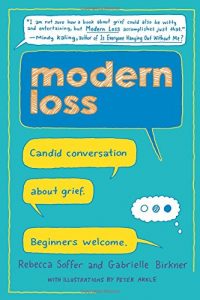
My wife Kat and I tell ourselves we’d love another child for who they are, not for who they replace. We even believe it. But we can’t be sure of it — and that keeps us from shutting our eyes, jumping back into the adoption process, and hoping it will turn out okay. We know all too horribly well that sometimes, it doesn’t.

That’s the opening of my essay “The Second Third Child”, included in the new book from Modern Loss titled Modern Loss: Candid Conversation About Grief. Beginners Welcome, published this week.

I’m deeply honored to be one of the 40+ contributors to the book, some of whom you may know — Dresden Dolls co-founder Amanda Palmer, CNN’s Brian Stelter, author Lucy Kalanithi, Dear Evan Hansen director Michael Greif, Stacy London of What Not To Wear — and many of whom you may not, as I will be unknown to the vast majority of the book’s readers. I’ve written articles for Modern Loss in the past, but to be entrusted with a part of their first book was humbling.

Several of the essays in the book are intentionally funny, but mine is not one of them. It’s quiet, reflective, and elegiac in more than one way, but never anything but honest. It appears in the first section of the book, titled “Collateral Damage”.

As Stephen Colbert put it: “Talking about loss can feel scary. This book isn’t. It’s about grieving deeply over the long term, and the reassurance that you’re far from broken because of it.” I hope my essay, and the book as a whole, helps readers to come to terms with their own grief, by seeing that they are not alone, and that they did the best they could even if it doesn’t feel that way at all.

All my thanks to Rebecca Soffer and Gabrielle Birkner for making me a part of their incredible, inspiring work.


Headings and Labels

Published 6 years, 1 month past

Following on my last two posts about accessibility improvements to meyerweb, I’ve made two more adjustments: better heading levels and added ARIA labels.

For the heading levels, the problem I face is one familiar to many authors: what makes sense as an <h1> in some situations needs to be an <h2> in others.  The most common example is the titles of blog posts like this one.  On its permalink page, the title of the page is the title of the post.  There, it should be an <h1>.  On archive pages, including the home page of meyerweb, there are a number of posts shown one after the other.  In those situations, each post title should be an <h2>.

Part of the redesign’s changes were to write a single PHP routine that generated posts and their markup, which I could then simply call from wherever.  So I added an optional function parameter that allowed me to indicate the context in which a post was being placed.  It goes something like this:

<?php blogpostMarkup("archive"); ?>
function blogpostMarkup($type = "standalone") {
    if ($type == "archive") $titletag = "h2"; else $titletag = "h1";
    // …markup is all generated here…
    echo $output;
}

Or code to that effect.  (I did not go copy-paste from my actual code base.)

So now, heading levels are what they should be, at least on most pages (I may have missed updating some of my old static HTML pages; feel free to point them out in the comments if you find one).  As a part of that effort, I removed the <h1> from the masthead except on the home page, being the one place it makes sense to be an <h1>.

As for ARIA labels, that came about due to a comment from Phil Kragnes on my last post, where he observed that pages often have multiple elements with a role of navigation.  In order to make things more clear to ARIA users, I took Phil’s suggestion to add aria-label attributes with clarifying values.  So for the page-top skiplinks, I have:

<nav role="navigation" aria-label="page" id="skiplinks">

Similarly, for the site-navigation bar, I have:

<nav role="navigation" aria-label="site" id="navigate">

The idea is that screen readers will say “Page navigation region” and “Site navigation region” rather than just repeating “Navigation region” over and over.

Other than cleaning up individual pages’ heading levels and the occasional custom layout fix (e.g., the Color Equivalents Table needed a local widening of the content column’s maximum size), I think the redesign has settled into the “occasional tinkering” phase.  I may do something to spruce up my old Web Review articles (like the very first, written when HTML tags were still uppercase!) and I’m thinking about adding subnavigation in certain sections, but otherwise I think this is about it.  Unless I decide to go really over the top and model my Tools page after Simon St. Laurent’s lovely new Grid design, that is…

Of course, if you see something I overlooked, don’t hesitate to let me know!  I can’t guarantee fast response, but I can always guarantee careful consideration.


Increasing Accessibility

Published 6 years, 2 months past

Thanks to the fantastic comments on my previous post, I’ve made some accessibility improvements.  Chief among them: adding WAI-ARIA role values to various parts of the structure.  These include:

  • role="banner" for the site’s masthead
  • role="navigation" added to the navigation links, including subnavigation links like previous/next posts
  • role="main" for the main portion of a page
  • role="complementary" for sidebars in the blog archives
  • role="article" for any blog post, whether there are several on a page or just one

In addition, I restored skip links to the masthead of most pages (the rest will get them soon).  The links are revealed on keyboard focus, which I’m not sure I like.  I feel like these aren’t quite where they need to be.  A big limitation is the lack of :matches() (or similar) support in browsers, since I’d love to have any keyboard focus in the masthead or navigation links bring up the skip links, which requires some sort of parent selection.  I may end up using a tiny bit of enhancing Javascript to make the links’ UX more robust in JS situations, but still obviously available if JS fails.  And I may replicate them in the footer, as a way to quickly jump back up the page, especially to the navigation.

Speaking of the navigation links, they’ve been moved in the source order to match their place in the visual layout.  My instincts with regard to source order and layout placement were confirmed to be woefully out of date: the best advice now is to put the markup where the layout calls for the content to be.  If you’re putting navigation links just under the masthead, then put their markup right after the masthead’s markup.  So I did that.

The one thing I didn’t change is heading levels, which suffer all the usual problems.  Right now, the masthead’s “meyerweb.com” is always an <h1> and the page title (or blog post titles) are all <h2>.  If I demoted the masthead content to, say, a plain old <div>, and promoted the post headings, then on pages like the home page, there’d be a whole bunch of <h1>s.  I’ve been told that’s a no-no.  If I’m wrong about that, let me know!

There’s still more to do, but I was able to put these into place with no more than a few minutes’ work, and going by what commenters told me, these will help quite a bit.  My thanks to everyone who contributed their insights and expertise!


How Do I Increase Accessibility?

Published 6 years, 2 months past

I have an accessibility question.  Okay, it’s a set of questions, but they’re really all facets of the same question:

How do I make my site’s structure the most accessible to the most people?

Which sounds a bit broad.  Let me narrow it down.  Here’s the basic layout order of most pages on meyerweb:

  1. Masthead
  2. Navigation (in a <nav> element)
  3. Main page content (in a <main> element), occasionally with a sidebar
  4. Footer (in a <footer> element)

But this is, at the moment, the source order of those pieces:

  1. Masthead
  2. Main page content (in a <main> element), occasionally with a sidebar
  3. Navigation (in a <nav> element)
  4. Footer (in a <footer> element)

The difference is the navigation.  I put it later in the source order because I want those using speaking browsers to be able to get the content quickly, without having to tab through the navigation on every page.

But is that actually a concern, given my use of a <main> element for the main content of the page?  And the <nav> and <footer> elements, do those also help with jumping around the page?  If not, what’s the best-practice structural order for those pieces?

If so, does that mean it’s okay to put the navigation back up there in the source order, and stop doing wacky things with the order element to place it visually where it isn’t, structurally?

I have the same questions for those who use keyboard tabbing of the visual layout, not speaking browsers.  What’s the best way to help them?  If it’s tabindex, how should I order the tabbing index?

And in either case, do I need skip links to get people around quickly?  Do I want skip links?  Do my assistive-technology users want skip links?

Maybe the real question is “Given this layout, and my desire to make getting to main content and other pieces of the page as easy as possible for those who rely on assistive technology, how should I structure and annotate the content to raise the fewest barriers for the fewest people?”

Unless, of course, the real question is one I don’t know enough to ask.

Can you help me out, accessibility hivemind?  I’d really appreciate some expert insight.  All my instincts are more than a decade out of date.


The Newwwyear Design

Published 6 years, 2 months past

Well, here it is — the first new design for meyerweb since February 2005 (yes, almost 13 years).  It isn’t 100% complete, since I still want to tweak the navigation and pieces of the footer, but it’s well past the minimum-viable threshold.

My core goal was to make the site, particularly blog posts, more readable and inviting.  I think I achieved that, and I hope you agree.  The design should be more responsive-friendly than before, and I think all my flex and grid uses are progressively enhanced.  I do still need to better optimize my use of images, something I hope to start working on this week.

Things I particularly like about the design, in no particular order:

  • The viewport-height-scaled masthead, using a minimum height of 20vh.  Makes it beautifully responsive, always allowing at least 80% of the viewport’s height to be given over to content, without requiring media queries.
  • The “CSS” and “HTML” side labels I added to properly classed pre elements.  (For an example, see this recent post.)
  • The fading horizontal separators I created with sized linear gradients, to stand in for horizontal rules.  See, for example, between post content and metadata, or underneath the navlinks up top of the page.  I first did this over at An Event Apart last year, and liked them a lot.  I may start decorating them further, which multiple backgrounds make easy, but for now I’m sticking with the simple separators.
  • Using string-based grid-template-areas values to rearrange the footer at mobile sizes, and also to make the rare sidebar-bearing pages (such as those relating to S5) more robust.

There are (many) other touches throughout, but those are some high points.

As promised, I did livestream most of the process, and archived copies of those streams are available as a YouTube playlist for those who might be interested.  I absolutely acknowledge that for most people, nine hours of screencasting overlaid with rambling monologue would be very much like watching paint dry in a hothouse, but as Abraham Lincoln once said: for those who like this sort of thing, this is the sort of thing they like.

I was surprised to discover how darned easy it is to livestream.  I know we live in an age of digital wonders, but I had somehow gotten it into my head that streaming required dedicated hardware and gigabit upstream connections.  Nope: my five megabit upstream was sufficient to stream my desktop in HD (or close to it) and all I needed to broadcast was encoding software (I used OBS) and a private key from YouTube, which was trivial to obtain.  The only hardware I needed was the laptop itself.  Having a Røde Podcaster for a microphone was certainly helpful, but I could’ve managed without it.

(I did have a bit of weirdness where OBS stopped recognizing my laptop’s camera after my initial tests, but before I went live, so I wasn’t able to put up a window showing me while I typed.  Not exactly a big loss there.  Otherwise, everything seemed to go just fine.)

My thanks to everyone who hung out in the chat room as I livestreamed.  I loved all the questions and suggestions — some of which made their way into the final design.  And extra thanks to Jen Simmons, who lit the fire that got me moving on this.  I enjoyed the whole process, and it felt like a great way to close the books on 2017.


Browse the Archive