Posts from October 2007

Set Preferences

Published 17 years, 2 weeks past

In his inaugural “Dork Talk” column for The Guardian, Stephen Fry talked about something I’ve been mulling over for the last little while:

Very little is as mutually exclusive as we seem to find it convenient to imagine. In our culture we are becoming more and more fixated with an “it’s one thing or the other” mentality. You like Thai food? But what’s wrong with Italian? Woah, there… calm down. I like both. Yes. It can be done.

It’s always tempting to make jokes about how computer folks are binary thinkers (har de har har), but the sad joke is that most people think that way, computers notwithstanding.  I don’t think we can blame the digital age for “you’re either with me or against me” thought patterns.  And those who don’t generally think that way, whether naturally or with effort, get treated with some degree of suspicion.

This is something I run into professionally, not incredibly often but still enough to notice, and it’s frustrating when I do.  The only slightly exaggerated version is:

“Hey, do you use Dreamweaver?”

“Nope.”

“Why?  What do you have against Dreamweaver?”

If that seems outré, replace “use Dreamweaver” with something else, like “run Linux” or “watch Fox News” or “drive a Chevrolet”.

I wish I could write in 500-foot flaming letters across the skies of every country of the world in localized translations: An expression of preference does not equate criticism of differing preferences.  It’s really that simple.  My lack of using or doing or watching or liking X does not mean I think people who use or do or watch or like X are subhuman air-wasters, let alone that I claim such a position.

If more people really understood that statement and used it as a principle of daily interaction, I think we’d all be a lot less tense.


Out of Order

Published 17 years, 2 weeks past

Apologies to anyone who tried visiting meyerweb in the very near past and found it broken.  I’d noticed that suddenly all kinds of comment spam were getting past Akismet and landing in the moderation queue, and was just preparing to ask the spam-fighters about it when I discovered that the blog portions of the site were throwing a PHP error about not being able to find a function I’d written into a plugin.

At which point I discovered that all my WordPress plugins had been deactivated.  I know I didn’t do that, so how they all got turned off remains a bit of a mystery to me.  I’ve turned all the ones I need back on, and things appear to be back to normal.

So Akismet wasn’t being evaded by the spam: it was simply switched off.  Good thing my non-plugin defenses caught everything that poured in during the outage.  Which, come to think of it, must all have been direct-submit spam, since there wouldn’t have been a comment form available on the entire site.  So what they were really avoiding was my direct-submission defensive plugin, not Akismet.

Well, either way, other defensive measures protected the site, so all’s well there.  I’m certainly not thrilled about the site having been largely offlined for a short period, and again, my apologies to anyone who got blocked from information they wanted.

This episode has actually given me cause to reconsider my usual preference to put site navigation at the end of the document source.  When the PHP failed, the navigation was never served up.  Had I put it at the top of the page, it would’ve been present even though the blog posts were failing.  Getting to the static areas of the site would have been possible.  Due to my structural choices, a script failure dramatically affected the usability of the site as a whole.

Something worth thinking about as I slowly work on improving the organization of meyerweb.


What A Bargain!

Published 17 years, 3 weeks past

Dear Microsoft,

I was reading yesterday morning that you bought 1.6 percent of Facebook for $240 million.  Congratulations!  I hope it’s not too forward of me, but now that you’ve had a chance to recover from the exuberant celebrations that I’m sure accompanied this latest coup, I’d like to humbly point out that you have the opportunity to make an even more amazing investment.

I hereby offer to sell you 80 percent of meyerweb.com for a mere $24 million.  Think about it: that’s five hundred times better than your Facebook deal, plus you’d be getting a clear majority stake in one of the world’s leading web sites primarily focused on a three-letter web design acronym written by a tallish redhead living in a lakeshore city in the American Midwest.  I know: wow!

After we seal the deal, I’ll just keep doing what I’ve always been doing to make this site as successful as it’s become, and you can just ride the wave feeling amazed that you scored such an amazing bargain.  Sound good?  Awesome.  Call me.  We’ll talk.


Survey Analysis Service

Published 17 years, 3 weeks past

During our analysis of the responses to the Web Design Survey, one of the things I thought seriously about doing was dumping the whole dataset into a database and building a web front end to query it.  Then I remembered that as back-end developer, I’m an excellent book author.  I know some MySQL and PHP, but I’m right in that sour spot of knowing enough to make the development process slow and error-prone due to my moderate but incomplete knowledge of the languages while not knowing enough to correctly design the project from the outset.  So I stuck to Excel and the like, which can be cumbersome but quickly learned.

I was a little sad, though.  I’d had the thought that if I built an interface to the survey results, it could be released publicly once we were done.  With such a tool, anyone could generate their own pivot tables without having to learn the process in Excel (or deal with Excel’s handling of enormous data files).  That seemed like a really good thing.

Well, the dataset is public now.  So how about one or more of you super-sharp developer types, the ones who didn’t check any of the boxes on the question about gaps in your back-end coding skills, doing what I could not?

The basic scope of the project would be to list the various data points (gender, ethnicity, age bracket, salary, geographic location, perception of bias, etc., etc., etc.) and let a user pick the two they want to analyze against.  So if someone wanted a table showing the breakdown of gender by ethnicity, they would pick one to go on the top and the other to go on the left.  The table generated would give those numbers.  I’d have it spit out raw numbers, but allowing the user to optionally get the results as percentages might be a nice touch.  Though then you’d have to let the user say which way the percentages are calculated: by column, or by row.

For extra deepness, one could also filter the results based on the value for a third data point.  With that sort of feature, one could get the breakdown of gender by ethnicity for only the EU respondents.  I might do it by letting the user click on a data point and then pick the specific filtering value via a dropdown.  Maybe three radio buttons: one for top, one for left, and one for filter.  Or, heck, do a whole Web 2.0 drag-n-drop interface.  That part’s not important.  What matters is giving anyone the ability to easily get numbers out of the massive dataset.

The only real challenge I can foresee is where questions allowed more than one answer, like the location of work question and the skill questions.  In the dataset, they’re just comma-separated value lists.  Those would need to somehow be broken out into subtables or Boolean columns or something.  The actual structure of the solution interests me a whole lot less than simply having one.

I’m quite sure this is the kind of thing a real programmer could create in about a day.  As I am not a real programmer any more, it would take me a month or four.  Let’s not wait.  Anyone out there able to take the idea and run with it?


Digging Into the Data

Published 17 years, 1 month past

One of the practical reasons we released the anonymized data sets from the 2007 Web Design Survey was that we knew we couldn’t ask every possible question, let alone report on the results.  For that matter, we knew we wouldn’t even be able to come up with every possible question.  It’s one thing to approach this enormous mountain of data with a specific question in mind; those questions always seem obvious to the questioner.  In that case, there’s a clear path to the summit.  But we didn’t come at this with a specific angle in mind.  We just wanted to know what the profession looks like.  So we not only didn’t have a clear path to the summit, we didn’t even have a summit to reach.  Instead, we had thousands.  The tyranny of choice came down on our heads like a, well, like a falling mountain.

So the obvious choice was to release the data for others to analyze in search of their own summits, and I’m really glad to see people already doing so.  One gentleman is looking to produce an analysis of UK respondents, for example.  Others are asking specific questions and getting surprising results.

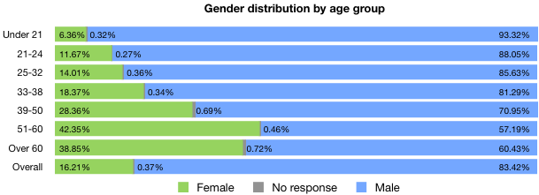
For example, Rebekah Ahrens grabbed a copy of the dataset and pulled out the answer to a straightforward question: what’s the gender distribution for the various age groups?  What she found was that almost without exception, the younger the age group, the smaller the percentage of women.  Here’s a chart showing the results she found in graphic form.

Wow.  What is causing that?  It’s a pronounced enough pattern that I initially wondered if it was somehow an artifact of the analysis method.  Several times during the authoring of the report I’d think I’d found some amazing and previously unsuspected trend… only to discover I’d divided some numbers by the wrong total, or charted column-wise when the table was row-oriented.  Mistakes along those lines.  They happen.  But I really don’t think that’s the case here.

Now, the really important question is why this pattern exists, and that’s where the data fail us—we can’t get the numbers to reveal all the forces that went into their collection.  There are any number of reasons why this pattern might exist.  I thought of three hypotheses in quick succession, and I’m sure there are many more of equal or greater plausibility.

  1. Younger women didn’t hear about the survey, and so didn’t take it.
  2. Women are losing interest in the field, instead heading into other career paths, and so those who have stuck with the field longer are more prevalent.
  3. Increasing margins of error at the low and high ends of the age spectrum reduces the confidence of the numbers to the point that we can’t draw any conclusions.

Remember, these are all hypotheses, any one of which could be true or not.  So how would we go about proving or disproving them?

  1. Conduct a survey of women in the field to see if they answered the survey, if they know others who did, the ages of themselves and those others, and so on.  Difficult to undertake, but not impossible.
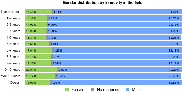
  2. Ditto #1, although a possibly useful followup analysis would be to look at the gender distributions by longevity in the field and then cross-reference the two results.
  3. Get someone who is a statistician to figure out the likely margins of error to see if that might explain things.  I’d do it, but I have no idea how.  I would tend to be skeptical of this as an explanation given the clear trend, but I suppose it is possible.

I can, however, create the gender-by-longevity chart mentioned in #2 there.

Check it out: above six years’ longevity, women are consistently more represented (compared to the overall average) than they are below six years’ longevity.  The only exception is a spike at “1 year or less”.  Is that enough to explain the trend Rebekah spotted?  It doesn’t look like it to me, but then I’m not a statistician.  I also wonder a bit about the spikes at edges of the longevity spectrum.

I’m not trying to propose an explanation here, because I don’t have one.  I don’t even have an unsubstantiated belief as to what’s happening here.  I know just enough to know that I don’t know enough to know the answer.  What I’m saying is this: the great thing is that anyone can do this sort of analysis; and that even better, having done so, we can start to figure out what questions we need to be asking of ourselves and each other.


Analytical Breakdowns

Published 17 years, 1 month past

As a member of the incredible team that’s worked so hard to create it, I couldn’t be more pleased to announce the publication of the findings of the 2007 Web Design Survey.

It’s amazing how many things this process broke.  Right from the outset, the enormity of the entire enterprise pushed all sorts of things past their limits.

The first thing the survey broke was our expectations.  I can only speak authoritatively for myself, but I think the general sense in the team was that we’d be really happy if the number of responses approached 10,000; I myself was expecting somewhere in the 7,000 – 8,000 range.  Instead, we got 32,831 responses.  So many people took the survey at once that it slowed down the Event Apart server, where the survey was hosted.

Although the survey software collected all that information with nary a hitch, getting it back out was another question.  Over the first few days, I was grabbing snapshots of the results as they came in.  That had to stop when an export request brought the entire server to a grinding halt.  Turns out we’d hit a limitation in the software’s code that made exports of tables above a certain size run very, very slowly.

When everything was finished and it was time to run the final export, the same problem bit us again: only this time, we couldn’t get the data out at all.  It was finally Mark Huot who extracted it by hacking the software a bit and running a custom-configured local server instance just to get it extracted in CSV format.

Which left us with a 35.8MB CSV file that needed to be cleaned a bit, as it had some funky characters in it that prevented a straight import into Excel (or anything else).  Have you ever tried to load a 35.8MB text file into a text editor?  It takes a while.  At one point, I honestly feared I’d locked up BBEdit.  And that was just to load it.  Imagine doing find-and-replace operations.  With grep.  (Now imagine constructing the grep expressions needed without gacking half the file.)

But eventually we got the file scrubbed clean and imported into Excel.  The end result was a 21.7MB Excel file.  Have you ever tried to work with a 21.7MB file in Excel?  It takes a while.  Hell, just hitting “Save” sometimes meant a three-minute wait.  And then there’s doing data analysis on a file that large.  Have you ever…?  Right, you get the idea.

The next thing that broke was our ability to process the data in meaningful ways.  I was able to pull some high-level numbers—what you might call surface analyses—for each of the questions.  For example, I could tell you the breakdown of titles, or genders, or education levels; in effect, all the charts in the final report’s introduction (that is, Figures i – xxviii).  At one point, I could even tell you what proportion of the respondents had 401(k)s.  But when it came to looking more in-depth, I was out of my depth.  Want to know the educational-level distribution of female part-time workers at non-profits?  I was lost.  A statistician I’m not.

So we hired two.  Jeffrey and I decided to use some of the proceeds from An Event Apart to retain two professional statistical consultants, Alan Brickman and Larry Yu, and we worked with them to identify interesting questions and patterns.  They did a superb job of not only breaking down the data for us, but also keeping our pattern-recognition impulses in check.  It’s tempting to look at a spike in numbers and invent reasons for its existence, and they reined us in more than once.

For example, and here’s a tiny peek into the results, we found that the higher a respondent’s salary, the more likely they are to participate in formal training (Fig. 9.6, p. 73, in case you want to go straight there).  But why?  Do they make more because they undergo more training; or undergo more training because they can afford it, or can afford to make their company pay for it?  Do not know, so cannot say.

Of course, it’s one thing to get a few hundred tables of numbers and a lengthy written summary from your consultants.  It’s quite another to turn it into a report that distills it all down to the essence, and looks good to boot.  And that’s where we started to heave real trouble.

I mean, sure, Excel can spit out charts like nobody’s business, but I have news: visually speaking, they really aren’t very good charts.  I know you’re shocked to hear this.  Perhaps under most circumstances that would be okay, but the charts that would go into our final report needed to look professional.  And by that, I mean designery professional.

As Head Chart Guy, I grappled with Excel (the Office X version) for weeks.  I learned more about Excel charting than I’d ever known, and still I could not get it to do what I wanted.  Right aligning the left labels on a chart?  The only way was to set the text rotation to something other than zero.  Then they’d all right-align, but also not be straight horizontal labels.  Plus they looked like crap that way, because there was no anti-aliasing happening on the text, or really anywhere else.  And so on.  We absolutely needed Excel to analyze the data, but its graphical output wasn’t what we needed.

So we looked around.  We considered PlotKit; we thought about pure CSS graphs; we even considered hand-drawing every last chart in Illustrator.  Eventually, we decided to give Numbers a try.  And immediately broke it.

Remember the big ol’ data files I mentioned earlier?  It turns out that Numbers was unable to even open them.  We couldn’t do any of our analysis in Numbers.  In hindsight, this was probably a good thing, because I don’t think it does anything like pivot tables, and those were absolutely fundamental to the whole process.  One personal benefit of this whole process for me is that I finally learned how to create pivot tables in Excel.  Strangely, it’s both easier and harder than you might expect.

So in the end, I produced needed data tables in Excel, copied them over to Numbers, and produced the charts there.  In the process, I learned way more about Numbers than I ever really wanted to know.  Jason and I could probably write a medium-sized book on all the things we learned, and learned to hate, about Numbers.  (Like, legends aren’t directly attached to their charts.  WTF?)

Which is not to say Numbers was a total disaster:  far from it.  All the charts you see in the report were created using Numbers, exported to PDF, and dropped into InDesign.  There were a lot of things about Numbers that made the process a lot easier than it would have been, and that very definitely helped us stay organized.  Of course, that just highlighted its limitations all the more harshly.  (You can’t change the separation distance between labels and the chart area?  WTF?)

And then there was the actual assembly, authoring, and proofreading.  Finding typos that inverted claims, mismatches between numbers, charts that were incomprehensible, summary tables that were calculated along the wrong axis.  All the innumerable errors that creep into a process, intensified and magnified by the unusually high information density of this particular project.  Late-stage changes of approach, starting over in places, realizing that things were not as we thought they were.  It’s the kind of thing that might lead one to break a web service.

And now it’s done.  It’s out.  We can rest.

It’s possible that you will not choose to rest, however.  I’m very proud to say that we’re giving the data back to the community that gave it to us in the first place.  Along with the report, we’re also providing anonymized copies of the complete survey data.  Every single one of those 32,831 responses, available in three formats, with only the identifying information stripped away.  If you want to fact-check our results, you can.  If you want to dig deeper, go for it.  If you want to investigate an area we passed over, please do.  It’s all there.  It’s all yours.  It always was yours—we just collected it and held onto it for a little while, and for that trust and honor, we thank you.

So: go read it and let us know what you think.  Tell us how we could do things better next year.  Show us what we missed by producing your own analyses.  And be ready for spring 2008, when we start the cycle anew.

Primal Tweet

Published 17 years, 1 month past

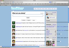
It seems that Twitter just can’t handle the display of primal screams.

See, I had need to let loose a really good primal scream today.  Uncharacteristically, I decided to share it with the online world.  It seemed like the perfect method was to Twitter it.  And for me, the correct form of a primal scream is “AAAAAAAAA…”, so that’s what I Twittered.  Only, I filled the limit: I held down shift-A in Twitterrific until I’d generated 140 upper-case “A”s, no breaks, no punctuation.  Just, you know, primal screaming.

Twitterbreak

What didn’t occur to me was the fact that browsers are really bad at word-wrapping big long chunks of unbroken characters.  So my primal tweet seriously disrupted the layout of Twitter for me, and for all 768 people following me (at the time), as a layout table got super-expanded and the scream overflowed various and sundry other element boxes.

Oops.  Sorry ’bout that, folks.  Though I have to admit there is the part of me that’s secretly pleased: a primal scream should be disruptive.  And in some cases, the effect is unintentionally funny and appropriate: like the individual display of that tweet, where the scream runs right out of the “text balloon” and just keeps going and going and going.  The failure states become extra levels of commentary on what’s been said.  Screamed.  They accidentally reinforce the intended message instead of subverting it.

Honestly, that’s kind of cool.  I find it all the more delightful because I didn’t intend any of that to happen.  I was just blowing off 140 characters worth of steam.

As for why I felt the need to scream so primally, odds are very high you’ll hear all about it tomorrow.


Browse the Archive