Following on my last two posts about accessibility improvements to meyerweb, I’ve made two more adjustments: better heading levels and added ARIA labels.
For the heading levels, the problem I face is one familiar to many authors: what makes sense as an <h1> in some situations needs to be an <h2> in others. The most common example is the titles of blog posts like this one. On its permalink page, the title of the page is the title of the post. There, it should be an <h1>. On archive pages, including the home page of meyerweb, there are a number of posts shown one after the other. In those situations, each post title should be an <h2>.
Part of the redesign’s changes were to write a single PHP routine that generated posts and their markup, which I could then simply call from wherever. So I added an optional function parameter that allowed me to indicate the context in which a post was being placed. It goes something like this:
<?php blogpostMarkup("archive"); ?>
function blogpostMarkup($type = "standalone") {
    if ($type == "archive") $titletag = "h2"; else $titletag = "h1";
    // …markup is all generated here…
    echo $output;
}
Or code to that effect. (I did not go copy-paste from my actual code base.)
So now, heading levels are what they should be, at least on most pages (I may have missed updating some of my old static HTML pages; feel free to point them out in the comments if you find one). As a part of that effort, I removed the <h1> from the masthead except on the home page, being the one place it makes sense to be an <h1>.
As for ARIA labels, that came about due to a comment from Phil Kragnes on my last post, where he observed that pages often have multiple elements with a role of navigation. In order to make things more clear to ARIA users, I took Phil’s suggestion to add aria-label attributes with clarifying values. So for the page-top skiplinks, I have:
The idea is that screen readers will say “Page navigation region” and “Site navigation region” rather than just repeating “Navigation region” over and over.
Other than cleaning up individual pages’ heading levels and the occasional custom layout fix (e.g., the Color Equivalents Table needed a local widening of the content column’s maximum size), I think the redesign has settled into the “occasional tinkering” phase. I may do something to spruce up my old Web Review articles (like the very first, written when HTML tags were still uppercase!) and I’m thinking about adding subnavigation in certain sections, but otherwise I think this is about it. Unless I decide to go really over the top and model my Tools page after Simon St. Laurent’s lovely new Grid design, that is…
Of course, if you see something I overlooked, don’t hesitate to let me know! I can’t guarantee fast response, but I can always guarantee careful consideration.
Thanks to the fantastic comments on my previous post, I’ve made some accessibility improvements. Chief among them: adding WAI-ARIA role values to various parts of the structure. These include:
role="banner" for the site’s masthead
role="navigation" added to the navigation links, including subnavigation links like previous/next posts
role="main" for the main portion of a page
role="complementary" for sidebars in the blog archives
role="article" for any blog post, whether there are several on a page or just one
In addition, I restored skip links to the masthead of most pages (the rest will get them soon). The links are revealed on keyboard focus, which I’m not sure I like. I feel like these aren’t quite where they need to be. A big limitation is the lack of :matches() (or similar) support in browsers, since I’d love to have any keyboard focus in the masthead or navigation links bring up the skip links, which requires some sort of parent selection. I may end up using a tiny bit of enhancing Javascript to make the links’ UX more robust in JS situations, but still obviously available if JS fails. And I may replicate them in the footer, as a way to quickly jump back up the page, especially to the navigation.
Speaking of the navigation links, they’ve been moved in the source order to match their place in the visual layout. My instincts with regard to source order and layout placement were confirmed to be woefully out of date: the best advice now is to put the markup where the layout calls for the content to be. If you’re putting navigation links just under the masthead, then put their markup right after the masthead’s markup. So I did that.
The one thing I didn’t change is heading levels, which suffer all the usual problems. Right now, the masthead’s “meyerweb.com” is always an <h1> and the page title (or blog post titles) are all <h2>. If I demoted the masthead content to, say, a plain old <div>, and promoted the post headings, then on pages like the home page, there’d be a whole bunch of <h1>s. I’ve been told that’s a no-no. If I’m wrong about that, let me know!
There’s still more to do, but I was able to put these into place with no more than a few minutes’ work, and going by what commenters told me, these will help quite a bit. My thanks to everyone who contributed their insights and expertise!
I have an accessibility question. Okay, it’s a set of questions, but they’re really all facets of the same question:
How do I make my site’s structure the most accessible to the most people?
Which sounds a bit broad. Let me narrow it down. Here’s the basic layout order of most pages on meyerweb:
Masthead
Navigation (in a <nav> element)
Main page content (in a <main> element), occasionally with a sidebar
Footer (in a <footer> element)
But this is, at the moment, the source order of those pieces:
Masthead
Main page content (in a <main> element), occasionally with a sidebar
Navigation (in a <nav> element)
Footer (in a <footer> element)
The difference is the navigation. I put it later in the source order because I want those using speaking browsers to be able to get the content quickly, without having to tab through the navigation on every page.
But is that actually a concern, given my use of a <main> element for the main content of the page? And the <nav> and <footer> elements, do those also help with jumping around the page? If not, what’s the best-practice structural order for those pieces?
If so, does that mean it’s okay to put the navigation back up there in the source order, and stop doing wacky things with the order element to place it visually where it isn’t, structurally?
I have the same questions for those who use keyboard tabbing of the visual layout, not speaking browsers. What’s the best way to help them? If it’s tabindex, how should I order the tabbing index?
And in either case, do I need skip links to get people around quickly? Do I want skip links? Do my assistive-technology users want skip links?
Maybe the real question is “Given this layout, and my desire to make getting to main content and other pieces of the page as easy as possible for those who rely on assistive technology, how should I structure and annotate the content to raise the fewest barriers for the fewest people?”
Unless, of course, the real question is one I don’t know enough to ask.
Can you help me out, accessibility hivemind? I’d really appreciate some expert insight. All my instincts are more than a decade out of date.
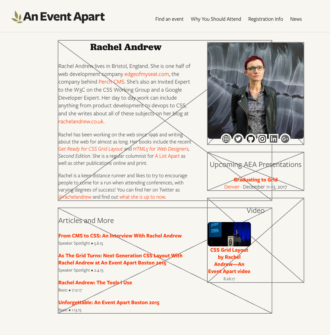
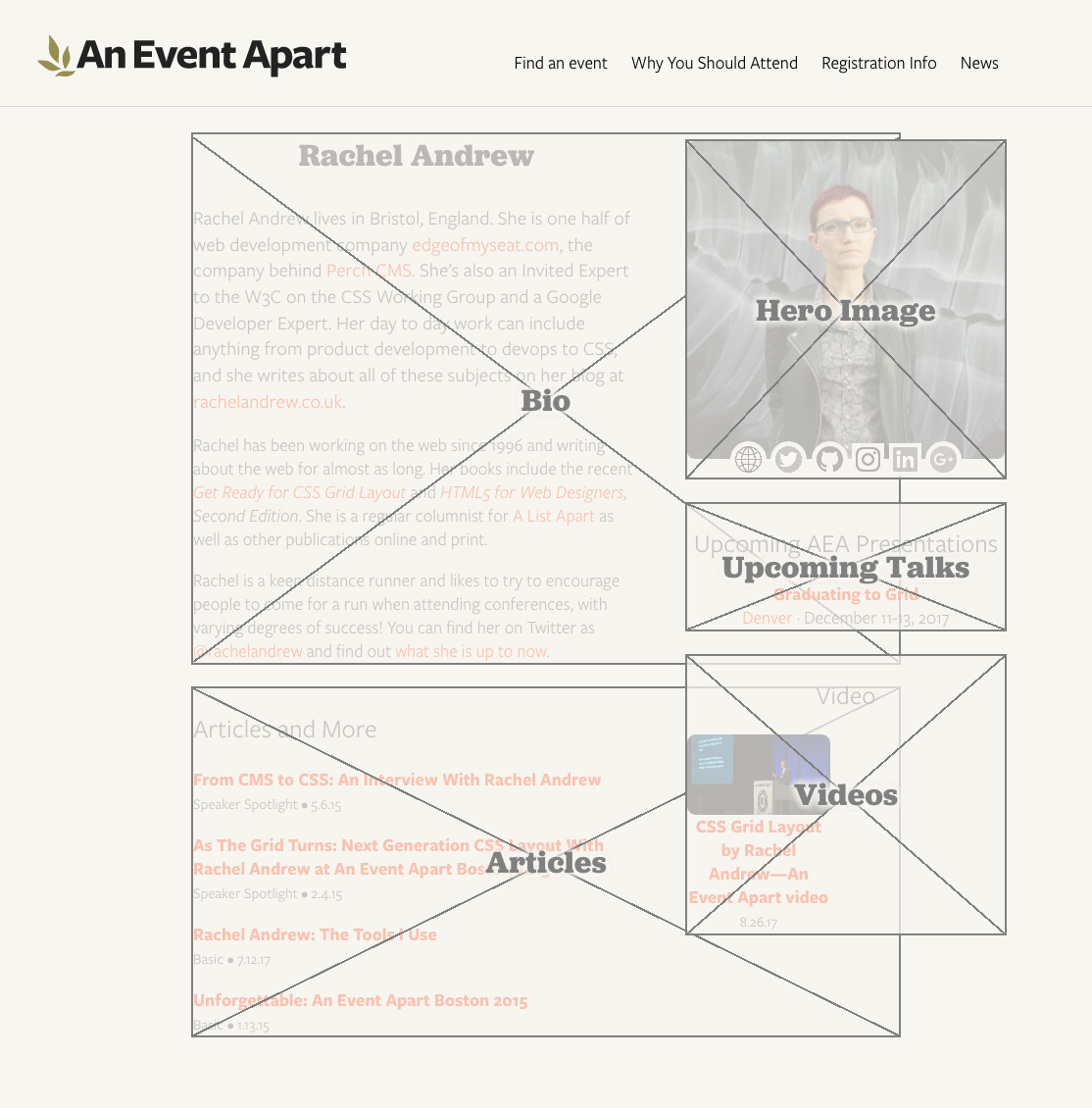
I was recently noodling around with some new layout ideas for An Event Apart’s speaker pages (e.g., Chris Coyier’s or Jen Simmons’) and wanted to share the ideas with other members of the team. But what I really wanted to show was wireframes to convey basic arrangement of the pieces, since I hadn’t yet done any time polishing details.
I thought about taking screenshots and Photoshopping wireframe boxes over the various layout pieces, but then I wondered: could I overlay boxes on the live page with CSS? Or perhaps even create and overlay them with nothing but some declarations and a wanton disregard for the sensibilities of god or man?
And that’s when I realized…I could.
Now I’m going to share my discovery with you.
Before I get started, I want to make one thing clear: this isn’t backward compatible. I don’t care. It doesn’t need to be. It does work in the latest versions of Firefox and Chrome, within reasonable tolerances — Chrome falls a bit short on one aspect, which I’ll point out when we get there.
All good? Then let’s go.
The goal was creating X-filled boxes that wireframers love so very, very much. I figured, any container element that needs to have a box stuck over it gets a class of wireframe.
(Don’t get too attached to that class, by the way: it doesn’t survive the article. Foreshadowing!)
The easy part was drawing a box around any element with that class. I decided to use outlines, because they’re rarely employed for box edging and they don’t affect the layout even if your box-sizing is set to content-box. (Mine usually is, by dint of not setting box-sizing at all. But, you know, you do you.)
The boxes overlap each other because the layout pieces on the right are, at least for the moment, floated. They’re laid out that way so that if the right-hand content is short and the bio and articles run long, they can wrap around below the ‘sidebar’. It’s generally useful to have the outlines showing the actual limits of the element boxes to which they’re attached.
There is a potential drawback here: if your layout involves using negative margins to pull some elements out of their parents, and those parent elements are designated as wireframe boxes, outlines will stretch around the outhanging elements in Firefox, though not in Chrome. Borders do not act the same way in Firefox. I can’t rightly call this a bug, because I’m honestly not sure what outlines should do here. Just be aware of it, is what I’m saying.
Anyway, drawing rectangles with outlines, that’s the easy part. Now I needed two diagonal lines, going from corner to corner. But how?
Linear gradients, that’s how. See, if you use quadrant-based directions for your gradients, special magic math happens under the hood such that at the exact midpoint of the gradient, the color-line that extends perpendicularly off the gradient ray shoots precisely into the corners of the two quadrants adjacent to the quadrant into which the gradient ray is pointing. Okay, that was probably hard to follow. For example, set the gradient direction as to top right and the 50% color line of the gradient will run into the top left to the bottom right corners.
Bingo: an X. But not one that scales terribly well. Using percentages there means that the gray lines will be as thick as 0.2% the total length of the gradient ray. Small boxes get thin, sometimes broken diagonals. Great big boxes get thick honkin’ lines.
There are two things to note here, before we move on. First is that the spaces around the operators in the calc() values are intentional and, more to the point, necessary. If you remove one or both of those spaces, calc() will simply fail to work. In other words, calc(50%-1px) will fail — no background for you! This is as designed, and there are reasons for it I don’t want to go into here, but suffice to say they exist and are arguably sensible. calc(50% - 1px), on the other hand, works as intended.
Well, mostly: this is where Chrome comes up a bit short. In large boxes, Chrome creates fuzzy lines thicker than 2 pixels. I’m not sure what it’s doing to fudge the numbers here, but it sure seems like it’s fudging something. The lines also don’t go into the corners quite as precisely as they should. Firefox’s lines, on the other hand, come out correctly sized no matter what box size I set up, even if they are a bit jagged at times, and they go exactly into the corners of all the boxes I tested. Chrome’s sloppiness here isn’t a deal-breaker, as far as I’m concerned, but it’s there and you should know about it.
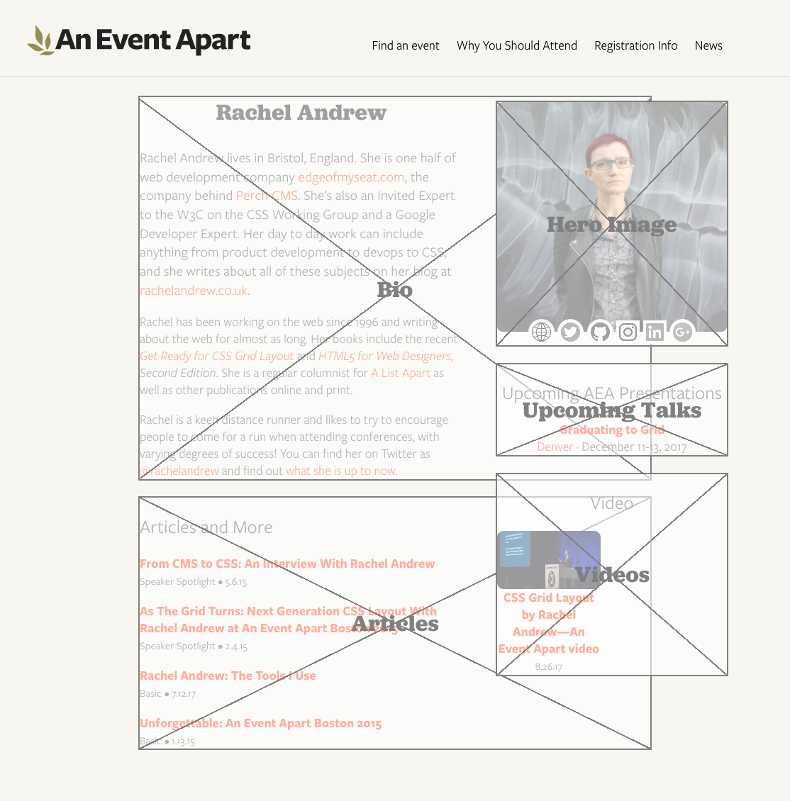
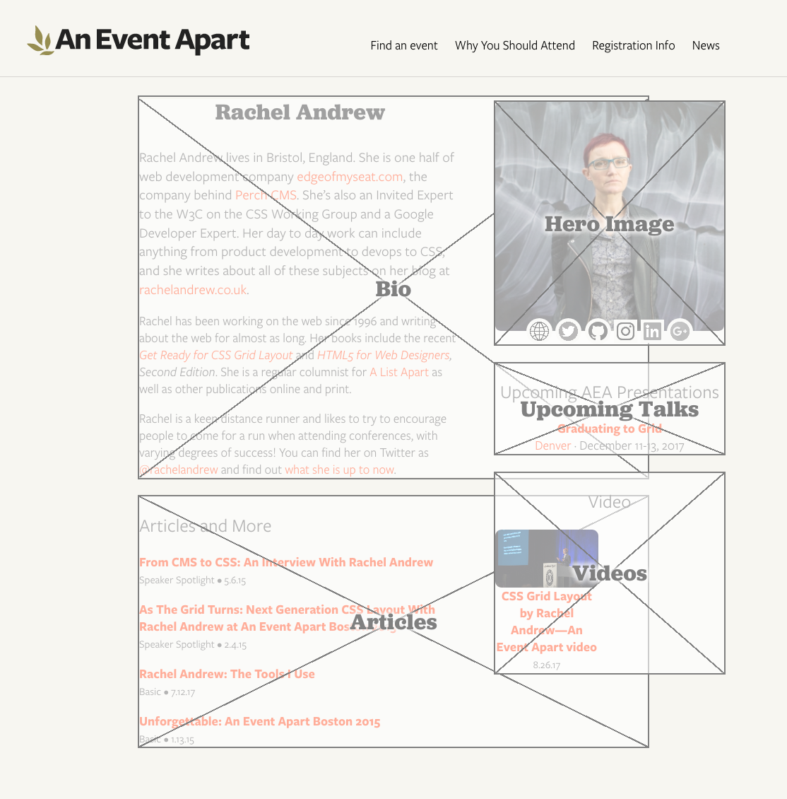
So that’s an element with an outer edge and two diagonal lines. This is great as long as the box contains no actual content, which will sit on top of the diagonals, as you can see with the “hero image” in the top right. Maybe that’s what you want, in which case great, but I specifically wanted overlays. That way I could stick them on a live page and sort of fade out the contents while sticking wireframe boxes on top, to make the boxes the focus while still showing the stuff inside them.
Enter generated content. If I create a pseudo-element and attach the diagonal background gradients to that, they can sit on top of all the content. That’ll also let me throw in a translucent background color to fill the box and fade out the contents. Like so:
Placing the diagonals, and a translucent color, over the elements
I used ::before mostly because hey, why not, but also because clearfix is usually an ::after and I hear people are still using clearfix, more’s the pity. So this avoids it. If you’ve moved beyond the need for clearfix, then you can use ::after just as easily. Whatever floats your fancy. (Get it? Floats? Yeah? Clearfix? Floats? Ah, I kill me.)
The stupidly large z-index on the ::before is there to put the box overlay above any gridded, flexed, or positioned content that has an automatic z-index, or at least a sensible one. You can raise it as high as you’d like (and your browser’s bit-depth will allow). The small z-index on the elements themselves, on the other hand, makes sure they get an explicit stacking placement instead of an automatically-assigned place on the Z axis. I find this generally settles a number of odd behaviors in various browsers. Your experience may vary.
It was at this point that I realized there was a whole other level here. I mean, wireframe boxes stretched over content is pretty nifty all by itself. That could have been enough. But it wasn’t.
Because what I realized was that I didn’t just want wireframe boxes, I wanted labeled wireframe boxes. If a box was being applied to a list of articles, then I wanted a great big “Articles” label sitting in the middle of it, to make it obvious what was being placed there.
Well, there was already a content property just sitting there, waiting to throw in actual content instead of an empty string, but how to fill it? And that’s when I knew that .wireframe’s days were numbered.
That’s because the easiest way to label each box was to use an HTML data attribute to attach the label I wanted to display. And once that attribute was there, why not apply the wireframe styles based on the presence of the attribute, instead of adding class names that might get in the way of some unexpected DOM script? So I changed the markup and CSS like this:
(True story: I almost called it data-wtf instead. Almost.)
Having done that, I could modify the CSS to insert the attribute value, style the inserted text to look nice, and use flexbox properties to center it in the box. So I did.
That yielded big beautiful bold Jubilat labels (Jubilat is one of AEA’s brand font faces), sitting right on top of the center of the box, the crossing of the two diagonal lines behind them.
Which actually turned out to be a small problem for me. That text is certainly readable, but I wanted it to stand out a bit more from the diagonals. I decided to stack text shadows in order to semi-simulate outside text stroking.
It’s possible to use just four offset shadows with minimal or zero blur, but I find it sometimes creates weird jags on serif fonts, so I like stacking blurred shadows better. But, again, you do you.
As I looked over the results, it slowly dawned on me that the white-on-gray box scheme works well enough for a starting wireframe setup with no branding applied, but I was planning to drop these on pages with actual design and colors and that sort of thing. I didn’t want the boxes to fill with translucent white; I wanted them to be translucent versions of the page background color. And, furthermore, I wanted a way to be able to easily alter that color, when applied to different designs.
Custom properties to the rescue! Which is to say, native CSS variables to the rescue!
Our page background color at An Event Apart is #F7F6F1, a combo I actually have memorized at this point. Since I wanted to fill the boxes with a roughly three-quarters-opaque variant, I settled on #F7F6F1BB. (Actual 75% is BF, if you care.) So I defined a custom property for it:
html {
   --fill: #F7F6F1BB;
}
I could have assigned the variable to the [data-wf] rule instead of html, but I felt like setting them globally. Because that’s how I roll, yo — Wulf & Shaw have no strings on me. If you want to bring the variables in closer, go for it.
While I was there, I figured, why not, let’s also define a variable for the shared color of the outlines, diagonals, and label text.
html {
   --fill: #F7F6F1BB;
   --wire: gray;
}
Then all I needed was to sprinkle variable calls where the colors were sitting. I ended up here:
The final product, with color themes and everything
The label could be broken out to use its own variable (e.g., --text or --label) easily enough, but I wanted a minimum of things to change. I know myself too well to set up a bunch of controls to fiddle with, especially where color is concerned.
And with that, I had a ready-to-hand, easily theme-able wireframing style block that I can drop into any development page and invoke simply by adding a few data attributes to the markup. Data attributes, I might add, that would be trivially easy to later find and remove with regular expressions. It’s a quick way to make it clear to stakeholders that a work in progress is, in fact, in progress, as well as a handy way to visualize which pieces of a prototype layout are going where.
Now that we’ve come to the end and you’re still hanging in there with me, let me just say that I hope you’ve enjoyed this little trip through various parts of CSS. If you have any questions, feel free to drop them in the comments below. I’ll do my best to respond in reasonable amounts of time, travel and such permitting.
P.S. And one final note, as Kai Ryssdal would say: every bit of CSS I used here is covered in CSS: The Definitive Guide, 4th Edition. I turned to my print copy twice in the process of working all this out, as it happens, to remind myself of specific syntax (for custom properties) and whitespace requirements (for calc() operators). It really feels good to have a thing I made be useful to me!
A couple of weeks back I wrote about customizing your markup, but I got an important bit wrong and while I’ve corrected the post, I wanted to clear up the error in detail.
I said that you wrap portions of your document (or the whole thing) in an element element and use the customized element inside. This is incorrect, and actually a very bad idea. In fact, you define your customized elements using an element element and then use the customized elements later in the document. Something like this:
<element extends="h1" name="x-superh1">
</element>

<h1 is="superh1">UltraMegaPower!!!</h1>
<h1>Regular Old Power</h1>
The line break inside the element element isn’t required — I just threw it in for clarity.
The element element can optionally contain template markup, but I honestly don’t understand that part of it yet. I get the general idea, but I haven’t crawled through the specifics long enough to have really internalized all the fiddly bits. And as we all know by know, the fiddly bits are where understanding lives and dies. (Also where the Devil hangs out, or so I’ve been told.)
I still firmly believe that all this papers over a much bigger problem, which is the arbitrary barrier to devising and using actual custom elements (as opposed to customized existing elements). HTML5 already allows you to make up your own bits of language: you can make up any attribute you want as long as your preface the name with data-. Okay, so that’s a little bit clumsy naming-wise, but the capability is there. You don’t have to register your attributes, or declare them in a list, or any of that other stuff. You just make up data-timing or data-proglang or data-sttngcharacter on the spot and off you go.
This is not possible for elements. You can’t even make up a prefixed element name, whether it’s data-kern or x-kern or even xkern (to avoid the limitation that hyphens aren’t allowed in element names). You just can’t devise your own elements. The best you can do is use the element element to sprinkle some semantic dust bunnies on top of elements that already exist.
Of course, all this “you can’t” and “not possible” applies to the specification. Browsers will let you feed them any old element name and style it, script it, whatever. Some say that’s more than enough. If the browser lets you do it, why let the specification hold you back? And of course, that’s how most people will approach the situation.
To someone like me, though, who spent years (literal years) explaining to web folk the world over that just because Internet Explorer for Windows let you write width: 12 px, actually writing it was still a bad idea — well, those habits die hard. Just doing stuff because the browser let you do it is not always a good idea. In fact, more often than not it’s a bad idea.
None of that really matters, as I say, because people are going to inject their own elements into their markup. They’ll do it because it’s easier than thinking about the proper element to use, or they’ll do it because no appropriate element yet exists, or for some other reason. That’s why the HTML5 specification ought to include the ability to do it, so that we have a paved path and defined best practices. The capability is useful, as the data- attribute feature demonstrates. If there’s a good, solid technical reason why extending that customization from attributes to elements is not desirable, I’d really like to know what it is.
Suppose you’re creating a super-sweet JavaScript library to improve text presentation — like, say, TypeButter — and you need to insert a bunch of elements that won’t accidentally pick up pre-existing CSS. That rules span right out the door, and anything else would be either a bad semantic match, likely to pick up CSS by mistake, or both.
Assuming you don’t want to spend the hours and lines of code necessary to push ahead with span and a whole lot of dynamic CSS rewriting, the obvious solution is to invent a new element and drop that into place. If you’re doing kerning, then a kern element makes a lot of sense, right? Right. And you can certainly do that in browsers today, as well as years back. Stuff in a new element, hit it up with some CSS, and you’re done.
Now, how does this fit with the HTML5 specification? Not at all well. HTML5 does not allow you to invent new elements and stuff them into your document willy-nilly. You can’t even do it with a prefix like x-kern, because hyphens aren’t valid characters for element names (unless I read the rules incorrectly, which is always possible).
No, here’s what you do instead :
Wrap your document, or at least the portion of it where you plan to use your custom markup,Define the element customization you want with an element element. That’s not a typo.
To your element element, add an extends attribute whose value is the HTML5 element you plan to extend. We’ll use span, but you can extend any element.
Now add a name attribute that names your custom “element” name, like x-kern.
Okay, you’re ready! Now anywhere you want to add a customized element, drop in the elements named by extends and then supply the name via an is attribute.
Did you follow all that? No? Okay, maybe this will make it a bit less unclear. (Note: the following code block was corrected 10 Apr 12.)
(Based on markup taken from the TypeButter demo page. I simplified the inline style attributes that TypeButter generates for purposes of clarity.)
So that’s how you create “custom elements” in HTML5 as of now. Which is to say, you don’t. All you’re doing is attaching a label to an existing element; you’re sort of customizing an existing element, not creating a customized element. That’s not going to help prevent CSS from being mistakenly applied to those elements.
Personally, I find this a really, really, really clumsy approach — so clumsy that I don’t think I could recommend its use. Given that browsers will accept, render, and style arbitrary elements, I’d pretty much say to just go ahead and do it. Do try to name your elements so they won’t run into problems later, such as prefixing them with an “x” or your username or something, but since browsers support it, may as well capitalize on their capabilities.
I’m not in the habit of saying that sort of thing lightly, either. While I’m not the wild-eyed standards-or-be-damned radical some people think I am, I have always striven to play within the rules when possible. Yes, there are always situations where you work counter to general best practices or even the rules, but I rarely do so lightly. As an example, my co-founders and I went to some effort to play nice when we created the principles for Microformats, segregating our semantics into attribute values — but only because Tantek, Matt, and I cared a lot about long-term stability and validation. We went as far as necessary to play nice, and not one millimeter further, and all the while we wished mightily for the ability to create custom attributes and elements.
Most people aren’t going to exert that much effort: they’re going to see that something works and never stop to question if what they’re doing is valid or has long-term stability. “If the browser let me do it, it must be okay” is the background assumption that runs through our profession, and why wouldn’t it? It’s an entirely understandable assumption to make.
We need something better. My personal preference would be to expand the “foreign elements” definition to encompass any unrecognized element, and let the parser deal with any structural problems like lack of well-formedness. Perhaps also expand the rules about element names to permit hyphens, so that we could do things like x-kern or emeyer-disambiguate or whatever. I could even see my way clear to defining an way to let an author list their customized elements. Say, something like <meta name="custom-elements" content="kern lead follow embiggen shrink"/>. I just made that up off the top of my head, so feel free to ignore the syntax if it’s too limiting. The general concept is what’s important.
The creation of customized elements isn’t a common use case, but it’s an incredibly valuable ability, and people are going to do it. They’re already doing it, in fact. It’s important to figure out how to make the process of doing so simpler and more elegant.
This morning I caught a pointer to TypeButter, which is a jQuery library that does “optical kerning” in an attempt to improve the appearance of type. I’m not going to get into its design utility because I’m not qualified; I only notice kerning either when it’s set insanely wide or when it crosses over into keming. I suppose I’ve been looking at web type for so many years, it looks normal to me now. (Well, almost normal, but I’m not going to get into my personal typographic idiosyncrasies now.)
My reason to bring this up is that I’m very interested by how TypeButter accomplishes its kerning: it inserts kern elements with inline style attributes that bear letter-spacing values. Not span elements, kern elements. No, you didn’t miss an HTML5 news bite; there is no kern element, nor am I aware of a plan for one. TypeButter basically invents a specific-purpose element.
I believe I understand the reasoning. Had they used span, they would’ve likely tripped over existing author styles that apply to span. Browsers these days don’t really have a problem accepting and styling arbitrary elements, and any that do would simply render type their usual way. Because the markup is script-generated, markup validation services don’t throw conniption fits. There might well be browser performance problems, particularly if you optically kern all the things, but used in moderation (say, on headings) I wouldn’t expect too much of a hit.
The one potential drawback I can see, as articulated by Jake Archibald, is the possibility of a future kern element that might have different effects, or at least be styled by future author CSS and thus get picked up by TypeButter’s kerns. The currently accepted way to avoid that sort of problem is to prefix with x-, as in x-kern. Personally, I find it deeply unlikely that there will ever be an official kern element; it’s too presentationally focused. But, of course, one never knows.
If TypeButter shifted to generating x-kern before reaching v1.0 final, I doubt it would degrade the TypeButter experience at all, and it would indeed be more future-proof. It’s likely worth doing, if only to set a good example for libraries to follow, unless of course there’s downside I haven’t thought of yet. It’s definitely worth discussing, because as more browser enhancements are written, this sort of issue will come up more and more. Settling on some community best practices could save us some trouble down the road.
Update 23 Mar 12: it turns out custom elements are not as simple as we might prefer; see the comment below for details. That throws a fairly large wrench into the gears, and requires further contemplation.
And then there’s Facebook. Rumor has it they’re using HTML5 features like the History API while still bearing an XHTML DOCTYPE. I was also told they use video but all the videos I saw were Flash-based. It’s possible that more is going on — who knows, maybe Farmville is all HTML5 now — but I was only willing to put up with the user experience for so long.
Some notes:
I didn’t run a spider script to verify which HTML5 elements, if any, were being used on a site. Instead I surfed around using a user stylesheet that highlights HTML5 elements and looked for dashed red outlines. If they were there, the site got “uses HTML5 markup”. If I didn’t see any, then “no apparent HTML5 markup”. This may mean I miscategorized a site or two, in which case sorry. Even if not, these lists won’t stay current for more than a couple of weeks, so regard this as a single snapshot in time, not the whole movie.
In my limited and purely anecdotal peerings, far and away the most commonly-used HTML5 element was section. nav appeared to run a distant second.
Any site that uses font replacement is using HTML5: canvas. I didn’t list such sites, so bear that in mind. (Sorry, Beano.) I just hope such sites change their DOCTYPEs to match.
I did not list any site that lacked a DOCTYPE. I don’t care if the HTML5 DOCTYPE is optional, that doesn’t mean any DOCTYPE-less page is using HTML5. Or, if it does, my next step is to write a MeyerHTML DTD with an optional DOCTYPE and then charge you all $1 per site for using invalid markup in violation of the terms of the DTD’s license. And then I’m buying an island. Oahu seems nice.
Comments are switched off for once partly because I don’t really want another faceful of politics right now, and partly because attempts to post links to other HTML5 sites will end up in the spam trap and frustrate posters. Feel free to go nuts on your own sites, of course.


