After I announced my newwwyear plans, a couple of people pinged me to ask if I’d do a Google Hangout or some such so that people could follow along as I live-redesign meyerweb in production. And I thought, that sounds like the nerdiest Twitch stream ever, but what the heck, why not?
So! I’m going to livestream at least part of my process over on YouTube Live, spread over a few days. I picked YTL over Twitch because YouTube will archive the streams to my channel, whereas Twitch only holds onto them for 14 days, and one of my weaknesses is that I’m a data hoarder — I hate to throw away anything digital. So I’ll keep copies on someone else’s computer.
During the stream, I’ll keep up a running commentary on what I’m doing and why. This sounds artificial, but honestly, I talk to myself a lot as I work anyway. I’ll also have the YouTube Live chat window open so people can ask questions about why I do what I do, and I’ll do my best to answer. Or, you know, we can talk about the latest Star Wars movie or whatever. I’m not going to put too many limits on it other than A) keep the language professional, since kids starting out in web design might join in; and B) treat everyone in the chat with respect.
My guess is any given stream session will be two hours, tops. My tentative schedule is:
December 26th (today!) starting around 2000 UTC (3:00pm EST, 12:00n PST)
December 27th, 1830 UTC (1:30pm EST, 10:30am PST)
December 28th, 1900 UTC (2:00pm EST, 11:00am PST)1500 UTC (10:00am EST, 7:00am PST)
December 29th, 1500 UTC (10:00am EST, 7:00am PST)
I don’t have a specific structure for how I’m going to approach this, other than: first I turn off all site-wide styling and put up a note about it, maybe add a few very minimal styles, rework the page structures to be sane without CSS, then start building up a new design. I have no idea how long each part of that sequence will take (except the “remove site-wide styles” part, that’ll take a few seconds). But there isn’t a scheduled “Typography Day” or what-have-you: I’ll probably go wandering off on tangents, riffing on happy accidents, fiddling with stuff as I notice it and it bugs me, etc., etc. In other words, how I normally work.
If any of this sounds interesting to you, please join in! I’ll do my best to announce start times with an hour or so lead over on Twitter, and as comments on this post.
Ok, here’s the deal. Tweet your personal website plan with the hashtag #newwwyear (thanks @jamiemchale!): 1) When will you start? 2) What will you try to accomplish? 3) When is your deadline? Improve an existing site. Start a new one. Burn one down & start over. It’s up to you.
Many of us feel bad about our personal websites. Me included. We keep meaning to make one, improve what’s there, or burn it down and start over. We are busy. Afraid. Overwhelmed. Well, let’s do it. Maybe over the holidays. Maybe after, in the New Year. #newwwyear
On Friday, I announced my plan:
I’ll start Wednesday, December 27th.
I’ll redesign http://meyerweb.com for the first time in a dozen years, and I’ll do it live on the production site.
My deadline is Wednesday, January 3rd, so I’ll have a week.
I won’t be redesigning all day every day — I still have paying work to do, after all — but I’ll do my best to put in a couple of hours each weekday.
When say I’ll do it live, I mean I’ll be making all my changes here on the production site, with minimal or no testing beforehand — literally opening the style sheet(s) into BBEdit via Transmit, and saving changes up to the server to see what happens. Stuff will break, and then I’ll fix it, live in the public eye. It’s possible I’ll try out new ideas and then junk them before moving on to others. I’m hoping that accidents spark inspiration, as they often do.
(There will be a local copy of the site in case things go so badly that I need to reset to the starting point. I’m not completely insane, after all.)
I have a vague plan with all this, which is: realign the site’s appearance to be more inviting, more readable, and more visually engaging. I do have a few past experiments that I’ll fold in, like using relative times (e.g., “Two months ago”) on posts, but a lot of this will be me doing free-association design. And hopefully a little markup cleanup and enhancement as well.
I’m sticking with WordPress to drive the blog, given that it contains close to two decades of posts and makes it easy to allow comments, a feature I still value; and my hand-built old-school-standards-punk mostly-static templating system for the rest of the site, which let the site be static(ish) way before static was cool. (No, I will not consider migrating to other CMSes or template systems: with a week set aside for this, I won’t have the time.)
So, that’s the plan: a week for a meyerweb makeover. I don’t know if I’ll keep up a running commentary on Twitter while I do, or if I’ll take breaks and blog short entries chronicling my progress, or what. If someone sets up a #newwwyear Slack team, I’ll probably join in. If the #newwwyear idea excites you, I hope you’ll join in too!
A thing people ask me with some regularity is, “What’s a good book for someone who wants to get started in web design?” I’m here to review a book that’s one of the best I’ve seen, Create with Code: Build Your Own Website, written by Clyde Hatter of CoderDojo’s Dojo Bray in Ireland. I got my copy at my son’s elementary school Scholastic Book Fair earlier this year; it’s available from online booksellers and probably through local bookstores as well.
I’ll go into some details of what’s in it and what I think, and there will be some complaints. So I want to stress up front: this is an excellent book for people who want to learn web design, with the modifier if you’re available to help them out when they hit stumbling blocks. You aren’t going to have to hold their hands through the whole thing by any stretch, but there are moments where, for example, the filenames used in the text will mislead. (More on that anon.) For all that, it’s still an excellent book, and I recommend it.
The book is 94 pages, of which 88 pages are instructional, and none of it is filler — Mr. Hatter packs a surprising amount of good web design practice into those 88 pages. The pages themselves are filled with colorful design, and the text is easily readable. It’s aimed squarely at elementary-school readers, and it shows. That’s a good thing, I hasten to add. The tone is simple, uncomplicated, and stripped to the essentials. At no point does it condescend. It works well for any age, not just the suggested range of 7-17. I enjoyed reading it, even though I knew literally everything the book covers.
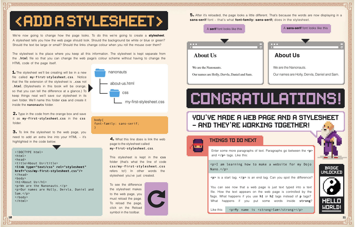
The organizing idea of the book is creating a small web site for a ninja band (!!!) called The Nanonauts. In the course of the book, the reader sets up a home page, an About Us page, a page listing upcoming concerts, and a couple more. Everything makes sense and interrelates, even if a couple of things feel ever so slightly forced.
Here’s a page-number timeline of concepts’ first introductions:
p. 6
Brainstorming site content and sketching a site map. Bear in mind here that the actual instructional text starts on page 6.
p. 10
Adding a style sheet to an HTML document via a link element.
p. 14
A nice breakdown of how images are loaded into the page, what the various (common) image attributes are and mean, and the importance of good alt text. On page 14.
p. 17
The concept of an empty element and how it differs from other elements.
pp. 20-24
An extended discussion of proper structure and good content for the web. It shows how using headings and paragraphs breaks up large text walls, makes the distinction between ordered and unordered lists, and demonstrates the importance of proper element nesting.
p. 25
Diving into CSS. A style sheet was added to the document back on page 10, but this is where CSS starts to be discussed in detail.
p. 28
Radial gradients! They went there! The syntax isn’t dissected and explained, but just showing working gradients clues readers in to their existence. There’s also an example of styling html separately from body, without making a super big deal out of it. This is a pattern throughout the rest of the book: many things are used without massively explaining them. The author relies on the reader to repeat the example and see what happens.
pp. 30-32
A really great explanation of hexadecimal color values. I’ve never seen better, to be honest. That’s followed by a similarly great breakdown of the uses for, and differences between, px, em, and % values for sizing.
p. 36
The first of several really lovely step-by-step explanations of style blocks. In this case, it’s styling a nav element with an unordered list of links, explaining the effects of each rule as it’s added.
pp. 50-52
An example of properly structuring and styling tabular data (in this case, a list of upcoming concerts).
p. 59
The box model and inline elements explained in sparing but useful detail. This includes a brief look at inline elements and the baseline, and vertical alignment thereof.
p. 74
Responsive web design! A nice introduction to media queries, and a quick primer on what responsive means and why it’s important.
p. 78
Floating images to wrap text around them. That segues into layout, using floats for the boxes enclosing the bits of content.
p. 88
Using web fonts (basically Google fonts).
p. 90
Putting your site online.
That isn’t everything that’s touched on in the book by a long shot — max-width and min-width show up early, as do :last-child, border-radius, and several more CSS features. As I said above, these are generally introduced without much detailed explanation. It’s a bold approach, but one that I think pays off handsomely. Trusting the reader to become interested enough to track down the details on their own leaves room to include more things to spark interest.
Pages 10 and 11. Not all pages are this text-heavy.
That said, there are some aspects that may — probably will — cause confusion. The biggest of these has to do with images. There are several instances of using img to add images to pages, as you’d expect. The author does provide a downloadable archive of assets, which is a little difficult to actually find (here’s a direct link), but the real problem is that once you extract the files, the filenames don’t match the filenames in print. For example, in the book there’s a reference to nanonauts.jpg. The corresponding file in the archive is NINJA_FACE_FORWARD.png. At another point, DSC03730.png turns out to actually be NINJA_GUITAR.png. There’s no indication of this whatsoever in the book.
I get it: mistakes happen, and sometimes digital assets get out of step with print. Nevertheless, I fear this could prove a major stumbling block for some readers. They see one filename in the book, and that filename doesn’t exist in the assets. Maybe they open up the asset images until they find the right one, and then maybe they figure out to replace the filename in the book with the one they found, and move on from there… but maybe they don’t. I’d be a lot happier if there were an errata note and mapping table on the download page, or the online archive’s assets were corrected.
Something similar happens on page 19, where the reader is directed to create a navigation link to songs.html when the page they’ve already created is called our-songs.html. This one is a lot more forgivable, since the filenames are at least close to each other. But again, it’s a place the reader might get lost and frustrated. The painful irony is that this error appears in a “NINJA TIP” box that starts out, “Be careful when you’re typing links. You have to get them exactly right!”
Another error of this kind happens in the section on adding a video to a page (p.45). All the markup is there, and the URL they supply in great big text loads a video just fine. The problem is that the video it loads is an ad for Scholastic, not the ninja-playing-a-guitar video the text very heavily implies it will be. I don’t know if it used to be a rock ninja shredding power chords and Scholastic replaced it or what, but it almost feels like a bait and switch. It was a little disheartening.
There’s one aspect I can’t quite make up my mind about, which is that just about everything in the book — text, design elements, media query breakpoints — is done using pixels. A couple of percentage widths show up near the very end, but not much is said about them. There is a very nice comparison of pixels, ems, and percentages on page 32, but with ems never being used (despite a claim to the contrary), readers are unlikely to use or understand them.
Now, I don’t style this way, and my every instinct rebels against it. But given that pixels really don’t mean what they used to, and that all modern browsers will scale pages up and down pretty seamlessly, is this a major problem? I’m not sure that it is. Either way, this does set readers on a specific initial path, and if that path bothers you, it’s worth knowing about so you can give them extra advice.
The third thing I found weird was the two pages devoted to embedding a live Google Map into one of the pages (showing the location of the Nanonauts’ next show). On the one hand, it’s cool in that it shows how some HTML elements (i.e., iframe) can serve as containers for external assets more complicated than images and videos, and having a live map show up in the page you’re building is probably pretty mind-blowing for someone just starting out. On the other, it’s kind of a fiddly and unusual use case: not many novice sites need an embedded widget calling an API.
I had less of a problem with the author showing a simple image-swapping-on-hover JavaScript solution, later in the book (even though my hindbrain kept chanting, “do that with CSS!”). It’s a simple example of scripting pieces of the page, and lets Mr. Hatter talk about the DOM and DOM scripting without getting super crazy about it.
The last thing I found a bit lacking was the closing two pages, which cover putting the site online. The author does their best with the two pages, and what’s there is correct, but it’s just not enough to help everyone get the results of their work online. I’m not sure two pages ever could be enough to help the novice audience. I’d have liked to see this get four pages, so there was room for more detail and more options. If you’re giving this book to someone to help them learn, my advice is to tell them up front that you’ll help them get their work online once they’ve finished the book.
Okay, all that said? I still absolutely recommend this as a beginners’ book. Nearly every topic the text introduces, and there are many I didn’t mention here, is covered just the right amount and in just the right way to get readers where they need to be, excited about what they’ve accomplished, and ready to learn more on their own. It’s pretty well up to date, at least as I write this, and isn’t likely to fall badly out of date any time soon. Approachable, accessible, and instructive.
Final grade: I give it a solid B+, only falling short of A level due to the filename mismatches.
Note: All images in this review are copyright The CoderDojo Foundation. Some were taken from the book’s asset files.
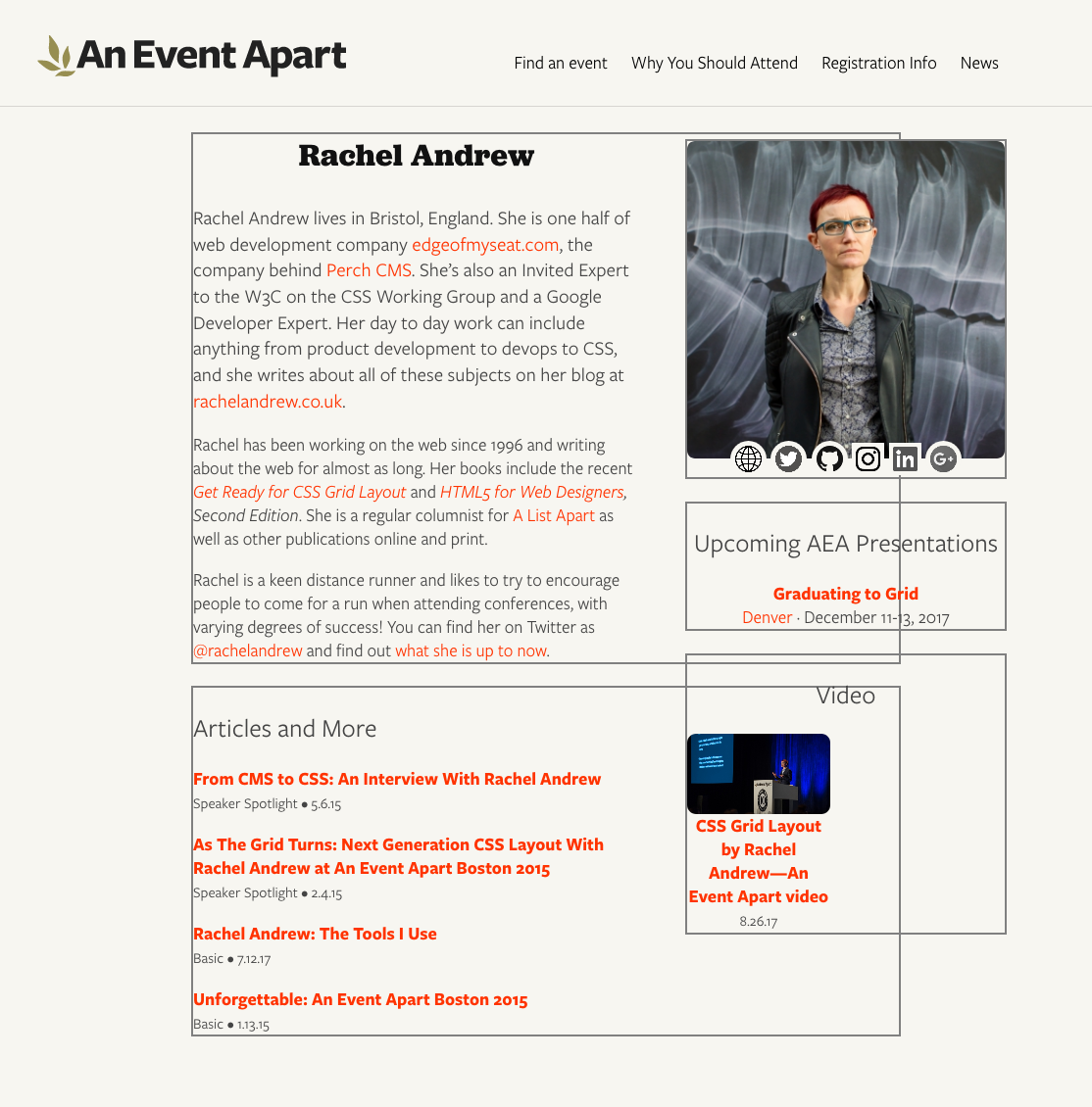
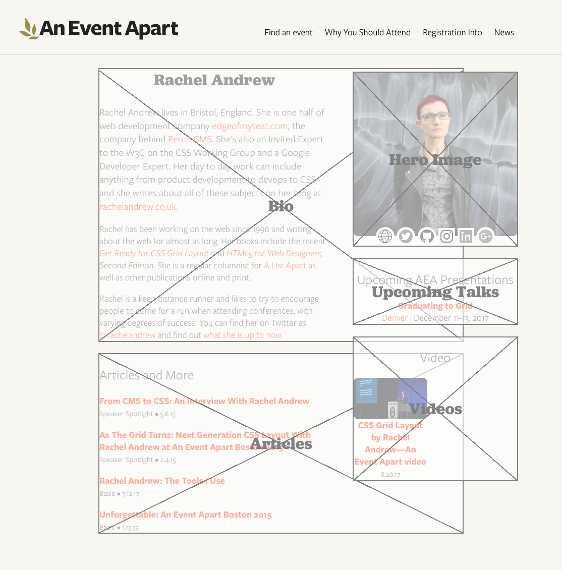
I was recently noodling around with some new layout ideas for An Event Apart’s speaker pages (e.g., Chris Coyier’s or Jen Simmons’) and wanted to share the ideas with other members of the team. But what I really wanted to show was wireframes to convey basic arrangement of the pieces, since I hadn’t yet done any time polishing details.
I thought about taking screenshots and Photoshopping wireframe boxes over the various layout pieces, but then I wondered: could I overlay boxes on the live page with CSS? Or perhaps even create and overlay them with nothing but some declarations and a wanton disregard for the sensibilities of god or man?
And that’s when I realized…I could.
Now I’m going to share my discovery with you.
Before I get started, I want to make one thing clear: this isn’t backward compatible. I don’t care. It doesn’t need to be. It does work in the latest versions of Firefox and Chrome, within reasonable tolerances — Chrome falls a bit short on one aspect, which I’ll point out when we get there.
All good? Then let’s go.
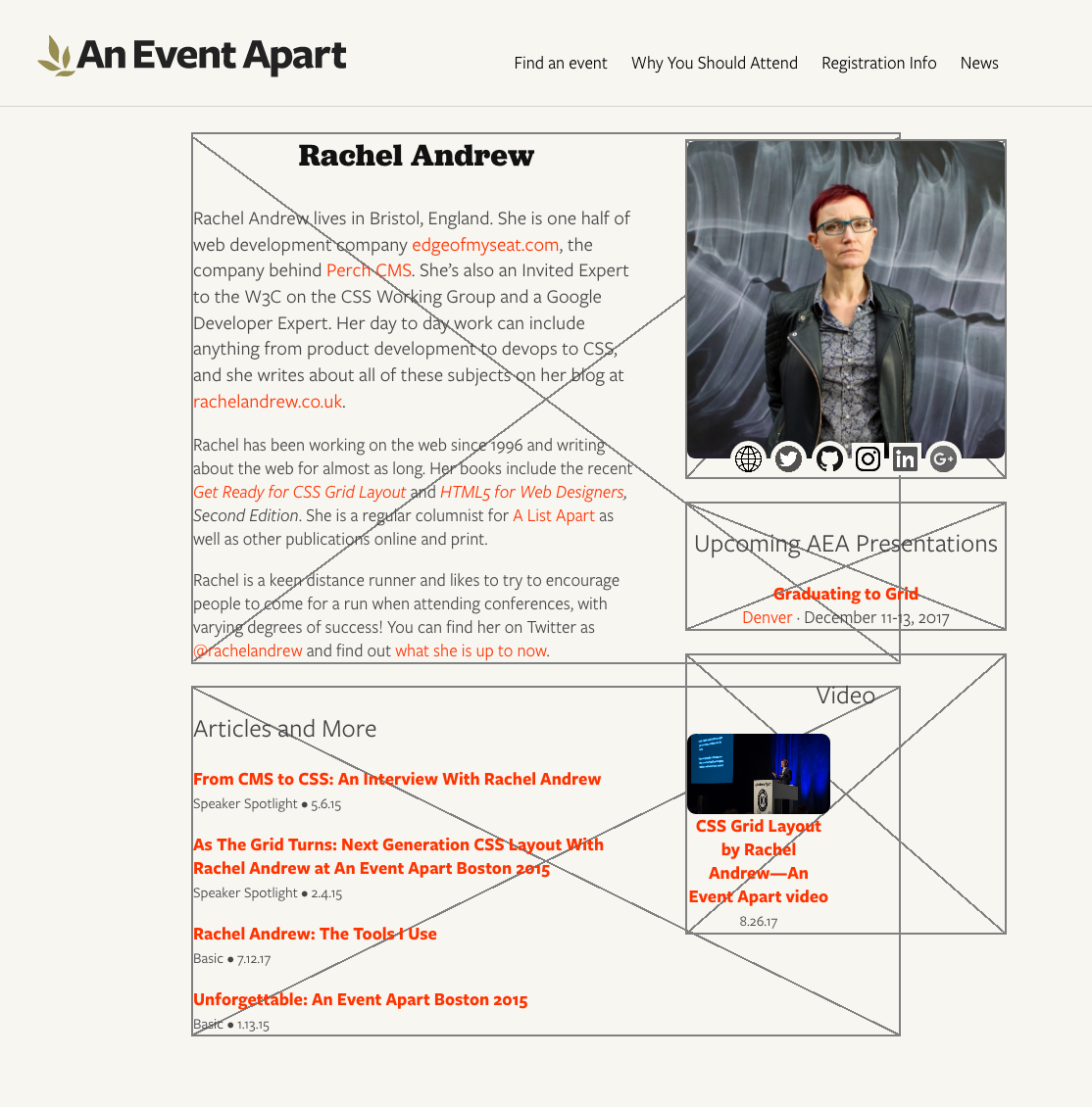
The goal was creating X-filled boxes that wireframers love so very, very much. I figured, any container element that needs to have a box stuck over it gets a class of wireframe.
(Don’t get too attached to that class, by the way: it doesn’t survive the article. Foreshadowing!)
The easy part was drawing a box around any element with that class. I decided to use outlines, because they’re rarely employed for box edging and they don’t affect the layout even if your box-sizing is set to content-box. (Mine usually is, by dint of not setting box-sizing at all. But, you know, you do you.)
The boxes overlap each other because the layout pieces on the right are, at least for the moment, floated. They’re laid out that way so that if the right-hand content is short and the bio and articles run long, they can wrap around below the ‘sidebar’. It’s generally useful to have the outlines showing the actual limits of the element boxes to which they’re attached.
There is a potential drawback here: if your layout involves using negative margins to pull some elements out of their parents, and those parent elements are designated as wireframe boxes, outlines will stretch around the outhanging elements in Firefox, though not in Chrome. Borders do not act the same way in Firefox. I can’t rightly call this a bug, because I’m honestly not sure what outlines should do here. Just be aware of it, is what I’m saying.
Anyway, drawing rectangles with outlines, that’s the easy part. Now I needed two diagonal lines, going from corner to corner. But how?
Linear gradients, that’s how. See, if you use quadrant-based directions for your gradients, special magic math happens under the hood such that at the exact midpoint of the gradient, the color-line that extends perpendicularly off the gradient ray shoots precisely into the corners of the two quadrants adjacent to the quadrant into which the gradient ray is pointing. Okay, that was probably hard to follow. For example, set the gradient direction as to top right and the 50% color line of the gradient will run into the top left to the bottom right corners.
Bingo: an X. But not one that scales terribly well. Using percentages there means that the gray lines will be as thick as 0.2% the total length of the gradient ray. Small boxes get thin, sometimes broken diagonals. Great big boxes get thick honkin’ lines.
There are two things to note here, before we move on. First is that the spaces around the operators in the calc() values are intentional and, more to the point, necessary. If you remove one or both of those spaces, calc() will simply fail to work. In other words, calc(50%-1px) will fail — no background for you! This is as designed, and there are reasons for it I don’t want to go into here, but suffice to say they exist and are arguably sensible. calc(50% - 1px), on the other hand, works as intended.
Well, mostly: this is where Chrome comes up a bit short. In large boxes, Chrome creates fuzzy lines thicker than 2 pixels. I’m not sure what it’s doing to fudge the numbers here, but it sure seems like it’s fudging something. The lines also don’t go into the corners quite as precisely as they should. Firefox’s lines, on the other hand, come out correctly sized no matter what box size I set up, even if they are a bit jagged at times, and they go exactly into the corners of all the boxes I tested. Chrome’s sloppiness here isn’t a deal-breaker, as far as I’m concerned, but it’s there and you should know about it.
So that’s an element with an outer edge and two diagonal lines. This is great as long as the box contains no actual content, which will sit on top of the diagonals, as you can see with the “hero image” in the top right. Maybe that’s what you want, in which case great, but I specifically wanted overlays. That way I could stick them on a live page and sort of fade out the contents while sticking wireframe boxes on top, to make the boxes the focus while still showing the stuff inside them.
Enter generated content. If I create a pseudo-element and attach the diagonal background gradients to that, they can sit on top of all the content. That’ll also let me throw in a translucent background color to fill the box and fade out the contents. Like so:
Placing the diagonals, and a translucent color, over the elements
I used ::before mostly because hey, why not, but also because clearfix is usually an ::after and I hear people are still using clearfix, more’s the pity. So this avoids it. If you’ve moved beyond the need for clearfix, then you can use ::after just as easily. Whatever floats your fancy. (Get it? Floats? Yeah? Clearfix? Floats? Ah, I kill me.)
The stupidly large z-index on the ::before is there to put the box overlay above any gridded, flexed, or positioned content that has an automatic z-index, or at least a sensible one. You can raise it as high as you’d like (and your browser’s bit-depth will allow). The small z-index on the elements themselves, on the other hand, makes sure they get an explicit stacking placement instead of an automatically-assigned place on the Z axis. I find this generally settles a number of odd behaviors in various browsers. Your experience may vary.
It was at this point that I realized there was a whole other level here. I mean, wireframe boxes stretched over content is pretty nifty all by itself. That could have been enough. But it wasn’t.
Because what I realized was that I didn’t just want wireframe boxes, I wanted labeled wireframe boxes. If a box was being applied to a list of articles, then I wanted a great big “Articles” label sitting in the middle of it, to make it obvious what was being placed there.
Well, there was already a content property just sitting there, waiting to throw in actual content instead of an empty string, but how to fill it? And that’s when I knew that .wireframe’s days were numbered.
That’s because the easiest way to label each box was to use an HTML data attribute to attach the label I wanted to display. And once that attribute was there, why not apply the wireframe styles based on the presence of the attribute, instead of adding class names that might get in the way of some unexpected DOM script? So I changed the markup and CSS like this:
(True story: I almost called it data-wtf instead. Almost.)
Having done that, I could modify the CSS to insert the attribute value, style the inserted text to look nice, and use flexbox properties to center it in the box. So I did.
That yielded big beautiful bold Jubilat labels (Jubilat is one of AEA’s brand font faces), sitting right on top of the center of the box, the crossing of the two diagonal lines behind them.
Which actually turned out to be a small problem for me. That text is certainly readable, but I wanted it to stand out a bit more from the diagonals. I decided to stack text shadows in order to semi-simulate outside text stroking.
It’s possible to use just four offset shadows with minimal or zero blur, but I find it sometimes creates weird jags on serif fonts, so I like stacking blurred shadows better. But, again, you do you.
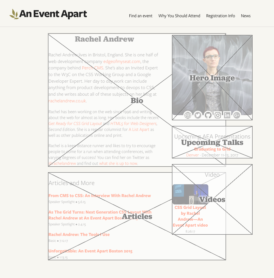
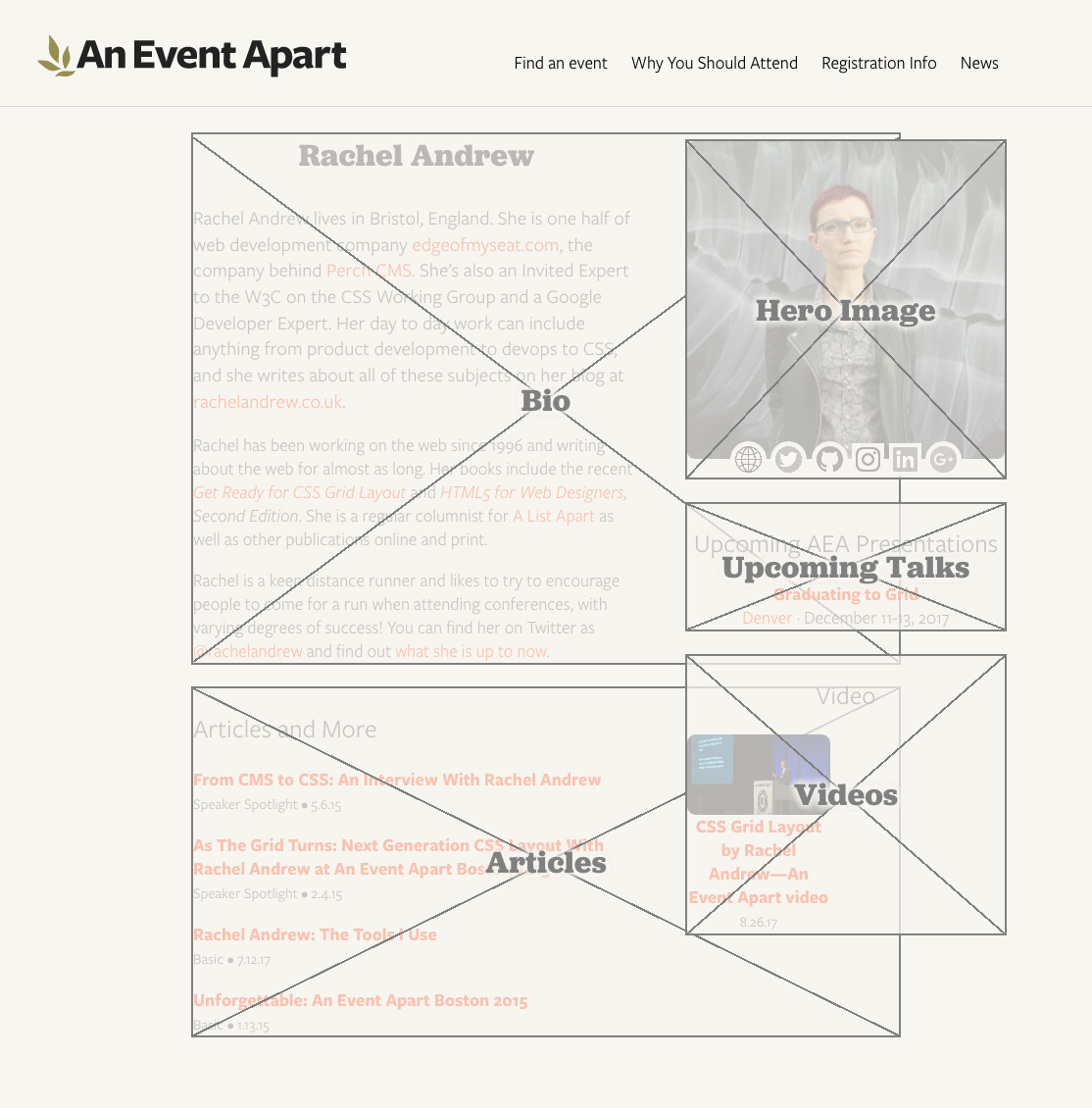
As I looked over the results, it slowly dawned on me that the white-on-gray box scheme works well enough for a starting wireframe setup with no branding applied, but I was planning to drop these on pages with actual design and colors and that sort of thing. I didn’t want the boxes to fill with translucent white; I wanted them to be translucent versions of the page background color. And, furthermore, I wanted a way to be able to easily alter that color, when applied to different designs.
Custom properties to the rescue! Which is to say, native CSS variables to the rescue!
Our page background color at An Event Apart is #F7F6F1, a combo I actually have memorized at this point. Since I wanted to fill the boxes with a roughly three-quarters-opaque variant, I settled on #F7F6F1BB. (Actual 75% is BF, if you care.) So I defined a custom property for it:
html {
   --fill: #F7F6F1BB;
}
I could have assigned the variable to the [data-wf] rule instead of html, but I felt like setting them globally. Because that’s how I roll, yo — Wulf & Shaw have no strings on me. If you want to bring the variables in closer, go for it.
While I was there, I figured, why not, let’s also define a variable for the shared color of the outlines, diagonals, and label text.
html {
   --fill: #F7F6F1BB;
   --wire: gray;
}
Then all I needed was to sprinkle variable calls where the colors were sitting. I ended up here:
The final product, with color themes and everything
The label could be broken out to use its own variable (e.g., --text or --label) easily enough, but I wanted a minimum of things to change. I know myself too well to set up a bunch of controls to fiddle with, especially where color is concerned.
And with that, I had a ready-to-hand, easily theme-able wireframing style block that I can drop into any development page and invoke simply by adding a few data attributes to the markup. Data attributes, I might add, that would be trivially easy to later find and remove with regular expressions. It’s a quick way to make it clear to stakeholders that a work in progress is, in fact, in progress, as well as a handy way to visualize which pieces of a prototype layout are going where.
Now that we’ve come to the end and you’re still hanging in there with me, let me just say that I hope you’ve enjoyed this little trip through various parts of CSS. If you have any questions, feel free to drop them in the comments below. I’ll do my best to respond in reasonable amounts of time, travel and such permitting.
P.S. And one final note, as Kai Ryssdal would say: every bit of CSS I used here is covered in CSS: The Definitive Guide, 4th Edition. I turned to my print copy twice in the process of working all this out, as it happens, to remind myself of specific syntax (for custom properties) and whitespace requirements (for calc() operators). It really feels good to have a thing I made be useful to me!
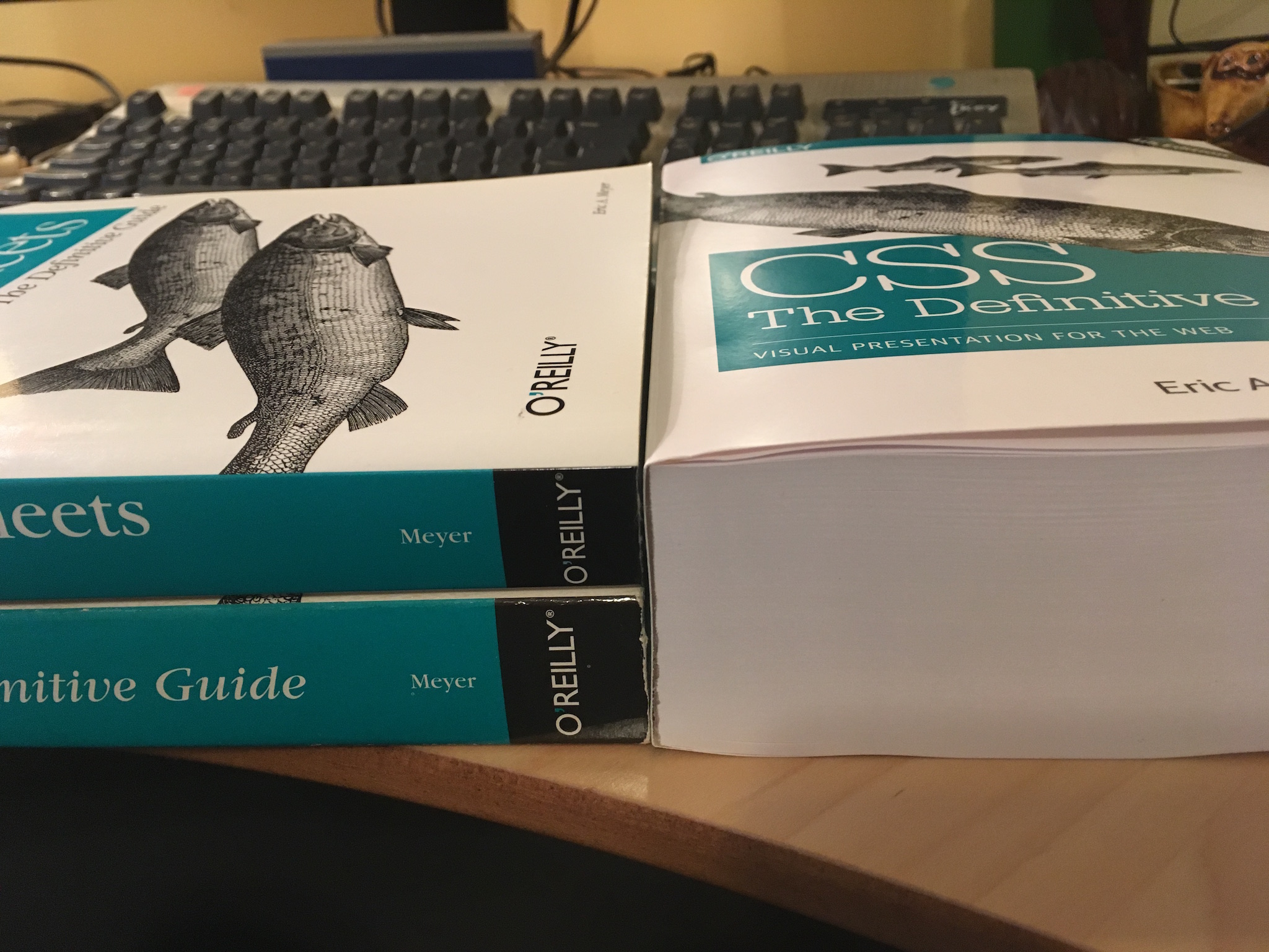
At the end of last week, I posted this picture to Twitter and Facebook, and on Twitter it kind of took off.
On the left: the 2nd and 3rd editions of “CSS: The Definitive Guide”. On the right, a single copy of the fourth edition. 😳
My intent in posting it was to say, in not nearly so many words, “Look at how CSS has dramatically expanded its capabilities since the previous edition, and wow, I can’t believe Estelle and I did that much work!” I know we have 280 characters now, but I try not to blog places other than, well, my actual blog. (Welcome!)
The Twitter reaction was…interesting. And by interesting, I really do mean interesting. There were the people who responded with excitement and anticipation — thanks to you all! — but a whole lot of people who said, in effect, “This is what’s wrong with front end, all this accelerating complexity.”
Which was not what I was saying. And which is not, I think, what’s actually happened here, but it depends on what you mean by ”complexity”.
CSS has a great deal more capabilities than ever before, it’s true. In the sense of “how much there potentially is to know”, yes, CSS is more of a challenge.
But the core principles and mechanisms are no more complicated than they were a decade or even two decades ago. If anything, they’re easier to grasp now, because we don’t have to clutter our minds with float behaviors or inline layout just to try to lay out a page. Flexbox and Grid (chapters 12 and 13, by the way) make layout so much simpler than ever before, while simultaneously providing far more capability than ever before.
“How? How is that even possible?” you might ask, to which I would reply, “That’s what happens when you have systems that were designed from the outset to be used for layout.” Floats weren’t; they were a necessary hack. Inline-block wasn’t; that was a necessary hack. People did ingenious, brilliant things to make those tools work, yes. But they were always a perversion of original intent.
Whereas with Grid and Flexbox, we have things that were always meant to handle layout. That’s why, for example, they make vertical centering of elements a breeze. A breeze, people. I’ve been working with the new stuff long enough that I literally forget vertical centering is supposed to be difficult. I have similar amnesia about the struggle to balance layout needs with accessible source order. These problems are not 100% banished, but it’s to the point now that when I do run into these problems, it’s a surprise, and almost a personal affront. Like how you feel when you’ve been zooming along a near-empty highway for hours, enjoying the rush of wind and power, and then you come around a curve and all of a sudden there’s a roadblock of two slow-moving cars side by side, doing exactly the speed limit of all things, each refusing to pass the other.
I envy “the kids”, the ones just starting to learn front end now. They’re likely never going to know the pain of float drop, or wrestling with inline blocks, or not being able to center along one axis. They’re going to roll their eyes when we old-timers start grumbling about the old days and say, “Floats?!? Who ever thought floats would be a good way to lay out a page? That’s totally not what they’re for, anyone can see that! Were you all high as a kite, or just utterly stupid?” You know, the way “the kids” talked ten years ago, except then it was about using tables for layout.
So if you’ve written CSS in the past, CSS today is not significantly harder to understand, and probably a bit easier. There’s just a lot more of it. You might not be able to remember every single property and value, but that’s okay. Neither can I. I don’t think many (or any) of us can hold every last tiny piece of a serious programming language in our heads, either. We know the core things, and the patterns we learned, and some cool techniques, and there are the things we always have to look up because we don’t often use them.
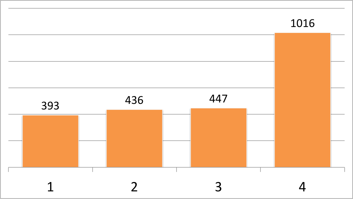
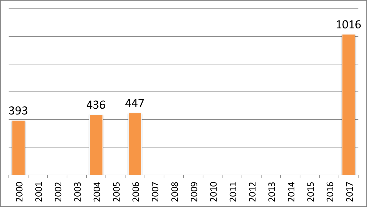
I also think people saw the books in the picture and forgot about the time component. I checked the page number at the end of the last chapter for each book (thus omitting appendices and the index) and came up with the following chart.
Editions of CSS: The Definitive Guide
Whoa, right? But let’s chart those numbers again, this time taking date of publication into account.
Editions of CSS: The Definitive Guide over 18 years
Rather less crazy, I would say. It’s still an apparent upward trend, but think about all the new features that have come out since the 3rd Edition, or are coming out right now: gradients, multiple backgrounds, sticky positioning, flexbox, Grid, blending, filters, transforms, animation, and media queries, among others. A lot of really substantial capabilities. They don’t make CSS more convoluted, but instead extend it into new territories.
Speaking of which, a few people asked how I got the books to line up so neatly. I admit they’re being supported by a table there, but the real secret? Grid. So easy. Here, have a set of three “book spines” (each one a cite element) gridded out in supporting browsers, and still laid out just fine in older browsers.
See what I mean? That took me about 20 minutes all told, even though I’m using internal markup that’s probably not ideal, by putting grids in my grid so I can grid while I grid. I rearranged the 2nd-3rd-4th source order into the visual arrangement seen in the photo, and centered the text blocks vertically without using margins or padding or line height to fake it, just because I could. The grid layout is an enhancement: in older browsers, the spines render as a vertical stack, one atop the other, in chronological order.
Another five minutes, and I could neaten that rendering up further so the spines looked more consistent between grid-capable and grid-incapable browsers. Five to ten more minutes could get the O’Reilly logo and fish graphics into the black areas. Five more, and it would be neatly responsive. Maybe I’ll come back and fix it up to do those things, but for now, as far as I’m concerned, this will do nicely.
The other common response I got was, “Well, looks like it’s time for ‘CSS: The Good Parts’!” Fam, we already have “CSS: The Good Parts”. Estelle and I just wrote it. You can see it on the right side of the picture up above. Available now on paper or in electronic form!
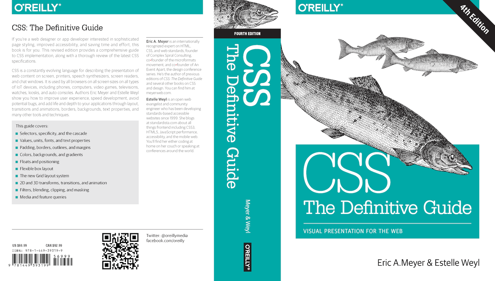
CSS: The Definitive Guide, 4th Edition is wending its way to the reading public, and I have some updates on that.
The O’Reilly catalog still says October 2017, but for the physical copy, Barnes & Noble and Amazon are now listing a release date of November 5th, 2017, so we seem to have just missed that October release window I was hoping to hit. But not by much! The DRM-free version at eBooks is apparently available now, as are Nook and Kindle versions.
For those of you with access to O’Reilly’s Safari subscription service, there’s an older version of the book currently available. Apparently, so many people have joined the queue to get it that the content-update process breaks. (Our production editor was impressed.) O’Reilly’s engineering staff is aware of the problem and working on it, so hopefully by the time you read this, the problem will be resolved and the final copy online. If not, our apologies, and thanks for your patience.
If you’re wondering if this edition is for you, absolutely it is! But I would say that, wouldn’t I? As would my co-author Estelle. To help you decide, here’s the Table of Contents with a few brief notes on the new things contained therein (chapters marked ALL NEW! are chapters that didn’t exist at all in the 3rd Edition):
CSS and Documents – a brief overview of what CSS is for, how to apply it (including via HTTP headers!), basic syntax, media and feature queries
Selectors – all the selectors as of mid-2017, including :not(), validity pseudo-classes, the case-insensitivity modifier in attribute selectors, and more
Specificity and the Cascade – probably the least-changed chapter, this lays out the cascade in some detail
Values and Units – adds viewport units, ch (which does not actually mean “one character”), calc(), and various new color syntaxes like HSL and #RRGGBBAA patterns
Fonts – includes a lot about @font-face and the process of loading custom fonts, in addition to the classics like weight, style, variant, family, etc.
Text Properties – adds a fair amount of material on non-horizontal writing and alignment, writing modes, hyphenation, and so forth
Basic Visual Formatting – this is another chapter that didn’t change a huge amount from the 3rd Edition, though it does touch on the new values for display
Padding, Borders, Outlines, and Margins – to all the existing details on those basic topics, we’ve added border-radius and all the properties that affect image borders
Colors, Backgrounds, and Gradients – there are all the new background-related properties like background-size and background-clip, handling multiple background images, and the wonder world of linear and radial gradients, explained in more detail than anyone probably thought reasonable, plus there’s a section on box-shadow
Floating and Shapes – floating hasn’t changed much, but the section on Float Shapes is all new and pretty nifty, if I do say so myself
Positioning – this got a section on sticky positioning to go along with the classic positioning material
Flexible Box Layout – ALL NEW! – the ins and outs, the nitty-gritty, the pros and cons of Flexbox
Grid Layout – ALL NEW! – Grid is here and it’s hot; this chapter explores it in up-to-the-minute detail
Table Layout in CSS – the third of the minimally-updated chapters, this discusses how data tables are laid out
Lists and Generated Content – a surprisingly large amount of new material in this chapter, pretty much all centered around @counter-style and its capabilities and how you can create emoji counting systems
Transforms – ALL NEW! – rotating, scaling, translating, 3D effects, and more, all with a minimum of matrix math
Transitions – ALL NEW! – state-based animations and how to define them, introducing some of the basic animation concepts along the way
Animation – ALL NEW! – stateless animations, which can happen at any time, for any reason you choose to define, made possible through @keyframes and a bevy of new properties
Blending, Filtering, Compositing, and Masking – ALL NEW! – all (okay, almost all) the nifty things you used to do in Photoshop, now available natively in browsers, so you can do grayscale images that pop color on hover or click without having to produce two separate images
Media-Dependent Styles – this was almost ALL NEW!, but it’s a radically reworked chapter from the 3rd Edition with fewer bits about printing, no bits on audio, and a whole lot of details about media queries
And then the Appendices:
Animatable Properties – a list of CSS2.1 properties that are animatable, with a note on exactly what can be animated
Basic Property Reference – a compact table of properties, their default values, and the complete value syntax
Color Equivalence Table – the 148 color names defined in CSS Color Level 4 with their equivalents in RGB decimal, RGB percentage, HSL, and hexadecimal formats
Whew! After all that, you might be thinking that, much like Emacs, this book has everything. And I’d like to say that it does, but… it doesn’t. For example, I decided fairly late in the process to drop multicolumn properties. It was a tough decision, but when I started testing browser support and looking at the state of the specification, it felt too unstable to include. I’ve rushed explanations in past editions, and usually regretted it. (Although, fun fact: the 2nd Edition contains the only known documentation of the CSS Working Group’s multi-hour discussion on how the old clip property was supposed to work.) So I put multicolumn off for the next edition.
Still, there are far far far more examples of things added in than things left out, enough to make this edition twice as long as the previous. There’s been a lot of growth in CSS over the past decade, and I think Estelle and I have brought together something that will get you up to speed on very nearly all of it. For those of you eagerly waiting on a copy, we really hope you enjoy the result!
Yesterday afternoon, CSS: The Definitive Guide, 4th Edition went to the printers. Eighteen years after the First Edition hit shelves, eleven years after its predecessor came out, five years after I first started working on this edition, and thanks in no small part to Estelle Weyl and a parade of long-suffering editors at O’Reilly, the last changes were entered, the pages were locked, and the repository closed.
It comes in at 1,088 pages: almost exactly twice the length of the Third Edition, with six new chapters and a lot of overhauling of old chapters. Flexbox, Grid, filtering, blending, clipping and masking, float shapes, animations and transitions, transforms, image borders, counting systems, custom properties (a.k.a. CSS variables), media and feature queries — they’re all in there, and a whole lot more besides. Gradients got a major new section in what used to be called just “Colors and Backgrounds” and is now “Colors, Backgrounds, and Gradients”. And all the new background properties! So many new background properties.
We didn’t skimp on the visuals, either. The book has, if I counted correctly, a total of 778 figures. Almost all of them were captured in-browser, and you can download or clone all the files from GitHub. If you’d rather just browse them online, you can do so thanks to GitHub Pages. That’s also where to find the transition and animation examples that are referenced in the text, but not figures themselves (detailed animation being somewhat difficult to represent on paper). If we add figures and animation examples together, there are 826 elements supporting the main text. Which feels like a lot to me.
The book will be available in both tree-wafer and glowing-display formats from your favorite supplier of such things; e.g., Amazon. (If you’re going to buy through Amazon and are inclined to support another aspect of my life, please designate Rebecca’s Gift as your Amazon Smile recipient before buying the book.) I also hear tell it will be available DRM-free from eBooks.com, and potentially in PDF form for those who prefer it. O’Reilly doesn’t sell books directly any more, but I do believe it will be avialable to those with Safari subscriptions.
I’ll have more to say about the book and its contents as the release date draws closer. Last I heard, it should be out by the end of this month, but as always, release dates can slip for any number of reasons. Even if this release does slip, it should still come out no later than early November.
(Let’s hope I didn’t just jinx that.)
This is always a tense and exhilarating time. What if I got a huge piece completely wrong? What if I made the wrong calls on what to include and what to defer to the next edition? What if I missed egregious typos? What if nobody likes it? Basically, the same doubts that strike most any author. But there’s also the incredible feeling of a project brought to its conclusion and the anticipation of getting it into readers’ hands. This has been a longer-than-usual time coming, but as it usually does, the time has come at last. I hope you’re looking forward to it half as much as I am.
My primary SVG viewer is Firefox. This is partly because it’s always running, so the startup time is essentially zero. It also allows me to directly inspect and modify elements of the SVG element through the Web Inspector, which can be handy.
But I’ve run into a problem more than once, which is that if I load an SVG file in Firefox, the browser window’s background defaults to white, and a lot of times I’m trying to view images that are partially or entirely white. I started thinking that if there were a way to make the window background medium gray, that would solve the problem with rare downsides, since I can’t remember trying to view an all-medium-gray SVG.
After a question on Twitter and some ideas from Tibor Martini, I realized I could use Stylish to give the SVG files a background through CSS. I didn’t want to select all SVGs, only those I was loading directly, so I tried this:
svg:root {background: gray;}
And it worked! So I decided to make it more robust by doing a multicolor gradient, and grayscaling it on hover. I couldn’t use filter because that would grayscale the whole image, rather than just the background, but that was easy to work around. I ended up with this:
Which works great! Except that I discovered Firefox applies it to all SVGs, even those loaded into HTML documents via img. SVGs apparently define their own roots, which I hadn’t expected, but I can see how it might make sense. So I poked around in MDN until I came up with this:
And that’s exactly what I wanted. If it’s useful to you, have at it. Just paste that into a new Stylish rule in Firefox, and you should be good to go.
If you’re on Chrome, you can import the above into Stylish and create a new rule, but it hasn’t worked for me, and I’m not sure why not. Removing :root didn’t fix it when I tried, and that shouldn’t matter anyway: I can see in Chrome’s user styles that svg:root is used and applied. And my Stylish toolbar icon shows the rule is being applied. It just doesn’t do anything I can see. If anyone can figure out how to make it work, or explain why it can’t work, I’d love to know in the comments!