Scaling SVG Clipping Paths for CSS Use
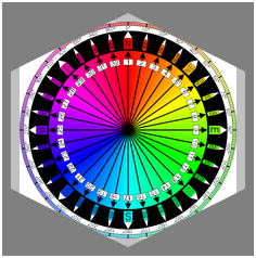
Published 9 years, 1 month pastI’ve been working a lot with the clip-path property recently, as I write the chapter on filters, blends, clipping, and masking for CSS: The Definitive Guide’s long-delayed 4th edition (available now in early-release format!). One of the nifty things you can do with clipping paths is define them with percentage-based coordinates. For example, here’s a hexagon-like clipping path:
clip-path: polygon(50% 0, 100% 25%, 100% 75%, 50% 100%, 0 75%, 0 25%);That starts at the center top (50% 0), goes to the right edge, quarter-down (100% 25%), and so on.
When I got to SVG-based clipping, which you can use with the CSS pattern clip-path: url(#pathID), I tried and failed with this:
<clipPath id="hexlike">
  <polygon points="50% 0, 100% 25%, 100% 75%, 50% 100%, 0 75%, 0 25%" />
</clipPath>
It didn’t work because, as I discovered to my horror, SVG does not allow percentage coordinates. I could just strip all the percent signs out, but that would be the same as saying this in CSS:
clip-path: polygon(50px 0, 100px 25px, 100px 75px, 50px 100px, 0 75px, 0 25px);I didn’t want pixels, though. I want percentages, darn it all!
So I asked around on Twitter, and Markus Stange pointed me to the solution: converting all the SVG coordinates to the range 0–1 and using the clipPathUnits attribute. The working version looks like this:
<clipPath id="hexlike" clipPathUnits="objectBoundingBox">
  <polygon points="0.5 0, 1 0.25, 1 0.75, 0.5 1, 0 0.75, 0 0.25"/>
</clipPath>`
That yields the same result as the polygon() CSS shape with the percentages I showed before.
All that is great if you’re writing your own SVG shapes and can make sure you set it up properly, but what if someone hands you a shape to be used as a clip path and it’s in absolute coordinates like 100 75? If you’re really lucky, the shape has a viewbox of 0 0 100 100 (or all the coordinate points are in that range) and you can just divide all the coordinate points by 100 to get the proper values. But that’s really tedious for any but the simplest of shapes, and besides, what if it has some other viewbox? That’s where the transform attribute saves the day.
For example, suppose you get an SVG file that looks like this (with the actual path coordinates removed because there are a lot of them):
<svg version="1.1" xmlns="http://www.w3.org/2000/svg"
  xmlns:xlink="http://www.w3.org/1999/xlink" viewBox="0 0 329.6667 86">
  <clipPath id="cloud02">
    <path d="…(coordinates go here)…"/>
  </clipPath>
</svg>
First, add the clipPathUnits attribute to the <clipPath> element:
<svg version="1.1" xmlns="http://www.w3.org/2000/svg"
 xmlns:xlink="http://www.w3.org/1999/xlink" viewBox="0 0 329.6667 86">
  <clipPath id="cloud02" clipPathUnits="objectBoundingBox">
    <path d="…(coordinates go here)…"/>
  </clipPath>
</svg>
Next, look at the viewBox attribute on the <svg> element itself. The value there is 329.6667 86. That means 329.6667 coordinate units horizontally, and 86 units vertically. So all you need to do now is divide all the horizontal values by 329.6667, and the vertical values by 86. Which would be super tedious, except we have scaling transforms at our disposal:
<svg version="1.1" xmlns="http://www.w3.org/2000/svg"
  xmlns:xlink="http://www.w3.org/1999/xlink" viewBox="0 0 329.6667 86">
  <clipPath id="cloud02" clipPathUnits="objectBoundingBox"
   transform="scale(0.003033 0.0116279)">
    <path d="…(coordinates go here)…"/>
  </clipPath>
</svg>
Those two values are 1/329.6667 and 1/86, respectively, and they effectively scale every point in the d attribute to fit into the needed 0–1 range. (That’s not precisely what happens, but the outcome is the same.) Thus we have an SVG clipping path that scales with the element and fits to its dimensions!
This works just as well for other markup patterns. To return to the hexlike path from before, assume it was written like this:
<svg version="1.1" xmlns="http://www.w3.org/2000/svg"
 xmlns:xlink="http://www.w3.org/1999/xlink" viewBox="0 0 100 100">
  <clipPath id="hexlike">
    <polygon points="50 0, 100 25, 100 75, 50 100, 0 75, 0 25" />
  </clipPath>
</svg>
If that were applied as-is, via clip-path: url(#hexlike), it would create a hex-like clipping path that fits a 100px by 100px box, positioned in the top left of the element (in left-to-right languages, I presume). The quick fix:
<svg version="1.1" xmlns="http://www.w3.org/2000/svg"
 xmlns:xlink="http://www.w3.org/1999/xlink" viewBox="0 0 100 100">
  <clipPath id="hexlike" clipPathUnits="objectBoundingBox"
   transform="scale(0.01)">
    <polygon points="50 0, 100 25, 100 75, 50 100, 0 75, 0 25" />
  </clipPath>
</svg>
Bingo bango bongo, it will now scale to the element’s dimensions, whatever those turn out to be.
Of course, if you apply that to something like a short paragraph, it will be verrrrry stretched out, but the same would be true with a percentage-based polygon() shape. The beauty here is that you can scale any coordinate set, so if you have a tiny path that you want to blow up, or a huge path you want to shrink down, you can transform it without using clipPathUnits to stretch it over the bounding box. Something like this:
<svg version="1.1" xmlns="http://www.w3.org/2000/svg"
 xmlns:xlink="http://www.w3.org/1999/xlink" viewBox="0 0 100 100">
  <clipPath id="hexlike" transform="scale(4)">
    <polygon points="50 0, 100 25, 100 75, 50 100, 0 75, 0 25" />
  </clipPath>
</svg>
That gets you a hexlike shape that fits a 400px by 400px box, for example.
Now all CSS needs is the ability to size and position clipping paths in a manner similar background images, and we’ll be in clover. I hope such properties are in the WG’s mind, because I’d love to be able to just point an at SVG clipping path, and then say something like clip-path-position: center; clip-path-size: contain;. That would remove the need for fiddling with SVG attributes altogether.
Thanks to Markus Stange for the technique and his invaluable assistance in proofreading this article.