My Contribution to “Modern Loss”
Published 8 years, 5 months past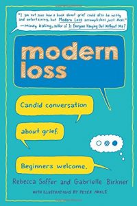
My wife Kat and I tell ourselves we’d love another child for who they are, not for who they replace. We even believe it. But we can’t be sure of it — and that keeps us from shutting our eyes, jumping back into the adoption process, and hoping it will turn out okay. We know all too horribly well that sometimes, it doesn’t.
That’s the opening of my essay “The Second Third Child”, included in the new book from Modern Loss titled Modern Loss: Candid Conversation About Grief. Beginners Welcome, published this week.
I’m deeply honored to be one of the 40+ contributors to the book, some of whom you may know — Dresden Dolls co-founder Amanda Palmer, CNN’s Brian Stelter, author Lucy Kalanithi, Dear Evan Hansen director Michael Greif, Stacy London of What Not To Wear — and many of whom you may not, as I will be unknown to the vast majority of the book’s readers. I’ve written articles for Modern Loss in the past, but to be entrusted with a part of their first book was humbling.
Several of the essays in the book are intentionally funny, but mine is not one of them. It’s quiet, reflective, and elegiac in more than one way, but never anything but honest. It appears in the first section of the book, titled “Collateral Damage”.
As Stephen Colbert put it: “Talking about loss can feel scary. This book isn’t. It’s about grieving deeply over the long term, and the reassurance that you’re far from broken because of it.” I hope my essay, and the book as a whole, helps readers to come to terms with their own grief, by seeing that they are not alone, and that they did the best they could even if it doesn’t feel that way at all.
All my thanks to Rebecca Soffer and Gabrielle Birkner for making me a part of their incredible, inspiring work.