Declining Complexity in CSS
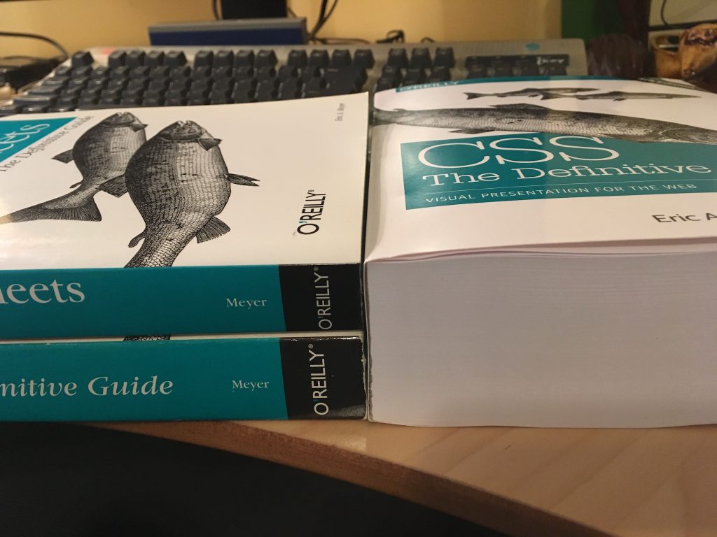
Published 8 years, 5 months pastAt the end of last week, I posted this picture to Twitter and Facebook, and on Twitter it kind of took off.

My intent in posting it was to say, in not nearly so many words, “Look at how CSS has dramatically expanded its capabilities since the previous edition, and wow, I can’t believe Estelle and I did that much work!” I know we have 280 characters now, but I try not to blog places other than, well, my actual blog. (Welcome!)
The Twitter reaction was…interesting. And by interesting, I really do mean interesting. There were the people who responded with excitement and anticipation — thanks to you all! — but a whole lot of people who said, in effect, “This is what’s wrong with front end, all this accelerating complexity.”
Which was not what I was saying. And which is not, I think, what’s actually happened here, but it depends on what you mean by ”complexity”.
CSS has a great deal more capabilities than ever before, it’s true. In the sense of “how much there potentially is to know”, yes, CSS is more of a challenge.
But the core principles and mechanisms are no more complicated than they were a decade or even two decades ago. If anything, they’re easier to grasp now, because we don’t have to clutter our minds with float behaviors or inline layout just to try to lay out a page. Flexbox and Grid (chapters 12 and 13, by the way) make layout so much simpler than ever before, while simultaneously providing far more capability than ever before.
“How? How is that even possible?” you might ask, to which I would reply, “That’s what happens when you have systems that were designed from the outset to be used for layout.” Floats weren’t; they were a necessary hack. Inline-block wasn’t; that was a necessary hack. People did ingenious, brilliant things to make those tools work, yes. But they were always a perversion of original intent.
Whereas with Grid and Flexbox, we have things that were always meant to handle layout. That’s why, for example, they make vertical centering of elements a breeze. A breeze, people. I’ve been working with the new stuff long enough that I literally forget vertical centering is supposed to be difficult. I have similar amnesia about the struggle to balance layout needs with accessible source order. These problems are not 100% banished, but it’s to the point now that when I do run into these problems, it’s a surprise, and almost a personal affront. Like how you feel when you’ve been zooming along a near-empty highway for hours, enjoying the rush of wind and power, and then you come around a curve and all of a sudden there’s a roadblock of two slow-moving cars side by side, doing exactly the speed limit of all things, each refusing to pass the other.
I envy “the kids”, the ones just starting to learn front end now. They’re likely never going to know the pain of float drop, or wrestling with inline blocks, or not being able to center along one axis. They’re going to roll their eyes when we old-timers start grumbling about the old days and say, “Floats?!? Who ever thought floats would be a good way to lay out a page? That’s totally not what they’re for, anyone can see that! Were you all high as a kite, or just utterly stupid?” You know, the way “the kids” talked ten years ago, except then it was about using tables for layout.
So if you’ve written CSS in the past, CSS today is not significantly harder to understand, and probably a bit easier. There’s just a lot more of it. You might not be able to remember every single property and value, but that’s okay. Neither can I. I don’t think many (or any) of us can hold every last tiny piece of a serious programming language in our heads, either. We know the core things, and the patterns we learned, and some cool techniques, and there are the things we always have to look up because we don’t often use them.
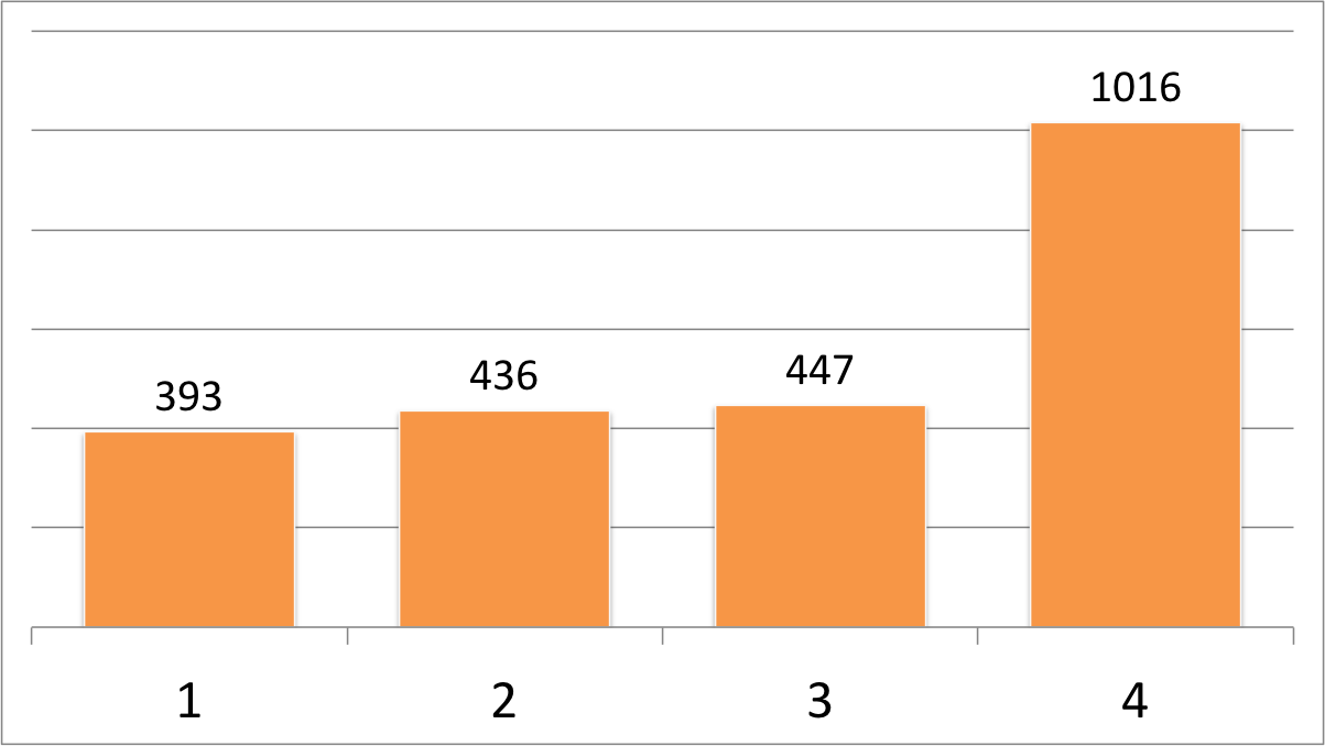
I also think people saw the books in the picture and forgot about the time component. I checked the page number at the end of the last chapter for each book (thus omitting appendices and the index) and came up with the following chart.

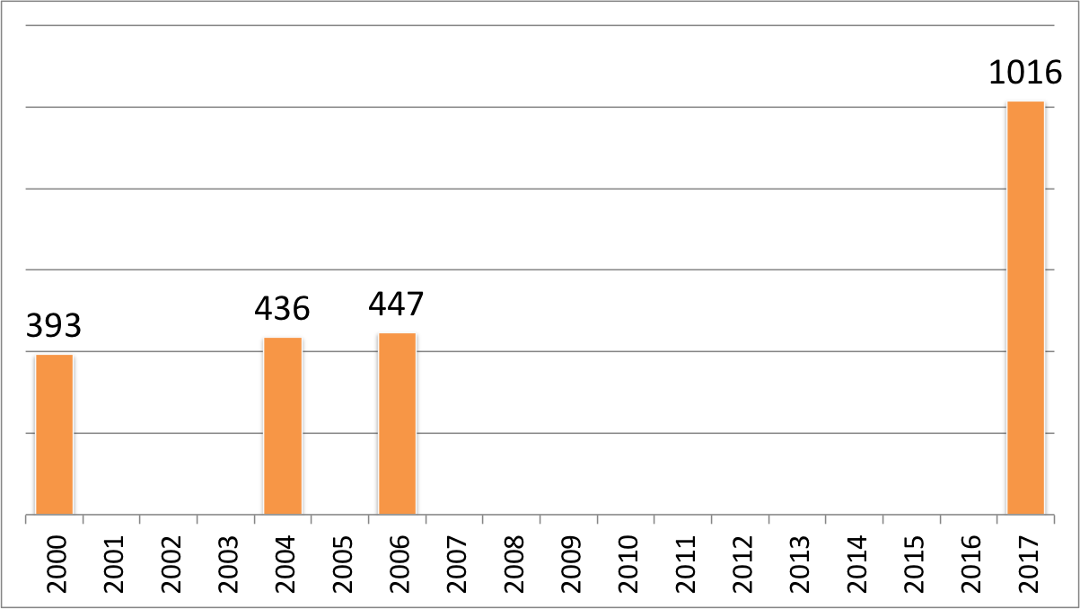
Whoa, right? But let’s chart those numbers again, this time taking date of publication into account.

Rather less crazy, I would say. It’s still an apparent upward trend, but think about all the new features that have come out since the 3rd Edition, or are coming out right now: gradients, multiple backgrounds, sticky positioning, flexbox, Grid, blending, filters, transforms, animation, and media queries, among others. A lot of really substantial capabilities. They don’t make CSS more convoluted, but instead extend it into new territories.
Speaking of which, a few people asked how I got the books to line up so neatly. I admit they’re being supported by a table there, but the real secret? Grid. So easy. Here, have a set of three “book spines” (each one a cite element) gridded out in supporting browsers, and still laid out just fine in older browsers.
See what I mean? That took me about 20 minutes all told, even though I’m using internal markup that’s probably not ideal, by putting grids in my grid so I can grid while I grid. I rearranged the 2nd-3rd-4th source order into the visual arrangement seen in the photo, and centered the text blocks vertically without using margins or padding or line height to fake it, just because I could. The grid layout is an enhancement: in older browsers, the spines render as a vertical stack, one atop the other, in chronological order.
Another five minutes, and I could neaten that rendering up further so the spines looked more consistent between grid-capable and grid-incapable browsers. Five to ten more minutes could get the O’Reilly logo and fish graphics into the black areas. Five more, and it would be neatly responsive. Maybe I’ll come back and fix it up to do those things, but for now, as far as I’m concerned, this will do nicely.
The other common response I got was, “Well, looks like it’s time for ‘CSS: The Good Parts’!” Fam, we already have “CSS: The Good Parts”. Estelle and I just wrote it. You can see it on the right side of the picture up above. Available now on paper or in electronic form!
Comments (8)
Congratulations on the next version of the classic, Eric!
(And if we compare to CSS properties—53 in CSS 1 → 115–122 in CSS 2 → 355+ now—I guess that supports what we see here 😬)
The first edition made me believe I could get into writing front-end web code for a living, back in 2002. I’m delighted that it’s 15 years later and you’re still taking me to school. Looking forward to reading the entire 4th edition.
“by putting grids in my grid so I can grid while I grid”
I audibly chuckled over that one.
Looking forward to obtaining the Tome of Awesome™.
Pingback ::
Collective #369 | Web Design News from Dubado
[…] Declining Complexity in CSS […]
Can’t wait to get the new edition of the CSS series.
Congratulations! :-)
just waiting for chinese edition.
Pingback ::
Web Insights – Your JS/CSS/UI/UX Digest #16 - getButterfly
[…] On Declining Complexity in CSS Despite the latest edition of CSS: The Definitive Guide dwarfing earlier ones, Eric Meyer suggests CSS is not any more complex than it was, just more capable. The book’s out now. css […]