Fixing Font Display in Thunderbird 3.1
Published 15 years, 10 months pastIf you upgraded Thunderbird and discovered that the fonts used to display messages suddenly changed, and worse still, you were unable to get all messages to obey your font display settings, then this post is most likely for you.
Here’s what happened to me: I upgraded to Thunderbird 3.1, and suddenly all my messages were in a font I didn’t recognize or appreciate. I insist on seeing only the plain text version (technically, the text/plain part) of all my e-mail; and what’s more, that it be displayed in a monospace font. Courier 13, in my case.
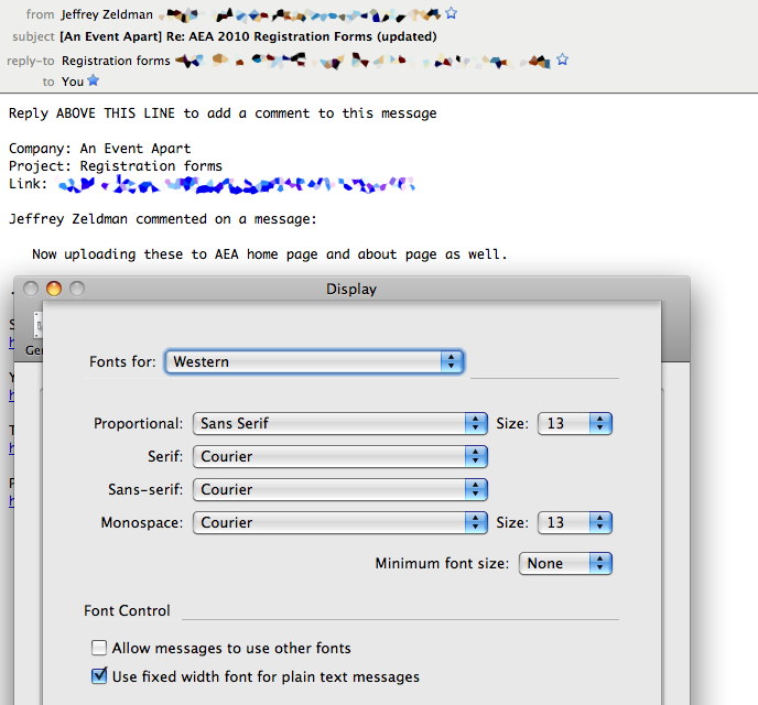
So I made sure “View > Message Body As” was still set to “Plain Text”, which it was. Then I went into the preferences and messed around for a bit. Eventually I set every font setting I could in “Preferences… > Display > Formatting > Advanced…” to be Courier and have a size of 13, and also to make sure that “Allow messages to use other fonts” was not checked. All this was done, and Thunderbird relaunched to make sure the preferences stuck. They did, and most of my mail was displayed as I intended. And yet a number of messages, such as those generated by Basecamp, were still displaying in this new, thoroughly unwanted font.
At first I thought it was happening with any HTML mail, but after viewing source on a bunch of messages (using command-U, same as in any Gecko browser) that didn’t seem to be true. I Googled about and came across a post on Daniel Glazman’s blog which decried the problem in terms very similar to those I’d have used. Unfortunately, all the comments on the post told me was that the interloping font is Menlo, that this was a deliberate decision by the Thunderbird team, and that they didn’t seem to understand why anyone might be annoyed as hell to have their font settings changed out from under them with no apparent recourse. What they didn’t tell me was how to fix the problem.
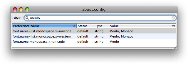
Eventually, I tweeted a complaint—you know, the way you do—and Bryan Watson got me pointed in the right direction. Something just told me that if I dug around in the hidden preferences, I’d find what I needed. So I went to “Preferences… > Advanced > Config Editor…” and searched for “Menlo”. I got three hits, and it suddenly became clear what was happening: Menlo was being used for Unicode-based mail. Further, it would seem, the GUI options in “Preferences… > Display > Formatting” don’t affect the settings for Unicode mail. For whatever reason.
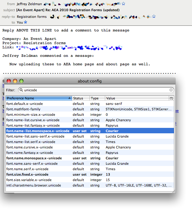
So I ran a new search in the Config Editor, this time for “unicode”. That got me several results, but it also got me what I needed: the settings for both the font face and the font size used to display monospace and “fixed” type in Unicode mail.
Accordingly, I changed three lines in the Config Editor—the ones in the screenshot which are boldfaced and have a “user set” value for the “Status” column—and with that, my mail was displayed the way I wanted it, which is to say the way it had been displayed for years, which is to say the way it would have continued to have been displayed if Thunderbird hadn’t silently changed the settings on me and then refused to honor my reasserted preferences.
If you’ve encountered a similar problem, now you can do what I did and hopefully avoid some of the annoyance I experienced in trying to get my mail client to behave properly.
[Update 8 Jul 10: Mook wrote in to point out where this setting is buried in the preferences UI, for those who might want to set it without diving into the Config Editor. Thanks, Mook!]
I’m also really rather annoyed that Thunderbird can’t seem to remember that I don’t ever want to see the Message Pane, but that’s a reported bug and I only hope that they fix it sooner rather than later.
Translations
- German courtesy Andreas Beraz
Comments (21)
Is that the same as Preferences -> Display -> Formatting -> Advanced… -> Fonts for: Other Languages -> Monospace ?
Mook: looks like it is, actually, or at least part of the solution! Nice of it to be so buried. Thanks for contributing—now your comment will serve as another path to the same solution.
Truly I understand the bother… what I cannot fathom is how anyone can fancy Courier in the first place – or that anyone wouldn’t consider Menlo a drastic improvement. All shapes and sizes, I guess…
Aristotle, you’ll note that I didn’t denigrate Menlo or other people’s font preferences in my post, but hey, thanks for bringing some condescension to the comments. That’s always awesome.
Eric, the razor-sharp comeback gave me a nice chuckle. And while Aristotle was totally off-base, I am genuinely curious as to why you prefer Courier over the myriad other monospaced fonts out there. Does it just has a special place in your heart, or is it something more?
And lest I’ve put myself on the chopping block, there’s no hate for Courier here. I just enjoy hearing people’s opinions on their typographical choices. At least, when they’re deliberate choices…
Thanks for writing this, Eric! Some of my e-mail messages looked very different and I couldn’t immediately figure out why.
I actually don’t have a huge problem when program updates change an old default setting to a new one, like when Firefox introduced the Awesome bar and extended the history settings. But in that case, I liked that it was part of the update information that that was happening. This new font was stealthy and confused me.
I was genuinely stunned and would have liked to hear what there is to like about Courier (if it can be articulated). My bad.
I can understand why you’re choosing not to use Menlo, since I don’t like it either, but why Courier? Monaco is a far nicer looking font.
Thanks for posting this, Eric. I have a sort of lukewarm relationship with Thunderbird and the way it deals with font preferences, as well. The one that bothers me is that I prefer to send text/plain e-mail messages but can’t understand why Thunderbird insists on forcing me to compose those messages in a monospaced font. text/plain should not have to equate to monospaced for either display or composition (for legibility) but Thunderbird seems to think otherwise… and seems to think that how I choose to display messages should be used for how I choose to compose them, and offers no control unique to the latter.
I know it wasn’t the point of your post, but I’m with Jeff Byrnes and his comment above: I’m always curious to hear why people choose the monospaced typefaces they prefer, particularly when they are conscious choices. As a software and Web application developer, I spend a big portion of my work hours (at least those when I’m awake) rooting around in development environments and editors with text displayed in a monospaced typeface and the legibility of same is crucial to me. (And ironically, I work with several individuals who claim they can’t tell the difference between Verdana and Arial, but I’m close to deciding they may just be saying that to irk me.) I’m a fan of Inconsolata (but wish it had other weights and styles) and Anonymous Pro; I prefer Menlo over Monaco; I prefer drinking salted lukewarm Florida tapwater to Courier in any of its various incarnations.
I don’t have any problem with people asking about my font preferences, of course. Dismissing them, yes; inquiring, no.
I believe a lot of my preference for Courier is simple familiarity: I’ve been using it for close to two decades now, primarily in e-mail clients, from back when it was the only option and, after that, when it was the only halfway-decent option. (To my eyes.)
So, to me, Courier says “e-mail”, and—here’s the crucial bit—immediately puts me in that mental context. I fiddle a bit with the size every second or third year, and actually have slightly different sizes in my two e-mail clients (Thunderbird and Eudora), but the face stays the same. The font essentially acts as a configuration file for my brain. I see it, and I subconsciously know I’m doing e-mail. I don’t have to explicitly think about it. I just context-switch based on the font.
Similarly, Monaco 9 says “code editor”, since that’s what I use in BBEdit. It works really well for me there, but I would dislike it in my e-mail client—and the obverse obviously applies. Again, when I open a window and see that font, my brain orients itself to that context.
Amusingly, I actually really like (and use for code samples here on meyerweb) Andale Mono—but, again, I would not want it in those other environments, because it doesn’t say “e-mail” or “code editor” to me. And while I could force myself through an extended period of retraining by, say, switching everything to Monaco, why would I bother? What I have set up works, and works well, and serves me quite nicely. I like it. I’m glad I can still have it.
Ah, thanks for the additional insight there, Eric. Interesting idea of using different faces for different contexts as part of the mental scaffolding for switching gears. For me, the visual consistency across applications where I use monospaced faces is something I value, so I tend to find something that works for me and use it everywhere to avoid the mental “ugh” of things that look different… just one of my many idiosyncrasies, those same typeface-blind co-workers would tell you.
I think my own dislike of Courier goes back in large part to how badly rendered it was on early versions of Windows particularly at small sizes, yet it was the only widely available monospaced face. Andale Mono was such a breath of fresh air when it was released as part of Microsoft’s Web Fonts package… I leaped at the chance to ditch the Courier I always disliked and I’ve never gone back, despite the fact that I now work primarily on Macs and Linux boxes where Courier is admittedly better than it used to be, but still nowhere near as appealing or legible to me as the other readily available choices for a monospaced face.
Eric, very cool explanation, thanks!
I like it how from fixing font display issue the subject went on another road, about Eric’s font preferences. Great explanation though, the reading of this day. :)
Thank you for finding this. I’m a PC user, but it’s largely the same (except that my version of Thunderbird doesn’t seem to have a Fonts > Other Languages) setting. Anyway, I was delighted to get rid of the Unicode font it imposed and go back to Courier New.
As for “why Courier” — I’m middle-aged, I grew up with typewriters and still like the look. Even Courier New doesn’t look EXACTLY right to me, but it’s close enough.
Thanks for helping me solve this hard problem. It is why I delayed upgrading to 3.1 on my Laptop because of the font change when upgraded T-bird on my desktop.
I wanted to go back to Courier New because the default font I had “Consolas” looked like a bad dot-matrix print out on my screen. I didn’t use the advanced – other languages because I thought it would change all my settings to that. It was the Unicode setting messing me up
Thanks Eric, you’re one of the few people who talk sensibly about Thunderbird config issues. Can you tell me first which config entry deals with the message list font. Secondly, where is the explanation of all the config entries?
Thanks
Greg
Eric,
Have you given any study on how to fix the issue of CSS font-size in HTML formatted messages? Like the font family issue cited above, it would appear that Thunderbird also ignores CSS font-size among other declarations. Instead it appears to use the font size (or some multiple thereof) as it appears in Tools > Options > Display > Formatting.
If you know of anyway to make tbird honor font-size CSS settings in HTML messages (even if it means defining font-size inline with HTML), please let me know.
Thanks for what you do!
Sorry, Scott, I don’t have experience with HTML mail. My interaction with it mostly consists of configuring my email clients to only show me the plain-text alternative part of multipart mail, and to always reply in plain text regardless of the original mail’s format.
Unicode mail has always been a separate font setting (it’s “Other languages” in the GUI, confusingly) – I ran into this trying to increase my font sizes.
Like you, I vastly prefer Courier 10 Pitch to every other font. Thank you a thousand times for posting this thoughtful and easy to follow explanation, it’s been driving me mad for about a year.
9-2-2016 — My boss really wants Courier so I changed his in Thunderbird (he still has 3.1) but it is TOO light (he has very low vision problems). Is there any way to make the Courier bold? Thanks for your help. Elizabeth