Grid Inspection
Published 9 years, 2 months pastI said yesterday I would write up the process of adding Grid to meyerweb, and I did. I started it last night and I finished it this morning, and when I was done with the first draft I discovered I’d written almost four thousand words.
So I pitched it to an online magazine, and they accepted, so it should be ready in the next couple of weeks. Probably not long after Chrome ships its Grid implementation into public release, in fact. I’ll certainly share the news when it’s available.
In the meantime, you can inspect live grids for yourself, whether here or at Grid by Example or The Experimental Layout Lab of Jen Simmons or wherever else. All you need is Firefox 52, though Firefox Nightly is recommended for reasons I’ll get to in a bit.
In Firefox 52, if you inspect an element that has display: grid assigned to it, you’ll get a little waffle icon in the inspector, like so:

Click it, and Firefox will draw the grid lines on the page for you in a lovely shade of purple. It will even fill in grid gaps (which are a thing) with a crosshatch-y pattern. It’s a quick way to visualize what the grid’s template values are creating.
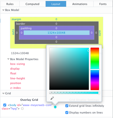
If you have Firefox Nightly, there’s an even more powerful tool at your disposal. First, go into the inspector’s settings, and make sure “Enable layout panel” is checked. You may or may not have to restart the browser at this point — I did, but YEMV — but once it’s up and running, there will be a “Layout” panel to go with the other panels on the right side of the Inspector. There you get the box model stuff, as well as a checklist of grids on the current page.

For each grid on the page — not just the element you’re inspecting — you can set your own color for the gridlines, though those color choices do not currently persist, even across page reloads. You can also turn on number labels for the grid lines, which are currently tiny and black no matter what you do. And if you allow grid lines to extend into infinity, you can turn the page into a blizzard of multicolored lines, assuming there are several grids present.
This panel is very much in its infancy, so we can expect future enhancements. Things like color persistence and better grid line labels are already on the to-do list, I’m told, as well as several more ambitious features. Even as it is, I find it valuable in constructing new grids and diagnosing the situation when things go sideways. (Occasionally, literally sideways: I was playing with writing-mode in grid contexts today.)
There’s another, possibly simpler, way to enable the Layout panel, which I learned about courtesy Andrei Petcu. You type about:config into the URL bar, then enter layoutview into the search field. Double-click “devtools.layoutview.enabled” to set it to “true”, and it will be ready to go. Thanks, Andrei!
So go ahead — inspect those grids!
Comments (2)
Pingback ::
[DigitalScholarship] [webdev] Web Design Update: March 16, 2017 | statisticssources
[…] http://meyerweb.com/eric/thoughts/2017/03/08/grid-inspection/ […]
Pingback ::
[DigitalScholarship] [webdev] Web Design Update: March 16, 2017 – educatorgold
[…] http://meyerweb.com/eric/thoughts/2017/03/08/grid-inspection/ […]