Welcome to the Grid
Published 8 years, 4 months pastGrid is public. It’s live right now in the latest Firefox release, Firefox 52.
It will similarly be live in the next public Chrome release, due in the next week or so.
It’s here. I almost can’t believe it.
For well more than a decade now, when asked what CSS needs more than anything, I’ve said it needs real, actual layout. “A layout-shaped hole at its heart” is a phrase I may have used a fair few times.
Rachel Andrew had a great article last week about “Learning CSS Grid Layout”, which charts a sensible course for getting used to grid. It also busted a few myths about grid. I recommend it highly.
There’s one more myth I’d like to do my best to bust, which I’ll summarize as a comment I’ve seen many times: “Ugh, tables again?”
The underlying assumption here is: grids are just tables with a new syntax. This is entirely untrue.
I mean, yes, you can recreate 1990s-era table-based layout techniques with grid, in much the same way you can recreate the submit button with two JS libraries and a complex front-end framework. The ability to do it doesn’t necessarily make it a good idea.
(Though you might, from time to time, find the ability useful. Here’s what I mean: you can take a bunch of data contained in arbitrary markup someone else is producing, and lay it out in a tabular format. It would be far preferable to have the data in actual table markup, but if that’s not an option, grid will give you a potential solution.)
I have an example of just one way grids are different than tables. I just last Friday finished writing the last chapter of CSS: The Definitive Guide, 4th Edition, covering filters, blending, clipping, and masking. (I finished the grid chapter late last year, so it’s already available in the early-access title.) Almost all the figures in the book were created by building HTML+CSS pages, and taking high-resolution screen captures with Firefox’s screenshot command. Here’s one.
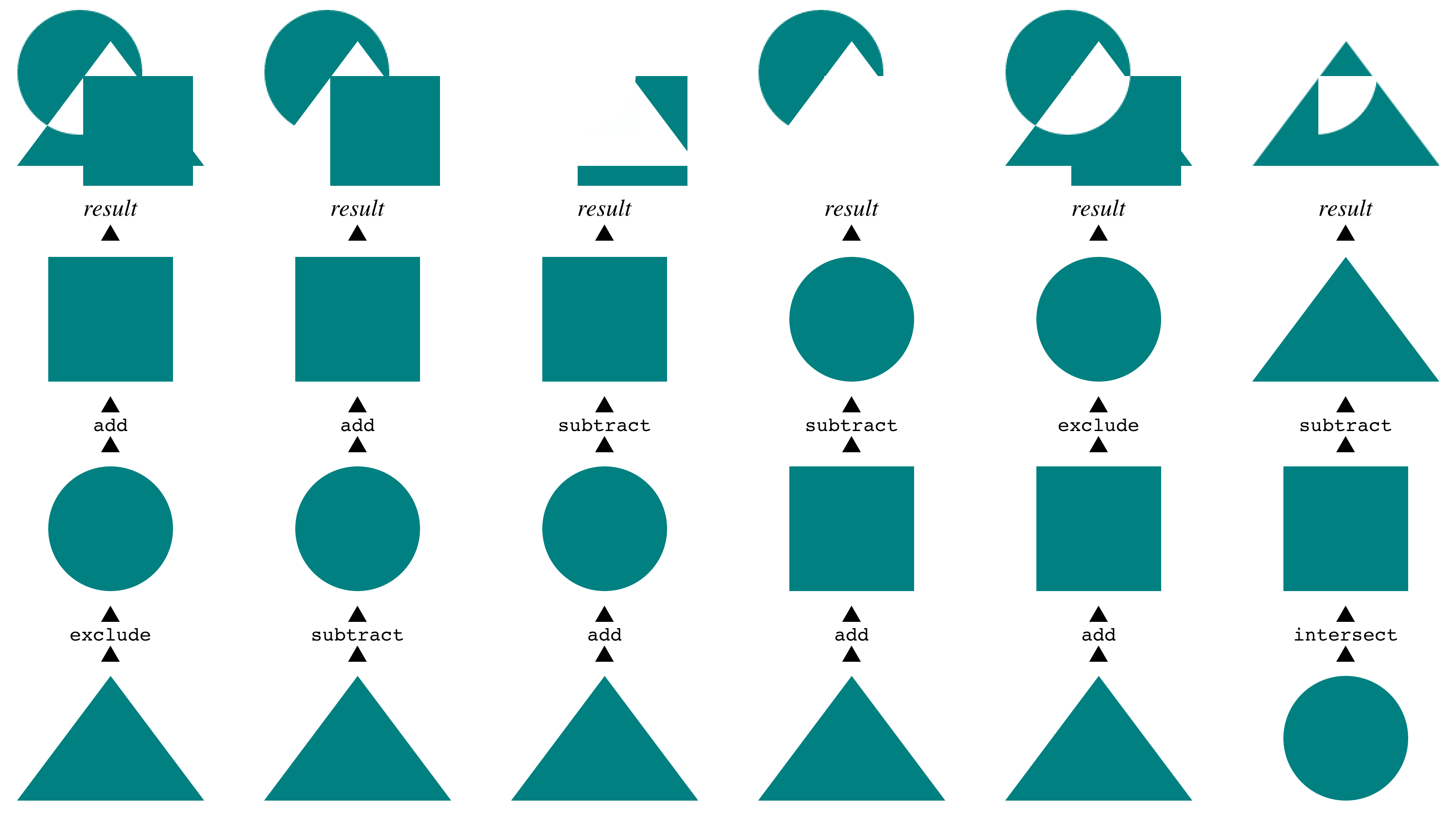
The way these are displayed is actually the inverse of their source order. I wanted them to be in document source such that the compositing steps were in chronological order, so that’s how I wrote them. Once I laid them out that way in the figure, using grid, I realized it made more sense to arrange them visually, with the bottom layer at the bottom of the figure, the next above that, all leading up to the result at the top.
So I just rearranged them on the grid, by assigning grid row numbers. The document source wasn’t touched. A bit simplified, the CSS to do that looked something like this:
ol li:nth-child(1) {grid-row: 4;}
ol li:nth-child(2) {grid-row: 3;}
ol li:nth-child(3) {grid-row: 2;}
ol li:nth-child(4) {grid-row: 1;}
Because the compositing examples (the “columns” in the layout) were represented as ordered lists, with the grid set up to place each image with some captioning, I could just change their order. So yes, it looks like a table, but the underlying structure is anything but table-like. Just to get each column of examples grouped together with tables, I’d have to nest tables, or accept a one-row table with each cell containing some other structure. Rearranging the columns would mean doing markup surgery, instead of just reassigning their layout placement via CSS.
Instead, I was able to represent the content in the best available structure (ordered lists) and then arrange them on a grid in the best way I could visually. For that matter, I could responsively change the layout from a six-column grid to a three-column grid to un-gridded lists as the viewport got more and more narrow. As, in fact, I did — check it out. If you make the window narrow enough, Grid is dropped entirely so you can see the base structure and content.
This ability to place grid items without respect to source order is a powerful tool, and like all powerful tools it can be used for good or ill. It’s possible to assemble a visually usable layout out of the most inaccessible, horrible markup structures imaginable. It’s also possible to assemble a visually usable layout from clean, accessible markup in ways we’ve never even dared dream.
Combine grids with other CSS features, and you can really create art. Jen Simmmons has a layout lab site, and her 2016 main-page design is… well, go see it in a grid-capable browser, like today’s release of Firefox. Realize it’s all text, no images, no scripting. Just markup and style.
And the style is remarkably simple for what’s being accomplished. It’s not too alien a syntax, but it will likely take some time to adjust to using it. It’s taken me some time, as I’ve experimented and written about it. Unlearning my float habits has taken some work, and I don’t know that I’m completely done. I do know that it’s been worth it many times over.
I’ve done a few experiments with the layout of a local copy of meyerweb, and done some frankly goofy things to the design along the way. I’m hoping to convert what’s up here to a simple grid layout in the next few days, make it a slightly more complex grid shortly after that, and then maybe — maybe — actually do some redesigning for the first time in over a decade, to take advantage of grid more fully. Jen has a great six-minute video exploring a few features of grid and the grid inspection tool now built into Firefox, which I recommend to anyone curious to know more.
So if you’re thinking of grid as tables 2.0, please, stop. Table-style layouts are the first one percent of what grid offers. There are works of art and undiscovered techniques waiting in the other 99 percent.
Comments (6)
Update: I converted meyerweb to a simple grid layout this morning. It took about 5 minutes to write the grid code, and 15 minutes to troubleshoot interactions between the grid code and the old layout code. I plan to write up the process tonight or tomorrow, so stay tuned!
I hope clients don’t quote your comment on the speed of production. No bills would be paid. Have you considered a re-design Eric? I mean, seriously, the CSS god author with this uglified (sic) site? I don’t get it. I never have. I’m not trying to be a troll, but hire a designer! Look at the iterations of css-tricks.com — not always 5 stars, but always exciting!
Hey Daniel, no trolling assumed. I know it isn’t a knock-your-eyes-out visual experience, but I prefer minimalist presentation for the most part. I may redesign in the near-ish future, but I doubt it will be a massive change, because to me, the content is central and too much adornment distracts from that. Look at it this way: I was rocking a proto-Medium aesthetic years before Medium existed! And, since I stole most of the design from Khoi Vinh, I not only imitated a designer, but I also became an artist.
Now all the browser companies have to implement this awesome grid feature …. hurry up guys :-)
Chrome 57 did a surprise release yesterday, and has Grid enabled!
Safari also supports it . So is IE n Edge but they support v0 of the spec and not v1