Playing For Position
Web Review
February 1998
Tables and frames have been long used to create certain page layout effects. With the continuing evolution of the Cascading Style Sheets standard, however, it will be possible to create the same effects without the use of either tables or frames. In a "sneak preview," Web Review's CSS guru Eric Meyer explores CSS positioning and how it might be used in future Web design.
One of the most powerful sets of new features in Cascading Style Sheets, level 2 (CSS2) is found in the section on positioning. Although this section isn't terribly well supported yet, it is the one area of CSS2 which both Netscape and Microsoft are striving to include in their browsers, and with good reason. Using the positioning properties, you can shift any element from where it would normally appear on the page and put it somewhere else. Where, exactly? As we'll see, that depends on what kind of positioning you use.
By the way, each of the example graphics in this article will have a browser icon in the lower-right corner. This indicates which browser I used to generate the screenshots on my Macintosh (yes, some of us do still use them). None of the effects shown in the screenshots were retouched, so these are all things you can try on your own-- assuming you have the right browser.
The Positioning We Already Know
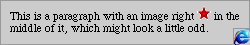
Actually, many of you have been using positioning for a while, quite possibly without realizing it. Floating images are a kind of positioned element. Consider, for a moment: you have a paragraph with an image tag right in the middle of it, like this:
<P>
This is a paragraph with an image right <IMG SRC="star.gif">
in the middle of it, which might look a little odd.
</P>
Now we add the attribute align="left" to the IMG tag, and get this instead:
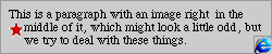
The image has been removed from its normal place in the document's flow, where it appeared in the first example, and has been placed somewhere else, as in the second example. The fact that the text flows around it is due to the browser's handling of floated images, and in a sense this represents a secondary form of positioning. The lines of text are shifted from their normal position into a new one, thus preventing the text and image from overlapping.
In CSS1, it became possible to float any element, not just images. All the same rules applied in these cases-- if you floated one paragraph, the following elements flowed around it (assuming a browser that could do such things). Now, in CSS2, we can do more than float: we can position any element at all, either in reference to its usual position or with respect to the browser window itself.
Before we get to actual positioning, though, there are some basics to work through, not to mention a bunch of new properties to get to know.
Building Blocks
As you're no doubt aware, every element has a content box, padding, borders, and margins. (If you weren't aware of this, take a quick look at last month's article, "Styling Inside the Box.") Altogether, these components are termed the containing block. Every element in HTML has one, whether it be text, an image, or a form input. Another term often used to describe the edges of the containing block are the outer edges (beyond the margins) of the element's box.
In normal document layout, the position of each containing block affects the position of all the other containing blocks in the document. This only makes sense, of course. Without some way to calculate the dimensions of each containing block, the browser wouldn't know where to put paragraphs. The beginning position and height of the first paragraph affect where the second paragraph will start, and the second paragraph's height determines where the third will start, and so on.
Until now, the only way to affect the position of a containing block was to float an image, or to constrain it within a table. Neither approach was guaranteed, of course; floats are calculated by the browser, as are the heights and widths of table cells. With positioning, however, we can exercise more control over where content is displayed.
In order to do so, we need properties which express the position of the outer edges of the containing block. They are, appropriately enough, top, right, bottom, and left. Each of these properties can take length and percentage values, as well as the default value of auto. None of these properties are inherited, and can be applied to any element. These are each used to shift the respective sides of the containing block from where they would normally appear. How they do so depends on the type of positioning which is being used, and we'll deal with each in its turn.
At this point, we need to discuss position, which is the property by which we actually accomplish the positioning. There are four values: normal, relative, absolute, and fixed. normal is the default, and it merely means that the containing block is calculated as it would normally be done. Not much else there, really, but let's take a little extra time to explore each of the other three.
Relative Positioning
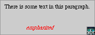
As the name implies, this sort of positioning is done relative to the normal position of the containing block. It works fairly simply. Let's say we want to shift emphasized text upward six pixels and three pixels to the left. (Don't ask why, just work with me here.) We'll also color it red, to make it easier to see. To accomplish this, we might declare:
<STYLE type="text/css">
EM {color: red; position: relative; top: -3px; left: -6px;}
</STYLE>
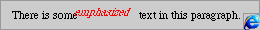
Each 'box' of emphasized text is shifted in relation to its default position. As you can see, the text is almost overlapping, which makes it a little hard to read. This is perfectly normal behavior. The way relative positioning works is that the document's layout is calculated normally, and then any relatively positioned elements are shifted from wherever they were originally placed to their new location. However, other elements are not shifted to account for the positioning. Thus the danger of overlapping.
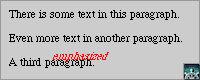
The other consequence of this is that the space which the relatively positioned element vacates stays right there. Let's modify our last example to really displace the emphasized text: EM {position: relative; top: 20px;} This will have the following effect:
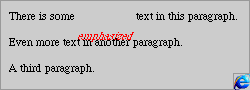
Note the blank space where the emphasized text would have been. Again, the text surrounding the positioned element's original location is not moved. This is in contrast to the next kind of positioning...
Absolute Positioning
Despite what it sounds like, absolute positioning is really a sort of relative positioning. The difference lies in which position it's positioned in relation to. Relative positioning is done in relation to the initial position of the positioned element, whereas absolute positioning is done in relation to the position of the containing block of another element. In many cases, absolute positioning will be done with respect to the document itself, but as we'll see, this is not always the case.
Let's take the simplest case first, however. Instead of moving the emphasized text relatively, let's do it absolutely. We modify our previous example to this:
<STYLE type="text/css">
EM {color: red; position: absolute; top: 50px; left: 50px;}
</STYLE>
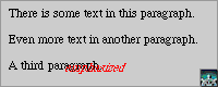
All right, there are three things to examine here. The first is that the top left corner of the emphasized text is 50 pixels down and 50 pixels to the right of the top left corner of the document. The text may look like it's anchored to the browser window, but this is not actually the case. If you were to scroll the document, the absolutely positioned text would scroll right along with it. Its position is in relation to the document's coordinate space, not the browser window's.
The second thing is to point out that as with relatively positioned elements, an absolutely positioned element will overlap other elements. If we add more text to the example, you can see this very clearly:
Part of this point is that absolutely positioned elements lose their margins. They are instead positioned using the border as the outer edge of the element's box, just as if you had declared margin: 0;. It doesn't matter what you do or don't declare for the margin of an absolutely positioned element-- it simply won't have any.
This leads us to the third point of this example, which is that the space which the absolutely positioned element vacates is removed. In other words, the parent element is rearranged to eliminate any blank space that may have resulted from the positioning of the element. Take another look at the example. The containing paragraph has closed up so it reads "There is some text in this paragraph."
Now that we have those basics down, let's move on to the second part of the article, where we'll see some interesting ways to combine types of positioning, and why you may never need to use the FRAME tag again...
Combination Plays
Thus far, we've shown absolute positioning being done with respect to the upper left corner of the document. This need not always be the case. The CSS2 specification states that if any element is relatively positioned, it establishes a new containing block for any descendent elements. If any of these elements are absolutely positioned, they are placed with regard to the containing block of the relatively positioned element.
So let's change our example a little. The paragraph containing the emphasized text now looks like this:
<P style="position: relative;">
There is some <EM>emphasized</EM> text in this paragraph.
</P>
Notice that the position of the emphasized text has changed from the previous example. That's because it's now 50 pixels down and to the left of the upper left corner of the paragraph which starts with "There is some..." Also, the position of the containing paragraph doesn't change, because although it's been set to a relative position, it hasn't been moved in any way.
This particular effect can be employed in some pretty nifty ways. For example, let's assume we want to show where there are changes to some text by putting two red asterisks in the left margin of the paragraph. Floating them doesn't work, because they'll appear to the left of the line after the changes, not right next to it. So instead we do this:
<P style="position: relative; margin-left: 2em;">
Any place a change has been made, two red asterisks
will appear to the left of the line where the changes
start.  For example, there is such a marker to the left
of the line containing <SPAN style="position: absolute;
top: auto; left: 0px; color: red;">**</SPAN>
THESE WORDS.
</P>
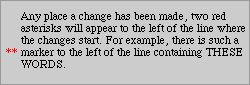
Pretty nifty, eh? Remember, though, that without the position: relative; declaration on the paragraph, the asterisks would be positioned with respect to the document, no matter where the change might have occurred... so you'd have your asterisks somewhere near the top left corner of the document. (Also, see the sidebar which explains the lack of a browser icon in that last screenshot.)
Frames? What Frames?
Now it's time for our last subject: fixed positioning. The only problem here is that neither major browser is far enough along intheir CSS suppor to recreate the effects I describe in this section... so, no screenshots. You'll have to rely on your imagination, I'm afraid.
Remember how I said that absolute positioning is done with regard to the document (or a parent element), and not with respect to the browser window? Well, fixed positioning is done with respect to the browser window. Think frames. It's exactly the same sort of effect, although you'll have to be a little more careful with fixed positioning.
In fixed positioning, the properties height, width, top, right, bottom, and left are all declared in relation to the browser window. So let's say we have a three-frame page which is laid out like this (using a table to illustrate the layout):
| Top (a toolbar?) | |
| The left side bar |
The main content of the document goes here |
Were we to use frame markup, we'd have to define a frameset page, and then create three other pages just to hold the content for each frame, plus include the content from all three pages in a NOFRAMES tag so that older browsers can still use the page. Messy. It seems like a much better idea to simply put all the content on one page and use positioning to arrange the content, doesn't it? Let's do that thing.
First, we take the content and divide it into three sections like this:
<DIV ID="top"> ..... </DIV>
<DIV ID="left"> ..... </DIV>
<DIV ID="main"> ..... </DIV>
Then we declare the following:
<STYLE type="text/css">
#top {position: fixed;
      top: 0; left: 0; right: 0; bottom: auto;
      width: 100%; height: 100px;}
#left {position: fixed;
       top: 100px; left: 0; right: auto; bottom: 0;
       width: 20%; height: auto;}
#main {position: fixed;
       top: 100px; left: auto; right: 0; bottom: 0;
       width: auto; height: auto;}
</STYLE>
We could also set background colors, border styles, and so forth for each of these sections, but let's leave those out for the sake of clarity. What happens here?
First, #top is positioned. top, left, and right are set to zero, and the width is 100% so the block will go to those edges of the browser window. bottom is set to auto, its position to be determined by the height of the block (100px).
Next, #left is set. Its top is placed 100 pixels from the top of the browser window, whereas its bottom is at the very bottom of the window and its left edge against the left side of the window. The right side is automatically set, based on the width, which is 20%. Finally, the height is left to the browser to determine, based on the positions of the top and bottom of the block.
Last but certainly not least, #main is created. Again, the top edge is set to 100px, in order to avoid overlapping #top. The right an bottom edges are pinned to their respective window sides, and the left edge, height, and width of the block are calculated automatically by the browser. Et voila! A frame-type layout without the use of any frames!
A natural question is, "Why did we have to position #main? Couldn't it have been left to be calculated completely automatically?" The simple answer is, "no." Why not? Because if we had done so, the contents of that DIV would have started in the upper left corner of the browser window, overlapping both #top and #left. Remember, elements which are positioned in this way don't cause other elements to flow around them, and they're positioned from the borders, not the outer edges: they have no margins.
In order to ensure that you can see all of the content of a box, though, you might have to set it to use a scrollbar. The browser probably won't do this on its own, so you'll need to use the property visibility. There are four values for this property. The default is visible, which means that the box is expanded as far as possible to show the content. You can also declare visibility: hidden;, which means that any content which goes beyond the boundaries of the box is not displayed, and there is no way to retrieve it. The most likely value is scroll, which has the browser use a scrollbar, when necessary, to allow the user to move through the box's content; however, with this value the scrollbar will always be there, whether or not it's needed. Finally, there is auto, which lets the browser do what it judges best.
Therefore, you'd probably want to modify the above example so that it has the following declaration:
#main {position: fixed;
       top: 100px; left: auto; right: 0; bottom: 0;
       width: auto; height: auto; visibility: scroll;}
You might also want to set visibility: auto; on the other divisions just in case, or not. It's pretty much up to you.
Another use for fixed-position elements is they'll appear on every page of a printout (or other paged media). So if you wanted to affix a graphic of your company's logo in the top right corner of every page, you could use fixed positioning to put it there.
A Bright Shining...
Whether we can finish the title of this last section with "Promise" or "Lie" will depend entirely on those who create Web browsers for us. The specification allows for very rich and complex layouts, without sacrificing content or structure of the base document. Both Microsoft and Netscape have partial implementations of positioning, and with any luck they'll get better at it. As usual, we can only hope that their implementation agree well enough to use the properties in real-world Web authoring. If they do, authors everywhere will have a powerful tool at their disposal.