Inaccessible Accessiblity Information
Published 23 years, 7 months pastRemember the flap, back in April, when the Section 508 site‘s markup didn’t validate? Guess what: it still doesn’t, but that’s not what I’m here to talk about. I just found, thanks to a co-worker, a story almost as good. It involves Microsoft’s Accessibility page. Think it’s accessible, let alone legible in anything other than Explorer? Hah!
Given my employer, I thought about taking a pass, but you know what? To heck with it. I’d be taking Microsoft to task over this if I worked for myself, so I’m going to do it now. So here’s the deal: go to the page using a Gecko-based browser like Mozilla. Or use Opera, which has its own display problems, but which aren’t the ones I’m about to describe.
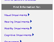
 Okay, take a look at the links on the right side of the page. Nice. Even someone with my eyesight can’t read that text without major squinting. I suppose there’s a witty remark to be made about forcing the user to squint at a link to a page on “Visual Impairments,” but in a rare display of moderate taste, I’m not going to make it. Now look at the left rail. A few of the links, and all of the search area, are completely gone (you may have to compare the page in Explorer to see what I mean). They’ve been pushed out of the top of the left rail.
Are these display errors due to bugs in Gecko? No. They’re due to sloppy authoring practices made possible by bugs in Explorer. To wit:
- The teensy link text is due to the site’s use of
font-size: x-smallfor the table that encloses the links. IE thinksx-smallis one “step” below the user’s default font, when in fact it’s two “steps.” To give some rough approximations, IE thinks it’s 80% normal whereas it should be 60% normal. (Those percentages are close to reality, but remember that CSS doesn’t define how big or small the keywords should be.) Changing the value tosmallgets you a decent display in Gecko, but of course the text gets bigger in IE, which thinks thatsmallis the same size as the user’s text. As opposed to, say,medium, which is clearly defined to be the same size as unstyled text. Todd Fahrner has written about this topic far better than I ever could; see “Toward a standard font size interval system” and “Size Matters” for details and good advice. - The cut-off links and search area are due to stupid table tricks. The entire left rail is a single table cell with a bunch of stuff inside it—no great surprise there. But how does Microsoft try to get the content of the rail up against the top of the cell? By sticking in a table with a height of 100% below the rest of the cell’s contents. IE assumes that if an element is too tall, then it should be resized. Gecko, on the other hand, properly calculates the height of this table to be equal to the height of the entire left rail. So you have a table as tall as the whole rail, and then more content above it, and all of it is vertically centered in the rail… which means the visible content gets pushed out of the cell. The fix? What most any Web designer would have done in the first place: add
valign="top"to the rail’s cell.
In addition, the page’s markup comes nowhere close to validating (of course!) and is composed of so many convoluted, nested tables, spacer GIFs, and font tags that I shudder to contemplate what a screen reader, or a text-mode browser, might end up displaying.
It’s not like these particular authoring errors were difficult to spot, or even to fix. Tracking down the source of the problems and fixing them took me about 20 minutes, tops. I think I’ve spent more time writing and editing this rant than I did on the diagnosis and testing of the fixes described above. Of course, there are doubtless other problems on the page, but if so they weren’t immediately obvious—and as much as I’d love to spend my days fixing obvious authoring mistakes for other people, I only have 50 or 60 more years to live. I hate to start a project when I know I can’t finish it.
What is it about accessibility sites that brings out the absolute worst in the Web and its authors?