The Font of Frustration
Published 23 years, 3 weeks pastI’m still wrestling with the entire issue of fonts and font sizing. A lot of this arises from a meyerweb redesign on which I’ve been occasionally working for the last few weeks. My last redesign switched font styling from the user default to 11-pixel Verdana. This is not a choice without its detractors; apparently I’ve earned the nickname “Mr. Microfonts” in some circles. It’s also a choice I made knowing full well its benefits and drawbacks.

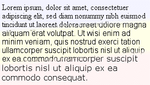
When I decided to go to a sans-serif font, it became almost mandatory to crank down the size. Take a look at the accompanying image, which shows a comparison of the default-size text in IE5/Mac in Times New Roman, Arial, and Verdana. To produce the text, all I did was set the font family, not the size. They’re all effectively at font-size: 1em;, which given the browser’s default setting is the same as if I’d set them all to font-size: 16px;. The same size value but a changing family means huge differences in the text’s appearance. This is why font-size-adjust was invented, by the way. Too bad only Mozilla for Windows supports it. The lack of cross-browser implementation led to its removal from the CSS 2.1 Working Draft.
Nonetheless, when I started fiddling with the new design—which is more an evolutionary change than a revolutionary makeover, so don’t get too excited—I decided to see if I could go back to the user-default approach and still be happy with the result. I think I’ve managed it, but what’s been interesting to me has been how that choice has influenced the entire design process. What I have now is something that I think works well with a serif font, but if I were to switch to a sans-serif font, I’d have to change other things as well. More proof of the fundamental importance of text styling, as if any more were needed. Those of you who went to design school have known this for years, I suppose. Nothing I studied in the pursuit of my B.A. in History really taught me the importance of typography.
Speaking of redesigns, Scott Andrew just launched one, and I really like it. There are some interesting behaviors at my default window size, which is apparently smaller than his, but overall my thumbs are up. The warm tones and nice use of sunflowers make a nice antidote to the recent trend of minimalist white-backed redesigns, which are all fine but were starting to get a bit monotonous.
Looking over Scott’s new design, I realized how much I envy people who can come up with attractive color combinations; all my designs tend to be monochromatic variations (gee, really?). People like me need EasyRGB‘s Color Harmonizer just to get started.