People and Places
Published 17 years, 9 months pastI don’t know about you, but I find the results of the People magazine cover Ericsperiment (thanks for the term, Bob!) to be quite interesting. The boiled-down version of the results is: just about everyone saw what I did, but nearly everyone drew the wrong conclusions about what I was saying. (What? I’ll explain.)
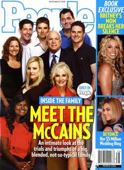
First, I want to address a couple of objections that were raised. The first was: “It’s just a family photograph”. No, it’s not. It’s a magazine cover shoot. Those things are planned, directed, and executed down to the tiniest detail. If you think it’s just a family portrait, you’re either being willfully obdurate or else completely ignoring the context. That’s a mistake, because context is everything. I’ve been involved in a few portrait sessions of no public reach whatsoever, and the photographer is always telling people where to stand or sit, adjusting the angle of people’s arms, getting them to fractionally tilt heads one way or the other, shifting people an inch or two, and so on. “Just a family photo” is when the magazine gets a real family photo, taken by an amateur using a consumer-grade camera during a vacation, and puts it on the cover in a white Polaroid-esque frame at a 15-degree angle.
The second was that the image is a Photoshop job, created either by assembling individual shots or altering a group photo. Maybe, maybe not; either way, Photoshopping or a lack thereof is completely irrelevant to my point. If it wasn’t Photoshopped, then the photographer is responsible for the arrangement of the shot; if it was, then it’s the Photoshopper who bears responsibility. Either way, someone arranged the shot, and did so very badly.
So here’s what I saw: “large group” and “outsider”. That was the immediate message. Look at the cover again, paying attention to where the faces are. There’s a blob of faces above the headline text, which is the group. Then there’s a face to the left of the headline text, which is the outsider.
This is completely independent of the race, color, gender, creed, etc. of the people in the photo. The visual message is “here’s a bunch of people, plus a hanger-on”. Not because of color, which is what most people assumed I was talking about (and more on that in a minute). Because of placement.
Though I think this unlikely, you may not quite be seeing it. In that case, imagine a cover image with nine faces in the same places, only they’re of religious deities. Or pop stars. Or CEOs. Or heads of state. Or conference speakers. Or browser-team leads; heck, even browser logos. Whichever it is, imagine your favorite of each group is in the lower-left position, with all the others up above. Feel good about that? Even neutral? Still think there’s no message being conveyed by that placement?
(And if you still aren’t seeing it, maybe a comparative example, courtesy George Butler, will provide some insight.)
Now, given that one of the people has been placed as an outsider, the natural next step is to wonder why they’ve been so placed. And here, there are obvious visual differences that jump right out: like being female, having darker skin, and being younger. Already primed to ask “Why is this person an outsider?” we can find apparent reasons, and in this case they’re touchy ones. If you know the background story of the family, then there’s a non-visual one as well: that she’s adopted.
But remember, I’m not saying Bridget (the young lady in that position) has been excluded for any of those reasons. I’m saying that having been given a visual cue that she is excluded, we look for reasons to explain that exclusion. That’s exactly what most of the people who responded to my post about the cover did. All those people saw it, consciously or otherwise, and responded to the message… and then took that next step, trying to find reasons to explain the message. Then, as per each individual’s feelings and experiences, they reacted, either accepting or rejecting what they thought I was saying. Interesting, though, that so many people came to the same conclusion about what they thought I was saying. That’s evidence of a strong message, whether or not said message was intended.
And that is the failure that occurred, one which I lay squarely at the doorstep of the magazine. I might also toss in a head-slap to the campaign, if they saw the image and gave approval to use it—such pre-approval is sometimes, but not always, an option. The problem with that composition should have been obvious from the outset, and avoided. That it wasn’t makes me wonder a number of things about the magazine. Taking a teenaged girl and putting her in the outsider spot? Seriously? How callous do you have to be to do that?
Oh, and special postscript to all the people who took the time to share their pitying sorrow over how “you Americans” are so race-aware: I know it’s a tragedy, but remember, we’re still a young country and have not had the same lengthy maturation time you’ve enjoyed. So please, try to remain patient with us while segregation, anti-immigrant violence, race riots, tribal warfare, and ethnic cleansing uniquely wrack our poor, blighted country, and continue to hope that one day we’ll join the rest of the world in the tranquil harmony that so characterizes your enlightened societies.
Comments (32)
Dang. Well said, dude.
Thank you for taking the time to pen this well-written follow-up. If you are attacked for it, I would wager the attack will be not nearly so well-written nor will it be as logical or factual.
I immediately saw what you saw and my eyes bugged out. The arrangement also guarantees that you are less likely to see the non-white girl when the magazine is on display in a rack. Anyone who doesn’t get it, after reading your followup, doesn’t want to.
I didn’t see it initially, but now that you mention it… it’s there.
Having been a magazine copyeditor, I can tell you two things immediately: the cover was *most likely* comp’ed in Photoshop, as it is the software of choice in most publishing houses. The comps are usually dropped into a PDF and sent to the printer when deemed OK.
An artist goofed, even though (technically) he/she was correct — from a positioning standpoint only. But from the standpoint you put out here, it was dead wrong.
So, to me, the fault lies with the editor — probably two or three editors to boot — who: a) didn’t catch this; b) didn’t even think to look for this; and c) saw this image time after time after time in the creative process and never saw anything possibly amiss.
When I was a magazine editor, we looked at every aspect of a cover shot and headline layout, imagined or not, to see if anything even potentially obtuse could be seen — and I worked in an area where things of similar nature were scrutinized by more than just the readers. We stopped a lot of covers, too (which also gets expensive!).
What gets me even more is that after 10 years out of the business, *I* didn’t catch it — which means that my eye is either getting lazy or out of practice.
Well put. It took a few seconds for it to sink in when you first posted it, but you are absolutely right. And, like Duncan pointed out before, her face is also no doubt obscured by the rack at the grocery checkout. Totally unfair, and it’s just impossible to come up with any potential best-case scenario behind the process of arranging, selecting, and approving that shot.
Though I’ve never worked in print magazine I like Will took a minute to see what you were getting at in your first post. Once I looked at the ‘grid’ for lack of a better word it was woefully obvious that someone fell below the fold (so to speak). And generally, whether web or print design, if you fall below the fold you are automatically given less significance.
As I’m sure the comments of your previous post and the content of this post point out, there are a number of reasons we can assume this young lady was positioned where she was. However, no matter what the actual reason (assuming there was one and it wasn’t just a gaffe) there is a clear delineation of the prominent or important people vs. the one who is less so.
Excellent follow up as Speednet mentioned.
See for yourself. The slightest of spaces make all the difference.
http://tinyurl.com/3nlh3e
Special postscript: tasty :)
George Butler – beautifully illustrated.
Ok, the placement sent a message. We in the more “enlightened societies” may read different messages into such picture placements, so “culture” clearly plays a role.
I wasn’t sure which message I should read into that picture since it appeared in a different culture, so found no reason to respond. “Race” doesn’t matter, but “placement” may – as George Butler has illustrated so well.
Your postscript is well placed though.
Some in my own culture shoot at long range (literally) because of the messages they read into what they think they see, or hear, or whatever, in pictures and elsewhere, and some have the attitude that the “misplaced should take their misplacement anywhere but here”.
“Anywhere but here” is what some in my culture call “tranquil harmony”, and they work hard at keeping it that way.
While there are some valid points brought up, it seems that no matter where Bridget was placed, she would have been the focus of this discussion: If she was where the lady farthest to the upper left, then she’s also “away from the family”; behind one of the men, “hiding her”; equal prominence with the other faces, “oh look there’s a black woman in that photo”. In all cases, including the one discussed, there is a no-win situation for composing this photo.
Of course, there are two sides: was there a “hidden agenda” by the magazine to leverage race, and how do YOU react to people with a different skin color than you? The first one is certainly a politically oriented issue, and people/groups/organizations wanting to make race an issue (when there is never a need to) will leverage devicive techniques to further their agenda. The second is a personal way to combat the first one, since I believe humans will ALWAYS notice the singular difference, regardless of what it is. Reaction-wise, it’s simple: either become outraged and further stir up the issue, or make the obvious mental observation and just move on.
If we’re truely talking about all aspects of this photo composition, it is terrible on other accounts as well:
– All the women are on the left, men on the right: why?
– There is an odd mixing of shirt colors (1 blue, 2 red, 2 white, 4 black): go uniform, or mix it all up.
– There is a very uncomfortable face-gap to the right of Mrs. McCain: this gap is as odd as placing someone in the supposed “outlier” position.
– Why is Mrs. McCain the foreground, making her the true focus of the image when Mr. McCain is the one running for President?
The photo is an ARTISTIC failure, however an EDITORIAL success because of the discussion being generated, and agendas are safely preserved (no one is being fired, certainly).
Since we’re analysing magazine covers and the media, can we also infuse a bit more balance in the views of editors at US magazine given the syrupy-sweet spin of one and shock spin of the other? Oops, did I just stir up an issue?
Oh, so she’s not just really short???
Try substituting her for one of the other heads though – you’ll see that suddenly the shot becomes all about her. So it’s almost understandable.
But George Butler shows it could have been fine so easily.
George, that’s fantastic. I’m going to link to it from within the article; is it okay with you if I host a local copy for future reference?
“So please, try to remain patient with us while segregation, anti-immigrant violence, race riots, tribal warfare, and ethnic cleansing uniquely wrack our poor, blighted country, and continue to hope that one day we”ll join the rest of the world in the tranquil harmony that so characterizes your enlightened societies.”
Whoa that’s a bit tough ;) !
I reacted to your last post saying something like “you Americans blah blah” … Maybe that was unclear, but I certainly did not say “We in France” … Actually, as everybody know since the 2005 riots, we have exactly the same problems here, of course. And I guess no-one got any answer either …
Nothing more to say… than well said. Way to look at the entire thing from a wide angle rather than with tunnel vision.
Oh and
p:last-childnice touch.I noticed the oddity the first time I’d walked through a grocery lane and saw the cover, and thought “That doesn’t seem right.” Granted, I couldn’t pin down exactly what seemed wrong about the picture other than the sort of knee jerk conclusions that make people uncomfortable (the combination of ethnicity and placement), but I think you summed it up brilliantly with the outsider connotation. Your example of browser or religious icons grouped in a similar fashion really help hit home the point.
@George Butler – Your slightly adjusted photo really visually emphasizes what a small difference does. I am surprised that nobody on a magazine staff couldn’t realize that something like this should be done when they were assembling the cover.
@kyle: considering the way publishing companies continue to let go of older workers in favor of less expensive younger, less experienced ones, I am not surprised at all.
But, there is an issue with the @George Butler’s altered photo, as well: all of a sudden, it’s not an authentic photo of the family! For where I am, no issue — and probably not for most; others in the media, ethics gurus, etc., will decry the lack of authenticity on the cover of a major publication, however.
I would have used a different photo.
Also, I’m surprised that McCain would even have that particular photo printed, with all of its undertones…
They like to mention her, but they never seem to have her around, which is rather telling.
I think the bigger problem with this cover for the campaign is their claims that Obama is a ‘celebrity,’ when they’re posing for the cover of freaking People magazine. Gimme a break.
thanks, eric, for raising this issue. i agree that someone screwed up big time (hard to believe it could have been deliberate). i’d lay the blame at the feet of the magazine editors (no news there).
i feel compelled to point out that it actually could have been worse: at least the color red creates a visual connection between mother and daughter, and the headline “Meet the” starts at the daughter’s face, giving another bit of visual continuity.
I suspect that the shot was composed (and approved by the McCain campaign) w/o consideration of the framing text and how its imposition on the photo altered the composition.
If you elide the text, it’s a much more cohesive photo. It looks like the photographer was trying to leave a block open for the headline text and that the shot was later cropped to allow room for the Britney sidebar on the right. If you imagine the whole cover being the McCain family portrait with the same text in the lower right, IMHO, it become a much more cohesive image.
But the fault still lies with the magazine’s editor/photo editor.
I have a much more obvious rebuttal to those who say it was just a sitting, don’t pick it apart.
Imagine the same portrait with Bridget and John McCain swapped. How does it look now?
Why would the photo never be composed that way? Because it was very carefully constructed, and the inferior/superior relationship would be mightily violated.
Thanks Eric, It’s amazing what a little positioning or juxtaposing can do. But come on, I bet George Butler created that image in photoshop.
Pierre said:
Perhaps, but it certainly made the point, didn’t it?
Kurtis
“Hold on a second while I help you to wipe that mote of dust from your eye …”
or
“Ring, ring! … Hello, Pot? It’s Kettle … You’re black!”
I was very much more struck by the “towering men and their women at their feet” than I was struck by the “outsider woman of color”. It looks almost comically like a shot of a football team and their cheerleaders: there’s no question who is in the game and who is (literally) sitting on the sidelines. I agree with your reading, though in my opinion, the message being conveyed about women in general is much stronger than the message being conveyed about women of color. “Sit down and be quiet, girls” is the old boy’s message being conveyed there.
Pingback ::
boblog » Blog Archive » Campanha nos EUA - uma questão de posição
[…] pela intromissão, pois não resisti a partilhar com o universo boblogger este follow-up de um post sobre uma capa recente da revista People. Esta revista semanal, cheia de glamour e gente […]
All of these diagnoses are built on the same flaw. The idea that an editorial magazine is deliberate about its work.
If you haven’t noticed that print is dying, it’s because you’ve been getting all of your news from the internet or TV. Let me fill you in. There’s this shuffling corpse called print that has been shedding staff faster than the Titanic shed women and children. Within this corpse are other near-dead entities called staff photography and editorial process. The disgruntled photo cadaver will choose only those photos that look like other photos that the editor cadaver has approved before. The disgruntled writer cadaver never even makes it to the shoot, because he is too busy cobbling together his story from press releases, newswires, and blogs. The disillusioned editor cadaver has already written a headline and as soon as he approves a photo, he’ll be on his way to the bar. The disgruntled night editor cadaver has to contort the headline to fit on the photo and make sure that it jumps to the right page. Viola!
However, we are talking about People, so add or subtract integrity as you see fit.
If you look at the heads of everyone, it sorta draws an inverse “z”, a zig zag pattern. The two foreground women were wearing red, the middle group were wearing black, and the background folks were wearing white, which goes with the white shirt on John Mccain and the background blue shirt tops up the black top group.
It is in fact deliberate, but is it due to composition or ill will?
Of the two women in red, should the elder person be on the bottom?
She may be too low in the picture, it does make her seem “squeezed out” and un-natural, maybe to make some room for the pretty lady above her position? but overall the picture does spread out everyone in a pattern, tight top and gradually spaced out at the bottom, where there is a deliberate space left open to place that headline.
Lets put it this way, if she was white, there would be no potential for any subliminal message whatsoever.
I totally missed her in the picture until I read the comments. Placement has everything to do with this.
I find it disturbing that the default reaction of so many people to this discussion is so scathing.
Respect to Eric for posting about a difficult, important and deeply-unfashioanable subject.
The photo was probably approved by the McCain campaign. After a bit of traveling recently, and meeting many McCain supporters, I’m certain that the photo was not a mistake. Her inclusion was meant to say, yeah, we’re a diverse family but we know where to keep the darkies… Many of the people I’ve met who are voting republican in the upcoming election are definitely racist. It’s like the guy who says, I’m not prejudiced but I don’t want my country’s president to be a colored person. Many of the folks voting McCain/Palin are taking that stance.
It tears my heart out, but I believe that photo was intentional. It turns my stomach. That Chris Coyne (?) from the earlier post’s comments is naive to think that our societies have evolved to the point where we in the marketing/communications/design field shouldn’t have to think about these things. Sadly, we still do. I recently worked with an insurance company where I intentionally did attempt to have diversity in the photo research I did — each and every time all colored folks were taken out… and the people removing them said things like not having an “urban” audience, or not having a low-income or liberal audience, and so on… I’m thankful not to work with them anymore.
Comment 29 by jen reminds me of that advert for car company in Birmingham UK the details of which I forget but they had this photo of the workers. Some were white and some were black. They later used it for promotional work I think and allegedly had all the black faces removed. Needless to say someone spotted this and reported it.
As for the magazine cover here, it’s surely a subtle dig at Obama. Like it’s saying black people are at the bottom in presidential candidate terms so don’t vote for them. I hope I’m reading too much into it.
I’m also surprised they didn’t try to lighten her face to make her more “acceptable” to a white audience.
Racism sucks. I hope this was just an unforseen accident and not deliberate. In real terms though, the world has more important things to think about (but thanks for bringing it to our attention Eric) such as poverty and war, you know?
Racism is alive and well this side of the pond as well. I think it all boils down to the fact that Americans tend to be more aware of it, both in a good and bad sense (they are either sensitive to race issues or consciously racist).
I am disheartened by all the people who, when some message like this is pointed out to them, still insist that it’s just you, or that you are overreacting.
Yes i’m late. And not very substantial or earnest. But looking at George Butler’s proposal for a different arrangement, and assuming that People Magazine is anything like our tabloids over here (germany, europe), then it’s probably just the ordinary sexist thing: George’s suggestion would have covered the enormous and obviously intentionally presented cleavage of the blonde.