Accordion Rows in CSS Grid
Published 6 years, 3 weeks pastAnother aspect of the meyerweb redesign I’d like to explore is the way I’m using CSS Grid rows to give myself more layout flexibility.
First, let’s visualize the default layout of a page here on meyerweb. It looks something like this:

So simple, even flexbox could do it! But that’s only if things always stay this simple. I knew they probably wouldn’t, because the contents in those two sidebars were likely to vary from one part of the site to another — and I would want, in some cases, for the sidebar pieces to line up vertically. Here’s an example:
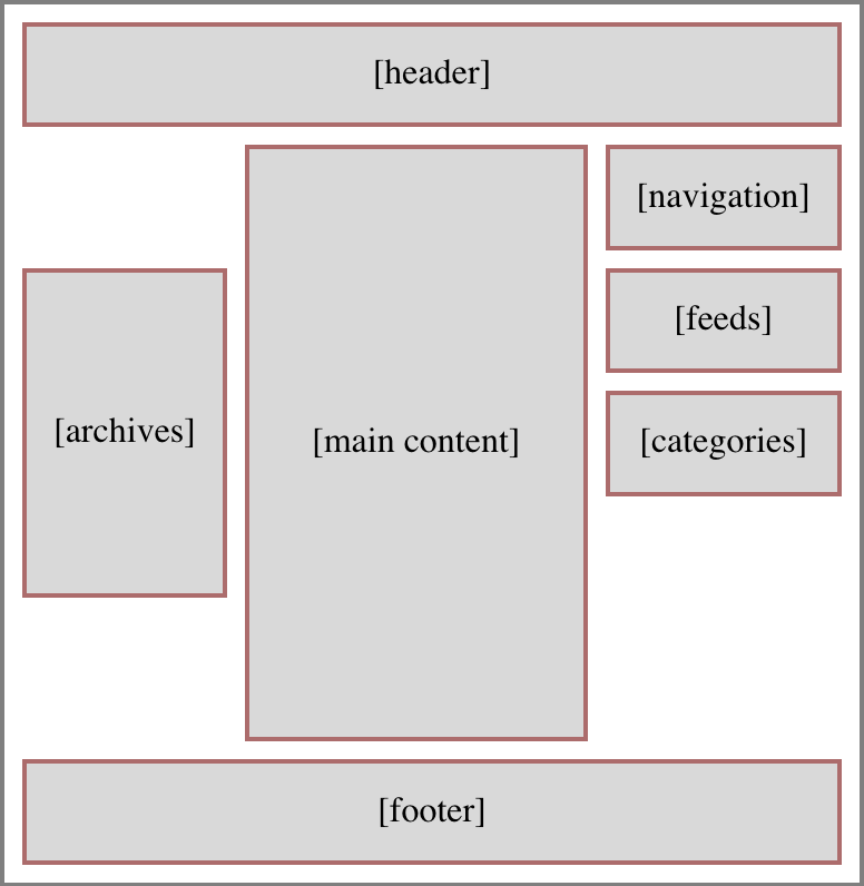
That’s the basic layout of archive pages. See how the left sidebar’s Archives lines up with the top of the Feeds box in the right sidebar? That’s Grid for you. I thought about lumping the Feeds and Categories into a the same grid cell (thus making them part of the same grid row), which would have meant wrapping them in a <div>, but decided keeping them separate allows more flexibility in terms of responsive rearrangement of content. I can, for example, assign the Feeds to be followed by Archives and then Categories at mobile sizes. Or to reverse that order.
More to the point, I also wanted the ability to place things along the bottoms of the sidebars, down near the footer but still next to the main content column, like so:
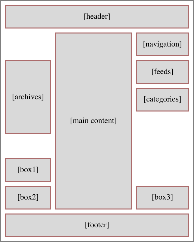
An early design prototype for the blog archives put the “Next post” and “Previous post” links in some of those spots, before I moved the links into the bottom of the main content column. So at the moment, I don’t have anything making use of those spots, although the capability is there. I could cluster content along the tops and the bottoms of the sidebars, as needed.
But here’s the important thing, and really the point of this article: I’m not rewriting the row structure and grid cell assignments for each page type. There’s a unified row template applied to the body on every page that uses the Hamonshū design. It is:
grid-template-rows: repeat(7,min-content) 1fr repeat(3,min-content);
The general idea here is, the first seven rows are sized to be the minimum necessary to contain content inside those rows. This is also true of the last three rows. And in between those sets, a 1fr row that takes up the rest of the grid container’s height, pushing the two sets apart.
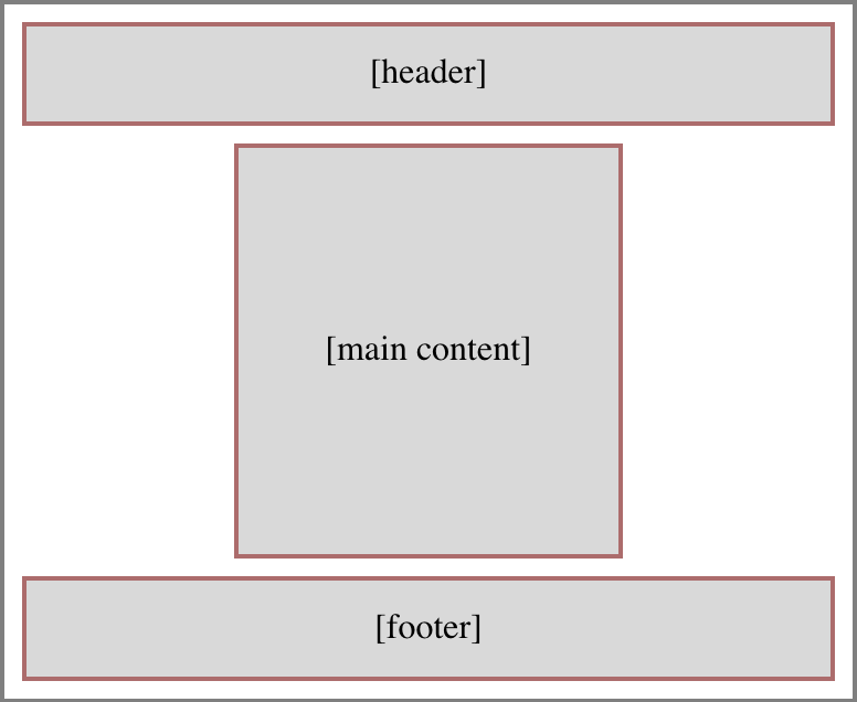
In the simplest case, where there’s just a header, main content column, and a footer, with nothing in the sidebars (the layout has three columns, remember), the content will fill the rows like so:
Here’s the Grid CSS to make that happen:
header {grid-row: 1; grid-column: 1 / -1;}
footer {grid-row: -2; grid-column: 1 / -1;}
main {grid-row: 2; grid-column: 2;}
Thus: The header fills all of row one. The content expands row two from its placement in the center column. The footer fills all of the last row, which is specified via grid-row: -2 (because grid-row: -1 would align its top with the bottom edge of the grid container). There’s no more content, so all the other min-content rows have no content, so their height is zero. And there’s no leftover height to soak up, so the 1fr row also has a height of zero. Seems like a lot of rows specified to no real purpose, doesn’t it?
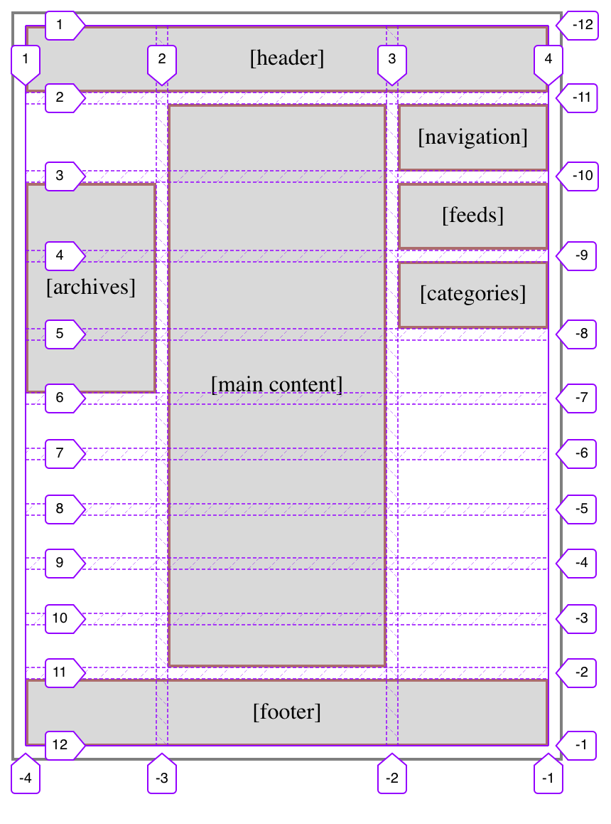
But now, let’s add some sidebar content to columns one and three; that is, the sidebars. For example, you might remember this layout from before:
Given this setup, we can’t just assign the main content column to grid-row: 2 and leave it at that — it’s going to have to span rows. Really, it needs to span all but the last, thus ensuring it reaches down to the footer. So the CSS ends up like this:
header, footer {grid-row: 1; grid-column: 1/-1;}
footer {grid-row: -2;}
main {grid-column: 2; grid-row: 2/-2;}
nav {grid-row: 2; grid-column: 3;}
.archives {grid-row: 3 / span 3;}
.feeds {grid-row: 3; grid-column: 3;}
.categories {grid-row: 4; grid-column: 3;}
And as a result, the rows end up like this:
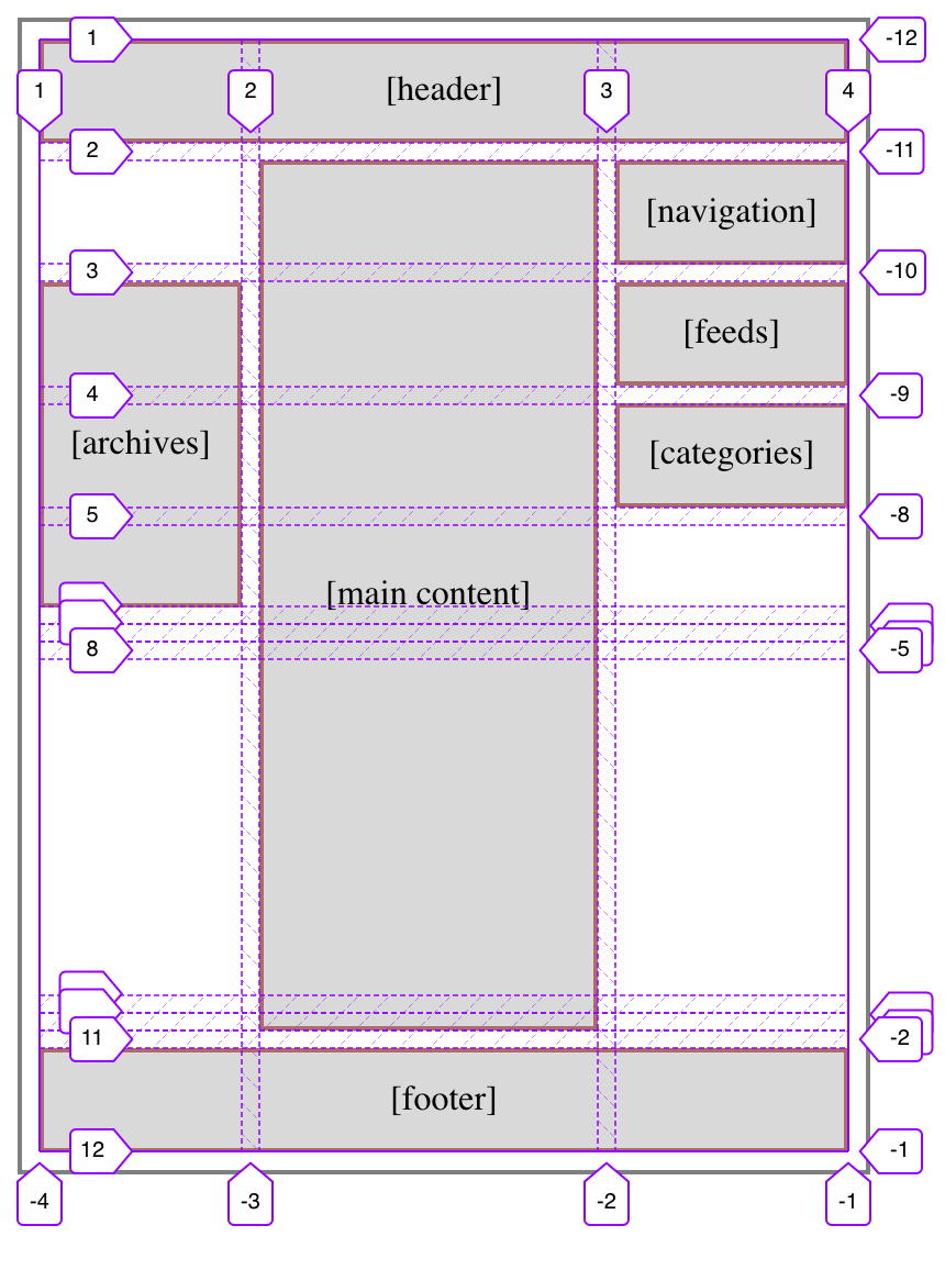
The first set of min-content rows are all gathered up against the bottom of the top part of the layout, and the second set are all pushed down at the bottom. Between them, the 1fr row eats up all the leftover space, which is what pushes the two sets of min-content rows apart.
I like this pattern. It feels good to me, having two sets of rows where the individual rows accordion open to accept content when needed, and collapse to zero height when not, with a “blank” row in between the sets that pushes them apart. It’s flexible, and even allows me to add more rows to the sets without having to rewrite all my layout styles.
As an example, suppose I decided I needed to add a few more rows to the bottom set, for use in a few specialty templates. Because of the way things are set up, all I have to do is change the row template like this:
grid-template-rows: repeat(7,min-content) 1fr repeat(5,min-content);
That’s everything. I just changed the number of repeats in the second set of rows. All the existing pages will continue on just fine, no layout changes, no CSS changes. In the few (currently hypothetical) pages where I need to put a bunch of stuff along the bottom of the main content column, I just plug them in using grid-row values, whether positive or negative. It all just works.
The same is true if more rows are added to the first set, for whatever reason. Everything gets managed in a single CSS rule, where you can add rows for the whole site instead of having to write, track, and maintain a bunch of variants for various page types. (Subtracting rows is harder without causing layout upset, but could still be done in some scenarios.)
As a final note, you’re probably wondering: Is that one 1fr row actually necessary to get a layout like this one? Not really, no. Let’s take it out, like this:
grid-template-rows: repeat(11,min-content);
What happens as a result is the rows that aren’t directly occupied by content (the ones that previously collapsed to zero height), but are still spanned by content (the center column), divvy up the leftover space the 1fr row used to consume. This leads to a situation like so:
To the user, there’s no practical difference. Things go to the same places either way. You just get the “extra” rows stretching out, instead of being pushed apart by the 1fr row.
I certainly could have left it at that, and it arguably would have been cleaner to do so. But something about this approach doesn’t sit quite right with me; there’s a tickly feeling in the back of my instinct that tells me there’s a downside to this. Admittedly, it could be a vestigial instinct from the Age of Floats; I doubtless have many things I still have not unlearned. On the other hand, it could be something about Grid I’ve picked up on subconsciously but haven’t yet brought into full realization.
If I ever pin the tickle down enough to articulate it, I’ll update the post to include it.
Thanks to Kitt Hodsden and Laura Kalbag for their assistance with this article.
Comments (6)
Pingback ::
Web Design & Development News: Collective #613 | Codrops
[…] Accordion Rows in CSS Grid […]
I want you to know that I really appreciate this article Eric, for even though I was aware of that “accordion” effect of the min-content rows I hadn’t realised how freeing it was and how flexible it is as a code base. Brilliant! Thankyou.
Pingback ::
Weekly News for Designers № 548 - Flexbox Cheatsheet, Free UI Kit, Create a Menu Image Animation, Simplified HTML Code
[…] Accordion Rows in CSS Grid – Designer Eric Meyer details his use of CSS Grid on his website’s new layout. […]
Pingback ::
Nouvelles hebdomadaires pour les concepteurs № 548 – 1dmx Actu internet
[…] Lignes d’accordéon dans la grille CSS – Le designer Eric Meyer détaille son utilisation de CSS Grid sur la nouvelle mise en page de son site Web. […]
K4HAMvhtKmekiuL45
Pingback ::
Collective #613 – Enjoy Web
[…] Accordion Rows in CSS Grid […]