To Infinity… But Not Beyond!
Published 7 months, 1 week pastPreviously on meyerweb, I explored ways to do strange things with the infinity keyword in CSS calculation functions. There were some great comments on that post, by the way; you should definitely go give them a read. Anyway, in this post, I’ll be doing the same thing, but with different properties!
When last we met, I’d just finished up messing with font sizes and line heights, and that made me think about other text properties that accept lengths, like those that indent text or increase the space between words and letters. You know, like these:
div:nth-of-type(1) {text-indent: calc(infinity * 1ch);}
div:nth-of-type(2) {word-spacing: calc(infinity * 1ch);}
div:nth-of-type(3) {letter-spacing: calc(infinity * 1ch);}
<div>I have some text and I cannot lie!</div>
<div>I have some text and I cannot lie!</div>
<div>I have some text and I cannot lie!</div>
According to Frederic Goudy, I am now the sort of man who would steal a infinite number of sheep. Which is untrue, because, I mean, where would I put them?
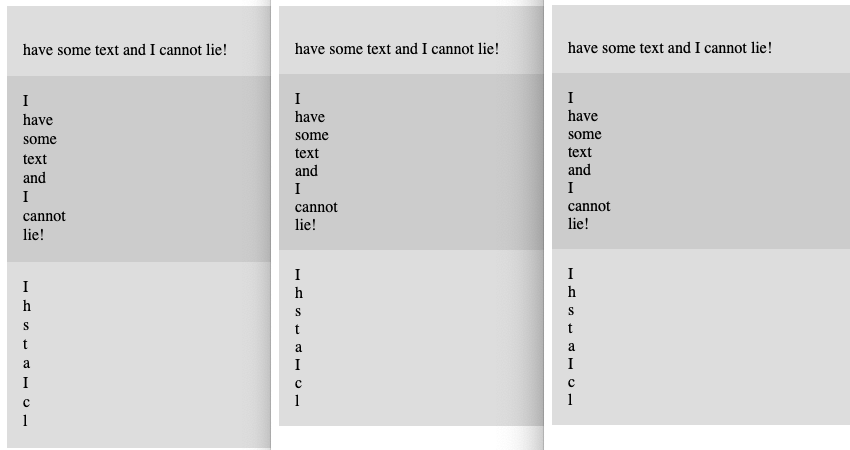
Visually, these all came to exactly the same result, textually speaking, with just very small (probably line-height-related) variances in element height. All get very large horizontal overflow scrolling, yet scrolling out to the end of that overflow reveals no letterforms at all; I assume they’re sat just offscreen when you reach the end of the scroll region. I particularly like how the “I” in the first <div> disappears because the first line has been indented a few million (or a few hundred undecillion) pixels, and then the rest of the text is wrapped onto the second line. And in the third <div>, we can check for line-leading steganography!
When you ask for the computed values, though, that’s when things get weird.
| Computed value for… | |||
|---|---|---|---|
| Browser | text-indent |
word-spacing |
letter-spacing |
| Safari | 33554428px | 33554428px | 33554428px |
| Chrome | 33554400px | 3.40282e+38px | 33554400px |
| Firefox (Nightly) | 3.40282e+38px | 3.40282e+38px | 3.40282e+38px |
Safari and Firefox are at least internally consistent, if many orders of magnitude apart from each other. Chrome… I don’t even know what to say. Maybe pick a lane?
I have to admit that by this point in my experimentation, I was getting a little bored of infinite pixel lengths. What about infinite unitless numbers, like line-height or — even better — z-index?
div {
	position: absolute;
}
div:nth-of-type(1) {
	top: 10%;
	left: 1em;
	z-index: calc(infinity + 1);
}
div:nth-of-type(2) {
	top: 20%;
	left: 2em;
	z-index: calc(infinity);
}
div:nth-of-type(3) {
	top: 30%;
	left: 3em;
	z-index: 32767;
}
<div>I’m really high!</div>
<div>I’m really high!</div>
<div>I’m really high!</div>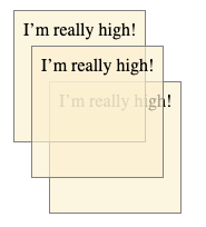
It turns out that in CSS you can go to infinity, but not beyond, because the computed values were the same regardless of whether the calc() value was infinity or infinity + 1.
| Browser | Computed value |
|---|---|
| Safari | 2147483647 |
| Chrome | 2147483647 |
| Firefox (Nightly) | 2147483647 |
Thus, the first two <div> s were a long way above the third, but were themselves drawn with the later-painted <div> on top of the first. This is because in positioning, if overlapping elements have the same z-index value, the one that comes later in the DOM gets painted over top any that come before it.
This does also mean you can have a finite value beat infinity. If you change the previous CSS like so:
div:nth-of-type(3) {
	top: 30%;
	left: 3em;
	z-index: 2147483647;
}
…then the third <div> is painted atop the other two, because they all have the same computed value. And no, increasing the finite value to a value equal to 2,147,483,648 or higher doesn’t change things, because the computed value of anything in that range is still 2147483647.
The results here led me to an assumption that browsers (or at least the coding languages used to write them) use a system where any “infinity” that has multiplication, addition, or subtraction done to it just returns “infinite”. So if you try to double Infinity, you get back Infinity (or Infinite or Inf or whatever symbol is being used to represent the concept of the infinite). Maybe that’s entry-level knowledge for your average computer science major, but I was only one of those briefly and I don’t think it was covered in the assembler course that convinced me to find another major.
Looking across all those years back to my time in university got me thinking about infinite spans of time, so I decided to see just how long I could get an animation to run.
div {
	animation-name: shift;
	animation-duration: calc(infinity * 1s);
}
@keyframes shift {
	from {
		transform: translateX(0px);
	}
	to {
		transform: translateX(100px);
	}
}
<div>I’m timely!</div>The results were truly something to behold, at least in the cases where beholding was possible. Here’s what I got for the computed animation-duration value in each browser’s web inspector Computed Values tab or subtab:
| Browser | Computed value | As years |
|---|---|---|
| Safari | 🤷🏽 | |
| Chrome | 1.79769e+308s | 5.7004376e+300 |
| Firefox (Nightly) | 3.40282e+38s | 1.07902714e+31 |
Those are… very long durations. In Firefox, the <div> will finish the animation in just a tiny bit over ten nonillion (ten quadrillion quadrillion) years. That’s roughly ten times as long as it will take for nearly all the matter in the known Universe to have been swallowed by supermassive galactic black holes.
In Chrome, on the other hand, completing the animation will take approximately half again as long asan incomprehensibly longer amount of time than our current highest estimate for the amount of time it will take for all the protons and neutrons in the observable Universe to decay into radiation, assuming protons actually decay. (Source: Wikipedia’s Timeline of the far future.)
“Okay, but what about Safari?” you may be asking. Well, there’s no way as yet to find out, because while Safari loads and renders the page like usual, the page then becomes essentially unresponsive. Not the browser, just the page itself. This includes not redrawing or moving the scrollbar gutters when the window is resized, or showing useful information in the Web Inspector. I’ve already filed a bug, so hopefully one day we’ll find out whether its temporal limitations are the same as Chrome’s or not.
It should also be noted that it doesn’t matter whether you supply 1s or 1ms as the thing to multiply with infinity: you get the same result either way. This makes some sense, because any finite number times infinity is still infinity. Well, sort of. But also yes.
So what happens if you divide a finite amount by infinity? In browsers, you very consistently get nothing!
div {
	animation-name: shift;
	animation-duration: calc(100000000000000000000000s / infinity);
}
(Any finite number could be used there, so I decided to type 1 and then hold the 0 key for a second or two, and use the resulting large number.)
| Browser | Computed value |
|---|---|
| Safari | 0 |
| Chrome | 0 |
| Firefox (Nightly) | 0 |
Honestly, seeing that kind of cross-browser harmony… that was soothing.
And so we come full circle, from something that yielded consistent results to something else that yields consistent results. Sometimes, it’s the little wins that count the most.
Just not infinitely.
Comments (3)
Just as a quick note, 10^300 is not ‘half as long again’ as 10^200, it is a number with a hundred more zeroes. Big numbers get so incomprehensible so quickly.
Quite right, Chester; thanks for the correction! I’ve edited the post.
Pingback ::
Drop #701 (2025-08-28): Thursday Morning Grab Bag – hrbrmstr's Daily Drop
[…] calc() in CSS enables mathematical calculations for numerical values, such as setting a margin to ¼ of the container width, as demonstrated in the example. Eric Meyer explores infinity in CSS, noting browser discrepancies and its use in experiments like infinite pixel widths. (https://meyerweb.com/eric/thoughts/2025/08/20/to-infinity-but-not-beyond/) […]