Accessible (I Think) Split-Cell Table Headers
Published 4 months, 2 weeks pastMy colleague Chris Griffith, with whom I collaborated to put The Effects of Nuclear Weapons, Third Edition (1977) online, is also a spaceflight enthusiast (and an urban trails hiker: check out his new book!). He recently asked me how I would mark up a table with a split diagonal header cell; specifically, this one from the Apollo 16 documentation:
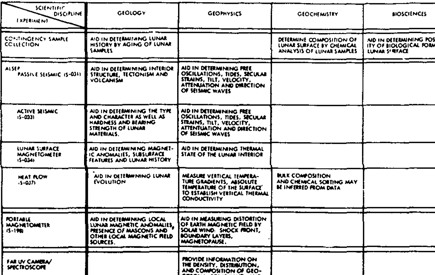
My immediate thought was to throw two spans in the header cell and position or grid them within that cell, but the accessibility of that seemed… questionable. It’s also what Wikipedia already does, and we here at meyerweb are nothing if not obsessed with finding new ways to do niche stuff. So I tried something different. But is its accessibility any better?
If you want to see it as a live example, it’s over at Codepen. Most of the text in the table is what macOS Preview OCRed out of the original image, which I kept intact because I think it’s funny. Anyway, here is the original markup I came up with for the table head, which you should not use:
<thead>
	<tr>
		<th scope="row">SCIENTIFIC DISCIPLINE</th>
		<th scope="col">GEOLOGY</th>
		<th scope="col">GEOPHYSICS</th>
		<th scope="col">GEOCHEMISTRY</th>
	</tr>
	<tr>
		<th scope="col">EXPERIMENT</th>
	</tr>
 </thead>
So one row for the headers across the top of the table, including the top-left label that goes with them, and then another row with the header that relates to the row headers for the rows below. That is to say, the row-scoped table header in each of the rows in the table’s bodies (it has more than one), like this:
<tbody>
	<tr>
		<th scope="row">CONTINGENCY SAMPLE COLLECTION</th>
		[…]
	</tr>
The thing is, when I ran the idea past accessibility experts like Alice Boxhall and Adrian Roselli, they identified a problem: Not having a full row of cells, as is the case for the second header row, fails WCAG 1.3.3. The suggested fix was to rowspan most of the cells in the first row, like this:
 <thead>
	<tr>
		<th scope="row">SCIENTIFIC DISCIPLINE</th>
		<th scope="col" rowspan="2">GEOLOGY</th>
		<th scope="col" rowspan="2">GEOPHYSICS</th>
		<th scope="col" rowspan="2">GEOCHEMISTRY</th>
	</tr>
	<tr>
		<th scope="col">EXPERIMENT</th>
	</tr>
 </thead>
With that, table navigation wasn’t perfect, but it seemed decent, so we could move forward.
In terms of presentation, to get the upper-left header cell to do the
split-diagonal thing, I relatively position the
<thead> and then absolutely position the second row
in the table head to sit over top of the first, pinned to the bottom
left corner.
thead {
	position: relative;
}
thead tr:nth-child(2) th {
	  position: absolute;
	  bottom: 0;
	  left: 0;
}
I fiddled around for a bit with trying to use a grid instead, but it didn’t really add anything that positioning didn’t already provide and threw some other wrenches into the works, like having to convert the entire table into a grid so the columns would stay aligned, so I decided to just stick with the positioning.
Then I throw a linear gradient background into the first row’s first cell to draw the diagonal, and everything’s thus more or less as intended, visually speaking. (That diagonal could also be an SVG, in fact probably should be in production, but I was seeing how an all-CSS solution might work so a gradient is where things stand.)
There are some layout caveats with this approach, but they’re pretty much the same as other solutions I saw: primarily, the two bits of text that the diagonal visually separates can stick out of their respective halves of the split cell, or even overlap each other. Also, you might need to explicitly set a minimum height of the first header row, in order to not exacerbate the overlap risk just described.
And then there’s a really big caveat: Safari, as of this writing,
doesn’t handle the layout at all well, because it doesn’t apply
relative positioning to <thead> (or
<tfoot> or <tbody>, but at least
it does <tr>s). I went to file a bug and found there’s already
one open, so maybe this will be fixed in the near future. I figured
out a way to get at least close to the intended result while still
allowing line-wrapping in the column header cells, but it mangled the
layout in Firefox and Chrome. In the end, to work around the problem, I
delved into browser
strangeness (at the suggestion of Marius Gundersen) and settled on
the following:
/* this is gross and I hate it but it works to fix
   Safari’s layout of the table’s top headers */
@supports (font: -apple-system-body) {
	thead tr:nth-child(1) th {
		white-space: nowrap;
	}
	thead tr:nth-child(2) th {
		position: static;
		display: block;
		margin-block: -1.5lh 0;
		padding-block: 0;
		text-align: start;
		transform: translateY(0.25lh);
	}
}
Thanks, I hate it! But it works, and I try to be pragmatic.
Anyway, the point being, what I’ve done here feels more accessible to me, and basic testing by both me and Adrian didn’t reveal any major problems, but I still worry about the positioning dorking things up for the users of screen readers I don’t have access to. So I throw it to the audience, particularly the accessibility-technology-using part of the audience: does this solution fall down for you, or is it good enough? Please let me know!
Comments (2)
Pingback ::
Weekly Reading List 1 June 2026 – OZeWAI
[…] Accessible (I Think) Split-Cell Table Headers Eric Meyer: does this solution fall down for you, or is it good enough? Please let me know! […]
Pingback ::
Accessible (I Think) Split-Cell Table Headers by Eric Archived Thoughts
[…] Accessible (I Think) Split-Cell Table Headers by Eric Archived Thoughts […]