Digging Into the Data
Published 18 years, 8 months pastOne of the practical reasons we released the anonymized data sets from the 2007 Web Design Survey was that we knew we couldn’t ask every possible question, let alone report on the results. For that matter, we knew we wouldn’t even be able to come up with every possible question. It’s one thing to approach this enormous mountain of data with a specific question in mind; those questions always seem obvious to the questioner. In that case, there’s a clear path to the summit. But we didn’t come at this with a specific angle in mind. We just wanted to know what the profession looks like. So we not only didn’t have a clear path to the summit, we didn’t even have a summit to reach. Instead, we had thousands. The tyranny of choice came down on our heads like a, well, like a falling mountain.
So the obvious choice was to release the data for others to analyze in search of their own summits, and I’m really glad to see people already doing so. One gentleman is looking to produce an analysis of UK respondents, for example. Others are asking specific questions and getting surprising results.
For example, Rebekah Ahrens grabbed a copy of the dataset and pulled out the answer to a straightforward question: what’s the gender distribution for the various age groups? What she found was that almost without exception, the younger the age group, the smaller the percentage of women. Here’s a chart showing the results she found in graphic form.
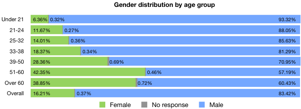
Wow. What is causing that? It’s a pronounced enough pattern that I initially wondered if it was somehow an artifact of the analysis method. Several times during the authoring of the report I’d think I’d found some amazing and previously unsuspected trend… only to discover I’d divided some numbers by the wrong total, or charted column-wise when the table was row-oriented. Mistakes along those lines. They happen. But I really don’t think that’s the case here.
Now, the really important question is why this pattern exists, and that’s where the data fail us—we can’t get the numbers to reveal all the forces that went into their collection. There are any number of reasons why this pattern might exist. I thought of three hypotheses in quick succession, and I’m sure there are many more of equal or greater plausibility.
- Younger women didn’t hear about the survey, and so didn’t take it.
- Women are losing interest in the field, instead heading into other career paths, and so those who have stuck with the field longer are more prevalent.
- Increasing margins of error at the low and high ends of the age spectrum reduces the confidence of the numbers to the point that we can’t draw any conclusions.
Remember, these are all hypotheses, any one of which could be true or not. So how would we go about proving or disproving them?
- Conduct a survey of women in the field to see if they answered the survey, if they know others who did, the ages of themselves and those others, and so on. Difficult to undertake, but not impossible.
- Ditto #1, although a possibly useful followup analysis would be to look at the gender distributions by longevity in the field and then cross-reference the two results.
- Get someone who is a statistician to figure out the likely margins of error to see if that might explain things. I’d do it, but I have no idea how. I would tend to be skeptical of this as an explanation given the clear trend, but I suppose it is possible.
I can, however, create the gender-by-longevity chart mentioned in #2 there.
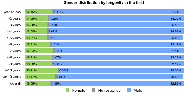
Check it out: above six years’ longevity, women are consistently more represented (compared to the overall average) than they are below six years’ longevity. The only exception is a spike at “1 year or less”. Is that enough to explain the trend Rebekah spotted? It doesn’t look like it to me, but then I’m not a statistician. I also wonder a bit about the spikes at edges of the longevity spectrum.
I’m not trying to propose an explanation here, because I don’t have one. I don’t even have an unsubstantiated belief as to what’s happening here. I know just enough to know that I don’t know enough to know the answer. What I’m saying is this: the great thing is that anyone can do this sort of analysis; and that even better, having done so, we can start to figure out what questions we need to be asking of ourselves and each other.
Comments (23)
Hi Eric – I’d spotted this too. I’m in the 18.37% bracket myself! I feel though that in the coming years ahead, we’ll be seeing more women in technology coming to the fore, so will be great to compare these stats again in years to come! There are females out there, but just maybe not as visible. As the survey continues and becomes more wider known across the field, maybe a wider participation of users will take part.
Well done for pondering over this though, nearly blogged about it myself!
Another thing to take into consideration is that some women in the 21 to 38 range (more or less) are having to choose between pursing a career or having a family. Even for women that can obtain a well paying job, its sometimes more economical, practical, and/or desirable to stay home with the family….than to try to juggle a family, work and household responsibilities.
I am in the 25-32 range, want to have children in the near future …and am wondering if doing so is going to “pause” my career. Which will be a challenge in such a fast paced industry.
My friend Dylan & I have been playing around with hypotheses & data around non-profit and educational web people, because one of the conclusions about job titles seemed off to me.
I really appreciate the raw data being available. I hope we can keep doing this regularly to get better understandings of the nature of our industry.
That makes me curious of a possible non related reason: are men leaving the field after a certain time in the field? ie: is the number of men declining over time when charted against longevity, and this increasing the % of women?
another way to think of it is this: are each of those various percentages made up of the same # of women correspondents meaning the % of women when charted against the over all # of survey participants is constant, but the # of men is changing?
There is no clear trend: it just looks that way because you’ve assumed infinite precision (i.e. all error bars are zero in size). If the error bars are of the order of 40%, then there’s no trend (and the data are mostly worthless).
A number without a plus-or-minus range has no meaning in proper science. Not including error ranges (e.g. “10.05 ± 1.1 %”) is the single easiest way to make any scientific analysis useless.
(Good work, though, and everything—once some statisticians have conjured up error bars, this will be very illuminating.)
I also wonder if this isn’t the oh-shucks response. At the lower age ranges and longevities-in-the-field, women might be less likely to self-identify as true members of the field. The spike at “1 year or less” could be due to people who have been doing the work for awhile but only began to “be serious” or “go pro” recently, and don’t count their prior work as “real work”.
I’m not a web designer so I didn’t take the survey, so I may be totally blowing smoke here–I don’t know if you had questions designed to compensate for how people view themselves.
If the subtle bump at the 6-year-longevity point is real, perhaps part of the reason is that it’s still a young industry, and some wild things were going on 6 years ago. People who, today, have 6+ years of experience were getting their start during the dot.com heydays, and the employment environment was completely different then. Thus, the sample has two different populations.
Pingback ::
User First Web » links for 2007-10-19
[…] Eric’s Archived Thoughts: Digging Into the Data “What she found was that almost without exception, the younger the age group, the smaller the percentage of women…Wow. What is causing that?” (tags: women gender business) This entry was written by Jason Grigsby and posted on October 19, 2007 at 12:24 am and filed under Bookmarks. Bookmark the permalink. Follow any comments here with the RSS feed for this post. Post a comment or leave a trackback: Trackback URL. « Saving the Environment–One Server at a Time […]
Pingback ::
David Carrington » UK breakdown of web design survey results
[…] Meyer pointed out that someone was looking to analyse the ALA Web Design 2007 Survey results for UK-only. I quite […]
I’d think you’d want a bar chart of women that shows years experience broken up by age group to answer this question. It’s my hunch that women come to the field later in life from some other endeavor.
Wow! Resizable graphs! (Resize your browser windows to see.) How?
Hi, I’m the Dylan that Elaine mentioned. And I have a wild theory for the big dropoff.
At SXSWi this year, I was surprised by the number of women there. But most of them were in marketing, content creation, or bloggers. Few were coders, or designers. The ones that were, at least anecdotally, were centered around mobile devices.
Maybe what we’re seeing is that with the emergence of these second and third generation job titles (e.g. information architect) that women who are interested in the web are gravitating towards those positions and away from the traditional design/development titles. Or maybe women are drawn more towards building and running websites more traditionally — through traditional jobs like marketing or writing/editing — because of perceived biases in the design/development world.
I think it’s troubling that 22%+ of all female respondents they they’ve been adversely affected by gender bias. And I’m wondering if that bias is driving women towards web-related jobs where there is less perceived bias.
We must start addressing gender, racial, and regional bias in the coming years. We must.
Thanks for posting this data. I’m glad you confirmed my results as well. I’m looking forward to future surveys where we can address some of these theories. If further surveys are planned, I’d be happy to volunteer some time to planning the questions so we can get more answers.
Chris: not that hard. max-width: 100% on the image to cause it to never overflow the width of the ‘column’.
I’m in the process of creating analysis of the Middle East respondents.
The results of the survey were interesting. I wonder if the language of the survey itself being English introduced a bias.
Maybe it would help to run the survey by steps and promoting it from country to country with an appropriate translation in the language of the country. Then collect the results by country.
For example, in Japan or France, the English only question will be a definitive no no.
Also it was very interesting to read where people get the information Web versus Mailing-list. More news in a near future on that.
Btw Eric, will you be at the W3C TPAC 2007? You are more than welcome, you should contact Janet Daly if not yet done.
What are the actual numbers for women in each age group? Are you sure this isn’t just actually a product of there being many less OLDER MEN in web design? If the actual trend here is that the web industry is dominated by younger men, but there’s a fairly EQUAL distribution of women of all ages, then by definition of how percentages work, there will be a higher percentage of older women vs older men like you are seeing.
Show me a histogram of just women by age and separately men by age. Without that, you can’t validly draw from this chart a statistical conclusion about what women are doing in the field of web development.
You’re quite right, Zach; that’s a possibility. The dataset is public, so please feel free to take the analysis further.
I took the survey and I’m female, a designer and somewhat of a coder (more than a lot of designers I know) and was dismayed to see the data, both in terms of gender breakdowns but also income/salary. How some people can still be paid so little in our field is truly depressing. Don’t even get me started on the m/f salary differences.
There are 2 things that are bugging me much more than the data in the compilation:
– Surveys are, by nature, not particularly reliable data. Many research groups do not even consider them to be valid research tools any more. So to have a number of very well-known web designers/developers/experts create and distribute an admittedly flawed survey seems… dare I say it… somewhat irresponsible. Lots of hard work and beautifully presented? Absolutely. Relevant? I question that.
– If we can all agree that surveys are flawed and this one was no different, and that creating one that can possibly gather any relevant information requires a statistician/survey professional, shouldn’t we leave this to the them? I’m not sure why an ‘official’ survey of this nature has not been attempted in the past. Perhaps a reflection on the lack respect in our industry (just make the logo bigger!). But given that it will be undoubtedly passed along to all sorts of people for all sorts of reasons… I find it troublesome that it will be read by some as ‘the lay of the land.’ Particularly impressionable younger women who decide not to get into the field because of what they’ll be reading. Or a manager who doesn’t think he needs to give that graphic designer a raise…
Don’t get me wrong. I fully recognize and appreciate the work that went into it to begin with… I just question what was actually created.
I understand your concerns, Rachel. It’s true that the survey is not truly and precisely representative—but all surveys and polls, regardless of how they’re conducted, are non-representative. It’s just that some are less non-representative than others.
Personally, I found it more troublesome that nobody really knew the lay of the land, or even the size of the land. Now we have something to go on, and given the number of people who responded, I believe it is likely a roughly accurate picture of the field. As in, it may not be in perfect focus, but it’s not so blurry as to be indecipherable. I feel that what was created was a big first step toward getting a handle on what the community really looks like. I think that’s important.
I think it’s a dangerous assumption on your part — and anyone else who thinks that the survey is even roughly accurate. I think you’ve gathered SOME information. That’s it. You’ll need more surveys, more time, and more importantly *professionals* designing and evaluating the survey, before you’ll know if what you came up with this time was relevant.
Had the survey results been distributed with more of a caveat, I would understand. But they really weren’t. I’m seeing back-patting and congratulations and another notch in the ol’ web design kudos belt. Relevant and useful? As a self-promotion tool for the people who created it, surely. And a smart one, too, hats off to you for that. Relevant and useful to the rest of us? I strongly disagree.
Self-promotion tool?
I’m not sure whether laughter or tears would be the more appropriate reaction. Maybe both.
Clearly, you’re not going to believe that we did what we did for other than selfish reasons, nor that what we did might possibly have been a net positive. I’m sorry for that, but there’s also little I can do about it, so I guess we’ll just have to leave things there.
Pingback ::
Laura’s Notebook | Technology for Non-profit Organisations, Social Media and Accessible Website Design » Blog Archive » Women working in non-profit technology - are we visible?
[…] on Eric Meyers blog, in his article on Digging into the Data, he ponders on questions raised by a post from Rebekah Ahrens. She saw that women made up 16.1% of […]