Table Column Alignment with Variable Transforms
Published 3 years, 7 months pastOne of the bigger challenges of recreating The Effects of Nuclear Weapons for the Web was its tables. It was easy enough to turn tab-separated text and numbers into table markup, but the column alignment almost broke me.
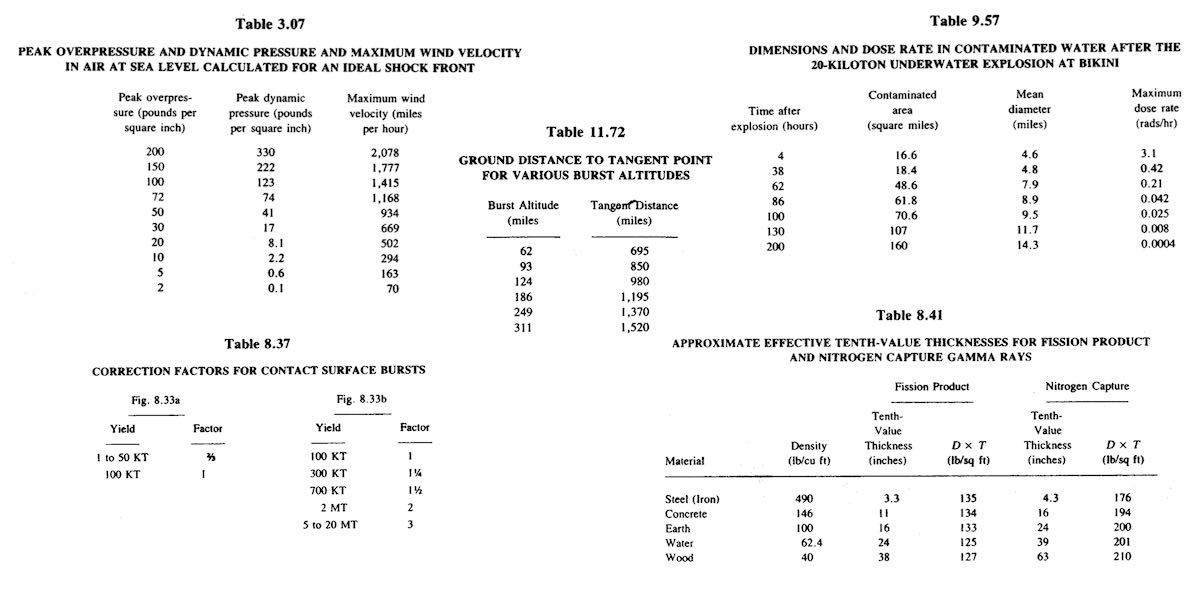
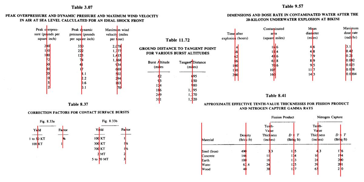
To illustrate what I mean, here are just a few examples of columns that had to be aligned.
At first I naïvely thought, “No worries, I can right- or left-align most of these columns and figure out the rest later.” But then I looked at the centered column headings, and how the column contents were essentially centered on the headings while having their own internal horizontal alignment logic, and realized all my dreams of simple fixes were naught but ashes.
My next thought was to put blank spacer columns between the columns of visible content, since table layout doesn’t honor the gap property, and then set a fixed width for various columns. I really didn’t like all the empty-cell spam that would require, even with liberal application of the rowspan attribute, and it felt overly fragile — any shifts in font face (say, on an older or niche system) might cause layout upset within the visible columns, such as wrapping content that shouldn’t be wrapped or content overlapping other content. I felt like there was a better answer.
I also thought about segregating every number and symbol (including decimal separators) into separate columns, like this:
<tr>
  <th>Neutrinos from fission products</th>
  <td>10</td>
  <td></td>
  <td></td>
</tr>
<tr class="total">
  <th>Total energy per fission</th>
  <td>200</td>
  <td>±</td>
  <td>6</td>
</tr>
Then I contemplated what that would do to screen readers and the document structure in general, and after the nausea subsided, I decided to look elsewhere.
It was at that point I thought about using spacer <span>s. Like, anywhere I needed some space next to text in order to move it to one side or the other, I’d throw in something like one of these:
<span class="spacer"></span>
<span style="display: inline; width: 2ch;"></span>
Again, the markup spam repulsed me, but there was the kernel of an idea in there… and when I combined it with the truism “CSS doesn’t care what you expect elements to look or act like”, I’d hit upon my solution.
Let’s return to Table 1.43, which I used as an illustration in the announcement post. It’s shown here in its not-aligned and aligned states, with borders added to the table-cell elements.

This is exactly the same table, only with cells shifted to one side or another in the second case. To make this happen, I first set up a series of CSS rules:
figure.table .lp1 {transform: translateX(0.5ch);}
figure.table .lp2 {transform: translateX(1ch);}
figure.table .lp3 {transform: translateX(1.5ch);}
figure.table .lp4 {transform: translateX(2ch);}
figure.table .lp5 {transform: translateX(2.5ch);}

figure.table .rp1 {transform: translateX(-0.5ch);}
figure.table .rp2 {transform: translateX(-1ch);}
For a given class, the table cell is translated along the X axis by the declared number of ch units. Yes, that means the table cells sharing a column no longer actually sit in the column. No, I don’t care — and neither, as I said, does CSS.
I chose the labels lp and rp for “left pad” and “right pad”, in part as a callback to the left-pad debacle of yore even though it has basically nothing to do with what I’m doing here. (Many of my class names are private jokes to myself. We take our pleasures where we can.) The number in each class name represents the number of “characters” to pad, which here increment by half-ch measures. Since I was trying to move things by characters, using the unit that looks like it’s a character measure (even though it really isn’t) made sense to me.
With those rules set up, I could add simple classes to table cells that needed to be shifted, like so:
<td class="lp3">5 ± 0.5</td>

<td class="rp2">10</td>
That was most of the solution, but it turned out to not be quite enough. See, things like decimal places and commas aren’t as wide as the numbers surrounding them, and sometimes that was enough to prevent a specific cell from being able to line up with the rest of its column. There were also situations where the data cells could all be aligned with each other, but were unacceptably offset from the column header, which was nearly always centered.
So I decided to calc() the crap out of this to add the flexibility a custom property can provide. First, I set a sitewide variable:
body {
	--offset: 0ch;
}
I then added that variable to the various transforms:
figure.table .lp1 {transform: translateX(calc(0.5ch + var(--offset)));}
figure.table .lp2 {transform: translateX(calc(1ch   + var(--offset)));}
figure.table .lp3 {transform: translateX(calc(1.5ch + var(--offset)));}
figure.table .lp4 {transform: translateX(calc(2ch   + var(--offset)));}
figure.table .lp5 {transform: translateX(calc(2.5ch + var(--offset)));}

figure.table .rp1 {transform: translateX(calc(-0.5ch + var(--offset)));}
figure.table .rp2 {transform: translateX(calc(-1ch   + var(--offset)));}
Why use a variable at all? Because it allows me to define offsets specific to a given table, or even specific to certain table cells within a table. Consider the styles embedded along with Table 3.66:
#tbl3-66 tbody tr:first-child td:nth-child(1),
#tbl3-66 tbody td:nth-child(7) {
	--offset: 0.25ch;
}
#tbl3-66 tbody td:nth-child(4) {
	--offset: 0.1ch;
}
Yeah. The first cell of the first row and the seventh cell of every row in the table body needed to be shoved over an extra quarter-ch, and the fourth cell in every table-body row (under the heading “Sp”) got a tenth-ch nudge. You can judge the results for yourself.
So, in the end, I needed only sprinkle class names around table markup where needed, and add a little extra offset via a custom property that I could scope to exactly where needed. Sure, the whole setup is hackier than a panel of professional political pundits, but it works, and to my mind, it beats the alternatives.
I’d have been a lot happier if I could have aligned some of the columns on a specific character. I think I still would have needed the left- and right-pad approach, but there were a lot of columns where I could have reduced or eliminated all the classes. A quarter-century ago, HTML 4 had this capability, in that you could write:
<COLGROUP>
	<COL>
	<COL>
	<COL align="±">
</COLGROUP>
CSS2 was also given this power via text-align, where you could give it a string value in order to specify horizontal alignment.
But browsers never really supported these features, even if some of them do still have bugs open on the issue. (I chuckle aridly every time I go there and see “Opened 24 years ago” a few lines above “Status: NEW”.) I know it’s not top of anybody’s wish list, but I wouldn’t mind seeing that capability return, somehow. Maybe as something that could be used in Grid column tracks as well as table columns.
I also found myself really pining for the ability to use attr() here, which would have allowed me to drop the classes and use data-* attributes on the table cells to say how far to shift them. I could even have dropped the offset variable. Instead, it could have looked something like this:
<td data-pad="3.25">5 ± 0.5</td>

<td data-pad="-1.9">10</td>
figure.table *[data-pad] {transform: translateX(attr(data-pad,'ch'));}
Alas, attr() is confined to the content property, and the idea of letting it be used more widely remains unrealized.
Anyway, that was my journey into recreating mid-20th-Century table column alignment on the Web. It’s true that sufficiently old browsers won’t get the fancy alignment due to not supporting custom properties or calc(), but the data will all still be there. It just won’t have the very specific column alignment, that’s all. Hooray for progressive enhancement!


Comments (5)
Though not as nice as
data-padyou could set the padding via a custom property in the HTML:I’m sure you’re aware of this but just mentioning as an alternative.
Pingback ::
My Kingdom for Decimal Alignment on Numbers — Adrian Roselli
[…] Eric Meyer has found a much more elegant and less problematic solution to the character alignment issue in his post Table Column Alignment with Variable Transforms […]
@Eric: This is freaking brilliant! I’m folding this approach into several tables within one of our sites where we have technical tables with values with varying numbers of decimal places including some values without a decimal, and the result of having those values aligned in a manner that makes sense to the eye is nothing short of magical!
Pingback ::
My 3 most-wanted CSS table features - Darin Senneff
[…] Another is to use CSS Transforms to shift column text left or right so that their decimals line up. This also is an effort to set up and maintain, as each cell needs to have a class or styles manually added based on what it contains. Eric Meyer has a nice write-up of this solution. […]
Pingback ::
Character-based alignment - CSSence.com
[…] we can work around this! Eric Meyer came up with a really advanced solution using CSS transforms. If you’re looking for something simpler, albeit less versatile, I may have something in store for […]