Love, Feline Style
Published 22 years, 2 months pastEver since the day after Carolyn came home, our cat Gravity has mostly ignored Carolyn’s presence. We’d been somewhat concerned that there would be hostility between them in the months to come, which wouldn’t really end well because Gravity still has claws. Those concerns are now, for the most part, erased. This afternoon, we discovered that not only has Gravity gotten used to Carolyn’s presence, but now regards her as a part of the family.
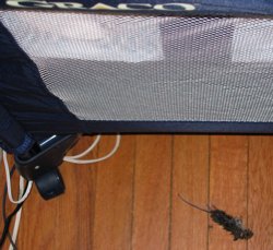
We know this because Gravity left Carolyn a gift—a freshly killed mouse, lying on the floor right next to the bassinet where Carolyn sleeps during the day.  From what I understand, this is typically how mother-cats feed their children, and start training them to hunt for their own food. I wished there were some way to communicate to Gravity that she could have her hunting spoils back, since Carolyn’s fairly well fed even without rodent supplements. When you think about all this, it’s really rather touching, in a morbid way. Kat and I both got a pretty good laugh out of it.
Of course, then I had to dispose of the carcass.
So Safari 1.2 is out, and of course was released just two days after I changed designs. So the fix for the first-letter bug that occurred with “Thoughts From Eric” in the previous design is in place, but you can’t see it working here. On the other hand, my recently constructed test page demonstrating Safari 1.1’s bugs with :hover and generated content show that 1.2 fixed the problem. So, that’s cool.
What is even cooler is John Gruber’s in-depth exploration of the OmniWeb beta. The “tabbed” interface, although not what I personally think of as tabbed, is still a welcome addition; I’ve found that I basically can’t live without tabs. (I do a sweep of all my regularly read blogs by opening them all in tabs, via a bookmark group.) What sounds really outstanding, though, is OmniWeb’s workspaces and site-specific preferences. It’s probably enough for me to tolerate the obsolescence of the rendering engine, which is equivalent to Safari 1.0, but we’ll see. You should see, too—go read John’s review of the browser, which is comprehensive and detailed. Truly excellent.
Complete topic shift: back in September, Molly was aghast at the Quizno’s television commercial featuring an adult male human suckling at the teat of a wolf. Well, their new ad campaign has launched, and if anything it’s more wrong. Sure, it’s a complete ripoff of the Spongmonkeys, mostly because it turns out the same guy did both. Warning: if you follow the Spongmonkeys link, I am not responsible for any psychological damage you may suffer, but it is very much like the commercial.
Is it just me, or are commercials in general getting a lot weirder of late?