Posts from March 2003

The Font of Frustration

Published 21 years, 1 month past

I’m still wrestling with the entire issue of fonts and font sizing.  A lot of this arises from a meyerweb redesign on which I’ve been occasionally working for the last few weeks.  My last redesign switched font styling from the user default to 11-pixel Verdana.  This is not a choice without its detractors; apparently I’ve earned the nickname “Mr. Microfonts” in some circles.  It’s also a choice I made knowing full well its benefits and drawbacks.

An image showing 'lorem ipsum' text in three different fonts (Times New Roman, Arial, and Verdana) at the browser's default font size, which works out to be 16 pixels.

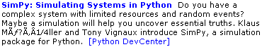
When I decided to go to a sans-serif font, it became almost mandatory to crank down the size.  Take a look at the accompanying image, which shows a comparison of the default-size text in IE5/Mac in Times New Roman, Arial, and Verdana.  To produce the text, all I did was set the font family, not the size.  They’re all effectively at font-size: 1em;, which given the browser’s default setting is the same as if I’d set them all to font-size: 16px;.  The same size value but a changing family means huge differences in the text’s appearance.  This is why font-size-adjust was invented, by the way.  Too bad only Mozilla for Windows supports it.  The lack of cross-browser implementation led to its removal from the CSS 2.1 Working Draft.

Nonetheless, when I started fiddling with the new design—which is more an evolutionary change than a revolutionary makeover, so don’t get too excited—I decided to see if I could go back to the user-default approach and still be happy with the result.  I think I’ve managed it, but what’s been interesting to me has been how that choice has influenced the entire design process.  What I have now is something that I think works well with a serif font, but if I were to switch to a sans-serif font, I’d have to change other things as well.  More proof of the fundamental importance of text styling, as if any more were needed.  Those of you who went to design school have known this for years, I suppose.  Nothing I studied in the pursuit of my B.A. in History really taught me the importance of typography.

Speaking of redesigns, Scott Andrew just launched one, and I really like it.  There are some interesting behaviors at my default window size, which is apparently smaller than his, but overall my thumbs are up.  The warm tones and nice use of sunflowers make a nice antidote to the recent trend of minimalist white-backed redesigns, which are all fine but were starting to get a bit monotonous.

Looking over Scott’s new design, I realized how much I envy people who can come up with attractive color combinations; all my designs tend to be monochromatic variations (gee, really?).  People like me need EasyRGB‘s Color Harmonizer just to get started.


Titanium Turnaround

Published 21 years, 1 month past

While I was in Santa Fe, NM a couple of weeks ago, I dropped my TiBook onto a bed from a height of about three inches.  The result was as immediate as it was unexpected: the hinge on the right side of the laptop snapped completely away from the display panel.  I have no idea how the forces involved could have even shifted the panel, let alone rend hardware joints.  The screen went blank in concert with the snapping sound, which set off an icy explosion in the pit of my stomach.  Fortunately the display was fine.  It had just gone into sleep mode for some reason.

So last week, I got in touch with the IC Help Desk (it’s actually AOLTW’s laptop) and they set things up with AppleCare.  A box was delivered on Thursday, and with a tear in my eye I boxed my silver little baby up on Friday.  A completely repaired TiBook came back to me yesterday.  Even figuring on overnight express shipping, that’s astonishing.  I figured it would take a minimum of four weeks to get there, be fixed, and come back, not four days—and one of them a Sunday, too!  Just when I was feeling grumpy about Apple‘s rapid move to OS X and the mass exodus of developers away from OS 9 (including Mozilla, which is no longer being updated for OS 9), they make me love them all over again.  Well, maybe not love them, exactly, but you know what I mean.


Out of Character

Published 21 years, 1 month past

After more than a year of sitting bolt upright in a chair whose back was about 20 degrees from horizontal, Kat finally got me to buy a new chair on Saturday.  I assembled it this morning, which anyone who knows me will tell you is astonishing on two counts:

  1. I put it together less than a month after I bought it.  Usually I let a project like that sit for a while, to let it come to the proper sense of fullness.  Or else because I’m lazy.
  2. I put it together, period.  I’m not what you would call handy with a toolbox.

I did put the armrests on backwards, but I did that on purpose.  They look cooler this way.

A screenshot of text on the O'Reilly Network which has some severe character-encoding problems.

Font and text handling seem to occupy more and more of my attention of late.  Here’s another good example of the problems we face: character encoding.  This morning I dropped by the O’Reilly Network and spotted some badly mangled text.  Apparently that’s supposed to be a “ü” in there, since that’s what the referenced article shows.  How did this happen?  No doubt somebody copy-and-pasted the text from a word processor into a CMS interface, and it looked fine on their machine when they previewed the text.  Unfortunately, in my Web browser, no such luck.  (This was in IE5.1.4/MacOS9.1, but a quick check in a recent Mozilla build showed the same problem.)  It may have gone through some XSLT for extra munging, for all I know.

I have a little experience with the encoding problems that can arise when you’re working with XML and XSLT.  If you want to use HTML-style character entities, you have to write a stylesheet that defines every last entity you might use, which is kind of weighty, although I do it for this journal’s XML files.  For the new DevEdge, we wrote a separate namespaced transform based on the old entities.  In our world, a “u” with an umlaut is <ent:uuml/>; an “A” with a ring is <ent:Aring/>.  Of course we also have documents that are encoded for localization (e.g., DevEdge Japan) by their authors, and nobody else can touch them for fear that we’ll break the encoding.  For that matter, when we had an inline JavaScript alert for our printer-friendly links, the spaces in the value were encoded as %20.  Every browser showed those as spaces in the link, except Opera, which showed the raw text (“This%20page%20is%20already…”).  Is it right to do this?  Is it wrong?  I don’t know.  Do I care?  Not really.

In a like vein, I recently found out why recent e-mail message from a certain well-known CSS luminary look like an encoded binary to me, while his responses to other authors’ messages on listservs look just fine: he’s sending out 8-bit text in ISO-8859-1, and something between his fingers and my eyes is munging the text into 7-bit ASCII.  If he sends a message as 7-bit text, there are no problems.  I’m not sure if it’s my aging mail client or a server along the message’s path from him to me.  Again, I don’t care.  I shouldn’t have to care.

It seems that the more powerful our tools become, the more ways we have to break the flow of information.  This to me is exactly opposite of what should be happening.  It’s not that hard to implement character encoding, and it’s not that hard to agree on a character format.  We (as an industry) just haven’t done it to the necessary extent, and there’s really no excuse for this fact.  A character should be a character.  If Unicode is the answer, then great, let’s do it.

As is common for my little technology rants, I don’t have a solution, only questions.  My biggest question is, “How long until we fix this basic problem?”  I don’t even care about how, really.  Just when.

Today is a triple-three, for those of you who care and use two-digit date formatting: 03/03/03.  I wonder if any lotteries will have that number come up tonight.  I still remember when the American Embassy hostages were released by Iran after 444 days in captivity, and that night one state lottery’s Pick 3 came up 444.  Those kinds of coincidences are always fascinating to me.


Browse the Archive

Later Entries