Linear Gradient Keywords
Published 14 years, 1 month pastLinear gradients in CSS can lead to all kinds of wacky, wacky results — some of them, it sometimes seems, in the syntax itself.
Let me note right up front that some of what I’m talking about here isn’t widely deployed yet, nor for that matter even truly set in stone. Close, maybe, but there could still be changes. Even if nothing actually does change, this isn’t a “news you can use RIGHT NOW” article. Like so much of what I produce, it’s more of a stroll through a small corner of CSS, just to see what we might see.
For all their apparent complexity, linear gradients are pretty simple. You define a direction along which the gradient progresses, and then list as many color stops as you like. In doing so, you describe an image with text, sort of like SVG does. That’s an important point to keep in mind: a linear (or radial) gradient is an image, just as much as any GIF or PNG. That means, among other things, that you can mix raster images and gradient images in the background of an element using the multiple background syntax.
But back to gradients. Here’s a very simple gradient image:
linear-gradient(45deg, red, blue)The 45deg defines the gradient line, which is the line that defines how the gradient progresses. The gradient line always passes through the center of the background area, and its specific direction is declared by you, the author. In this case, it’s been declared to point toward the 45-degree angle. red and blue are the color stops. Since the colors don’t have stop distances defined, the distances are assumed to be 0% and 100%, respectively, which means you get a gradient blend from red to blue that progresses along the gradient line.
You can create hard stops, too:
linear-gradient(45deg, green 50%, lightblue 50%)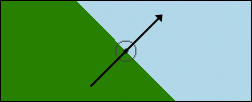
That gets you the result shown in Figure 1, to which I’ve added (in Photoshop) an arrow showing the direction of the gradient line, as well as the centerpoint of the background area. Each individual “stripe” in the gradient is perpendicular to the gradient line; that’s why the boundary between the two colors at the 50% point is perpendicular to the gradient line. This perpendicularness is always the case.
Now, degrees are cool and all (and they’ll be changing from math angles to compass angles in order to harmonize with animations, but that’s a subject for another time), but you can also use directional keywords. Two different kinds, as it happens.
The first way to use keywords is to just declare a direction, mixing and matching from the terms top, bottom, right, and left. The funky part is that in this case, you’re declaring the direction the gradient line comes from, not that toward which it’s going; that is, you specify its origin instead of its destination. So if you want your gradient to progress from the bottom left corner to the top right corner, you actually say bottom left:
linear-gradient(bottom left, green 50%, lightblue 50%)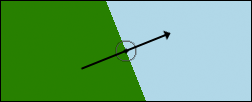
But bottom left does not equal 45deg, unless the background area is exactly square. If the area is not square, then the gradient line goes from one corner to another, with the boundary lines perpendicular to that, as shown in Figure 2. Again, I added a gradient line and centerpoint in Photoshop for clarity.
Of course, this means that if the background area resizes in either direction, then the angle of the gradient line will also change. Make the element taller or more narrow, and the line will rotate counter-clockwise (UK: anti-clockwise); go shorter or wider and it will rotate clockwise (UK: clockwise). This might well be exactly what you want. It’s certainly different than an degree angle value, which will never rotate due to changes in the background’s size.
The second way to use keywords looks similar, but has quite different results. You use the same top/bottom/left/right terms, but in addition you prepend the to keyword, like so:
linear-gradient(to top right, green 50%, lightblue 50%)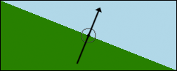
In this case, it’s clear that you’re declaring the gradient line’s destination and not its origin; after all, you’re saying to top right. However, when you do it this way, you are not specifying the top right corner of the background area. You’re specifying a general topward-and-rightward direction. You can see the result of the previous sample in Figure 3; once more, Photoshop was used to add the gradient line.
Notice the hard-stop boundary line. It’s actually stretching from top left to bottom right (neither of which is top right). That’s because with the to keyword in front, you’re triggering what’s been referred to as “magic corners” behavior. When you do this, no matter how the background area is (re)sized, that boundary line will always stretch from top left to bottom right. Those are the magic corners. The gradient line thus doesn’t point into the top right corner, unless the background area is perfectly square — it points into the top right quadrant (quarter) of the background area. Apparently the term “magic quadrants” was not considered better than “magic corners”.
The effect of changing the background area’s size is the same as before; decreasing the height or increasing the width of the background area will deflect the gradient line clockwise, and the opposite change to either axis will produce the opposite deflection. The only difference is the starting condition.
Beyond all this, if you want to use keywords that always point toward a corner, as in Figure 2 except specifying the destination instead of the origin, that doesn’t appear to be an option. Similarly, neither can you declare an origin quadrant. Having the gradient line always traverse from corner to corner means declaring the origin of the gradient line (Figure 2). If you want the “magic corners” effect where the 50% color-stop line points from corner to corner, with the gradient line’s destination flexible, then you declare a destination quadrant (Figure 3).
As for actual support: as of this writing, only Firefox and Opera support “magic corners”. All current browsers — in Explorer’s case, that means IE10 — support angles and non-magic keywords, which means Opera and Firefox support both keyword behaviors. Nobody has yet switched from math angles to compass angles. (I used 45deg very intentionally, as it’s the same direction in either system.)
That’s the state of things with linear gradients right now. I’m interested to know what you think of the various keyword patterns and behaviors — I know I had some initial trouble grasping them, and having rather different effects for the two patterns seems like it will be confusing. What say you?